library(tidyverse)6 Common ggplot2 Mistakes
Visualization
Here’s a list of some beginner’s mistakes when it comes to
ggplot (and how to avoid them)
In this blog post, I want to walk you through six common mistakes that beginners make with ggplot. They range from simple programming mistakes to mistakes in applying data visualization principles. So, with that said, let’s dive in.
Aesthetics Placement
One of the most common mistakes is about where to put aesthetics in ggplot. The question is whether to include them inside the aes() call or outside of it. Once you understand the difference, it’s easy to avoid this mistake. So let me explain:
- Inside the
aes(), include data-dependent things like variable names from the dataset. This is where you letggplotfigure things out on its own. No specific instructions like “Make category A into blue points” - If you want to specify things manually, and this includes using things that are not data-dependent, keep them outside the
aes().
Here are two examples:
Let ggplot assign colors the way it wants to based on the species column.
ggplot(data = palmerpenguins::penguins) +
  geom_point(
    aes(
      x = bill_length_mm,
      y = bill_depth_mm,
      color = species
    )
  )
Tell ggplot to make all points blue and large.
ggplot(data = palmerpenguins::penguins) +
  geom_point(
    aes(
      x = bill_length_mm,
      y = bill_depth_mm
    ),
    color = "blue",
    size = 3
  )
Use color instead of fill
One of the things, that happens a lot in the beginning is that you confuse the fill and color aesthethic. For example, imagine that you have a bar chart like this.
ggplot(data = diamonds) +
  geom_bar(
    aes(x = cut)
  )
And now imaging that you want to change the color of the bars. Well, chances are that you might try to do something like this.
ggplot(data = diamonds) +
  geom_bar(
    aes(x = cut),
    color = "dodgerblue4"
  )
But that doesn’t work. What you will get is a blue outline but not a blue fill. So instead use fill:
ggplot(data = diamonds) +
  geom_bar(
    aes(x = cut),
    fill = "dodgerblue4"
  )
This type behavior is not limited to bar charts. Basically, whenever you have a shape that can be filled, like a rectangle from geom_rect() or geom_tile(), you should use fill instead of color. (Unless of course you want to change the outline color.)
Creating legends manually with multiple layers
When you set, say, the color aesthetic to a text instead of a variable, then you will get that text in the legend. Here’s an example of that.
fake_dat <- tibble(
  x = 1:6,
  colA = c(3, 4, 9, 2, 4, 2),
  colB = c(2, 3, 1, 5, 2, 3)
)

fake_dat |>
  ggplot() +
  geom_point(
    aes(x = x, y = colA, color = "Column A"),
    size = 6
  ) +
  geom_point(
    aes(x = x, y = colB, color = "Column B"),
    size = 6
) 
Here we have manually created two layers, one for each column. But whenever you catch yourself doing that, try to remember that this is a tell-tale sign that you should have used pivot_longer() to reshape your data first.
rearranged_data <- fake_dat |>
  pivot_longer(
    cols = c(colA, colB),
    names_to = "column",
    values_to = 'y'
  )
rearranged_data
## # A tibble: 12 × 3
##        x column     y
##    <int> <chr>  <dbl>
##  1     1 colA       3
##  2     1 colB       2
##  3     2 colA       4
##  4     2 colB       3
##  5     3 colA       9
##  6     3 colB       1
##  7     4 colA       2
##  8     4 colB       5
##  9     5 colA       4
## 10     5 colB       2
## 11     6 colA       2
## 12     6 colB       3
And then you can easily create a legend by mapping the color aesthetic to the column variable.
rearranged_data |>
  ggplot() +
  geom_point(
    aes(x = x, y = y, color = column),
    size = 6
  )
And if you’re unhappy with the names that are displayed in the legend, then you can just modify the labels in the data set before they are passed to ggplot(). You could achieve that with a combination of mutate() and case_when().
rearranged_data |>
  mutate(
    column = case_when(
      column == "colA" ~ "Column A",
      column == "colB" ~ "Column B"
    )
  ) |>
  ggplot() +
  geom_point(
    aes(x = x, y = y, color = column),
    size = 6
  )
Creating a legend
Now that we have covered how to create a legend manually, let’s talk about how to avoid creating a legend in the first place. You see, the legend is not necessary in a lot of cases. You could achieve the exact same result by
- putting labels directly inside of the plot or
- colorizing labels in the titles of the plot.
Both ways give your data much more room instead of wasting space on a bulky legend. For example, here’s a plot I’ve created in one of my other YT videos.

Notice how I have much more room for my points when the legend is gone and the color information incorporated into the subtitle. It would be a bit too much to show how that chart was created here. But you can see the whole process on YouTube:
Using too many colors
It’s pretty easy to produce a colorful mess if you use too many colors. For example, check out this line chart.
plt <- gapminder::gapminder |>
  filter(
    country %in% c("Germany", "France", "Italy", "Spain", "United Kingdom", "United States")
  ) |>
  ggplot() +
  geom_line(
    aes(
      x = year,
      y = lifeExp,
      color = country
    ),
    linewidth = 2
  )
plt
Even though there are only a couple of lines, it’s hard to tell them apart. At this point, it’s hard to tell what your chart is supposed to show. The easiest way to avoid that is to pick out specific groups that you want to focus on. And then highlight only those colors and gray out everything else. This can be achieved quite easily with gghighlight from the package of the same name.
plt +
  gghighlight::gghighlight(
    country %in% c("Germany", "France")
  )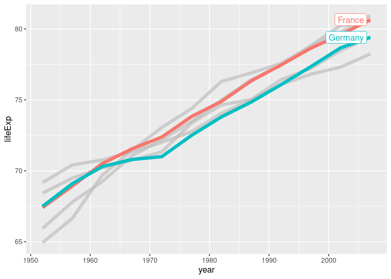
gghighlight will gray out everything that is not highlighted. And by default it will even give you direct labels instead of a legend. Alternatively, you can always combine groups. For example, in my data viz course “Insightful Data Visualizations for ‘Uncreative’ R Users”, I show students how to build the following chart:

Here, I have combined a couple of categories into the group “Others”. Otherwise, the chart would have been too colorful.
Using the Wrong Color
This mistake is also related to colors. It is about using the wrong color or even using the default colors. Default colors are boring, and, to me, they signal that someone hasn’t really thought about customizing the chart a little bit to put some effort into it. So if you can, try to use your colors. For example, in the penguins plot from before, we could use some nicer colors by adding a scale_color_manual() layer.
ggplot(data = palmerpenguins::penguins) +
  geom_point(
    aes(
      x = bill_length_mm,
      y = bill_depth_mm,
      color = species
    )
  ) +
  scale_color_manual(
    values = c(
      "Adelie" = "#E69F00",
      "Chinstrap" = "#009E73",
      "Gentoo" = "#0072B2"
    )
  )
But more importantly than that, you should try to use colors that are meaningful. For example, here I have used three completely different colors which was appropriate because we have three different species. But if we had a variable with a natural ordering, then we should use a color gradient that uses one or at most two colors that get lighter. That’s what ggplot does by default if you use a continuous variable in the color mapping.
ggplot(data = palmerpenguins::penguins) +
  geom_point(
    aes(
      x = bill_length_mm,
      y = bill_depth_mm,
      color = body_mass_g
    ),
    size = 4
  )
But usually you want higher numbers to be darker and lower numbers to be lighter. So you have to tell ggplot that. For example, this could look like this
ggplot(data = palmerpenguins::penguins) +
  geom_point(
    aes(
      x = bill_length_mm,
      y = bill_depth_mm,
      color = body_mass_g
    ),
    size = 4
  ) +
  scale_color_gradient(
    low = "white",
    high = "#0072B2"
  )
Conclusion
This concludes our list of common mistakes that beginners make with ggplot. If you found this helpful, here are some other ways I can help you:
- 3 Minute Wednesdays: A weekly newsletter with bite-sized tips and tricks for R users
- Insightful Data Visualizations for “Uncreative” R Users: A course that teaches you how to leverage
{ggplot2}to make charts that communicate effectively without being a design expert.