I recently saw a nice thread on Twitter and I wanted to chime in. The author of said thread suggests to use bar charts instead of colored matrices to visualize correlations. Let’s try that with {ggplot2}. Additionally, I will suggest a few ideas of my own.
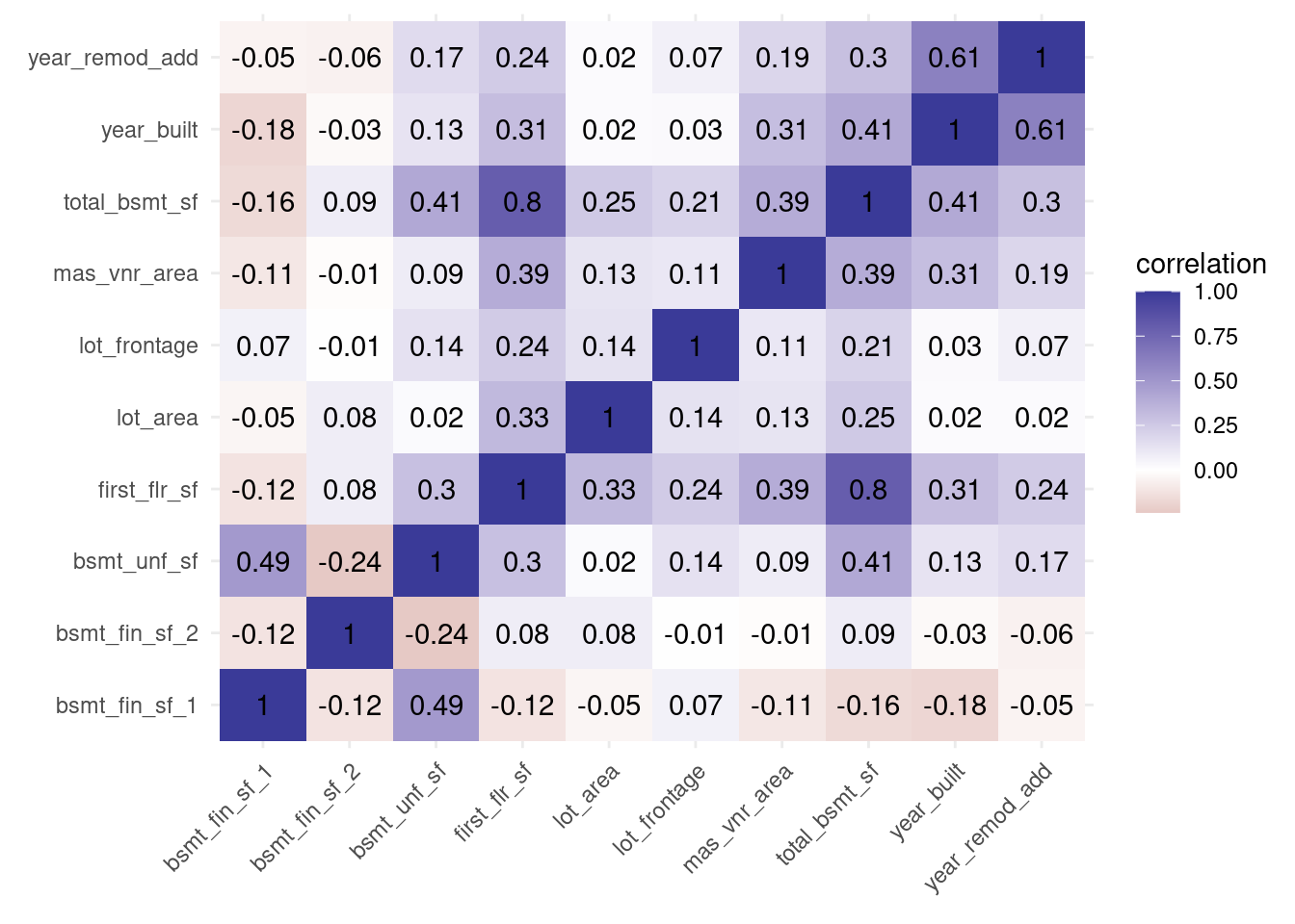
Using geom_tile() to visualize correlation matrices
Let’s start with the basic plot, i.e. we
pick a data set,
compute correlations between variables
visualize correlations with geom_tile().
Our data set will be the Ames housing data set from {modeldata}. Since this data set contains many variables, we’ll just pick a few from them. Otherwise, we’ll have to work hard to visualize the correlations of MANY variables. Technically, that’s possible with large images but it won’t give us any more insights into the visualization process.
Also, for a real visual, we should probably relabel the variable names into something human-readable. But for simplicity, I skip that step in this demo.
Next, we’re going to compute the correlation matrix with cor(). Then, we make the resulting matrix into a tibble (keep the row names) and then pivot the tibble to rearrange the data.
Now, this is a tidy format. It’s majestic and {ggplot2} will love the format. Now, visualizing the correlation matrix is only a matter of using geom_tile(). Unfortunately, we will have to tilt the labels of the x-axis. I usually dislike this move but with this visual I don’t think there much we can do about it.
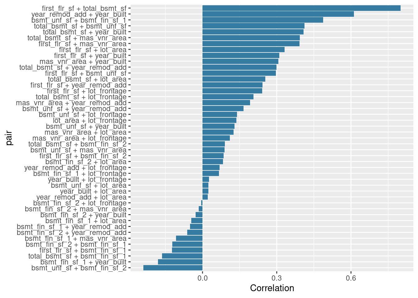
Next, let us try visualizing the correlations with bars instead of colored tiles. For that, we need to create a new variable that describes the pairs of all variables.
Notice that we do not want to use the same pair twice. This can happen if we use “both” pairs A + B and B + A. To avoid that, I have set all entries of the correlation matrix that are not in the lower triangle of the matrix to zero. Here’s how a sub-matrix looks so that you know how our matrix looks in principle.
This is easy to visualize with geom_col(). Notice that I do not use different colors for the bars. That’s because I think that it’s unnecessary in this visual. In the matrix plot, the color gradient served a purpose. Here, this purpose is negligible.
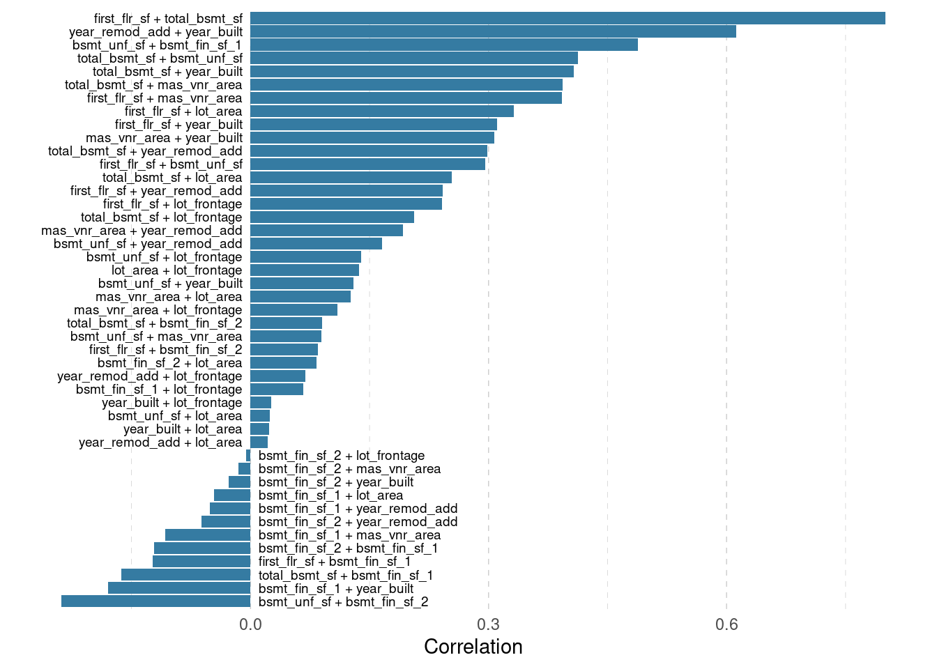
I think there is some room for improvement in the previous plot. For starters, I am not so happy that the reader always has to follow a line from label to bar. That’s why I would move the labels next to the bars. Then, we can also get rid of many grid lines. While we’re at it, let’s make the remaining grid lines lighter.
nudge_x <-0.01text_size <-2.5grid_color <-'grey80'text_color <-'grey40'correlations %>%ggplot(aes(y = pair, x = correlation)) +geom_col(fill = my_col) +geom_text(aes(x =0, label = pair),size = text_size,# Change horizontal justification based on correlation value# This moves labels to left or right of the barshjust =if_else(correlations$correlation >0, 1, 0),# Same trick just for moving the labels a tiny bitnudge_x =if_else(correlations$correlation >0, -nudge_x, nudge_x) ) +scale_y_discrete(breaks =NULL) +labs(x ='Correlation', y =element_blank()) +theme_minimal() +theme(panel.grid =element_line(size =0.25, linetype =2, color = grid_color) )
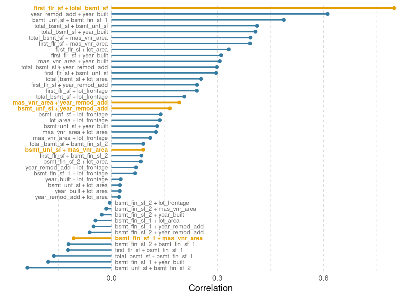
Use lollipops to visualize correlation matrices
Bar charts use quite a lot of ink. And I think in this case we can do with a little bit less ink. Instead of geom_col(), let us use geom_seqment() and geom_point(). That’s how you build a lollipop chart!
Finally, let me give one more reason why I didn’t use a color gradient so far. That’s because I can now highlight selected variable pairs.
I think the text labels clutter the image quite a lot. If we need to show all the variables this cannot be avoided. But what if we only care about certain variables or certain relationships? Then, we can highlight these and grey out everything else.
For demo purposes, I have randomly sampled a few variable pairs. Let’s highlight these.
I like to think that the last plot is a neat way to visualize correlations. What do you think? Feel free to let me know in the comments.
Also, if you have any questions, let me know via mail or in the comments. And don’t forget to stay in touch via my Newsletter, Twitter or my RSS feed. See you next time!
This in-depth video course teaches you everything you need to know about becoming better & more efficient at cleaning up messy data. This includes Excel & JSON files, text data and working with times & dates. If you want to get better at data cleaning, check out the course page.
Insightful Data Visualizations for "Uncreative" R Users
This video course teaches you how to leverage {ggplot2} to make charts that communicate effectively without being a design expert. Course information can be found on the course page.