Today we’re finding out what goes wrong then ggplot can plot the lines that we want to plot.
Author
Albert Rapp
Published
June 30, 2024
Have you ever tried to create a line chart with ggplot only to find that the chart remains blank and a warning showing up that each group consists out of one observation? That’s a common struggle and I used to attempt a lot of trial and error to fix this. In today’s blog post we’re going to take a look what’s going on when this warning message occurs and how to fix that like a pro. Like always, you can find a video version of this blog post on YouTube:
Generate some fake data
First, what we need is data to work with. Here, I’m just going to simulate a bit of random data. And at the end of the day, the exact data isn’t that important. Just know that all of the data sets I use in this blog post are simulated.
You can find the code for that simulation in this folded code chunk. Feel free to check that out if you’re curious.
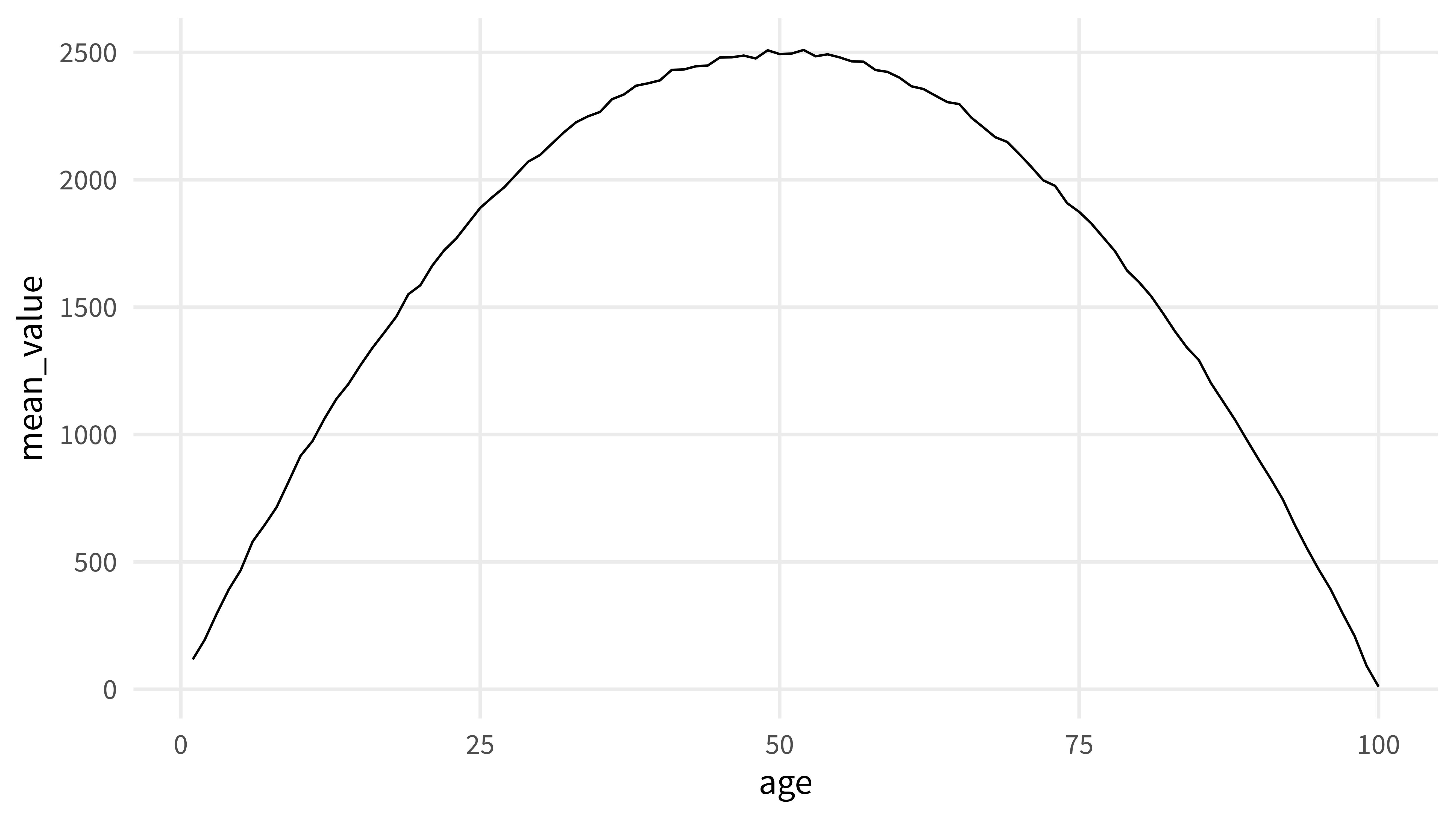
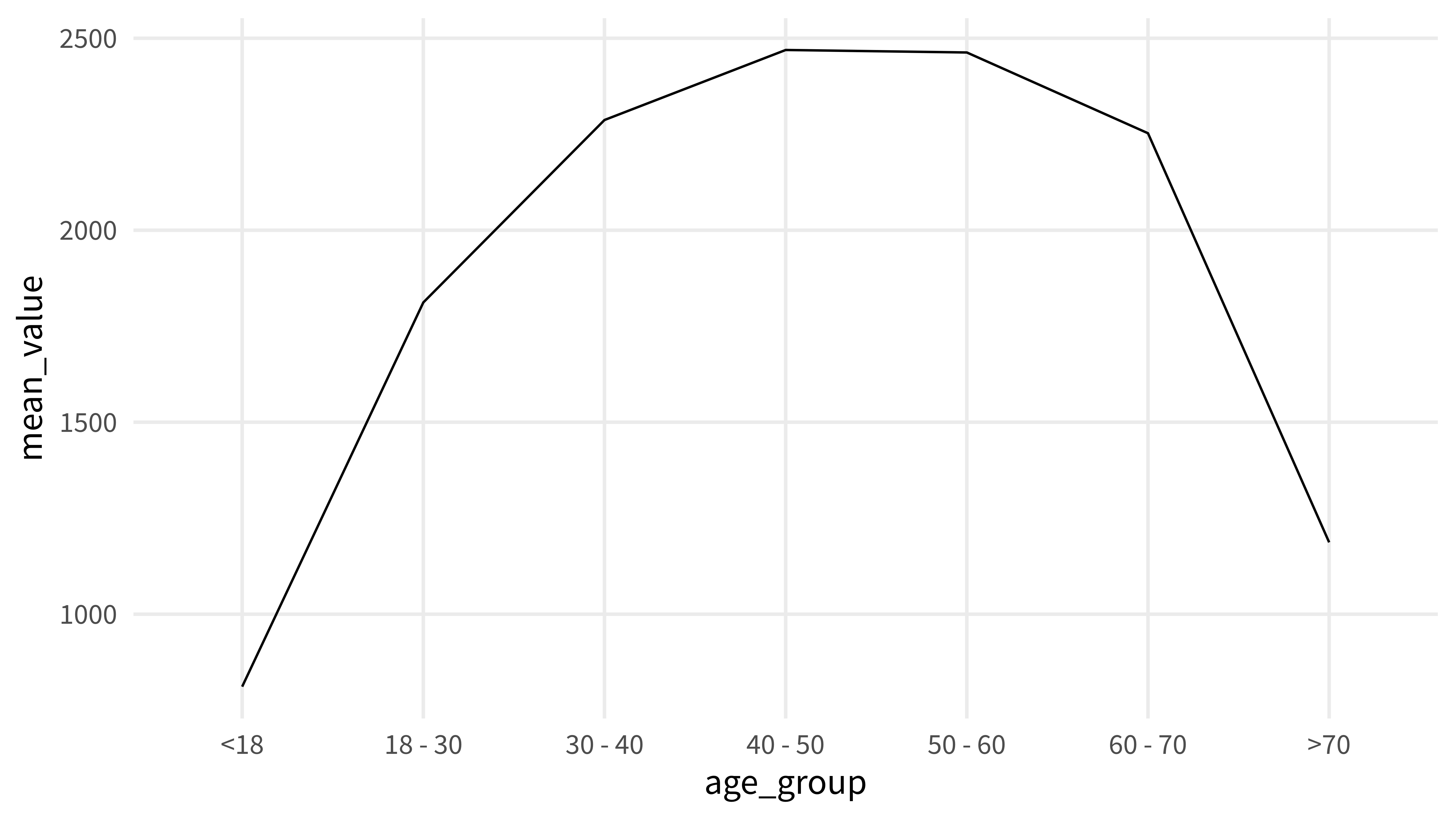
In the following examples we want to create line charts with the mean_value as the thing that goes on the y axis. This works pretty smoothly when the x-axis uses something numeric.
mean_value_by_age |>ggplot(aes(x = age, y = mean_value)) +geom_line()
A classical example where the plot remains blank
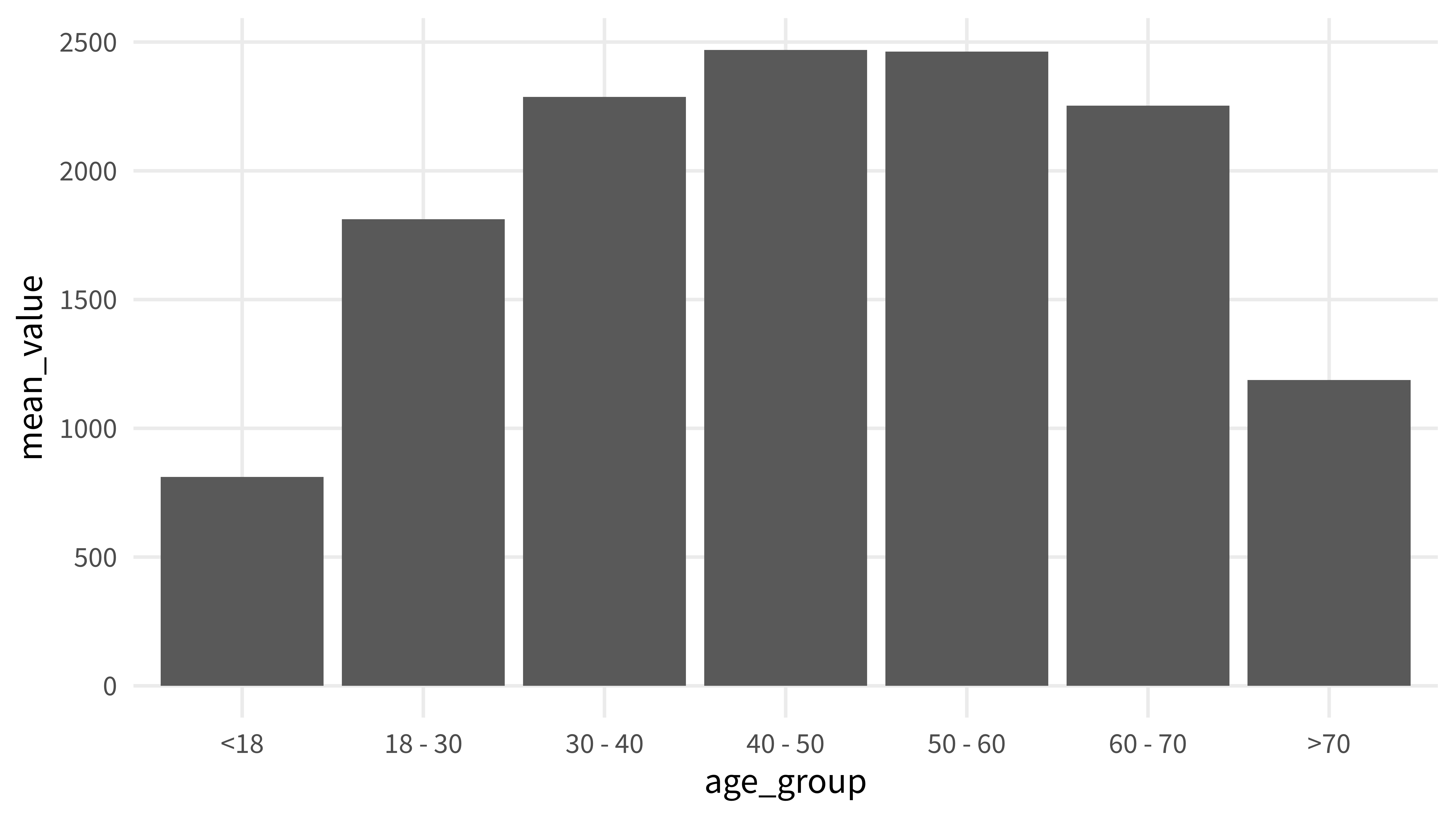
But now look at the data set mean_value_by_age_group. Instead of a numeric variable age it now uses a character vector age_group.
Typically, I’d try to create a bar chart from this.
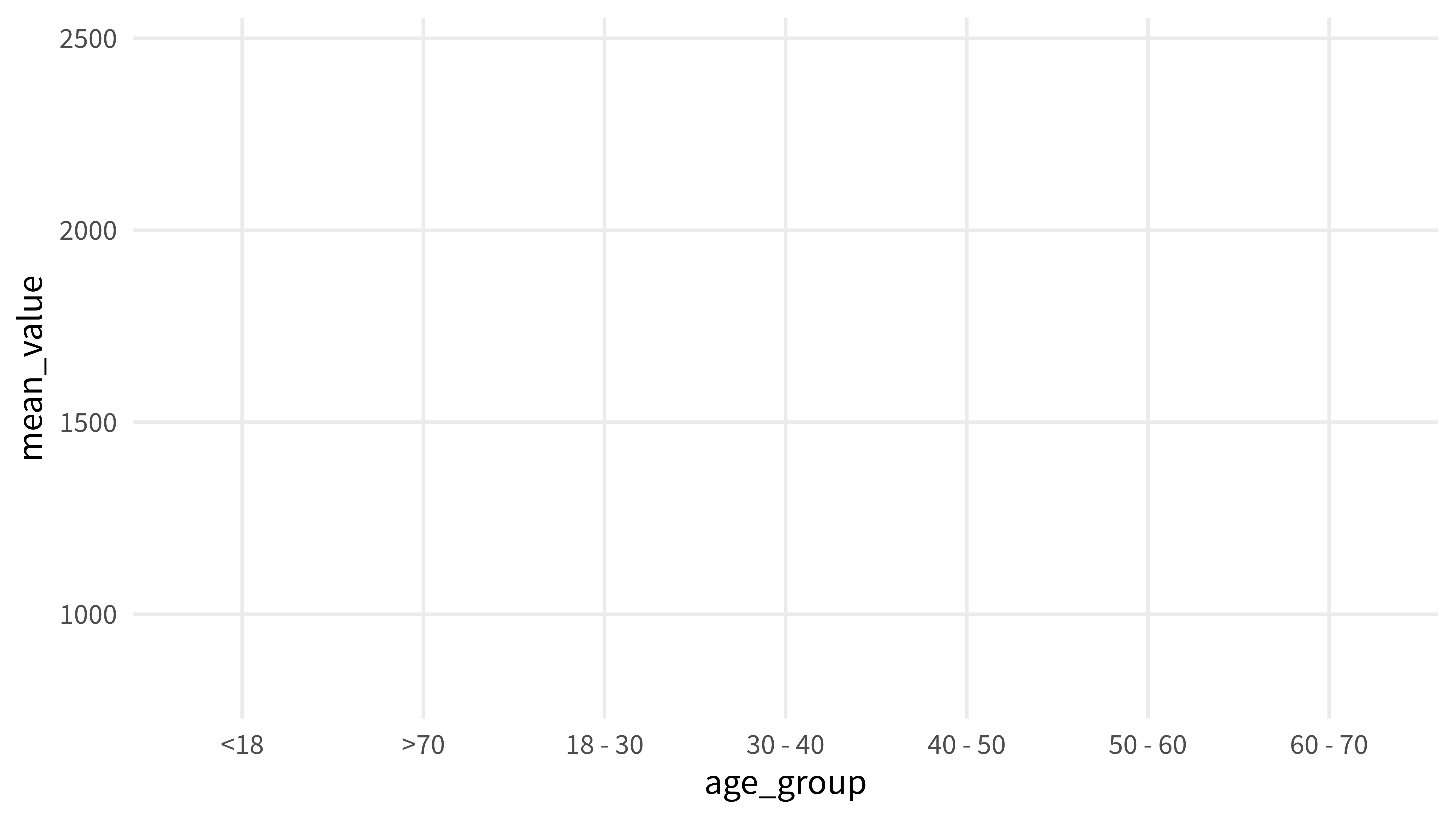
But for this blog post let’s see what happens when we want to create a similar chart as before but with age_group instead of age on the x-axis.
mean_value_by_age_group |>ggplot(aes(x = age_group, y = mean_value)) +geom_line()## `geom_line()`: Each group consists of only one observation.## ℹ Do you need to adjust the group aesthetic?
Oh no. That didn’t work particularly nice. Unfortunately, geom_line() needs you to be very specific when the x-axis is not a numeric variable. You will need to tell geom_line() what points belong together across the x-axis.
Setting the group aesthetic
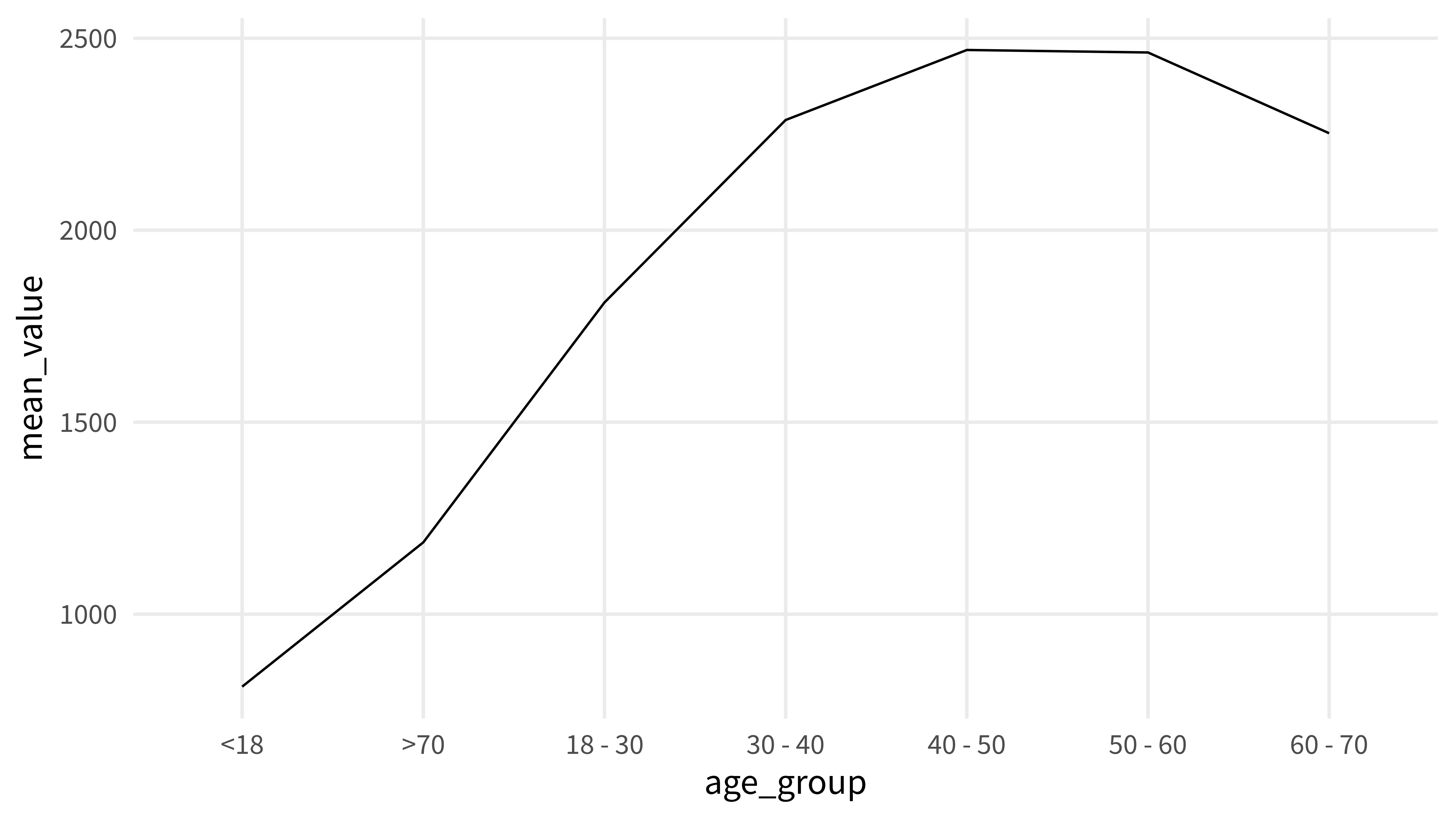
With numeric variables like age there’s a natural order and geom_line() acts like all the numbers belong to the same continuum of numbers. But with other kind of data geom_line() will act like it doesn’t know anything. That’s why you can tell it that all of the points can be connected across the x-axis. That’s where group comes in. Just map it to the same string for all observations.
mean_value_by_age_group |>ggplot(aes(x = age_group, y = mean_value)) +geom_line(aes(group =''))
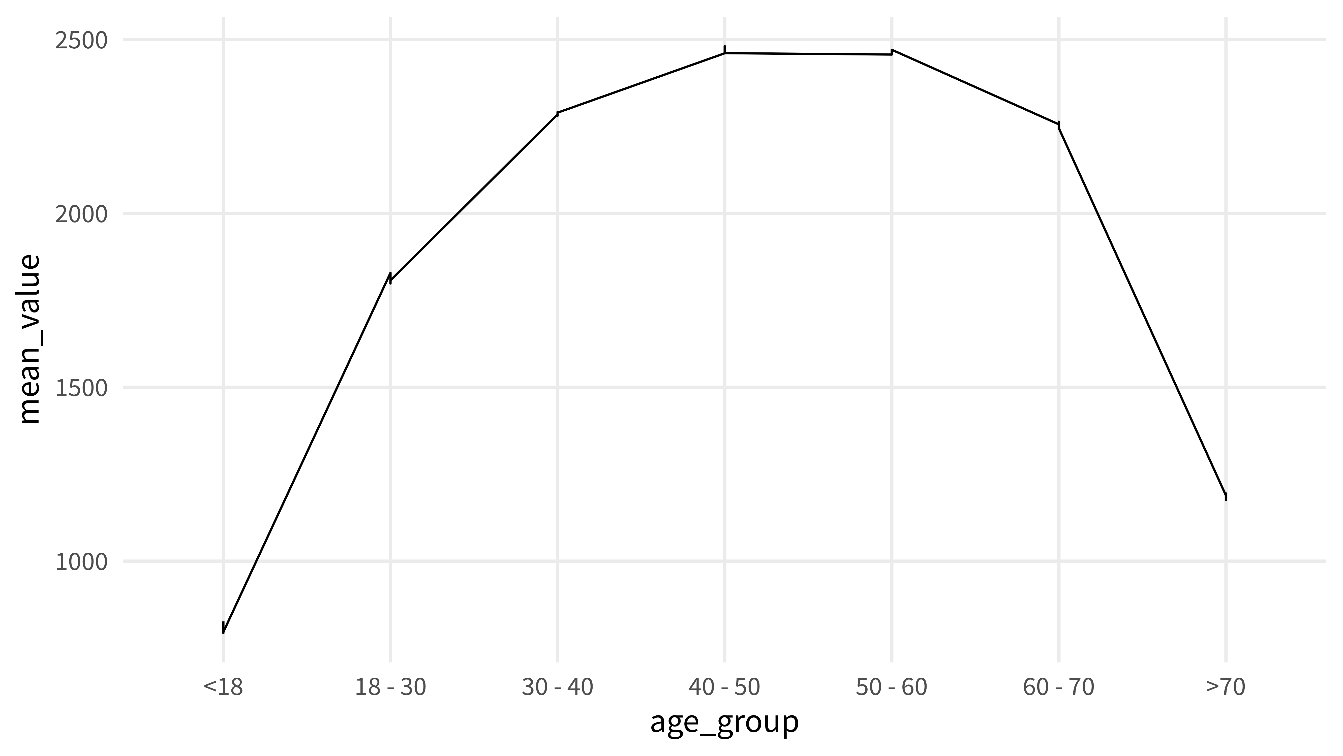
Cool. That worked pretty nicely. But notice that the things on the x-axis are not in a natural order. Here, geom_line() just sorts things alphabetically. We can change that by hard-coding a new order with the factor() function.
Notice how we only get one jagged line. The thing is, we didn’t tell geom_line() which of the things should form seperatea lines. Instead group = '' still makes sure that all the observations should belong to the same line.
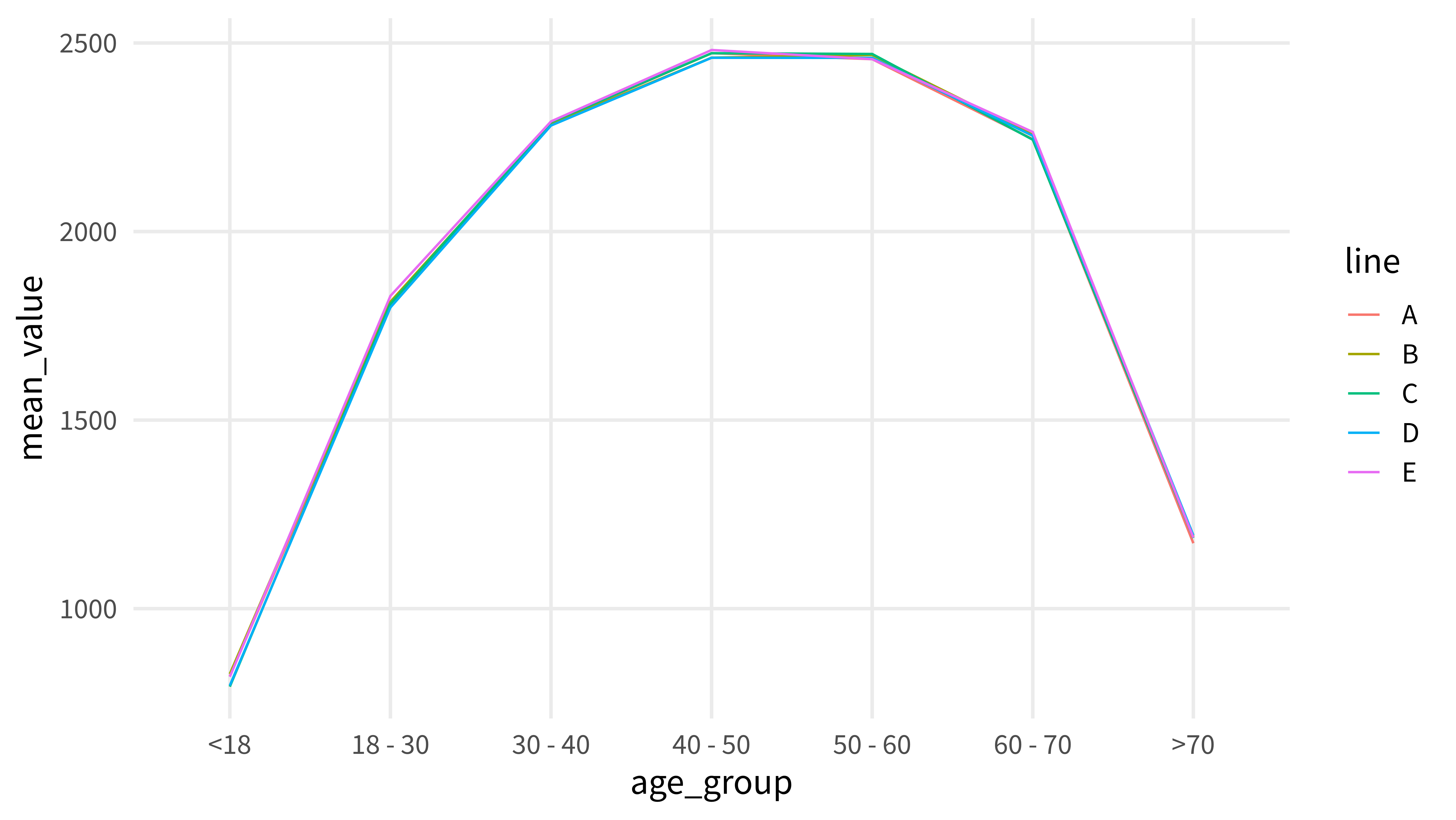
So that’s why geom_line() tries to do its best and connect all the observations. In effect, we get a jagged line. Instead, we can tell geom_line() to map the group aesthetic to our new column line.
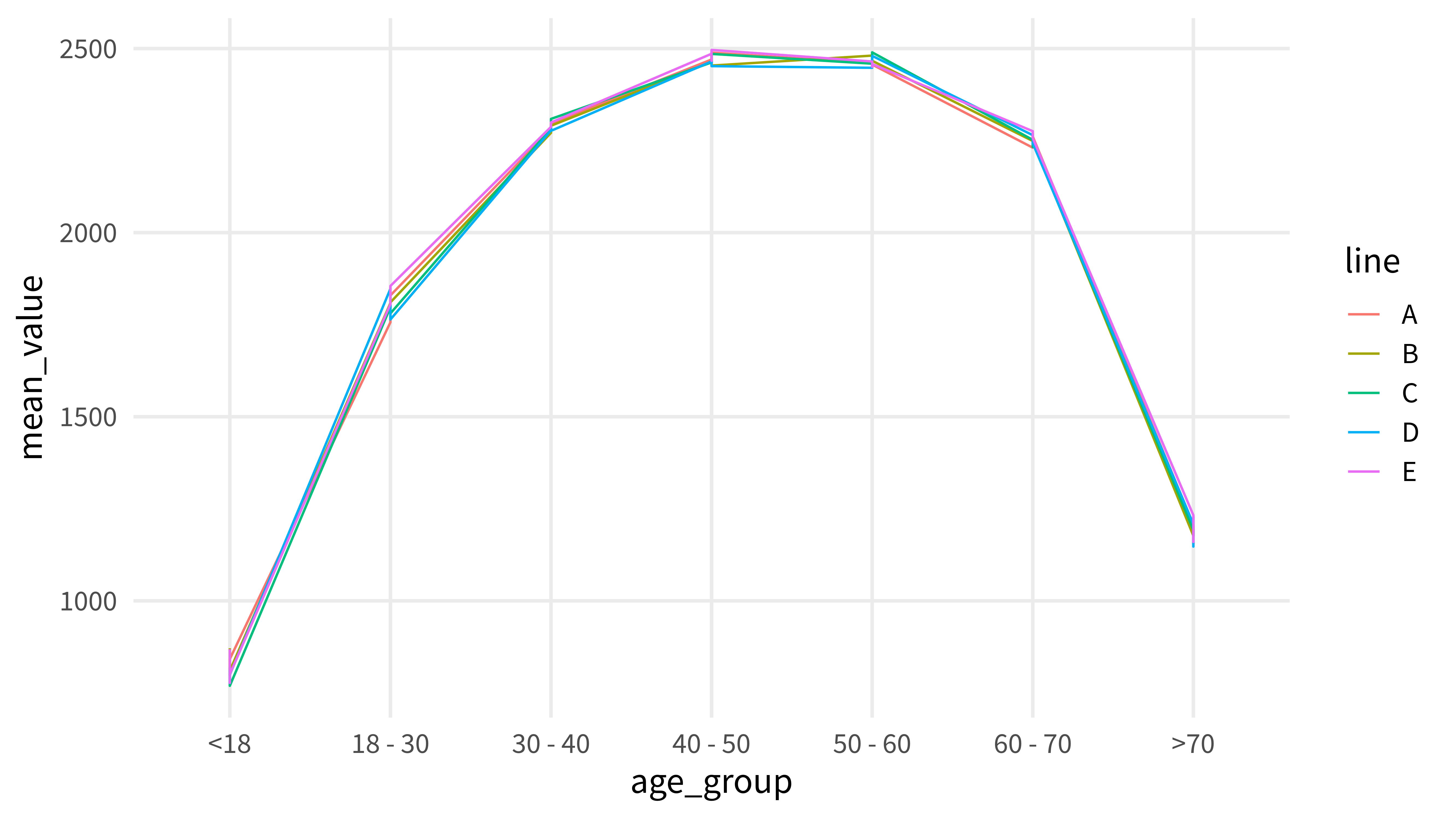
Nice, we got seperate lines know. Now, imagine that we had mapped line to the color aesthetic. It’s easy to think that geom_line() would understand that all the things that are mapped to the same color also correspond to the same line. This is not the case, though.
mean_value_by_age_group_and_line |>mutate(age_group =factor( age_group,c('<18', '18 - 30', '30 - 40', '40 - 50', '50 - 60', '60 - 70', '>70') ) ) |>ggplot(aes(x = age_group, y = mean_value)) +geom_line(aes(color = line))## `geom_line()`: Each group consists of only one observation.## ℹ Do you need to adjust the group aesthetic?
Once again, we are left with an empty chart (albeit with a legend now) and a warning message. To get seperate lines and colors, we have to map to both the color and group aesthetic.
Cool beans! That’s exactly what we want. Now what if we had another data set with yet another column that could be used to differentiate lines. Here’s such a data set.
mean_value_by_age_group_and_line_and_fruit## # A tibble: 105 × 4## age_group line fruit mean_value## <chr> <chr> <chr> <dbl>## 1 >70 E apricot 1232.## 2 >70 B apricot 1177.## 3 <18 B apricot 871.## 4 >70 D apricot 1208.## 5 <18 B apple 799.## 6 60 - 70 B apricot 2249.## 7 >70 D avocado 1147.## 8 >70 C apricot 1192.## 9 >70 C avocado 1194.## 10 18 - 30 E avocado 1806.## # ℹ 95 more rows
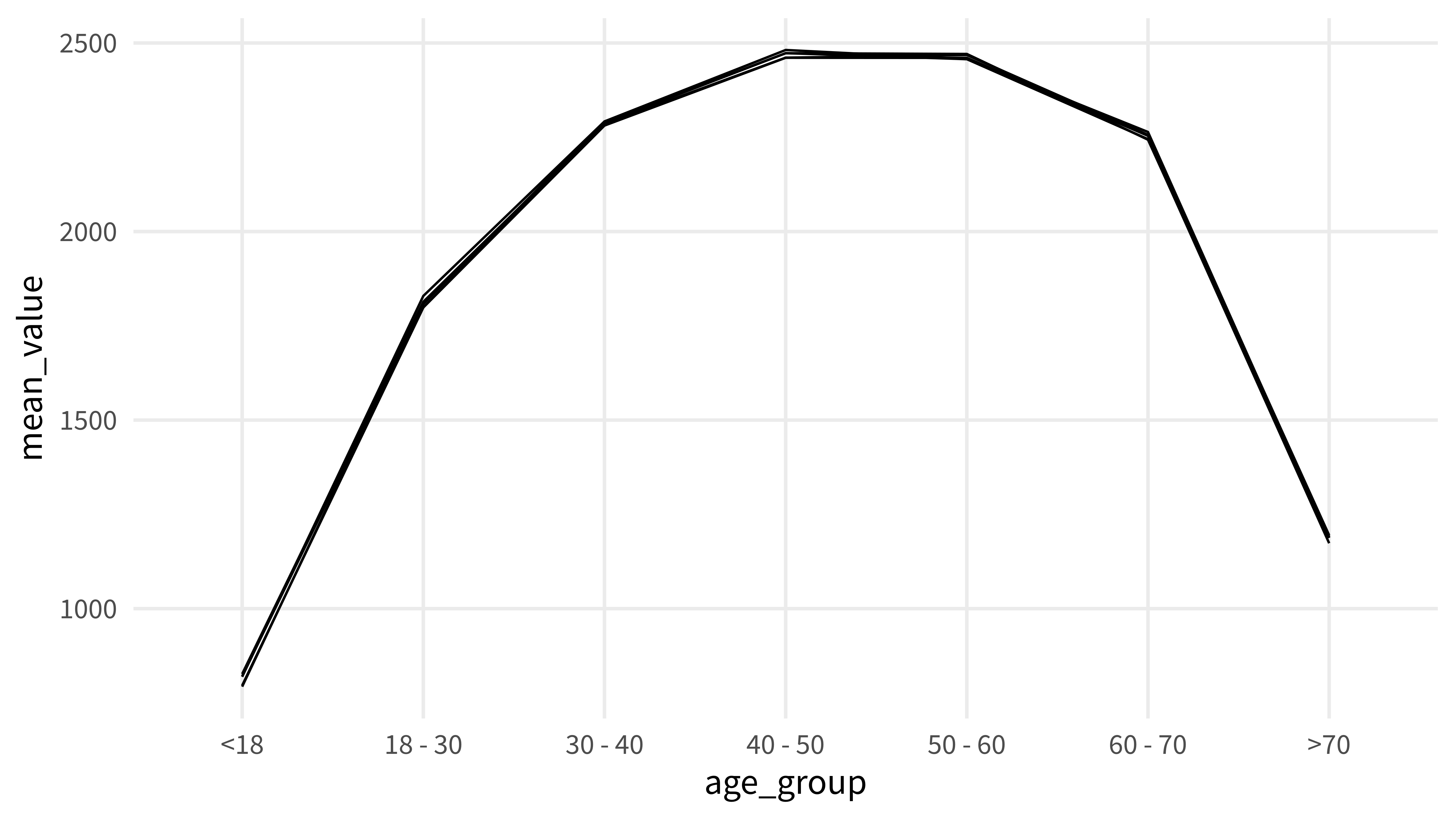
Notice that there is another column fruit now. If we were to just use our previous code and throw the same ggplot code as before at it, you can probably guess what will happen.
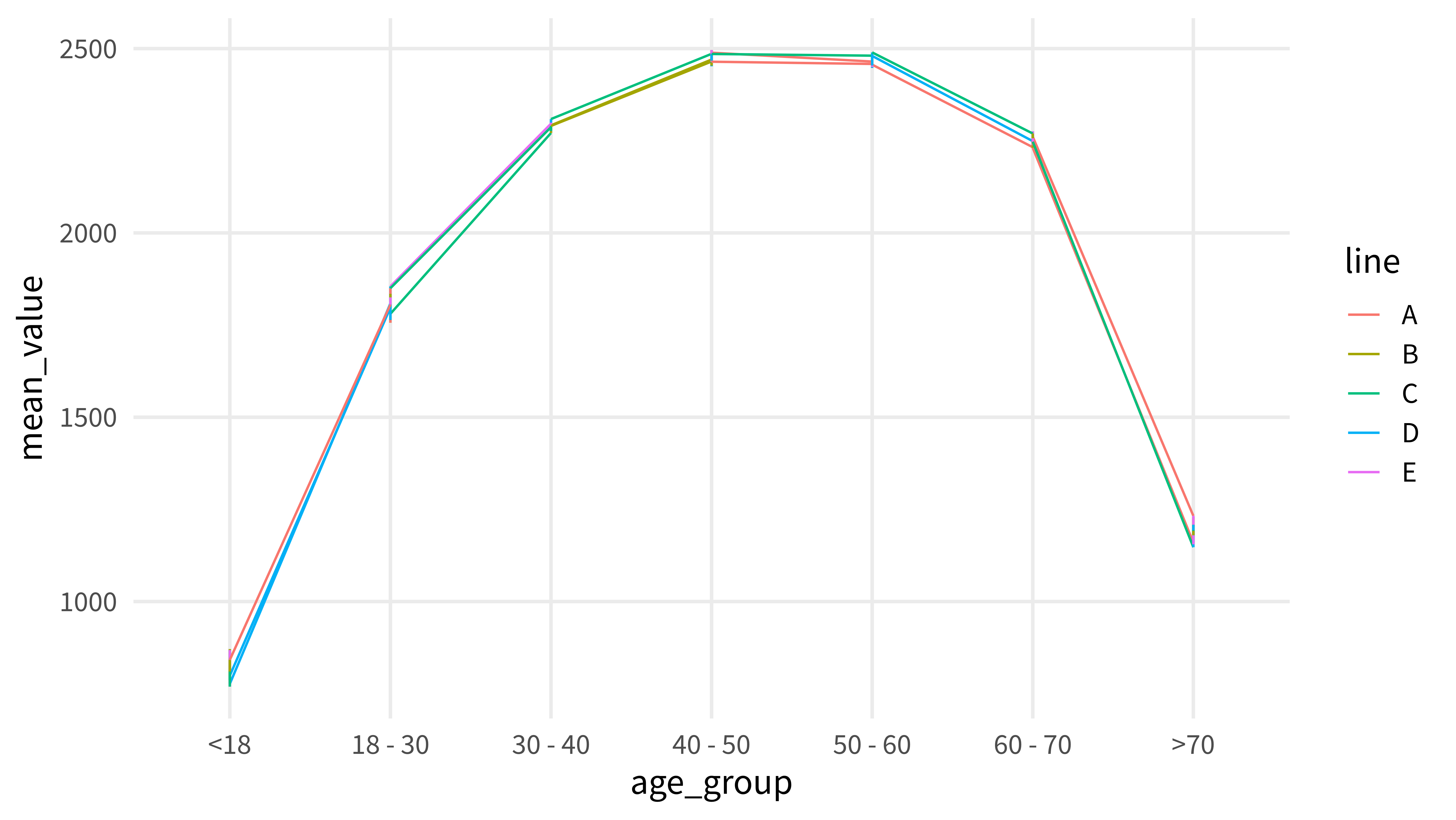
That’s right. We get jagged lines again. Once again, we haven’t told geom_line() how all the groups should be separated and it does its thing to connect all the dots. The same thing happens when we map fruit to the group aesthetic now.
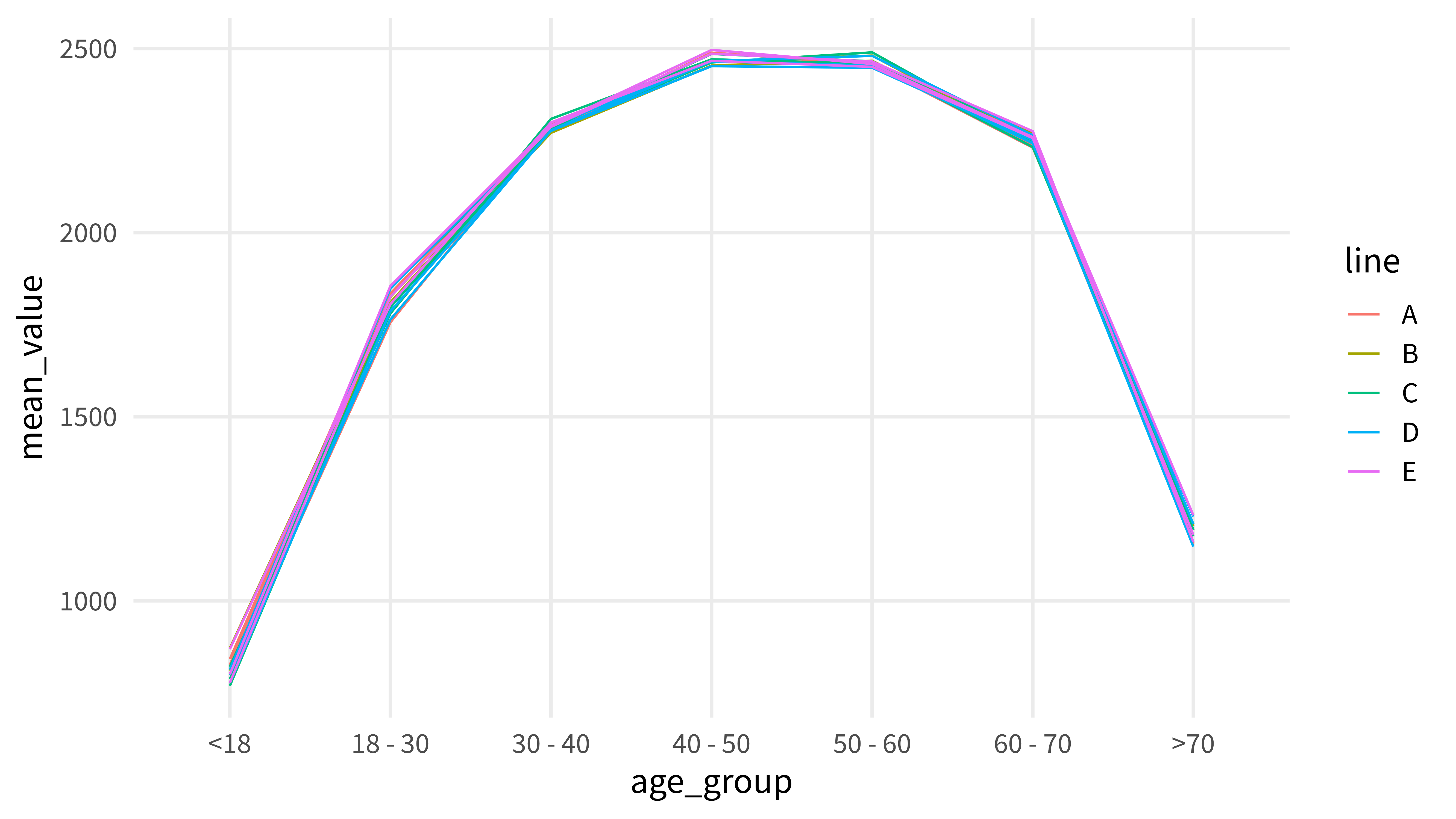
In this code, we have not carefully separated all the grouping variables and told geom_line() about it. We can do that with help of the interaction() function. If we want to get only one color per letter in the column line we have to leave the color aesthetic as is and tell geom_line() that there is an interaction between the two columns fruit and line.
Beautiful! This leaves us still with 5 colors but a separate line for each fruit. In case you’re wondering what interaction does, it’s instructive to just create a new column in the data set. That way, we can look at exactly what interaction() calculates.
mean_value_by_age_group_and_line_and_fruit |>mutate(age_group =factor( age_group,c('<18', '18 - 30', '30 - 40', '40 - 50', '50 - 60', '60 - 70', '>70') ),interaction =interaction(fruit, line) )## # A tibble: 105 × 5## age_group line fruit mean_value interaction## <fct> <chr> <chr> <dbl> <fct> ## 1 >70 E apricot 1232. apricot.E ## 2 >70 B apricot 1177. apricot.B ## 3 <18 B apricot 871. apricot.B ## 4 >70 D apricot 1208. apricot.D ## 5 <18 B apple 799. apple.B ## 6 60 - 70 B apricot 2249. apricot.B ## 7 >70 D avocado 1147. avocado.D ## 8 >70 C apricot 1192. apricot.C ## 9 >70 C avocado 1194. avocado.C ## 10 18 - 30 E avocado 1806. avocado.E ## # ℹ 95 more rows
As you can see interaction() does nothing too fancy. All it does is that it creates a string that combines the things from the two columns fruit and line. If we wanted to, we could use these strings as color aesthetic. That way we will get one color for each of the combinations.
mean_value_by_age_group_and_line_and_fruit |>mutate(age_group =factor( age_group,c('<18', '18 - 30', '30 - 40', '40 - 50', '50 - 60', '60 - 70', '>70') ),interaction =interaction(fruit, line) ) |>ggplot(aes(x = age_group, y = mean_value)) +geom_line(aes(color = interaction))## `geom_line()`: Each group consists of only one observation.## ℹ Do you need to adjust the group aesthetic?
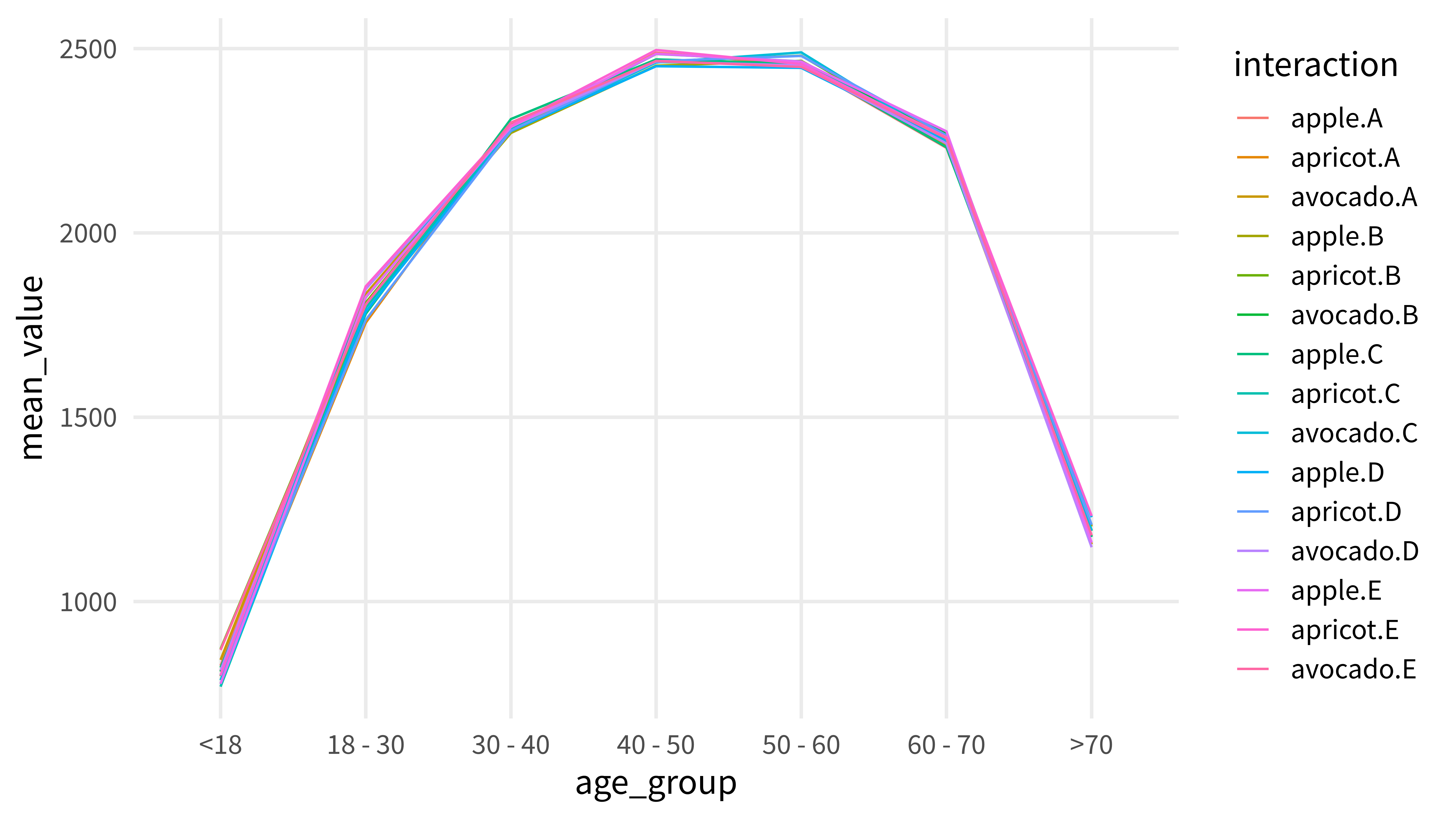
But as always we have to tell geom_line() how to connect points to form a line. In this example, we’d had to additionally map interaction to the group aesthetic.
Now, you may wonder why geom_line() is so complicated for this simple thing. The reason is probably best explained with an example. Let’s go back to our first data set with only the columns age_group and mean_value.
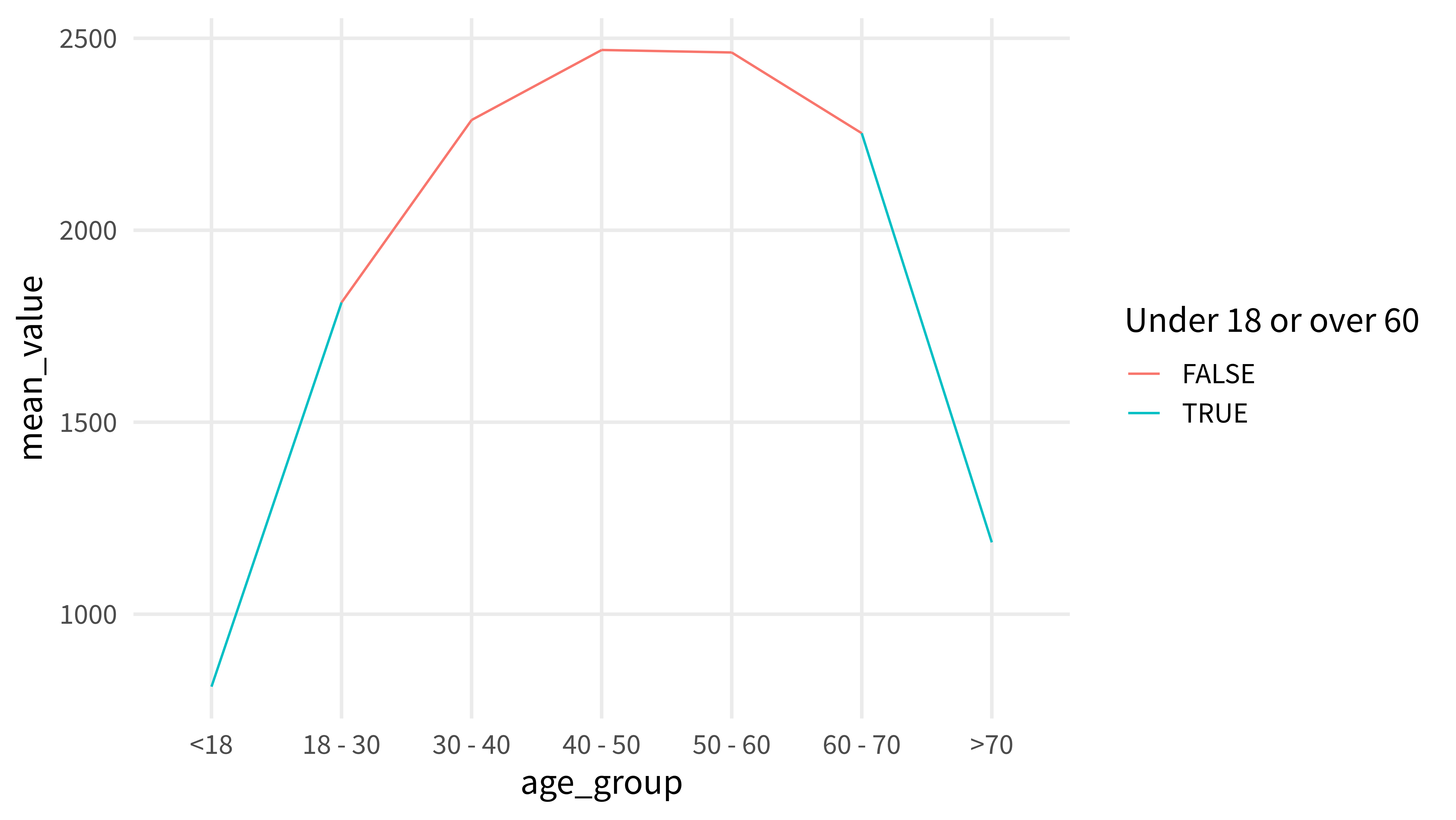
Imagine that you want to draw one single line that consists out of two colors. Something like this:
If the color aesthetic would also determine how things are supposed to be connected, then this would be impossible. After all, we have to color the line at two spatially disconnect positions. Hence, another aesthetic is needed. And that’s why you have group to save the day.
This in-depth video course teaches you everything you need to know about becoming better & more efficient at cleaning up messy data. This includes Excel & JSON files, text data and working with times & dates. If you want to get better at data cleaning, check out the course page.
Insightful Data Visualizations for "Uncreative" R Users
This video course teaches you how to leverage {ggplot2} to make charts that communicate effectively without being a design expert. Course information can be found on the course page.