filter(dat, year > 1995)6 Lessons that I learned from teaching R to non-programmers
Last week, I gave a short workshop teaching R to Economics students without prior programming experience. On Twitter, I shared six lessons that I wish I had learnt before. This blog post is a more detailed account of my experience. Additionally, I incorporated many excellent suggestions from others on Twitter into this blog post.
Do less
The first and most important lesson is that I have to plan to do less. This is probably the trickiest part for me. Usually, I like to create an ambitious curriculum for my students. For example, in my semester-long YARDS course for mathematicians, I introduce many topics like
- data viz and wrangling with
ggplot2anddplyr, - if-conditions and for-loops (yes, I think everyone should be familiar with for-loops),
- model building with
tidymodels, - functional programming with
purrr, - creating and sharing content with
Rmarkdownand - interactive web apps with
shiny.
In that course, students already came with at least a basic understanding of programming. Most of the time, I only had to lay out a few code examples. Then, I quickly made students work on assignments. As students already knew how to read code and debug, they knew how to get themselves unstuck. This was nice as it enabled my ambitious curriculum. Though, I never fully appreciated how much easier this made teaching.
Scaling down for the workshop
Of course, I knew that I needed to scale down in a 4x3h workshop. And I thought I did that. But I was in for a surprise because there was a crucial issue:
Things that are obvious to someone with programming experience are not obvious to non-programmers at all.
Let’s go through an example. Imagine students already had seen the following fictitious code chunks.
ggplot(data = dat) +
    geom_point(mapping = aes(x = x, y = y))
In one exercise, the students were supposed to plot not the whole data set dat but a filtered version of it. So, I thought that - having seen the code chunks and heard explanations - students would “intuitively” know to combine the chunks like so
ggplot(data = filter(dat, year > 1994)) +
    geom_point(mapping = aes(x = x, y = y))
But this was not the case. Students were so unfamiliar with code that they were hesitant to “stick together” the two building blocks. Unfortunately, I did not anticipate this. And without any programming experience, students will get stuck in even more unexpected places. Therefore, be sure to have time for detours. And the only way I see how that’s possible is to plan to do less.
Teach through typing
So, providing students with building blocks was not enough. At least in their learning stage it wasn’t. Students were just too unfamiliar with code. Fortunately, it turns out that it does not take a huge effort to familiarize students with code. Think: What’s the fastest way to learn to write code? Well, write a lot of code.
And that’s exactly what I tried with them. Instead of doing demos where only I typed code, I made students type along. And I know this sounds silly. But to my surprise, it helped. It helped a lot!
In the end, students had the same building block as if I had done the demo alone. Yet, students were more willing to experiment with the code they have written themselves. In my book, that’s a huge step on anyone’s programming journey.
Make time for typing
On Twitter, Trader Vix disagreed with this typing along approach. It is a fair point to say that not everyone can type “sufficiently” fast. Subsequently, some students may fall behind. In this case, I argued that even more students struggled without this typing approach. This way though, students were not falling behind. Instead, they didn’t know how to get started.
Of course, you will have to make time for students to type. Once again: Plan to do less as students will be slower than you are. Also, make sure to ask students if they can execute the code. This can even have additional benefits. In one case, the students couldn’t execute the code we typed. From their description, I could tell that they forgot quotes as in x == 'text'. Thus, typing together can also generate teachable moments.
Start with ggplot
Some say vector manipulation should be the first thing to teach. I didn’t and this was one of the few things I wouldn’t change. My non-statistically inclined students seemed to find visual results more engaging than number/vector crunching. And once students can create graphics, the nice thing is that you can always refer back to that for motivation. Let me elaborate.
Shockingly, data wrangling does not have value in itself. I know that as mathematicians/statisticians/number crunchers it is hard to imagine that. However, incorporating a calculated value in a visualizations can generate insights. And many people find that more valuable. Take a look at two examples that use this idea. Both consider the ames data from {modeldata}.
library(tidyverse)
data(ames, package = 'modeldata')
dat <- ames %>%
  janitor::clean_names() %>%
  select(lot_area, sale_price, neighborhood)
dat
## # A tibble: 2,930 × 3
##    lot_area sale_price neighborhood
##       <int>      <int> <fct>
##  1    31770     215000 North_Ames
##  2    11622     105000 North_Ames
##  3    14267     172000 North_Ames
##  4    11160     244000 North_Ames
##  5    13830     189900 Gilbert
##  6     9978     195500 Gilbert
##  7     4920     213500 Stone_Brook
##  8     5005     191500 Stone_Brook
##  9     5389     236500 Stone_Brook
## 10     7500     189000 Gilbert
## # … with 2,920 more rows
## # ℹ Use `print(n = ...)` to see more rows
Slice for highlighting
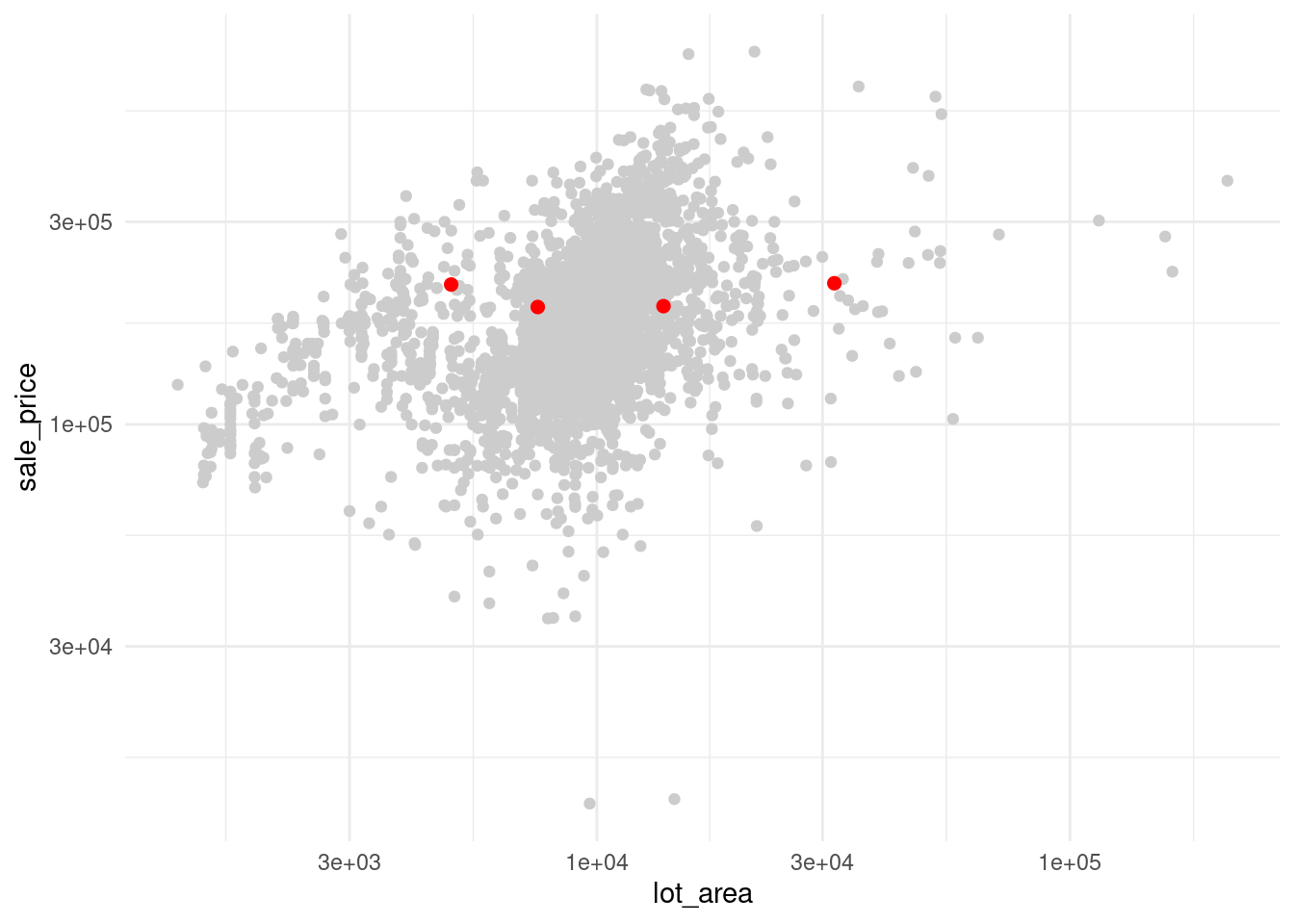
Why would you want to extract specific rows from a data set? Here, we use it to highlight specific houses.
How do we do that? We extract the rows and throw that into another point layer.
Now, come up with an artificial story why house 1, 5, 7 and 10 may be important. Bam! You now have a visual motivation for why slicing data is a neat technique to master.
Summaries for context
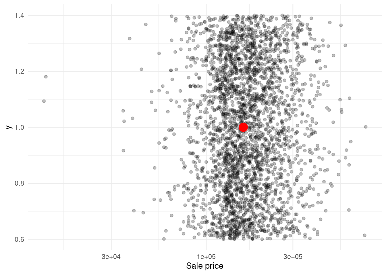
The same can be done to motivate vector calculations. Why is it good to extract a vector and compute its median? To put your other data into context. Let’s try that out for the sale prices in dat.
x <- dat$sale_price
med <- median(x)

ggplot() +
  geom_jitter(aes(x = x, y = 1), alpha = 0.25) +
  geom_point(aes(x = med, y = 1), col = 'red', size = 5) +
  scale_x_log10() +
  labs(x = 'Sale price') +
  theme_minimal()
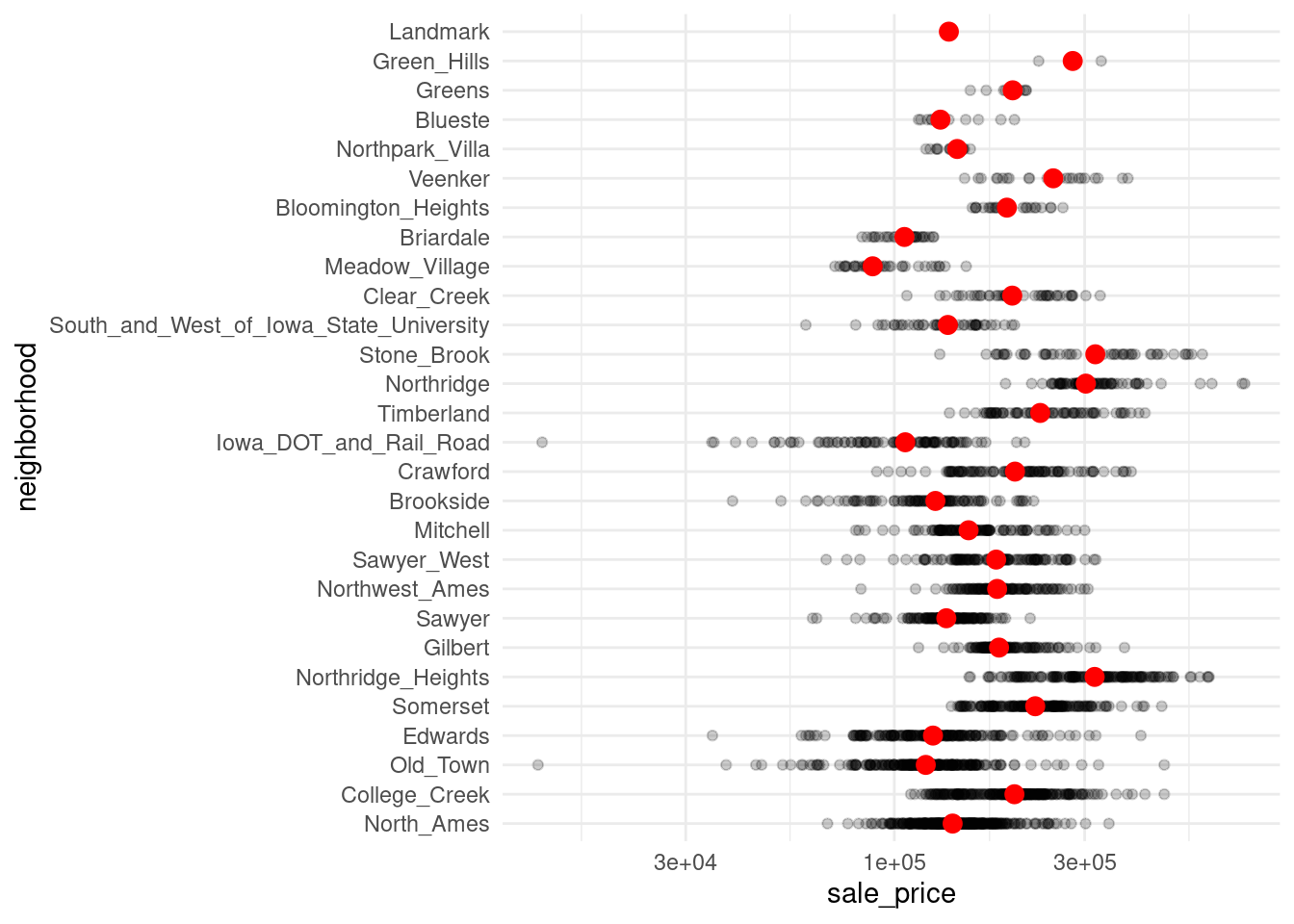
For a more elaborate case, you can do the same for each neighborhood.
Is ggplot too hard?
So, why didn’t I use the plot() function instead of ggplot? That’s because most people (including myself) would agree that ggplot’s defaults are visually more pleasing. But the more pressing question is: Was ggplot too hard for the students? Let’s take a step back on this one.
Every new syntax is confusing
Take a look at the following quote.
When teaching, be careful not to mix up "I learned this a long time ago" with "This is simple"#rstats
— David Robinson (@drob) April 20, 2016
In the same spirit, let me say:
When teaching, be careful not to mix up “I learned this only fairly recently” with “This is pretty advanced stuff and better not taught early on”.
Personally, I have encountered ggplot and the tidyverse only late in my programming game. Therefore, I have refrained from teaching it to students for some time. Honestly though, this was also due to my own lack of wanting to learn new “complicated” syntax. As David Robinson states in his insightful “Teach the tidyverse to beginners” essay:
“…all programming syntax is confusing for non-programmers.”
In my case, I was not a non-programmer. But ggplot has its own ecosystem with its own syntax. Thus, it is easy to say that ggplot is way too hard for beginners. But the truth is:
Every syntax is confusing to the uninitiated.
So, did students cope with ggplot or not?
Coming back to my students, this long-winded detour explains why they did surprisingly well with ggplot. Sure, the intricacies of aes() are probably not fully understood after this workshop. But having no prior experience in programming whatsoever, they were surprisingly willing to accept that aes() is just a necessary fact of life ggplot.
As a mathematician, I like to compare this to integral notation $ \int_0^1 f(x)\, \mathrm{d}x $. In high school, I did not fully grasp the meaning of $ \mathrm{d}x $. But I accepted its presence and treated it like a delimiter for what’s inside and outside the integral. Clearly, this is far from understanding the meaning of this notation. Yet, it enabled me to do what I needed to do.
Overall, students would sometimes forget to put e.g. col = into the correct place. For most parts, though, the students accepted the syntax just the way it is and understood that within aes() we refer to the columns in data. And what may sound even more surprising:
Students fared better with ggplot() than with other functions like filter(), slice() or mutate().
I suspect that is because ggplot is its own ecosystem and each plot follows the same template. But filter(), slice() and mutate() each work differently. One wants a conditional statement, one wants row indices and one wants a new column name plus its “formula”.
Stress to save variables before using them
This was another surprising moments for me. Apparently, if you have never programmed, it is not obvious to save results. Therefore, make sure that students understand that calculations can only be used later if they are saved into a variable. But this variable-saving line has to be executed for the actual saving to happen. Often, students would have a code chunk like this
dat <- filter(ames, Sale_Price > 200000)
ggplot(data = dat) +
    geom_point(mapping = aes(x = Lot_Area, Sale_Price))
But then, they would only execute the second line. More often than not, there was no previous dat variable in the environment and students would get an error. This was confusing because the dat <- line is right there. Of course, that does not mean the line was executed. Unfortunately, you will likely have to mention this multiple times before it sticks.
Teach named functions
The symbols$, [ and ] all have their rightful place in R. However, students unanimously found using memorable function names like pull() or select() easier to learn. But remember: Do less. I tried to show students multiple ways to get a job done using e.g. $ or pull(). This only caused confusion. So, use only one approach.
Though, in this specific case I would likely go with $ instead of pull(). Of course, pull() is nice but chances are that students will encounter $ at some point. Thus, see this as an investment into enabling students to read more code. For the same reason, Nikita Telkar suggested to teach the full name notation, e.g. dplyr::select().
Personally, I would not use full names all the time though. But one particular use case comes to mind. After experiencing a few errors due to not using capital letters in column names, the students were more than willing to use clean_names() from {janitor}. So, janitor::clean_names() may be a good showcase for the full name notation.
Use pipes
As mentioned, saving variables felt foreign to students at first. The same was true for nesting functions. Consequently, two step processes like selecting and filtering were hard. Here, pipes helped.
Though I’ve had Math students complain that pipes feel wrong, for the Economics students it was just the right thing. In fact, the pipe often mimicked what students wanted to do anyway. Frequently, students knew that they want to e.g. filter data. So they typed filter(year > 1999). Of course, this misses the data. It seems like students were so caught up in what they wanted to do that they forgot to tell R what data to use. But chaining multiple function calls circumvented that (modulo at the beginning of the chain).
Additionally, let me mention that there were great contributions on Twitter by Deidre Toher and Fran Barton. Deidre Toher suggested reading pipes as ‘then’ and Fran Barton pronounced conditions like x[x > 5] as ‘such that’. This kind of reading code aloud, could go a long way to make code feel more natural for beginners.
Other reactions
These were my six lessons. All of them were enhanced by a lot of great suggestions from Twitter. But not all suggestions fit into the previous text. So, let me mention a few more contributors.
TidyverseSkeptic
I don’t want to give the impression that I filtered out “negative” comments. So, let me point out that Prof. Norm Matloff chimed in and advocated against using pipes. For his elaborate reasons see the TidyverseSkeptic essay. That being said, I do not agree with many statements in his tweet or his essay (though I agree that for-loops should not be a reason to feel ashamed).
Having gotten this off my chest, I really do not want to comment more on the artificial fight between base-R and the tidyverse. To me, a lot of this dispute feels like a highly subjective back-and-forth between both sides anyway. I do like parts of both worlds and I don’t want to throw my own subjective two cents into the mix.
Miscellaneous tips
So, let me close this post on a lighter note with the remaining contributions.
Remington Moll suggested to use data sets that students care about. This could encompass letting students choose a data set from five prepared data sets. Of course, this could potentially take up a huge amount of preparation time. But maybe skimming a few data sets in advance could be enough for demos.
Fadel Megahed shared some of his own course material. In his slides, he uses timers and I like the idea. This way, in-class time management may become easier. I always struggle with sticking to the allotted time during a set of exercises.
Dr. Robert M Flight shared the datacarpentry lessons. I have only skimmed them but I’ve heard people praise these lessons multiple times already.
Closing
This concludes my blog post. Thanks to everyone on Twitter for contributing. It pleased me to see that many people in the R community are passionate about teaching. If you liked this essay, then consider following me on Twitter and/or subscribing to my RSS feed. See you next time!
