Use {lubridate} and {rtweet} to analyze your Twitter timeline
Visualization
API
We take a quick look at the rtweet and lubridate package. These help you to analyse your Twitter timeline. And they helped me to visualize my follower count as I reached 1000 followers this week.
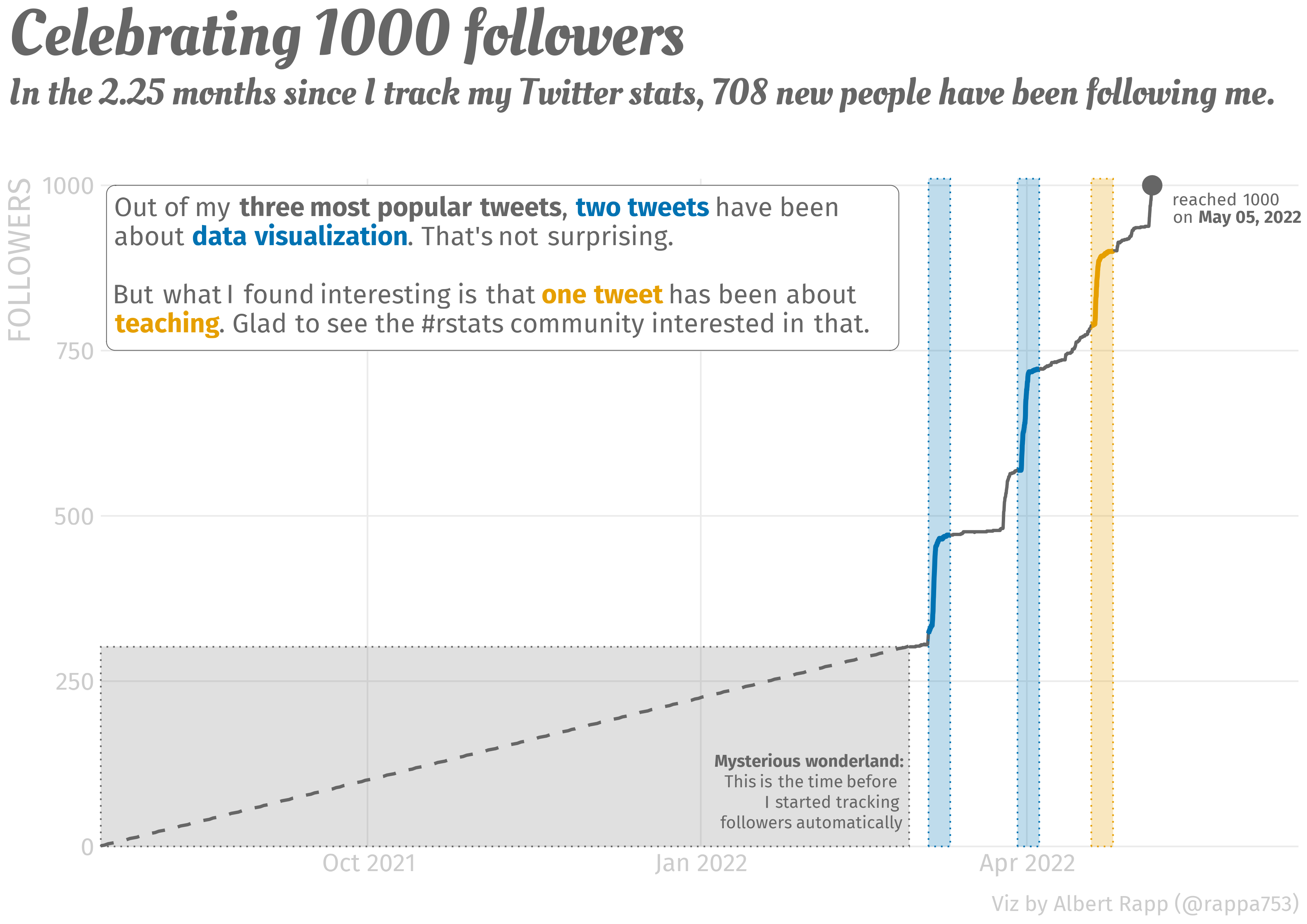
This week, I am oddly proud to announce that I have reached 1000 followers on Twitter. Check out the visualization that I have created for this joyous occasion.
To me, my rising follower count and the somewhat regular mails that I receive are a sign that people like to read my blog. And to thank you all for following my work, let me give you a quick intro to the packages rtweet and lubridate. These were instrumental in creating the above visual.
Working with rtweet
At the end of February 2022, I wondered how my follower count evolves over time. Unfortunately, this is not something Twitter shows you by default. The Analytics page only shows me the change within my last 28 days. To overcome this drawback, I consulted the rtweet package which is a fabulous package that lets you interact with Twitter’s API through R.
In my case, I only do rudimentary work with it and track my followers over time. For this to work, I have set up an R script that runs every hour to download a list of my followers. Each hour, the list’s length tells me how many followers I have.
If you want to do the same, install the package first. Make sure to install the development version from GitHub, though.
remotes::install_github("rOpenSci/rtweet")Basic functionalities
rtweet comes with a lot of convenient function. Most of these start with get_. For instance, there are
get_followers(): This is the function to get a list of an account’s followers.get_timeline(): This gives you the a user’s timeline like tweets, replies and mentions.get_retweets(): This gives you the most recent retweets of a given tweet.
My aforementioned R script just runs get_followers() and computes the number of rows of the resulting tibble.
library(rtweet)
tib <- get_followers('rappa753')
tib
# A tibble: 2,207 × 2
from_id to_id
<chr> <chr>
1 1447053543786090504 rappa753
2 254563418 rappa753
3 382843130 rappa753
4 1543220302296977408 rappa753
5 1673477562 rappa753
6 1308732763726589954 rappa753
7 1549153427061501952 rappa753
8 1387151657507692545 rappa753
9 1374557861309775872 rappa753
10 1479882642413793284 rappa753
# … with 2,197 more rows
# ℹ Use `print(n = ...)` to see more rowsnrow(tib)[1] 2207For my above visualization, I used get_timeline() to extract my five most popular tweets. Here, I ranked the popularity by the count of likes resp. “favorites” as rtweet likes to call it.
library(tidyverse)
tl <- get_timeline('rappa753', n = 1000)
tl_slice <- tl %>%
  slice_max(favorite_count, n = 5) %>%
  select(created_at, full_text, favorite_count, retweet_count)
tl_slice
# A tibble: 5 × 4
created_at full_text favor…¹ retwe…²
<dttm> <chr> <int> <int>
1 2022-06-18 15:46:22 "Ever heard of logistic regression? Or Po… 1460 231
2 2022-07-10 16:18:10 "The #rstats ecosystem makes splitting a … 660 95
3 2022-03-05 21:56:33 "The fun thing about getting better at #g… 507 82
4 2022-07-09 13:21:04 "Creating calendar plots with #rstats is … 419 53
5 2022-02-19 18:32:23 "Ever wanted to use colors in #ggplot2 mo… 347 56
# … with abbreviated variable names ¹favorite_count, ²retweet_countNotice that I tweeted two of these before I started tracking my followers. Consequently, I ignored them for my visualization.
Unfortunately, the rtweet package cannot do everything. For example, the snapshot functionality tweet_shot() does not work anymore. I think that’s because the Twitter API changed.
This bothered me during the 30 day chart challenge in April because I wanted to automatically extract great visualizations from Twitter. But as tweet_shot() was not working, I had to call Twitter’s API manually without rtweet. If you’re curious about how that works, check out my corresponding blog post. There, I’ve also explained how to set up a script that gets executed, say, every hour automatically.
Setting up a Twitter app
This pretty much explains how rtweet works. In general, it is really easy to use. And if you only want to use it only occasionally, there is not much more to it.
However, if you want to use the package more often - as in calling the API every hour - then you need to set up a Twitter app. You can read up on how that works in the “Preparations” section of the above blog post. Once you’ve got that down, your rtweet calls can be authenticated through your Twitter app like so.
auth <- rtweet::rtweet_app(
  bearer_token = keyring::key_get('twitter-bearer-token', keyring = 'blogpost')
)
auth_as(auth)
Here, I have used the keyring package to hide the bearer token of my Twitter app. If that doesn’t mean anything to you, let me once again refer to the above blog post. The important thing is that after these lines ran your rtweet calls get funneled through your own Twitter app.
Working with lubridate
As you saw above, the timeline that we extracted and saved in rtweet contains time data. Here it is once again.
tl_slice# A tibble: 5 × 4
created_at full_text favor…¹ retwe…²
<dttm> <chr> <int> <int>
1 2022-06-18 15:46:22 "Ever heard of logistic regression? Or Po… 1460 231
2 2022-07-10 16:18:10 "The #rstats ecosystem makes splitting a … 660 95
3 2022-03-05 21:56:33 "The fun thing about getting better at #g… 507 82
4 2022-07-09 13:21:04 "Creating calendar plots with #rstats is … 419 53
5 2022-02-19 18:32:23 "Ever wanted to use colors in #ggplot2 mo… 347 56
# … with abbreviated variable names ¹favorite_count, ²retweet_countSadly, working with times and dates is rarely pleasant. But we can make our life a bit easier by using the lubridate package which was made for that. To show you how it works, it is probably best to show you a couple of use cases.
All of these will be taken from what I had to deal with to create my celebratory visualization. But I simplified it to minimal examples for this blog post. More use cases can be found in the lubridate cheatsheet or the tidyverse cookbook ressource by Malte Grosser.
Parse dates and times
EDIT July 13, 2022: After moving my blog to quarto, {rtweet} updated its default output format. Now, parsing dates and times is not necessary anymore. I leave this section in here because the code may still be helpful in other situations.
First, I needed to convert the created_at column from character to datetime format. The easiest way to do that gets rid of +0000 in the character vector and then parses the vector into the right format via parse_date_time(). But there is a catch. Check out what happens if I try this on my computer.
library(lubridate)
tl_slice %>%
  mutate(created_at = parse_date_time(
    str_remove(created_at, '\\+0000'), # remove the +0000
    orders = 'a b d H:M:S Y'
  ))
See how all values in created_at are NA now? That’s a problem. And we will solve it very soon. But first, let me explain how the function call works.
The orders argument specifies how the vector created_at (without +0000) is to be understood. We clarify that created_at contains (in the order of appearance)
- abbreviated week day names (
a) - abbreviated month names (
b) - the day of the month as decimals (
d) - and so on
Where do these abbreviations a, b, d, etc. come from? They are defined in the help page of parse_date_time(). You can find them in the section “Details”. But why does the code not work? Why do we always get an NA? For once, my computer is truly the problem. Or rather, its settings.
By default, my computer is set to German. But even if RStudio or R’s error messages are set to English, my computer’s so-called “locale” may be still be set to German. That’s a problem because abbreviations like “Sat” and “Wed” refer to the English words “Saturday” and “Wednesday”. So, we need to make sure that parse_date_time() understands that it needs to use an English locale. Then, everything works out.
parsed_highlights <- tl_slice %>%
  mutate(created_at = parse_date_time(
    str_remove(created_at, '\\+0000'), # remove the +0000
    orders = 'a b d H:M:S Y',
    locale = "en_US.UTF-8"
  ))
parsed_highlights
We are now ready to send this data to ggplot. Since created_at is formatted in datetime now, ggplot will understand what it means when we map x = created_at.
parsed_highlights %>%
  ggplot(aes(created_at, favorite_count)) +
  geom_line()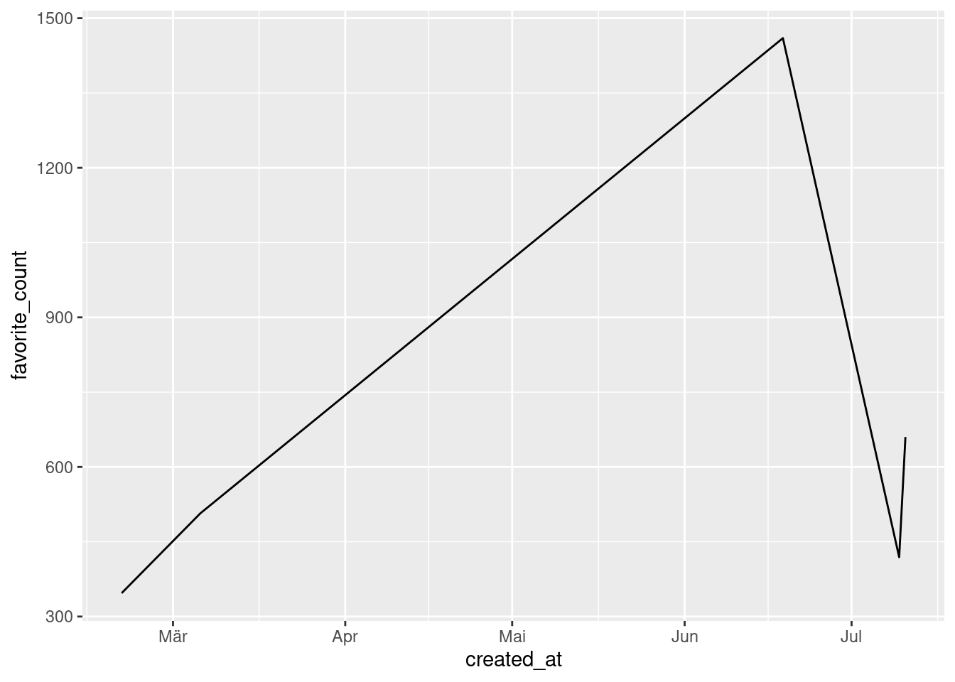
Using scale_x_date(time) and locale
Did you see that the x-axis uses German abbreviations and doesn’t show what year we’re in? That’s not great. Let’s change that. As is always the case when we want to format the axes we will need a scale_*() function. Here, what we need is scale_x_datetime().
But this won’t solve our German locale problem. The easiest way to solve that tricky ordeal is to change the locale globally via Sys.setlocale(). Don’t worry, though. The locale will reset after restarting R. No permanent “damage” here.
Sys.setlocale("LC_ALL","en_US.UTF-8")[1] "LC_CTYPE=en_US.UTF-8;LC_NUMERIC=C;LC_TIME=en_US.UTF-8;LC_COLLATE=en_US.UTF-8;LC_MONETARY=en_US.UTF-8;LC_MESSAGES=en_US.UTF-8;LC_PAPER=de_DE.UTF-8;LC_NAME=C;LC_ADDRESS=C;LC_TELEPHONE=C;LC_MEASUREMENT=de_DE.UTF-8;LC_IDENTIFICATION=C"p <- parsed_highlights %>%
ggplot(aes(created_at, favorite_count)) +
geom_line() +
scale_x_datetime(
date_breaks = '2 months', # break every two months
date_labels = '%b %Y'
)
p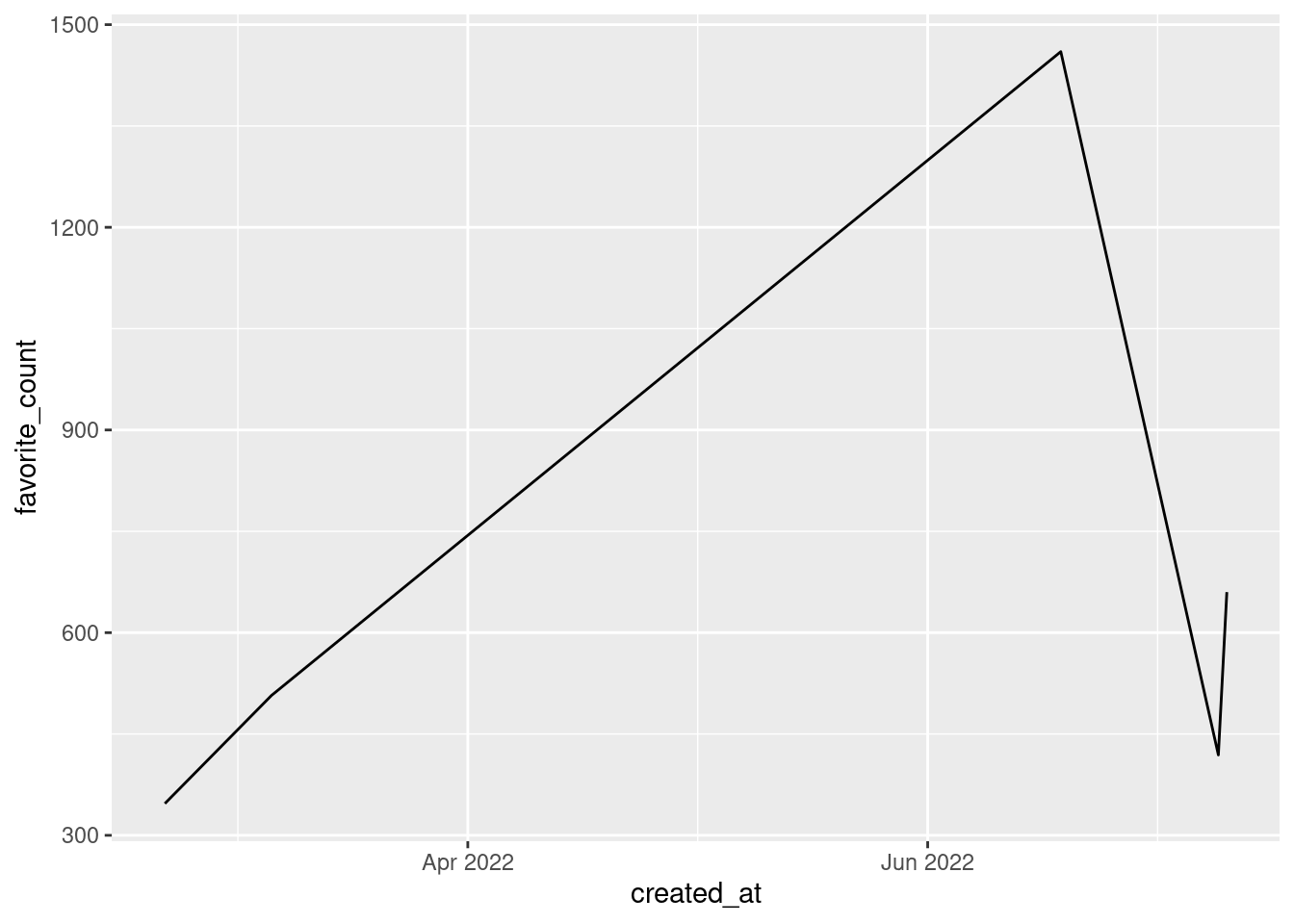
Notice that we have once again used the same abbreviation as for parse_date_time(). This time, though, they have to be preceded by %. Don’t ask me why. It is just the way it is.
Create new dates
Let us add a rectangle to our previous plot via an annotation. This is similar to what I needed to do when adding my “mysterious wonderland” to my plot.
Since the x aesthetic is formatted to datetime, we have to specify dates for the xmin and xmax aesthetic of our annotation. Therefore, we need to create dates manually. In this case, make_datetime() is the way to go. If we’re dealing only with dates (without times), then make_date() is a useful pendant. Both functions are quite straightforward.
p <- p +
  annotate(
    'rect',
    xmin = make_datetime(year = 2021, month = 11, day = 6, hour = 12),
    xmax = make_datetime(year = 2021, month = 9),
    ymin = 200,
    ymax = 273,
    alpha = 0.5
  )
p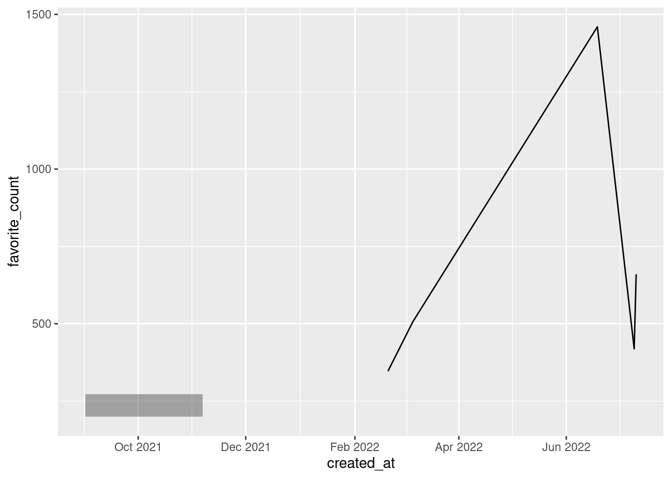
Filter with intervals
Maybe we want to highlight a part of our line. To do so, we could filter our data to check whether certain date ranges correspond to parts that we want to highlight. Usually when we want to check if a value x is within a certain set of objects we use x %in% objects.
To do the same with dates, we need to create an interval with interval() first. Then, we can use that in filter() in conjunction with %within% instead of %in%.
my_interval <- interval(
  start = make_date(year = 2022, month = 2),
  end = make_date(year = 2022, month = 3, day = 10)
)

p +
  geom_line(
    data = parsed_highlights %>% filter(created_at %within% my_interval),
    color = 'red',
    size = 2
  )
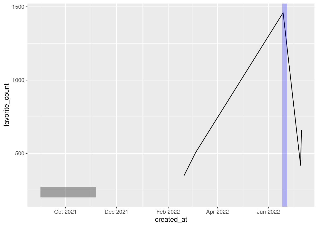
Calculations with times
Say that you want to highlight the first five days after a certain date. (That’s exactly what I did in my plot.) Then, you can simply add days(5) to this date. There are similar functions like minutes(), hours() and so on. Let me show you how that may look in a visualization.
p +
  annotate(
    'rect',
    xmin = parsed_highlights[[1, 'created_at']] - hours(24),
    xmax = parsed_highlights[[1, 'created_at']] + days(5),
    ymin = -Inf,
    ymax = Inf,
    alpha = 0.25,
    fill = 'blue'
  )
Closing
This was a short intro to lubridate and rtweet. Naturally, the evolution of my follower count contained a lot more steps. In the end, though, these steps were merely a collection of
- techniques you know from my two previous storytelling with ggplot posts (see here and here) plus
- data wrangling using times and dates with the functions that I just showed you.
Once again, thank you all for your support. And if you liked this post and don’t follow my work yet, then consider following me on Twitter and/or subscribing to my RSS feed. See you next time!


