library(tidyverse)
ggplot(data = mpg, aes(hwy, cty)) +
geom_jitter(alpha = 0.5)ggplot tips: Assigning Labels to an Aesthetic
This blog post is part of a series I am creating where I collect tips I found useful when I first learned to work with ggplot2. All posts which are part of this series can be found here. In this post I want to deal with how to manually or automatically create labels for some aesthetic.
Manually Assigning Labels
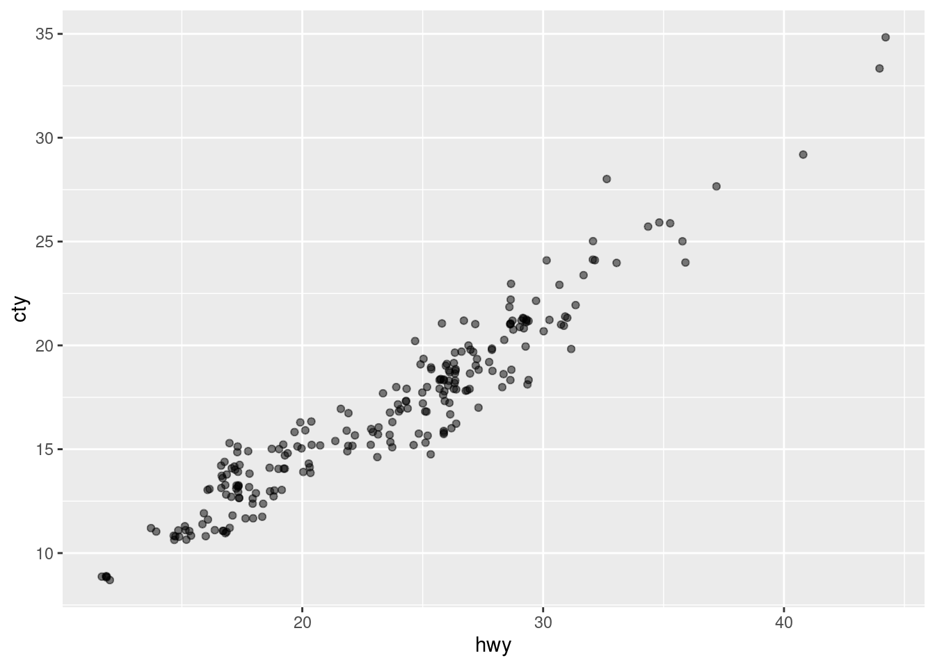
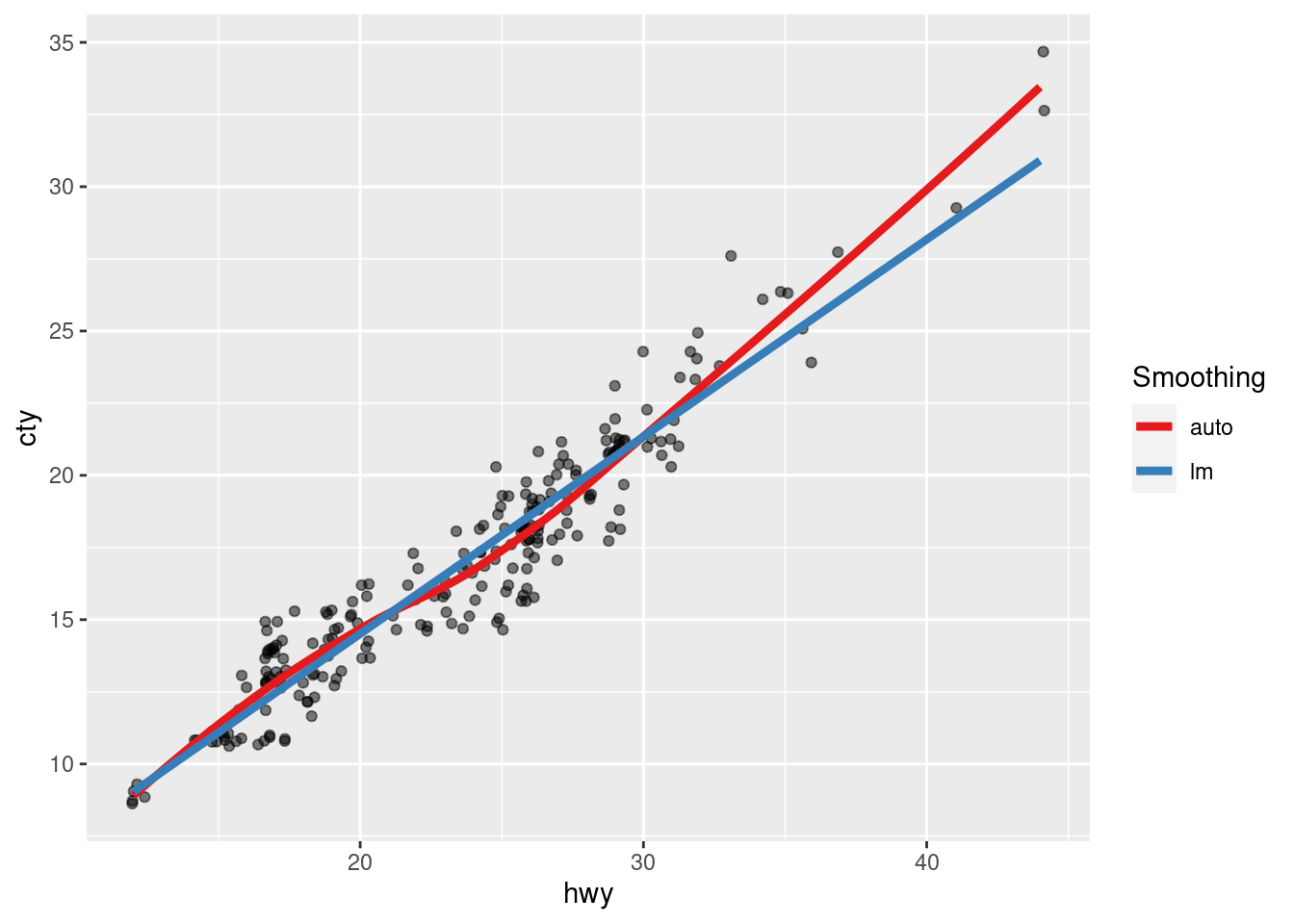
Assigning labels by hand, e.g. via col = "some label", can be a great idea in some instances. For example, when you use two different smoothing methods, a hand-written label to differentiate between the two methods helps a lot. For instance, take a look the relationship between city mileage cty and highway mileage hwy of cars in the mpg data set from the ggplot2 package.
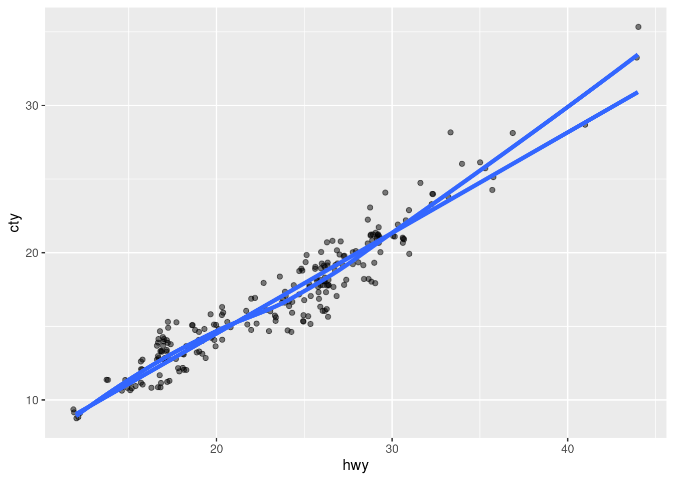
If one suspects a linear relationship between those two variables, one might want to use geom_smooth(method = 'lm') to check that hypothesis by drawing a straight line through the points. Similarly, one may be inclined to see what geom_smooth() would return if a linear model is not enforced. Adding both smoothing methods to the plot (and removing the confidence bands) yields:
ggplot(data = mpg, aes(hwy, cty)) +
  geom_jitter(alpha = 0.5) +
  geom_smooth(se = F, size = 1.5) +
  geom_smooth(method = 'lm', se = F, size = 1.5)
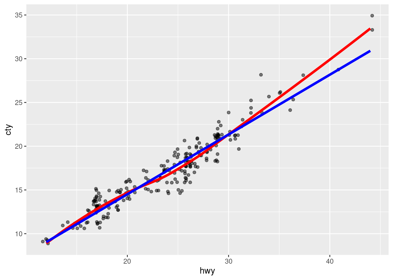
Obviously, differently colored lines should be used here to differentiate between the two smoothing methods. We have two approaches to do this. Either, we can manually assign a color (without using aes()):
ggplot(data = mpg, aes(hwy, cty)) +
  geom_jitter(alpha = 0.5) +
  geom_smooth(se = F, size = 1.5, col = 'red') +
  geom_smooth(method = 'lm', se = F, size = 1.5, col = 'blue')
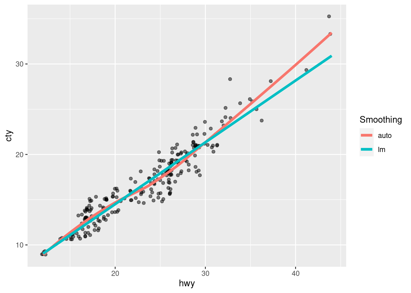
Or we can use aes() and assign labels instead and let ggplot2 handle the colors on its own.
ggplot(data = mpg, aes(hwy, cty)) +
  geom_jitter(alpha = 0.5) +
  geom_smooth(aes(col = 'auto'), se = F, size = 1.5) +
  geom_smooth(method = 'lm', aes(col = 'lm'), se = F, size = 1.5) +
  labs(col = 'Smoothing')
Personally, I prefer the latter approach because it has a couple of small advantages
- A legend is automatically generated with the corresponding labels such that even without looking at the code it becomes more obvious how each line was generated. Also, creating labels for an aesthetic is kind of the point of this post.
- I do not have to bother about the specific color names. For me, this is something that could take up a lot of time if I want to change the appearance of the plot later on because I might spend way too much time on finding colors that “work” together. Here, if I want to change the colors, I could simply use a Brewer color palette and hope that the creators of that palette had good reasons to arrange the palette the way they did.
Automatically Assigning Labels via Pivoting
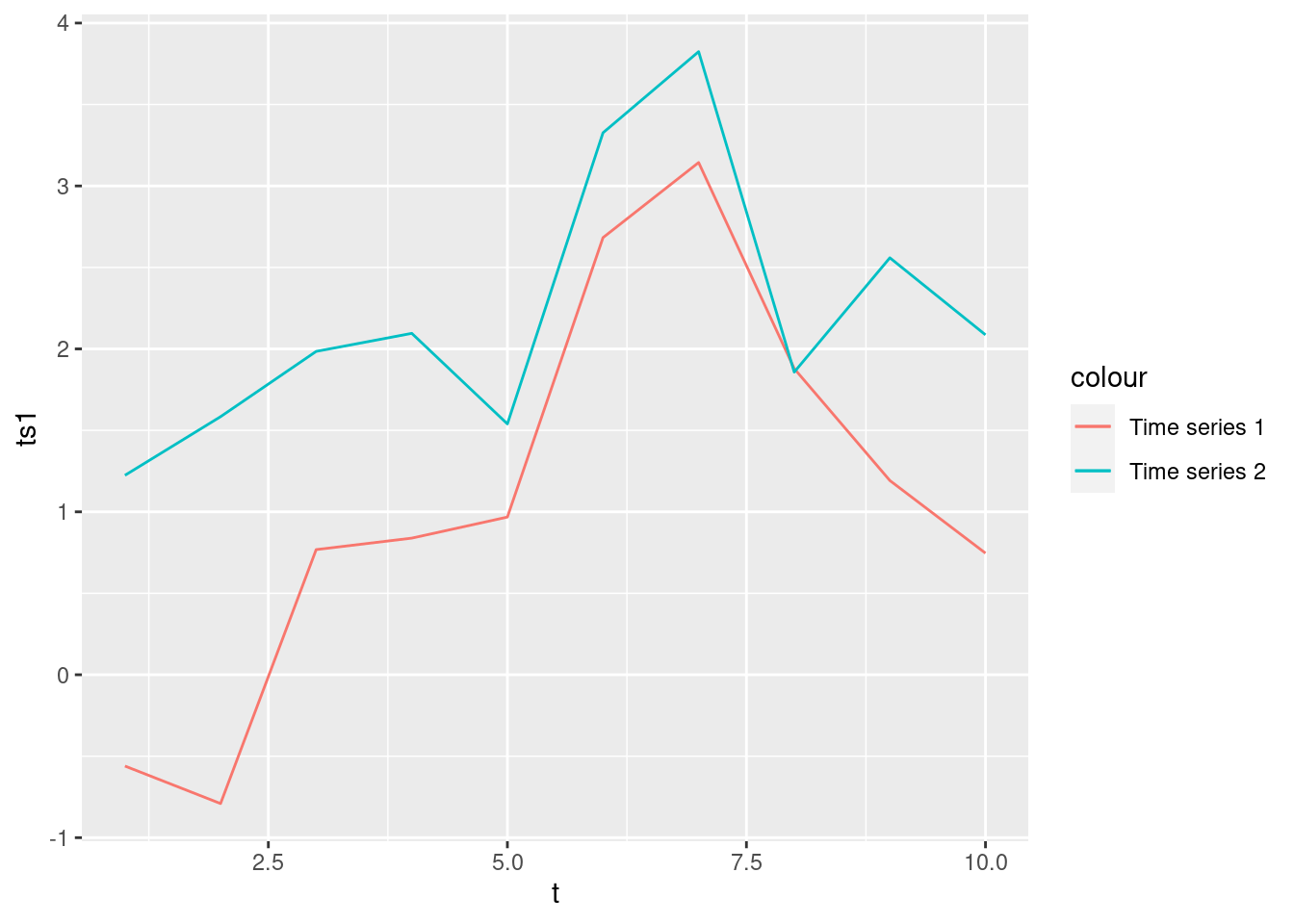
Sometimes, manually coloring aspects of your data can also be a bad idea. Especially, if you find yourself using the exact same geom_* multiple times on different variables of a data set, you may want to think about using a different approach. One such approach can be to rearrange the data first. For example, take a look at the following two time series that were simulated and collected in a tibble as follows:
set.seed(123)
x1 <- rnorm(10)
x2 <- rnorm(10)
tib <- tibble(
  t = seq_along(x1),
  ts1 = cumsum(x1),
  ts2 = cumsum(x2)
)
tib
# A tibble: 10 × 3
t ts1 ts2
<int> <dbl> <dbl>
1 1 -0.560 1.22
2 2 -0.791 1.58
3 3 0.768 1.98
4 4 0.839 2.10
5 5 0.968 1.54
6 6 2.68 3.33
7 7 3.14 3.82
8 8 1.88 1.86
9 9 1.19 2.56
10 10 0.746 2.09Now, it is possible to plot both times series using geom_line() and use different colors for each line. To do so, one might be tempted (as I often was when I first learned ggplot2) to write code similar to the one we wrote earlier:
tib %>%
  ggplot(aes(x = t)) +
  geom_line(aes(y = ts1, col = "Time series 1")) +
  geom_line(aes(y = ts2, col = "Time series 2"))
Here, we basically used geom_line() twice for more or less the same plot but with only one aesthetic slightly changed. However, this may not be the best approach. This is especially true if we were to do this for, say, 100 time series as it would involve a lot of code duplication.
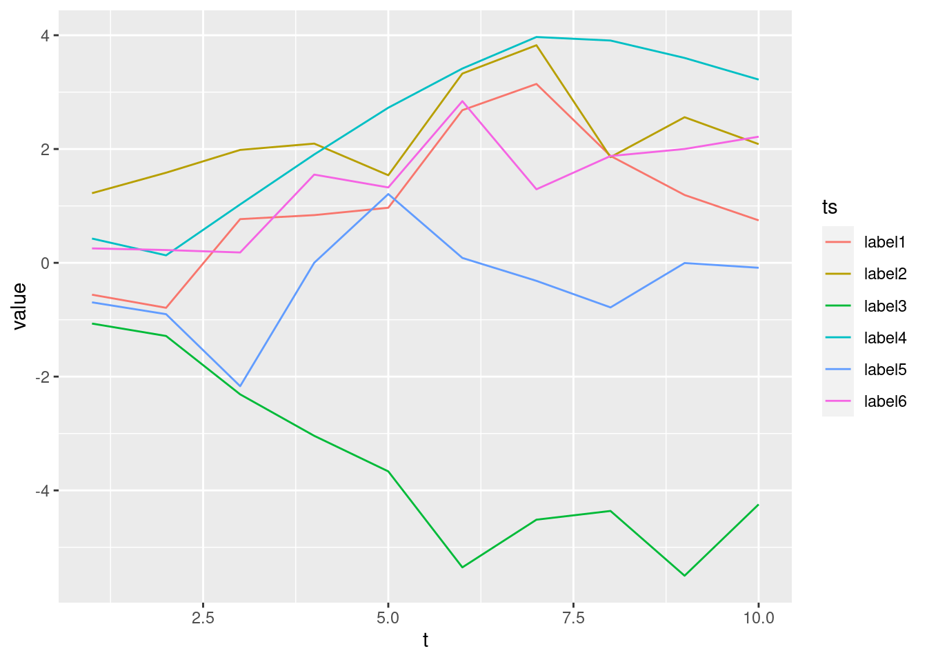
Instead, let’s try to rearrange the data via pivot_longer() before even beginning to plot anything1. This way, we might even plot way more than 2 time series with only a single geom_line():
set.seed(123)
# Create multiple time series
tib <- map_dfc(1:6, ~cumsum(rnorm(10))) %>%
  rename_with(~glue::glue("label{1:6}")) %>%
  bind_cols(t = 1:10, .)

# Pivot and plot
tib %>%
  pivot_longer(cols = -1, names_to = "ts") %>%
  ggplot(aes(t, value, col = ts)) +
  geom_line()
As you just saw, it is also possible to, if necessary, relabel the column names in bulk before rearranging the data in order to label the aesthetic the way we want.
Same Procedure, Different Aesthetic
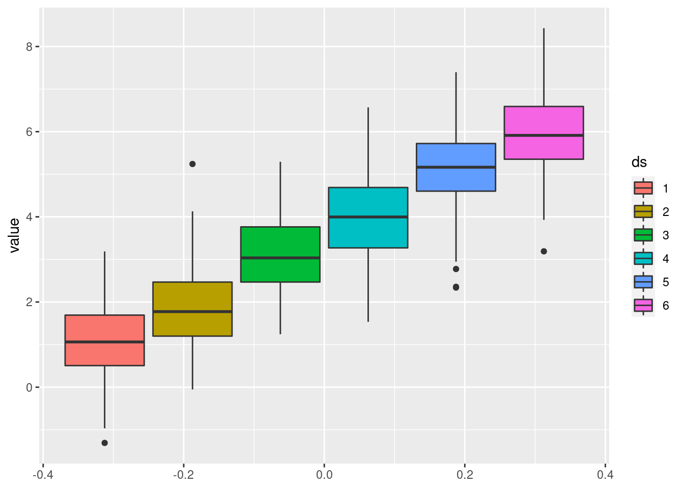
For the sake of an additional example, let us use the same ideas but with geom_boxplot() instead of geom_line(). Therefore, we will generate a couple of “data sets” and plot a box plot for each one:
set.seed(123)
map_dfc(1:6, rnorm, n = 100) %>%
  rename_with(~(1:6)) %>%
  pivot_longer(cols = everything(), names_to = "ds") %>%
  ggplot(aes(col = ds, y = value)) +
  geom_boxplot()
Here, I have used col again but as I have recently come to realize, using fill instead of col creates the “prettier” box plots so let’s use that instead.
set.seed(123)
map_dfc(1:6, rnorm, n = 100) %>%
  rename_with(~(1:6)) %>%
  pivot_longer(cols = everything(), names_to = "ds") %>%
  ggplot(aes(fill = ds, y = value)) +
  geom_boxplot()
So, as you just witnessed, what I have described so far does not only work with the color aesthetic. In fact, we can pretty much use the same approaches for all other aesthetics.
Thus, we have seen how to easily create labels for an aesthetic of our choice by either manually assigning labels or rearranging the data first in order to use the previous column names to assign labels automatically. Let me know what you think in the comments or if you liked this post, simply hit the applause button below.
Footnotes
I am not describing how
pivot_longer()works in detail here because I want to keep this post short by only “connecting the dots”. If you are unfamiliar with pivoting, you may check out the tidy data chapter from my YARDS lecture notes which was of course inspired by the infamous R for Data Science book. For an animation that demonstrates whatpivot_longer()andpivot_wider()do, see gadenbuie/tidyexplain on GitHub.↩︎
