library(tidyverse)
theme_set(theme_light())

# All missing values can be filtered out by filtering the `sex` variable
dat <- palmerpenguins::penguins %>% filter(!is.na(sex))ggplot tips: Arranging plots
In this week’s TidyTuesday, I noticed that I am frequently not using only ggplot2 to create plots. In fact, it has become essential to me to leverage the powers of other great additional packages that align well with ggplot2. Therefore, I decided to extend my ggplot2-tips series by introducing a few packages I use quite often.
In this post, I want to cover how to arrange multiple plots. In particular, I will talk about the fantastic patchwork package by Thomas Lin Pedersen which helps to arrange plots quite intuitively. Further, I want to take a glance at ggforce, another package written by the same author as patchwork, because it also has a neat function for arranging plots. However, ggforce can do way more and I will demonstrate that in another installment of this series. Also, if you like to watch and listen rather than read about how the two packages work, you can check out the corresponding video on YouTube.
So, let us begin by creating a data set we want to fiddle with for plotting purposes. For simplicity, let us use the penguins data (without missing values) from the palmerpenguins package.
Arrange Plots via patchwork
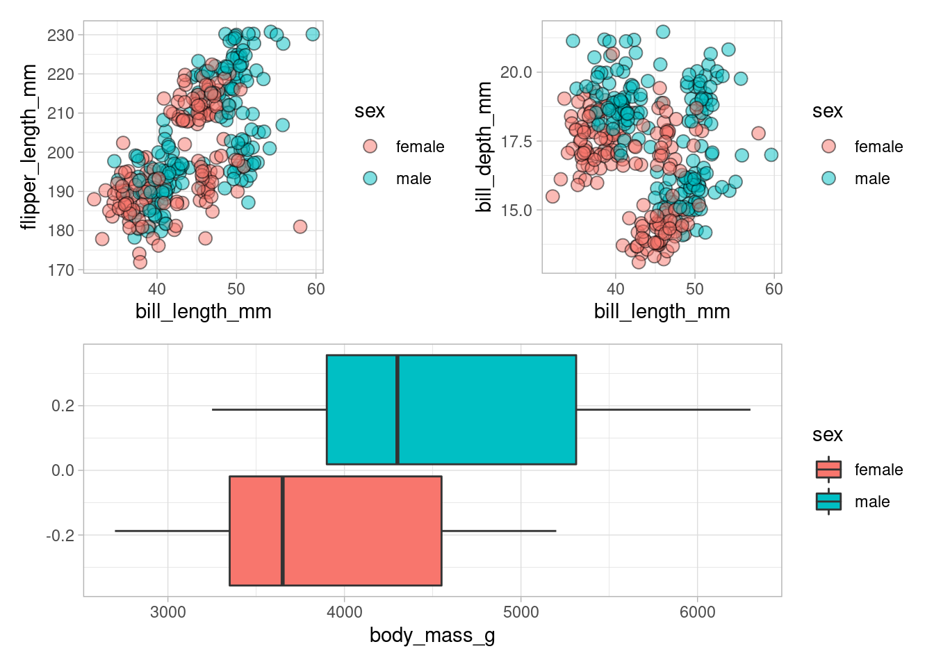
Often, we want to show multiple plots that tell a story when looked at together. Using patchwork, we can easily compose a single plot consisting of subplots. This is done by using the simple symbols + resp. / to display plots next to resp. on top of each other.
For demonstration purposes, let us generate a few simple plots.
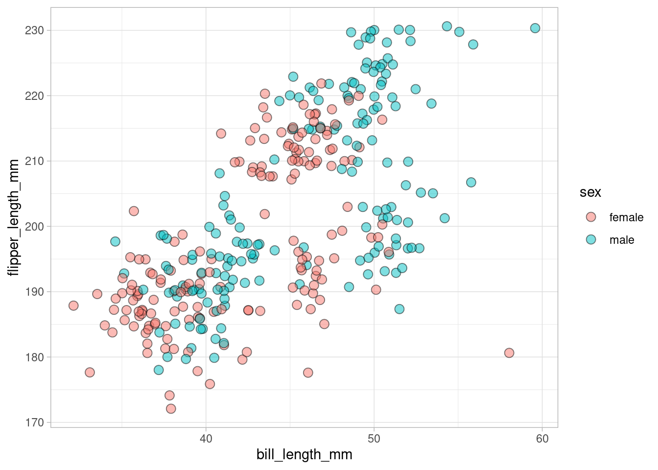
point_plot <- dat %>%
  ggplot(aes(bill_length_mm, flipper_length_mm, fill = sex)) +
  geom_jitter(size = 3, alpha = 0.5, shape = 21)
point_plot
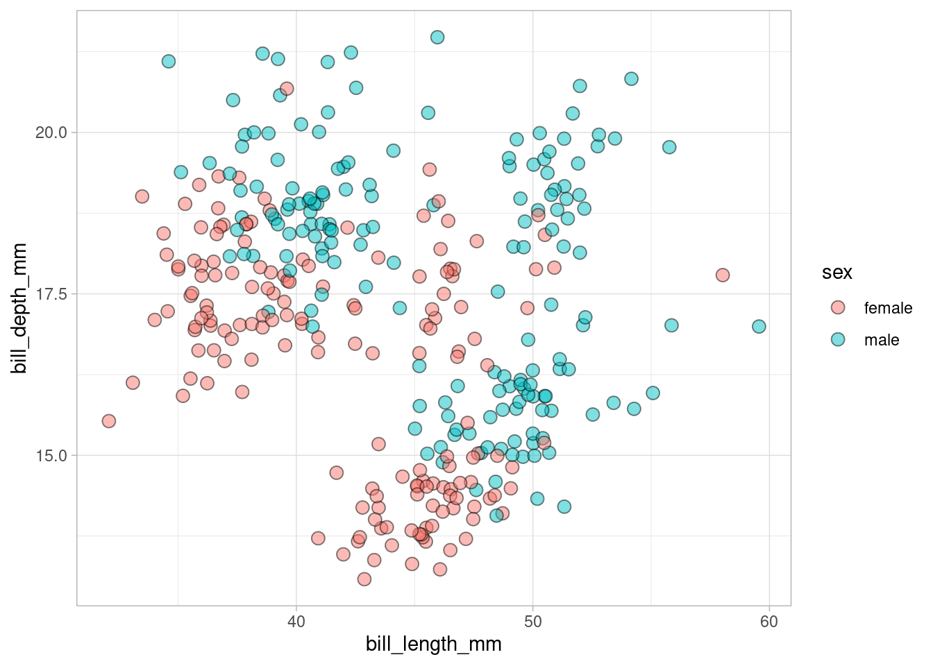
point_plot2 <- dat %>%
ggplot(aes(bill_length_mm, bill_depth_mm, fill = sex)) +
geom_jitter(size = 3, alpha = 0.5, shape = 21)
point_plot2# plot_plot is obviously a fun name
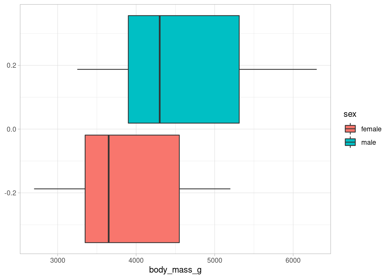
boxplot_plot <- dat %>%
ggplot(aes(x = body_mass_g, fill = sex)) +
geom_boxplot()
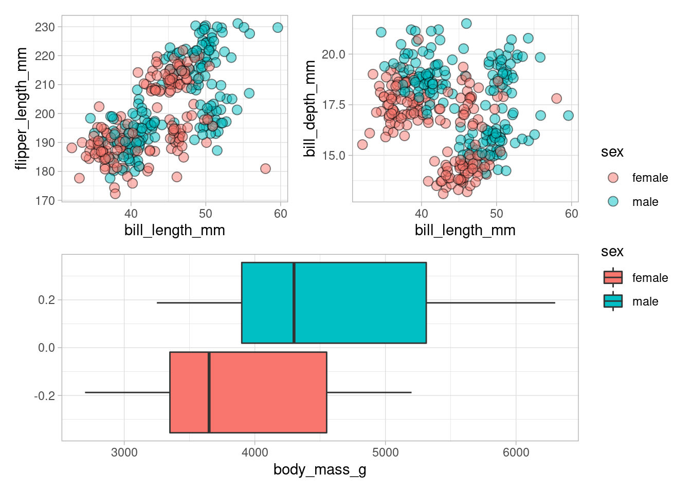
boxplot_plotClearly, showing each plot separately is boring and may not tell a story convincingly. Possibly, here you may want to say that the length and depth measurements give no clear distinction between male and female penguins but the weight measurements offers a better distinguishabilty between sexes. Maybe, if we see all plots together, we can tell that story without boring the reader.
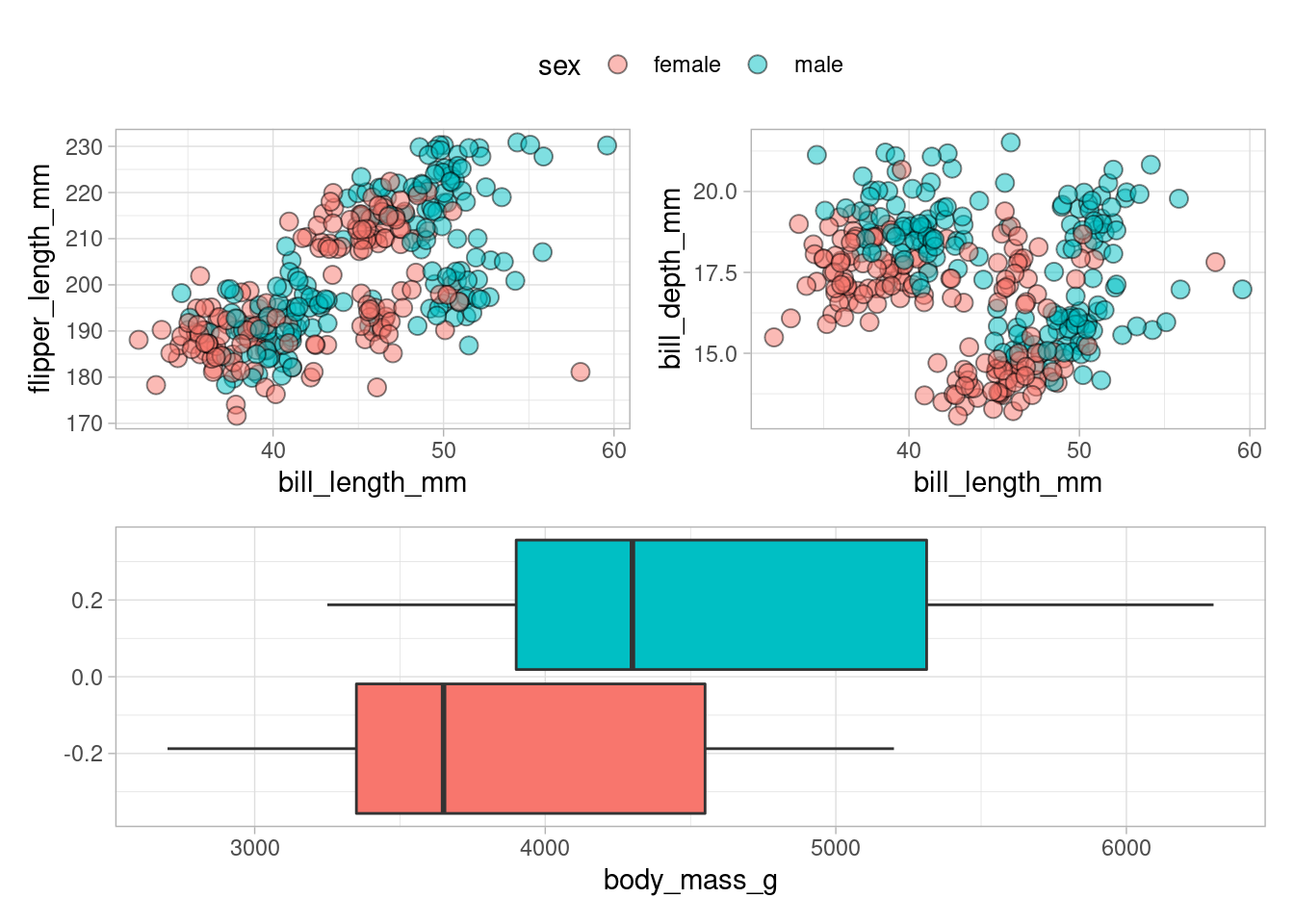
See how I have used + to put the point plots next to each other and / to plot the boxplots below the two point plots. Obviously, that was super easy and neat. But this simple arrangement leads to a doubling of the legends which is somewhat bothersome. However, this is no cause for concern. plot_layout() is there to collect those legends for you.
Of course, this leaves you with two legends which is kind of superfluous. The easy way to get rid of this is to plot no legends for the boxplots.
boxplot_plot <- boxplot_plot + guides(fill = "none")
p <- (point_plot + point_plot2) / boxplot_plot
p + plot_layout(guides = "collect")
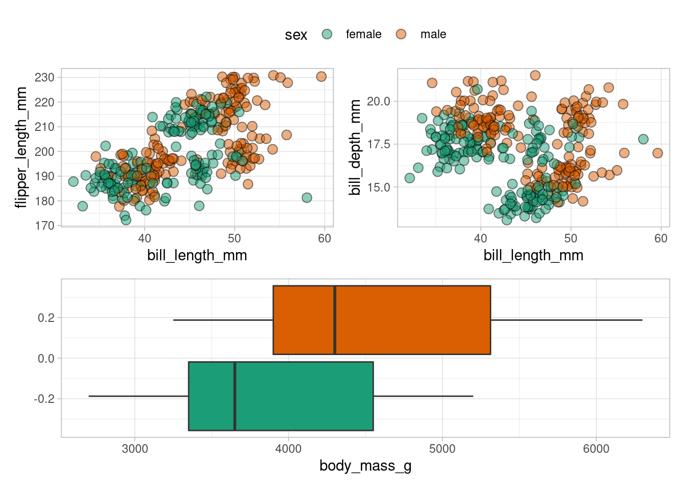
Now, what about legend positioning? Well, we already know how that usually works for a single plot (via theme() in case you forgot) and the good news is that the exact same thing works with patchwork as well. But beware to apply an additional theme() layer to the whole plot and not just to the last plot added to our composed plot. To make sure that happens, we have to add this layer via &.
By the same logic, we can make additional changes to the whole plot e.g. to change the color mapping.
p +
  plot_layout(guides = "collect") &
  theme(legend.position = "top") &
  scale_fill_brewer(palette = "Dark2")
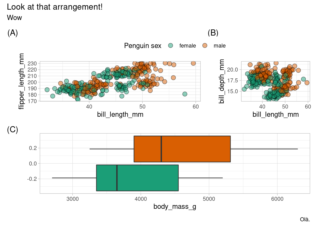
Next, let us control the layout a bit more and annotate the plot with plot_annotation().
(point_plot + point_plot2 + plot_layout(widths = c(0.7, 0.3))) /
  boxplot_plot +
  plot_layout(guides = "collect", heights = c(0.4, 0.6)) +
  plot_annotation(
    title = "Look at that arrangement!",
    subtitle = "Wow",
    caption = "Olà.",
    tag_levels = "A",
    tag_prefix = "(",
    tag_suffix = ")"
  ) &
  labs(fill = "Penguin sex") &
  theme(legend.position = "top") &
  scale_fill_brewer(palette = "Dark2")
We did quite a lot here, so let’s recap:
- We changed the widths of the plots in the first row by passing a vector of relative widths to
widthsinplot_layout(). - Same thing with
heightsinplot_layout()to make the boxplots larger. - Renamed legend label with the regular
labs()function. - Added a title, subtitle, caption and tags to the whole plot with
plot_annotation().
Also, if you want to have the tags to only label the upper and lower row, you may want to wrap the first row together by wrap_elements(). Think of this as creating a new single unit.
wrapped_plots <- wrap_elements(
  point_plot + point_plot2 + plot_layout(widths = c(0.7, 0.3))
)
(wrapped_plots) /
  boxplot_plot +
  plot_layout(guides = "collect", heights = c(0.4, 0.6)) +
  plot_annotation(
    title = "Look at that arrangement!",
    subtitle = "Wow",
    caption = "Olà.",
    tag_levels = "A",
    tag_prefix = "(",
    tag_suffix = ")"
  ) &
  theme(legend.position = "top") &
  scale_fill_brewer(palette = "Dark2")
Notice how the upper row reinstated the default colors and has two legends. This demonstrates how wrap_elements() made the plots “independent” from the overall theming via &, so to speak. On the bright side, there is no (C) tag anymore.
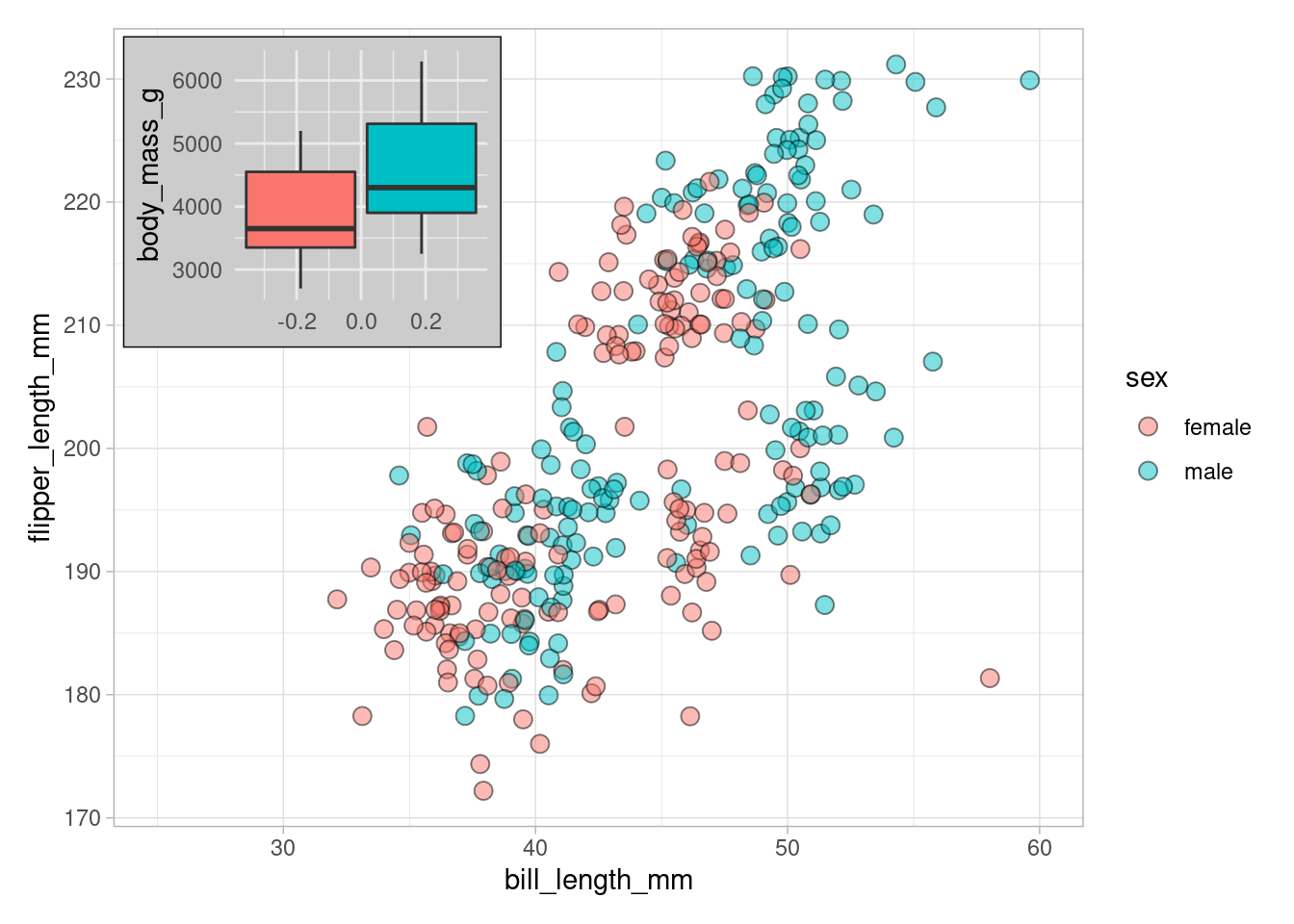
Unsurprisingly, patchwork can do much more but for starters I think the previous examples will already get you quite far. They are you “80/20 leverage points”, if you will. But in order to add one more neat feature, let me finish our intro to patchwork by showing you how to create plots in plots via insets.
Create Subplots via ggforce
I really enjoy arranging plots with patchwork because, to me, the syntax feels quite intuitive (mostly). However, as you probably noticed, I had to design each subplot and arrange them by hand. Clearly, if I want to use a grid-like arrangement to display each combination of two variables from a given set of variables, this may become tedious.
Luckily, there is the ggforce package that has a neat faceting function to accomplish just that. As was already mentioned above, apart from that, the ggforce package offers even more cool stuff which we will look at in a future blog post.
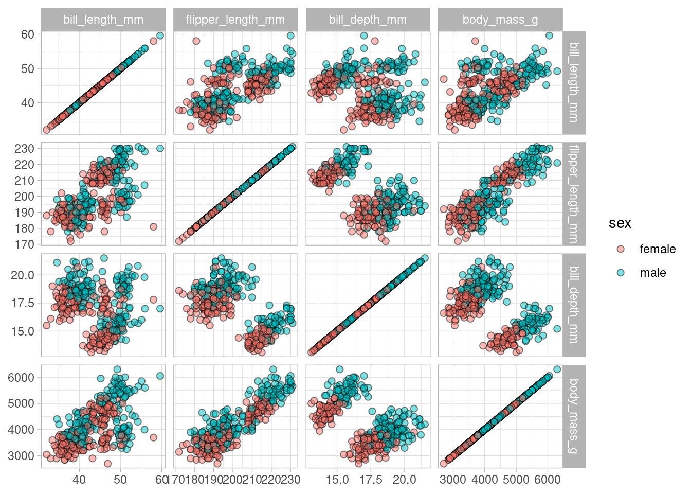
With facet_matrix() it becomes quite easy to get a grid of subplots to display multiple combinations of two variables. For instance, take a look at this.
library(ggforce)
dat %>%
  ggplot(aes(x = .panel_x, y = .panel_y, fill = sex)) +
  geom_point(alpha = 0.5, size = 2, shape = 21) +
  facet_matrix(
    vars(bill_length_mm, flipper_length_mm, bill_depth_mm, body_mass_g)
  )
Now, while this is not a particular beautiful plot, it gives us a quick overview of interesting variables which might be great for an exploratory analysis. Notice how we had to use .panel_x and .panel_y as placeholder for the individual variables. We could use the geom_auto*() functions to avoid typing that as they default to the correct values for x and y. Consequently, we could have written
dat %>%
  ggplot(aes(fill = sex)) +
  geom_autopoint(alpha = 0.5, size = 2, shape = 21) +
  facet_matrix(
    vars(bill_length_mm, flipper_length_mm, bill_depth_mm, body_mass_g)
  )
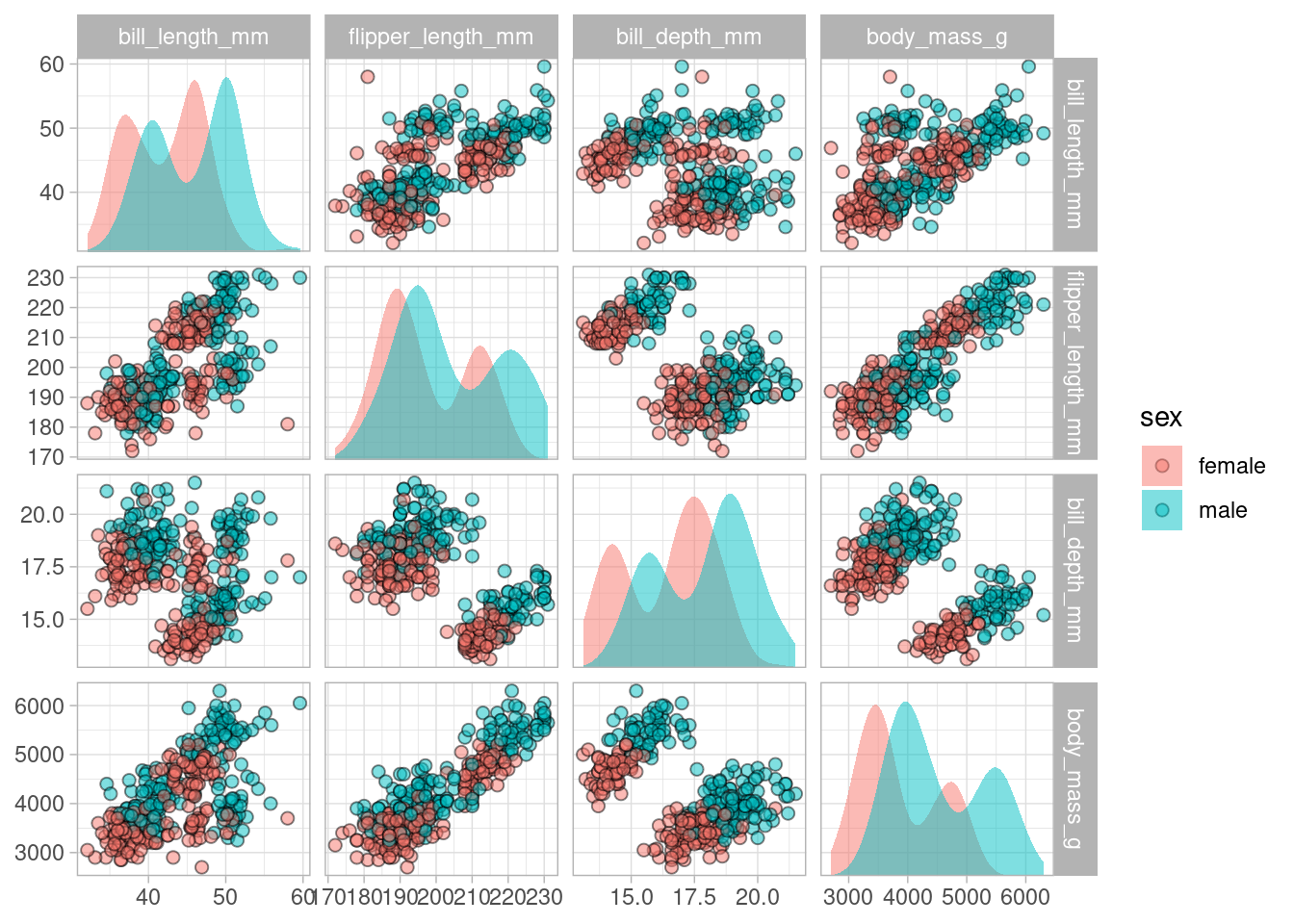
With a little bit of tweaking, we can make this plot more interesting. For example. it would be neat if we had density plots on the diagonal. No problem! Add another geom_autodensity() layer and make sure that facet_matrix() understands to map only this layer to the diagonal subplots.
dat %>%
  ggplot(aes(fill = sex)) +
  geom_autopoint(alpha = 0.5, size = 2, shape = 21) + # Layer 1
  geom_autodensity(alpha = 0.5, position = "identity") + # Layer 2
  facet_matrix(
    vars(bill_length_mm, flipper_length_mm, bill_depth_mm, body_mass_g),
    layer.diag = 2
  )
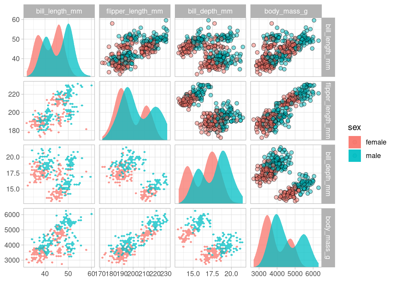
See how layer.diag = 2 maps the diagonal elements to the second line of geom_* code. Similarly, we can manipulate the content of the upper and lower triangle in this grid by changing layer.lower or layer.upper in facet_matrix(). Let’s add another layer to see that in action.
dat %>%
  ggplot(aes(fill = sex)) +
  geom_autopoint(alpha = 0.5, size = 2, shape = 21) + # Layer 1
  geom_autodensity(alpha = 0.75, position = "identity") + # Layer 2
  geom_hex(aes(x = .panel_x, y = .panel_y), alpha = 0.75) + # Layer 3
  facet_matrix(
    vars(bill_length_mm, flipper_length_mm, bill_depth_mm, body_mass_g),
    layer.diag = 2,
    layer.lower = 3
  )
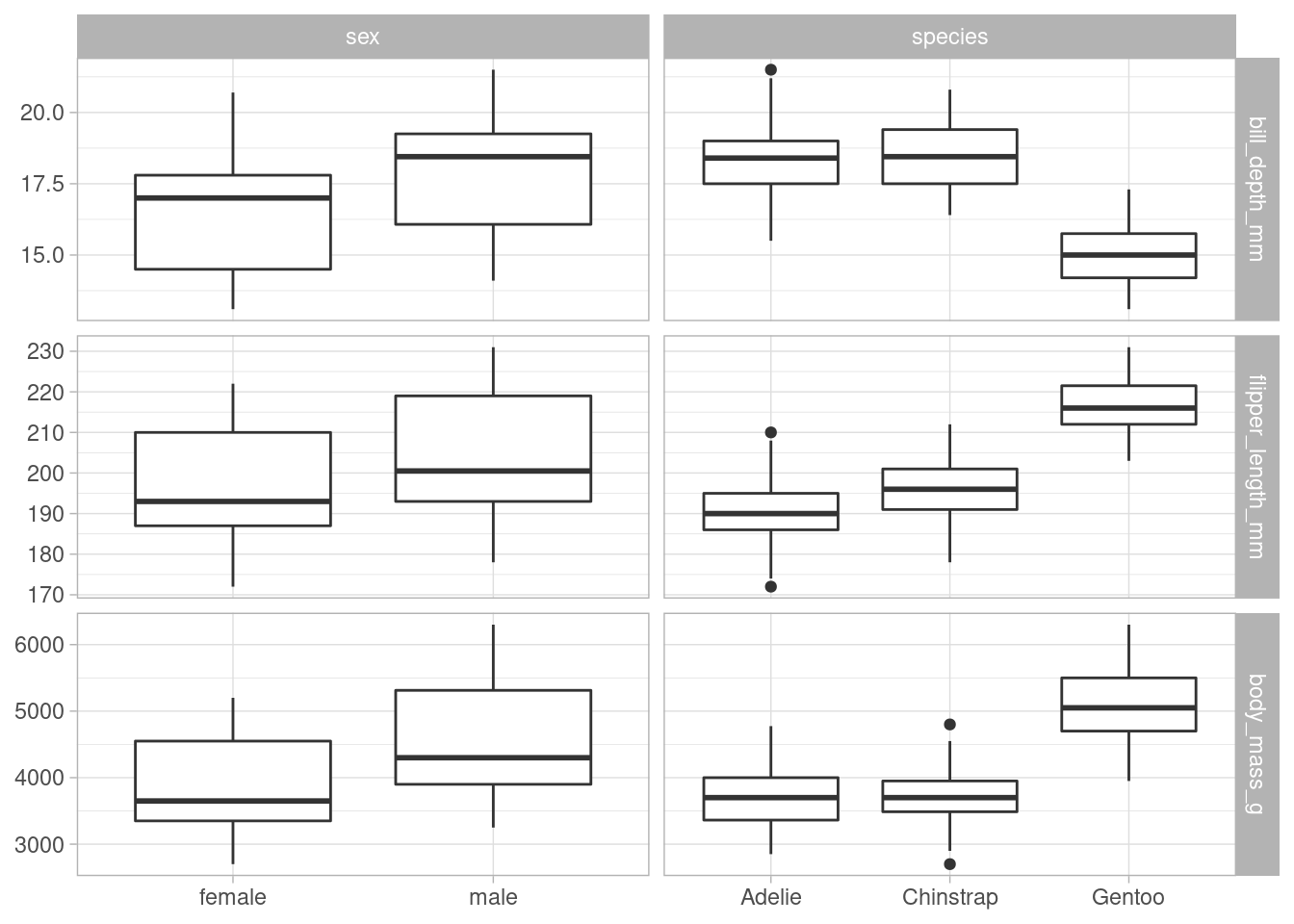
Last but not least, let me mention that we can also easily create what is called an “asymmetric grid” in ggforce by mapping rows and columns manually. This is great for having categorical variables on one axis and numerical variables on the other axis.
dat %>%
  ggplot() +
  geom_boxplot(
    aes(x = .panel_x, y = .panel_y, group = .panel_x)
  ) +
  facet_matrix(
    cols = vars(sex, species),
    rows = vars(bill_depth_mm:body_mass_g)
  )
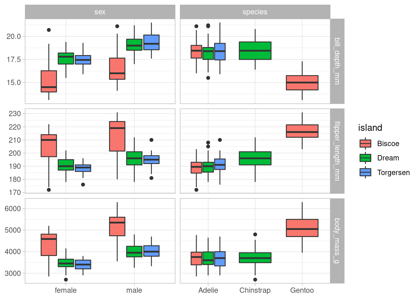
Beware that geom_boxplot() is a bit tricky as it requires the group argument to be explicitly set. Furthermore, if you want to add another aesthetic, e.g. fill, you will have to set group via interaction().
dat %>%
  ggplot() +
  geom_boxplot(
    aes(
      x = .panel_x,
      y = .panel_y,
      fill = island,
      group = interaction(.panel_x, island)
    )
  ) +
  facet_matrix(
    cols = vars(sex, species),
    rows = vars(bill_depth_mm:body_mass_g)
  )
This concludes our short summary of possibilities to arrange plots. In the next post of this ggplot2-tips series we will take a closer look at ggforce. I hope you enjoyed today’s blog post and I look forward to “see” you at my next blog post. In the meantime, feel free to leave a comment or a click on the applause button below.
