library(dplyr)
library(ggplot2)
theme_set(theme_light())
dat <- palmerpenguins::penguins %>%
  filter(!is.na(sex))
p <- dat %>%
  ggplot(aes(bill_length_mm, flipper_length_mm, col = species)) +
  geom_point()
pA couple of visualizations from ggforce
It is almost the beginning of a new year and I have decided to finish off this year with a quick blog post. Also, friends were shaming me that I have been slacking off on this blog lately. Therefore, let’s get started right away. We’ll keep things simple and look at a few cool plots from the ggforce package. Of course, we have already glimpsed at this package in the previous installment of this ggplot2-tips series.
Mark Point Plots
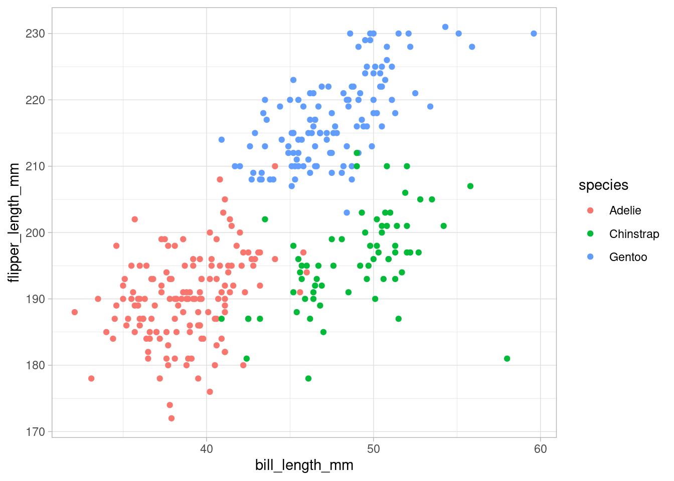
Let us first take a look at the penguins data set from the palmerpenguins package. Same as last time, this will be the dummy data set we use for plots but of course any other data set would be fine too.
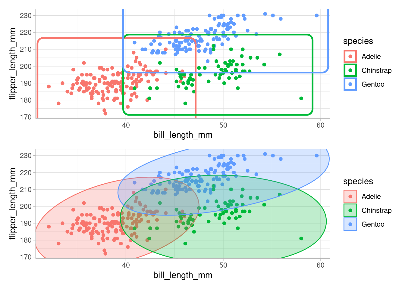
Visually, we can see that the points are strongly grouped by species which makes sense as these kind of measurements often define a species. With help from ggforce we can visually emphasize this grouping by drawing rectangles or ellipses around the groups.
library(ggforce)
rect_plot <- p +
  geom_mark_rect(size = 1)
ellipse_plot <- p +
  geom_mark_ellipse(aes(fill = species), alpha = 0.25)

library(patchwork) # see last ggplot2-tips post
rect_plot / ellipse_plot
There is also a geom_mark_hull() function that requires the concaveman package to be installed. Using this function, we can draw a hull around the points.
Beware though that this hull is “redrawn at draw time”, so your hull may look different when you zoom into the plot. Also, let me point out that geom_mark_hull() has an argument concavity that allows you to make the hull “more wiggly”.
Alluvial Plots
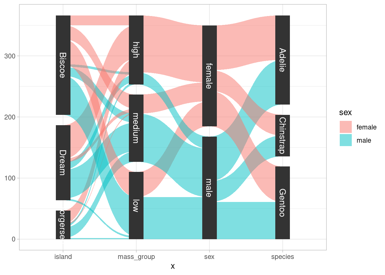
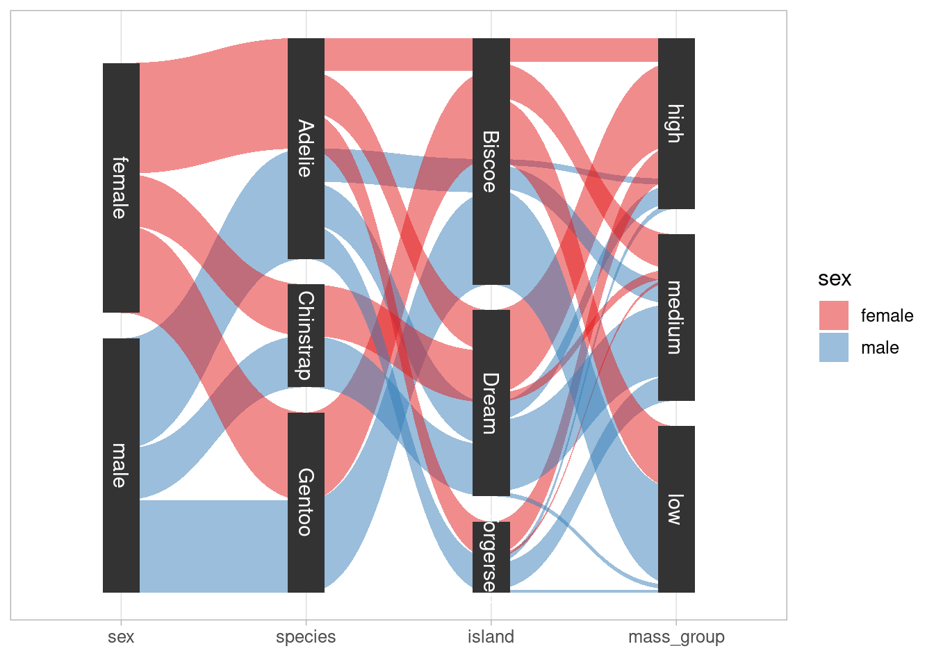
With ggforce you can easily draw so-called alluvial plots. Originally, these are used to visualize a “stream over time” as for instance shown on Wikipedia. But the same visualization can be used to visualize “composition of groups” like so.
From this plot, it is clear that unsurprisingly most of high weight penguins are male. What is maybe more surprising is that all Chinstrap penguins live on Dream. Obviously, the first layer in this alluvial plot is sort of redundant as the color already codes the sex but for accessibility it is often encouraged to use some form of double encoding (e.g. different shape AND color for groups). Thus, I find it practical and somewhat convenient to add this first layer.
Creating this plot requires a couple of steps but ggforce has useful functions that make our life easier. More precisely we will need to
- count occurences in each subgroup and convert this in a suitable format for later plotting.
gather_set_data()will help us doing that. - draw lines between subgroups with
geom_parallel_sets() - draw boxes to identify subgroups with
geom_parallel_sets_axes() - label the boxes with
geom_parallel_sets_labels
The first step is processed as follows
reshaped_dat <- dat %>%
  mutate(
    mass_group = factor(
      cut_number(body_mass_g, 3),
      labels = c("high", "medium", "low")
    )
  ) %>%
  count(species, island, sex, mass_group) %>%
  gather_set_data(x = 1:4)
This simply counts the occurences in each subgroup and then adds three columns x, y and id based on the subgroup labels. These three new columns are necessary for generating the plot which is done as follows
reshaped_dat %>%
  ggplot(aes(
    x = x,
    split = y,
    id = id,
    value = n
  )) +
  geom_parallel_sets(aes(fill = sex), alpha = 0.5) +
  geom_parallel_sets_axes(axis.width = 0.2) +
  geom_parallel_sets_labels(colour = 'white', size = 4)
Here, value is the counts of the subgroups. Also, notice that the splits on the x-axis is not in the same order as in my original plot. The order can be easily changed by converting x to a factor whose levels have the desired ordering. The complete code is
reshaped_dat %>%
  ggplot(aes(
    x = factor(x, c("sex", "species", "island", "mass_group")),
    split = y,
    id = id,
    value = n
  )) +
  geom_parallel_sets(aes(fill = sex), alpha = 0.5) +
  geom_parallel_sets_axes(axis.width = 0.2) +
  geom_parallel_sets_labels(colour = 'white', size = 4) +
  labs(x = element_blank()) +
  scale_y_continuous(breaks = NULL) +
  theme(text = element_text(size = 12)) +
  scale_fill_brewer(palette = 'Set1')
Voronoi Diagrams
Next, let us explore Voronoi diagrams. These are constructed from a set of “center points” which are used to form polygons such that these fill the whole plane and each polygons consists of the points that are closest to a polygon’s center point. If you found this somewhat confusing, then you are in luck because Wikipedia has a super neat animation that illustrates this concept.
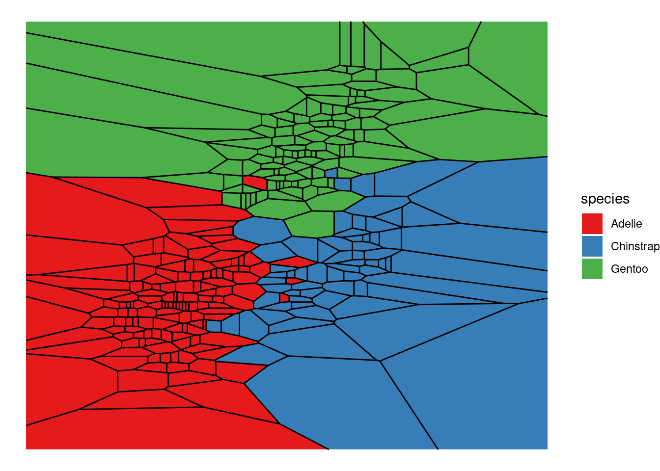
Using bill and flipper lengths to define the center points’ x- and y-coordinates, we can create a Voronoi diagram via geom_voronoi_tile() and geom_voronoi_segment() as follows.
dat %>%
  ggplot(aes(bill_length_mm, flipper_length_mm, group = 1)) +
  geom_voronoi_tile(aes(fill = species)) +
  geom_voronoi_segment() +
  scale_fill_brewer(palette = "Set1") +
  theme_void()
Here, the lines between polygons are shown due to geom_voronoi_segment() and if we wish to get rid of the lines we can simply remove this layer. Also, let us ignore possible applications of Voronoi diagrams1 for a bit. What I really wanted to demonstrate is a small bit of Rtistry I found on Twitter and found really cool.
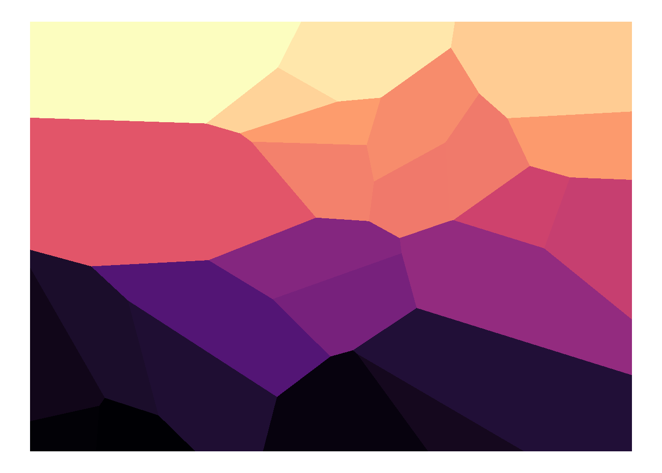
With a couple of random numbers and a bit of coloring one can create some visually appealing graphics (at least I like to think so). First, let’s take a look at only a few random numbers
set.seed(23479)
N <- 25
tibble(x = runif(N), y = runif(N)) %>%
  ggplot(aes(x, y)) +
  geom_voronoi_tile(aes(fill = y)) +
  scale_fill_viridis_c(option = 'A') +
  theme_void() +
  theme(legend.position = 'none')
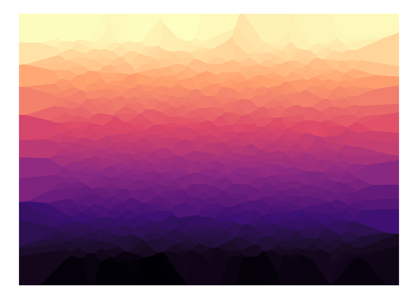
Not so super impressive but using many random numbers a “smoother” picture will be created.
set.seed(23479)
N <- 1000
tibble(x = runif(N), y = runif(N)) %>%
  ggplot(aes(x, y)) +
  geom_voronoi_tile(aes(fill = y)) +
  scale_fill_viridis_c(option = 'A') +
  theme_void() +
  theme(legend.position = 'none')
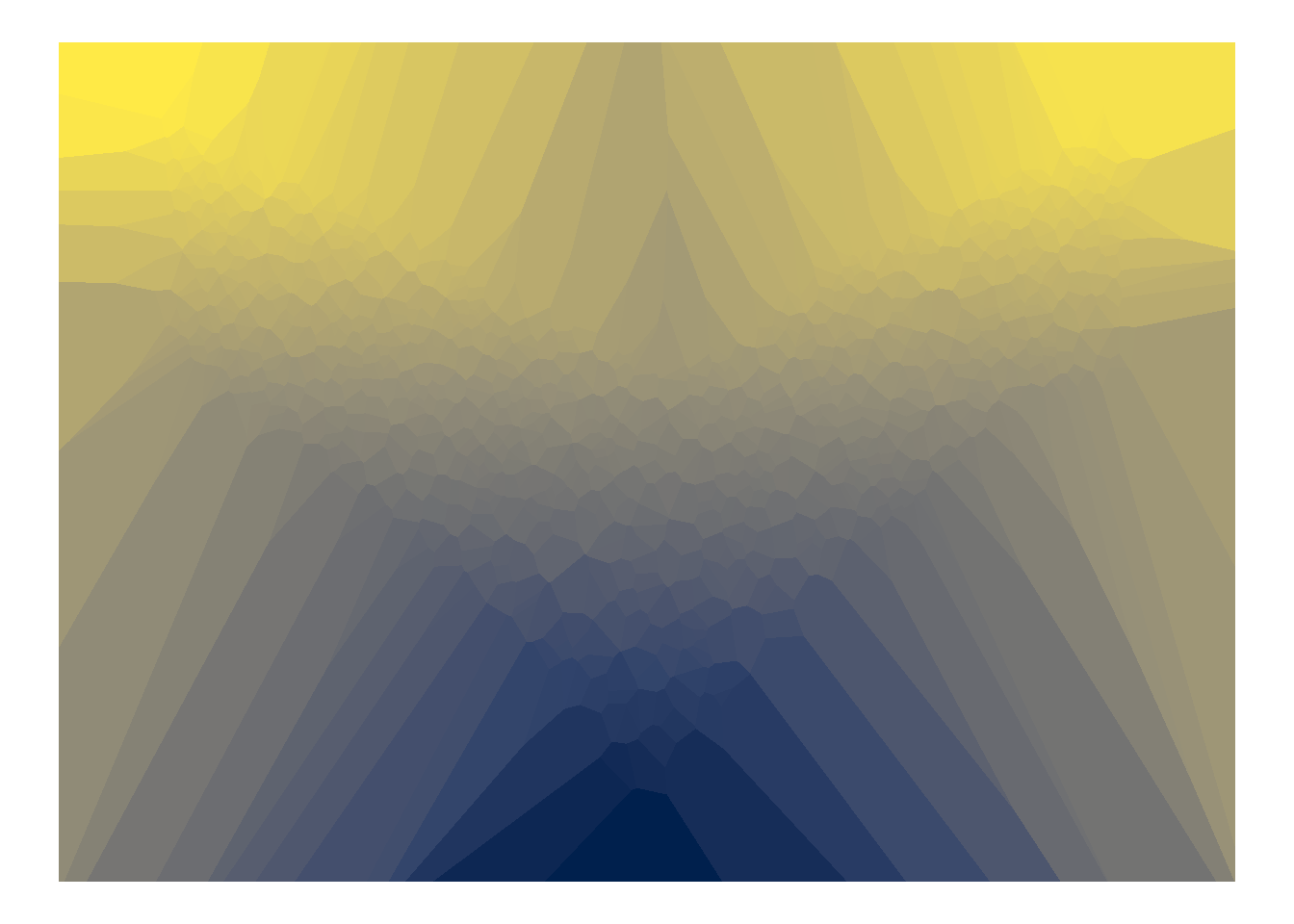
Of course, arranging the center points differently and using other colors leads to very different pictures.
Sina Plots
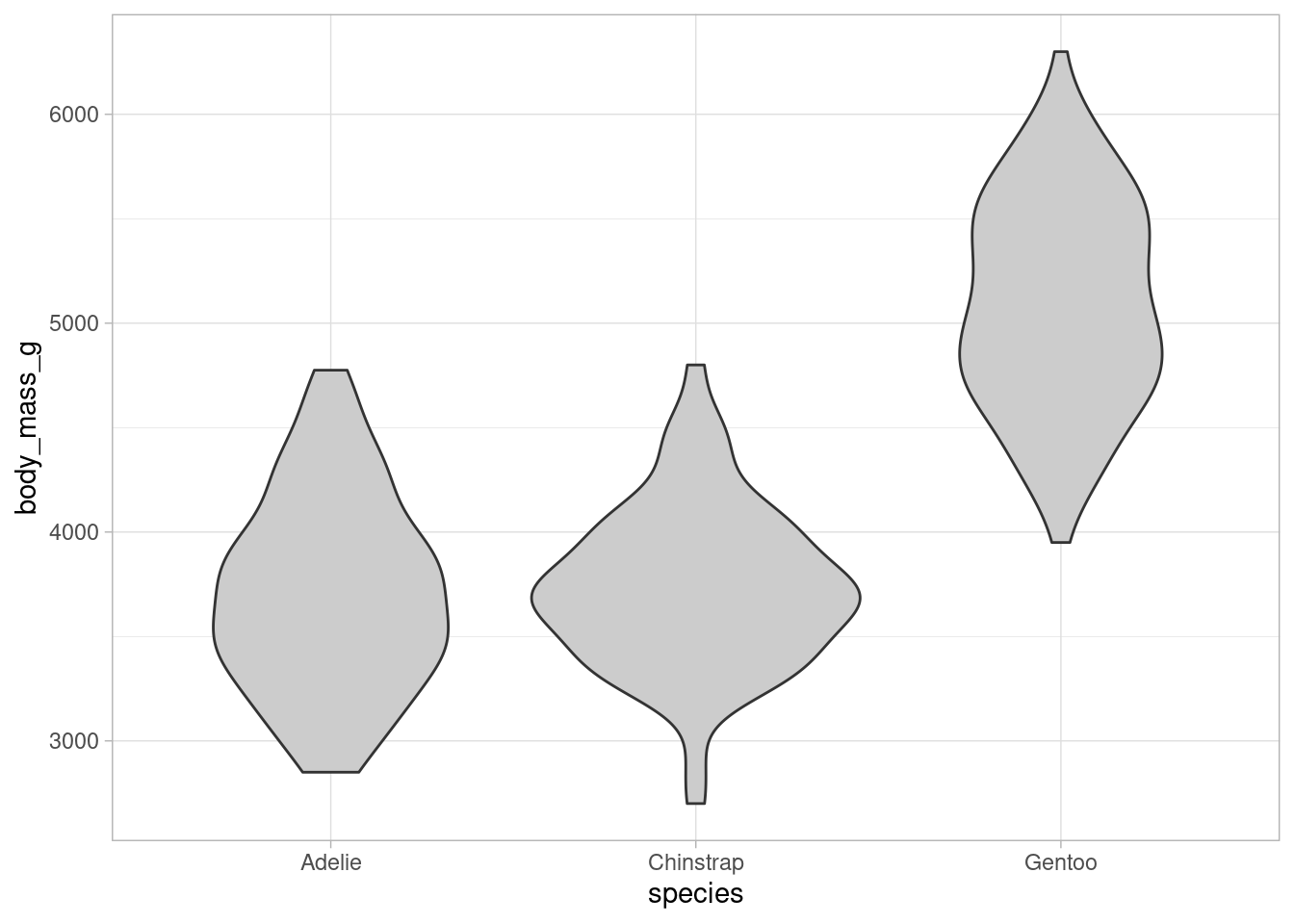
Coming back to less artistic plots, consider the following violin plots from the ggplot2 package.
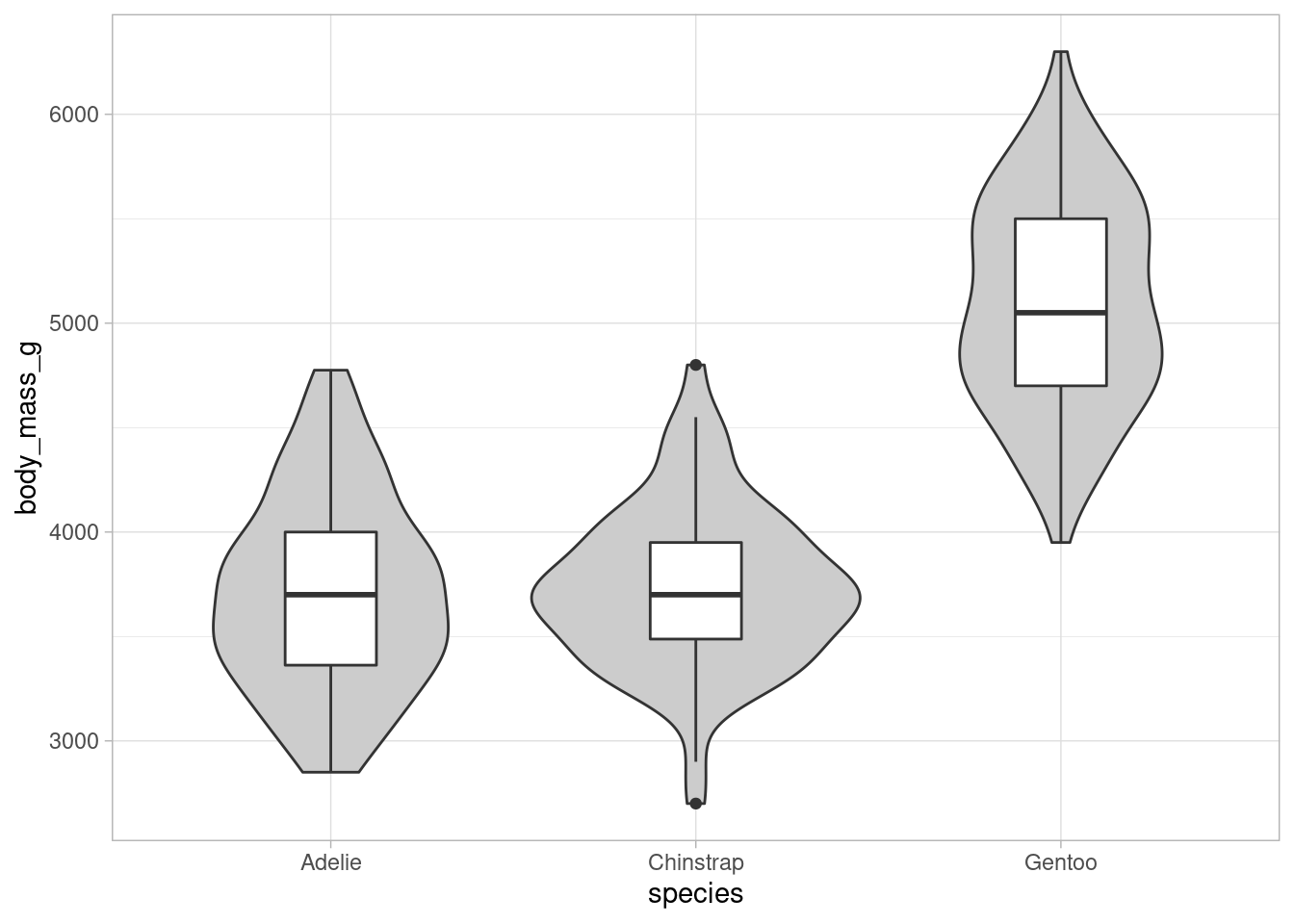
Compared with common boxplots, these kind of plots show the distribution of the data more explicitly with density estimates (rotated by 90 degrees and mirrored for symmetry). This gets rid of the intrinsic problem of boxplots, i.e. only showing quantiles. Sometimes though, we want to see the quantiles as well. In these instances, an additional boxplot is plotted within the violin plots like so.
dat %>%
  ggplot(aes(x = species, y = body_mass_g)) +
geom_violin(fill = "grey80") +
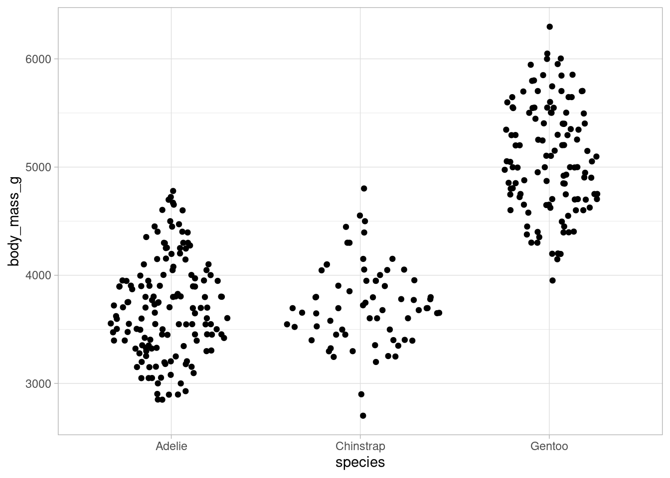
geom_boxplot(width = 0.25)However, even with both of these plots combined we still don’t know how many points are in this data set. To make that information available in the visualizations, so-called sina plots fill the area of violin plots with jittered data points instead of depicting the estimated density directly.
If a data set is large, then the points will display the same contour as the violin plot. In any case, the violin plot can be plotted beneath the points as well for better visibility.
This way, we can see both the distribution AND the number of data points in a single plot. Of course, there are more ways to display the distribution of data and ggdist is just the right package to do that job. I will show you that particular package in the next installment of the ggplot2-tips series.
And that concludes our small demonstration of a few ggforce functions. For more functions check out ggforce’s website. For sure, there is more cool stuff like Bezier curves and facet zooms to explore.
Finally, here is an overview of all the cool visuals we have created. Let me know what you think in the comments or simply hit the applause button below if you liked the content.

