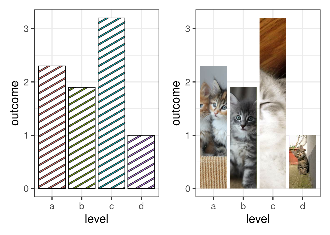
library(ggplot2)
library(ggpattern)
library(patchwork)

df <- data.frame(level = c("a", "b", "c", 'd'), outcome = c(2.3, 1.9, 3.2, 1))

stripes <- ggplot(df) +
  geom_col_pattern(
    aes(level, outcome, pattern_fill = level),
    pattern = 'stripe',
    fill    = 'white',
    colour  = 'black'
  ) +
  theme_bw(18) +
  theme(legend.position = 'none')

kittens <- ggplot(df) +
  geom_col_pattern(
    aes(level, outcome, fill = level),
    pattern = 'placeholder',
    pattern_type = 'kitten',
    pattern_size = 3
  ) +
  theme_bw(18) +
  theme(legend.position = 'none')

stripes + kittensggplot-tips: Learning by Thieving
TidyTuesday, the weekly social data project that brings together R users, is a great way to connect to the R community and learn to wrangle and visualize data. But more importantly, it is a superb chance to learn new data visualization skills by doing thieving. Let me elaborate.
Each week, you get a chance to work with a new data set and create a (hopefully) nice visualization1. Afterwards, you can share visualizations with the world on twitter using #tidyTuesday. Of course, being the curious person that you are, you check out contributions from other fellow R users. And more often than not, you will see really cool visualizations and wish that you could do something like that too. And you can!
Usually, people share their code together with their viz. Consequently, you are only one ctrl-C away from stepping up your dataviz game. Do I mean that you should take the entire code and brand that as your own work? Of course not! But you can maybe ctrl-C aspects of the code and reuse it for something you have been wanting to do for a long time. Let’s make this specific. Last week, I found this gem by Georgios Karamanis.
Transphobic hate crimes in Sweden for this week's Bring Your Own Data #TidyTuesday.
— Georgios Karamanis (@geokaramanis) January 5, 2022
The inspiration was a plot made by @thomasoide for this Axios article: https://t.co/zMrnr9tszG
Source: @myndigheten_bra
code: https://t.co/HSCew2zrUg
#Rstats #dataviz pic.twitter.com/IVQ1wTBZmt
What intrigued me were the bars with criss-cross lines. Now, clearly I want to be able to do that too. Luckily, the tweet also contains a link to the corresponding GitHub repository. Et voilà, a quick glance at the code reveals the use of a so-called ggpattern package and a quick ctrl-C of the package name combined with a internet search leads me to the package’s documentation.
There, I find out that it is quite easy to get bars with different patterns2 using geom_col_pattern(). For example, these code snippets are taken straight from the documentation (more ctrl-Cs). For more, check out the documentation.
There you go. So, now I “can do” bars with different patterns. “Hold on, it is not like you are totally an expert now. How does any of that help?”, you might think. And, clearly you are right. Having emulated something I saw online, does not make me exactly into an visual artist but now I am equipped with one more tool to try out come next TidyTuesday.
Repeat that often enough and soon you have acquired a lot of tools to use in diverse settings. Eventually, the lines between “I copied what I found online” and “This is a trick I like to do frequently” blur. In the end, repeated practice and learning from others is what makes you into an expert. And sometimes that “learning from others” part is as simple as strolling through GitHub repositories on the lookout for your next great coup.
Footnotes
Honestly, it does not really matter if your visualization is looking “nice”. I have ended up sharing a bunch of, say, average at best visualizations. (Exhibit A, Exhibit B). The point is too keep showing up and trying. In fact, even the visualizations I am not totally proud of contain elements which I have spent a lot of time working on. This practice has often ended up helping me in unexpected situations.↩︎
I know, I know. The tweet was using
geom_rect_pattern(). Not exactly the same but the principles are.↩︎


