library(tidyverse)
library(showtext)
font_add_google("Fira Sans", "firasans")
showtext_auto()

theme_customs <- theme(
  text = element_text(family = 'firasans', size = 16),
  plot.title.position = 'plot',
  plot.title = element_text(
    face = 'bold',
    colour = thematic::okabe_ito(8)[6],
    margin = margin(t = 2, r = 0, b = 7, l = 0, unit = "mm")
  ),
)

theme_set(theme_minimal() + theme_customs)4 Ways to use colors in ggplot more efficiently
When creating a plot I frequently catch myself using way too many colors. Thus, I have to remind myself often to keep things simple. Usually, this makes a data visualization way more effective.
Luckily, I found a neat datawrapper blogpost by Lisa Charlotte Muth that shows us how to reduce the use of colors.
But as I was reading the blog post, I found myself wondering how some of the mentioned principles could be implemented in ggplot. Naturally, I began experimenting and created a few example plots using fewer colors. This post will show you how you can do that too.
Preliminaries
For completeness’ sake, let me mention the basic settings I will use for all visualizations. Honestly, if you have no idea what happens in the following code chunk, just skip it. More or less, this chunk makes sure that all plots are using theme_minimal() plus a small number of tweaks. These tweaks are
- The use of the Fira Sans font with help from the
showtextpackage. - The plot titles are aligned to the left, have some spacing around them and are colored using a color from the Okabe Ito color palette. Ever since I read Fundamentals of Data Visualization by Claus Wilke, I am fond of this color palette as I find the colors nice and apparently it is also color-blind safe.
Show shades, not hues
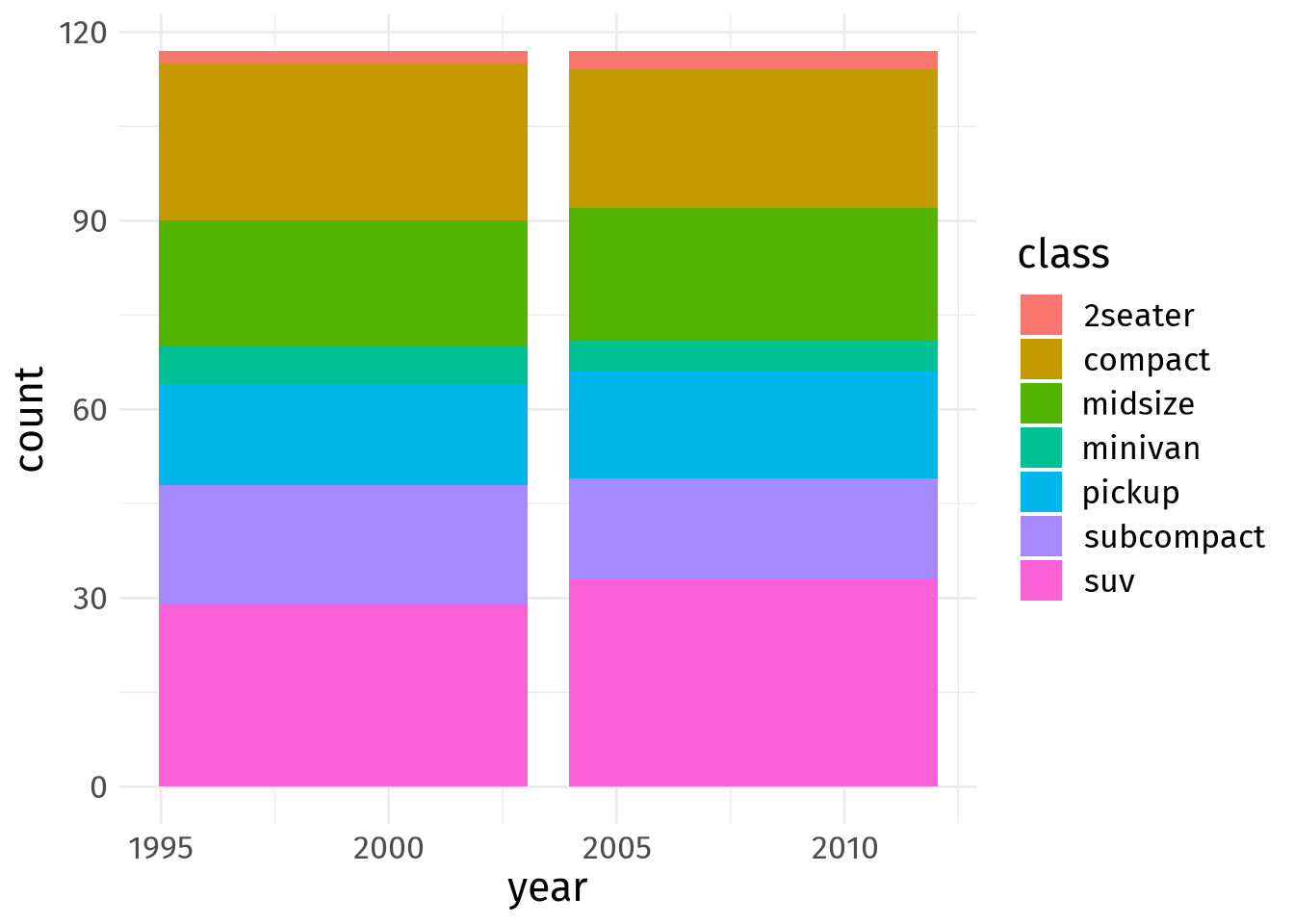
Alright, enough with the preliminaries. Let’s count how many different car classes are represented in the mpg dataset from the ggplot2 package. I am sure you have seen the data already when you read this ggplot post. So, no further comment on this data set.
Ugh, this is a colorful mess and sort of reminds me of the gnome rainbow puking gif. Let’s reduce the color load by sticking to only three colors. To differentiate between classes we will make some colors more transparent.
Thus, we need to create a new variable in our data set that lumps the classes into three groups (for the colors).
# Group classes into three groups (to reduce colors to 3)
dat <- mpg %>%
  mutate(
    year = factor(year),
    class_group = case_when(
      class %in% c('2seater', 'compact', 'midsize') ~ "grp1",
      class == 'minivan' ~ "grp2",
      T ~ "grp3"
    )
  )
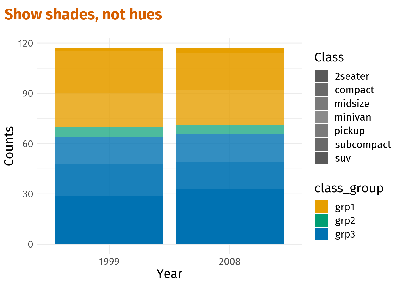
Now that this is done, we can map fill to our new class_group variable and the regular class variable to alpha.
shades_plt <- dat %>%
  ggplot(aes(x = year, fill = class_group, alpha = class)) +
  geom_bar() +
  labs(
    x = 'Year',
    y = 'Counts',
    alpha = 'Class',
    title = 'Show shades, not hues'
  )
shades_plt
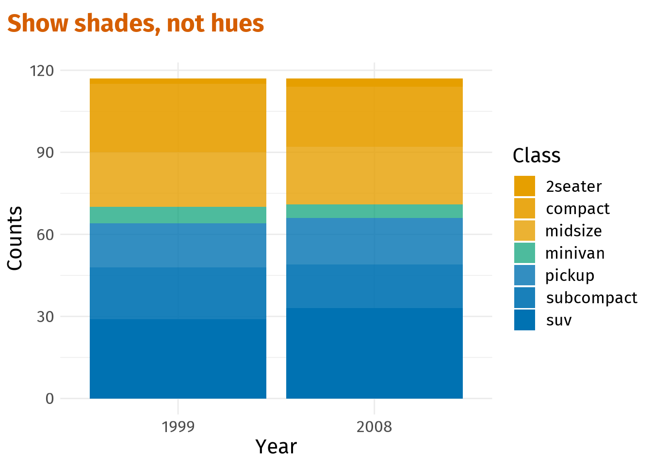
For better control of the visuals let us manually create and assign colors and the transparency levels.
# Color-blind safe colors
colors <-  thematic::okabe_ito(3)
# Possible levels of transparency (one for each class)
alpha_max <- 1
alpha_min <- 0.7
alpha_vals <- c(
  seq(alpha_max, alpha_min, length.out = 4),
  seq(alpha_min, alpha_max, length.out = 4)[-1]
)
alpha_vals
[1] 1.0 0.9 0.8 0.7 0.8 0.9 1.0# Tweak previous plot
shades_plt <- shades_plt +
scale_fill_manual(values = colors) +
scale_alpha_manual(values = alpha_vals)
shades_pltNext, let us consolidate the two legends into one. This can be done via guides(). Here, the fill guide will be set to guide_none() to get rid of the class_group legend.
Also, the alpha guide needs to be manually overwritten via override.aes in guide_legend() using the color codes that we saved in the vector colors. This way, the alpha legend will also depict the colors instead of only the transparency level.
Group categories together by color, but keep showing them
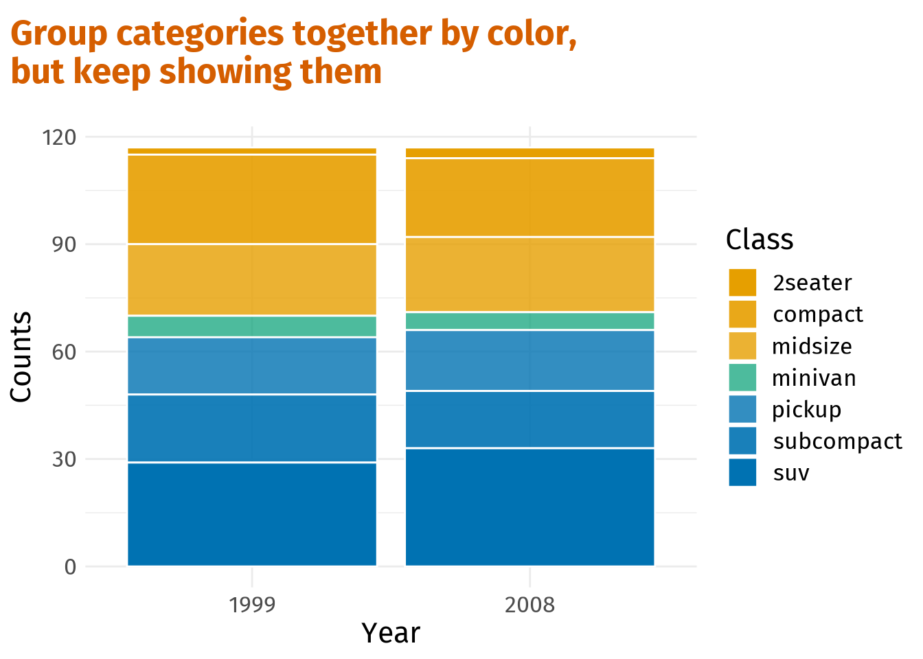
So, this already looks better. However, adjacent colored blocks now “merge” into each other. This can make it hard to differentiate between classes.
To overcome this issue, add lines between blocks. Luckily, this is spectacularly easy and done by setting the color aesthetic in geom_bar() to white. Here’s the complete code.
dat %>%
  ggplot(aes(x = year, fill = class_group, alpha = class)) +
  geom_bar(col = 'white') + # Add lines for distinction
  scale_fill_manual(values = colors) +
  scale_alpha_manual(values = alpha_vals) +
  guides(
    fill = guide_none(),
    alpha = guide_legend(override.aes = list(fill = colors[c(1, 1, 1, 2, 3, 3, 3)]))
  ) +
  labs(
    x = 'Year',
    y = 'Counts',
    alpha = 'Class',
    title = 'Group categories together by color, \nbut keep showing them'
  )
Emphasize just one or a few categories
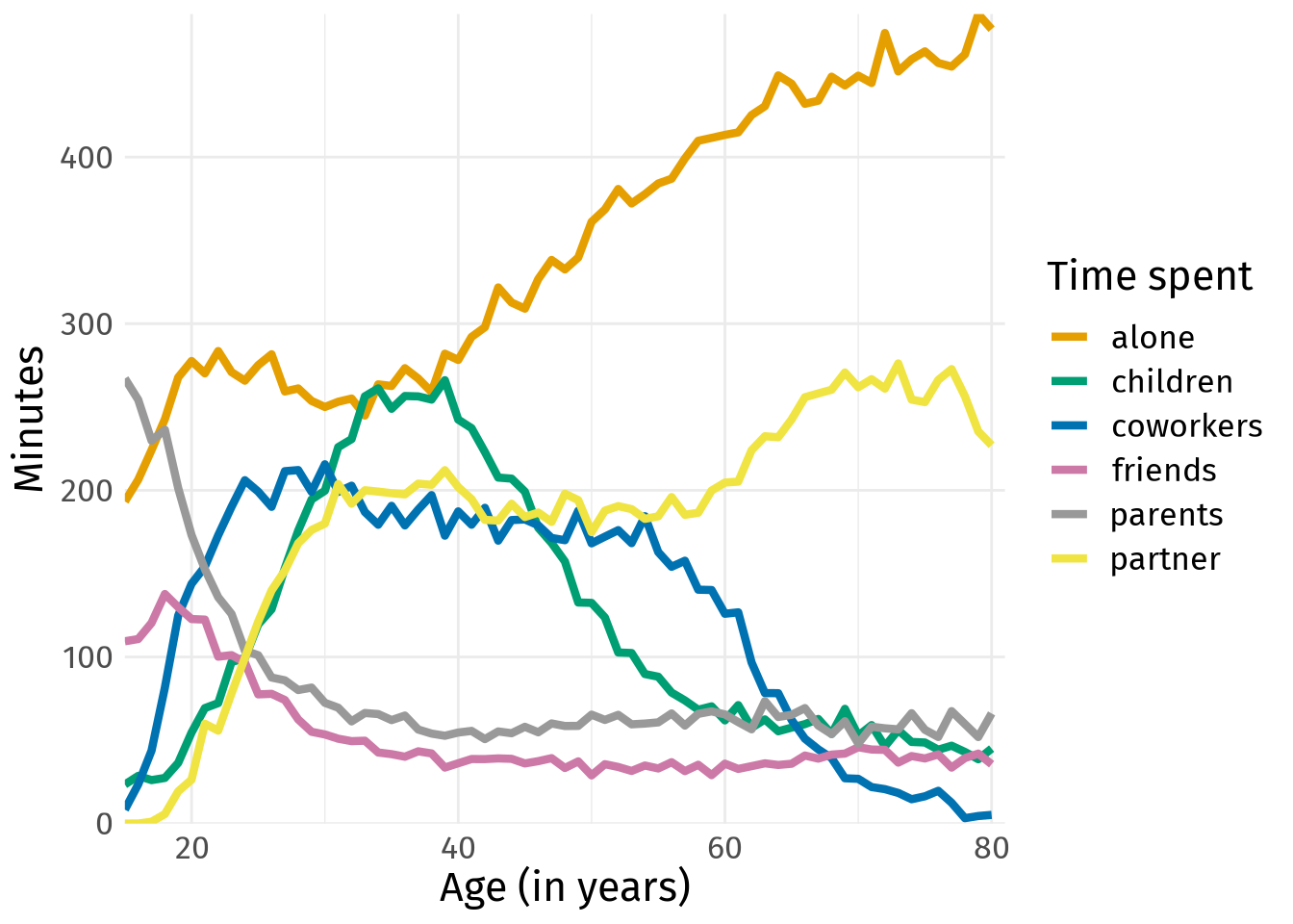
Next, let us switch tracks and look at some other kind of data. At Our World in Data you can find a lot of interesting data sets. One of these contains survey information on who Americans spend their time with (in average minutes per day by age). If you download this data set, you can create a plot like this.
# Some data wrangling
time_data <- read_csv("time-spent-with-relationships-by-age-us.csv") %>%
  rename_with(
    ~c('Entitity', 'Code', 'Age', 'alone', 'friends', 'children', 'parents',
       'partner', 'coworkers')
  ) %>%
  pivot_longer(
    cols = alone:coworkers,
    names_to = 'person',
    values_to = 'minutes'
  ) %>%
  janitor::clean_names() %>%
  filter(age <= 80)

# Color-blind safe colors
colors <- thematic::okabe_ito(8)[-6]

# Line plot
p <- time_data %>%
  ggplot(aes(x = age, y = minutes, col = person)) +
  geom_line(size = 1.5) +
  scale_color_manual(values = colors) +
  coord_cartesian(xlim = c(15, 81), expand = F) +
  scale_y_continuous(minor_breaks = NULL) +
  labs(x = 'Age (in years)', y = 'Minutes', col = 'Time spent')
p
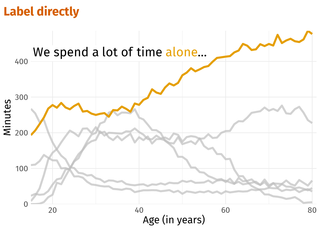
Once again, we created a plot with loads of color. If this were an interactive plot where we can focus on one line at a time, this would not necessarily be a problem. However, as it is, this is a rather messy spaghetti plot and extracting meaning from it is hard.
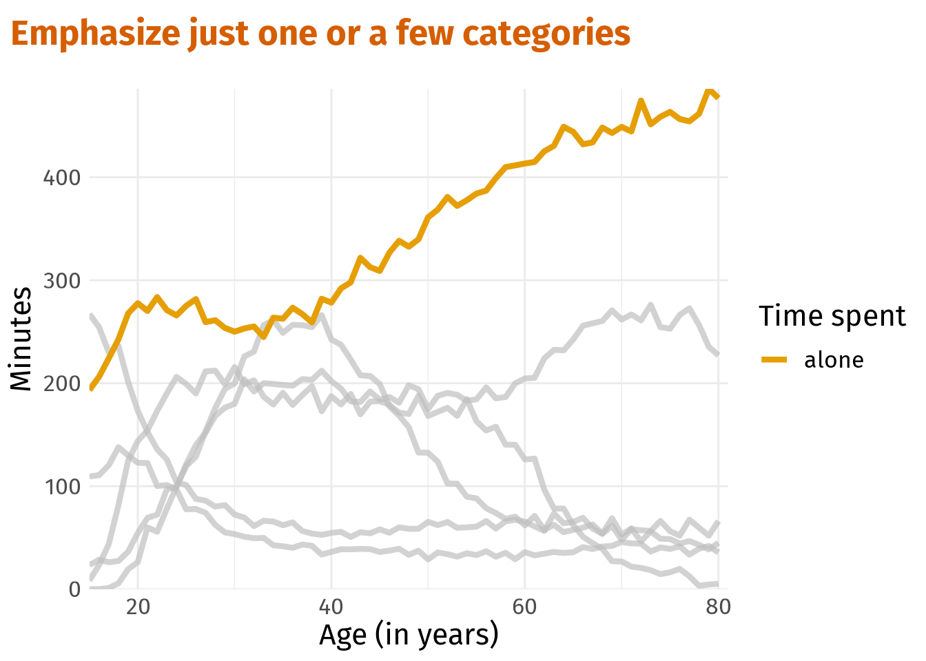
But if we know what story we want to tell, then we can save this plot by emphasizing only the important parts. This is where the gghighlight package shines. It works by adding a gghighlight() layer to an existing plot with conditions for filtering. All data points that do not fulfill these conditions are greyed out.
library(gghighlight)
alone_plt <- p +
  gghighlight(person == 'alone', use_direct_label = F) +
  labs(title = 'Emphasize just one or a few categories')
alone_plt
Finally, we are only one text annotation away from telling a story.
alone_plt +
  annotate(
    'text',
    x = 15,
    y = 455,
    label = 'We spend a lot of time alone...',
    hjust = 0,
    vjust = 0,
    family = 'firasans',
    size = 7
  )
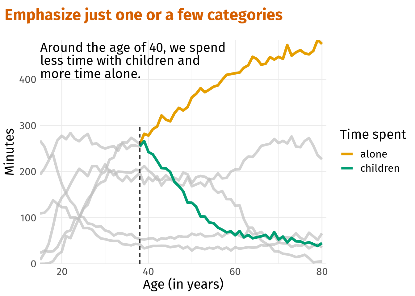
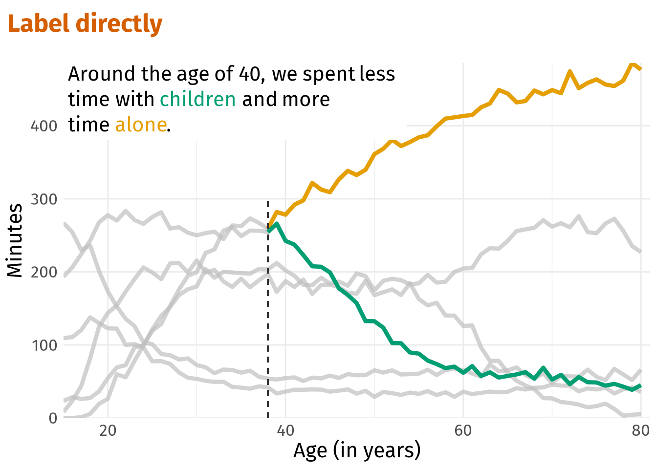
Of course, a data set may contain multiple stories that may also need multiple highlights. No problem. With gghighlight() we can combine as many conditions as we like.
age_40_plt <- p +
  gghighlight(
    person %in% c('alone', 'children'),
    age >= 38,
    use_direct_label = F
  ) +
  geom_segment(x = 38, xend = 38, y = -Inf, yend = 300, linetype = 2, col = 'grey20') +
  labs(title = 'Emphasize just one or a few categories')

age_40_plt +
  annotate(
    'text',
    x = 15,
    y = 403,
    label = 'Around the age of 40, we spend \nless time with children and \nmore time alone.',
    hjust = 0,
    vjust = 0,
    family = 'firasans',
    lineheight = 0.85,
    size = 5.5
  )
Label directly
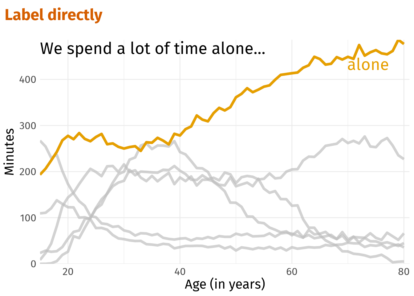
In all previous plots, we displayed a legend at the side of the plot. However, this requires quite a large amount of space which we can save by direct labeling (either with annotate() for a single label or geom_text() for multiple labels).
alone_plt +
  annotate(
    'text',
    x = 15,
    y = 455,
    label = 'We spend a lot of time alone...',
    hjust = 0,
    vjust = 0,
    family = 'firasans',
    size = 7
  ) +
  annotate(
    'text',
    x = 70,
    y = 420,
    label = 'alone',
    hjust = 0,
    vjust = 0,
    size = 7,
    family = 'firasans',
    color = colors[1]
  ) +
  labs(title = 'Label directly') +
  theme(legend.position = 'none')
This way, we save a lot of space and can give the remaining part of the plot more room. Also, this saves the reader some cognitive effort because one does not have to switch back and forth between legend and actual plot.
In this particular case, there is another option for direct labelling. Notice how close the word ‘alone’ from the original text annotation is to the highlighted line anyway. Therefore, we may as well save us one additional annotation and colorize a single word in the orginal annotation.
To do so, the ggtext package and a bit of HTML magic will help us. Basically, what we need is to change the annotation from text geom to richtext geom and create a string that contains the HTML-code for colored text. Here that is <span style = 'color:#E69F00;'>...</span>.
library(ggtext)
color_alone <- glue::glue(
  "We spend a lot of time <span style = 'color:{colors[1]};'>alone</span>..."
)
color_alone
We spend a lot of time <span style = 'color:#E69F00;'>alone</span>...alone_plt +
labs(title = 'Label directly') +
annotate(
'richtext',
x = 15,
y = 400,
label = color_alone,
hjust = 0,
vjust = 0,
family = 'firasans',
size = 7,
label.color = NA
) +
theme(legend.position = 'none')Naturally, we can do this for our second highlighted plot as well. In this case, the colored key words are not adjacent to the actual lines.
age_40_text <- glue::glue(
  "Around the age of 40, we spent less <br> time with
  <span style = 'color:{colors[2]};'>children</span>
  and more <br> time <span style = 'color:{colors[1]};'>alone</span>."
)

age_40_plt +
  labs(title = 'Label directly') +
  annotate(
    'richtext',
    x = 15,
    y = 380,
    label = age_40_text,
    hjust = 0,
    vjust = 0,
    family = 'firasans',
    lineheight = 1.25,
    size = 5.5,
    label.color = NA
  ) +
  theme(legend.position = 'none')
Consequently, the reader may have to go back and forth between text and lines again but still we used our space more efficiently. So, I will let this count as direct labeling.
Finally, let us come full circle and return to our initial bar plot. This one could also use some direct labels. Normally, I would simply add a geom_text() layer together with position_stack() to the initial plot as described here.
But for some magical reason, this did not align the labels properly and it was driving me crazy. Therefore, I counted the car classes and computed the label positions manually.
manual_counts <- mpg %>%
  count(year, class) %>%
  mutate(
    year = factor(year),
    class_group = case_when(
      class %in% c('2seater', 'compact', 'midsize') ~ "grp1",
      class == 'minivan' ~ "grp2",
      T ~ "grp3"
    )
  )

labels <- manual_counts %>%
  mutate(class = factor(class)) %>%
  group_by(year) %>%
  arrange(year, desc(class)) %>%
  mutate(
    csum = cumsum(n),
    n = (lag(csum, default = 0) + csum) / 2
  )
But once this small detour is overcome, we can label the plot in the same manner as before. Unfortunately, the 2seater class is so small that the label wouldn’t fit into the box. Therefore, I decided to plot the label on top.
manual_counts %>%
  ggplot(aes(x = year, y = n, fill = class_group)) +
  geom_col(aes(alpha = class), col = 'white') +
  scale_fill_manual(values = colors) +
  scale_alpha_manual(values = alpha_vals) +
  labs(
    x = 'Year',
    y = 'Counts',
    alpha = 'Class',
    title = 'Label directly'
  ) +
  # Add all but one label
  geom_text(
    data = labels %>% filter(class != '2seater'),
    aes(label = class),
    col = 'white',
    family = 'firasans',
    size = 5,
    fontface = 'bold'
  ) +
  # Add 2seater label
  geom_text(
    data = labels %>% filter(class == '2seater'),
    aes(y = n + 3, label = class),
    col = 'black',
    family = 'firasans',
    size = 5,
    fontface = 'bold'
  ) +
  theme(legend.position = 'none')
Closing remarks
The blog post that inspired this post contains a few more tips like using other indicators than color and you should definitely check it out. Also, Lisa Muth apparently writes a book on colors in data visualizations and documents her thoughts here. If you look for more content on colors, this might be a fountain of information.
As for using patterns instead of colors, I recently wrote a blog post that leverages the ggpattern package to do just that. Check it out here. And as always, if you don’t want to miss new blog post, either follow me on Twitter or via my RSS feed.
