Recreating the Storytelling with Data look with ggplot
Visualization
We try to imitate the Storytelling with Data look with ggplot
Author
Albert Rapp
Published
March 29, 2022
Nowadays, it’s easy to whip together a dataviz. But creating a great dataviz takes time. Especially, if you want to tell a story with your data.
But telling a story doesn’t have to be super hard. There are quite a few tricks that can help you. This great video from Storytelling with Data (SWD) shows you many of these. In this blog post, I’ll walk you through these tricks using ggplot2. Let’s start by looking at our data.
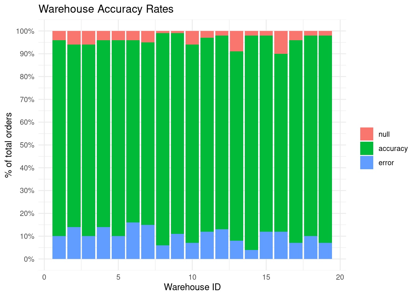
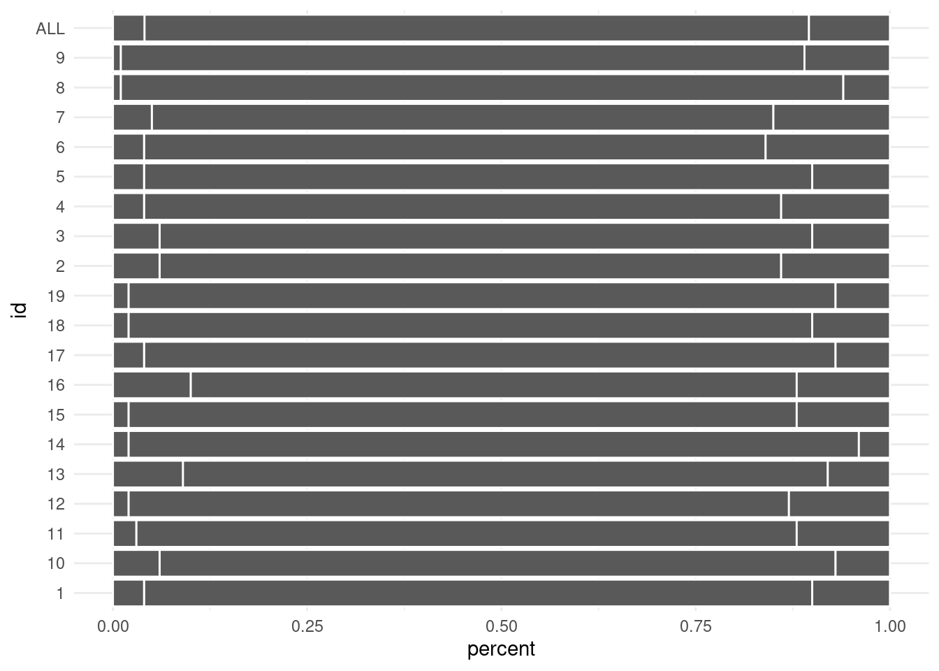
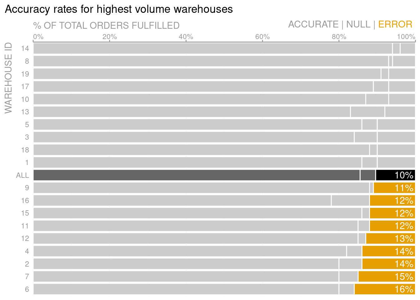
This data set contains a lot of accuracy and error rates from different (anonymous) warehouses. Additionally, there are “null rates”. These are likely related to data quality issues. Furthermore, this data set is apparently taken from a client the SWD team helped.
In any case, here is a ggplot2 recreation of the client’s initial plot. Note that the plot does not exactly match the original but it’s close enough to get the gist.
theme_set(theme_minimal())dat_long <- dat %>%pivot_longer(cols = accuracy:null,names_to ='type',values_to ='percent' )dat_long %>%ggplot(aes(id, percent, fill =factor(type, levels =c('null', 'accuracy', 'error')))) +geom_col() +labs(title ='Warehouse Accuracy Rates',x ='Warehouse ID',y ='% of total orders',fill =element_blank() ) +scale_y_continuous(labels =~scales::percent(., accuracy =1), breaks =seq(0, 1, 0.1))
As it is right know, the plot shows data. But what is the message of this dataviz? To make the message more explicit, the plot is transformed during the course of the video. Take a look at what story the exact same data can tell.
From reading the SWD book I know that some of the techniques that were used in this picture can be used in many settings. Again, this blog post is a documentation of how to do these steps with ggplot.
I tried to make this documentation as accessible as possible. Consequently, if you are already quite familiar with how to customize a ggplot’s details, then some of the explanations or references may be superfluous. Feel free to skip them.
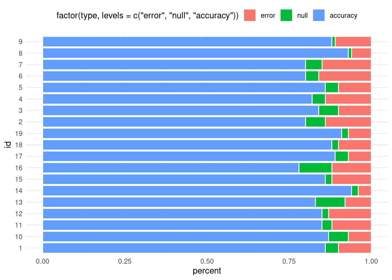
Flip the axes for long names
Although it is not really an issue here, warehouses or other places might be more identifiable by a (long) name rather than an ID. To make sure that these names are legible, show them on the y-axes.
When I first learned ggplot, there was the layer coord_flip() to do that job for us. Nowadays, though, you can often avoid coord_flip() because a lot of geoms already understand what you mean, when you map categorical data to the y-aesthetic. But make sure that ggplot will know that you mean categorical data (especially if the labels are numerical like here).
categorial_dat <- dat_long %>%mutate(id =as.character(id), )categorial_dat %>%ggplot(aes(x = percent, y = id)) +geom_col(aes(fill =factor(type, levels =c('error', 'null', 'accuracy'))),col ='white', # set color to distinguish bars better ) +theme(legend.position ='top') # temporarily move legend to top
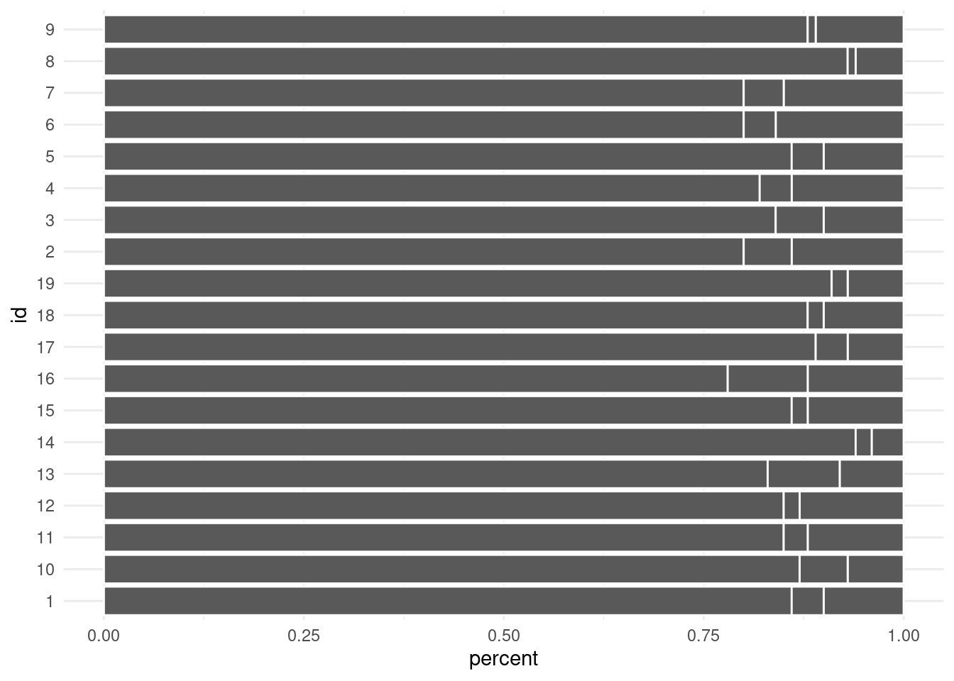
Start with grey
A good rule of thumb is to start with grey. So remove the colors by using the group- instead of fill-aesthetic. In general, it is a good idea to avoid excessive use of colors. Instead, use colors to emphasize parts of your story.
categorial_dat %>%ggplot(aes(x = percent, y = id)) +geom_col(aes(group =factor(type, levels =c('error', 'null', 'accuracy'))),col ='white', # set color to distinguish bars better )
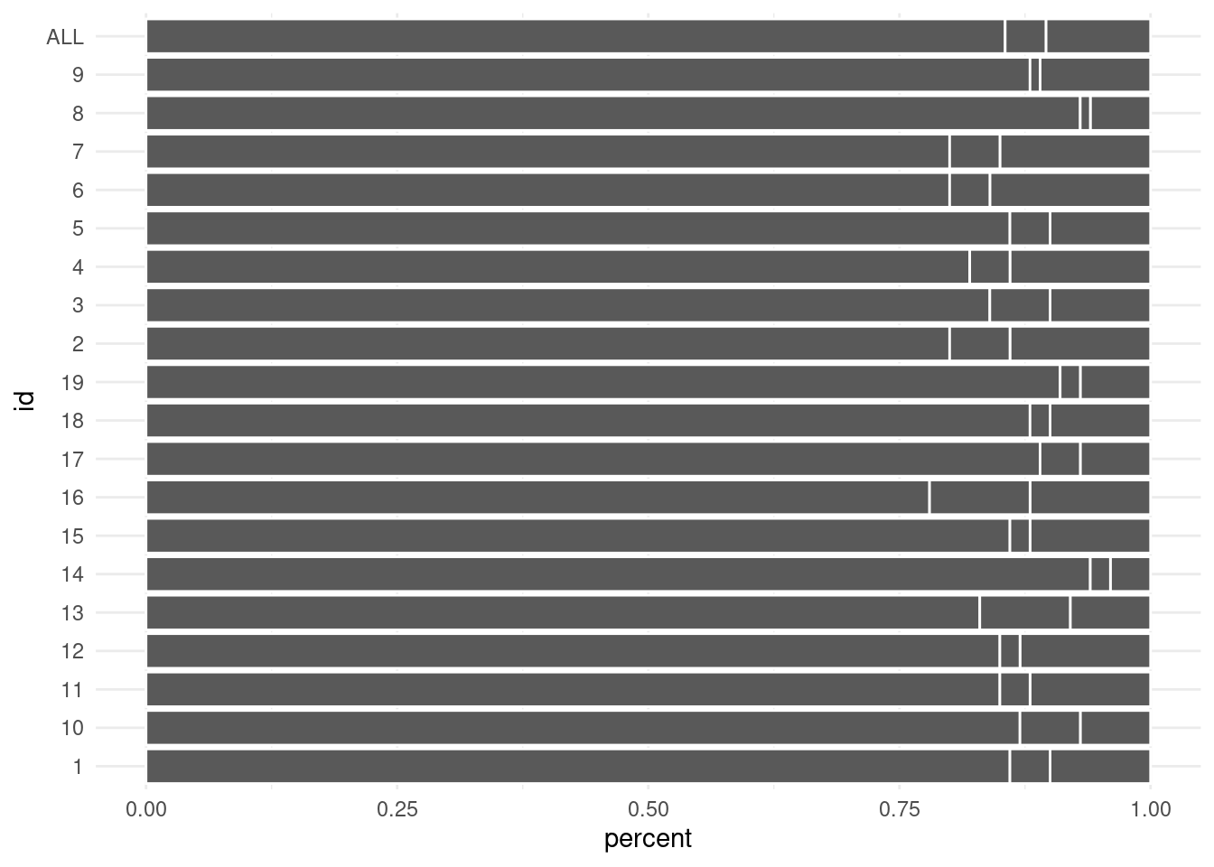
Add reference points
Another good idea it to put your data into perspective. To do so, include a reference point. This can be a summary statistic like the average error rate. For another great demonstration of reference points you can also check out the evolution of a ggplot by Cédric Scherer.
To help your reader to get a quick overview, put your data into some form of sensible ordering. This eases the burden of having to make sense of what the visual shows.
Notice that we already did part of that. See, with the order of the levels in the group aesthetic, we influenced the ordering of the stacked bars. Here, we made sure that important quantities start at the left resp. right edges.
Why is that helpful, you ask? Well, the bars that start on the left all start at the same vertical line. Therefore, comparisons are quite easy for these bars. The same holds true for the bars that start on right.
Consequently, it is best that we reserve these vip seats for the important data. Check out what happens if I were to put the accuracy in the middle.
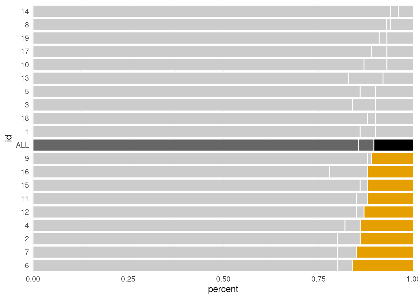
Now, we can’t really make out which warehouses have a higher accuracy. Given that the accuracy is likely something we care about, this is bad. But we can change the order even more. For instance, we can also order the bars by error rate. Here, fct_reorder() is our friend.
Next, it’s time to highlight your story points. This can be done with the gghighlight as I have demonstrated in another blog post. Alternatively, we can set the colors manually.
The latter approach gave me the best results in this case, so we’ll go with that. But I am still a big fan of gghighlight, so don’t discard its power just yet.
# Set colors as variable for easy change laterunhighlighted_color <-'grey80'highlighted_color <-'#E69F00'avg_error <-'black'avg_rest <-'grey40'# Compute new column with colors of each barcolored_dat <- ordered_dat %>%mutate(custom_colors =case_when( id =='ALL'& type =='error'~ avg_error, id =='ALL'~ avg_rest, type =='error'& percent >0.1~ highlighted_color, T ~ unhighlighted_color ) )p <- colored_dat %>%ggplot(aes(x = percent, y = id)) +geom_col(aes(group = type),col ='white',fill = colored_dat$custom_colors # Set colors manually )p
Notice how your eyes are immediately drawn to the intended region. That’s the power of colors! Also, note that setting the colors manually like this worked because fill in geom_col() is vectorized. This is not always the case. In these instances, you may find that functional programming solves your problem.
Remove axes expansion and allow drawing outside of grid
Did you notice that there is still some clutter in the plot? Removing that is a central element of the SWD look. Personally, I like this approach. So, let’s get down to the essentials and remove what’s not needed.
In this case, there are still (faint) horizontal lines behind each bar. Furthermore, this causes the warehouse IDs to be slightly removed from the bars. We change that through formatting the coordinate system with coord_cartesian().
p <- p +coord_cartesian(xlim =c(0, 1), ylim =c(0.5, 20.5), expand = F, # removes white spaces at edge of plotclip ='off'# allows drawing outside of panel )p
Here, we turned off the expansion to avoid wasting white space. Now, the IDs are at their designated place.
If you want even more power on the space expansion you can leave expand = T and modify the expansion for each axis with scale_*_continuous() and the expansion() function. Check out Christian Burkhart’s neat cheatsheet that teaches you everything you need to understand expansions.
On an unrelated note, you may wonder why I set clip = 'off'. This little secret will be revealed soon. For now, just know that it allows you to draw geoms outside the regular panel.
Move and format axes
In the finished plot, you may have noticed that the x-axis is at the top and not at the bottom. While that is unusual, it helps the reader to get straight to the point as the data is seen earlier. This assumes that the eyes of a typical dataviz reader will first look at the top left corner and then zigzag downwards.
In ggplot2, moving the axes and setting the break points happens in a scale layer. Also, it is here where we use the scales::percent() function to transform the axes labels. Additionally, changing labels happens in labs() and the remaining axes and text changes happen in theme().
Notice that we have customized the theme elements via element_*() functions. Basically, each geom type like “line”, “rect”, “text”, etc. has their own element_*() function. The theme() function expects attributes to be changed using these. If you are unfamiliar with this concept, maybe my YARDS lecture notes can help you.
Align labels
Aligning plot elements (like labels) to form clean lines is another major aspect of the SWD look. Before I read about it, I did not even notice it but once you see it you cannot go back.
Basically, plots feel “more harmonious” if there are clear (not necessarily drawn) lines like with the left and right edge of the stacked bars. But this concept does not stop with the bars and can be used for the labels too. Let’s demonstrate that by moving the labels with more of theme().
p <- p +theme(axis.title.x =element_text(hjust =0),axis.title.y =element_text(hjust =1),plot.title.position ='plot'# aligns the title to the whole plot and not the (inner) panel )p
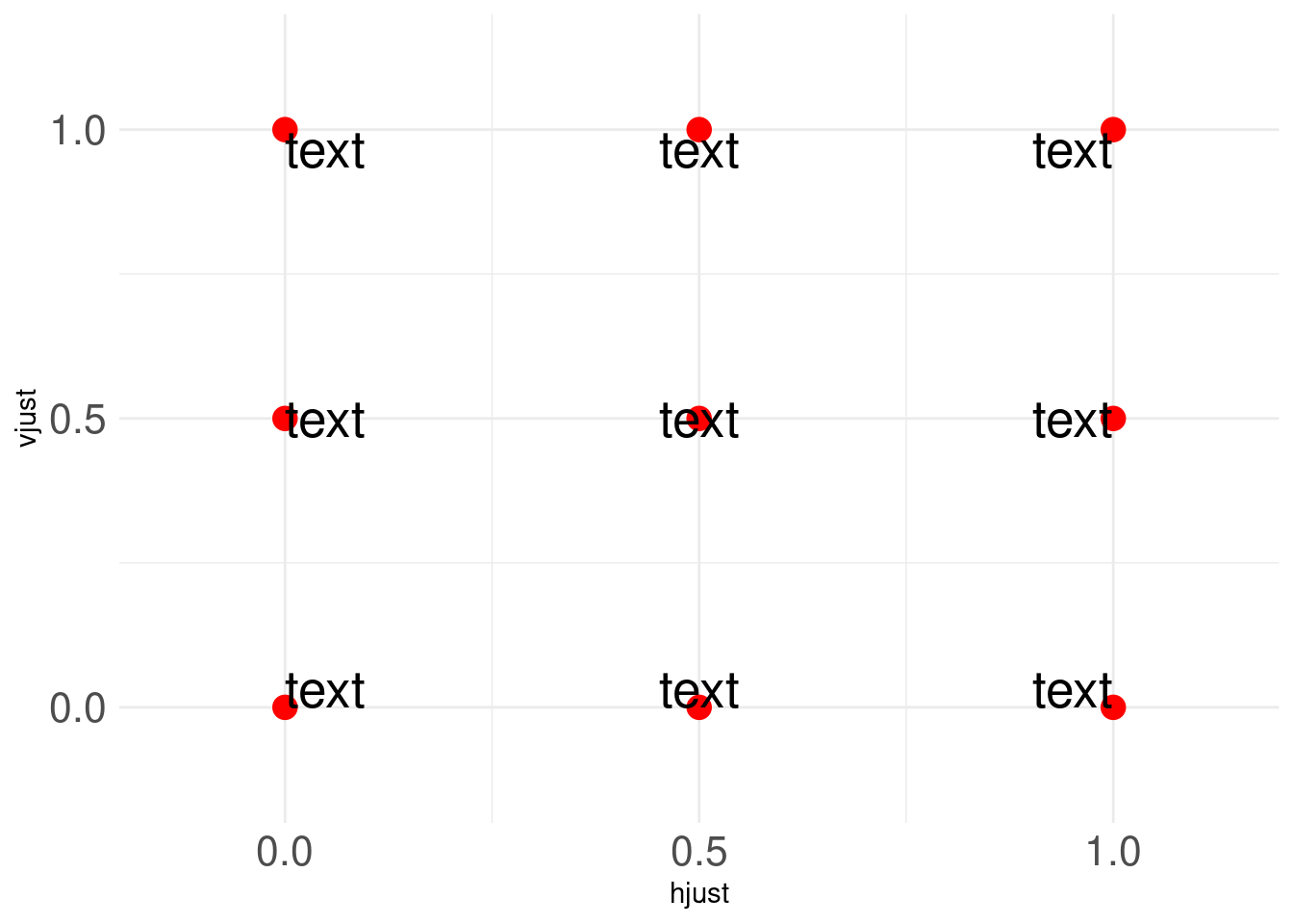
Once again, the design enforces that important information is in the top left corner. This was done by changing hjust. In this case hjust = 0 corresponds to left-justified whereas hjust = 1 corresponds to right-justified.
Of course, vjust works similarly. For more details w.r.t. hjust and vjust, check out this stackoverflow answer that gives you everything you need in one visual. For your convenience, here is a slightly changed form of that visual.
Once you start aligning the axes titles, you notice that the 0% and 100% labels fall outside the grid. We could try to set hjust of axis.text.x in theme() but sadly this is not vectorized. Subsequently, all hjust values must be the same. That’s not bueno.
Therefore, I drew the axes labels manually with annotate() but make sure that you remove the current labels with scale_x_continuous(). Now you know why we had to set clip = 'off' earlier: The axes labels are outside of the regular panel.
p <- p +# Overwriting previous scale will generate a warning but that's okscale_x_continuous(breaks =seq(0, 1, 0.2), # We still want the axes tickslabels =rep('', 6), # Empty strings as labelsposition ='top' ) +annotate('text',x =seq(0, 1, 0.2),y =20.75,label = scales::percent(seq(0, 1, 0.2), accuracy =1),size =3,hjust =c(0, rep(0.5, 4), 1),# individual hjust herevjust =0, col = unhighlighed_col_darker ) +theme(axis.title.x =element_text(hjust =0, vjust =0)# change vjust to avoid overplotting )p
Add text labels
The same trick can be used to add the category description (accuracy, null, error) to the top right corner. To label the highlighted bars, we simply extract the corresponding rows from our data and use that in conjunction with geom_text().
Notice that I used a hjust value greater than 1 to add some white space on the right side of the labels. Otherwise, the percent sign will be too close to the bar’s edge.
Next, add the category descriptions. This is a bit tricky because we want to highlight a single word too, So, we will annotate using richtext geom as described in my previous blog post.
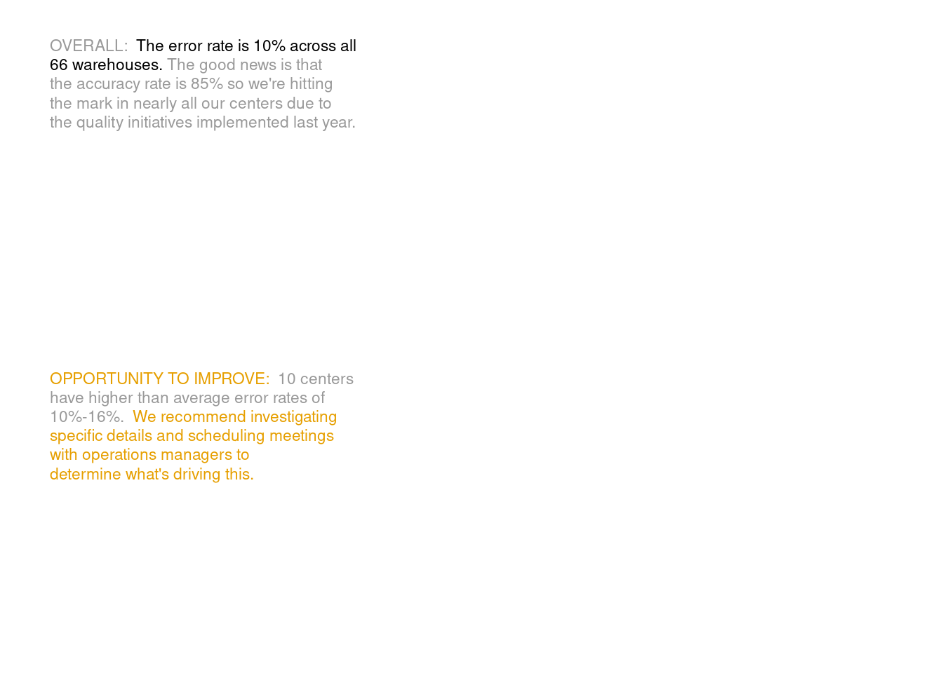
Now that the bar plot is finished we can work on the story text. For that, create another plot that contains only the text. Later on, we will combine both of our plots with the patchwork package. There are no new techniques here, so let’s get straight to the code.
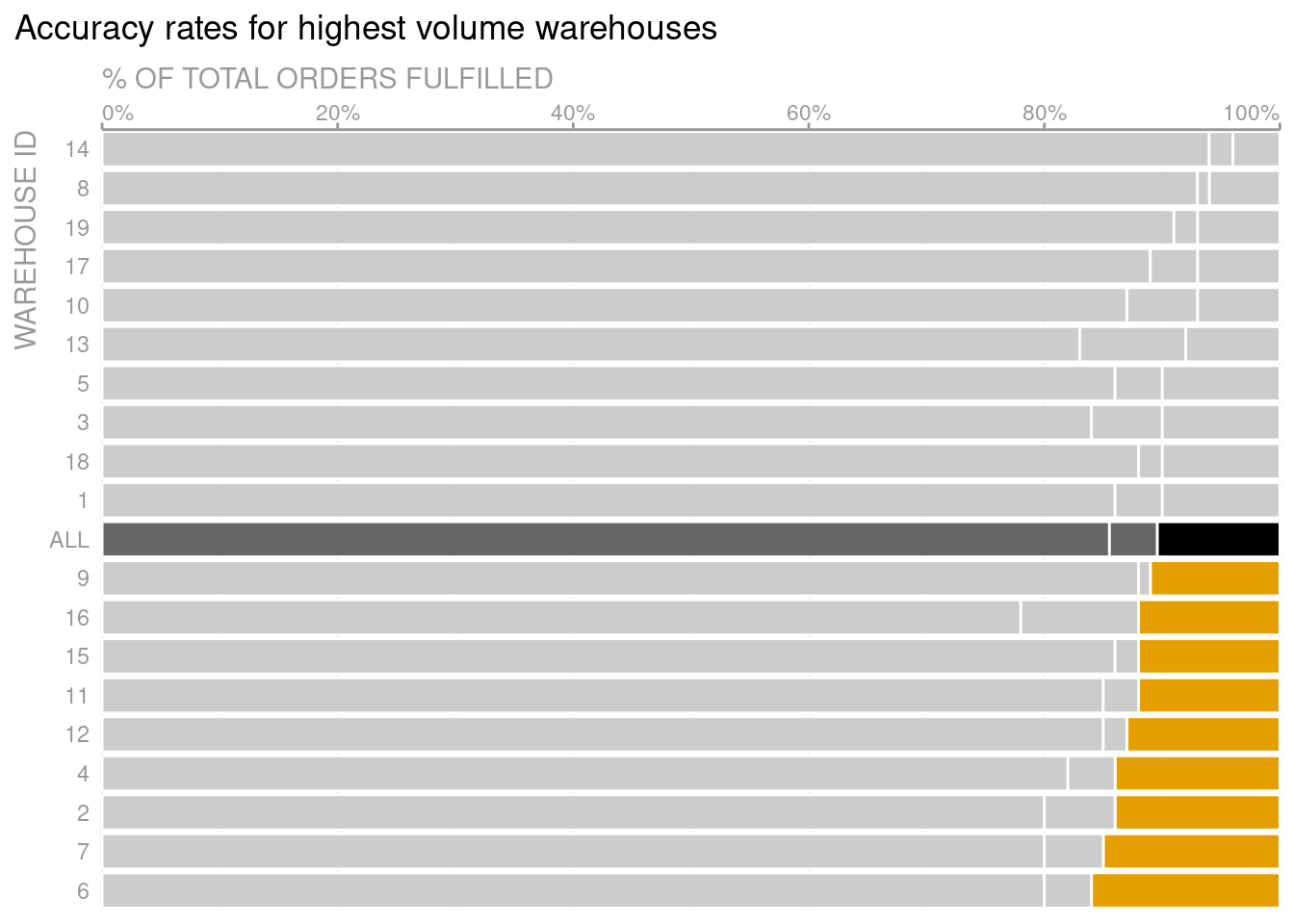
# Save text data in a tibbletib_summary_text <-tibble(x =0, y =c(1.65, 0.5), label =c("<span style = 'color:grey60'>OVERALL:</span> **The error rate is 10% across all<br>66 warehouses**. <span style = 'color:grey60'>The good news is that<br>the accuracy rate is 85% so we\'re hitting<br>the mark in nearly all our centers due to<br>the quality initiatives implemented last year.</span>","<span style = 'color:#E69F00'>OPPORTUNITY TO IMPROVE:</span> <span style = 'color:grey60'>10 centers<br>have higher than average error rates of<br>10%-16%.</span> <span style = 'color:#E69F00'>We recommend investigating<br>specific details and **scheduling meetings<br>with operations managers to<br>determine what's driving this.**</span>" ))# Create text plot with geom_richtext() and theme_void()text_plot <- tib_summary_text %>%ggplot() +geom_richtext(aes(x, y, label = label),size =3,hjust =0,vjust =0,label.colour =NA ) +coord_cartesian(xlim =c(0, 1), ylim =c(0, 2), clip ='off') +# clip = 'off' is important for putting it together later.theme_void()text_plot
Add main message as new title and subtitle
As I said before, we will put the two plots together with patchwork. If you have never dealt with patchwork, feel free to check out my short intro to patchwork.
Putting the plots together gives us another opportunity: We can now specify additional titles and subtitles of the whole plot. Use these to add the main message of your plot.
But make sure that there is enough white space around them by setting the title margins in theme(). Otherwise, your plot will feel “too full”.
Adding spacing is achieved by means of the margin() function in element_text(). Though, in this case we use element_markdown() which works exactly the same but enables Markdown syntax (like using asterisks for bold texts.)
# Save texts as variables for better code legibility# Here I used Markdown syntax# To enable its rendering, use element_markdown() in themetitle_text <-"**Action needed:** 10 warehouses have <span style = 'color:#E69F00'>high error rates</span>"subtitle_text <-"<span style = 'color:#E69F00'>DISCUSS:</span> what are <span style = 'color:#E69F00'>**next steps to improve errors**</span> at highest volume warehouses?<br><span style = 'font-size:10pt;color:grey60'>The subset of centers shown (19 out of 66) have the highest volume of orders fulfilled</span>"caption_text <-"SOURCE: ProTip Dashboard as of Q4/2021. See file xxx for additional context on remaining 47 warehouses<br><span style = 'font-size:6pt;color:grey60'>Original: Storytelling with Data - improve this graph! exercise | {ggplot2} remake by Albert Rapp (@rappa753)."# Compose plotlibrary(patchwork)p + text_plot +# Make text plot narrowerplot_layout(widths =c(0.6, 0.4)) +# Add main message via title and subtitleplot_annotation(title = title_text,subtitle = subtitle_text,caption = caption_text,theme =theme(plot.title =element_markdown(margin =margin(b =0.4, unit ='cm'),# 0.4cm margin at bottom of titlesize =16 ),plot.subtitle =element_markdown(margin =margin(b =0.4, unit ='cm'),# 0.4cm margin at bottom of titlesize =11.5 ),plot.caption.position ='plot',plot.caption =element_markdown(hjust =0, size =7, colour = unhighlighed_col_darker, lineheight =1.25 ),plot.background =element_rect(fill ='white', colour =NA)# This is only a trick to make sure that background really is white# Otherwise, some browsers or photo apps will apply a dark mode ) )
Get the sizes right
In the last plot, I cheated. I gave you the correct code I used to generate the picture. But I did not execute it. Instead, I only displayed the code and then showed you the (imported) picture from the start of this blog post. Why did I do this? Because getting the sizes right sucks!
If you’ve dealt with ggplot before, then you will know that text sizes are often set in absolute rather than in relative terms. Therefore, if you make the bar plot smaller in width (like we did), then the bars may be appropriately scaled to the new width. But more often than not, the texts are not scaled. In this case, this led to way too large fonts as beautifully demonstrated in Christophe Nicault’s helpful blog post.
So, how do you avoid this? First off, choose size and fonts last (choose the font first, though). This will save you a lot of repetitive work when you change the alignment in your plot. But this tip will only get you so far, because you have to fix some sizes in between to get a feeling for the visualization you are trying to create.
Therefore, try to get your canvas into an appropriate size first. I try to do this by using the camcorder package at the start of my visualization process. This will ensure that my plots are saved as a png-file with predetermined dimensions. Afterwards, the resulting file is displayed in the Viewer pane in RStudio (as opposed to the Plots pane).
For example, at the start of working on this visualization I called
camcorder::gg_record(dir ='img', dpi =300, width =16, height =9, units ='cm')
This made getting the sizes right output somewhat easier because the canvas size remains the same throughout the process. Though be sure to call gg_record()afterlibrary(ggtext) or make sure that you call gg_record() again if you add ggtext only later. Otherwise, your plots will revert back to being displayed in the Plots pane (with relative sizing).
Finally, if you want to use camcorder in conjunction with showtext, then be sure to instruct showtext with the dpi value you chose when calling gg_record().
showtext::showtext_opts(dpi =300)
Alright, that concludes this somewhat long blog post. I hope that you enjoyed it and learned something valuable. If you did, feel free to leave a comment.
This in-depth video course teaches you everything you need to know about becoming better & more efficient at cleaning up messy data. This includes Excel & JSON files, text data and working with times & dates. If you want to get better at data cleaning, check out the course page.
Insightful Data Visualizations for "Uncreative" R Users
This video course teaches you how to leverage {ggplot2} to make charts that communicate effectively without being a design expert. Course information can be found on the course page.