5 hidden gems from gg-packages to level up your dataviz game
Visualization
This blog post is a quick one. It highlights a few hidden gems (functions) from well-known or not so well-known packages.
Author
Albert Rapp
Published
July 27, 2022
There are incredibly many gg-packages that extend the power of {ggplot2}. Many of these packages fulfill specific purposes. And to achieve their goals, most packages contain helper functions that act in the background. Thus, the helpers get no spotlight. This is unfortunate because some of them are superb.
That’s why we’ll do things differently today! Today is about those amazing helper functions that deserve to be in the spotlight. I call these functions hidden gems. Let’s go!
Bump charts
The {ggbump} package is designed to create bump charts (bump is a funny sound. Try saying it). This type of chart is especially useful to show rankings over time. On Twitter, you can find many of these. Here’s one from Stephan Teodosescu.
For week 28 of #TidyTuesday I looked at flights ✈️ by country in Europe.
I wanted to use the patchwork package to combine a plot of the top ranked European countries (inspired by @rappa753's viz) and seasonality of flights.
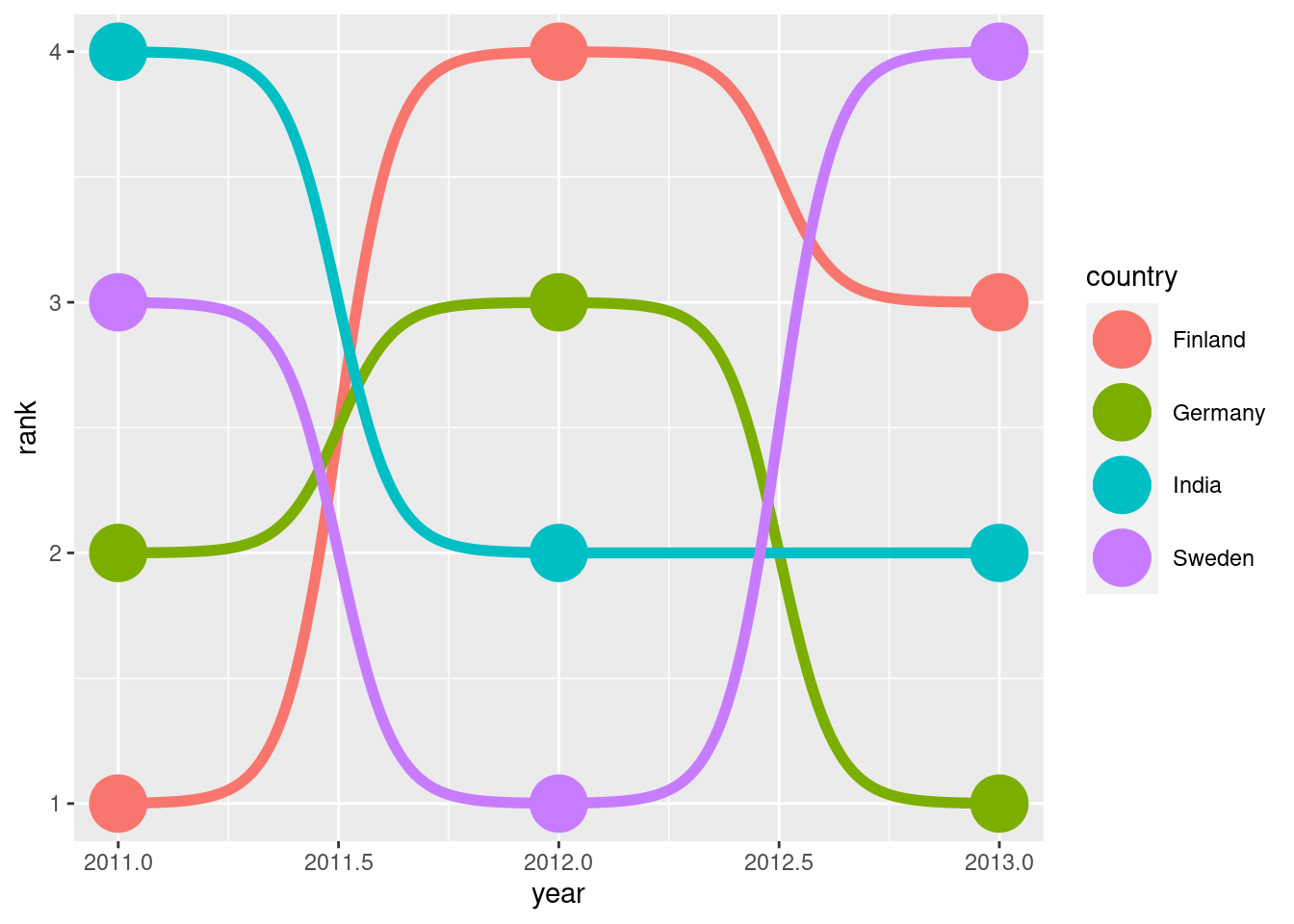
If you take a look at Stephan’s code, you will notice that it uses {ggbump}. And if you look even closer, you will notice that most of the heavy lifting (after computing the ranking) is done by geom_bump(). So, geom_bump() is the star of this package. And it’s really easy to use. Here’s an example from its docs.
library(ggplot2)df <-data.frame(country =c("India", "India", "India","Sweden", "Sweden", "Sweden","Germany", "Germany", "Germany","Finland", "Finland", "Finland"),year =c(2011, 2012, 2013,2011, 2012, 2013,2011, 2012, 2013,2011, 2012, 2013),rank =c(4, 2, 2, 3, 1, 4, 2, 3, 1, 1, 4, 3))# USE THE DEV VERSION FROM GITHUB# INSTALL WITH devtools::install_github("davidsjoberg/ggbump")ggplot(df, aes(year, rank, color = country)) +geom_point(size =10) + ggbump::geom_bump(size =2)
Bonus for bump charts: You can spice up your visual with images. Leverage {ggflags} to plot flags instead of points. Here’s an example of that (with code in thread) from Rosie Griffiths.
— Dr. Rosie Griffiths (@Rosie_Griffiths) July 20, 2022
But let’s not waste any more time talking about the star of the package. Today is about the underrated helpers. In this case, that award goes to geom_sigmoid().
This function gives you the bumps of the bump charts. And their smoothness looks oddly satisfying. Check out how Georgios Karamanis used them for a stunning visual.
For this week's #TidyTuesday I plotted the arrivals to Greek airports in 2022 compared to 2019.
So this function packs a punch on its own. That’s hidden gem material right there. But wait! There is more.
Digging down even further, notice that geom_sigmoid() uses another helper called sigmoid(). This is the exact same function that I used to build a ribbon bump chart. You may have seen it on Twitter.
As always, there's a #rstats package for every occasion.
🔀 With {ggbump}, bump charts (for rankings) are easily created. 👷🏽 With a little bit of work, one can transform them to ribbon bump charts.
The crucial part in this visual’s code has been computing the points of the the sigmoidal curves between rectangles. After that, it’s a piece of cake. Good ol’ geom_ribbon() can handle the rest for us.
To compute the points, sigmoid() was invaluable. All it needs are the start and end coordinates via x_from, x_to, y_from and y_to. Here’s the crucial step in my code (line 8). Note that I have used a bit of functional programming magic to compute the curves for each year.
lower_bounds <- state_data %>%select(year, percentage_flights_lower) %>%mutate(## Coordinates of left resp. right corner of rectanglesx_from = year + bar_width, x_to = year +1- bar_width,y_from = percentage_flights_lower + margin_between_ribbons,y_to =c(percentage_flights_lower[-1], percentage_flights_lower[7]) + margin_between_ribbons,## Compute sigmoidal function for each yearsigmoid =pmap(list(x_from, x_to, y_from, y_to), sigmoid, n = n_points, smooth =8) )
Chicklet charts
Another great package is {ggchicklet}. Its main purpose is to generate chicklet charts. You can think of them as stacked rounded bar charts. Here’s a great example from Dan Oehm.
A lot of things to look at regarding technology adoption. Chose to take a quick look at Aus electricity production by type. Our reliance on fossil fuels is embarrassing but hopeful with the new govt…#rstats#dataviz#DataVisualizationpic.twitter.com/x5YcCOP2Yr
But this is not the only great thing {ggchicklet} can do. Otherwise, why would we talk about it here? With {ggchicklet} you can also generate arbitrary rounded rectangles (not necessarily stacked ones). You just need to access ggchicklet:::geom_rrect() (three dots! This is really HIDDEN).
It works just like ggplot2::geom_rect() but add another aesthetic to include the radius r of the corners. You can find an in-depth explanation in one of my old blog posts. Or you can find a summary in the following thread.
By itself, a standard #ggplot2 output can rarely convince anyone.
You need a story to communicate your message. And for effective storytelling, your plot has to be customized.
Originally, {camcorder} is intended to be used for recording a data viz process. Basically, you can record all of your intermediate plots with camcorder::gg_record(). Afterwards, you can you can generate a gif from these recordings (also an in-built feature). For example, you can find a gif on the creation Georgios Karamanis’ earlier plot on Twitter.
So, this is the main purpose of {camcorder}. But the reason I list this package here is because it can be used off-label. I use {camcorder} for ALL my visualizations. But I rarely use it to build a gif.
In my opinion, the REAL advantage of using camcorder::gg_record() is that it fixes your canvas size. This mean that whenever you generate a plot, it is saved as a png-file with predetermined dimensions and the resulting file is displayed in the Viewer window in RStudio (not the Plots window).
Why is this helpful? Well, if you have ever created a custom plot and exported it with ggsave(), then you already know what can go wrong. Suddenly, all of your sizes can be wrong and your plot can look like a mess.
That’s because you usually hard-code sizes, e.g. 14pt. But pt is not a relative unit! So it will hardly give a f***, whether you export a 10x10-image or a 20x20-image. If you fix 14pt you will get that. Regardless of canvas size. For more information on the theory behind that take a look at Christiphe Nicault’s blog post.
The solution is to start with a fixed canvas size. Only then can you safely hard-code. That’s why at the start of working of every visualization I call something like
camcorder::gg_record(dir ='img', dpi =300, width =16, height =9, units ='cm')
This will save all plots that I generate in a directory called dir. I can still resize my picture afterwards. But this is easier to do than guessing “good” dimensions with ggsave().
Beware though that some packages like {patchwork} or {ggtext} can mess with {camcorder}. So, be sure to call gg_record()after you have imported them. Alternatively, just call gg_record() again if you add one the these packages only later. Finally, if you want to use {camcorder} in conjunction with {showtext}, then be sure to let {showtext} know what dpi value you chose when calling gg_record(). This can be done via
showtext::showtext_opts(dpi =300)
Otherwise, your texts may look weird.
Note to self and that one person that was asking about weird text spacing last #TidyTuesday (really couldn't find your tweet anymore).
Same problem just hit me and I solved it by setting the showtext dpi properly to e.g 300 with
{ggforce} includes a great deal of functions for data visualization. In fact, that’s why I’ve already displayed some of them in a previous blog post. Many of these functions don’t follow a specific theme and that’s why it’s hard to keep track of them.
In an effort to help my memory, let me teach you one function from {ggforce} I wish I had known a couple of weeks ago. Maybe you have seen the gauge plot I have created recently. Here’s a reminder for you.
I used the #tidyTuesday pay gap data from last week to practice
1 building gauge charts with #ggplot2 manually 2 adding a custom how-to-read legend with patchwork
Drawing these gauges was painful. I did everything by hand, i.e. I computed the circles’ coordinates via Polar coordinates. In hindsight, this was waaaay too much effort.
Just two weeks later, Nicola Rennie also built a gauge plot. But she was clever. She used geom_arc_bar() from {ggforce}. Here’s her tweet.
Data from @nberpubs for #TidyTuesday this week! I looked at changes in measles immunisations rates between 1980 and 2010. Used {ggforce} for some experimental double gauge plots!
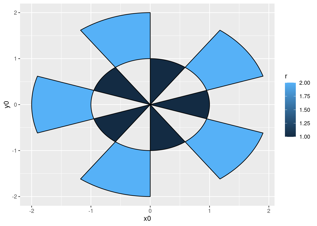
With geom_arc_bar(), it is easy to draw any curved bar. God forbid, you can even create a pie chart (see also Are food plots always foul?). Check out the cool examples from the docs.
arcs <-data.frame(start =seq(0, 2* pi, length.out =11)[-11],end =seq(0, 2* pi, length.out =11)[-1],r =rep(1:2, 5))# Behold the arcsggplot(arcs) + ggforce::geom_arc_bar(aes(x0 =0, y0 =0, r0 = r -1, r = r, start = start,end = end, fill = r))
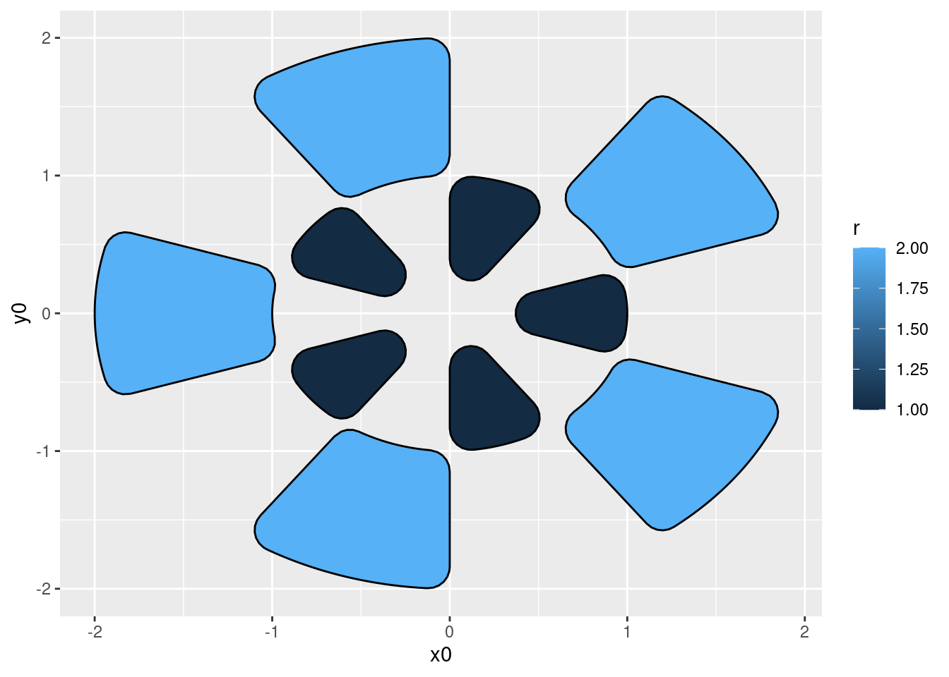
# geom_arc_bar uses geom_shape to draw the arcs, so you have all the# possibilities of that as well, e.g. rounding of cornersggplot(arcs) + ggforce::geom_arc_bar(aes(x0 =0, y0 =0, r0 = r -1, r = r, start = start,end = end, fill = r), radius =unit(4, 'mm'))
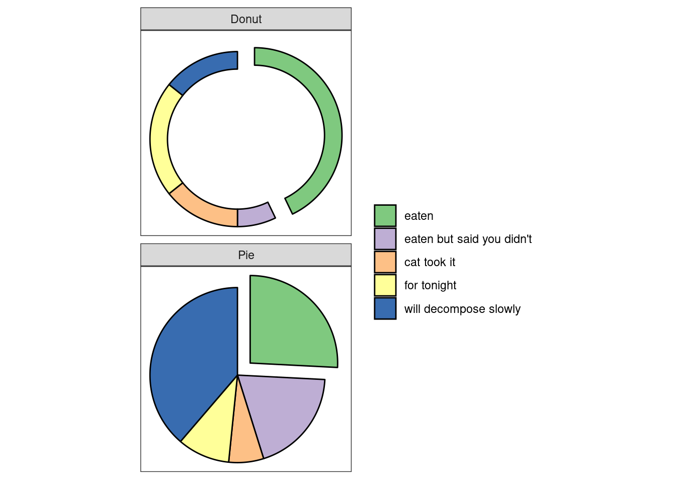
# If you got values for a pie chart, use stat_piestates <-c('eaten', "eaten but said you didn\'t", 'cat took it', 'for tonight','will decompose slowly')pie <-data.frame(state =factor(rep(states, 2), levels = states),type =rep(c('Pie', 'Donut'), each =5),r0 =rep(c(0, 0.8), each =5),focus =rep(c(0.2, 0, 0, 0, 0), 2),amount =c(4, 3, 1, 1.5, 6, 6, 1, 2, 3, 2),stringsAsFactors =FALSE)# Look at the cakesggplot() + ggforce::geom_arc_bar(data = pie, stat ='pie',aes(x0 =0, y0 =0, r0 = r0, r =1, amount = amount,fill = state, explode = focus ) ) +facet_wrap(~type, ncol =1) +coord_fixed() + ggforce::theme_no_axes() +scale_fill_brewer('', type ='qual')
Patchwork
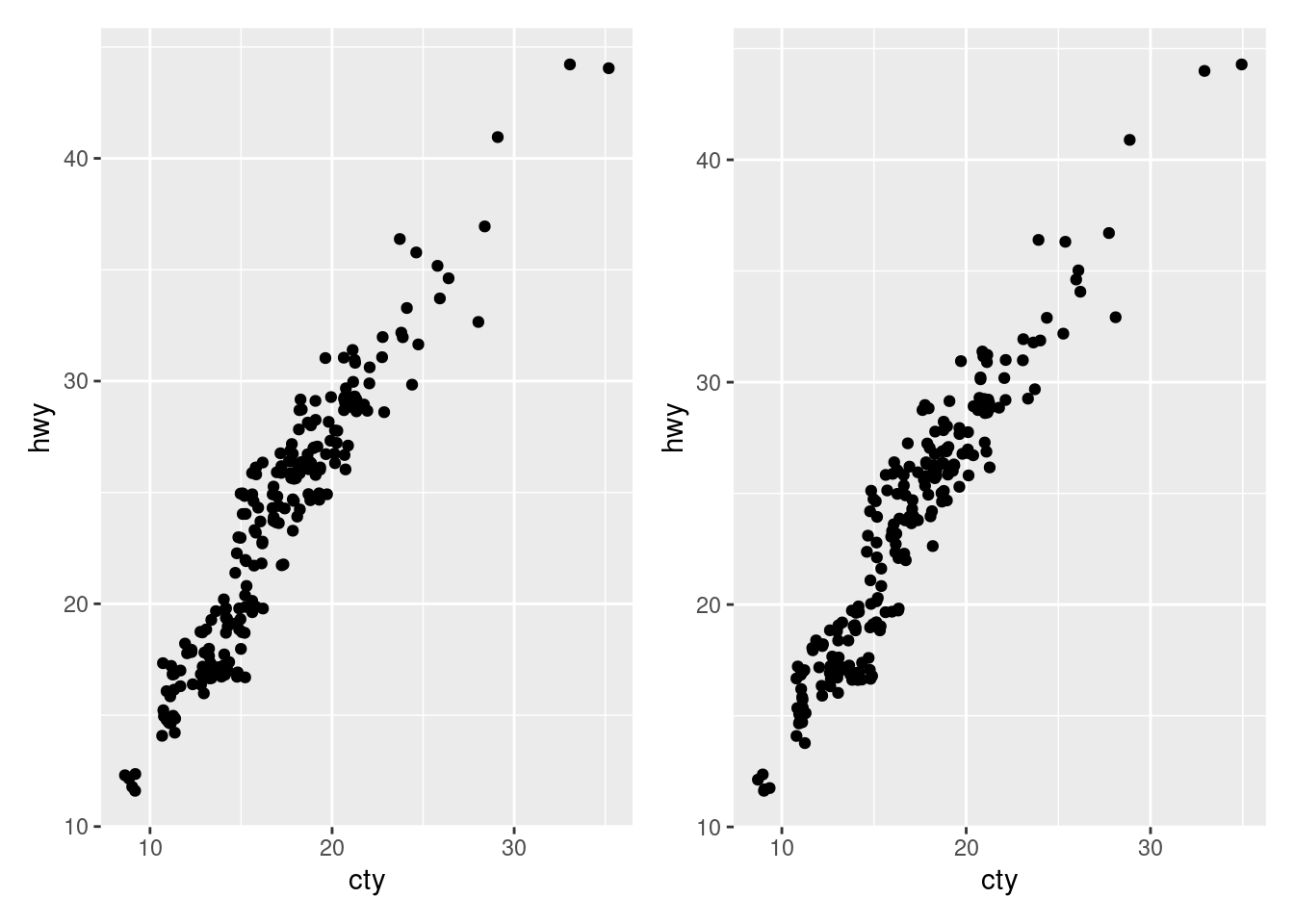
I have no doubt that you have already heard about {patchwork}. This package makes compositing plots super easy. If you haven’t heard about {patchwork}, here’s a super quick demo. Alternatively, you can check out my blog post about it.
library(patchwork)p <-ggplot(mpg) +geom_jitter(aes(cty, hwy))p + p # Add for side-by-side
p / p # Divide for stacking
Of course, there’s more to {patchwork} than that. Let me show you one more overlooked function. This function is called plot_spacer(). It’s great when you need w h i t e s p a c e.
There’s really no need to cover every inch of your plot with ink. Actually, white space can give your visuals some room to breathe in. And that can make your visual so much more powerful. Try that next time you use assemble plots with {patchwork}. Here’s how plot_spacer() works.
p +plot_spacer() + p +plot_layout(widths =c(0.4, 0.3, 0.4))
Closing
Alright, this concludes our short tour of hidden gems. I hope you liked them. Of course, the gg-ecosystem offers SO MUCH more. To find more packages, you can check out the extension library.
If you have any questions, let me know via mail or in the comments. And don’t forget to stay in touch via my Newsletter, Twitter or my RSS feed. See you next time!
This in-depth video course teaches you everything you need to know about becoming better & more efficient at cleaning up messy data. This includes Excel & JSON files, text data and working with times & dates. If you want to get better at data cleaning, check out the course page.
Insightful Data Visualizations for "Uncreative" R Users
This video course teaches you how to leverage {ggplot2} to make charts that communicate effectively without being a design expert. Course information can be found on the course page.