Forget regular heat maps. Use bubbles on a grid!
Visualization
We explore alternatives for heat maps to take sample sizes into account.
Heat maps are super easy to understand. And even better: They can be generated in warp speed with geom_tile(). Combine that with facet_wrap() and you can even build special heat maps. That’s how I created this calendar plot I shared on Twitter a few days ago.
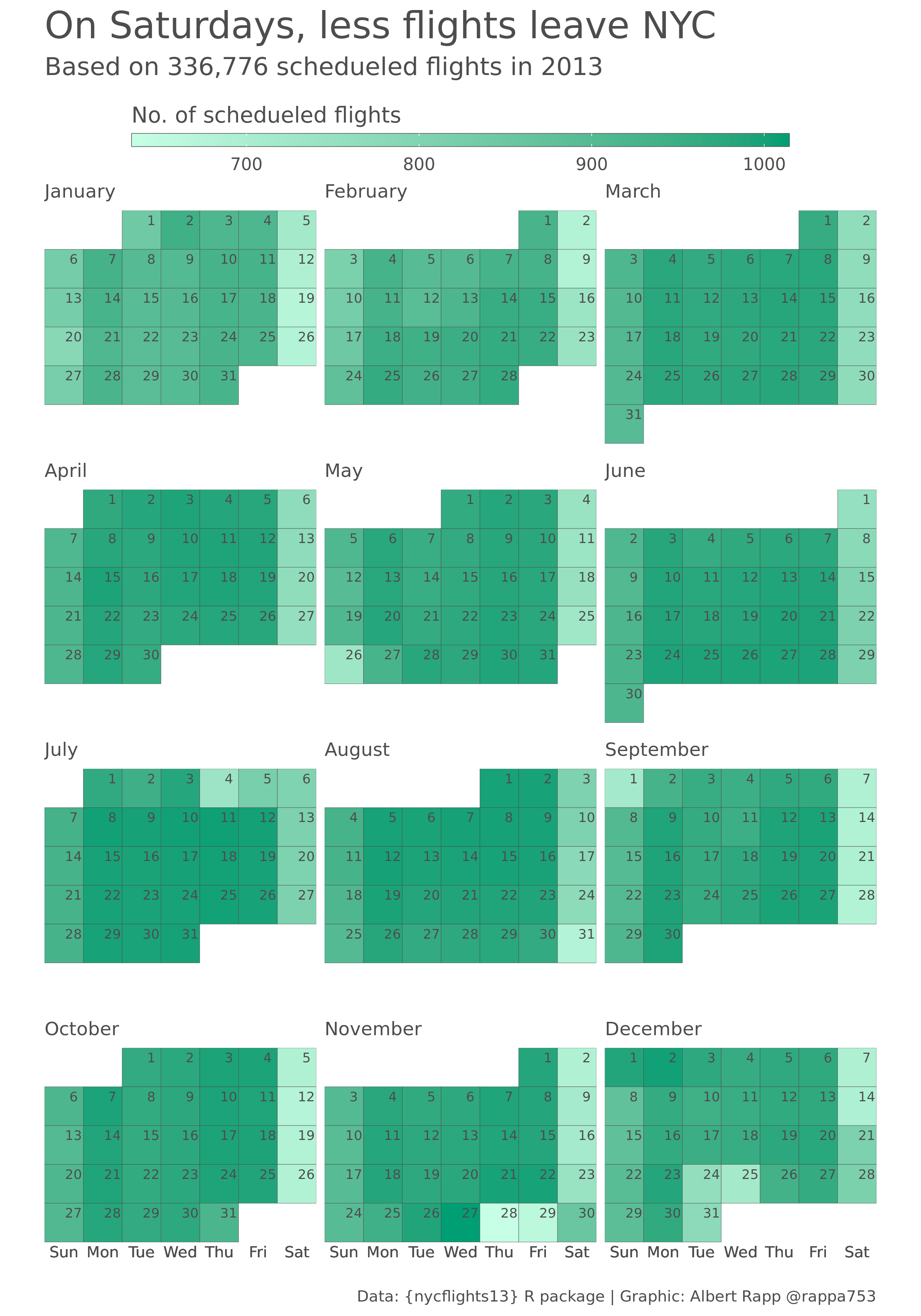
In this particular case, using heat maps feels apprpropriate. Each day has the exact same ¨weight” in the data. Sure, each day may see a different amount of flights. But that’s exactly what the color gradient shows. So, there are no bad surprises here.
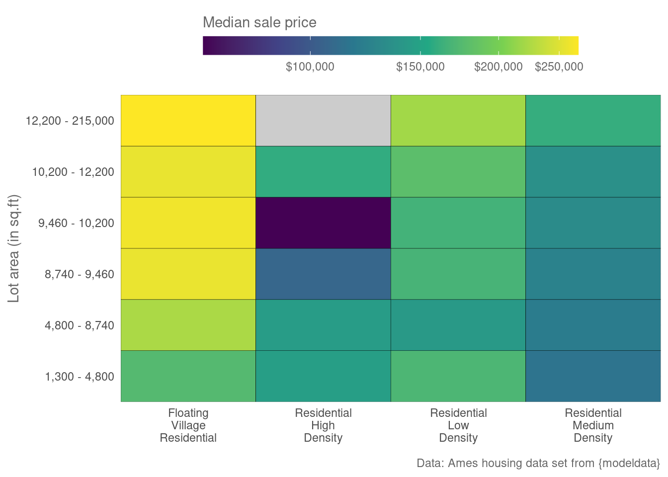
However, it’s not always this simple. Take a look at the following heat map. It tries to visualize the effect of a property’s size and it’s location (zone) on a House’s sale price.
The Problem with heat maps
Judging from this visual you could think that the information in each tile is in some sense equal. For starters, you could assume that a similar amount of information went into estimating the median. But this is not the case! In each tile, there’s a different group size. Take a look!
| lot_area | ms_zoning | n |
|---|---|---|
| 1,300 - 4,800 | Floating Village Residential | 59 |
| 1,300 - 4,800 | Residential High Density | 6 |
| 1,300 - 4,800 | Residential Low Density | 83 |
| 1,300 - 4,800 | Residential Medium Density | 146 |
| 4,800 - 8,740 | Floating Village Residential | 44 |
| 4,800 - 8,740 | Residential High Density | 13 |
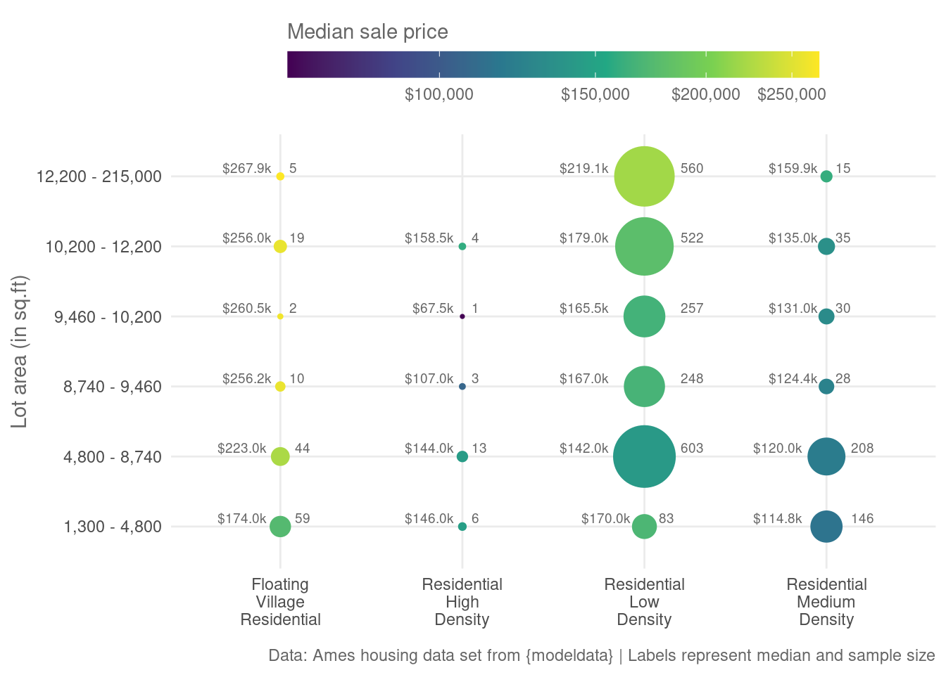
So, this visualization is somewhat misleading. Let’s try to fix that. Instead of a heat map, we could generate a bubble chart like this.

Notice how small some bubbles are. This is how you can tell that your summary statistic (in this case the median) may use a rather small sample size. And as we all know, this is not a good thing.
Also, the bubbles leave a lot of white space. We could use some of this additional space to make our plot more informative. For example, we could label the bubbles with the sample size or the median sale price.

Conclusion
Gridded bubble charts look nice and they are an excellent way to show it all. The colors show a summary statistic and the bubbles show the corresponding sample size. Add some labels to that and everything becomes even more explicit.
Though, I’m still a bit torn about whether labels for sample size and medians aren’t a bit too much. What do you think? Feel free to let me know in the comments.
If you want to find out how to generate these plots with {ggplot2}, you can check out the Appendix at the end of this blog post. Simply, unfold the Appendix section.
Also, if you have any questions, let me know via mail or in the comments. And don’t forget to stay in touch via my Newsletter, Twitter or my RSS feed. See you next time!
How to generate the plots
Appendix (click to unfold)
Data preprocessing
First, we need to create a data set. Here, the ames data set from the modeldata package will give us what we need.
data(ames, package = 'modeldata')
library(tidyverse)

price_by_size_and_zones <- ames |>
  janitor::clean_names() |>
  select(sale_price, lot_area, ms_zoning) |>
  filter(!str_detect(ms_zoning, "(A_agr|I_all|C_all)")) |>
  mutate(ms_zoning = fct_drop(ms_zoning)) # Filter out small zones
To create a regular heat map, we first need to bin the lot area.
price_by_binned_size_and_zones <- price_by_size_and_zones |>
  mutate(
    lot_area = cut(
      lot_area,
      breaks = quantile(lot_area, probs = c(0, 0.1, 0.4, 0.5, 0.6, 0.8, 1)),
      include.lowest = T
    )
  ) |>
  mutate(
    ms_zoning = str_replace_all(ms_zoning, "_", "\n")
  )
price_by_binned_size_and_zones
# A tibble: 2,901 × 3
sale_price lot_area ms_zoning
<int> <fct> <chr>
1 215000 (1.22e+04,2.15e+05] "Residential\nLow\nDensity"
2 105000 (1.02e+04,1.22e+04] "Residential\nHigh\nDensity"
3 172000 (1.22e+04,2.15e+05] "Residential\nLow\nDensity"
4 244000 (1.02e+04,1.22e+04] "Residential\nLow\nDensity"
5 189900 (1.22e+04,2.15e+05] "Residential\nLow\nDensity"
6 195500 (9.46e+03,1.02e+04] "Residential\nLow\nDensity"
7 213500 (4.8e+03,8.74e+03] "Residential\nLow\nDensity"
8 191500 (4.8e+03,8.74e+03] "Residential\nLow\nDensity"
9 236500 (4.8e+03,8.74e+03] "Residential\nLow\nDensity"
10 189000 (4.8e+03,8.74e+03] "Residential\nLow\nDensity"
# … with 2,891 more rows
# ℹ Use `print(n = ...)` to see more rowsNext, we estimate the median sale price for a given lot size and zone.
medians_by_binned_size_and_zones <- price_by_binned_size_and_zones |>
  group_by(ms_zoning, lot_area) |>
  summarise(
    n = n(),
    sale_price = median(sale_price),
    .groups = 'drop'
  ) |>
  complete(lot_area, ms_zoning)
The lot area labels will look terrible. That’s why I have transformed them with a custom function. But this is beside the point here, so you can skip this step. If you want to see the custom function, though, feel free to unfold the following code chunk.
Code
name_function <- function(text) {
  text %>%
    str_remove_all('[ () \\[ \\] ]') %>%
    str_split(',') %>%
    map(as.numeric) %>%
    map(scales::number, big.mark = ",") %>%
    map_chr(paste, collapse = ' - ')
}

# Better labels
medians_by_binned_size_and_zones <- medians_by_binned_size_and_zones |>
  mutate(lot_area = map_chr(lot_area, name_function))

# Convert labels to ordered factor
medians_by_binned_size_and_zones <- medians_by_binned_size_and_zones |>
  mutate(
    lower = str_match(lot_area, "\\d+,\\d+")[,1],
    lower = as.numeric(str_remove(lower, ',')),
    lot_area = fct_reorder(lot_area, lower)
  ) |>
  select(-lower)
Regular heat map
Now, we can build the regular heat map.
medians_by_binned_size_and_zones  |>
  ggplot(aes(x = ms_zoning, y = lot_area, fill = sale_price)) +
  geom_tile(col = 'black') +
  theme_minimal() +
  theme(
    legend.position = 'top',
    text = element_text(color = 'grey40')
  ) +
  guides(
    fill = guide_colorbar(
      barheight = unit(0.5, 'cm'),
      barwidth = unit(10, 'cm'),
      title.position = 'top'
    )
  ) +
  coord_cartesian(expand = F) +
  scale_fill_viridis_c(
    trans = "log",
    labels = scales::label_dollar(),
    na.value = 'grey80'
  ) +
  labs(
    x = element_blank(),
    y = 'Lot area (in sq.ft)',
    fill = 'Median sale price',
    caption = "Data: Ames housing data set from {modeldata}"
  )
Bubble chart
Here’s how to create the bubble chart. The trick is to use geom_point() and map size to the sample size n. You can adjust the maximal bubble size via scale_size_area().
bubble_grid_plot <- medians_by_binned_size_and_zones |>
  ggplot(aes(x = ms_zoning, y = lot_area)) +
  geom_point(
    aes(col = sale_price, fill = sale_price, size = n), shape = 21
  ) +
  theme_minimal() +
  theme(
    legend.position = 'top',
    text = element_text(color = 'grey40')
  ) +
  guides(
    col = guide_none(),
    size = guide_none(),
    fill = guide_colorbar(
      barheight = unit(0.5, 'cm'),
      barwidth = unit(10, 'cm'),
      title.position = 'top'
    )
  ) +
  scale_size_area(max_size = 15) +
  scale_color_viridis_c(
    trans = "log",
    labels = scales::label_dollar(),
    na.value = 'grey80'
  ) +
  scale_fill_viridis_c(
    trans = "log",
    labels = scales::label_dollar(),
    na.value = 'grey80'
  ) +
  labs(x = element_blank(), y = 'Lot area (in sq.ft)', fill = 'Median sale price')
bubble_grid_plot
For additional text labels use geom_text(). Positioning the labels so that they do not overlap with the bubbles is a bit tricky. I’ve hard-coded the labels’ positions based on the sample size n with case_when().
bubble_grid_plot_w_size <- bubble_grid_plot +
  geom_text(
    aes(label = n),
    nudge_x = case_when(
      medians_by_binned_size_and_zones$n > 225 ~ 0.2,
      medians_by_binned_size_and_zones$n > 100 ~ 0.135,
      medians_by_binned_size_and_zones$n > 40 ~ 0.08,
      T ~ 0.05
    ),
    nudge_y = 0.05, hjust = 0, vjust = 0, size = 2.5,
    col = 'grey40'
  ) +
  labs(
    caption = 'Data: Ames housing data set from {modeldata} | Labels represent sample size'
  )
bubble_grid_plot_w_size
bubble_grid_plot_w_size +
  geom_text(
    aes(label = scales::dollar(sale_price, scale_cut = c(0, "k" = 1000), accuracy = 0.1)),
    nudge_x = -case_when(
      medians_by_binned_size_and_zones$n > 225 ~ 0.2,
      medians_by_binned_size_and_zones$n > 100 ~ 0.135,
      medians_by_binned_size_and_zones$n > 40 ~ 0.08,
      T ~ 0.05
    ),
    nudge_y = 0.05, hjust = 1, vjust = 0, size = 2.5,
    col = 'grey40'
  ) +
  labs(
    caption = 'Data: Ames housing data set from {modeldata} | Labels represent median and sample size'
  )


