library(tidyverse)
set.seed(23445)Bar plot checklist
Visualization
Bar charts are easy to make but hard to perfect. Let’s create a small checklist to make things easier.
I always find myself adding the same little tweaks to bar charts. So, I decided to summarize these tweaks in a short checklist. Here’s a standard bar chart generated with ggplot2. We’re going to apply all the checks one-by-one.
library(tidyverse)
set.seed(23445)
manufacturers <- mpg |>
  janitor::clean_names() |>
  mutate(manufacturer = str_to_title(manufacturer))

selected_manufacturers <- manufacturers |>
  filter(
    manufacturer %in% sample(unique(manufacturer), size = 6)
  )

selected_manufacturers |>
  ggplot(aes(x = manufacturer)) +
  geom_bar(fill = 'dodgerblue4') +
  labs(
    x = element_blank(),
    y = 'Number of cars',
    title = 'Selected brands in the {mpg} dataset'
  )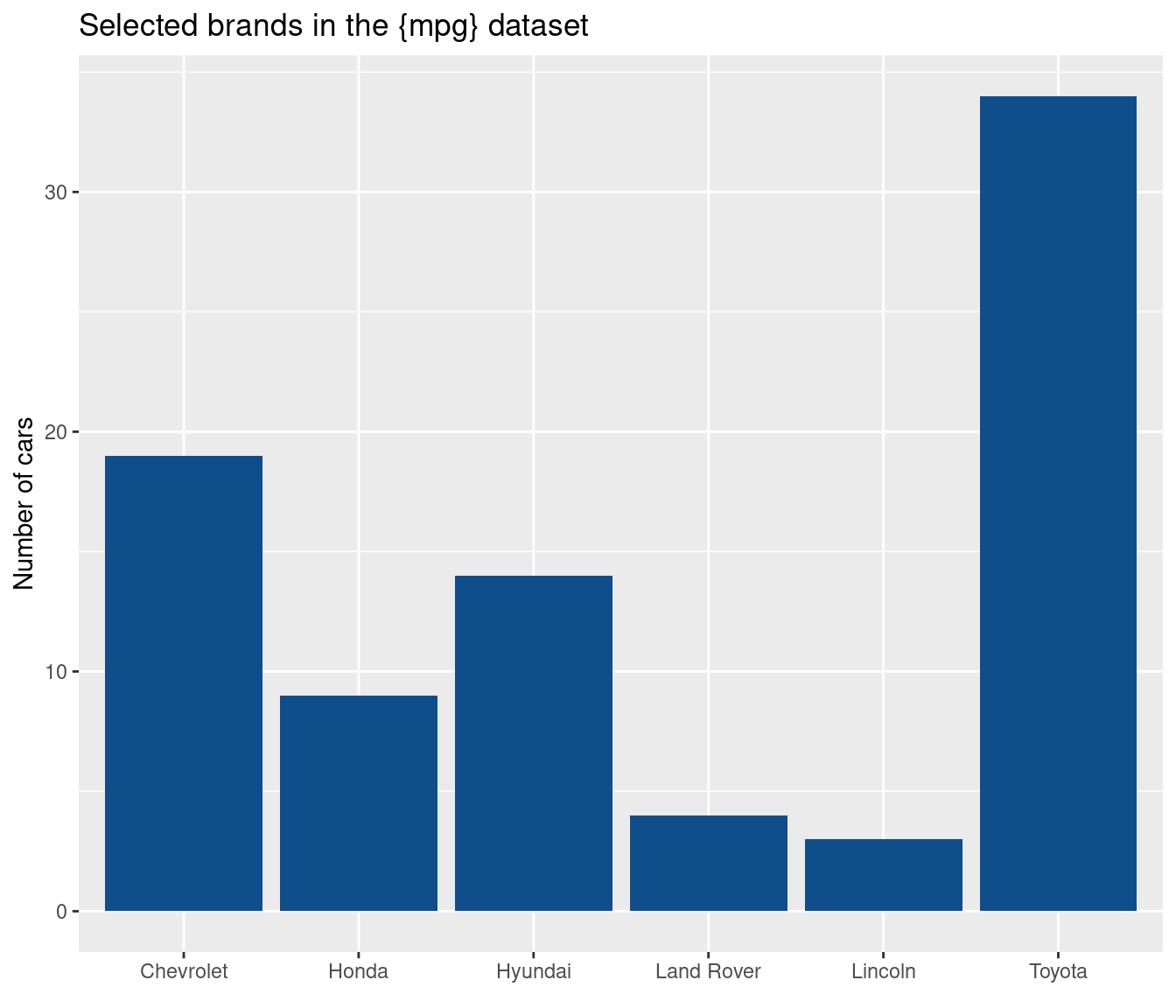
Are bars ordered meaningfully?
Currently, the bars are sorted alphabetically (by Brand name). This can make sense sometimes. But most of the time I think it’s more convenient to sort the bars numerically. With mutate() + fct_infreq() that’s a piece of cake.
selected_manufacturers |>
  mutate(manufacturer = fct_infreq(manufacturer)) |>
  ggplot(aes(x = manufacturer)) +
  geom_bar(fill = 'dodgerblue4') +
  labs(
    x = element_blank(),
    y = 'Number of cars',
    title = 'Selected brands in the {mpg} dataset'
  )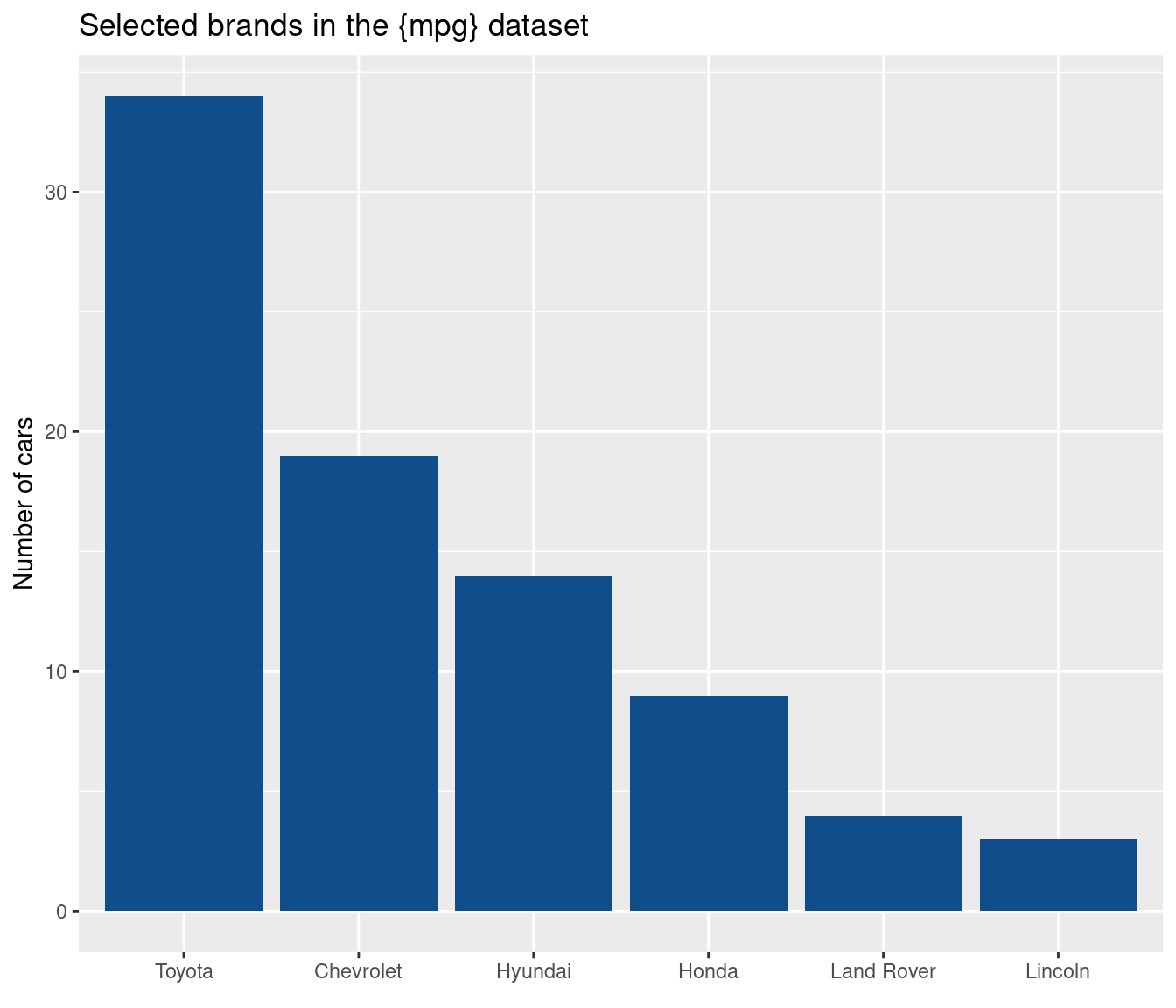
This makes it easier for the reader to compare numbers. Notice that I have used only a selection of the available brands from the data set. That’s because the axis labels would likely overlap if I used them all. This brings us to another check.
Did you move labels to the y-axis?
Usually, I prefer horizontal bars. If that should be a default is debatable. But when you have many bars or long labels, you should definitely opt for horizontal bars.
horizontal_bars <- manufacturers |>
  mutate(
    manufacturer = fct_infreq(manufacturer) |> fct_rev()
  ) |>
  ggplot(aes(y = manufacturer)) +
  geom_bar(fill = 'dodgerblue4') +
  labs(
    y = element_blank(),
    x = 'Number of cars',
    title = 'Number of cars in the {mpg} dataset'
  )
horizontal_bars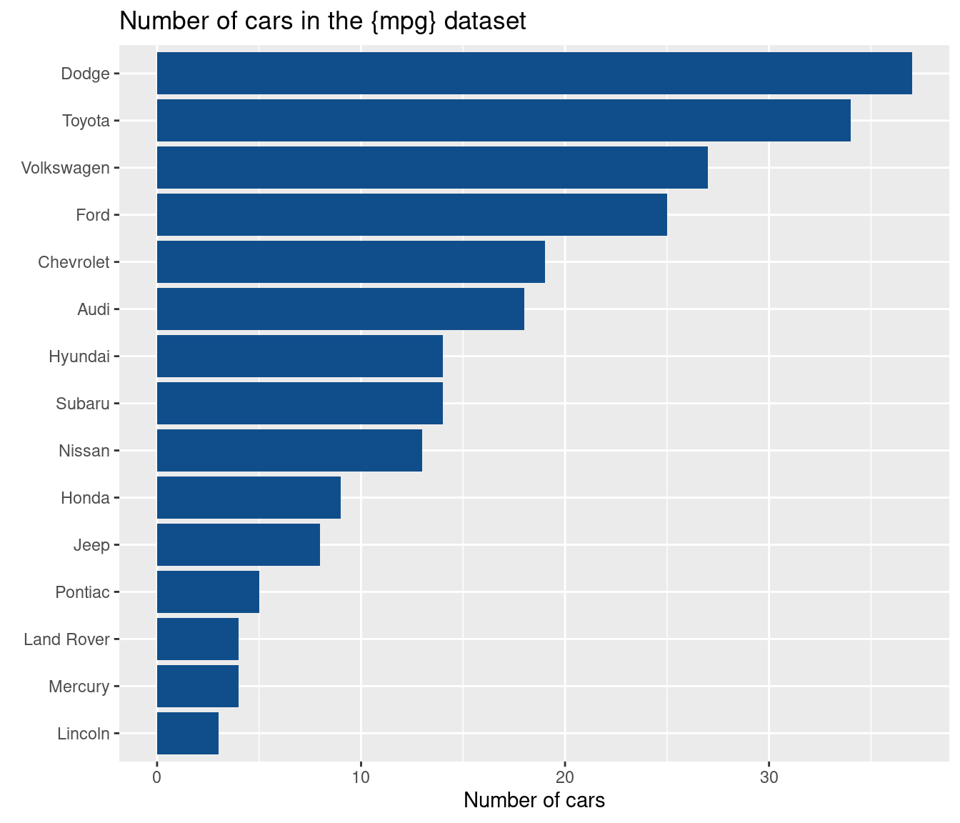
Are texts large enough?
This check is pretty obvious. But it’s easy to forget. It happens to me all the time.
The easiest way to use larger text is by using base_size() in a theme_*() function. And the best thing is: You can make all later sizes in theme() dependent on this base size. For that you just have to make sizes relative with rel().
larger_text <- horizontal_bars +
  theme_grey(base_size = 14) +
  theme(plot.title = element_text(size = rel(1.1)))
larger_text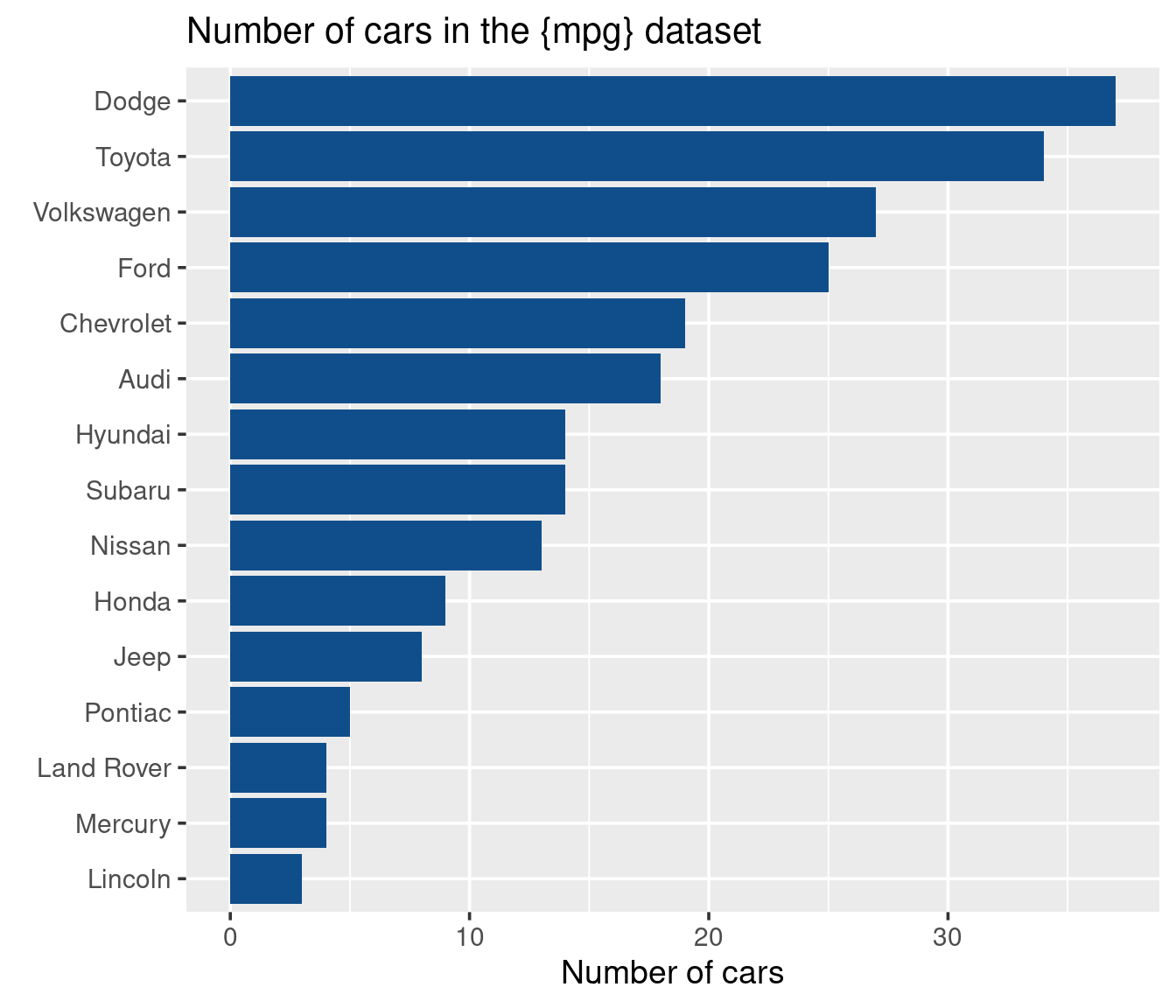
Did you remove unnecessary spacing around labels?
Notice how there is a lot of space between the brand labels and the actual bars? There is really no reason that there is so much space. Maybe that’s only a problem with ggplot2. Maybe other software does that too.
In any case, we should remove the extra spacing. This happens with scale_x_continuous() and expansion(). Notice that we want our x-axis to expand on the right but not on the left side. Hence, we can pass a two-dimensional vector to expansion(). This will treat the left and right side differently.
horizontal_bars_no_spacing <- larger_text +
  scale_x_continuous(expand = expansion(mult = c(0, 0.01)))
horizontal_bars_no_spacing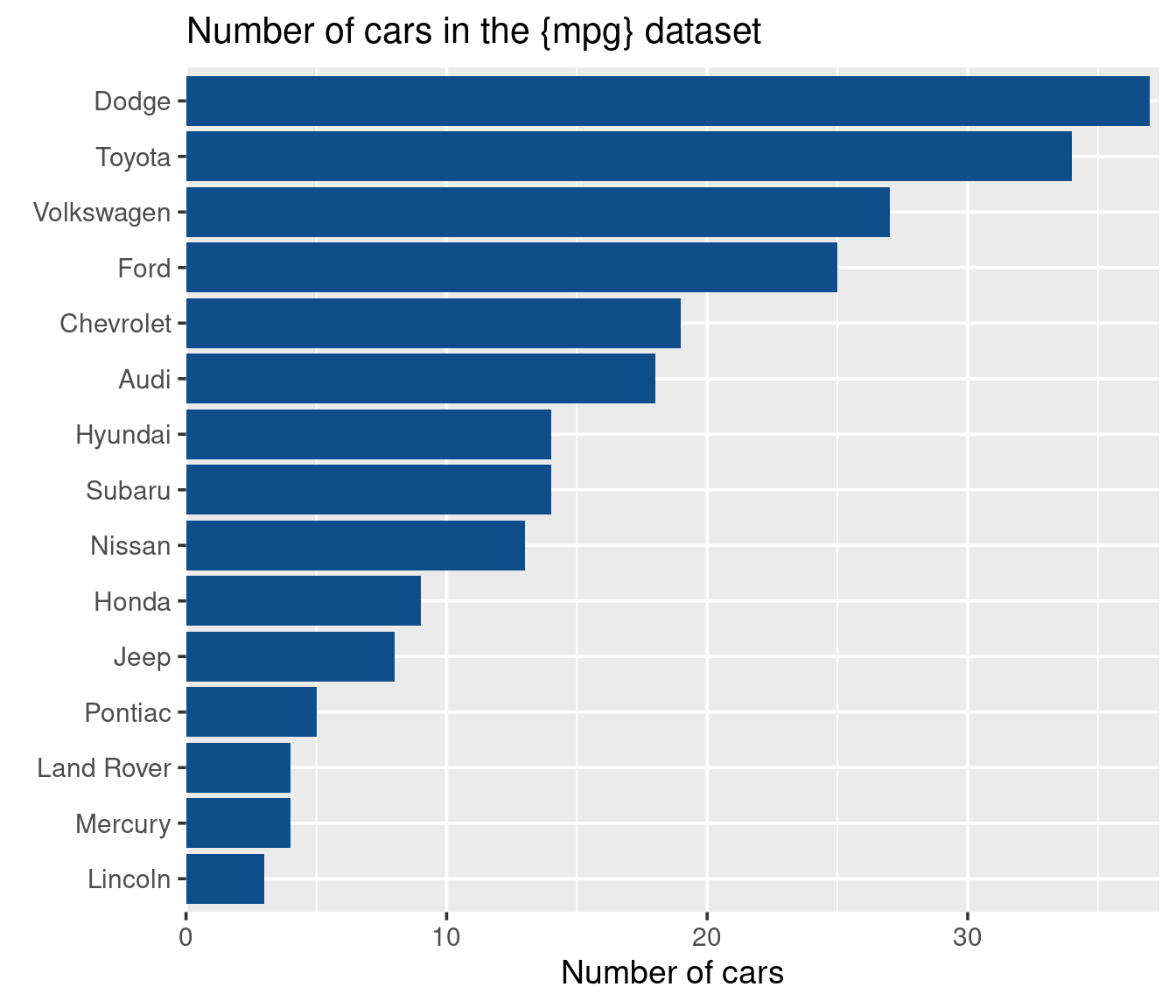
Die you remove clutter?
There’s a lot of clutter due to the excessive use of grid lines. In our case, the horizontal grid lines make little sense. So let’s remove them. While we’re at it, why not make the whole theme a bit lighter? Some people think of the grey background as clutter too.
no_y_grid_plot <- horizontal_bars_no_spacing +
  theme_minimal(base_size = 14) +
  theme(
    panel.grid.major.y = element_blank(),
    panel.grid.minor.y = element_blank(),
  )
no_y_grid_plot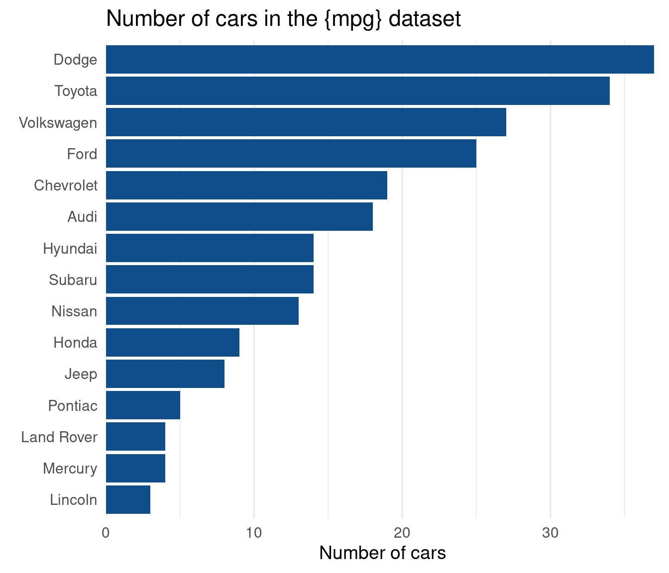
Did you label directly?
This step is optional. It removes even more grid lines in favor of direct labels.
counts_manufacturer <- count(manufacturers, manufacturer)

no_y_grid_plot +
  geom_text(
    data = counts_manufacturer,
    mapping = aes(x = n, y = manufacturer, label = n),
    hjust = 1,
    nudge_x = -0.25,
    color = 'white'
  ) +
  geom_vline(xintercept = 0) +
  scale_x_continuous(breaks = NULL, expand = expansion(mult = c(0, 0.01))) +
  labs(x = element_blank()) +
  theme(panel.grid.major.x = element_blank(), panel.grid.minor.x = element_blank())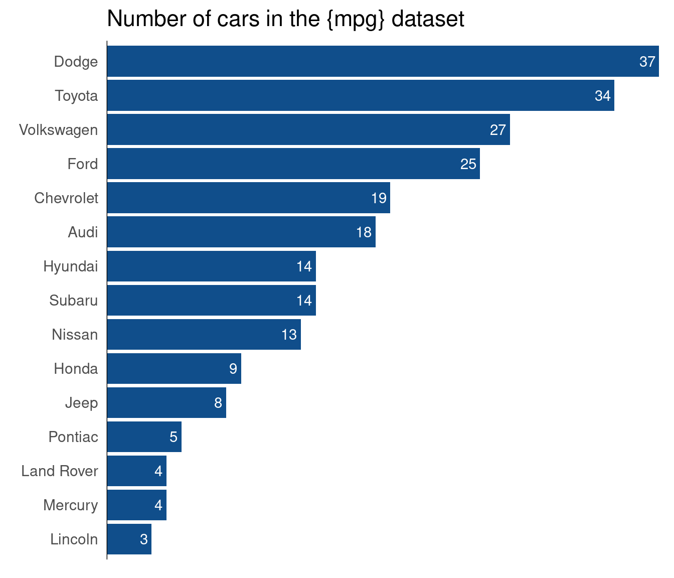
You could even incorporate the y-axis labels into the bars. But you have to make sure that your plot is wide enough for the labels. Maybe you’ll even have to shorten some of the labels to make that work.
counts_manufacturer <- counts_manufacturer |>
  mutate(
    manufacturer_label = case_when(
      manufacturer == 'Land Rover' ~ 'L. Rover',
      manufacturer == 'Lincoln' ~ 'Linc.',
      T ~ manufacturer
    )
  )
no_y_grid_plot +
  geom_text(
    data = counts_manufacturer,
    mapping = aes(x = n, y = manufacturer, label = n),
    hjust = 1,
    nudge_x = -0.1,
    color = 'white',
    fontface = 'bold',
    size = 4.5
  ) +
  geom_text(
    data = counts_manufacturer,
    mapping = aes(x = 0, y = manufacturer, label = manufacturer_label),
    hjust = 0,
    nudge_x = 0.25,
    color = 'white',
    fontface = 'bold',
    size = 4.5
  ) +
  geom_vline(xintercept = 0) +
  scale_x_continuous(breaks = NULL, expand = expansion(mult = c(0, 0.01))) +
  scale_y_discrete(breaks = NULL) +
  labs(x = element_blank()) +
  theme(panel.grid.major.x = element_blank(), panel.grid.minor.x = element_blank())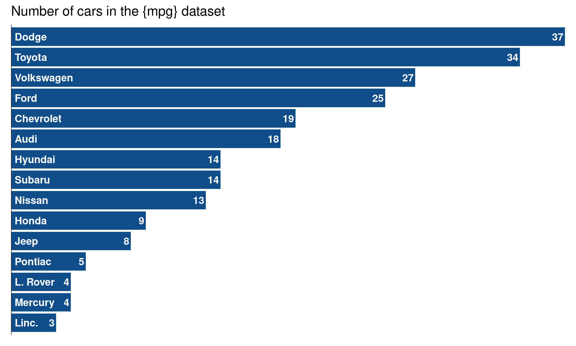
Are bars thin/wide enough?
This last step is a matter of taste. Some people find thinner bars better. So you could try it for your bar chart as well. And when you’re making you’re bar thinner, you can arrange your labels a little bit differently too.
Code
manufacturers |>
  mutate(manufacturer = fct_infreq(manufacturer) |> fct_rev()) |>
  ggplot(aes(y = manufacturer)) +
  geom_bar(
    just = 1,
    fill = 'dodgerblue4',
    width = 0.4
  ) +
  geom_text(
    data = counts_manufacturer,
    mapping = aes(
      x = n,
      y = manufacturer,
      label = n
    ),
    hjust = 1,
    vjust = 0,
    nudge_y = 0.1,
    color = 'grey30',
    fontface = 'bold',
    size = 5.5
  ) +
  geom_text(
    data = counts_manufacturer,
    mapping = aes(
      x = 0,
      y = manufacturer,
      label = manufacturer_label
    ),
    hjust = 0,
    vjust = 0,
    nudge_y = 0.1,
    nudge_x = 0.05,
    color = 'grey30',
    fontface = 'bold',
    size = 5.5
  ) +
  labs(
    y = element_blank(),
    x = 'Number of cars',
    title = 'Number of cars in the {mpg} dataset'
  ) +
  scale_x_continuous(expand = expansion(mult = c(0, 0.01)))  +
  scale_y_discrete(breaks = NULL) +
  theme_minimal(base_size = 14) +
  theme(
    plot.title = element_text(size = rel(1.1)),
    panel.grid.major.y = element_blank(),
    panel.grid.minor.y = element_blank()
  ) +
  geom_vline(xintercept = 0) +
  scale_x_continuous(breaks = NULL, expand = expansion(mult = c(0, 0.01))) +
  labs(x = element_blank()) +
  theme(panel.grid.major.x = element_blank(), panel.grid.minor.x = element_blank())
Conclusion
That’s a wrap. Let me know if you have more checks that are missing in this list. You can reach me via mail, Twitter or Mastodon.


