Creating interactive visualizations with {ggiraph} (with or without Shiny)

Shiny
Interactive Plots
Visualization
It is really simple to turn a ggplot into an interactive visualization. In this blog post you’ll learn how to do that with {ggiraph}. Also we’ll explore ways to enhance the interactivity with Shiny.
Author

Albert Rapp

Published

February 23, 2023

Interactive plots are great. They let users focus on what matters to them. That’s why they are so popular for communicating data-driven insights. And the good news is: They’re easy to create! Let me show you how.

Start with a ggplot

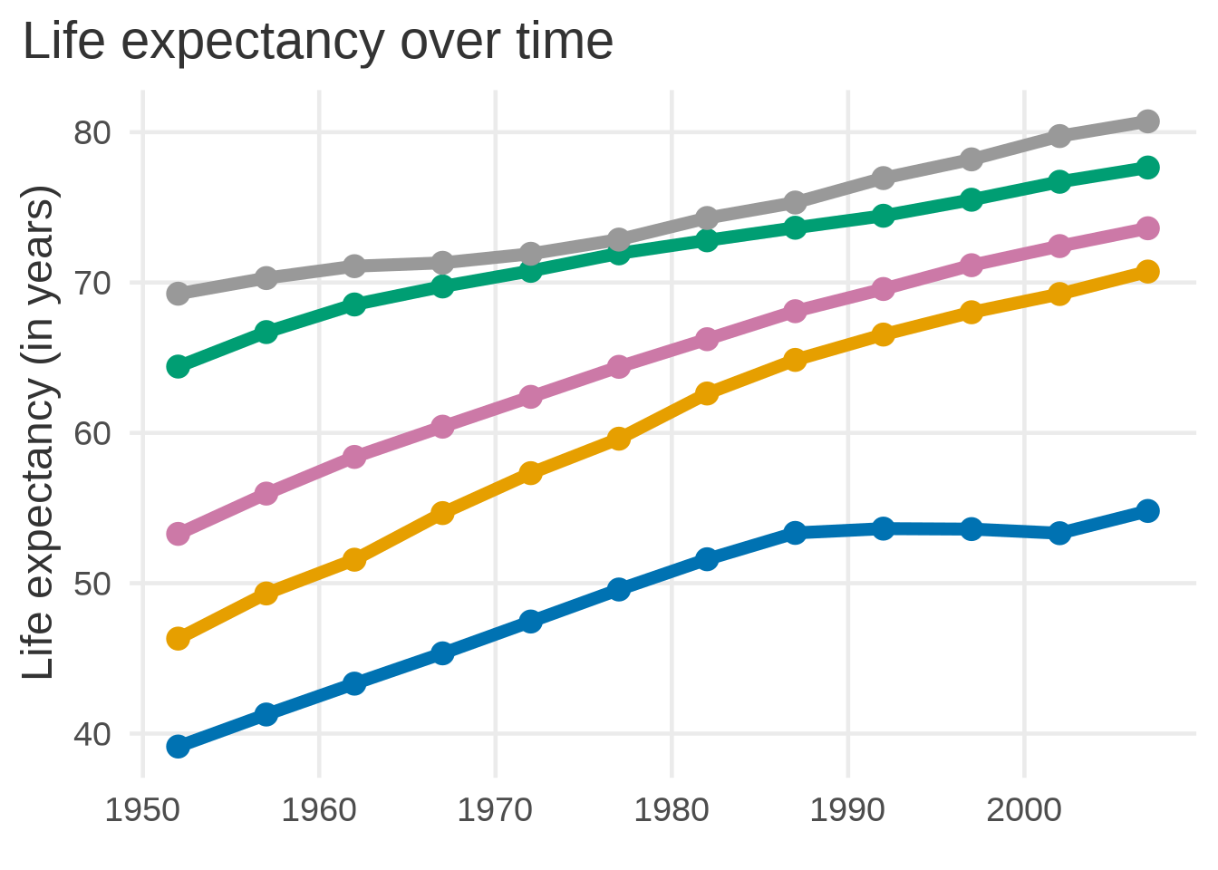
The first step is easy. Basically you create a ggplot just like you normally would. For example, here’s a basic line chart.

Data-prep code
library(dplyr)
library(ggplot2)
library(patchwork)
dat <- gapminder::gapminder |> 
  janitor::clean_names() |> 
  mutate(
    # Reformat continent as a character instead of as a factor
    # (will be important later)
    id = levels(continent)[as.numeric(continent)],
    continent = forcats::fct_reorder(continent, life_exp)
  )

color_palette <- thematic::okabe_ito(5)
names(color_palette) <- unique(dat$continent)
base_size <- 18
mean_life_exps <- dat |> 
  group_by(continent, year, id) |> 
  summarise(mean_life_exp = mean(life_exp)) |> 
  ungroup()
line_chart <- mean_life_exps |> 
  ggplot(aes(x = year, y = mean_life_exp, col = continent)) +
  geom_line(linewidth = 2.5) +
  geom_point(size = 4) +
  theme_minimal(base_size = base_size) +
  labs(
    x = element_blank(),
    y = 'Life expectancy (in years)',
    title = 'Life expectancy over time'
  ) +
  theme(
    text = element_text(
      color = 'grey20'
    ),
    legend.position = 'none',
    panel.grid.minor = element_blank(),
    plot.title.position = 'plot'
  ) +
  scale_color_manual(values = color_palette)
line_chart

Add interactive parts with {ggiraph}

Next, you need to decide what parts become interactive. I want to focus on the lines and the points one at a time. Just like this (go ahead, hover over the lines):

Therefore, we need to make both geom_line() and geom_point() interactive. We do this by loading {ggiraph} and

  1. changing geom_point() to geom_point_interactive(),

  2. changing geom_line() to geom_line_interactive() and

  3. adding one of the following aesthetics in each interactive layer: tooltip, data_id or onclick.

I’ll just map data_id to continent in both layers. This way, each continent has its own interactive part (just as we’ve seen).

library(ggiraph)

line_chart <- mean_life_exps |> 
  ggplot(aes(x = year, y = mean_life_exp, col = continent, data_id = id)) +
  geom_line_interactive(linewidth = 2.5) +
  geom_point_interactive(size = 4) +
  theme_minimal(base_size = base_size) +
  labs(
    x = element_blank(),
    y = 'Life expectancy (in years)',
    title = 'Life expectancy over time'
  ) +
  theme(
    text = element_text(
      color = 'grey20'
    ),
    legend.position = 'none',
    panel.grid.minor = element_blank(),
    plot.title.position = 'plot'
  ) +
  scale_color_manual(values = color_palette)

Notice that I saved the plot into a variable instead of generating output from the code. The magic step comes next.

Render the interactive plot with girafe()

Finally, pass our new variable to girafe(). Watch out for one thing, though. You need to call girafe(ggobj = line_chart) and not girafe(line_chart). If your plot is not interactive, make sure you did not make this particular mistake.

girafe(ggobj = line_chart)

Tweak the interactivity

Our line chart currently turns lines orange as we hover over them. Everything else remains unchanged. Let’s change that so that all but one line turn transparent.

The way to do that is to pass a list of options to girafe(). This list will contain opts_hover() and opts_hover_inv() to determine the CSS code that needs to be applied. Also, let us fix our plot size with opts_sizing().

girafe(
  ggobj = line_chart,
  options = list(
    opts_hover(css = ''), ## CSS code of line we're hovering over
    opts_hover_inv(css = "opacity:0.1;"), ## CSS code of all other lines
    opts_sizing(rescale = FALSE) ## Fixes sizes to dimensions below
  ),
  height_svg = 6,
  width_svg = 9
)

Here we’ve reset the hover CSS to no CSS at all. This gets rid of the orange line coloring so that all lines shine in their original color.

Combine {ggirafe} and {patchwork}

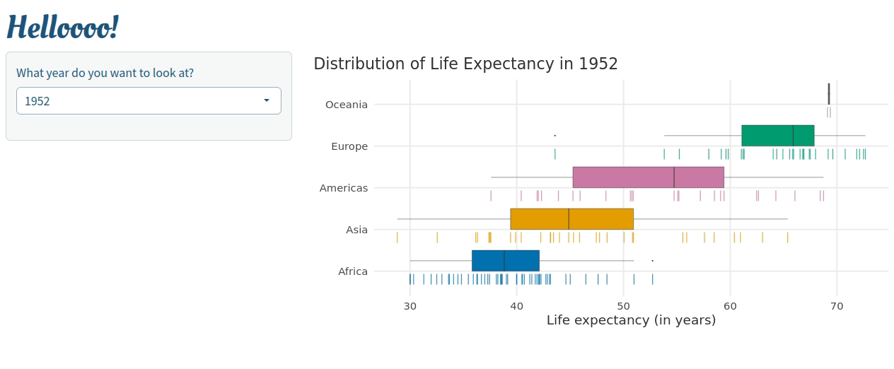
Now, let me show you one more trick. With the same logic as before we can create all kinds of plots. For example, here’s a box plot using the same data. The key function is geom_boxplot_interactive().

Code
selected_year <- 2007
box_plot <- dat |> 
  filter(year == selected_year) |> 
  ggplot(aes(x = life_exp, y = continent, fill = continent, data_id = id)) +
  geom_boxplot_interactive(
    position = position_nudge(y = 0.25), 
    width = 0.5
  ) +
  geom_point_interactive(
    aes(col = continent),
    position = position_nudge(y = -0.25),
    size = 8,
    shape = '|',
    alpha = 0.75
  ) +
  scale_fill_manual(values = color_palette) +
  scale_color_manual(values = color_palette) +
  labs(
    x = 'Life expectancy (in years)',
    y = element_blank(),
    title = glue::glue('Distribution of Life Expectancy in {selected_year}')
  ) +
  theme_minimal(base_size = base_size) +
  theme(
    text = element_text(
      color = 'grey20'
    ),
    legend.position = 'none',
    panel.grid.minor = element_blank(),
    plot.title.position = 'plot'
  ) 

girafe(
  ggobj = box_plot,
  options = list(
    opts_hover(css = ''),
    opts_hover_inv(css = "opacity:0.1;"),
    opts_sizing(rescale = FALSE)
  ),
  height_svg = 6,
  width_svg = 9
)

If our previous line chart and this box plot use the same data_id , then you can combine them using {patchwork}.

library(patchwork)
girafe(
  ggobj = box_plot + plot_spacer() + line_chart + plot_layout(widths = c(0.45, 0.1, 0.45)),
  options = list(
    opts_hover(css = ''),
    opts_hover_inv(css = "opacity:0.1;"), 
    opts_sizing(rescale = FALSE)
  ),
  height_svg = 8,
  width_svg = 12
)

Insert {ggiraph} plot into Shiny

It is super simple to combine {shiny} and {ggiraph}. All you have to do is to drop a girafeOutput() in the UI and a renderGirafe() in the server function. For example, let us embed our interactive boxplot into a Shiny app.

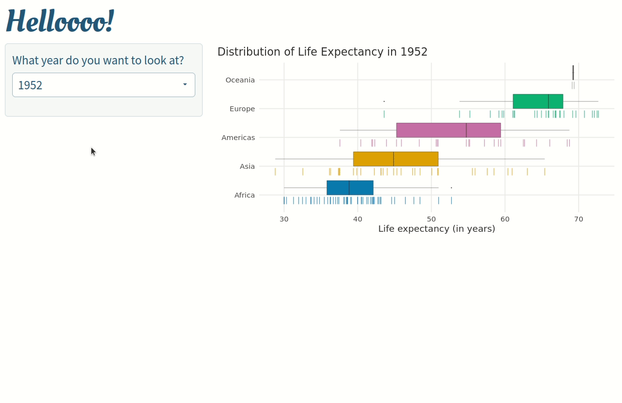
All we have to do is create a basic Shiny app skeleton and throw in the output and render call. Here, we let the user choose the year that is displayed in the plot.

Shiny app code
library(shiny)
ui <- fluidPage(
  theme = bslib::bs_theme(
    # Colors (background, foreground, primary)
    bg = 'white', 
    fg = '#06436e', 
    primary = colorspace::lighten('#06436e', 0.3),
    
    # Fonts (Use multiple in case a font cannot be displayed)
    base_font = c('Source Sans Pro',  'Lato', 'Merriweather', 'Roboto Regular', 'Cabin Regular'),
    heading_font = c('Oleo Script', 'Prata', 'Roboto', 'Playfair Display', 'Montserrat'),
    font_scale = 1.25
  ),
  h1('Helloooo!'),
  sidebarLayout(
    sidebarPanel = sidebarPanel(
      selectInput(
        'selected_year',
        'What year do you want to look at?',
        choices = unique(dat$year)
      )
    ),
    mainPanel = mainPanel(
      girafeOutput('girafe_output', height = 600)
    )
  )
)

server <- function(input, output, session) {
  
  dat_year <- reactive({dat |> filter(year == input$selected_year)})
  
  output$girafe_output <- renderGirafe({

    box_plot <- dat_year() |> 
      ggplot(aes(x = life_exp, y = continent, fill = continent, data_id = id)) +
      geom_boxplot_interactive(
        position = position_nudge(y = 0.25), 
        width = 0.5
      ) +
      geom_point_interactive(
        aes(col = continent),
        position = position_nudge(y = -0.2),
        size = 11,
        shape = '|',
        alpha = 0.75
      ) +
      scale_fill_manual(values = color_palette) +
      scale_color_manual(values = color_palette) +
      labs(
        x = 'Life expectancy (in years)',
        y = element_blank(),
        title = glue::glue('Distribution of Life Expectancy in {input$selected_year}')
      ) +
      theme_minimal(base_size = base_size) +
      theme(
        text = element_text(color = 'grey20'),
        legend.position = 'none',
        panel.grid.minor = element_blank(),
        plot.title.position = 'plot'
      ) 
    
    girafe(
      ggobj = box_plot,
      options = list(
        opts_hover(css = ''),
        opts_sizing(rescale = TRUE),
        opts_hover_inv(css = "opacity:0.1;")
      ),
      height_svg = 12,
      width_svg = 25
    )
    
  })
  
}

This will create the following app:

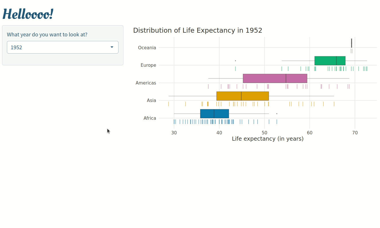
Use {ggiraph} plot variables

Next, let’s add UI elements as the user interacts with the plot. This is possible using a whole bunch of variables that are created with any girafeOutput(). For example, for girafeOutput(outputId = ‘my_plot’) we can automatically use the following input values (id + keyword):

  • input$my_plot_selected: Contains IDs of selected plot elements

  • input$my_plot_key_selected: Same but for legend elements

  • input$my_plot_theme_selected: Same but for theme elements

We could use this to let the user select points from the plot and display the underlying data in a table in return.

Here, we just added a gt_output() and render_gt() to our app. And in order to access the correct rows from our data set I simply used input$girafe_output_selected.

Shiny app code
library(gt)
ui <- fluidPage(
  theme = bslib::bs_theme(
    # Colors (background, foreground, primary)
    bg = 'white', 
    fg = '#06436e', 
    primary = colorspace::lighten('#06436e', 0.3),
    
    # Fonts (Use multiple in case a font cannot be displayed)
    base_font = c('Source Sans Pro',  'Lato', 'Merriweather', 'Roboto Regular', 'Cabin Regular'),
    heading_font = c('Oleo Script', 'Prata', 'Roboto', 'Playfair Display', 'Montserrat'),
    font_scale = 1.25
  ),
  h1('Helloooo!'),
  sidebarLayout(
    sidebarPanel = sidebarPanel(
      selectInput(
        'selected_year',
        'What year do you want to look at?',
        choices = unique(dat$year)
      ),
      gt_output('gt_output')
    ),
    mainPanel = mainPanel(
      girafeOutput('girafe_output', height = 600)
    )
  )
)

server <- function(input, output, session) {
  
  dat_year <- reactive({dat |> filter(year == input$selected_year)})
  
  output$gt_output <- render_gt({
    req(input$girafe_output_selected)
    
    selected_rows <- parse_number(input$girafe_output_selected)
      
    dat_year() |> 
      slice(selected_rows) |> 
      select(continent, country, life_exp) |> 
      arrange(desc(life_exp)) |> 
      group_by(continent) |> 
      gt() |> 
      opt_stylize(style = 5) |> 
      cols_align(columns = -life_exp, align = 'left') |> 
      cols_label(continent = 'Continent', country = 'Country', life_exp = 'Life Expectancy') |> 
      tab_header(
        title = 'Selected Countries'
      ) |> 
      tab_style(
        locations = cells_row_groups(),
        style = list(
          cell_fill(color = 'grey20'),
          cell_text(color = 'white')
        )
      )
  })


  output$girafe_output <- renderGirafe({
  
      box_plot <- dat_year() |> 
        ggplot(aes(x = life_exp, y = continent, fill = continent, data_id = id)) +
        geom_boxplot_interactive(
          position = position_nudge(y = 0.25), 
          width = 0.5
        ) +
        geom_point_interactive(
          aes(col = continent, data_id = seq_along(country)),
          position = position_nudge(y = -0.2),
          size = 11,
          shape = '|',
          alpha = 0.75
        ) +
        scale_fill_manual(values = color_palette) +
        scale_color_manual(values = color_palette) +
        labs(
          x = 'Life expectancy (in years)',
          y = element_blank(),
          title = glue::glue('Distribution of Life Expectancy in {input$selected_year}')
        ) +
        theme_minimal(base_size = base_size) +
        theme(
          text = element_text(color = 'grey20'),
          legend.position = 'none',
          panel.grid.minor = element_blank(),
          plot.title.position = 'plot'
        ) 
      
      girafe(
        ggobj = box_plot,
        options = list(
          opts_hover(css = ''),
          opts_sizing(rescale = TRUE),
          opts_hover_inv(css = "opacity:0.1;")
        ),
        height_svg = 12,
        width_svg = 25
      )
      
    })
  
}

Notice that I mapped data_id to the row numbers of the data set. Combining this with parse_number() allowed me to extract the correct rows from the data in order to display the table.

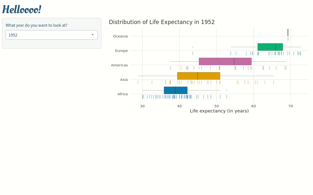
Trigger actions with onclick

Next, let us trigger an action by mapping JS code to the onclick aesthetic. Since you may not be that familar with JS (like me), let us do something simple. We could open up the Wikipedia page of a continent when a user clicks on the corresponding boxplot.

The JS code for that is just one line. Call window.open() and insert a valid URL into the parentheses. With R’s glue() function it’s really easy to assemble the correct URL. Hence, the code for your plot will look something like this:

dat_year() |> 
  ggplot(aes(x = life_exp, y = continent, fill = continent, data_id = id)) +
  geom_boxplot_interactive(
    aes(onclick = glue::glue('window.open("https://en.wikipedia.org/wiki/{continent}")')),
    position = position_nudge(y = 0.25), 
    width = 0.5
  ) +
  ## Rest of plot code
Shiny app code
ui <- fluidPage(
  theme = bslib::bs_theme(
    # Colors (background, foreground, primary)
    bg = 'white', 
    fg = '#06436e', 
    primary = colorspace::lighten('#06436e', 0.3),
    
    # Fonts (Use multiple in case a font cannot be displayed)
    base_font = c('Source Sans Pro',  'Lato', 'Merriweather', 'Roboto Regular', 'Cabin Regular'),
    heading_font = c('Oleo Script', 'Prata', 'Roboto', 'Playfair Display', 'Montserrat'),
    font_scale = 1.25
  ),
  h1('Helloooo!'),
  sidebarLayout(
    sidebarPanel = sidebarPanel(
      selectInput(
        'selected_year',
        'What year do you want to look at?',
        choices = unique(dat$year)
      ),
      gt_output('gt_output')
    ),
    mainPanel = mainPanel(
      girafeOutput('girafe_output', height = 600)
    )
  )
)

server <- function(input, output, session) {
  
  dat_year <- reactive({dat |> filter(year == input$selected_year)})
  
  output$gt_output <- render_gt({
    req(input$girafe_output_selected)
    
    selected_rows <- parse_number(input$girafe_output_selected)
      
    dat_year() |> 
      slice(selected_rows) |> 
      select(continent, country, life_exp) |> 
      arrange(desc(life_exp)) |> 
      group_by(continent) |> 
      gt() |> 
      opt_stylize(style = 5) |> 
      cols_align(columns = -life_exp, align = 'left') |> 
      cols_label(continent = 'Continent', country = 'Country', life_exp = 'Life Expectancy') |> 
      tab_header(
        title = 'Selected Countries'
      ) |> 
      tab_style(
        locations = cells_row_groups(),
        style = list(
          cell_fill(color = 'grey20'),
          cell_text(color = 'white')
        )
      )
  })


  output$girafe_output <- renderGirafe({
  
      box_plot <- dat_year() |> 
        ggplot(aes(x = life_exp, y = continent, fill = continent, data_id = id)) +
        geom_boxplot_interactive(
          aes(onclick = glue::glue('window.open("https://en.wikipedia.org/wiki/{continent}")')),
          position = position_nudge(y = 0.25), 
          width = 0.5
        ) +
        geom_point_interactive(
          aes(col = continent, data_id = seq_along(country)),
          position = position_nudge(y = -0.2),
          size = 11,
          shape = '|',
          alpha = 0.75
        ) +
        scale_fill_manual(values = color_palette) +
        scale_color_manual(values = color_palette) +
        labs(
          x = 'Life expectancy (in years)',
          y = element_blank(),
          title = glue::glue('Distribution of Life Expectancy in {input$selected_year}')
        ) +
        theme_minimal(base_size = base_size) +
        theme(
          text = element_text(color = 'grey20'),
          legend.position = 'none',
          panel.grid.minor = element_blank(),
          plot.title.position = 'plot'
        ) 
      
      girafe(
        ggobj = box_plot,
        options = list(
          opts_hover(css = ''),
          opts_sizing(rescale = TRUE),
          opts_hover_inv(css = "opacity:0.1;")
        ),
        height_svg = 12,
        width_svg = 25
      )
      
    })
  
}

Check it out:

Use onclick with R instead of JS code

Technically, you don’t need to use Shiny for onclick. But with Shiny you can use onclick to trigger actions that use R code (as opposed to JS).

The trick is to use a tiny bit of JS to change the value of one of Shiny’s reactive variables. Once that variable is changed, we can trigger R code based on that. Here’s how the relevant part of your Shiny app will look.

dat_year() |> 
  ggplot(aes(x = life_exp, y = continent, fill = continent, data_id = id)) +
  geom_boxplot_interactive(
    aes(onclick = glue::glue('
      Shiny.setInputValue("last_click", " ");
      Shiny.setInputValue("last_click", "{continent}");'
    )),
    position = position_nudge(y = 0.25), 
    width = 0.5
  ) +
  # Rest of code for the plot

This code does two things after a click on a boxplot:

  1. It sets the variable input$last_click to an empty string and

  2. updates the same variable with name of the boxplot’s continent

We can use that to our advantage. For example, we could observe input$last_click, track changes to that variable in a vector and display them in the app.

last_click <- reactive({
  input$last_click
})

# Tie an observer to changes in input$last click
observe({
  # Code that is supposed to get triggered here
}) |> bindEvent(last_click())

Do something similar with input$girafe_output_selected will create the following app:

Shiny app code
ui <- fluidPage(
  theme = bslib::bs_theme(
    # Colors (background, foreground, primary)
    bg = 'white', 
    fg = '#06436e', 
    primary = colorspace::lighten('#06436e', 0.3),
    
    # Fonts (Use multiple in case a font cannot be displayed)
    base_font = c('Source Sans Pro',  'Lato', 'Merriweather', 'Roboto Regular', 'Cabin Regular'),
    heading_font = c('Oleo Script', 'Prata', 'Roboto', 'Playfair Display', 'Montserrat'),
    font_scale = 1.75
  ),
  h1('Helloooo!'),
  sidebarLayout(
    sidebarPanel = sidebarPanel(
      selectInput(
        'selected_year',
        'What year do you want to look at?',
        choices = unique(dat$year)
      )
    ),
    mainPanel = mainPanel(
      girafeOutput('girafe_output', height = 600),
      verbatimTextOutput('last_clicked'),
      verbatimTextOutput('selections')
    )
  )
)
server <- function(input, output, session) {
  
  dat_year <- reactive({dat |> filter(year == input$selected_year)})
  
  last_click <- reactive({
    input$last_click
  })
  
  clicks_list <- reactiveVal()
  
  observe({
    clicks_list(c(last_click(), clicks_list()))
    print(clicks_list())
  }) |> bindEvent(last_click())
  
  output$last_clicked <- renderPrint({
    req(clicks_list())
    glue::glue('Clicked: {paste(clicks_list(), collapse = " ")}')
  })
  
  output$selections <- renderPrint({
    req(input$girafe_output_selected)
    glue::glue('Selected: {paste(input$girafe_output_selected, collapse = " ")}')
    
  })


output$girafe_output <- renderGirafe({
    box_plot <- dat_year() |> 
      ggplot(aes(x = life_exp, y = continent, fill = continent, data_id = id)) +
      geom_boxplot_interactive(
        aes(onclick = glue::glue('
          Shiny.setInputValue("last_click", " ");
          Shiny.setInputValue("last_click", "{continent}");'
        )),
        position = position_nudge(y = 0.25), 
        width = 0.5
      ) +
      geom_point_interactive(
        aes(col = continent, data_id = seq_along(country)),
        position = position_nudge(y = -0.2),
        size = 11,
        shape = '|',
        alpha = 0.75
      ) +
      scale_fill_manual(values = color_palette) +
      scale_color_manual(values = color_palette) +
      labs(
        x = 'Life expectancy (in years)',
        y = element_blank(),
        title = glue::glue('Distribution of Life Expectancy in {input$selected_year}')
      ) +
      theme_minimal(base_size = base_size) +
      theme(
        text = element_text(color = 'grey20'),
        legend.position = 'none',
        panel.grid.minor = element_blank(),
        plot.title.position = 'plot'
      ) 
    
    girafe(
      ggobj = box_plot,
      options = list(
        opts_hover(css = ''),
        opts_sizing(rescale = TRUE),
        opts_hover_inv(css = "opacity:0.1;")
      ),
      height_svg = 12,
      width_svg = 25
    )
    
  })
  
}

Notice that the second list shows only the current selection. Implementing the same list without onclick is much more complicated.

Closing

That’s a wrap. Hope you’ve enjoyed this blog bost. For more information on {ggiraph}, check out the excellent docs. If you want to reach out to me, you can find me via mail, Twitter or Mastodon.


Stay in touch

If you enjoyed this post, then you may also like my weekly 3-minute newsletter. Every week, I share insights on data visualization, statistics and Shiny web app development. Reading time: 3 minutes or less. Subscribe at

You can also support my work with a coffee