ggplot2 is an incredibly powerful tool to create great charts with R. But it has a bit of a learning curve. This tutorial shows you everything you need to know to get started with ggplot
Author
Albert Rapp
Published
November 22, 2023
Welcome 👋
ggplot2 is an incredibly powerful package that can create beauuutiful charts. And if you’ve been wanting to learn ggplot2, here’s your chance. I’ll give you the ultimate “Getting Started” guide. You can either watch the video (it comes with dumb memes) or you can read the blog post below.
The first steps
First, we need to load the tidyverse (which ggplot2 is part of). And then, just like an artist, we start out with an empty canvas.
library(tidyverse)## ── Attaching core tidyverse packages ──────────────────────── tidyverse 2.0.0 ──## ✔ dplyr 1.1.2 ✔ readr 2.1.4## ✔ forcats 1.0.0 ✔ stringr 1.5.0## ✔ ggplot2 3.4.4 ✔ tibble 3.2.1## ✔ lubridate 1.9.2 ✔ tidyr 1.3.0## ✔ purrr 1.0.1 ## ── Conflicts ────────────────────────────────────────── tidyverse_conflicts() ──## ✖ dplyr::filter() masks stats::filter()## ✖ dplyr::lag() masks stats::lag()## ℹ Use the conflicted package (<http://conflicted.r-lib.org/>) to force all conflicts to become errorsggplot()
Next, we put geometric objects on top of that layer by layer. Let’s add points. This requires the geom_point() layer. Pretty descriptive name, right? You’ll see that this is a common theme.
ggplot() +geom_point()
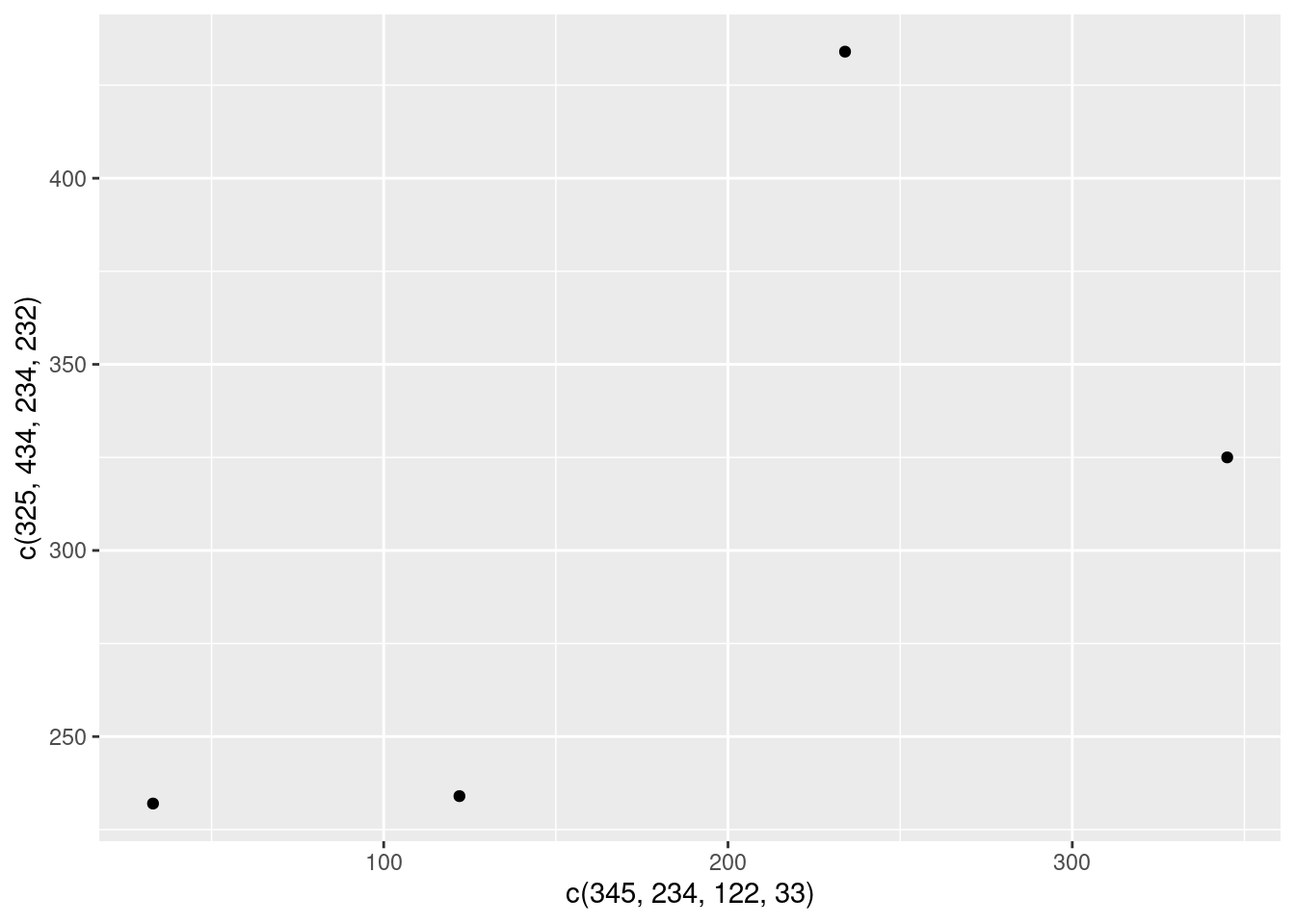
Well, nothing happened. How the hell should R now what you want to plot? That’s why we need to specify x- and y-aesthetics via the so-called mapping. Just create those with a vector using c().
Oh nice. That worked. So what’s the deal with the different output? Let me explain:
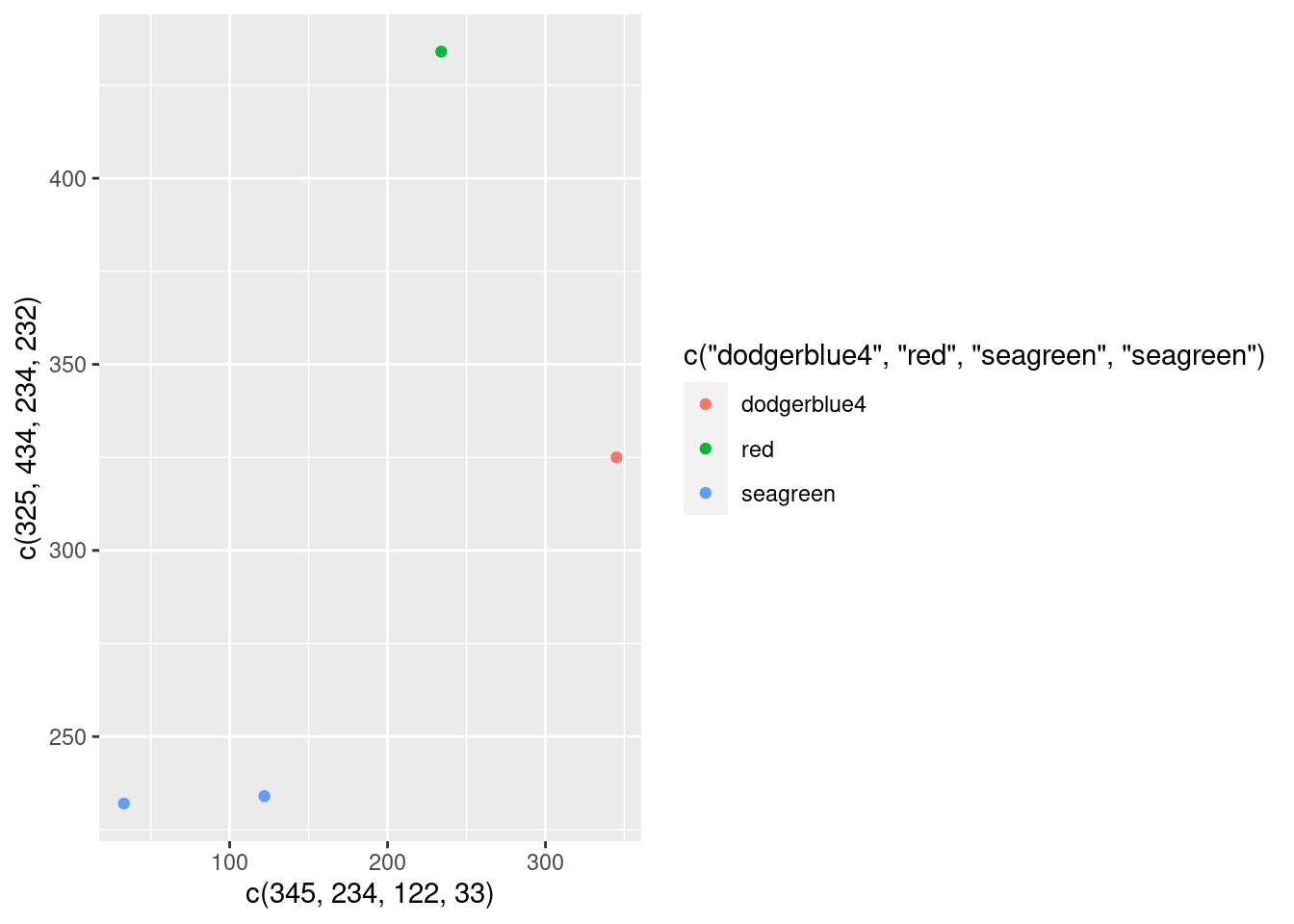
Inside of the aes() you don’t specify things yourself. You say “ggplot, here’s my data. Pretty please, do a useful color thingy with that.”
And ggplot is like “Uhh okay, I guess I can take the names that you gave me and make a color legend out of that. And when I do, I will assign a unique color to each of those names you gave me.”.
Secretly, ggplot will also think to itself “Boy, I hope there are no real color names inside of the names. I don’t know how to handle this at this point.”
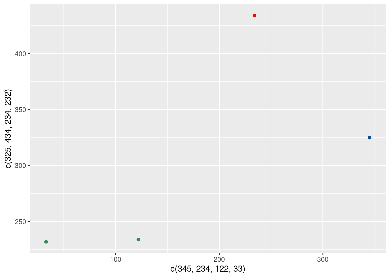
Outside of the aes() you specify things yourself. You say, “Listen up, ggplot. For each of the points, here are some colors. You better use them just like I specified them.” and then ggplot will just do what you say.
So that’s the reason why things behave differently depending on whether you put things into aes(). But I can already hear you say, “Hold on, guy! Why did we stick the x and y coordinates into the aes() then? Clearly, that’s something that’s supposed to be taken as is and should therefore be outside of aes().”
To which I reply “That’s a great observation, young padawan…but you’re wrong.”
You see, it’s easy to think that the coordinates are fixed but really ggplot() has to do quite some calculations to figure out where to place things on the canvas.
First, it has to figure out what the range of the coordinates are
And then it has to figure out where to place each point according to the current maximum and minimum values of the x- and y-axis.
That’s no small feat. Behind the scenes, ggplot() does this by computing so-called scales that translate data to visual properties. That’s a lot of work. Let’s be thankful that we don’t have to deal with that ourselves.
In fact, ggplot() is so nice that it hides all of this stuff for you if you don’t want to see it. But technically, all ggplots have way more layers (one for each aesthetic that you map). This is how the code looks if you would add the scales.
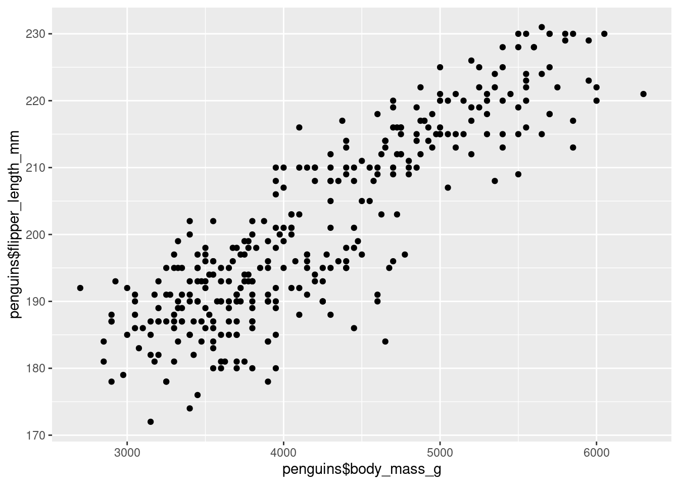
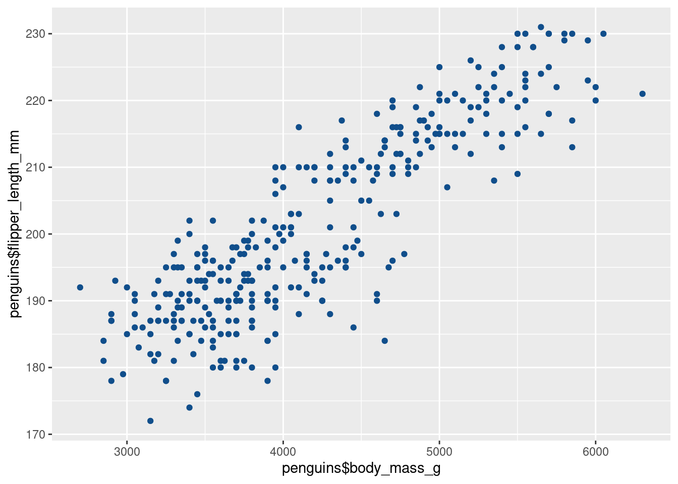
For example, we can use the columns body_mass_g and flipper_length_mm as x- and y-coordinates, respectively. Just like we added vectors inside of aes() before, we can do the exact same thing by extracting the columns as vectors using the $ operator.
Now, what if we wanted to make all of them have the color “dodgerblue4”? Do we again have to repeat the color “dodgerblue4” for each point like we did before?
Thankfully, no. We can just specify a single color and ggplot is kind enough to reuse that color on ALL points. (And remember, when we tell ggplot what to do, we put the instruction outside the aes()).
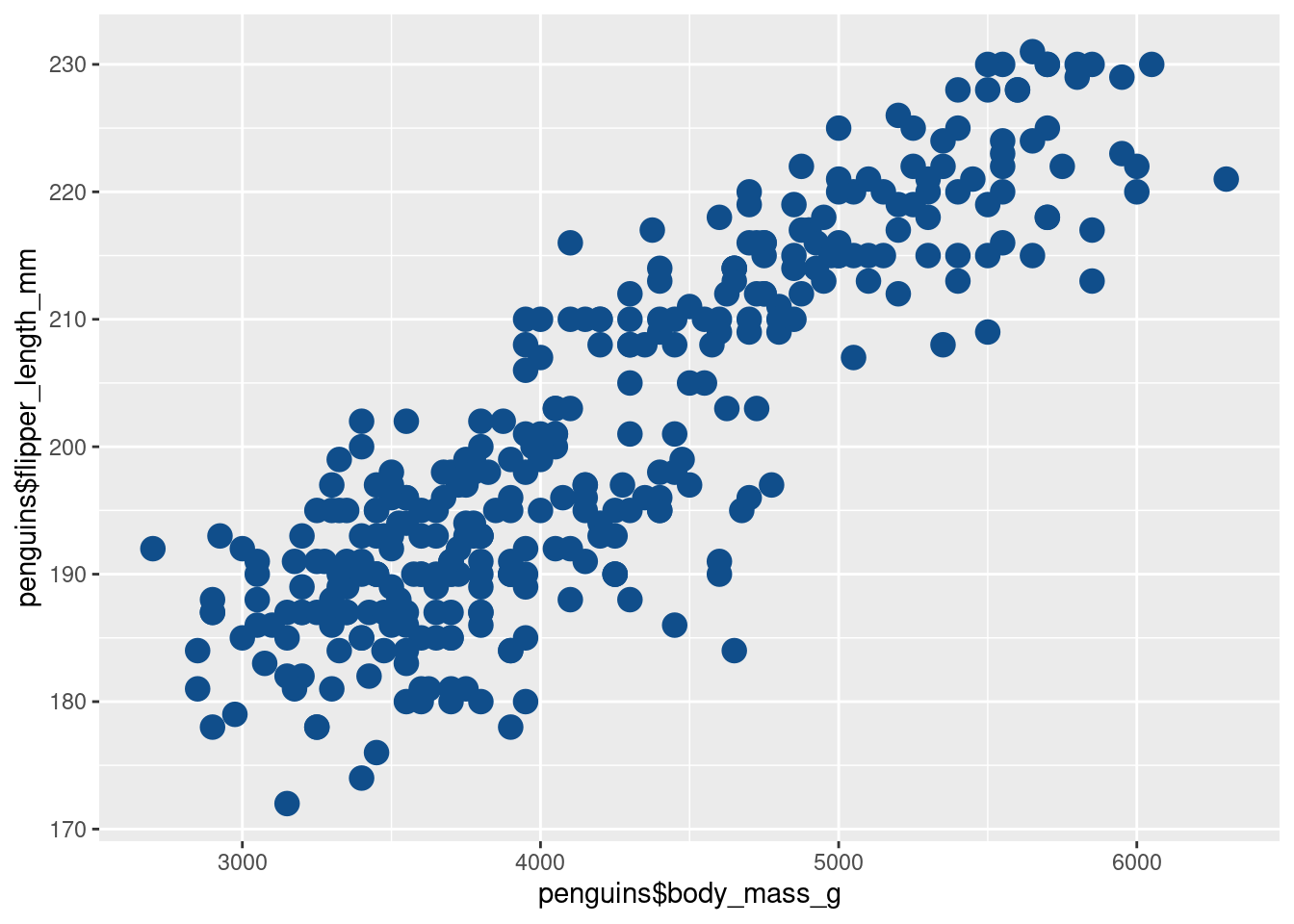
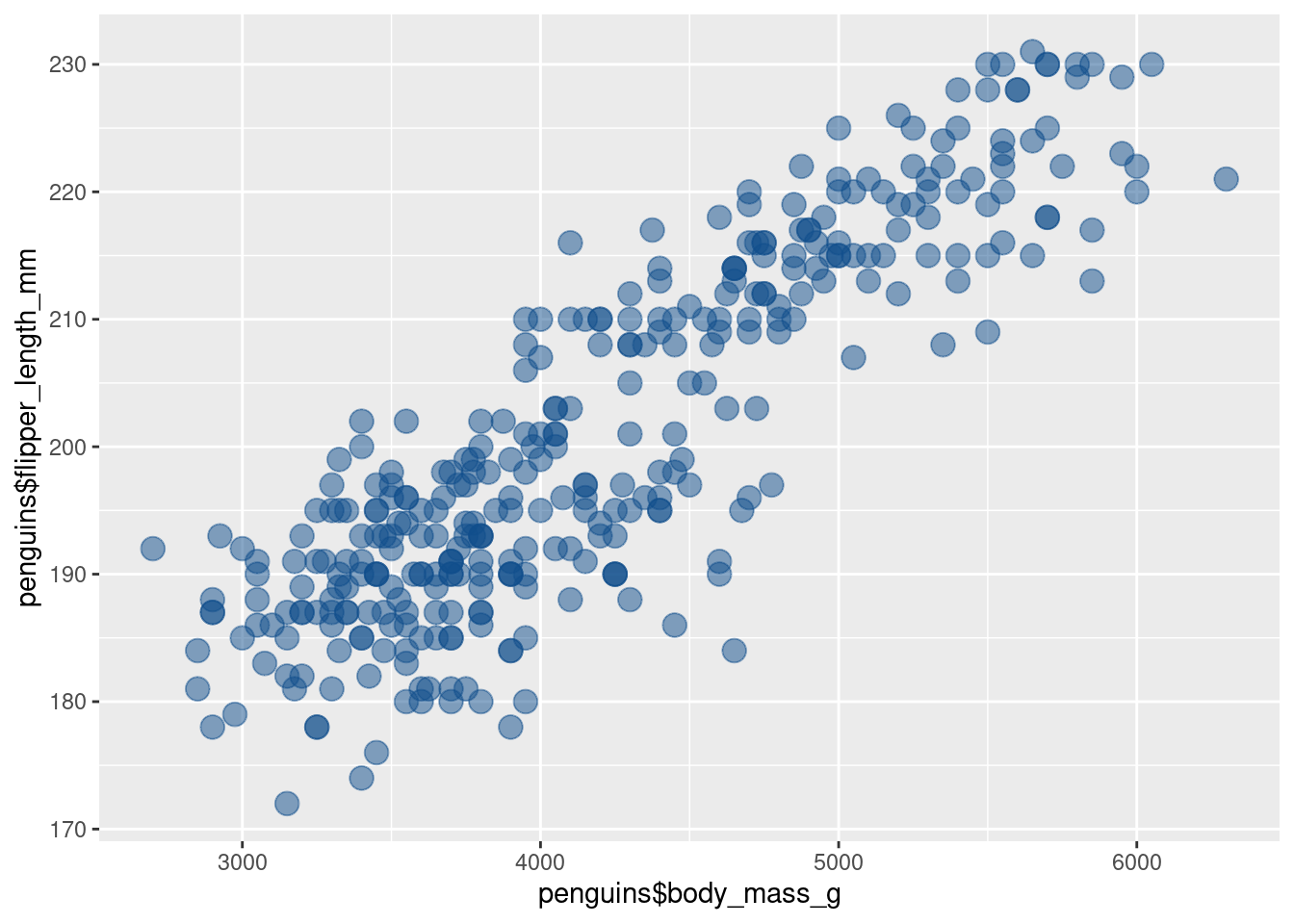
Uff, now the points overlap quite a lot. Luckily, we can make them a bit transparent. That way, we can see better if they overlap. To do so, we reduce the alpha aesthetic (0 is fully transparent and 1 is fully opaque).
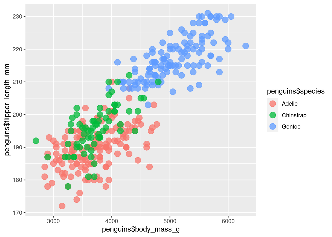
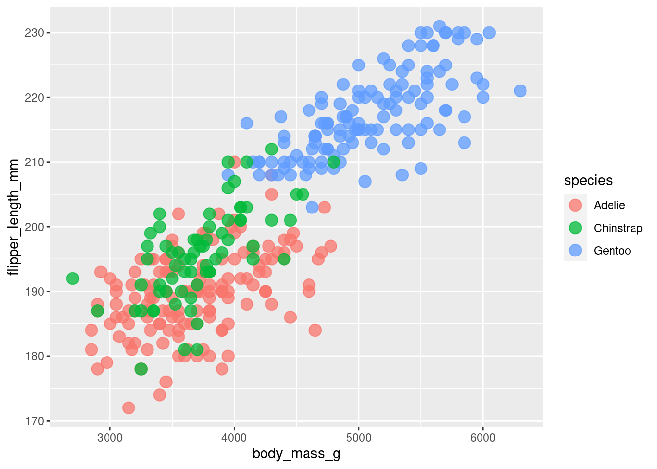
Having only one color isn’t that informative. Sure, we can see that penguins that are heavier tend to have longer flippers. But maybe seeing differences between species could be interesting.
So let’s color the points by species. This is a scenario where we want to let ggplot figure out which point gets which color based on the column species in our penguins data set. Therefore, we remove the color specification outside of the aes() call and put our data inside the aes() where we map the data to the color aesthetic.
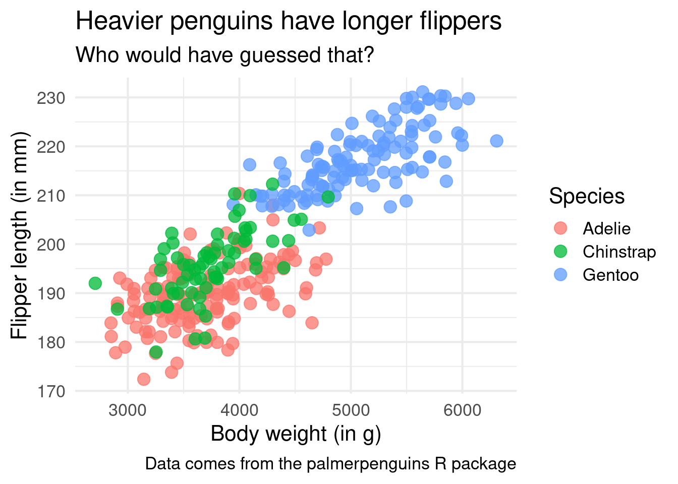
Interesting! It appears as if the Gentoo penguins are heavier in general. It’s still the same relationship of heavier penguins having a longer flipper in general but seeing the differences in species is also cool.
Avoid duplicate code
We have generated a new insight from this chart. That’s great. But now we should clean up our code a bit. Here, we have used penguins$ three times in a row. That’s pretty tedious.
A better way to do this is to use the data argument that that every geom_* layer has. Then, we can just skip the penguins$ part inside of the aes(). Because the point layer “knows” the data, it can just access the correct columns via its name. That’s pretty cool, isn’t it?
Since our code is good now, let us focus on our chart again. We can apply a bit of minimal effort to make it look nice. To do so, let us add more layers to our plot. After all, ggplot is all about adding layers on top of each other. And when it’s not layers with geometric objects that we add on top of our plot, we add other layers that take care of style.
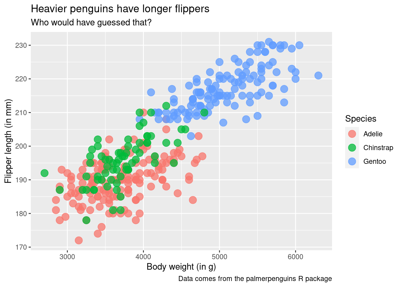
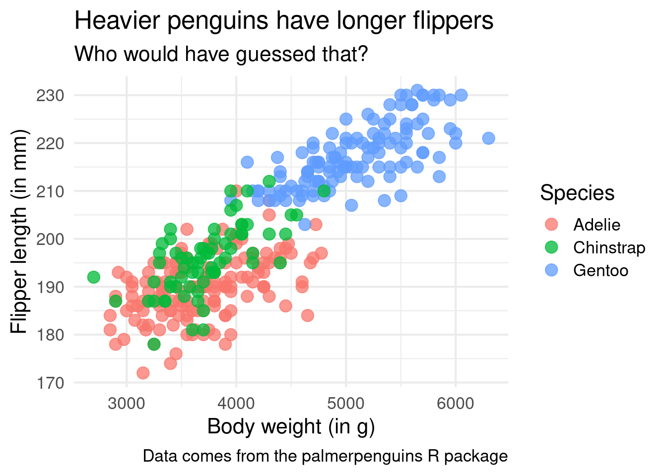
One such layer is the labs() layer. It’s responsible for making nice labels. Who would have guessed that based on the name of the layer, right? All this layer wants is labels specified as strings for each aesthetic that you mapped inside of aes() and want to rename. Here’s how that looks.
ggplot() +geom_point(data = penguins,mapping =aes(x = body_mass_g,y = flipper_length_mm,color = species ),size =4,alpha =0.75 ) +labs(x ='Body weight (in g)',y ='Flipper length (in mm)',color ='Species' )
But this layer can also add things like the title, subtitle and caption.
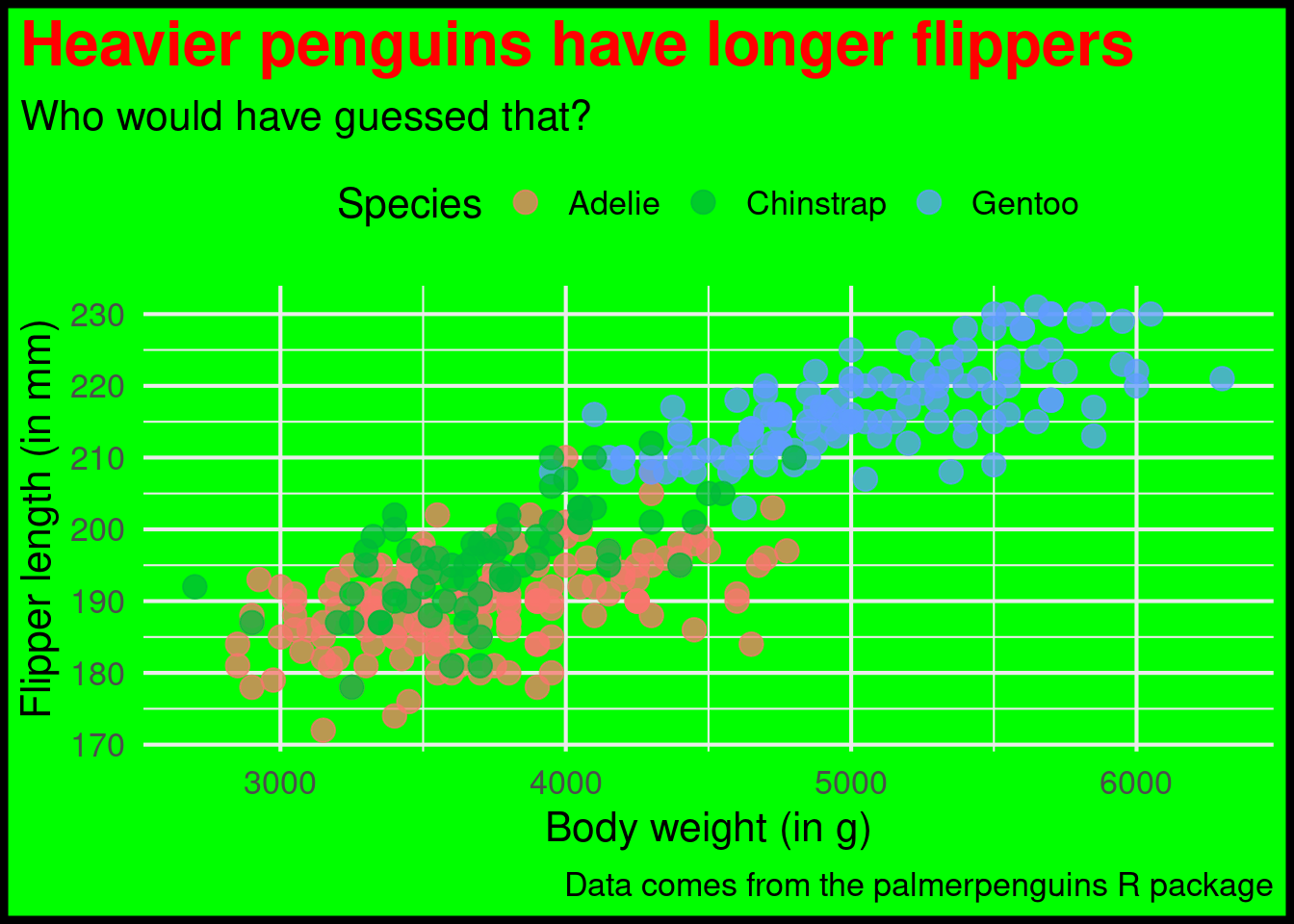
ggplot() +geom_point(data = penguins,mapping =aes(x = body_mass_g,y = flipper_length_mm,color = species ),size =4,alpha =0.75 ) +labs(x ='Body weight (in g)',y ='Flipper length (in mm)',color ='Species',title ='Heavier penguins have longer flippers',subtitle ='Who would have guessed that?',caption ='Data comes from the palmerpenguins R package' )
Easy theme changes
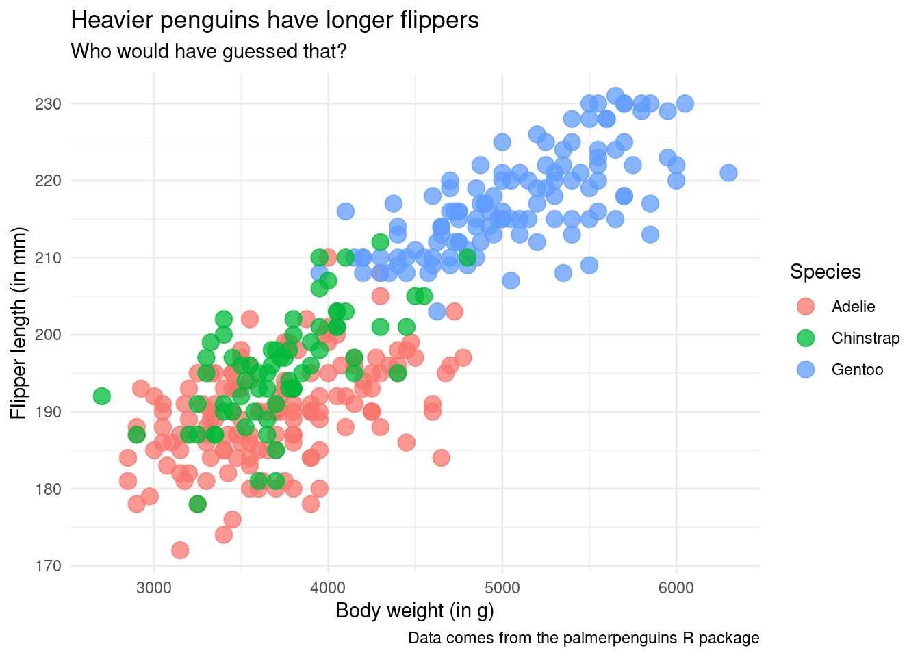
Another great layer are the theme layers. They change the overall look of your chart. For example, I really enjoy theme_minimal() because I like the subtle look.
ggplot() +geom_point(data = penguins,mapping =aes(x = body_mass_g,y = flipper_length_mm,color = species ),size =4,alpha =0.75 ) +labs(x ='Body weight (in g)',y ='Flipper length (in mm)',color ='Species',title ='Heavier penguins have longer flippers',subtitle ='Who would have guessed that?',caption ='Data comes from the palmerpenguins R package' ) +theme_minimal()
And the best part about this is that you can even increase the font size for your plot inside of this layer. That’s important. Because if no one can read your chart it doesn’t matter what cool insight you want to communicate. Don’t let your hard work be ruined because you forgot to increase the font size!
ggplot() +geom_point(data = penguins,mapping =aes(x = body_mass_g,y = flipper_length_mm,color = species ),size =4,alpha =0.75 ) +labs(x ='Body weight (in g)',y ='Flipper length (in mm)',color ='Species',title ='Heavier penguins have longer flippers',subtitle ='Who would have guessed that?',caption ='Data comes from the palmerpenguins R package' ) +theme_minimal(base_size =16)
Specific theme changes
Additionally, you can apply your own theme changes using the theme() layer. It has A TON of arguments that can modify all sorts of things. We cannot cover everything here. But let me give you an idea how theme() works.
Fixed value theme() arguments
Some of its arguments just expect a value. Among those, two I always use are the plot.title.position and plot.caption.position. Both of these can be set to "plot" to align the titles and captions to the whole plot and not the panel.
ggplot() +geom_point(data = penguins,mapping =aes(x = body_mass_g,y = flipper_length_mm,color = species ),size =4,alpha =0.75 ) +labs(x ='Body weight (in g)',y ='Flipper length (in mm)',color ='Species',title ='Heavier penguins have longer flippers',subtitle ='Who would have guessed that?',caption ='Data comes from the palmerpenguins R package' ) +theme_minimal(base_size =16) +theme(plot.title.position ='plot',plot.caption.position ='plot' )
Another example of that category could be legend.position. It can be set to "top", "bottom", "left" or "right" or "none". I think you can figure out what each option does.
ggplot() +geom_point(data = penguins,mapping =aes(x = body_mass_g,y = flipper_length_mm,color = species ),size =4,alpha =0.75 ) +labs(x ='Body weight (in g)',y ='Flipper length (in mm)',color ='Species',title ='Heavier penguins have longer flippers',subtitle ='Who would have guessed that?',caption ='Data comes from the palmerpenguins R package' ) +theme_minimal(base_size =16) +theme(plot.title.position ='plot',plot.caption.position ='plot',legend.position ="top" )
Changing theme elements
It gets a little bit more complicated when you want to change things like the background of your plot or the font size of your title. There, you will need not only the theme() arguments like plot.title and plot.background, you will also need helper functions. All of these helper functions start with element_. Depending on what you want to change, you will have to use one of
element_text(),
element_rect(),
element_line() or
element_blank().
Don’t worry. The documentation of theme() will tell you exactly what kind of element which argument expects. In any case, inside of these helpers, you can specify all kinds of things and usually the argument names inside of the helpers are pretty self-explanatory. Have a look.
ggplot() +geom_point(data = penguins,mapping =aes(x = body_mass_g,y = flipper_length_mm,color = species ),size =4,alpha =0.75 ) +labs(x ='Body weight (in g)',y ='Flipper length (in mm)',color ='Species',title ='Heavier penguins have longer flippers',subtitle ='Who would have guessed that?',caption ='Data comes from the palmerpenguins R package' ) +theme_minimal(base_size =16) +theme(plot.title.position ='plot',plot.caption.position ='plot',legend.position ="top",plot.title =element_text(size =24, face ='bold', color ='red' ),plot.background =element_rect(fill ='green',colour ='black',linewidth =3 ) )
Oh god. This turned into a pretty uply plot. But that was exactly the point. As I have learned from one of Allison Horst’s excellent blog posts, the best way to learn how to play around with theme() is to just make something ugly. Don’t worry about making something look good. Just think about how to change stuff.
Modifying scales
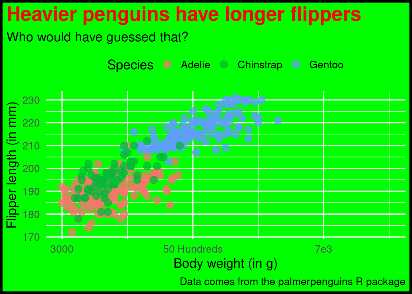
If you want, you could even try to modify the x and y scale layers that I showed you before. For example, you could try setting
limits (range of axis),
breaks (where to place labels) and
labels (actual labels)
of an axis to something terrible.
ggplot() +geom_point(data = penguins,mapping =aes(x = body_mass_g,y = flipper_length_mm,color = species ),size =4,alpha =0.75 ) +labs(x ='Body weight (in g)',y ='Flipper length (in mm)',color ='Species',title ='Heavier penguins have longer flippers',subtitle ='Who would have guessed that?',caption ='Data comes from the palmerpenguins R package' ) +theme_minimal(base_size =16) +theme(plot.title.position ='plot',plot.caption.position ='plot',legend.position ="top",plot.title =element_text(size =24, face ='bold', color ='red' ),plot.background =element_rect(fill ='green',colour ='black',linewidth =3 ) ) +scale_x_continuous(limits =c(3000, 8000),breaks =c(3000, 5000, 7000),label =c('3000', '50 Hundreds', '7e3') )
That’s a pretty fun exercise and I can wholeheartedly recommend that. As a side note, when you’re ready to learn more on how to make really good charts, you might want to try out my video course.
New chart, new challenges
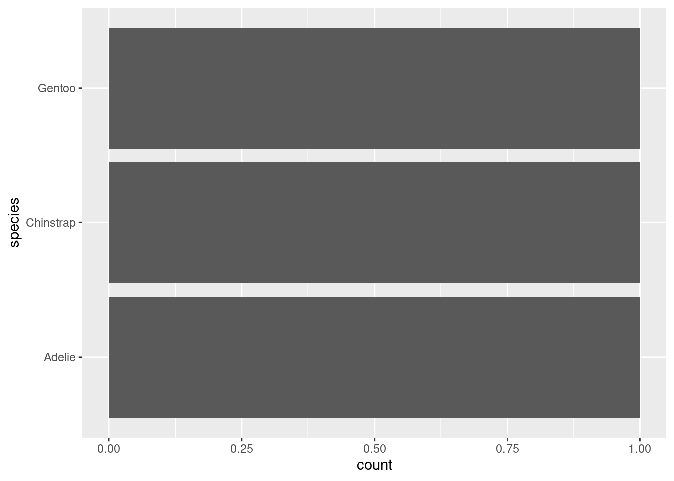
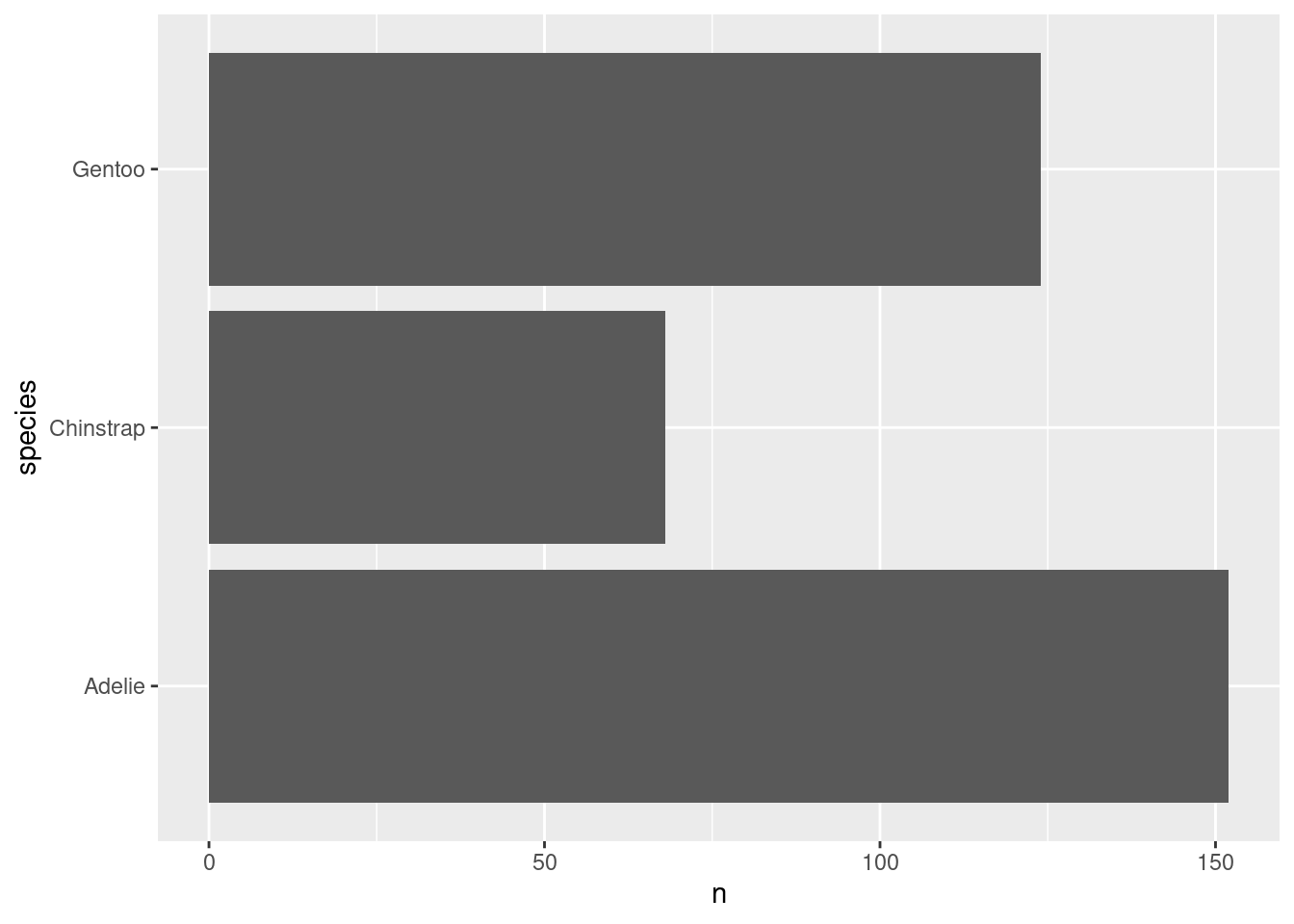
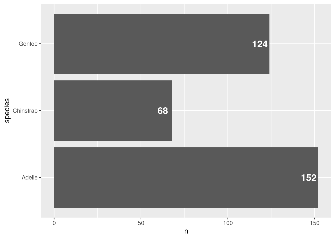
Next, let us switch gears a bit and create a completely new chart. For example, let us create a bar chart using the amount of penguins that we have in our data set. What we need for that is to count those penguins manually. Or do we? Check out this plot.
ggplot() +geom_bar(data = penguins,mapping =aes(y = species ) )
Whaaaat!?!?! How did that happen? There are probably a couple of things that bamboozle you:
When did the counting happen? Our data set has lots of columns and rows but none of them say “There are 68 Chinstrap penguins in the data”.
Why did we specify only one aesthetic? Don’t we need to specify things like coordinates or bar length or something like that?
What kind of magic geometric object is “bar” as in geom_bar(). Shouldn’t this be something like rectangle or something like that? For God’s sake, there’s even a layer called geom_rect().
Transfor-what!?!
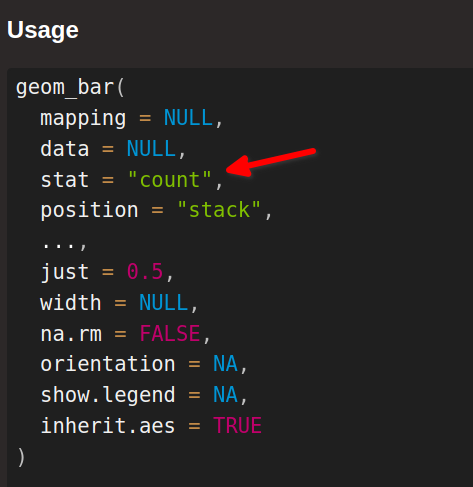
The answer to all of these questions is statistical transformations. What might sound a little ominous to you is really just a fancy way of saying “We can let ggplot handle a couple of easy computations instead of doing them manually.” And you know what? “Counting things” is one of those easy calculations that ggplot can handle. For example, check out the documentation of geom_bar():
You can think of this stat argument as describing the statistical transformation that is performed on the data. Here, this means something as simple as counting the number of penguins by species. Just like you could do manually with the count() function.
Now if you would rather compute things yourself to let ggplot handle only the plotting part - and this is a very valid thing to do - then you could pass in your counted data to the data argument yourself.
ggplot() +geom_bar(data = counted_penguins,mapping =aes(y = species ) )
Uhhhh, this had unfortunate consequences. Turns out that geom_bar() just likes to count too much. So here it counted in how many rows each species appears in counted_penguins. Guess what: All species names appear only once. See:
counted_penguins## # A tibble: 3 × 2## species n## <fct> <int>## 1 Adelie 152## 2 Chinstrap 68## 3 Gentoo 124
Stop counting, ggplot
But that’s not the point. The relevant thing happens in the n column. So, let’s try to tell geom_bar() that it should use the n column in the x-aesthetic to make each bar longer.
ggplot() +geom_bar(data = counted_penguins,mapping =aes(y = species,x = n ) ) ## Error in `geom_bar()`:## ! Problem while computing stat.## ℹ Error occurred in the 1st layer.## Caused by error in `setup_params()`:## ! `stat_count()` must only have an x or y aesthetic.
That didn’t go well for us. Again, it’s because geom_bar() just likes to count too much. It’s because its default stat argument is set to ¨count", remember? That’s why we need to tell geom_bar() that it should ignore its statistical transformation that is put into the stat argument.
But, oh boy, I can tell you right now. This will not go well for us. Every geometric layer in ggplot is tied to some statistical transformation. It’s just part of the Grammar of Graphics which “gg” stands for.
“Hold on!”, I can hear you say, “We haven’t used statistical transformations before. So why does every layer have one?” So here’s a shocking revelation for you: It turns out that we have secretly used a statistical transformation in all plots. It’s just that this was the simplest transformation you can think of, namely the identity transform. Just like Patrick Star takes Bikini Bottom and pushes it somewhere else, this transform just takes the data and moves it somewhere else. But no changes in between.
Use this stat instead
And we can do the exact same thing in our geom_bar() layer. Just tell this layer that it should use some other stat.
AHA! This worked. So why did I tell you all of this? Well, it turns out that this statistical transformation thing is a pretty wild thing to wrap your head around. It was like that for me. And it will probably be the same for you. But it’s just super necessary to let ggplot do statistical transforms for you.
stat_ layers
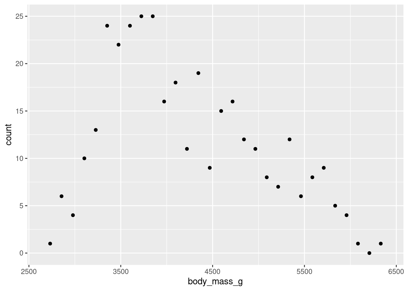
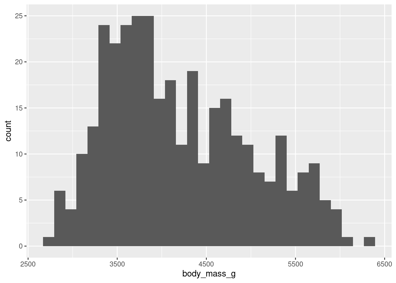
You’ve just seen that the "count" transform can count for you. But sometimes you also want to bin your data, i.e. split a numeric variable into equal chunks, and then count how many things fall in each bin. Thankfully, you can let ggplot do all of that. For example, you could look at the distribution of penguin weights that way.
Did you see that I used a stat_bin() layer? Confusing, right? This was just to teach you one thing that you may stumble on: There are geom_* layers and there are stat_ layers. Both are intricately linked.
Every statistical transformation needs a geometric object. And every geometric object needs a statistical transform. Both just can’t live without each other. So romantic, right?
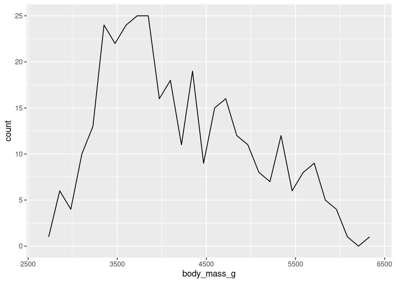
Here, stat_bin() is just the natural partner of geom_bar(). This means that you could also use geom_bar() and tell it to use the statistical transformation "bin". You will get the exact same image:
So, there is only one reason why you might want to use a stat_* layer as opposed to the corresponding geom_* layer. And that is because you want to make explicitly clear that there’s a non-identity statistical transform going on. This is important to know so that you don’t freak out when you find some ggplot code in the wild (like on StackOverflow) where someone uses a stat_* layer.
Connecting stats and geoms
More importantly, there’s some beauty in understanding how geoms and stats tie together. For example, you can create completely different looks by using a different geom in a stat_* layer or a different geom_* layer with the same stat.
In practice, though, you will be perfectly fine with using only geom_* layers without ever having to touch the stat. That’s because there are specifically designed geom_* layers for certain scenarios.
Want to create a bar chart with your counted_penguins data set? Use geom_col() instead of geom_bar() + stat = "identity".
Want to bin your data and count the number of observations in the bins? Use the geom_histogram() layer which creates this types of charts which are known as histograms.
Alright, now that we have covered the technicalities, let’s do something insightful again. Maybe we can add labels to our bars from before. To be precise, let’s add labels to this chart.
To do so, we have to add another layer, namely a text layer. The layer for that is geom_text(). What this layer needs are x and y coordinates of where to put text. And, of course, it needs to know what text to use. This goes into the label aesthetic. Here, this will just be the value from the n column in the counted_penguins data set. Putting this all together:
Uhm, these labels are not that great. Let’s move them inside of the bars by modifying the x aesthetic.
ggplot() +geom_col(data = counted_penguins,mapping =aes(y = species,x = n ) ) +geom_text(data = counted_penguins,mapping =aes(x = n -5.5,y = species,label = n ) )
Then we can modify their look using the size, color and fontface aesthetics. And remember, these things have nothing to do with the data. So you need to park them outside the aes().
ggplot() +geom_col(data = counted_penguins,mapping =aes(y = species,x = n ) ) +geom_text(data = counted_penguins,mapping =aes(x = n -5.5,y = species,label = n ),size =5,color ='white',fontface ='bold' )
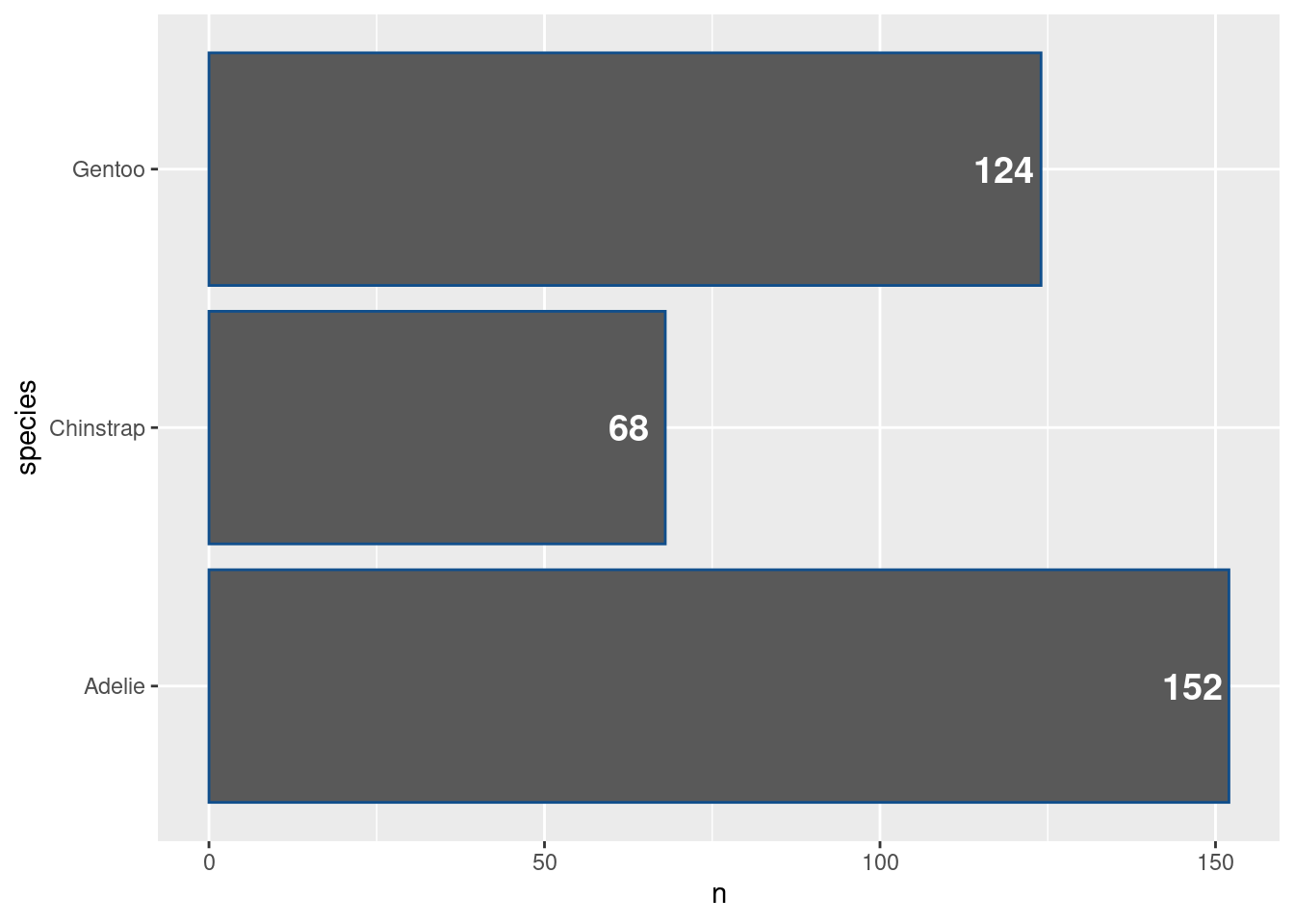
Changing the colors of bars
While we’re at it, we might make the bars have a nicer color. This grey is a bit depressing. Maybe let’s set color = "dodgerblue4" in the geom_col() layer. Should be straightforward at this point, right?
ggplot() +geom_col(data = counted_penguins,mapping =aes(y = species,x = n ),color ='dodgerblue4' ) +geom_text(data = counted_penguins,mapping =aes(x = n -5.5,y = species,label = n ),size =5,color ='white',fontface ='bold' )
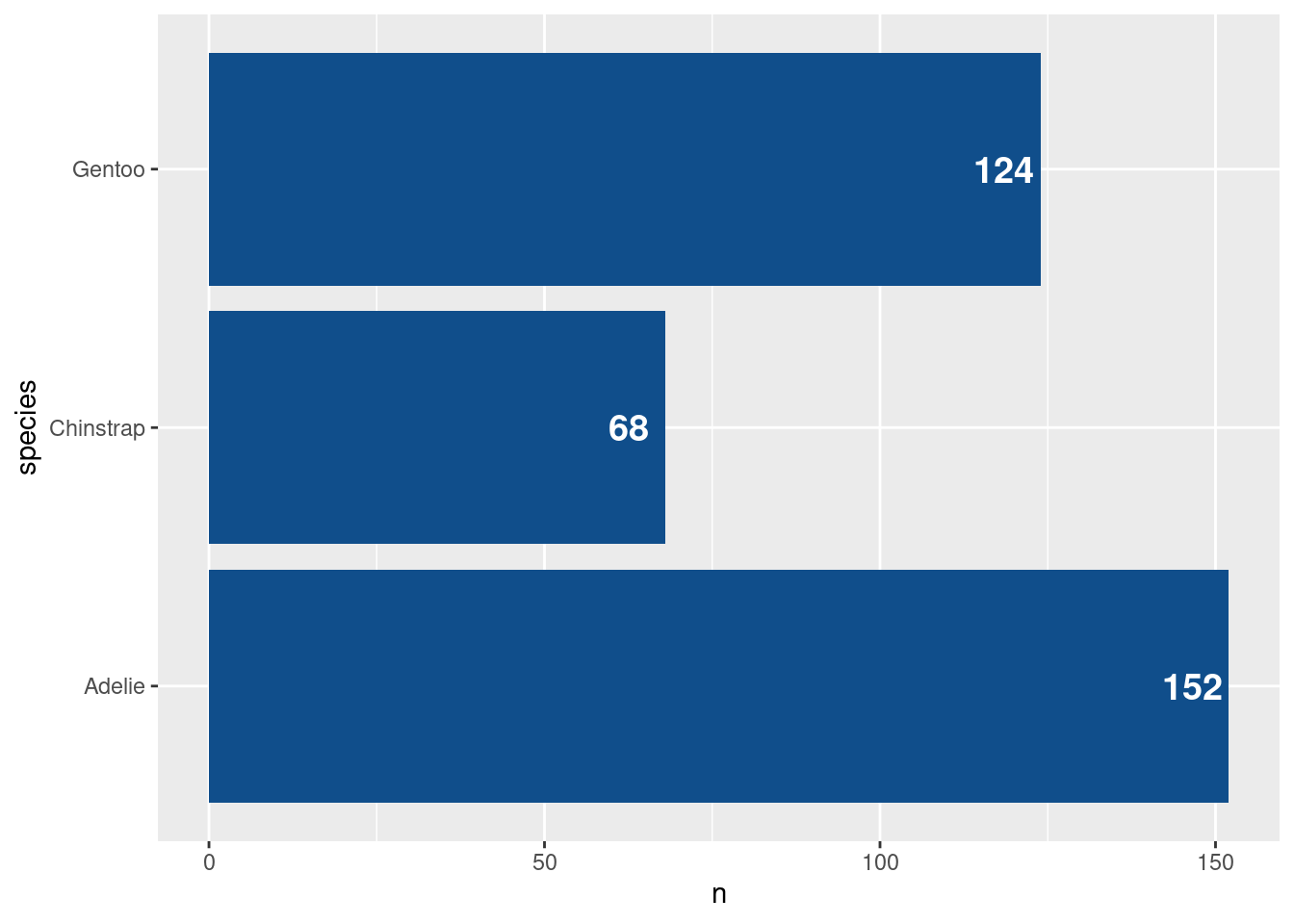
Shoot! This doesn’t look right. The outline of the bars became blue (look closely). This happens to me all the time. I totally forget that some geometric objects have two aesthetic that relate to colors: fill and color. One is for the outline and one for the filling. Let’s adjust accordingly.
ggplot() +geom_col(data = counted_penguins,mapping =aes(y = species,x = n ),fill ='dodgerblue4' ) +geom_text(data = counted_penguins,mapping =aes(x = n -5.5,y = species,label = n ),size =5,color ='white',fontface ='bold' )
More code cleaning
Ah that’s nice. We have made our bar chart for informative and improved its look. Once again, we can take the time after this huge success to clean up our code a bit. Notice that we have used the same data set in both layers. Alternatively, we could just use the data argument in the top ggplot() layer. All other layers will inherit from there.
ggplot(data = counted_penguins) +geom_col(mapping =aes(y = species,x = n ),fill ='dodgerblue4' ) +geom_text(mapping =aes(x = n -5.5,y = species,label = n ),size =5,color ='white',fontface ='bold' )
Similarly, we can move aesthetics that we want to pass to other layers anyway to the top layer.
ggplot(data = counted_penguins, aes(y = species)) +geom_col(mapping =aes(x = n ),fill ='dodgerblue4' ) +geom_text(mapping =aes(x = n -5.5,label = n ),size =5,color ='white',fontface ='bold' )
This doesn’t stop us from adding or even overwriting the data or mapping in a specific layer. But putting things into the top layer helps to avoid a little bit of code duplication.
Splitting histograms
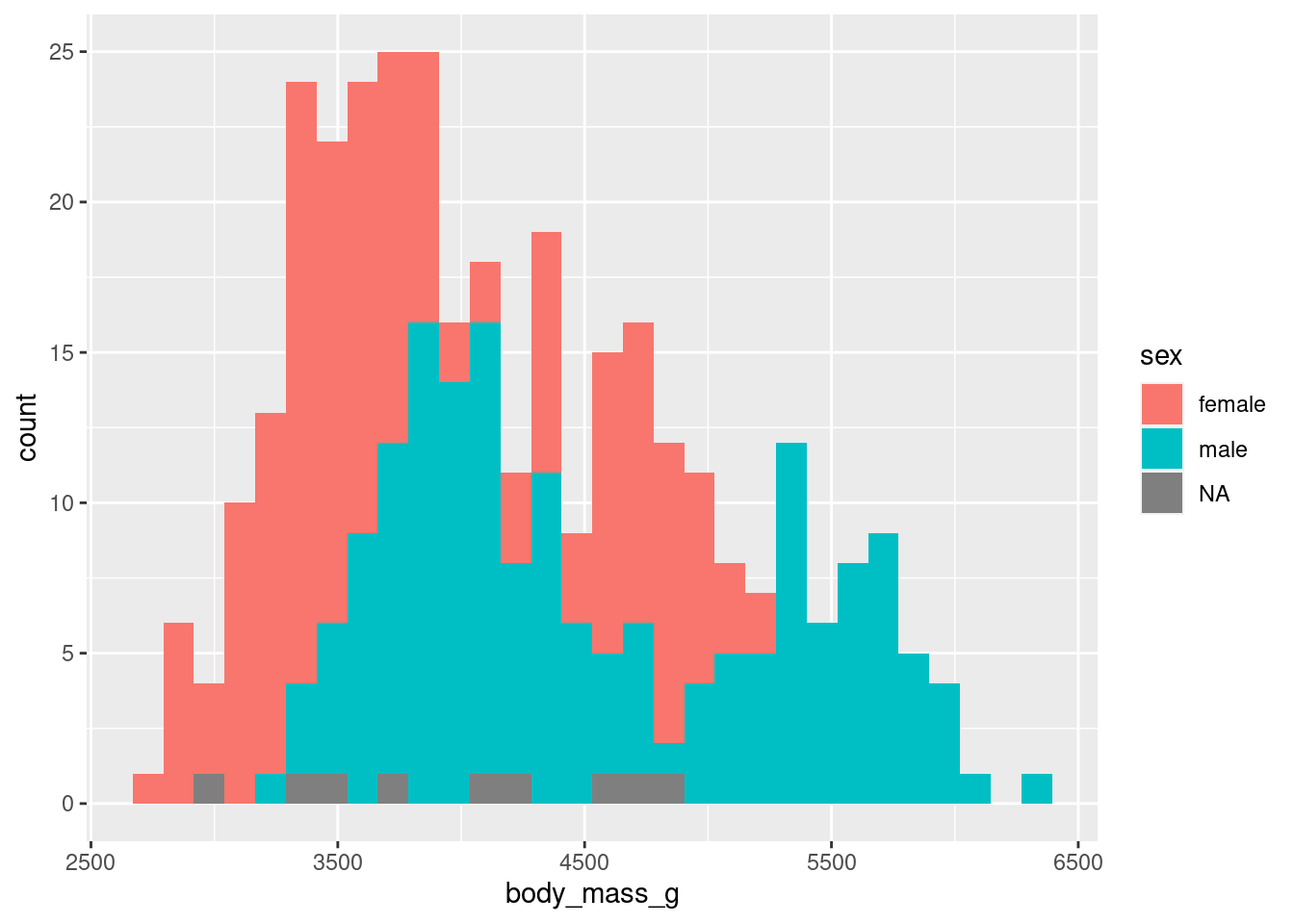
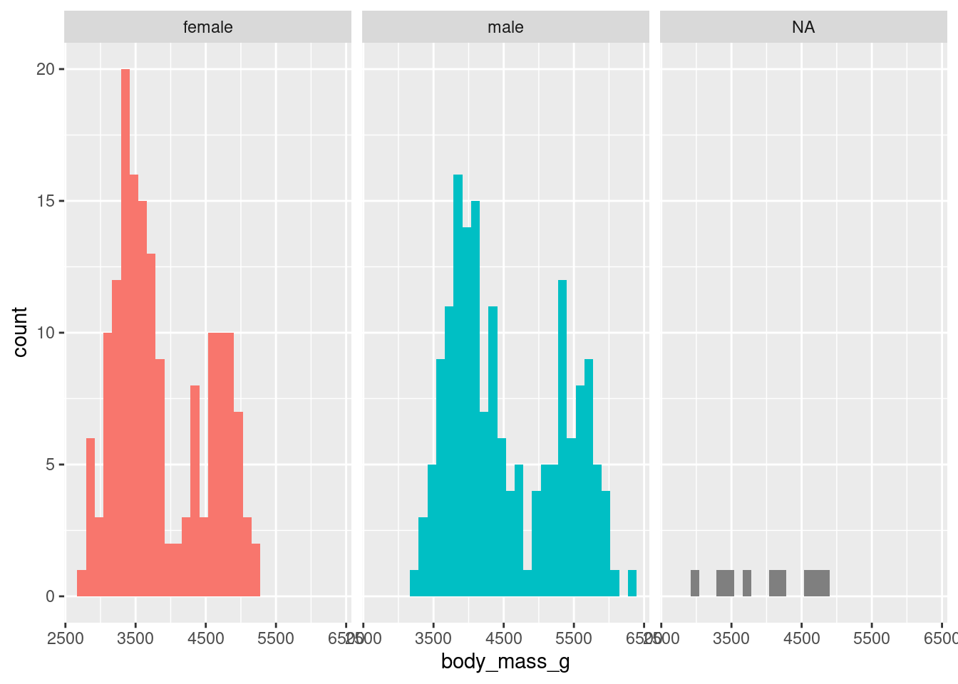
Next, let us make our histogram more informative. Maybe we can split it by sex. My guess is that male penguins are heavier than female ones. But let’s check if the data supports that. To do so, let us map fill to the sex column.
Apart from there being missing values (NA) which we just ignore, I find this a little bit hard to interpret. By default, geom_histogram() stacks the two histograms on top of each other. There are two ways we could overcome this:
Make bars transparent and not stack them or
Give each histogram its own window
Both solutions can be implemented fabulously with ggplot.
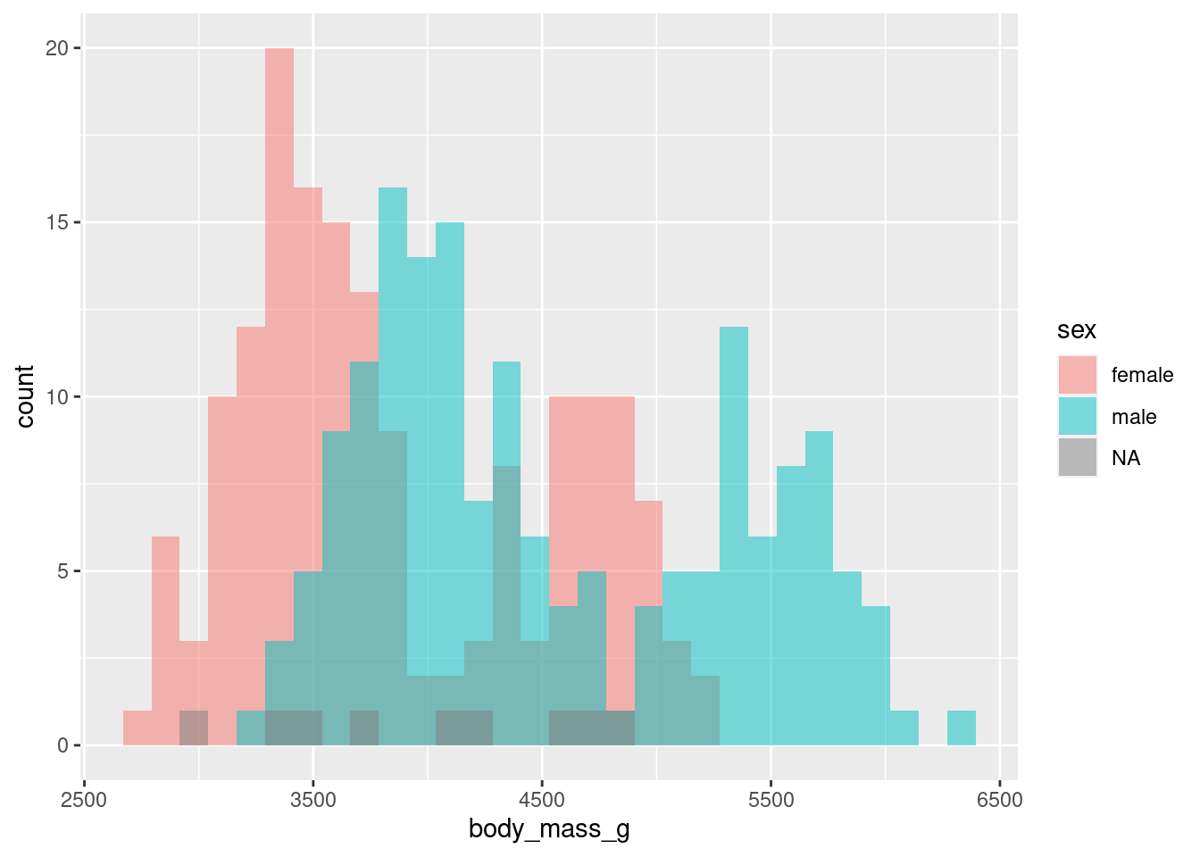
Change positioning
To change the positioning of the bars, we just have to modify the position argument inside geom_histogram(). You see, just like any layer has a stat argument that most of the time is just set to “identity”, all layers have a position argument that is set to “identity” most of the time. But in geom_histogram() it’s “stack” instead of “identity” by default. So that’s the thing we need to change.
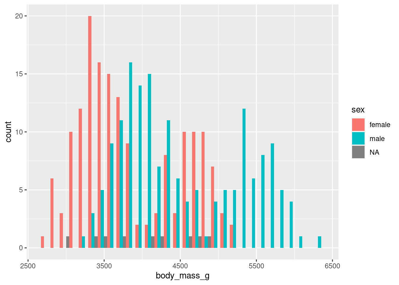
Here, I’ve used one of the position_() helper functions to set position to the “identity” position. But there are other position helpers. For example, you could bars let them dodge each other. Not something I recommend here but easily doable.
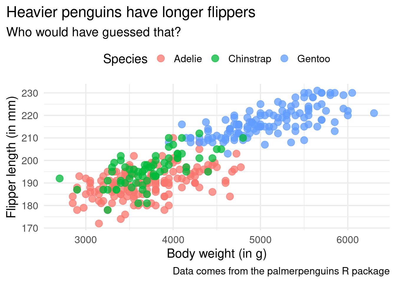
But there’s more. Remember our scatter plot from earlier? The ugly one. Here it is again (without the ugly styling)
ggplot() +geom_point(data = penguins,mapping =aes(x = body_mass_g,y = flipper_length_mm,color = species ),size =4,alpha =0.75 ) +labs(x ='Body weight (in g)',y ='Flipper length (in mm)',color ='Species',title ='Heavier penguins have longer flippers',subtitle ='Who would have guessed that?',caption ='Data comes from the palmerpenguins R package' ) +theme_minimal(base_size =16)
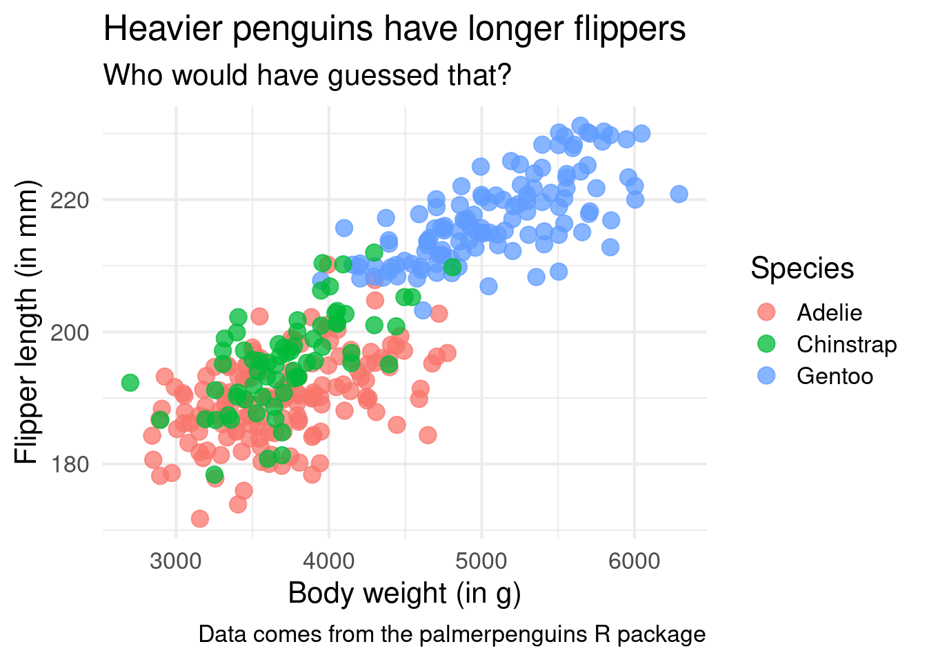
In geom_point() the default positioning is “identity” too. But you could for example wiggle the points a bit. This technique can be useful when points overlap too much and is known as jittering. The corresponding position helper is position_jitter().
ggplot() +geom_point(data = penguins,mapping =aes(x = body_mass_g,y = flipper_length_mm,color = species ),size =4,alpha =0.75,position =position_jitter() ) +labs(x ='Body weight (in g)',y ='Flipper length (in mm)',color ='Species',title ='Heavier penguins have longer flippers',subtitle ='Who would have guessed that?',caption ='Data comes from the palmerpenguins R package' ) +theme_minimal(base_size =16)
And the cool thing is that this jittering technique is so common that you can even use the short-hand geom_jitter().
ggplot() +geom_jitter(data = penguins,mapping =aes(x = body_mass_g,y = flipper_length_mm,color = species ),size =4,alpha =0.75 ) +labs(x ='Body weight (in g)',y ='Flipper length (in mm)',color ='Species',title ='Heavier penguins have longer flippers',subtitle ='Who would have guessed that?',caption ='Data comes from the palmerpenguins R package' ) +theme_minimal(base_size =16)
One window for each sub-plot
As we discussed, another alternative for our stacked histogram are seperate windows for each penguin sex. That can be done with a so-called facet layer like facet_wrap(). In this case, you could even remove the color legend because each window will be labeled by default anyway.
Notice that I have used another helper function vars(). This one is just like the aes() layer: It helps us to make data-dependent splits of the data. But behind the scenes this works a little bit differently for facets. That’s why we need a different function vars() and cannot use aes().
Putting this all together
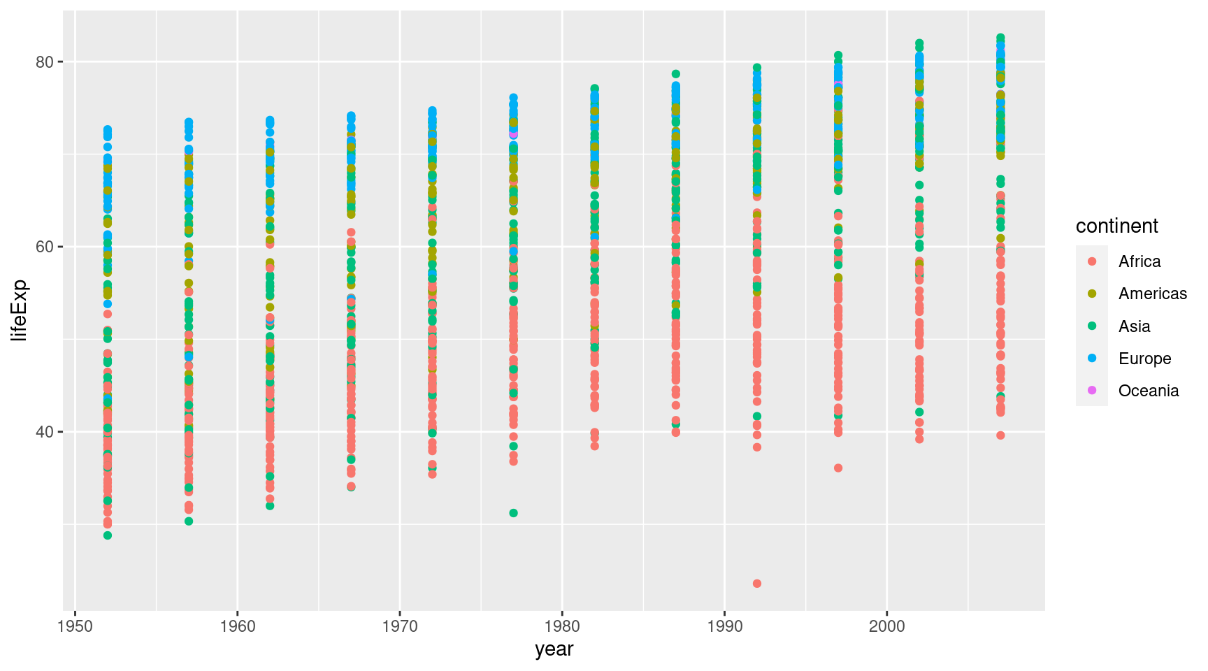
We have learned a lot so let’s put this all together. To do so we’re going to take a new data set. Namely, the gapminder data set from the gapminder package.
gapminder::gapminder## # A tibble: 1,704 × 6## country continent year lifeExp pop gdpPercap## <fct> <fct> <int> <dbl> <int> <dbl>## 1 Afghanistan Asia 1952 28.8 8425333 779.## 2 Afghanistan Asia 1957 30.3 9240934 821.## 3 Afghanistan Asia 1962 32.0 10267083 853.## 4 Afghanistan Asia 1967 34.0 11537966 836.## 5 Afghanistan Asia 1972 36.1 13079460 740.## 6 Afghanistan Asia 1977 38.4 14880372 786.## 7 Afghanistan Asia 1982 39.9 12881816 978.## 8 Afghanistan Asia 1987 40.8 13867957 852.## 9 Afghanistan Asia 1992 41.7 16317921 649.## 10 Afghanistan Asia 1997 41.8 22227415 635.## # ℹ 1,694 more rows
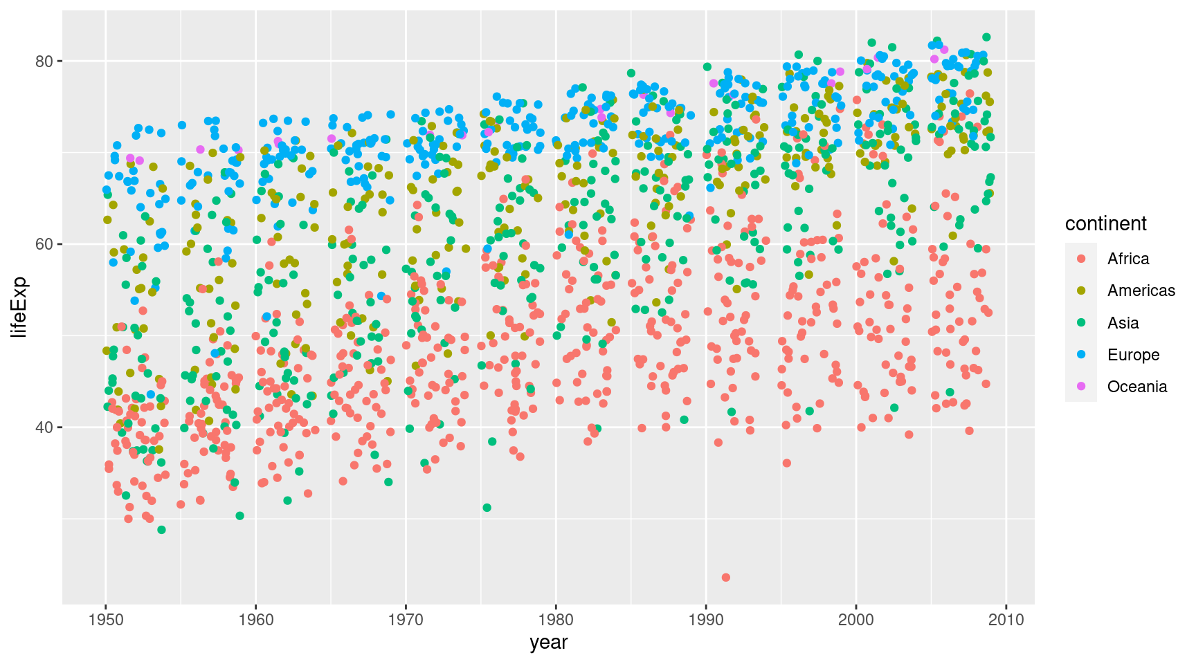
Let’s first pass the data to ggplot. This works because the first argument is in ggplot() is the data. While we’re at it, we can specify the mapping in the first layer and add a geom_point() layer.
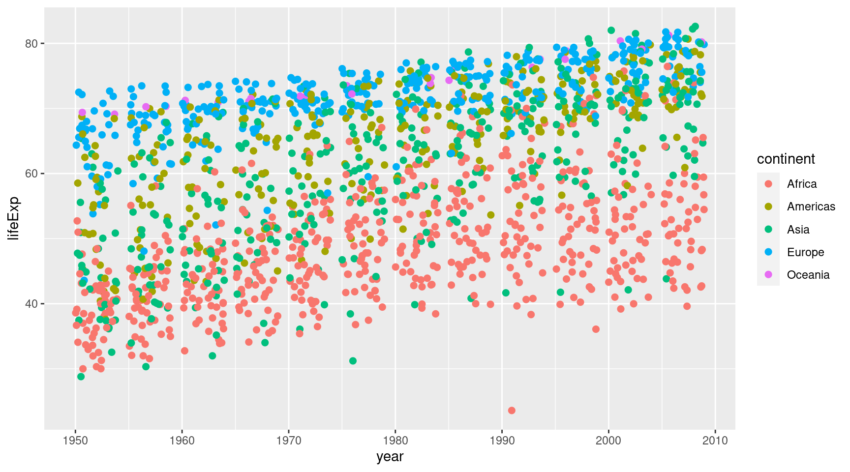
Ah that’s pretty messy. Everything is on vertical lines. That’s because the gets only recorded every couple of years, I guess. Good thing, we can wiggle the points a bit with geom_jitter().
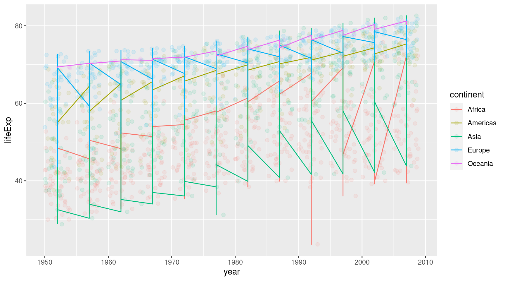
Ughh, these are not the lines I imagined we would create. But now that I think about it: geom_line() will just connect all the points of each continent. That’s not what we want. We want one line that is fitted to the points.
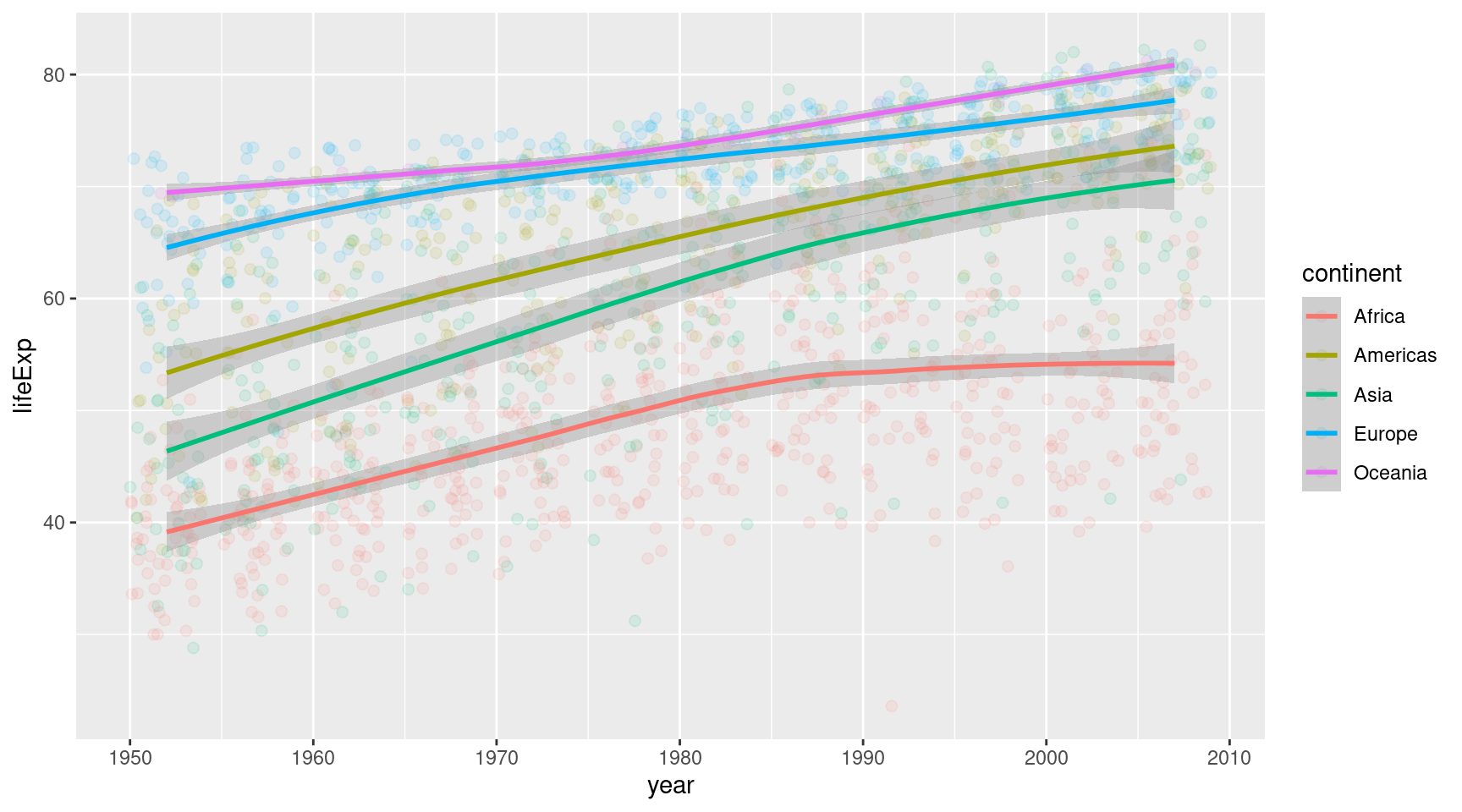
AHA! This screams statistical transformation. Turns out geom_smooth() does what we want. It will draw a smoothed curved through the points.
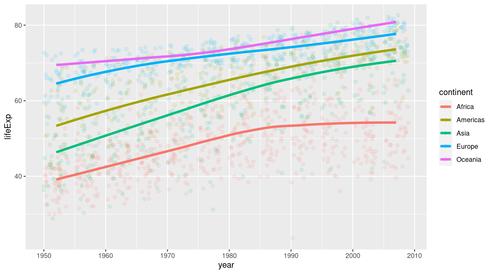
Ahh this looks better. It seems like geom_smooth() even adds things like a confidence band around the lines. Cool. I imagine the statistical folks among you are excited. The rest can just ignore this grey area.
Or we could remove it with se = FALSE. Yeah let’s do that. And while we’re at it, we might increase the linewidth a bit.
Ahh we’re getting somewhere. This looks decent. Let’s throw in a nice theme and some nice labels.
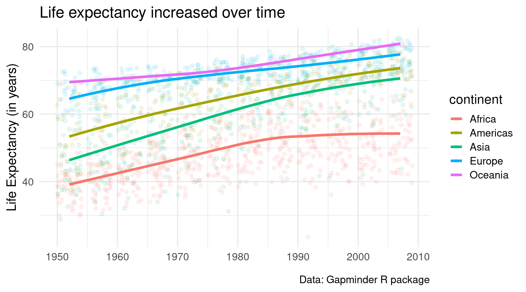
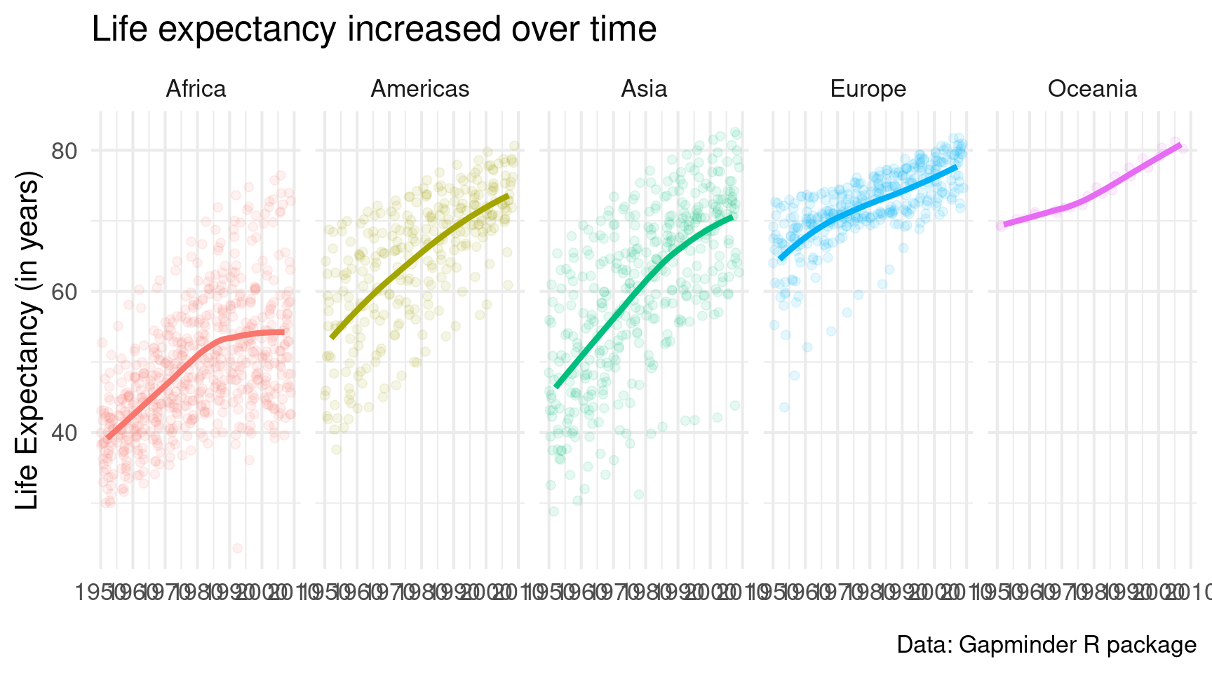
gapminder::gapminder |>ggplot(mapping =aes(x = year,y = lifeExp,col = continent ) ) +geom_jitter(alpha =0.1, size =2) +geom_smooth(linewidth =1.5, se =FALSE) +theme_minimal(base_size =16) +labs(x =element_blank(),y ='Life Expectancy (in years)',title ='Life expectancy increased over time',caption ='Data: Gapminder R package' )
Looks good. But I dislike that I can’t differentiate the points from the different continents that well. Maybe it’s best to give each continent its own window.
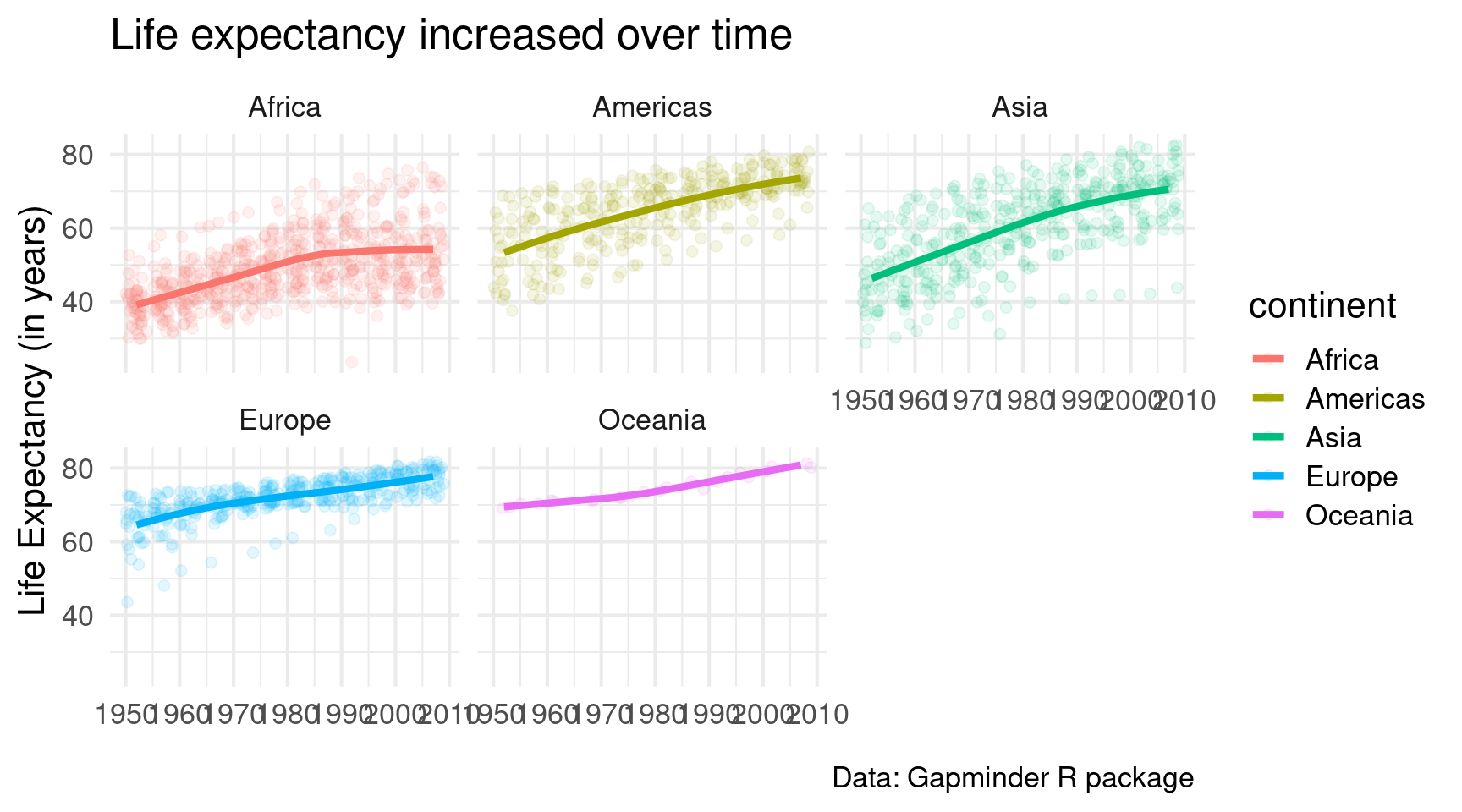
gapminder::gapminder |>ggplot(mapping =aes(x = year,y = lifeExp,col = continent ) ) +geom_jitter(alpha =0.1, size =2) +geom_smooth(linewidth =1.5, se =FALSE) +theme_minimal(base_size =16) +labs(x =element_blank(),y ='Life Expectancy (in years)',title ='Life expectancy increased over time',caption ='Data: Gapminder R package' ) +facet_wrap(vars(continent))
Ah much better. But I would like it even more if we had only one row of small windows. A quick look into the docs reveals that facet_wrap() has an argument called nrow. Looooooks like we have to set it to 1.
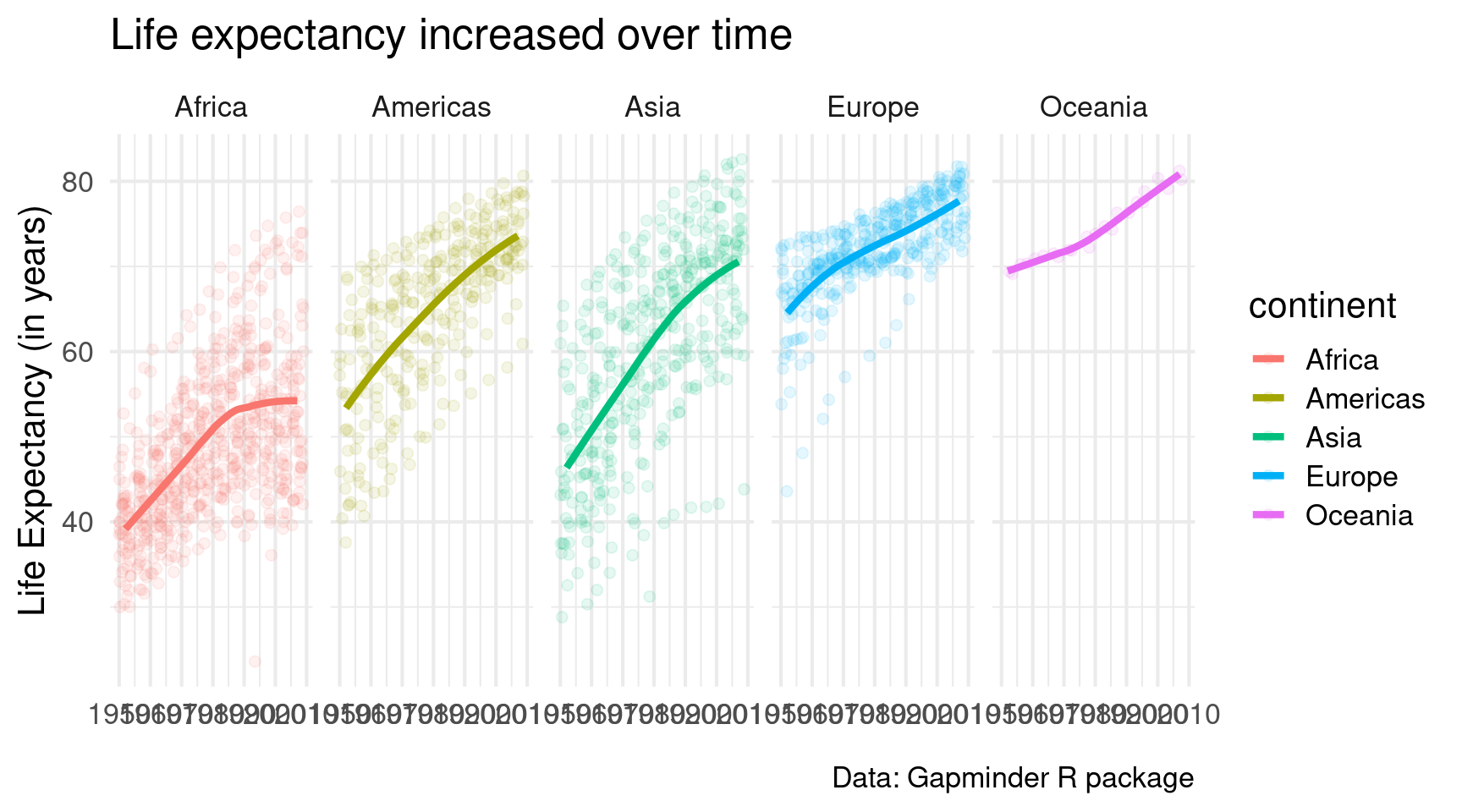
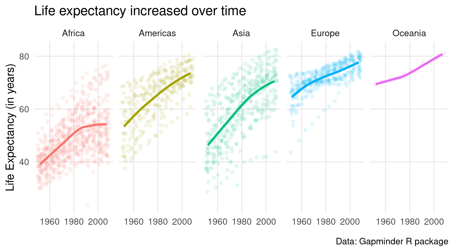
gapminder::gapminder |>ggplot(mapping =aes(x = year,y = lifeExp,col = continent ) ) +geom_jitter(alpha =0.1, size =2) +geom_smooth(linewidth =1.5, se =FALSE) +theme_minimal(base_size =16) +labs(x =element_blank(),y ='Life Expectancy (in years)',title ='Life expectancy increased over time',caption ='Data: Gapminder R package' ) +facet_wrap(vars(continent), nrow =1)
Cool. Small windows. But now the legend is superfluous. So let’s get rid of that. Remember, it’s legend.position = "none" in theme().
Niiiiiiice, we made it 🥳. Pretty great chart for a ggplot intro, don’t you think?
Where to next?
We have covered a lot but of course there still a lot of things I didn’t cover. Still, the ideas that we covered will get you 95% of the way. What you need now is to just practice the things I’ve taught you. The best place to start is the weekly TidyTuesday challenge.
And once you’re ready to learn more about ggplot, check out my video course. It teaches you how to use ggplot to create insightful charts that use good dataviz principles.
This in-depth video course teaches you everything you need to know about becoming better & more efficient at cleaning up messy data. This includes Excel & JSON files, text data and working with times & dates. If you want to get better at data cleaning, check out the course page.
Insightful Data Visualizations for "Uncreative" R Users
This video course teaches you how to leverage {ggplot2} to make charts that communicate effectively without being a design expert. Course information can be found on the course page.