big_tech_stock_prices <- readr::read_csv('https://raw.githubusercontent.com/rfordatascience/tidytuesday/master/data/2023/2023-02-07/big_tech_stock_prices.csv')
big_tech_stock_prices
## # A tibble: 45,088 × 8
##    stock_symbol date        open  high   low close adj_close    volume
##    <chr>        <date>     <dbl> <dbl> <dbl> <dbl>     <dbl>     <dbl>
##  1 AAPL         2010-01-04  7.62  7.66  7.58  7.64      6.52 493729600
##  2 AAPL         2010-01-05  7.66  7.70  7.62  7.66      6.53 601904800
##  3 AAPL         2010-01-06  7.66  7.69  7.53  7.53      6.42 552160000
##  4 AAPL         2010-01-07  7.56  7.57  7.47  7.52      6.41 477131200
##  5 AAPL         2010-01-08  7.51  7.57  7.47  7.57      6.45 447610800
##  6 AAPL         2010-01-11  7.6   7.61  7.44  7.50      6.40 462229600
##  7 AAPL         2010-01-12  7.47  7.49  7.37  7.42      6.32 594459600
##  8 AAPL         2010-01-13  7.42  7.53  7.29  7.52      6.41 605892000
##  9 AAPL         2010-01-14  7.50  7.52  7.46  7.48      6.38 432894000
## 10 AAPL         2010-01-15  7.53  7.56  7.35  7.35      6.27 594067600
## # ℹ 45,078 more rows5 Example Charts with ggplot2
Visualization
ggplot2 is an incredibly powerful tool to create great charts with R. But it can be hard to keep all the moving parts in mind in the beginning. So, it helps to have a few examples to get started. In this blog post I show you how to create the most common chart types with
ggplot2.
Learning ggplot2 can be very hard in the beginning. That’s why I put together an ultimate guide to teach you the basics. But still, it can be hard to remember all the things from that intro. So this is why this blog post shows you how to create a basic version of the most common chart types with ggplot2. You can think of this as a companion piece to my ggplot guide.
Line Chart
Let’s begin with probably the most common form of chart: the line chart. To do so, let us grab a data set for this. Here’s one from tidyTuesday
Now, we can extract the data for Apple (with the stock_symbol):
library(tidyverse)
apple_prices <- big_tech_stock_prices |>
  filter(stock_symbol == "AAPL")
And now we have everything to create a line chart:
apple_prices |>
  ggplot(aes(x = date, y = close)) +
  geom_line()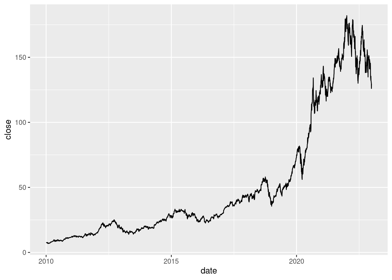
Nice, let’s make this a little bit nicer. First, let us use a different color and a different linewidth.
apple_prices |>
  ggplot(aes(x = date, y = close)) +
  geom_line(color = 'dodgerblue4', linewidth = 1)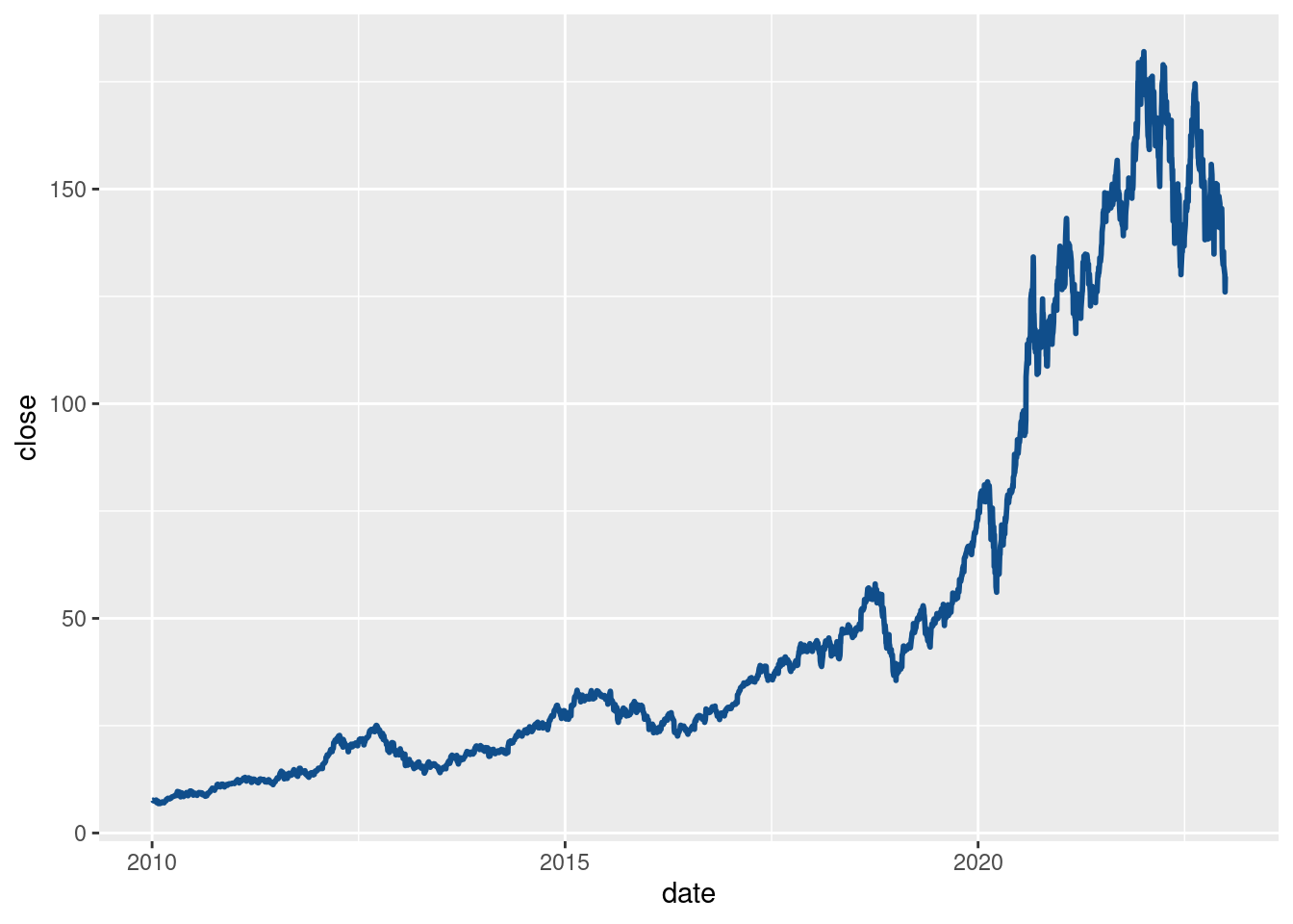
Next, lets add a title and some axis labels:
apple_prices |>
  ggplot(aes(x = date, y = close)) +
  geom_line(color = 'dodgerblue4', linewidth = 1) +
  labs(
    title = "Apple Stock Price",
    caption = 'Data: TidyTuesday 2023 - Week 06',
    x = element_blank(),
    y = "Closing Price (in USD)"
  )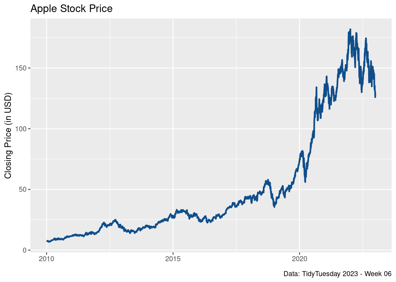
Finally, let us make this into a nicer theme. This is always a good chance to also increase the font size.
apple_prices |>
  ggplot(aes(x = date, y = close)) +
  geom_line(color = 'dodgerblue4', linewidth = 1) +
  labs(
    title = "Apple Stock Price",
    caption = 'Data: TidyTuesday 2023 - Week 06',
    x = element_blank(),
    y = "Closing Price (in USD)"
  ) +
  theme_minimal(base_size = 18, base_family = "Source Sans Pro")
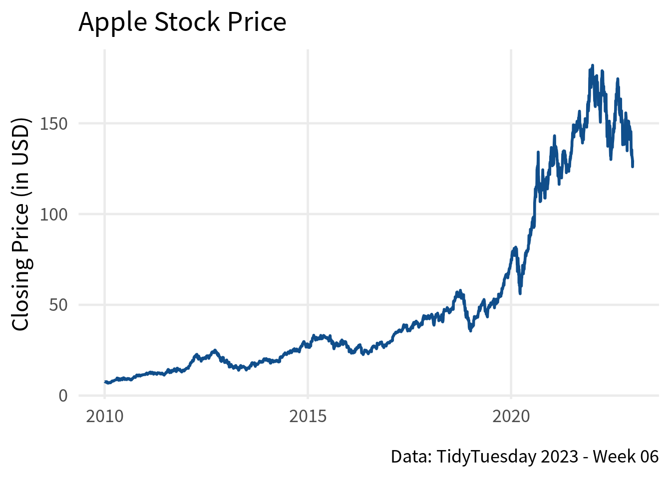
Next, let us make one more small theme to remove a couple of grid lines. There are way too many so that the chart is a little bit cluttered.
apple_prices |>
  ggplot(aes(x = date, y = close)) +
  geom_line(color = 'dodgerblue4', linewidth = 1) +
  labs(
    title = "Apple Stock Price",
    caption = 'Data: TidyTuesday 2023 - Week 06',
    x = element_blank(),
    y = "Closing Price (in USD)"
  ) +
  theme_minimal(base_size = 18, base_family = "Source Sans Pro") +
  theme(
    panel.grid.minor = element_blank()
  )
And that’s it. If you wanted to add a second line, you could include more data in the data set that is passed to ggplot(). Afterwards, it’s just a matter of mapping the color aesthetic to the different stock symbols.
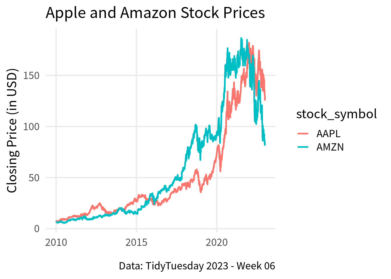
big_tech_stock_prices |>
  filter(stock_symbol %in% c("AAPL", "AMZN")) |>
  ggplot(aes(x = date, y = close, color = stock_symbol)) +
  geom_line(linewidth = 1) +
  labs(
    title = "Apple and Amazon Stock Prices",
    caption = 'Data: TidyTuesday 2023 - Week 06',
    x = element_blank(),
    y = "Closing Price (in USD)"
  ) +
  theme_minimal(base_size = 18, base_family = "Source Sans Pro") +
  theme(
    panel.grid.minor = element_blank()
  )
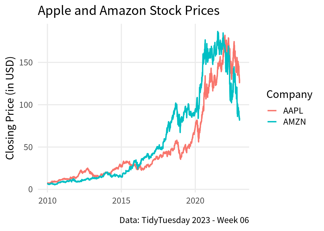
Of course, this means that you should also change the labels for the legend via the color aesthetic in the labs() function.
big_tech_stock_prices |>
  filter(stock_symbol %in% c("AAPL", "AMZN")) |>
  ggplot(aes(x = date, y = close, color = stock_symbol)) +
  geom_line(linewidth = 1) +
  labs(
    title = "Apple and Amazon Stock Prices",
    caption = 'Data: TidyTuesday 2023 - Week 06',
    x = element_blank(),
    y = "Closing Price (in USD)",
    color = 'Company'
  ) +
  theme_minimal(base_size = 18, base_family = "Source Sans Pro") +
  theme(
    panel.grid.minor = element_blank()
  )
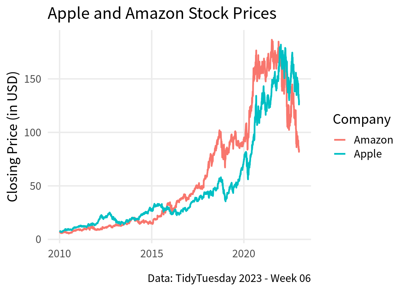
And if you want to change the names in the legend, it’s easiest if you just change what is inside of the data set. Of course, you will have to change the name of the column inside the aes() as well.
amazon_and_apple <- big_tech_stock_prices |>
  filter(stock_symbol %in% c("AAPL", "AMZN")) |>
  mutate(company_name = case_when(
    stock_symbol == "AAPL" ~ "Apple",
    stock_symbol == "AMZN" ~ "Amazon"
  ))

amazon_and_apple |>
  ggplot(aes(x = date, y = close, color = company_name)) +
  geom_line(linewidth = 1) +
  labs(
    title = "Apple and Amazon Stock Prices",
    caption = 'Data: TidyTuesday 2023 - Week 06',
    x = element_blank(),
    y = "Closing Price (in USD)",
    color = 'Company'
  ) +
  theme_minimal(base_size = 18, base_family = "Source Sans Pro") +
  theme(
    panel.grid.minor = element_blank()
  )
Bar Chart
Nice, now let’s move on to bar charts. For this, we’re going to count the number of flights that left an airport from NYC. The data for this can be found inside of the nycflights13 package.
# install.packages("nycflights13")
flights_count <- nycflights13::flights |>
  filter(!is.na(dep_time)) |>
  count(origin)
flights_count
## # A tibble: 3 × 2
##   origin      n
##   <chr>   <int>
## 1 EWR    117596
## 2 JFK    109416
## 3 LGA    101509
And then, we’re going to pass this to ggplot() and use geom_col() to create a bar chart.
flights_count |>
  ggplot(aes(y = origin, x = n)) +
  geom_col()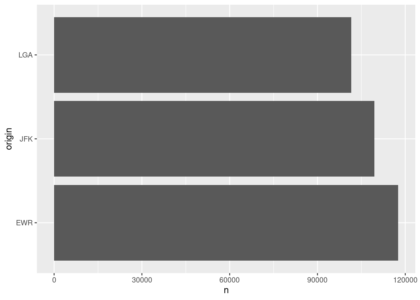
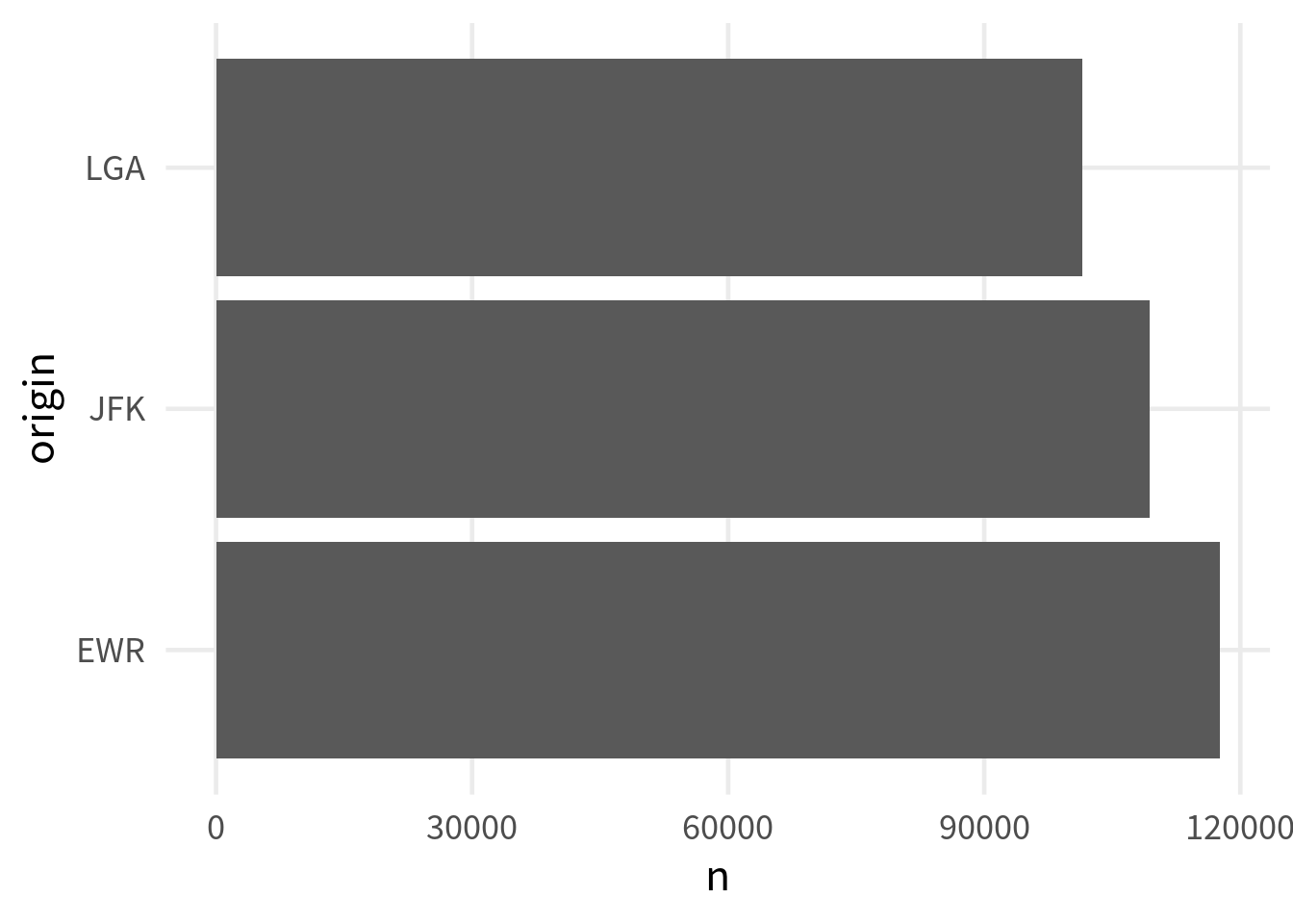
To make this a little nicer, we can apply the same theme from before.
flights_count |>
  ggplot(aes(y = origin, x = n)) +
  geom_col() +
  theme_minimal(base_size = 18, base_family = "Source Sans Pro") +
  theme(
    panel.grid.minor = element_blank()
  )
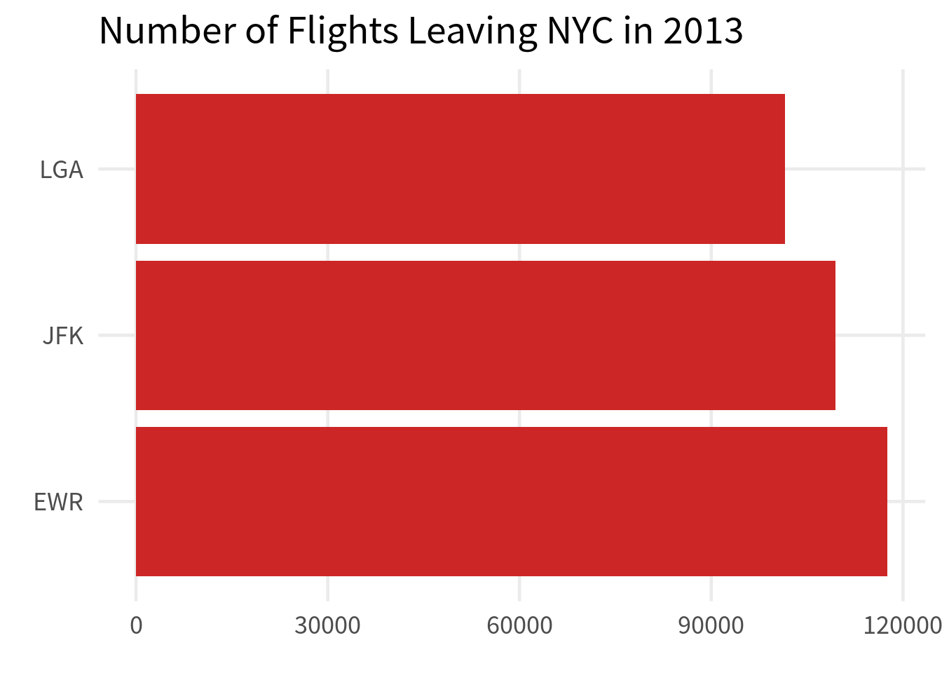
Also, we can add some labels and give the bars a nicer fill color.
flights_count |>
  ggplot(aes(y = origin, x = n)) +
  geom_col(fill = 'firebrick3') +
  theme_minimal(base_size = 18, base_family = "Source Sans Pro") +
  theme(
    panel.grid.minor = element_blank()
  ) +
  labs(
    x = element_blank(),
    y = element_blank(),
    title = "Number of Flights Leaving NYC in 2013"
  )
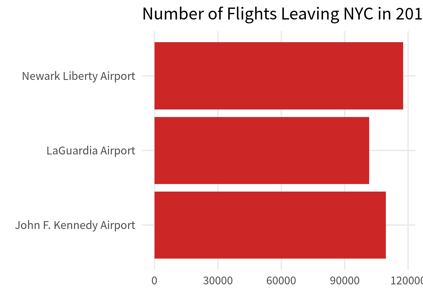
And just like before, we can make the labels a little bit more legible.
flights_count |>
  mutate(origin = case_when(
    origin == "EWR" ~ "Newark Liberty Airport",
    origin == "JFK" ~ "John F. Kennedy Airport",
    origin == "LGA" ~ "LaGuardia Airport"
  )) |>
  ggplot(aes(y = origin, x = n)) +
  geom_col(fill = 'firebrick3') +
  theme_minimal(base_size = 18, base_family = "Source Sans Pro") +
  theme(
    panel.grid.minor = element_blank()
  ) +
  labs(
    x = element_blank(),
    y = element_blank(),
    title = "Number of Flights Leaving NYC in 2013"
  )
Histogram
Next, let’s create a histogram. For example, we could visualize how much delay the flights have when they leave. Just like before, we filter for those flights that actually left first.
departed_flights <- nycflights13::flights |>
  filter(!is.na(dep_delay))
And then, we can use geom_histogram() to create a histogram. Recall that here we only map the x-aesthetic and the height of the bars is determined by the number of observations in each bin. These numbers are computed by ggplot() for us.
departed_flights|>
  ggplot(aes(x = dep_delay)) +
  geom_histogram()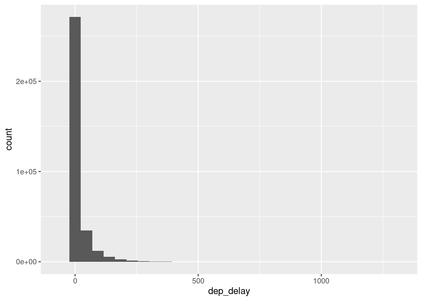
The y-axis doesn’t look super nice though. The reason for that is that there are some flights with HUUUUGE departure delays. That’s why using a fixed number of bins to do the counting may not be good. Instead, let’s tell geom_histogram() to just make the bins 5 minutes wide.
departed_flights |>
  ggplot(aes(x = dep_delay)) +
  geom_histogram(binwidth = 5)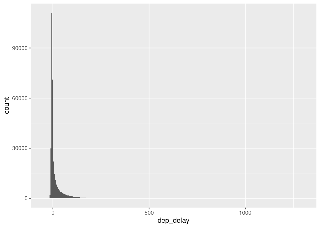
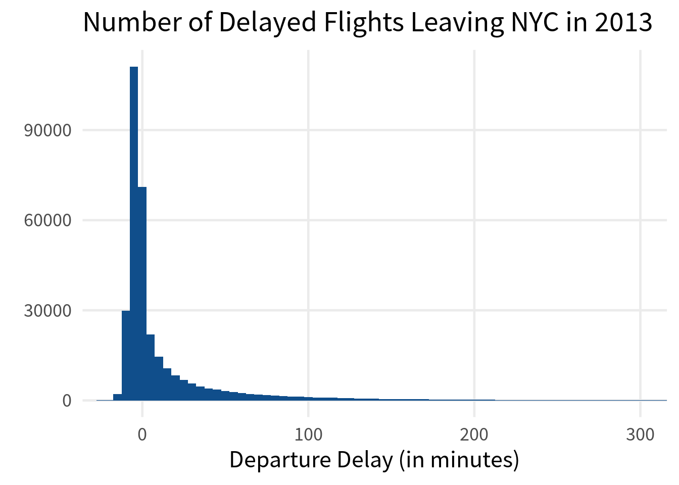
Ah nice, now we see more. But still we probably want to zoom into the chart a little bit. We can do that by setting the range of the x-axis to something that is of interest of us. Here, we could set this to anything between -20 and 300 minutes. That should show the most relevant part.
departed_flights|>
  ggplot(aes(x = dep_delay)) +
  geom_histogram(binwidth = 5) +
  coord_cartesian(xlim = c(-20, 300))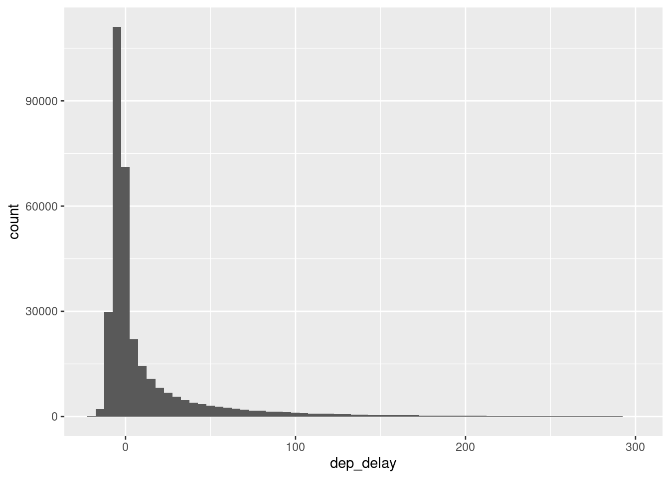
And just like before we can make this a little bit nicer by applying a theme and using better labels.
departed_flights|>
  ggplot(aes(x = dep_delay)) +
  geom_histogram(fill = 'dodgerblue4', binwidth = 5) +
  coord_cartesian(xlim = c(-20, 300))  +
  theme_minimal(base_size = 18, base_family = "Source Sans Pro") +
  theme(
    panel.grid.minor = element_blank()
  ) +
  labs(
    x = 'Departure Delay (in minutes)',
    y = element_blank(),
    title = "Number of Delayed Flights Leaving NYC in 2013"
  )
Scatterplot + Bubble Chart
For our next chart, let’s actually recreate a well-known chart from Hans Rosling. The data for that comes from the gapminder package. It shows you life expectancy, population and GDP per capita for different countries over time.
# install.packages("gapminder")
gapminder::gapminder
## # A tibble: 1,704 × 6
##    country     continent  year lifeExp      pop gdpPercap
##    <fct>       <fct>     <int>   <dbl>    <int>     <dbl>
##  1 Afghanistan Asia       1952    28.8  8425333      779.
##  2 Afghanistan Asia       1957    30.3  9240934      821.
##  3 Afghanistan Asia       1962    32.0 10267083      853.
##  4 Afghanistan Asia       1967    34.0 11537966      836.
##  5 Afghanistan Asia       1972    36.1 13079460      740.
##  6 Afghanistan Asia       1977    38.4 14880372      786.
##  7 Afghanistan Asia       1982    39.9 12881816      978.
##  8 Afghanistan Asia       1987    40.8 13867957      852.
##  9 Afghanistan Asia       1992    41.7 16317921      649.
## 10 Afghanistan Asia       1997    41.8 22227415      635.
## # ℹ 1,694 more rows
Let’s filter out one year and then create a scatterplot with this. The way to do that is to use geom_point() to create, well, points.
gapminder::gapminder |>
  filter(year == 2007) |>
  ggplot(aes(x = gdpPercap, y = lifeExp)) +
  geom_point()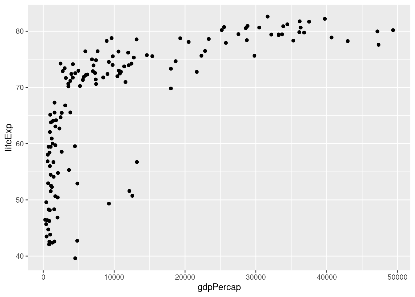
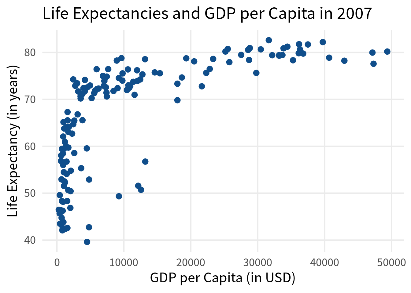
Once again, we can reuse our theme from before and add nicer labels. While we’re at it, let’s give the points another color and make them larger.
gapminder::gapminder |>
  filter(year == 2007) |>
  ggplot(aes(x = gdpPercap, y = lifeExp)) +
  geom_point(color = 'dodgerblue4', size = 3) +
  theme_minimal(base_size = 18, base_family = "Source Sans Pro") +
  theme(
    panel.grid.minor = element_blank()
  ) +
  labs(
    x = 'GDP per Capita (in USD)',
    y = 'Life Expectancy (in years)',
    title = "Life Expectancies and GDP per Capita in 2007"
  )
Here, we have set those aesthetics to fixed values. But what me more informative is to map the color to the continent column. In this case, we will have to put color into the aes() call.
gapminder::gapminder |>
  filter(year == 2007) |>
  ggplot(aes(x = gdpPercap, y = lifeExp)) +
  geom_point(aes(color = continent), size = 3) +
  theme_minimal(base_size = 18, base_family = "Source Sans Pro") +
  theme(
    panel.grid.minor = element_blank()
  ) +
  labs(
    x = 'GDP per Capita (in USD)',
    y = 'Life Expectancy (in years)',
    title = "Life Expectancies and GDP per Capita in 2007"
  )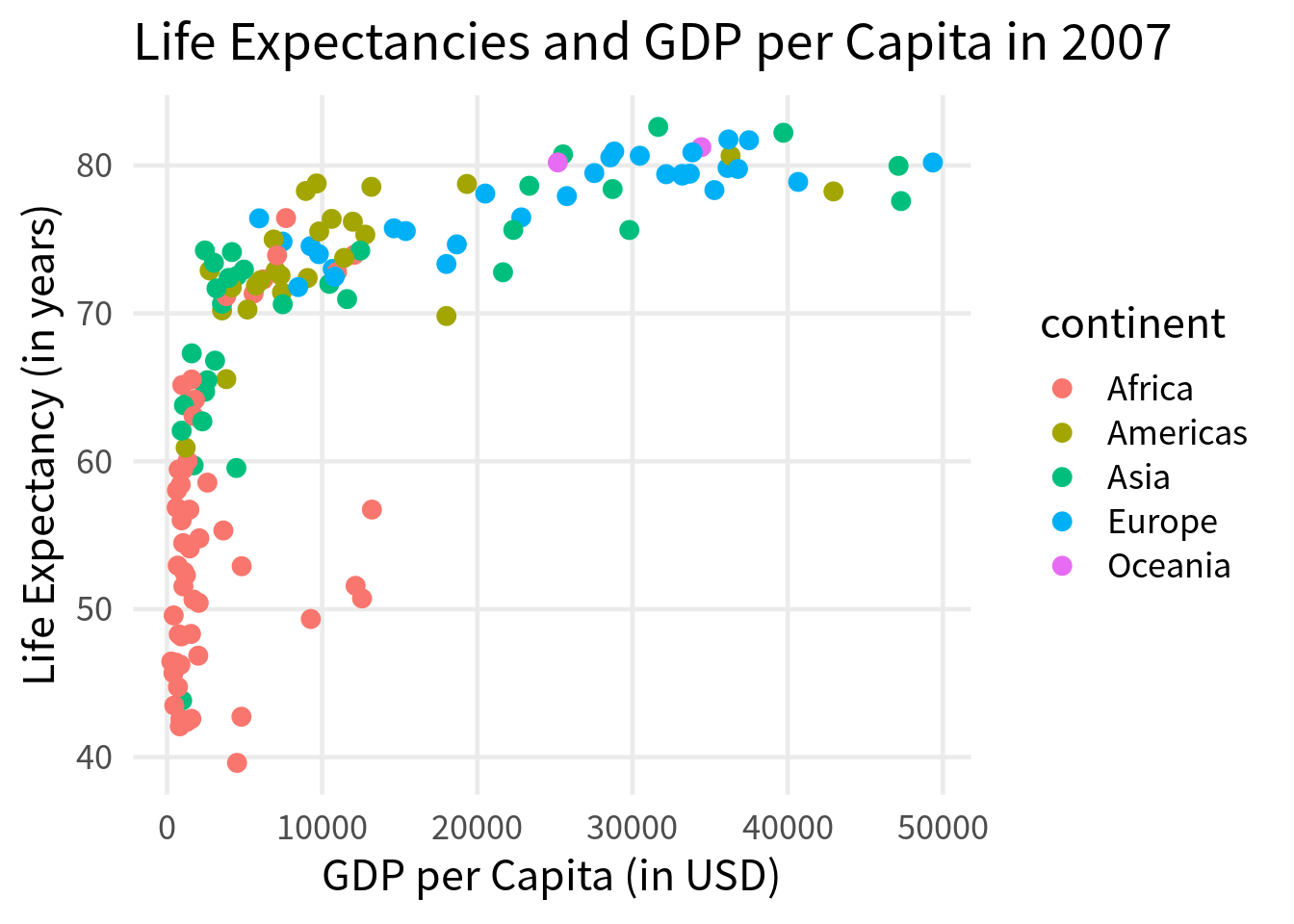
Aha! As expected, there are some differences between the continents. Notice that all the points corresponding to life expectancies below 50 years are in Africa. Now, what we could do next to turn this into a bubble chart is to map the size of the points to the population of the countries.
gapminder::gapminder |>
  filter(year == 2007) |>
  ggplot(aes(x = gdpPercap, y = lifeExp)) +
  geom_point(
    aes(color = continent, size = pop),
    alpha = 0.8
  ) +
  theme_minimal(base_size = 18, base_family = "Source Sans Pro") +
  theme(
    panel.grid.minor = element_blank()
  ) +
  labs(
    x = 'GDP per Capita (in USD)',
    y = 'Life Expectancy (in years)',
    title = "Life Expectancies and GDP per Capita in 2007"
  )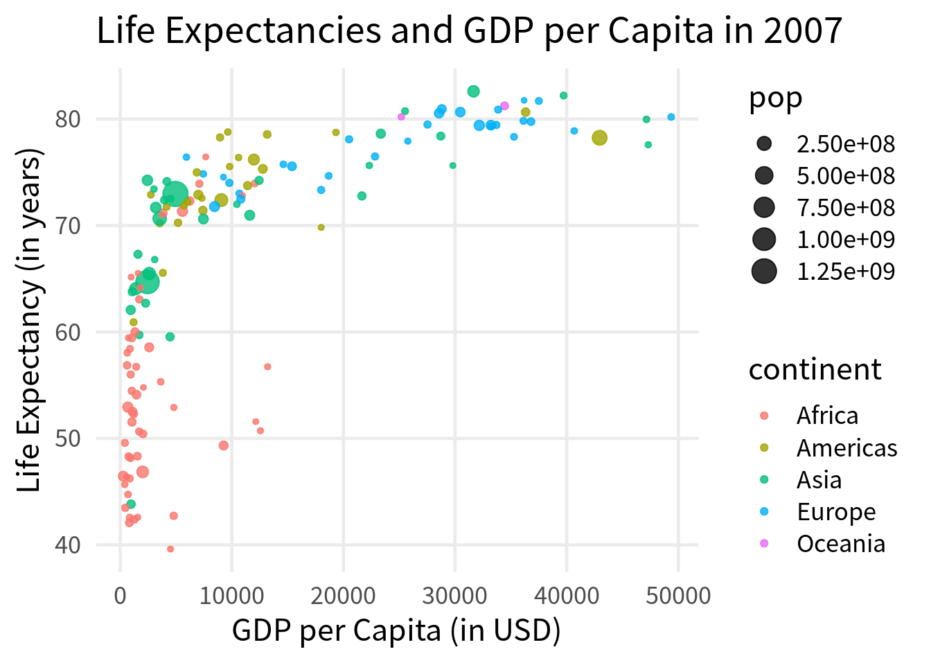
Notice that I’ve also made the points a little bit transparent here via alpha because they might overlap a little bit. Finally, we shouldn’t forget to make the legend labels a little bit nicer.
gapminder::gapminder |>
  filter(year == 2007) |>
  ggplot(aes(x = gdpPercap, y = lifeExp)) +
  geom_point(
    aes(color = continent, size = pop),
    alpha = 0.8
  ) +
  theme_minimal(base_size = 18, base_family = "Source Sans Pro") +
  theme(
    panel.grid.minor = element_blank()
  ) +
  labs(
    x = 'GDP per Capita (in USD)',
    y = 'Life Expectancy (in years)',
    title = "Life Expectancies and GDP per Capita in 2007",
    color = 'Continent',
    size = 'Population'
  )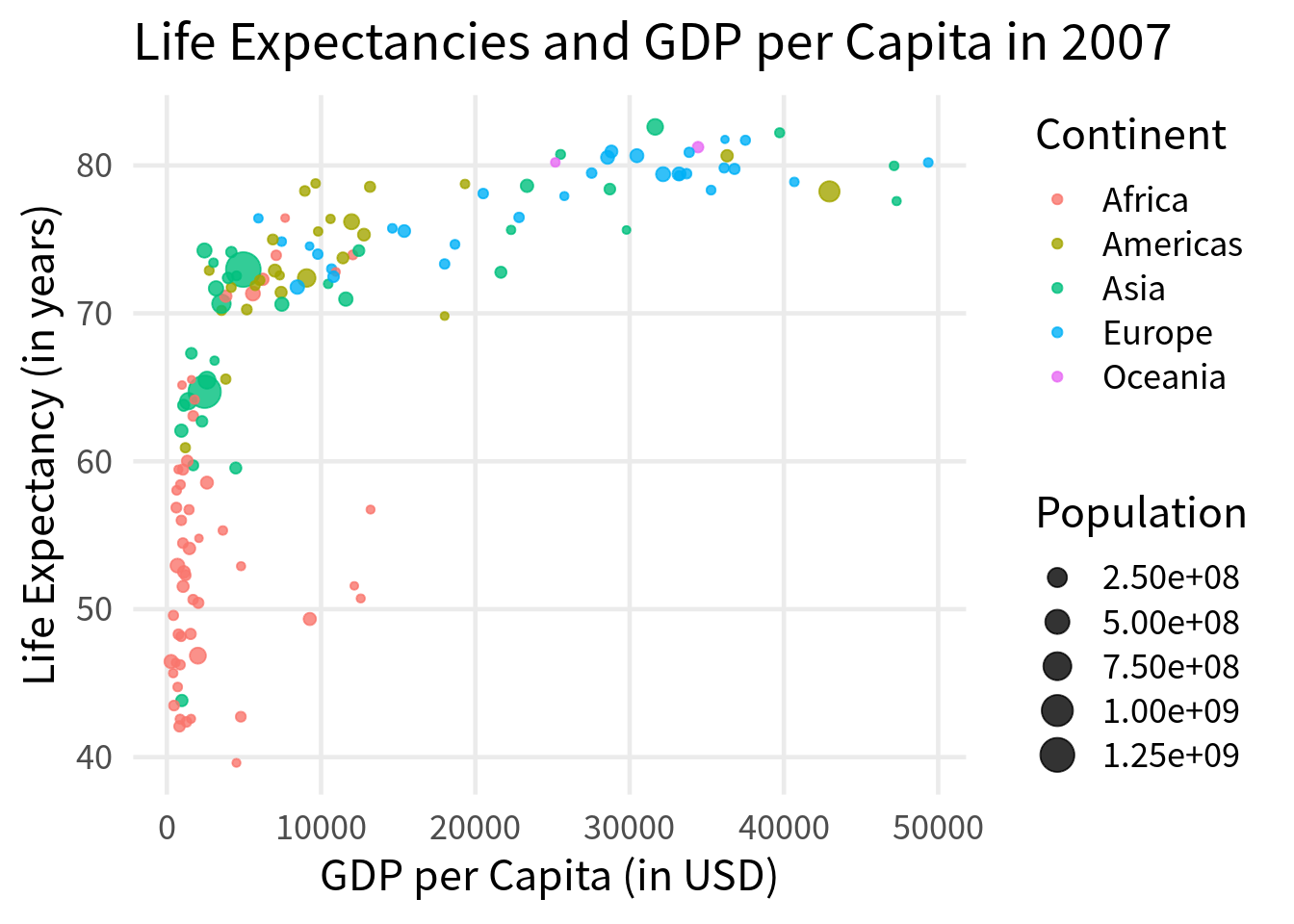
The labels of the size legend are not particularly nice. But it’s hard to compare sizes anyway. So let’s just remove that legend. This happens via the guides() layer where we specify that we don’t want to show the legend for the size aesthetic.
gapminder::gapminder |>
  filter(year == 2007) |>
  ggplot(aes(x = gdpPercap, y = lifeExp)) +
  geom_point(
    aes(color = continent, size = pop),
    alpha = 0.8
  ) +
  theme_minimal(base_size = 18, base_family = "Source Sans Pro") +
  theme(
    panel.grid.minor = element_blank()
  ) +
  labs(
    x = 'GDP per Capita (in USD)',
    y = 'Life Expectancy (in years)',
    title = "Life Expectancies and GDP per Capita in 2007",
    color = 'Continent',
    size = 'Population'
  ) +
  guides(size = guide_none())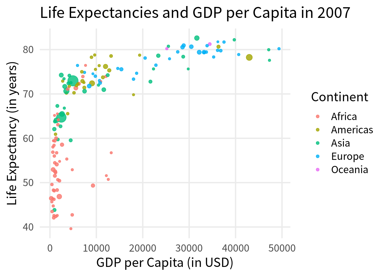
Heatmap
Finally, our last chart for today is a heatmap. These ones are easily created with geom_tile() once you have the data in the right format. For example, let’s say we want to visualize the number of flights that left NYC in 2013 by week and day. If that’s the case, we have to first compute those numbers. The trick here is to make a date out of the information that you get from the columns year, month and day with make_date(). Once you have that date, you can use week() and wday() to extract the week and the day of the week.
flights_day_counts <- departed_flights |>
  mutate(
    date = make_date(year, month, day),
    week = week(date),
    day = wday(date, week_start = 1)
  ) |>
  count(week, day)
flights_day_counts
## # A tibble: 365 × 3
##     week   day     n
##    <dbl> <dbl> <int>
##  1     1     1   930
##  2     1     2   838
##  3     1     3   935
##  4     1     4   904
##  5     1     5   909
##  6     1     6   717
##  7     1     7   831
##  8     2     1   926
##  9     2     2   895
## 10     2     3   897
## # ℹ 355 more rows
Now, we can use geom_tile() to create a heatmap. We will use the week column for the x-aesthetic, the day column for the y-aesthetic and the n column for the fill aesthetic.
flights_day_counts |>
  ggplot(aes(x = week, y = day, fill = n)) +
  geom_tile(color = 'white')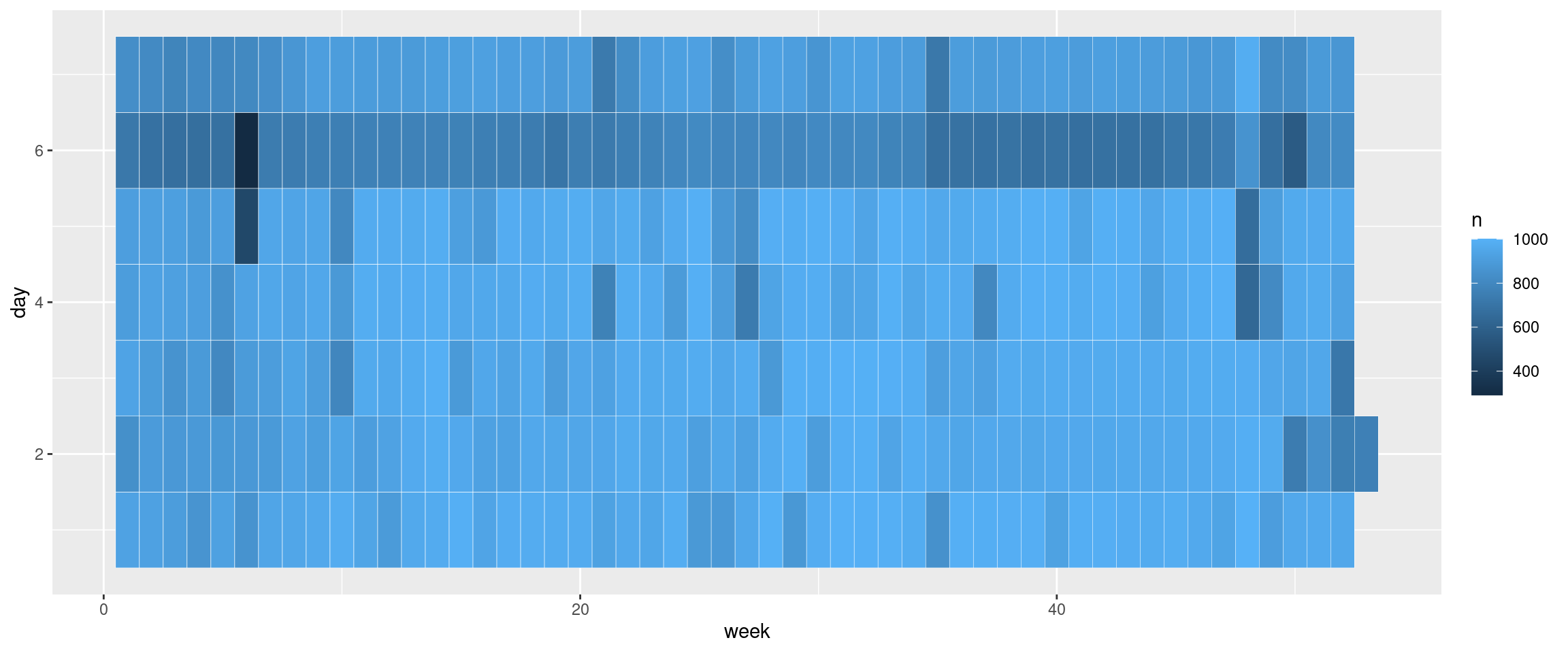
This is a good start but what would be great is to have squares instead of rectangles. The way to enforce that is to tell the x- and y-axis that they should use the same aspect ratio. This is done via coord_equal().
flights_day_counts |>
  ggplot(aes(x = week, y = day, fill = n)) +
  geom_tile(color = 'white') +
  coord_equal()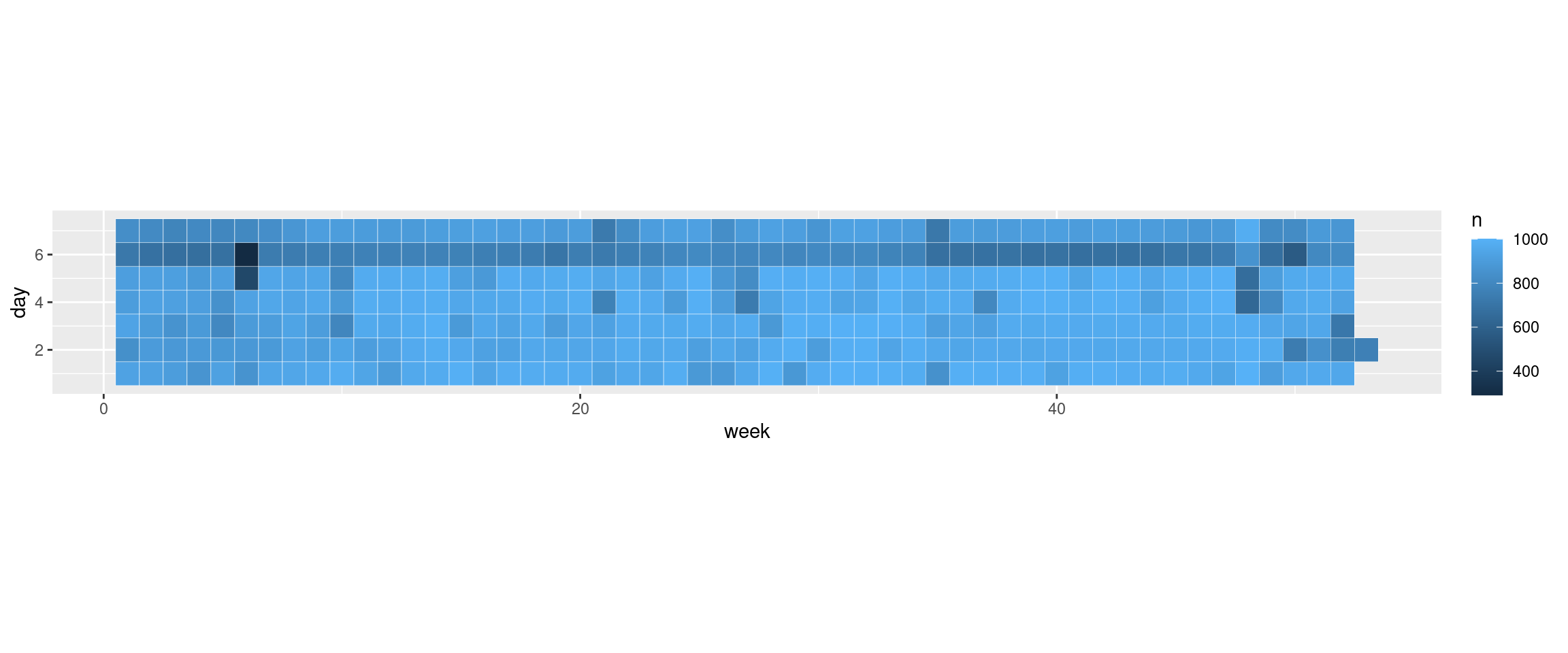
Next, let us flip the colors a little bit. Usually, we want high numbers to be represented with darker colors and low numbers with lighter colors. We can enforce that with scale_fill_gradient() where we specify the colors for low and high numbers.
flights_day_counts |>
  ggplot(aes(x = week, y = day, fill = n)) +
  geom_tile(color = 'white') +
  coord_equal() +
  scale_fill_gradient(low = 'white', high = 'dodgerblue3')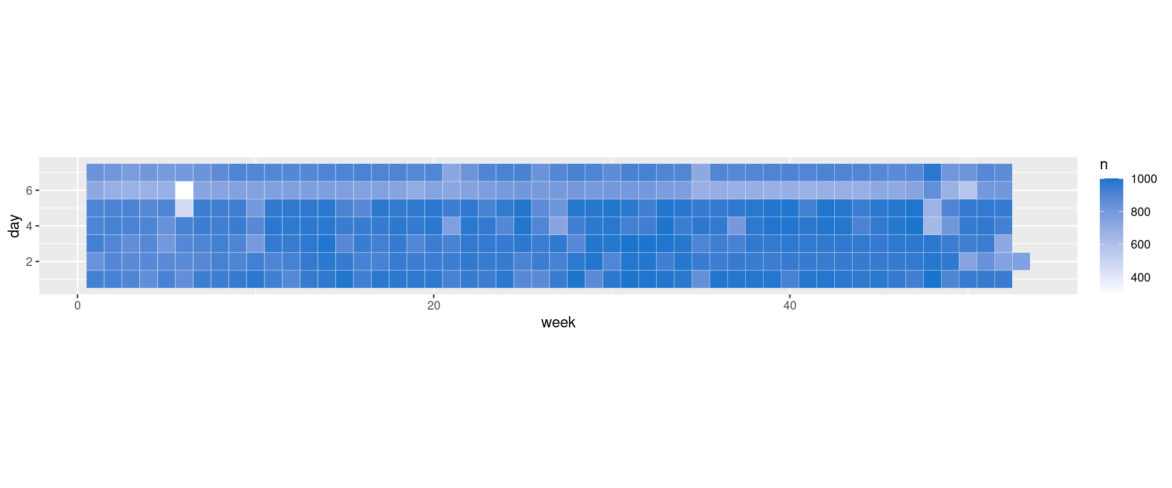
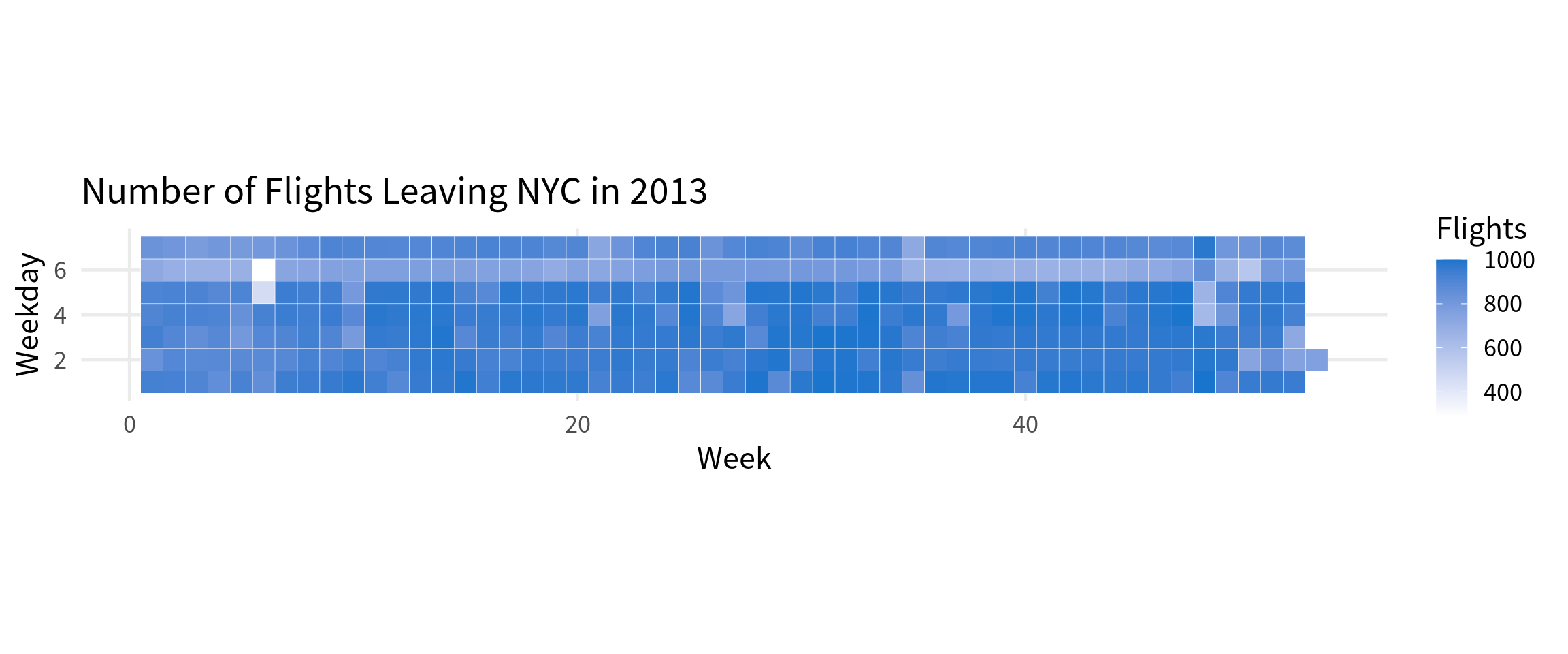
And for the final time we can apply our theme from before and add some labels.
flights_day_counts |>
  ggplot(aes(x = week, y = day, fill = n)) +
  geom_tile(color = 'white') +
  coord_equal() +
  scale_fill_gradient(low = 'white', high = 'dodgerblue3') +
  theme_minimal(base_size = 18, base_family = "Source Sans Pro") +
  theme(
    panel.grid.minor = element_blank()
  ) +
  labs(
    x = 'Week',
    y = 'Weekday',
    title = "Number of Flights Leaving NYC in 2013",
    fill = 'Flights'
  )
Before we leave, let’s make this a little bit nicer. Let’s move the legend to the top and translate the weekday numbers to actual names. If we do that, then we don’t actually need an axis label for the y-axis anymore.
flights_day_counts |>
  mutate(day = case_when(
    day == 1 ~ "Monday",
    day == 2 ~ "Tuesday",
    day == 3 ~ "Wednesday",
    day == 4 ~ "Thursday",
    day == 5 ~ "Friday",
    day == 6 ~ "Saturday",
    day == 7 ~ "Sunday"
  )) |>
  ggplot(aes(x = week, y = day, fill = n)) +
  geom_tile(color = 'white') +
  coord_equal() +
  scale_fill_gradient(low = 'white', high = 'dodgerblue3') +
  theme_minimal(base_size = 18, base_family = "Source Sans Pro") +
  theme(
    panel.grid.minor = element_blank(),
    legend.position = 'top'
  ) +
  labs(
    x = 'Week',
    y = element_blank(),
    title = "Number of Flights Leaving NYC in 2013",
    fill = 'Flights'
  )
Oh no. The order of the legend got all messed up. The way to fix that is to make the day column into a factor and specify the order of the levels.
flights_day_counts <- flights_day_counts |>
  mutate(
    day = case_when(
      day == 1 ~ "Monday",
      day == 2 ~ "Tuesday",
      day == 3 ~ "Wednesday",
      day == 4 ~ "Thursday",
      day == 5 ~ "Friday",
      day == 6 ~ "Saturday",
      day == 7 ~ "Sunday"
    ),
    day = factor(day, levels = c(
        "Monday",
        "Tuesday",
        "Wednesday",
        "Thursday",
        "Friday",
        "Saturday",
        "Sunday"
      )
    )
  )

flights_day_counts |>
  ggplot(aes(x = week, y = day, fill = n)) +
  geom_tile(color = 'white') +
  coord_equal() +
  scale_fill_gradient(low = 'white', high = 'dodgerblue3') +
  theme_minimal(base_size = 18, base_family = "Source Sans Pro") +
  theme(
    panel.grid.minor = element_blank(),
    legend.position = 'top'
  ) +
  labs(
    x = 'Week',
    y = element_blank(),
    title = "Number of Flights Leaving NYC in 2013",
    fill = 'Flights'
  )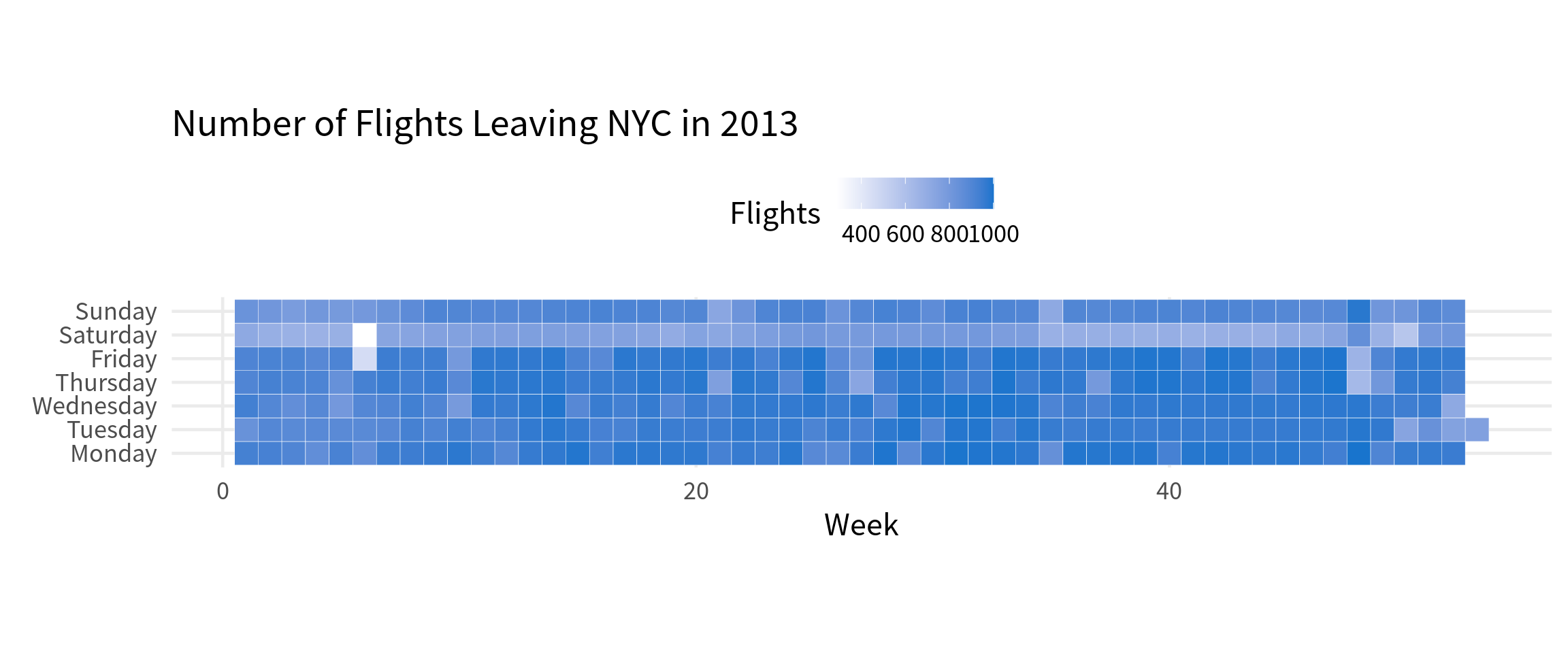
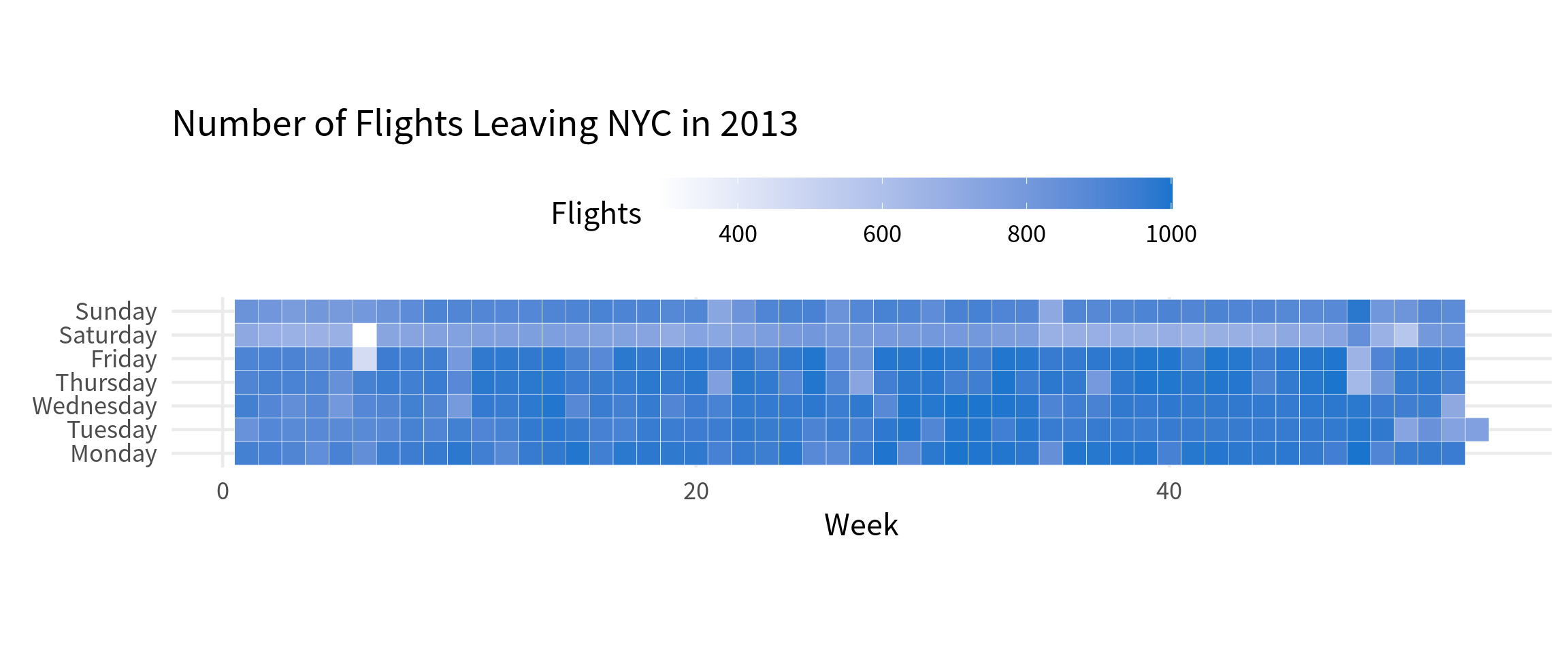
Nice that’s better. Now we can actually see that there are less flights leaving on Saturday. But the legend is still a little bit too messy. We can fix that by making it larger. The way that works is once again via the guides() layer. This time we have to use guide_colorbar() instead of guide_none().
flights_day_counts |>
  ggplot(aes(x = week, y = day, fill = n)) +
  geom_tile(color = 'white') +
  coord_equal() +
  scale_fill_gradient(low = 'white', high = 'dodgerblue3') +
  theme_minimal(base_size = 18, base_family = "Source Sans Pro") +
  theme(
    panel.grid.minor = element_blank(),
    legend.position = 'top'
  ) +
  labs(
    x = 'Week',
    y = element_blank(),
    title = "Number of Flights Leaving NYC in 2013",
    fill = 'Flights'
  ) +
  guides(
    fill = guide_colorbar(barwidth = unit(10, 'cm'))
  )
Conclusion
That’s it for today. Hopefully, this blog post has given you a good overview of how to create the most common chart types with ggplot2. Of course, all of that is only the start to an insightful data visualization. If you want to learn more, check out my ultimate guide to ggplot2 or my course on data visualization. Have a great day and see you next time 👋,


