library(tidyverse)
library(ggtext)
ggplot() +
  geom_richtext(
    aes(
      x = 0,
      y = 0,
      label = "This is a <b>bold</b> text annotation"
    )
  )
ggplot2 Extensionsggplot2 is powerful on its own but there are some extensions that make ggplot2 even better. In this blog post, I show you some of the best extensions.
In this blog post, I’ll show you how to make ggplot2 even better. To do so, we are going to look at five must-have extensions that can level up your dataviz game. This blog post is also available as a video on my YouTube channel. You can check it out here:
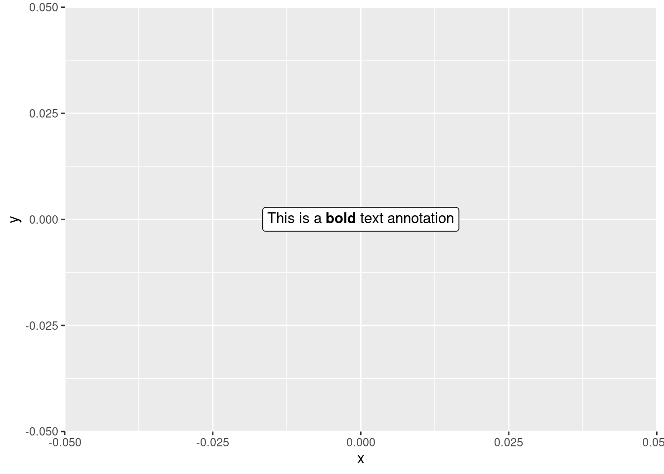
ggtextOne of my absolute go-to packages is ggtext. It’s a game-changer when it comes to custom text annotations. You can make single words bold, colored, or switch up fonts, all within a single text layer.
And the beauty of ggtext lies in its ability to handle these modifications for individual parts of your text. This means you can customize specific words or phrases in your text unlike geom_text which applies the same style to the entire text. Here’s how that could look.
library(tidyverse)
library(ggtext)
ggplot() +
geom_richtext(
aes(
x = 0,
y = 0,
label = "This is a <b>bold</b> text annotation"
)
)
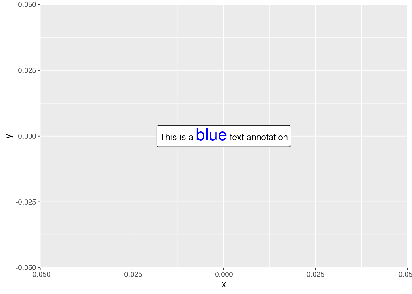
Notice how the word “bold” is now bold . To make this magic happen, a tiny bit of HTML and CSS notation using the <b> tag does the trick. You could also make a single word colored and larger by using the <span> tag and specifying the color in the style argument.
ggplot() +
  geom_richtext(
    aes(
      x = 0,
      y = 0,
      label = "This is a <span style='color:blue;font-size:20pt'>blue</span> text annotation"
    )
  )
patchworkNext up, let’s talk about patchwork, i.e. my second most cherished ggplot extension. This package makes it dead-simple to combine multiple plots into one large plot. You can arrange plots side by side by “adding” them or stack them up by dividing them.
library(patchwork)
penguins <- palmerpenguins::penguins |> filter(!is.na(sex))
# First plot
p1 <- penguins |>
  ggplot(aes(x = bill_length_mm, y = body_mass_g)) +
  geom_point(aes(fill = species), shape = 21, size = 3)
# Second plot
p2 <- penguins |>
  ggplot(aes(x = species, y = body_mass_g)) +
  geom_violin(aes(fill = species), linewidth = 0.5, alpha = 0.5) +
  geom_jitter(width = 0.1, alpha = 0.5, size = 1)

# Arrange them side by side
p1 + p2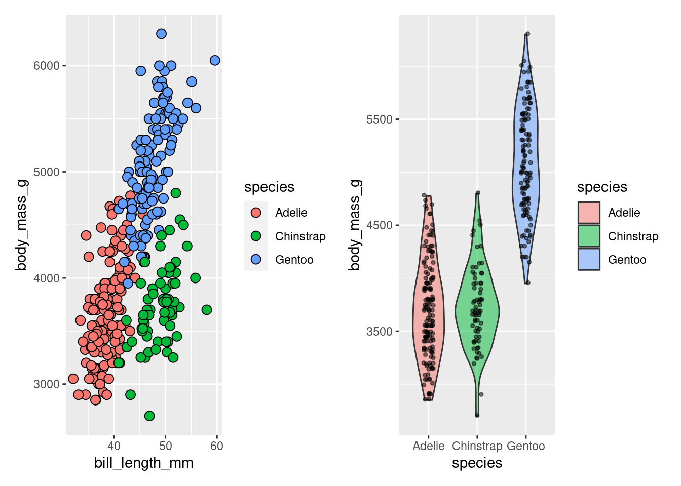
# Stack them up
p1 / p2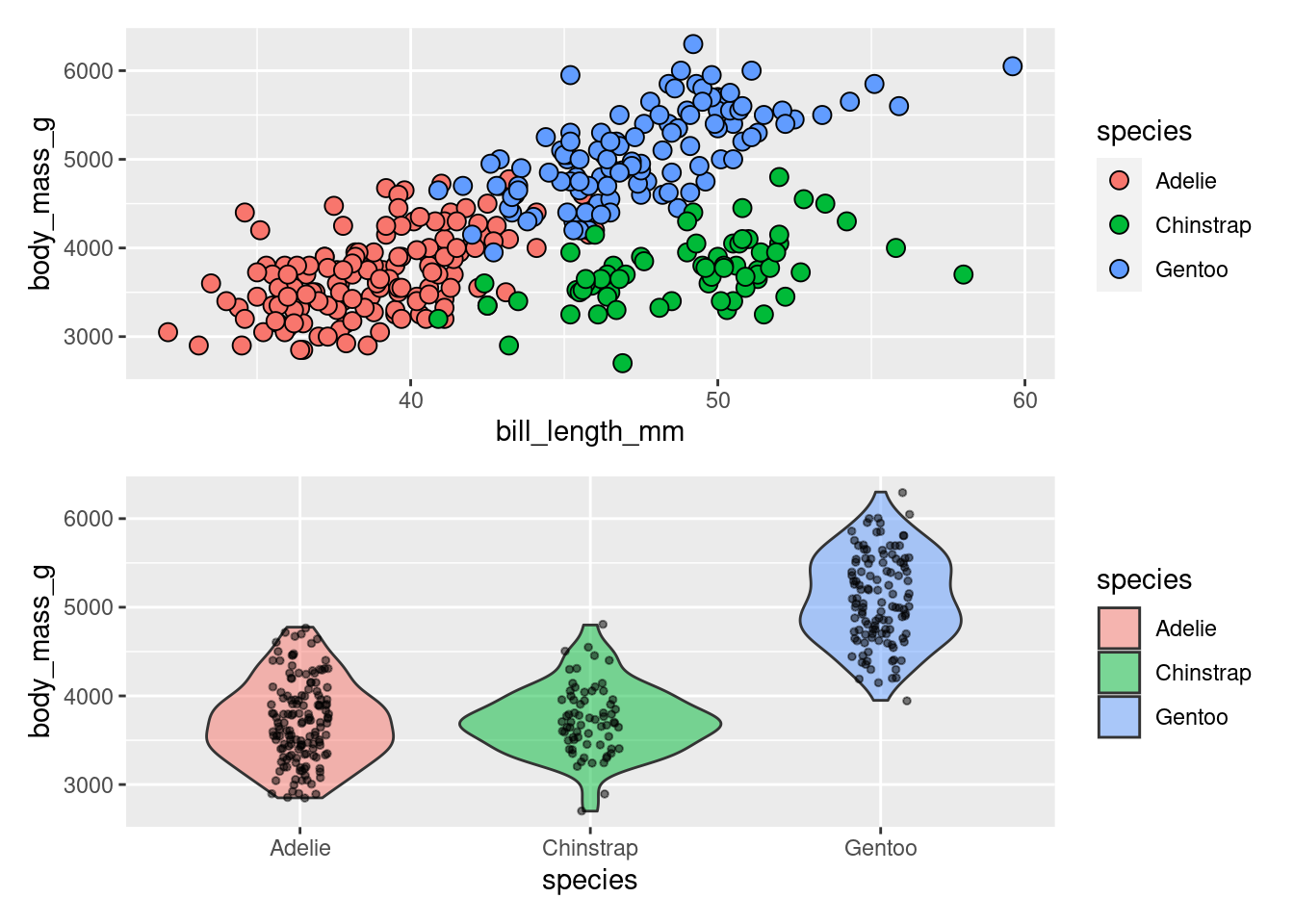
Of course, there’s lots more customization you can do with patchwork. Custom layouts and combining legends is pretty easy with this great package. For an in-depth guide on navigating patchwork, here’s one of my YouTube videos.
ggpatternMoving on to ggpattern, a nifty package that injects patterns into your beloved geoms. Whether it’s adding gradients beneath curves or incorporating geometric patterns into bar plots, ggpattern got your back. To make ggpattern do what you want, you just have to
geom_*() into geom_*_pattern()library(magick) # gradient pattern requires this
gt::sp500 |>
filter(date >= make_date(2000)) |>
ggplot(aes(x = date, y = open)) +
ggpattern::geom_area_pattern(
col = 'dodgerblue4',
pattern = "gradient",
pattern_fill2 = 'dodgerblue3',
pattern_fill = 'white'
) +
theme_minimal()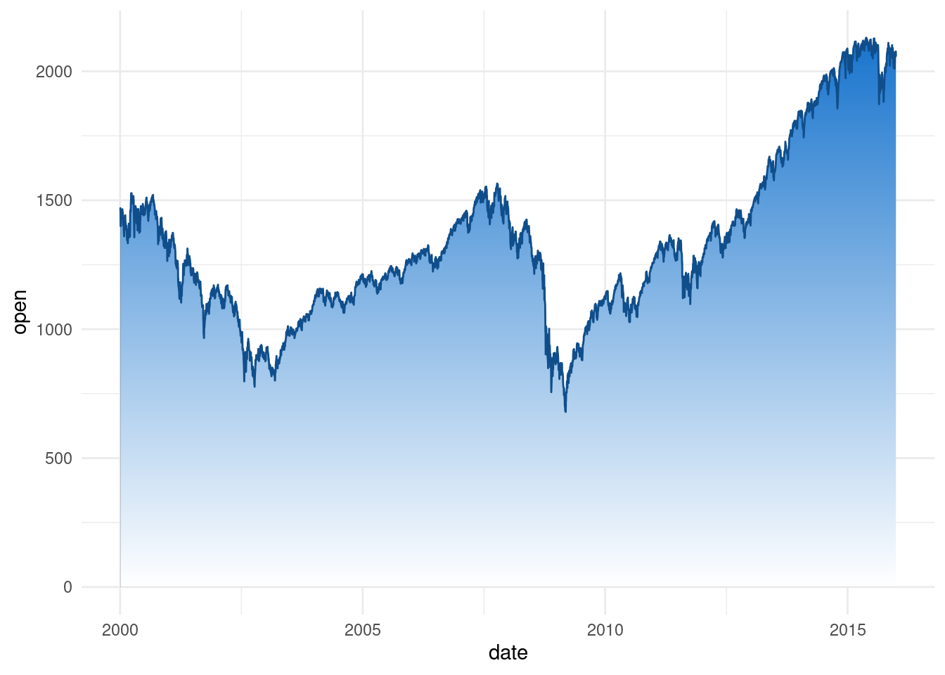
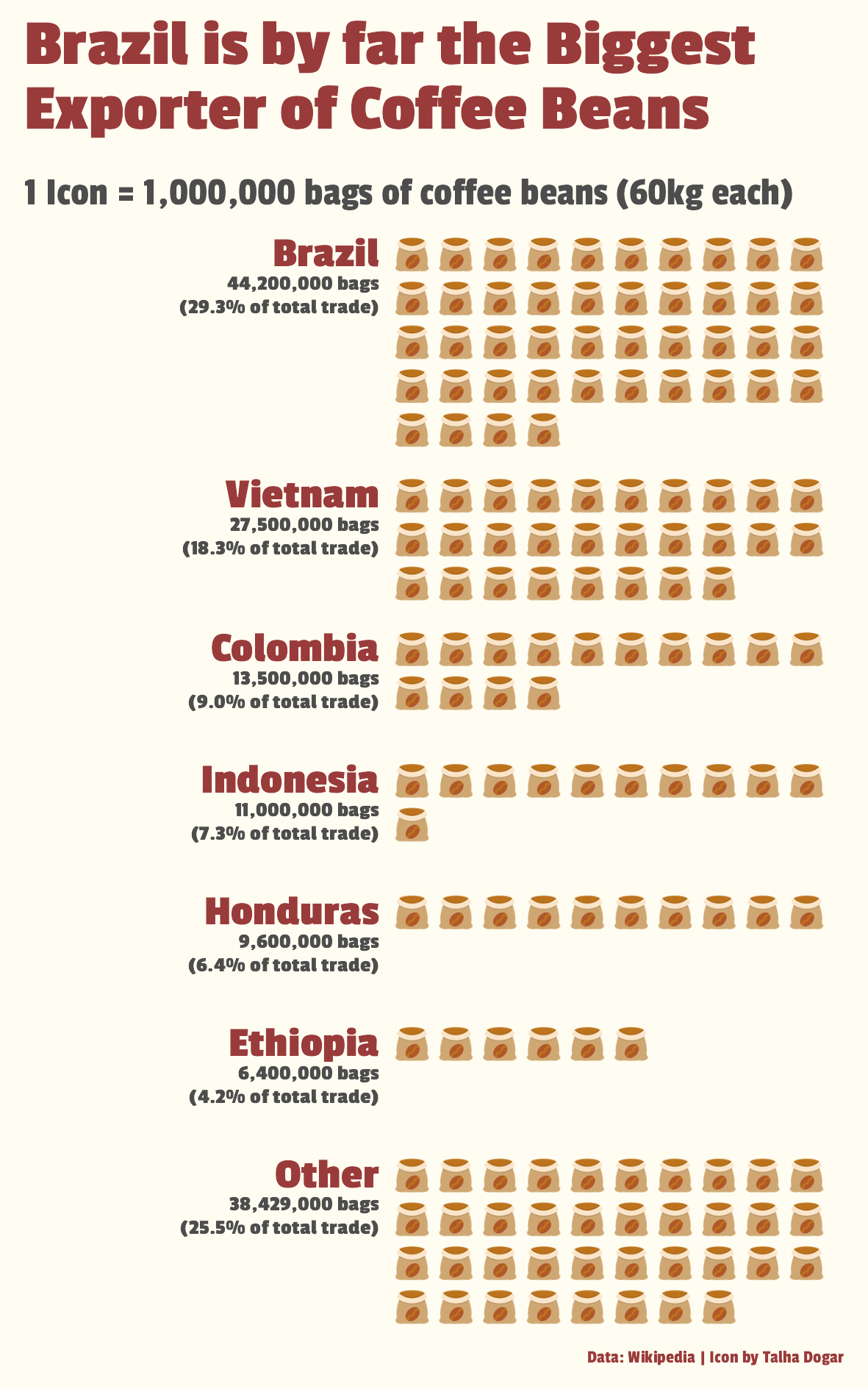
You can even venture into creating waffle charts with images or icons. For example, that’s what I teach in my data visualization course while creating a waffle plot to show the export of coffee.
ggforceggforce is a treasure trove of all kinds of add-ons you might want to use. From circle creation with geom_circle to wrapped bar charts with geom_arc_bar, the possibilities are wild. And sure you might at first think that you will never need these things. But think again! For example, geom_arc_bar is a great way to make pie charts, donut chars or sunburst plots. I explain how that works in one of my YT videos:
But hold on, there’s more. ggforce throws in custom annotations with a neat arrow and label for your charts. This makes for a pretty nice annotation and it’s easy to create too.
library(ggforce)
penguins |>
  ggplot(aes(x = bill_length_mm, y = body_mass_g)) +
  geom_point(
    aes(fill = species),
    shape = 21,
    size = 3
  ) +
  geom_mark_ellipse(
    data = penguins |>
      filter(
        bill_length_mm > 40,
        between(body_mass_g, 4000, 4500)
      ),
    aes(
      x0 = 30,
      y0 = 5000,
      label = "These penguins are important",
    ),
    color = "black",
    fill = "red",
    alpha = 0.2
  ) +
  theme_minimal()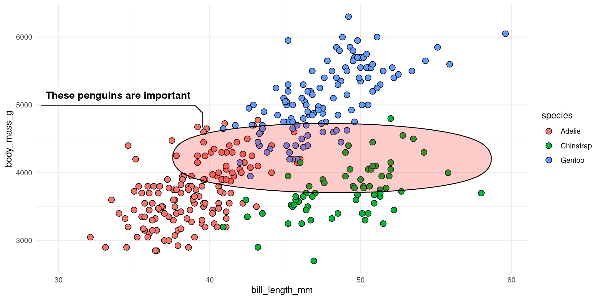
Here, we have added a geom_mark_ellipse() layer to highlight a few points. The trick was to pass the points that we want to highlight to the data argument and then specify the x0 and y0 arguments to position the annotation.
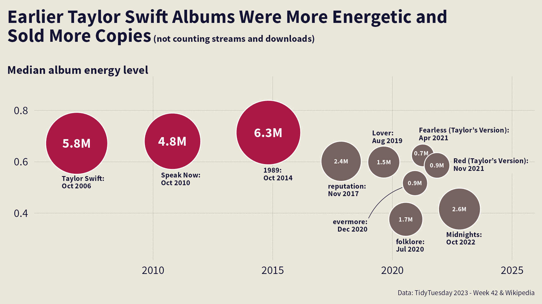
You can combine this with ggtext to make the annotation even more powerful. That’s what I did in my video course to concoct a Taylor Swift bubble chart.
Last but not least, let’s talk about ggbump. This package makes it suuuper easy to show rankings over time with bump charts. Here’s how such a chart could look.
flights <- readr::read_csv('https://raw.githubusercontent.com/rfordatascience/tidytuesday/master/data/2022/2022-07-12/flights.csv') |>
  janitor::clean_names()

country_flights_by_year <- flights |>
  select(year, state = state_name, flights = flt_tot_1) |>
  summarise(flights = sum(flights), .by = c(year, state))

country_rank_by_year <- country_flights_by_year |>
  mutate(rank = row_number(desc(flights)), .by = year)

max_rank <- 6
todays_top <- country_rank_by_year %>%
  filter(year == 2022, rank <= max_rank) %>%
  pull(state)

selected_countries <- country_rank_by_year %>%
  filter(state %in% todays_top)

color_palette <- c(
  "#E69F00", "#009E73", "#0072B2", "#CC79A7", "#999999", "#D55E00"
)
names(color_palette) <- todays_top
description_color <- 'grey30'

bump_chart <- selected_countries |>
  ggplot(aes(year, rank, col = state)) +
  geom_point(shape = '|', stroke = 9) +
  ggbump::geom_bump(linewidth = 2) +
  geom_text(
    data = selected_countries |> filter(year == 2016),
    aes(label = state),
    hjust = 1,
    nudge_x = -0.1,
    size = 8,
    fontface = 'bold',
    family = 'Source Sans Pro'
  ) +
  geom_text(
    data = selected_countries |> filter(year == 2022),
    aes(label = rank),
    hjust = 0,
    nudge_x = 0.1,
    size = 8,
    fontface = 'bold',
    family = 'Source Sans Pro'
  ) +
  annotate(
    'text',
    x = seq(2016, 2022, 2),
    y = 0.5,
    label = seq(2016, 2022, 2),
    hjust = 0.5,
    vjust = 1,
    size = 6.5,
    fontface = 'bold',
    color = description_color,
    family = 'Source Sans Pro'
  ) +
  scale_color_manual(values = color_palette) +
  coord_cartesian(xlim = c(2014.5, 2022.5), ylim = c(6.5, 0.25), expand = F) +
  theme_void(base_size = 24, base_family = 'Source Sans Pro') +
  theme(
    legend.position = 'none',
    plot.background = element_rect(fill = 'grey95', color = NA),
    plot.margin = margin(t = 2, l = 5, unit = 'mm'),
    text = element_text(color = description_color),
    plot.title = element_text(
      face = 'bold',
      family = 'Merriweather',
      size = rel(1.3)
    )
  ) +
  labs(
    title = 'European flight ranking',
    subtitle = 'Rank by number of incoming and outgoing flights from 2016 to 2022'
  )
bump_chart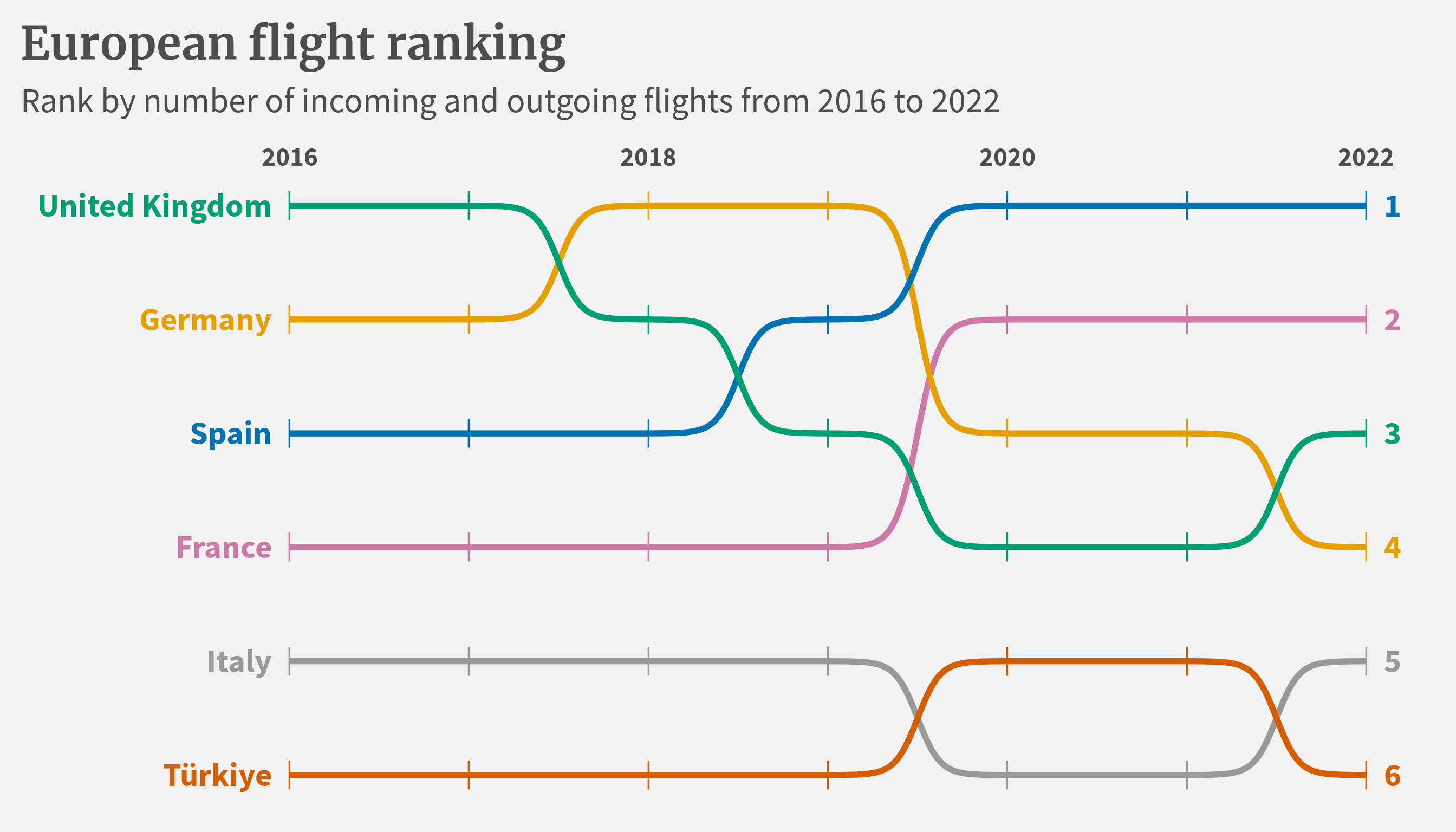
Once you have your data in the right format, then all of those curvy lines are simply created by using geom_bump() from ggbump. If you want to find out more about how to make this chart, check out my YouTube video on the topic.
And a cool combo is to combine ggbump with gghighlight (which is yet another powerful extension) to make the chart even more interesting.
bump_chart +
  gghighlight::gghighlight(
     # `state` column contains country names
    state == 'United Kingdom',
    use_direct_label = FALSE
  )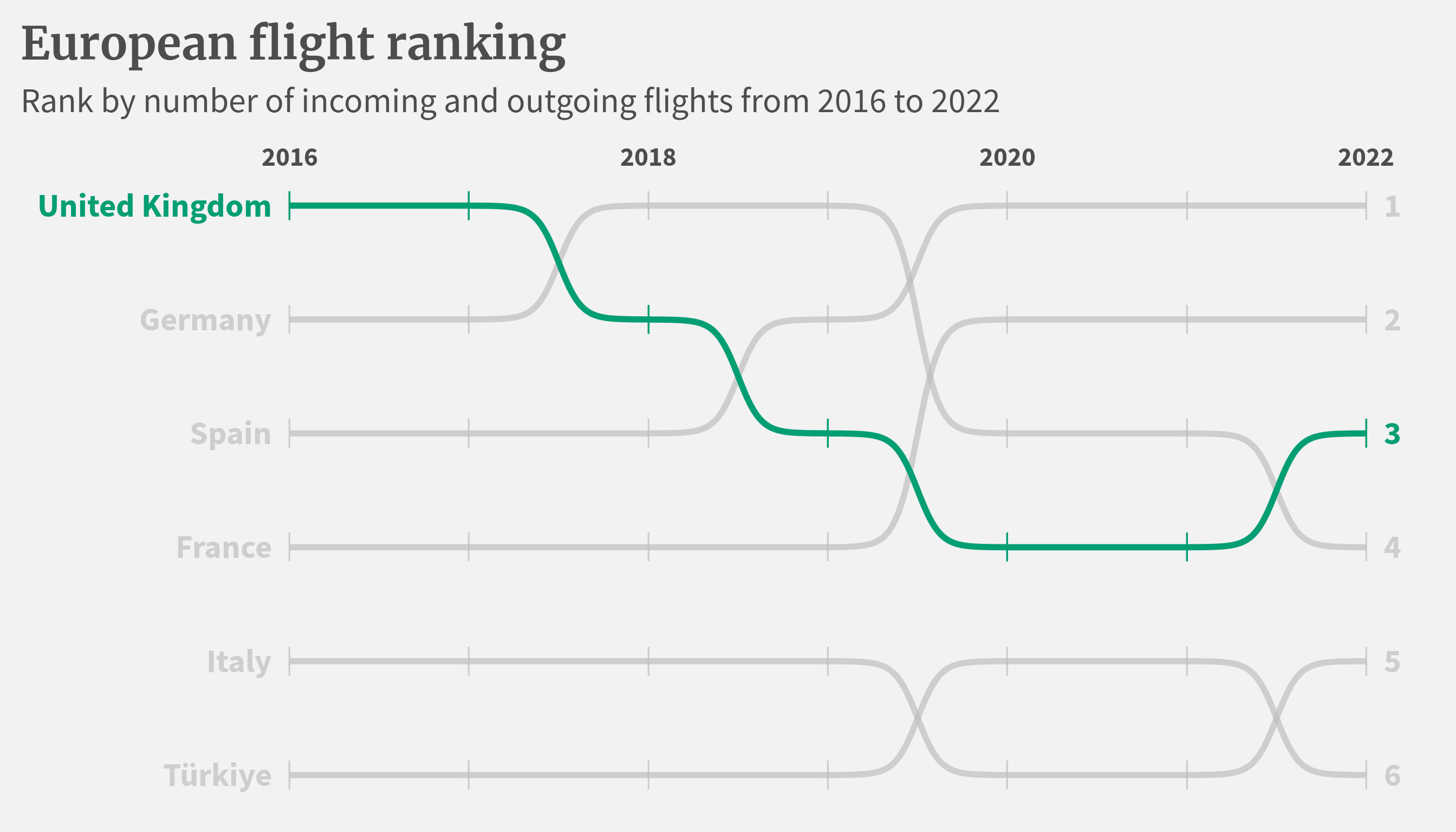
Here, all you have to do is to add the gghighlight layer and specify the country you want to highlight. The latter is done with a simple logical statement in the gghighlight function just like using filter in dplyr.
And there you have it, five ggplot extensions (and gghighlight as a bonus) that can transform your visualizations. If you enjoyed this blog post, then you may also enjoy
Here are three other ways I can help you:

Every week, I share bite-sized R tips & tricks. Reading time less than 3 minutes. Delivered straight to your inbox. You can sign up for free weekly tips online.

This in-depth video course teaches you everything you need to know about becoming better & more efficient at cleaning up messy data. This includes Excel & JSON files, text data and working with times & dates. If you want to get better at data cleaning, check out the course page.

This video course teaches you how to leverage {ggplot2} to make charts that communicate effectively without being a design expert. Course information can be found on the course page.