library(tidyverse)
original_dat <- tribble(
~label, ~group, ~strongly_oppose, ~somewhat_oppose, ~somewhat_favor, ~strongly_favor, ~neither, ~no_experience,
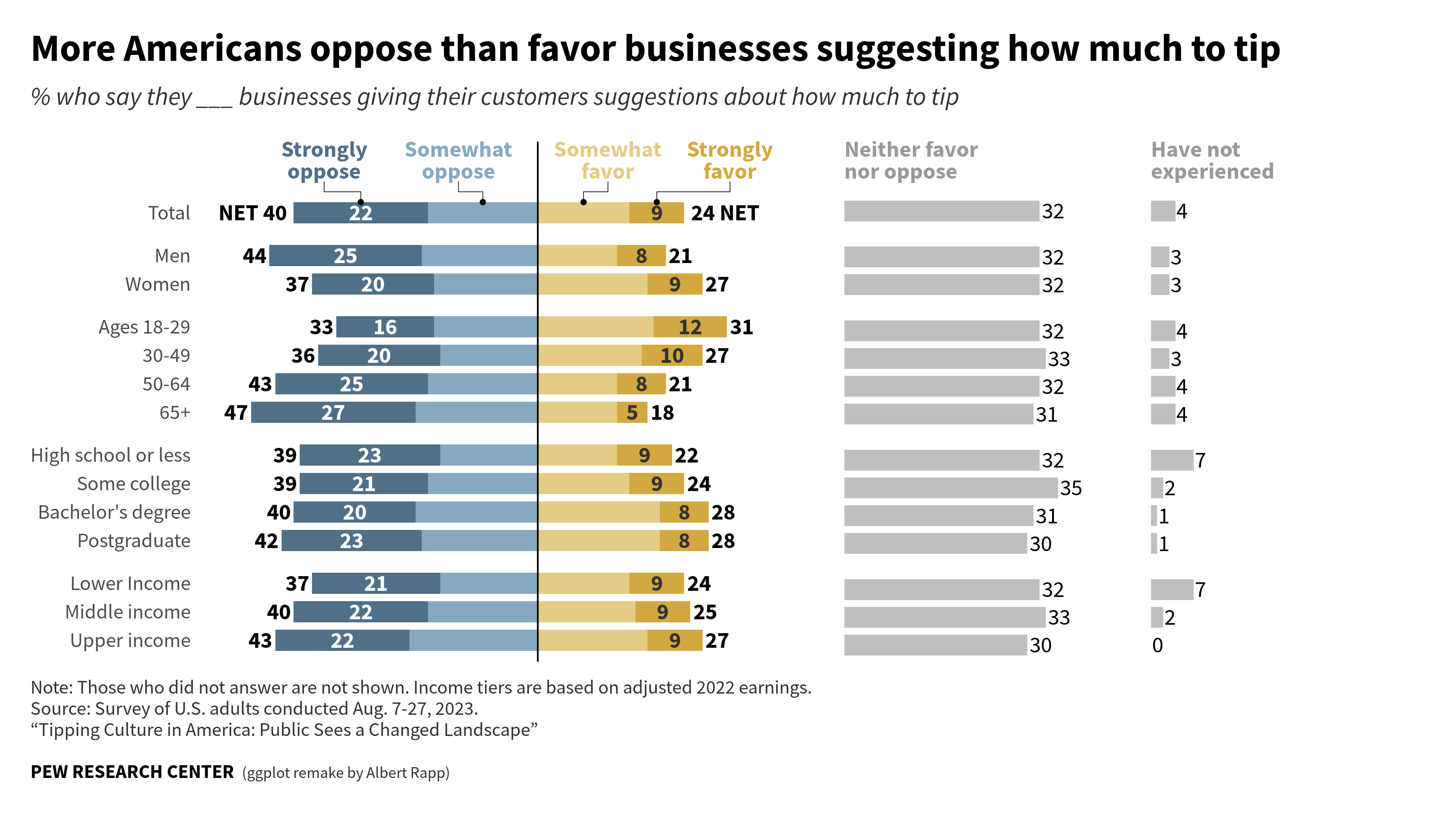
'Total', 'total', 22, 18, 15, 9, 32, 4,
'Men', 'gender', 25, 19, 13, 8, 32, 3,
'Women', 'gender', 20, 17, 18, 9, 32, 3,
'Ages 18-29', 'age', 16, 17, 19, 12, 32, 4,
'30-49', 'age', 20, 16, 17, 10, 33, 3,
'50-64', 'age', 25, 18, 13, 8, 32, 4,
'65+', 'age', 27, 20, 13, 5, 31, 4,
'High school or less', 'education', 23, 16, 13, 9, 32, 7,
'Some college', 'education', 21, 18, 15, 9, 35, 2,
'Bachelor\'s degree', 'education', 20, 20, 20, 8, 31, 1,
'Postgraduate', 'education', 23, 19, 20, 8, 30, 1,
'Lower Income', 'income', 21, 16, 15, 9, 32, 7,
'Middle income', 'income', 22, 18, 16, 9, 33, 2,
'Upper income', 'income', 22, 21, 18, 9, 30, 0
)
original_dat
## # A tibble: 14 × 8
## label group strongly_oppose somewhat_oppose somewhat_favor strongly_favor
## <chr> <chr> <dbl> <dbl> <dbl> <dbl>
## 1 Total total 22 18 15 9
## 2 Men gend… 25 19 13 8
## 3 Women gend… 20 17 18 9
## 4 Ages 18-… age 16 17 19 12
## 5 30-49 age 20 16 17 10
## 6 50-64 age 25 18 13 8
## 7 65+ age 27 20 13 5
## 8 High sch… educ… 23 16 13 9
## 9 Some col… educ… 21 18 15 9
## 10 Bachelor… educ… 20 20 20 8
## 11 Postgrad… educ… 23 19 20 8
## 12 Lower In… inco… 21 16 15 9
## 13 Middle i… inco… 22 18 16 9
## 14 Upper in… inco… 22 21 18 9
## # ℹ 2 more variables: neither <dbl>, no_experience <dbl>How to create diverging bar plots
Visualization
In this blog post, we are going to recreate a beautiful diverging bar plot from the PEW Research Center.
In today’s blog post, we are going to create an elaborate diverging bar chart. Namely, we are going to create this plot here:
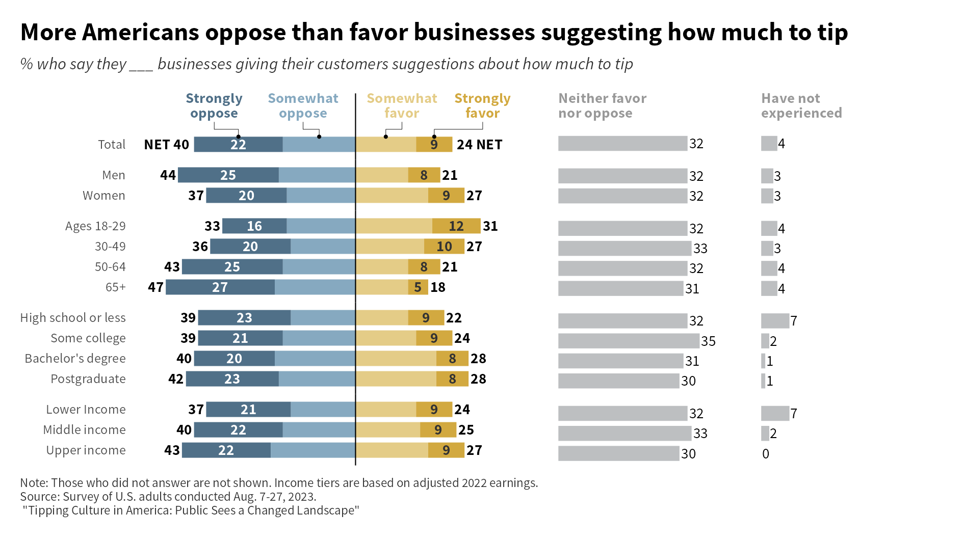
As you can see in the caption of this image, this plot was originally created by the PEW Research Center. Here, we use this chart to practice our ggplot2 skills. And before we dive into the blog post, let me point out that you can also watch the video version of this blog post on YouTube:
Get the data
Alright, now let’s get started. First, we need to copy the data from the initial chart.
Then, we will have to rearrange the data to get it into a good format for ggplot().
dat_longer <- original_dat |>
  pivot_longer(
    cols = strongly_oppose:no_experience,
    values_to = 'percentage',
    names_to = 'preference'
  )
And for the diverging bar chart part, we don’t actually need the “Neither” and “No experience” group.
dat_diverging <- dat_longer |>
  filter(!(preference %in% c('neither', 'no_experience')))
Compute middle points of the bars
Next, we will have to compute coordinates of the left and right edges of each rectangle as well as their middle points. Once we have that, we can use geom_rect() to create the diverging bar chart. Luckily, we have the preference column already in the natural order of “Strongly oppose”, “Somewhat oppose”, “Somewhat favor” and “Strongly favor”. Hence, we don’t have to sort the rows of that data set and can just compute the left and right edge of each part of the bar.
computed_values <- dat_diverging |>
  mutate(
    middle_shift = sum(percentage[1:2]),
    lagged_percentage = lag(percentage, default = 0),
    left = cumsum(lagged_percentage) - middle_shift,
    right = cumsum(percentage) - middle_shift,
    middle_point = (left + right) / 2,
    width = right - left,
    .by = label
  )
computed_values
## # A tibble: 56 × 10
##    label group  preference percentage middle_shift lagged_percentage  left right
##    <chr> <chr>  <chr>           <dbl>        <dbl>             <dbl> <dbl> <dbl>
##  1 Total total  strongly_…         22           40                 0   -40   -18
##  2 Total total  somewhat_…         18           40                22   -18     0
##  3 Total total  somewhat_…         15           40                18     0    15
##  4 Total total  strongly_…          9           40                15    15    24
##  5 Men   gender strongly_…         25           44                 0   -44   -19
##  6 Men   gender somewhat_…         19           44                25   -19     0
##  7 Men   gender somewhat_…         13           44                19     0    13
##  8 Men   gender strongly_…          8           44                13    13    21
##  9 Women gender strongly_…         20           37                 0   -37   -17
## 10 Women gender somewhat_…         17           37                20   -17     0
## # ℹ 46 more rows
## # ℹ 2 more variables: middle_point <dbl>, width <dbl>
And now we can send that data to ggplot.
bar_width <- 0.75
computed_values |>
  ggplot() +
  geom_tile(
    aes(
      x = middle_point,
      y = label,
      width = width,
      fill = preference
    ),
    height = bar_width
  )
Sort the bars
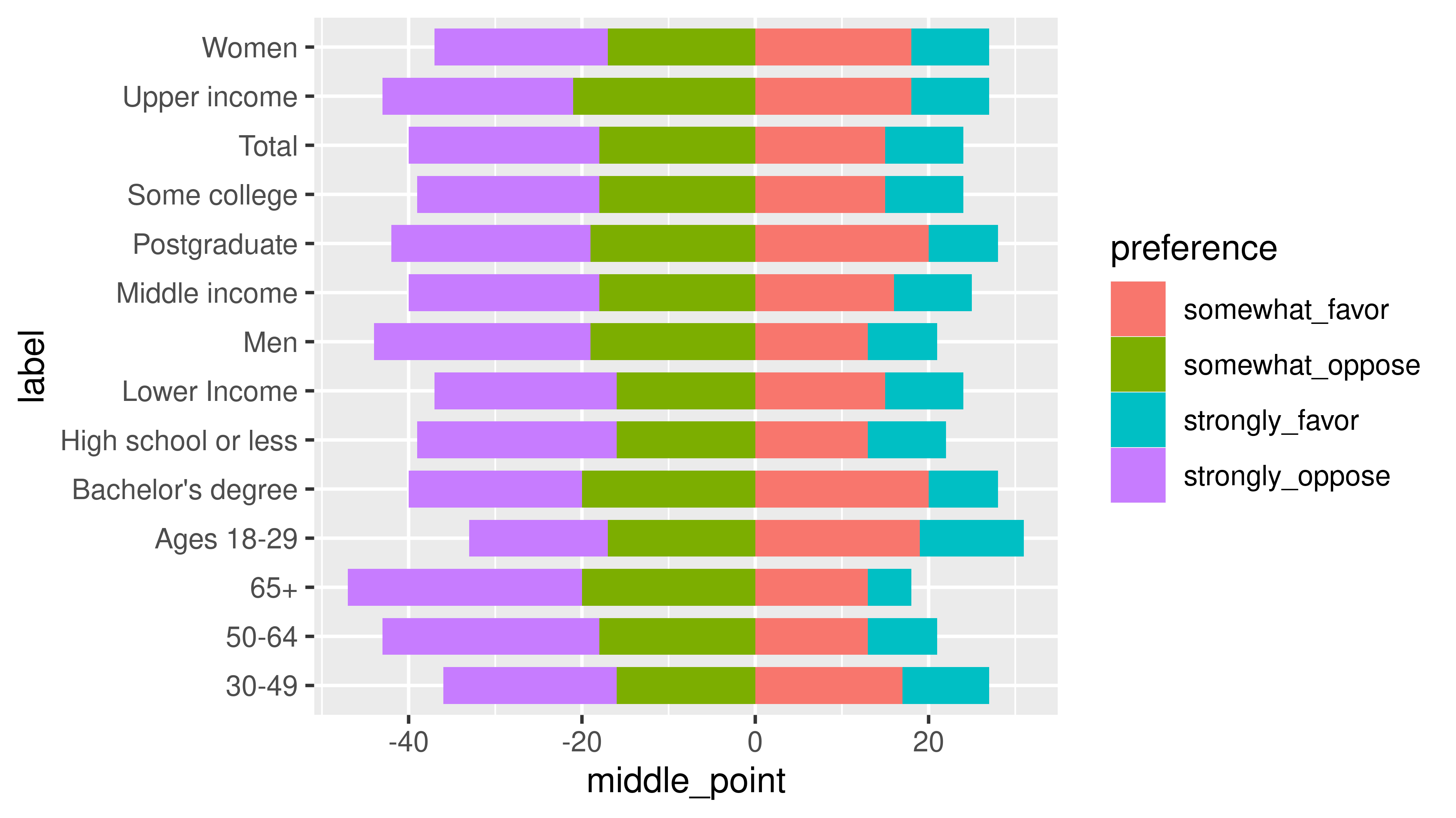
Unfortunately, the bars are not in the right order. We can sort them by making the label column into a factor variable.
factor_dat <- computed_values |>
mutate(
label = factor(
label,
levels = original_dat$label
) |> fct_rev()
)
initial_diverging_bar_plot <- factor_dat |>
ggplot() +
geom_tile(
aes(
x = middle_point,
y = label,
width = width,
fill = preference
),
height = bar_width
)
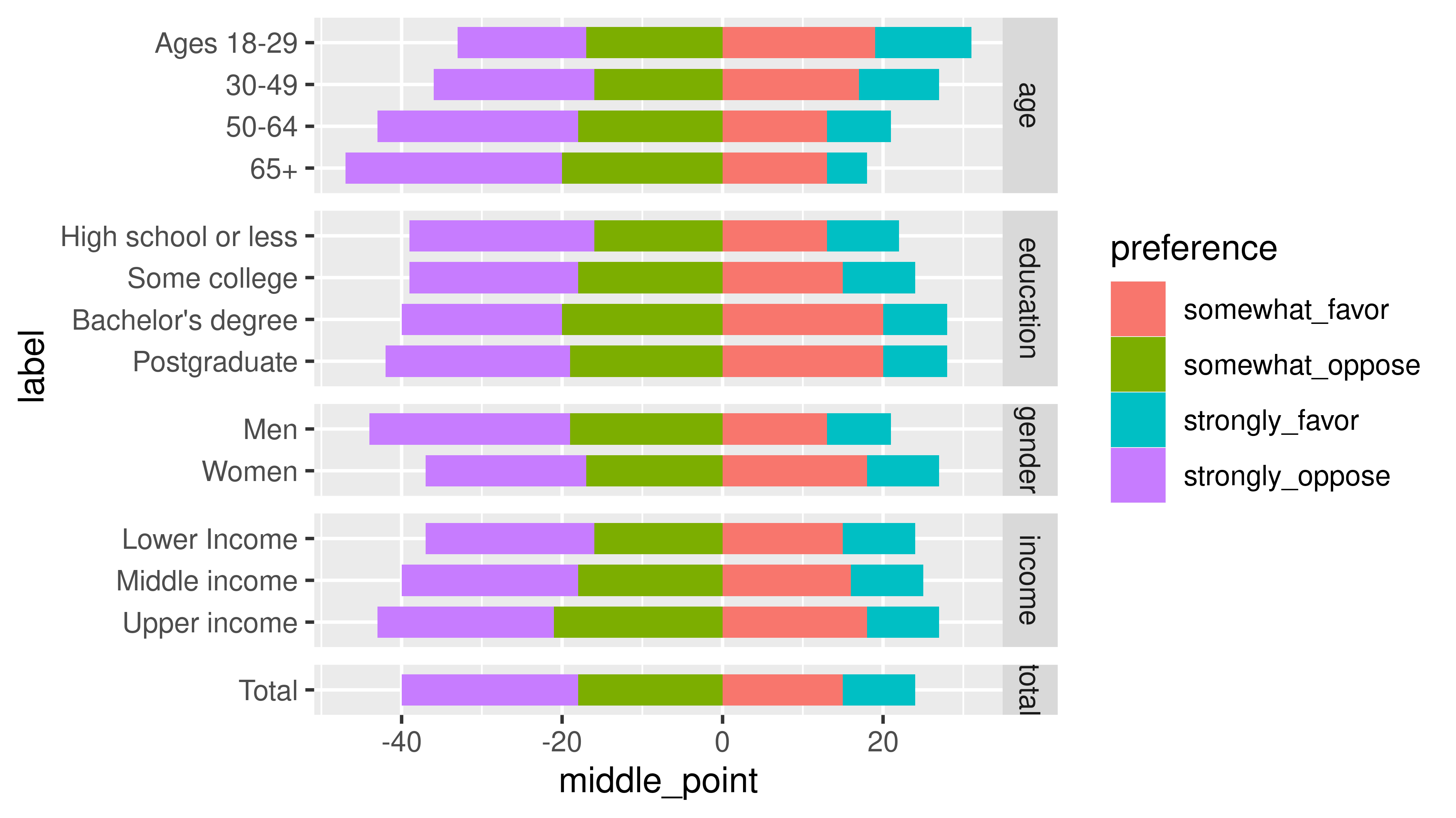
initial_diverging_bar_plot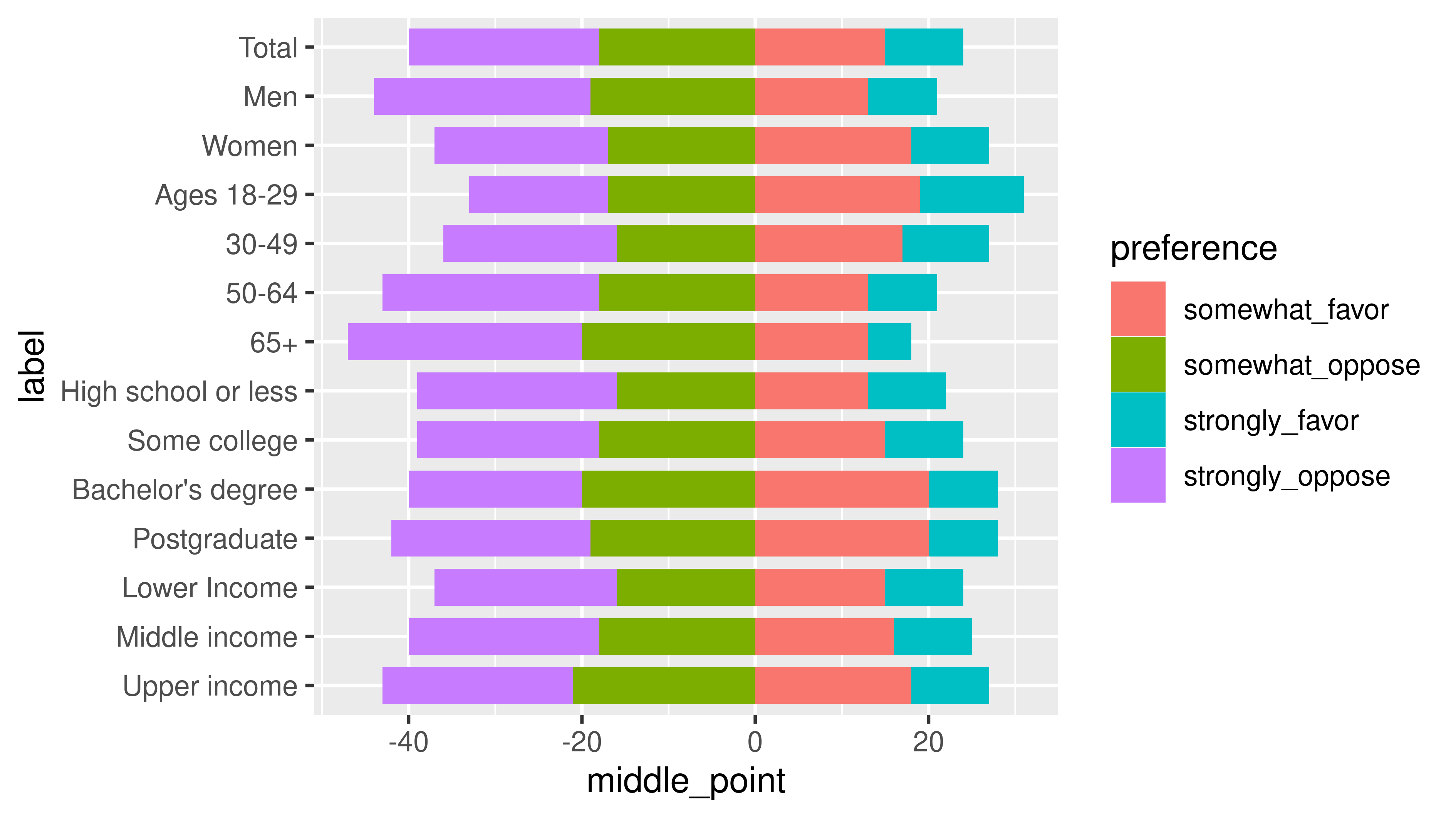
Group the bars
In our final image, we can see that the bars are grouped together. To make this happen, we can sure facet_wrap().
initial_diverging_bar_plot +
  facet_wrap(
    vars(group),
    ncol = 1,
    scales = 'free_y'
  )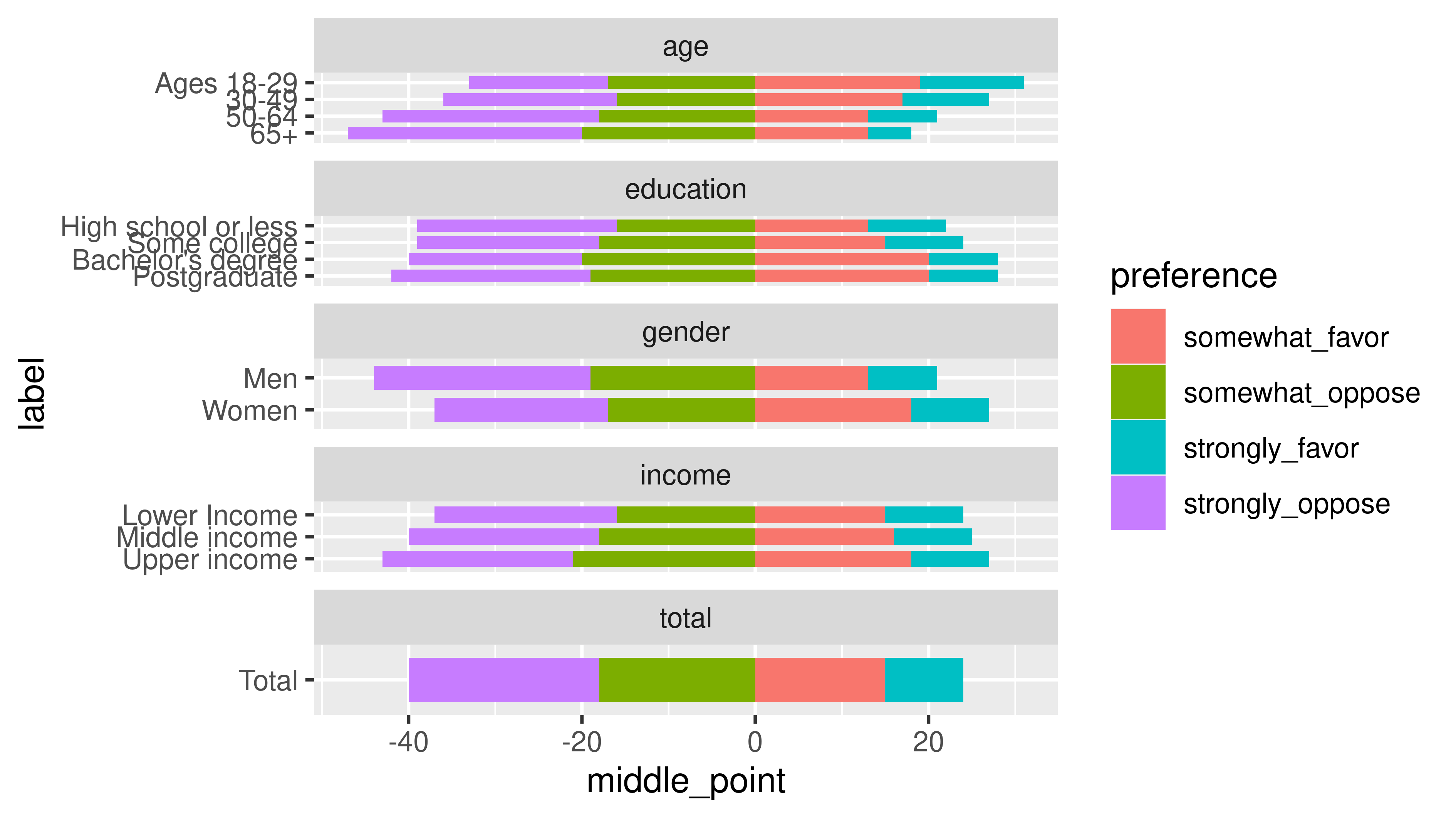
Argh. The bars are of different size now. But what we can do in that case is to use facet_grid and set the space to "free_y" too.
initial_diverging_bar_plot +
  facet_grid(
    rows = vars(group),
    scales = 'free_y',
    space = 'free_y'
  )
But the order of the facets is still wrong. To set this right, we have to make the group column into a factor as well.
sorted_groups_dat <- factor_dat |>
  mutate(
    group = factor(
      group,
      levels = unique(original_dat$group)
    )
  )


equal_bars <- sorted_groups_dat |>
  ggplot() +
  geom_tile(
    aes(
      x = middle_point,
      y = label,
      width = width,
      fill = preference
    ),
    height = bar_width
  ) +
  facet_grid(
    rows = vars(group),
    scales = 'free_y',
    space = 'free_y'
  )
equal_bars
Theming the bars
Next, we can apply a bit of theming. What we want to do is
- Set a minimal theme with larger and better font
- Remove the legend
- Remove the facet labels
- Remove the axes titles
- Remove the background grid
- Remove the x-axis entirely
And since we will set some sizes now, we are going to start gg_record() from {camcorder}. This makes sure that the exported plot has the right size.
camcorder::gg_record(
  dir = 'dir',
  width = 16,
  height = 9,
  unit = 'cm'
)
So now let’s begin styling the plot.
equal_bars +
  theme_minimal(
    base_size = 8,
    base_family = 'Source Sans Pro'
  ) +
  theme(
    legend.position = 'none',
    strip.text = element_blank(),
    axis.title = element_blank(),
    panel.grid = element_blank(),
    axis.text.x = element_blank()
) 
We should also get better colors. Here are the colors I’ve extracted from the original chart.
color_palette <- c(
  strongly_oppose = '#507088',
  somewhat_oppose =  '#86a9c0',
  somewhat_favor = '#e4cc87',
  strongly_favor = '#d2a940'
)
grey_color = '#bdbfc1'
With these colors we can easily set the fill colors via a scale_fill_manual() layer.
equal_bars +
  theme_minimal(
    base_size = 8,
    base_family = 'Source Sans Pro'
  ) +
  theme(
    legend.position = 'none',
    strip.text = element_blank(),
    axis.title = element_blank(),
    panel.grid = element_blank(),
    axis.text.x = element_blank()
  ) +
  scale_fill_manual(
    values = color_palette
  )
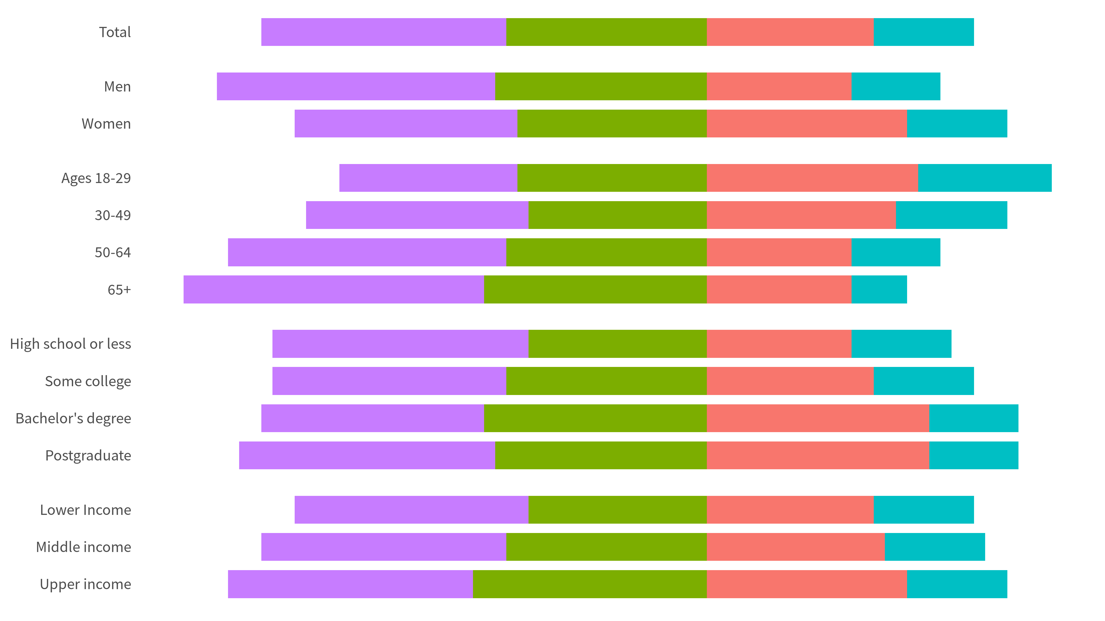
Add the numeric labels
Next, let us add in the labels. Here, we will proceed in three steps:
- First, let us add the labels that are always inside of the “strongly oppose/favor” bars.
- Second, let us add the labels that are always on the left of the bars.
- Third, let us add the labels that are always on the right of the bars.
The second two steps are very similar. Basically, they requires us to consider the absolute values of the left or right column.
bars_with_numbers <- equal_bars +
  geom_text(
    data = sorted_groups_dat |>
      filter(str_detect(preference, 'strongly')),
    aes(
      x = middle_point,
      y = label,
      label = percentage
    ),
    size = 2.5,
    color = rep(c('white', '#333333'), 14),
    family = 'Source Sans Pro',
    fontface = 'bold'
  ) +
  geom_text(
    data = sorted_groups_dat |>
      filter(preference == 'strongly_oppose'),
    aes(
      x = left,
      y = label,
      label = paste(
        c('NET', rep('', 13)),
        abs(left)
      )
    ),
    size = 2.5,
    color = 'black',
    family = 'Source Sans Pro',
    fontface = 'bold',
    hjust = 1.1
  ) +
  geom_text(
    data = sorted_groups_dat |>
      filter(preference == 'strongly_favor'),
    aes(
      x = right,
      y = label,
      label = paste(
        abs(right),
        c('NET', rep('', 13))
      )
    ),
    size = 2.5,
    color = 'black',
    family = 'Source Sans Pro',
    fontface = 'bold',
    hjust = -0.1
  ) +
  theme_minimal(
    base_size = 8,
    base_family = 'Source Sans Pro'
  ) +
  theme(
    legend.position = 'none',
    strip.text = element_blank(),
    axis.title = element_blank(),
    panel.grid = element_blank(),
    axis.text.x = element_blank()
  ) +
  scale_fill_manual(
    values = color_palette
  )
bars_with_numbers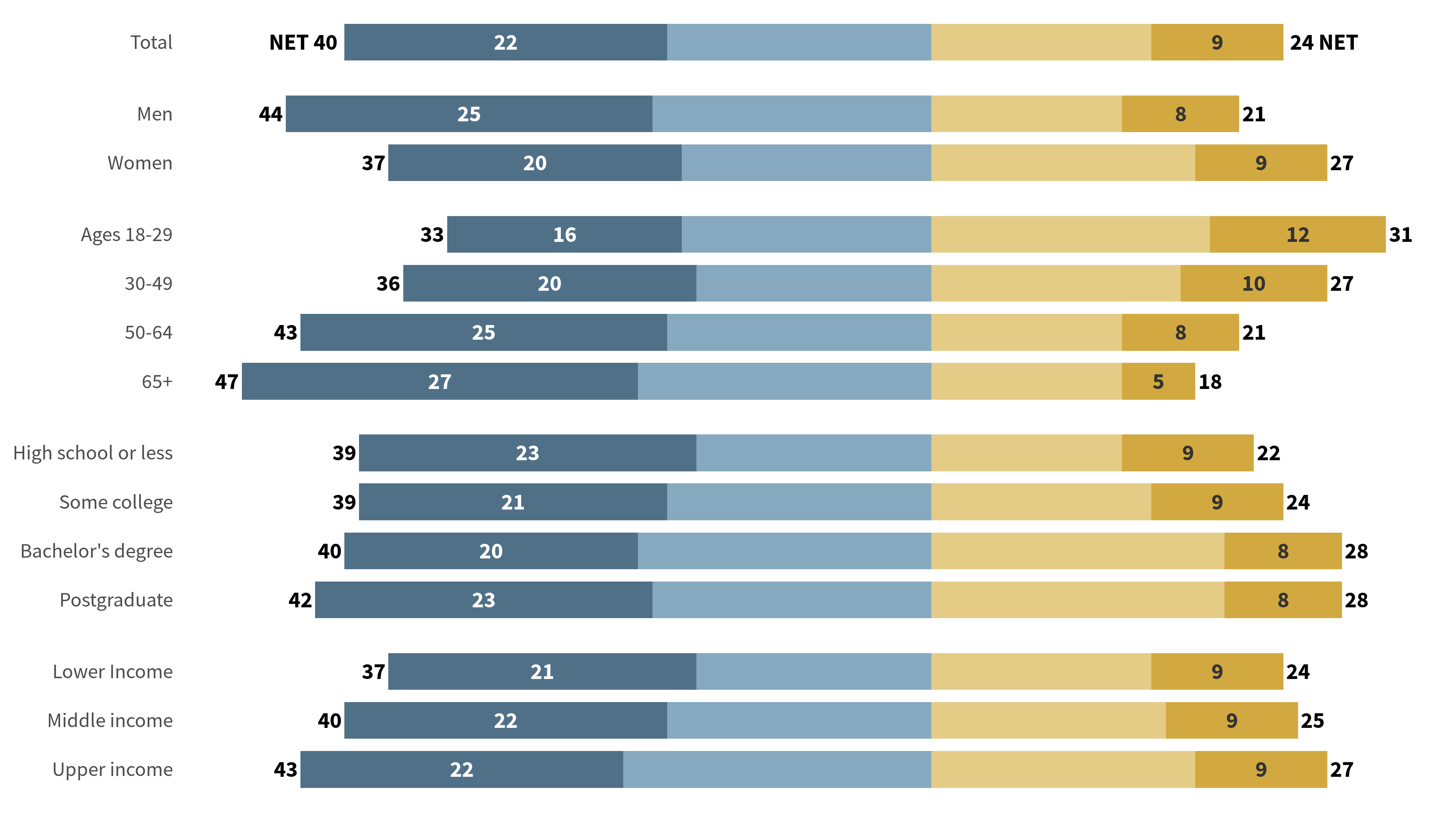
Add vertical line
This looks pretty good. All that’s left to do is to add a vertical line at 0. Usually, we would use geom_vline() for this. But this would draw vertical lines for each facet.
bars_with_numbers +
  geom_vline(
    xintercept = 0,
    color = 'black',
    linewidth = 0.25
  )
Instead, we want to have one vertical line for all facets. At first, I thought we’d have to get really creative here but then I found this excellent community post. The solution is to set the space between panels to zero but in order to still keep some space between the group, we can expand the y-axis on each facet.
bars_with_numbers_and_lines <- bars_with_numbers +
  geom_vline(
    xintercept = 0,
    color = 'black',
    linewidth = 0.25
  ) +
  scale_y_discrete(
    expand = expansion(
      add = 0.75
    )
  ) +
  theme(
    panel.spacing = unit(0, 'pt')
  )
bars_with_numbers_and_lines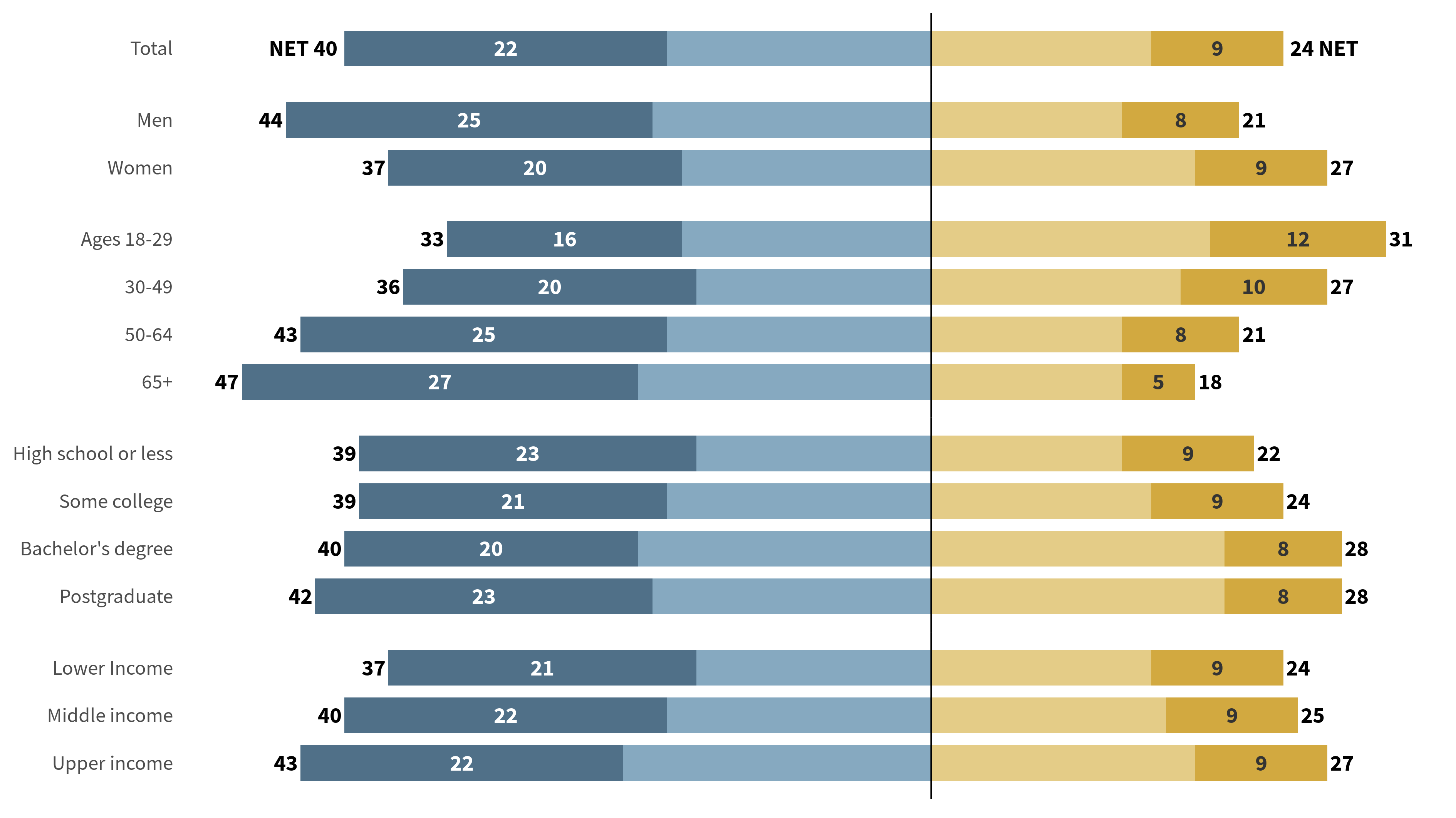
Group/Color labels
Next, let us add the labels to the bars so that everyone can understand what the colors represent. To do so, we filter the data set to only include the “total” group and then add the labels via a geom_text() layer. Filtering the data like this is necessary because we don’t want to have the labels for each facet.
Also, to move the labels above the total bar we have to use nudge_y. We can’t just add a constant value to the y aesthetic because then the y-aesthetic is not a numeric variable. Remember that part. It will become important in just a sec.
label_translation = c(
  'strongly_oppose' = 'Strongly\noppose',
  'somewhat_oppose' = 'Somewhat\noppose',
  'somewhat_favor' = 'Somewhat\nfavor',
  'strongly_favor' = 'Strongly\nfavor'
)

 bars_with_numbers_and_lines +
  geom_text(
    data = sorted_groups_dat |>
      filter(label == 'Total'),
    aes(
      x = middle_point + c(-6, -4, 4, 12),
      y = label,
      label = label_translation[preference],
      color = preference
    ),
    nudge_y = 2.5,
    size = 2.5,
    family = 'Source Sans Pro',
    fontface = 'bold',
    vjust = 1,
    lineheight = 0.8
  ) +
  scale_color_manual(
    values = color_palette
  )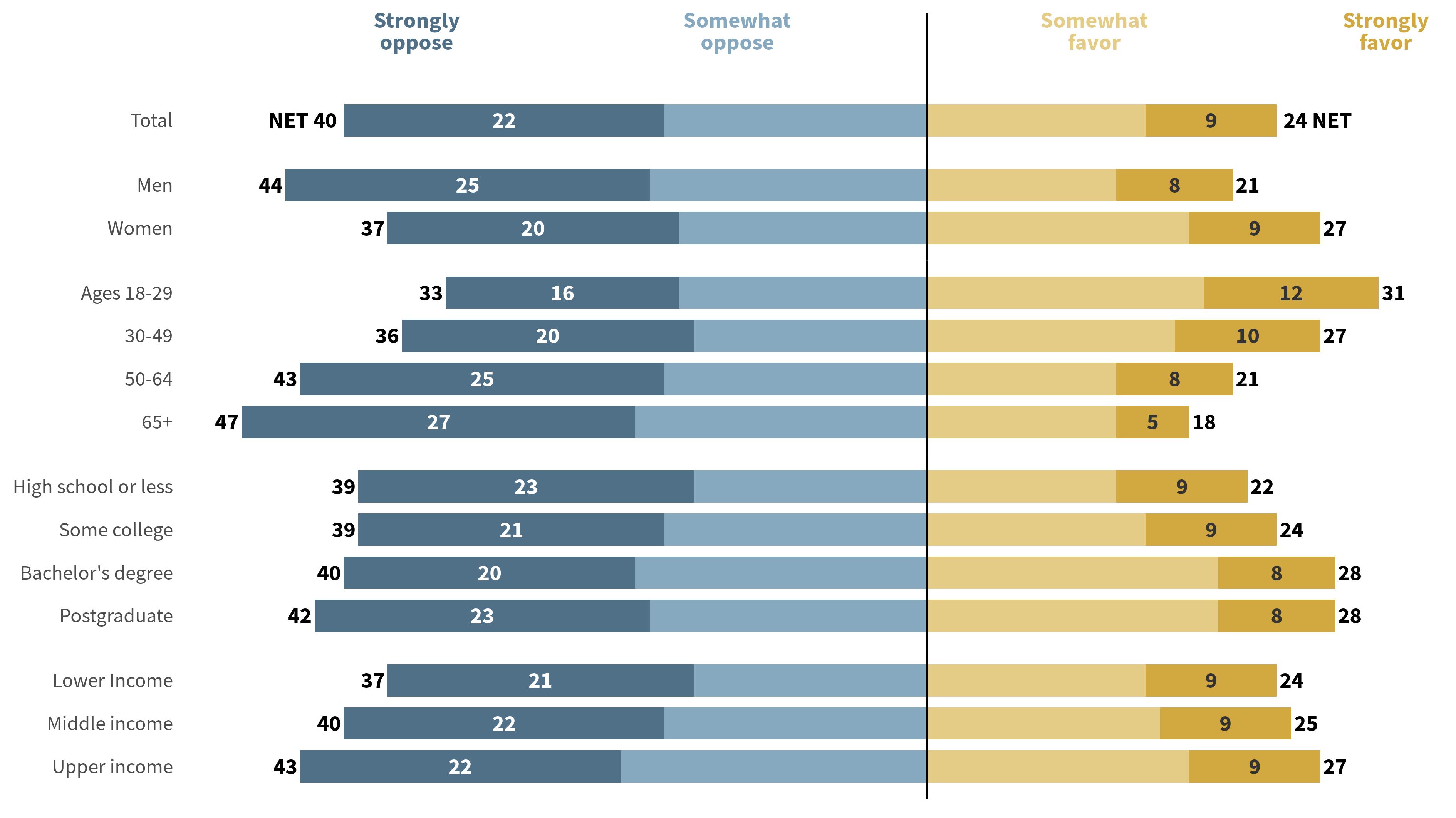
Add pointers
Now this was the easy part. Adding the pointers is actually waaay more tricky. What we want to do is to add a geom_step() layer to make the step-like pointer. But the problem is that we don’t have a numeric y-axis. Again, this forbids us to use a constant value to nudge the y-values. So instead we have to create a vector to nudge each point individually. Here’s how that looks.
pointer_data <- sorted_groups_dat |>
filter(label == 'Total') |>
mutate(
middle_point = middle_point + c(-6, -4, 4, 12)
) |>
bind_rows(
sorted_groups_dat |> filter(label == 'Total')
)
double_pointer_data <- bind_rows(
pointer_data, pointer_data
) |>
arrange(middle_point)
nudge_vector <- c(
rep(
c(
1.1,
(bar_width / 2 + 1.1)/2,
(bar_width / 2 + 1.1)/2,
bar_width / 2
),
2
),
rep(
c(
bar_width / 2,
(bar_width / 2 + 1.1)/2,
(bar_width / 2 + 1.1)/2,
1.1
),
2
)
)
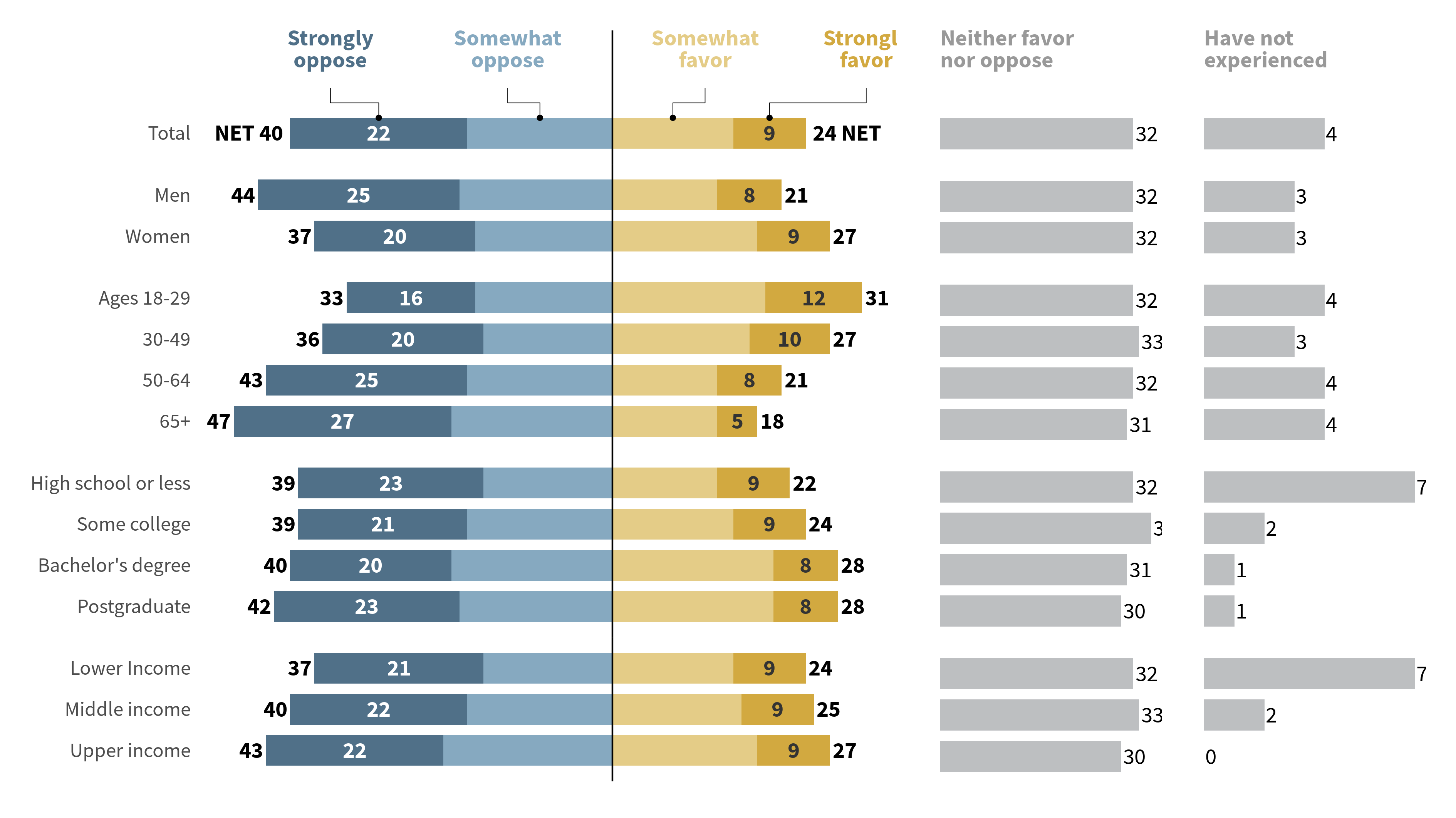
diverging_bar_plot <- bars_with_numbers_and_lines +
geom_text(
data = sorted_groups_dat |>
filter(label == 'Total'),
aes(
x = middle_point + c(-6, -4, 4, 12),
y = label,
label = label_translation[preference],
color = preference
),
nudge_y = 2.5,
size = 2.5,
family = 'Source Sans Pro',
fontface = 'bold',
vjust = 1,
lineheight = 0.8
) +
geom_step(
data = double_pointer_data,
aes(
x = middle_point,
y = label,
group = preference
),
position = position_nudge(
y = nudge_vector
),
linewidth = 0.1,
color = 'black'
) +
geom_point(
data = sorted_groups_dat |>
filter(label == 'Total'),
aes(
x = middle_point,
y = label
),
position = position_nudge(
y = bar_width / 2
),
size = 0.25,
color = 'black'
) +
scale_color_manual(
values = color_palette
)
diverging_bar_plot
Repeat steps for “Neither” and “No experience”
Hoooray, we finished our first plot. Now, let’s create the bar charts for the “Neither” and “No experience” groups. For both of these charts, we will have to make sure that there are no labels for either x- or y-axis. Also, we don’t want to use bold labels in this case (for some reason the PEW research center does this.)
Here, adding the labels at the top is actually much easier. So that’s why I won’t go into detail here.
original_dat_sorted <- original_dat |>
  mutate(
    label = factor(
      label,
      levels = label
    ) |> fct_rev(),
    group = factor(
      group,
      levels = unique(original_dat$group)
    )
  )


neither_chart <- original_dat_sorted |>
  ggplot() +
  geom_col(
    aes(
      y = label,
      x = neither,
    ),
    fill = grey_color,
    width = bar_width
  ) +
  geom_text(
    aes(
      y = label,
      x = neither,
      label = neither
    ),
    size = 2.5,
    color = 'black',
    family = 'Source Sans Pro',
    hjust = -0.1
  ) +
  geom_text(
    data = original_dat_sorted |>
      filter(label == 'Total'),
    aes(
      x = 0,
      y = label,
      label = 'Neither favor\nnor oppose'
    ),
    color = 'grey60',
    nudge_y = 2.5,
    size = 2.5,
    family = 'Source Sans Pro',
    fontface = 'bold',
    vjust = 1,
    hjust = 0,
    lineheight = 0.8
  ) +
  facet_grid(
    rows = vars(group),
    scales = 'free_y',
    space = 'free_y'
  ) +
  theme_minimal(
    base_size = 8,
    base_family = 'Source Sans Pro'
  ) +
  theme(
    legend.position = 'none',
    strip.text = element_blank(),
    axis.title = element_blank(),
    panel.grid = element_blank(),
    axis.text = element_blank()
  )
neither_chart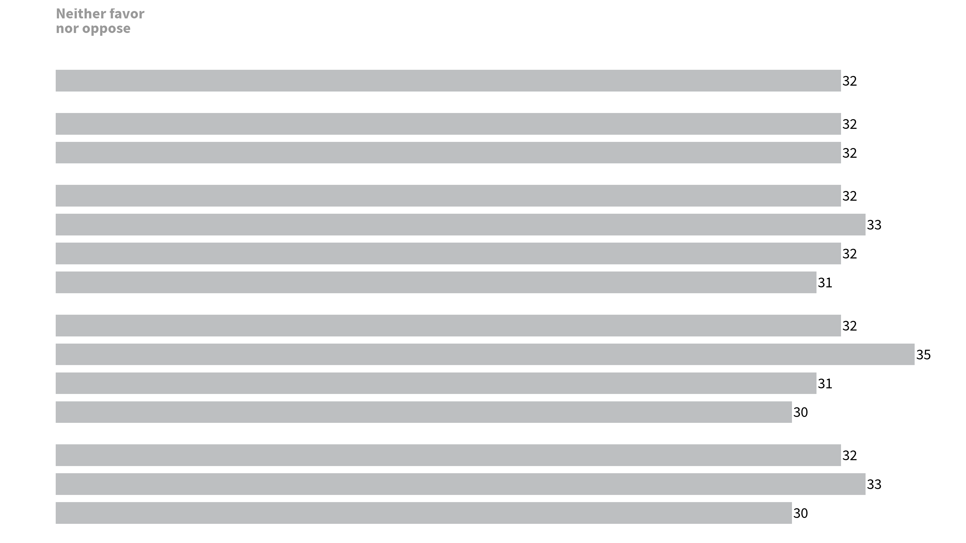
And for the “No experience” chart, we can use the same thing.
no_experience_chart <- original_dat_sorted |>
  ggplot() +
  geom_col(
    aes(
      y = label,
      x = no_experience,
    ),
    fill = grey_color,
    width = bar_width
  ) +
  geom_text(
    aes(
      y = label,
      x = no_experience,
      label = no_experience
    ),
    size = 2.5,
    color = 'black',
    family = 'Source Sans Pro',
    hjust = -0.1
  ) +
  geom_text(
    data = original_dat_sorted |>
      filter(label == 'Total'),
    aes(
      x = 0,
      y = label,
      label = 'Have not\nexperienced'
    ),
    color = 'grey60',
    nudge_y = 2.5,
    size = 2.5,
    family = 'Source Sans Pro',
    fontface = 'bold',
    vjust = 1,
    hjust = 0,
    lineheight = 0.8
  ) +
  facet_grid(
    rows = vars(group),
    scales = 'free_y',
    space = 'free_y'
  ) +
  theme_minimal(
    base_size = 8,
    base_family = 'Source Sans Pro'
  ) +
  theme(
    legend.position = 'none',
    strip.text = element_blank(),
    axis.title = element_blank(),
    panel.grid = element_blank(),
    axis.text = element_blank()
  )
no_experience_chart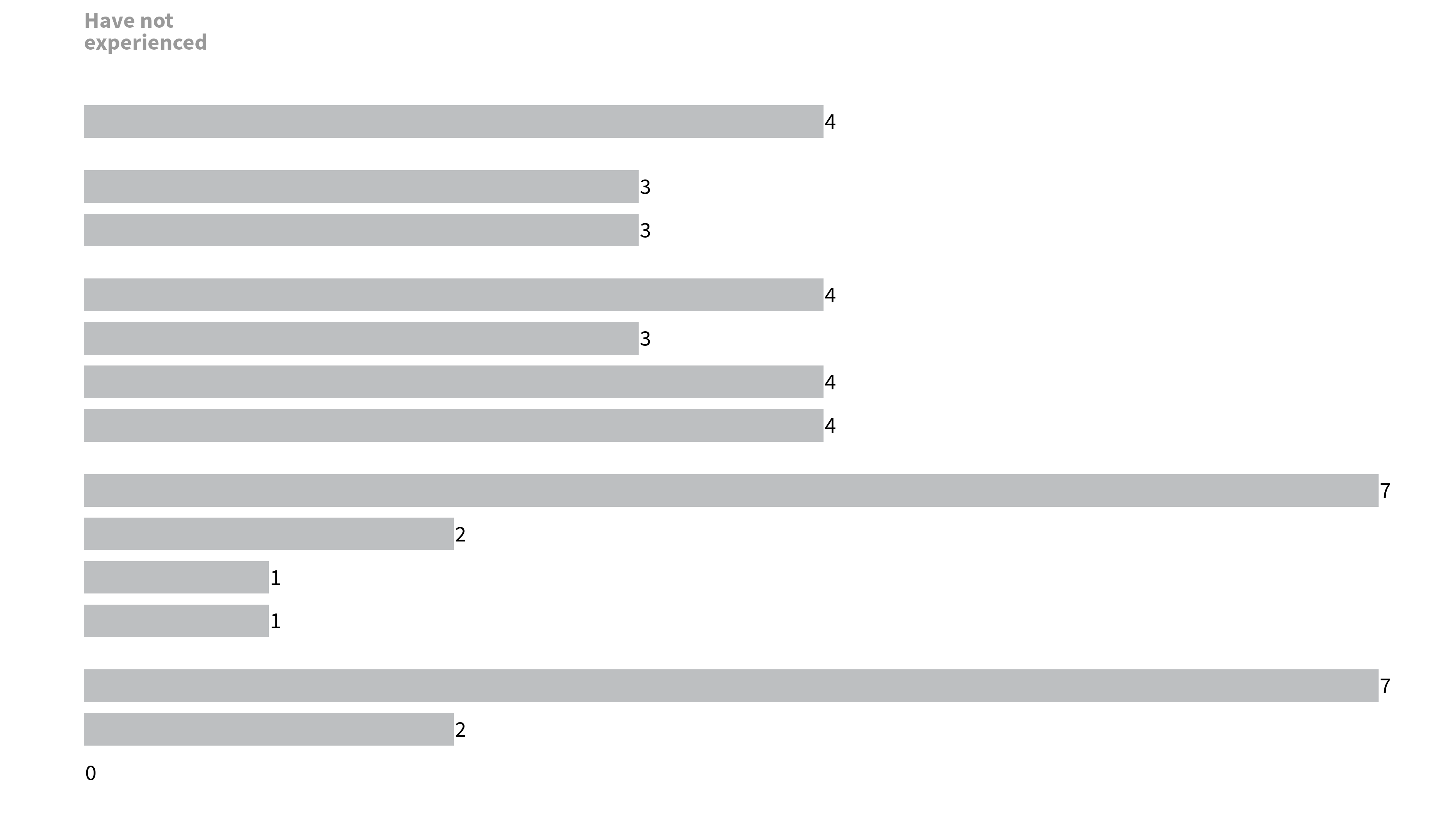
Assemble the charts
Now that we have all of our charts, it’s time to assemble them. As always, we can use the {patchwork} package to do that. If you’re unfamiliar with {patchwork}, then I recommend you check out this video:
In any case, there’s the code that uses {patchwork}.
library(patchwork)
diverging_bar_plot +
  neither_chart +
  no_experience_chart +
  plot_layout(
    ncol = 3,
    widths = c(3, 1, 1)
  )
Fixing the ratios between the subplots
But this is not quite right. The bars in the “Neither” and “No experience” charts are too large. To streamline those we have to set the x-axis limits to the same values as in all the plots. Also, we have to adjust the proportions in widths so that the bars are of the same size.
Here, this was done as follows: The diverging bar chart covers a range of -55 to 45. That’s 100 units. Assuming that this is set to width 1. The other two charts should have a width of 0.45.
diverging_bar_plot_adj <- diverging_bar_plot +
  scale_x_continuous(
    limits = c(-55, 45),
    expand = expansion()
  )

neither_chart_adj <- neither_chart +
  scale_x_continuous(
    limits = c(0, 45),
    expand = expansion()
  )

no_experience_chart_adj <- no_experience_chart +
  scale_x_continuous(
    limits = c(0, 45),
    expand = expansion()
  )

assembled_plot <- diverging_bar_plot_adj +
  neither_chart_adj +
  no_experience_chart_adj +
  plot_layout(
    ncol = 3,
    widths = c(1, 0.45, 0.45)
  )
assembled_plot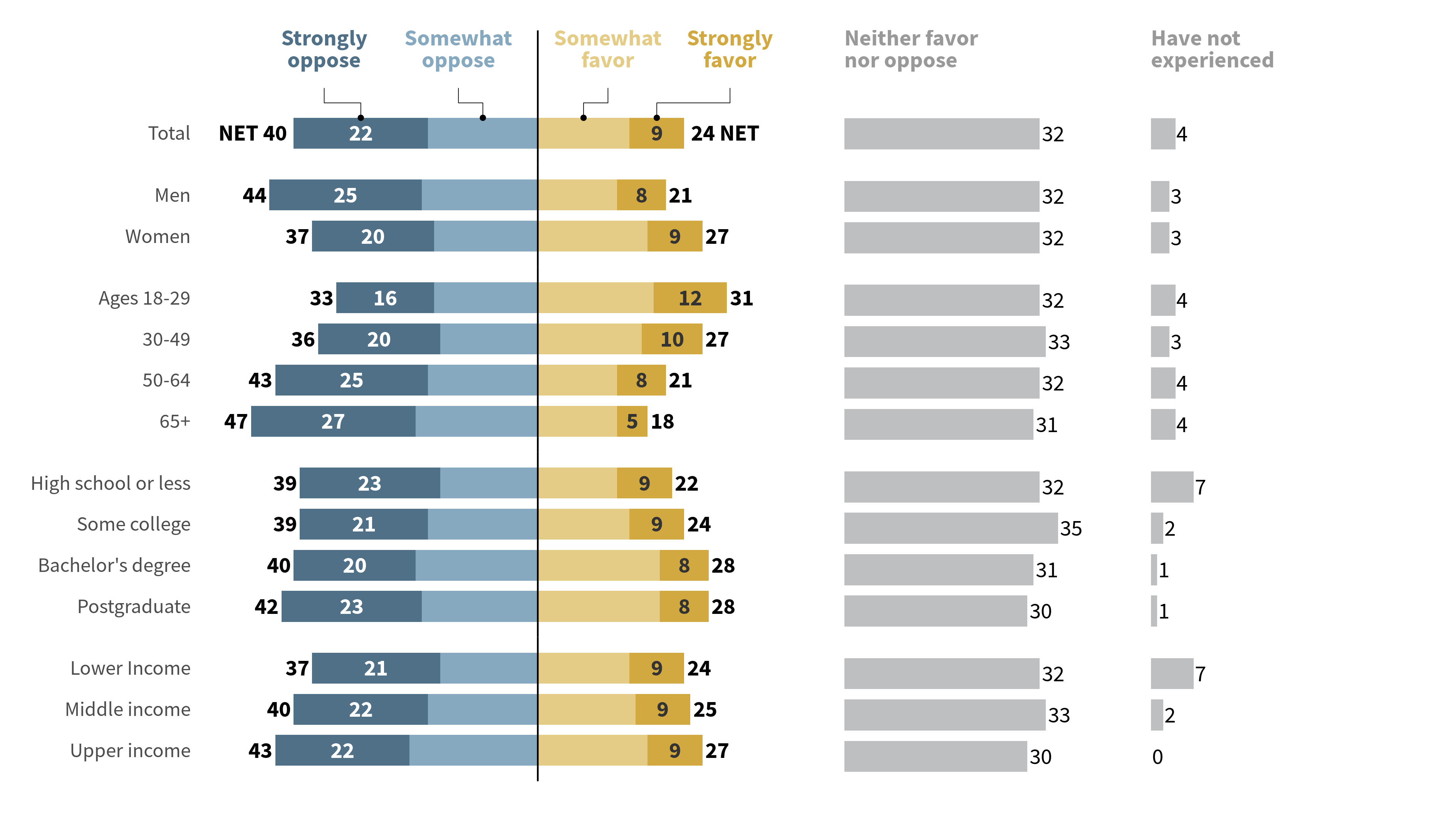
Add captions and titles
Next, we can add the labels and captions to this assembled plot.
title <- 'More Americans oppose than favor businesses suggesting how much to tip'
subtitle <- '% who say they ___ businesses giving their customers suggestions about how much to tip'
caption <- 'Note: Those who did not answer are not shown. Income tiers are based on adjusted 2022 earnings.\nSource: Survey of U.S. adults conducted Aug. 7-27, 2023.\n "Tipping Culture in America: Public Sees a Changed Landscape"'

assembled_plot +
  plot_annotation(
    title = title,
    subtitle = subtitle,
    caption = caption,
    theme = theme(
      plot.title = element_text(
        size = 12,
        family = 'Source Sans Pro',
        face = 'bold',
        margin = margin(t = 2, b = 2, unit = 'mm')
      ),
      plot.subtitle = element_text(
        size = 8,
        family = 'Source Sans Pro',
        color = '#333333',
        face = 'italic',
        margin = margin(b = 2, unit = 'mm')
      ),
      plot.caption = element_text(
        size = 6,
        family = 'Source Sans Pro',
        color = '#333333',
        margin = margin(b = 2, unit = 'mm'),
        hjust = 0
      )
    )
  )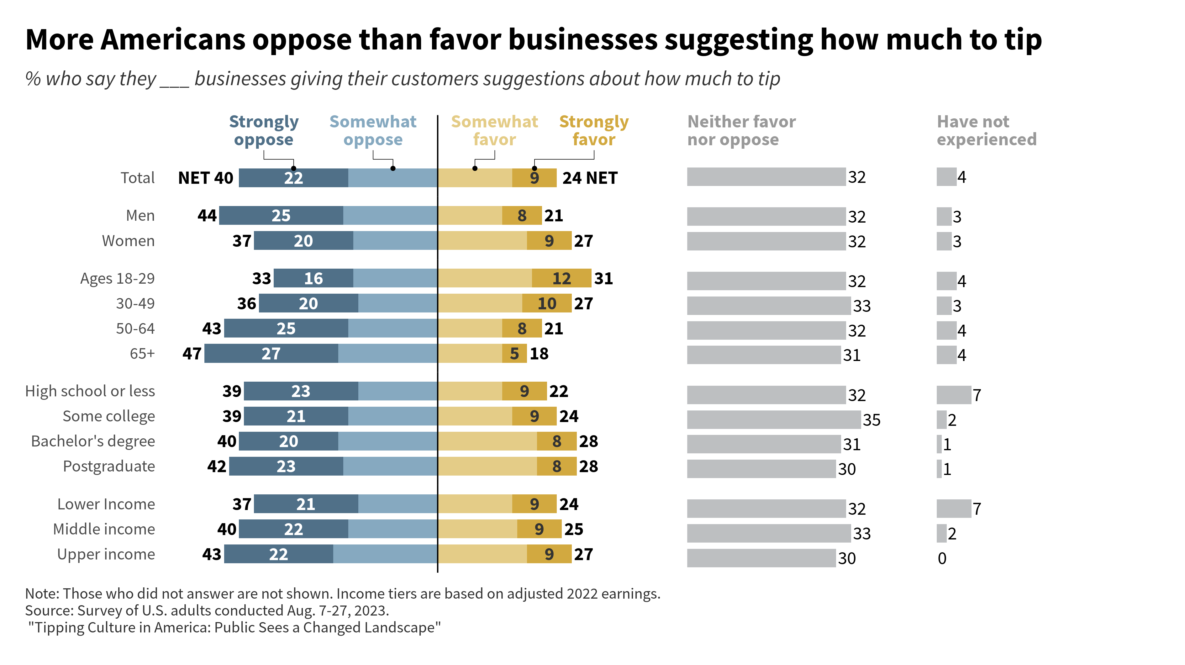
But now what’s missing is the PEW RESEARCH CENTER label. We can add that to the caption but the font is different. So that’s why have to make the caption into a markdown element with {ggtext}. That way, we can use custom style instructions. So let’s do that:
# Add the PEW RESEARCH CENTER label
# And change the line breaks \n to html line breaks <br>
caption <- 'Note: Those who did not answer are not shown. Income tiers are based on adjusted 2022 earnings.<br>Source: Survey of U.S. adults conducted Aug. 7-27, 2023.<br>"Tipping Culture in America: Public Sees a Changed Landscape"<br><br><span style = "color:black;font-size:6pt">**PEW RESEARCH CENTER**</span> <span style = "font-size:5pt">(ggplot remake by Albert Rapp)</span>'

assembled_plot +
  plot_annotation(
    title = title,
    subtitle = subtitle,
    caption = caption,
    theme = theme(
      plot.title = element_text(
        size = 12,
        family = 'Source Sans Pro',
        face = 'bold',
        margin = margin(t = 2, b = 2, unit = 'mm')
      ),
      plot.subtitle = element_text(
        size = 8,
        family = 'Source Sans Pro',
        color = '#333333',
        face = 'italic',
        margin = margin(b = 2, unit = 'mm')
      ),
      plot.caption = ggtext::element_markdown(
        size = 6,
        family = 'Source Sans Pro',
        color = '#333333',
        margin = margin(b = 2, unit = 'mm'),
        hjust = 0,
        lineheight = 1.1
      )
    )
  )
Conclusion
Hoooray, we have finished our chart. If you enjoyed this blog post, then you’re going to love my video course “Insightful data visualizations for”uncreative” R users. There, I show you lots more elaborate charts and how to build them. Don’t forget to check out the video course and I will see you next time.


