set.seed(345345)
library(tidyverse)
fake_dat <- tibble(
  reason_for_return = c(
    "Wrong Address",
    "Wrong Item",
    "Damaged",
    "Unhappy with the product",
    "Other"
  ),
  returned_items = rpois(5, 100)
)
fake_dat
## # A tibble: 5 × 2
##   reason_for_return        returned_items
##   <chr>                             <int>
## 1 Wrong Address                        86
## 2 Wrong Item                          103
## 3 Damaged                              92
## 4 Unhappy with the product            113
## 5 Other 104Dot plots as an alternative to bar charts
Visualization
Bar charts are great for comparing categories. But dot plots put more emphasis on individual data points. In this blog post, I show you how to create such an alternative plot with
ggplot2.
I recently saw a cool LinkedIn post where it was highlighted that a dot plot is a pretty neat alternative to bar charts. While bar charts makes it easy to compare categories, dot plots put more emphasis on individual data points. I thought the idea was quite cool. So let me show you how to do that in {ggplot2}. And if you want to watch the video version of this blog post, you can do that here:
Bar charts for comparison
First, let us create a good old bar chart. To do so, we will need to create a data set. Let’s create a fake one. And let’s make this fake data set about returned items of a retailer.
With this fake data, we can create a bar chart like we normally would. In case you haven’t done that before, I think bar charts are one of the most fundamental charts and I’ve put together a video on how to create this and other fundamental charts at
Anyway, the bar chart is created with geom_col().
fake_dat |>
  ggplot(
    aes(
      y = reason_for_return,
      x = returned_items
    )
  ) +
  geom_col(fill = 'dodgerblue4')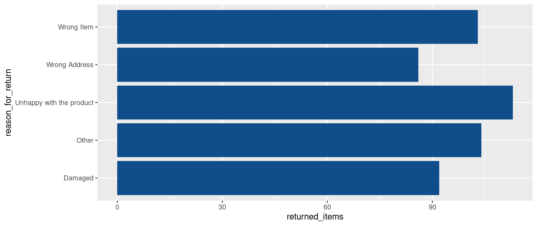
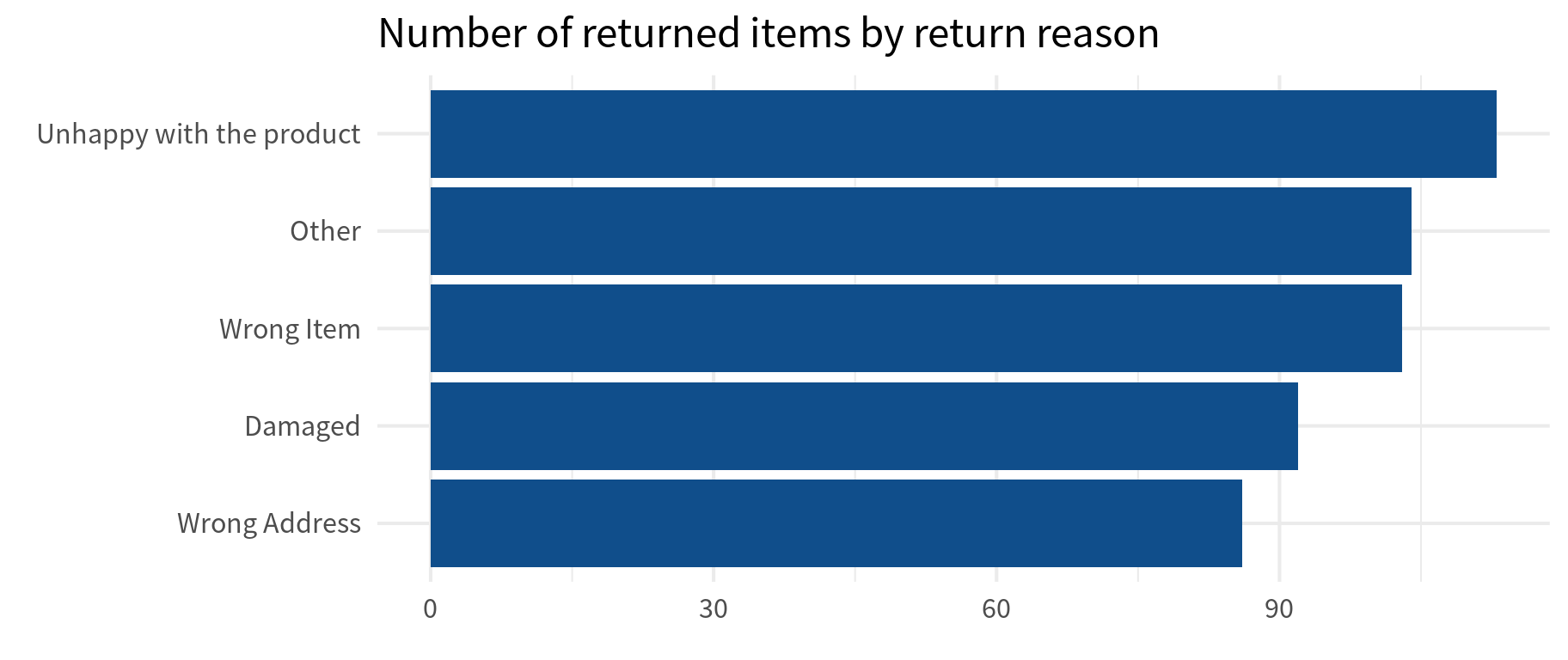
To make sure that this looks nice, let us
- reorder the categories by the number of returned items
- Apply a
theme_minimal()layer where we increase the base size - Add a title
- Remove the axes descriptions
sorted_dat <- fake_dat |>
  mutate(
    reason_for_return = fct_reorder(
      reason_for_return,
      returned_items
    )
  )

sorted_dat |>
  ggplot(
    aes(
      y = reason_for_return,
      x = returned_items
    )
  ) +
  geom_col(fill = 'dodgerblue4') +
  theme_minimal(
    base_size = 16,
    base_family = 'Source Sans Pro'
  ) +
  labs(
    title = "Number of returned items by return reason",
    x = element_blank(),
    y =element_blank()
  )
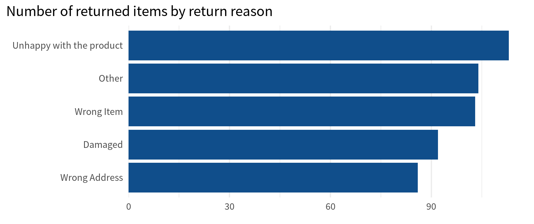
Finally, we can remove the x-axis expansion so that labels are closer to the bars. Also, we can remove the y-axis grid lines. They’re not of much use here.
sorted_dat |>
  ggplot(
    aes(
      y = reason_for_return,
      x = returned_items
    )
  ) +
  geom_col(fill = 'dodgerblue4') +
  theme_minimal(
    base_size = 16,
    base_family = 'Source Sans Pro'
  ) +
  labs(
    title = "Number of returned items by return reason",
    x = element_blank(),
    y =element_blank()
  ) +
  scale_x_continuous(
    expand = expansion(mult = c(0, 0.05))
  ) +
  theme(
    panel.grid.major.y = element_blank(),
    plot.title.position = 'plot'
  )
Sweet. A good old bar chart. It’s pretty easy to see that the most common reason that people return items is because they’re unhappy with the product. Now off to the dot plot.
Dot plot for individual points
Basically, creating the bar chart is only a matter of replacing geom_col() with geom_point().
sorted_dat |>
  ggplot(
    aes(
      y = reason_for_return,
      x = returned_items
    )
  ) +
  geom_point(
    color = 'dodgerblue4',
    size = 8
  ) +
  theme_minimal(
    base_size = 16,
    base_family = 'Source Sans Pro'
  ) +
  labs(
    title = "Number of returned items by return reason",
    x = element_blank(),
    y =element_blank()
  ) +
  scale_x_continuous(
    expand = expansion(mult = c(0, 0.05))
  ) +
  theme(
    panel.grid.major.y = element_blank(),
    plot.title.position = 'plot'
  )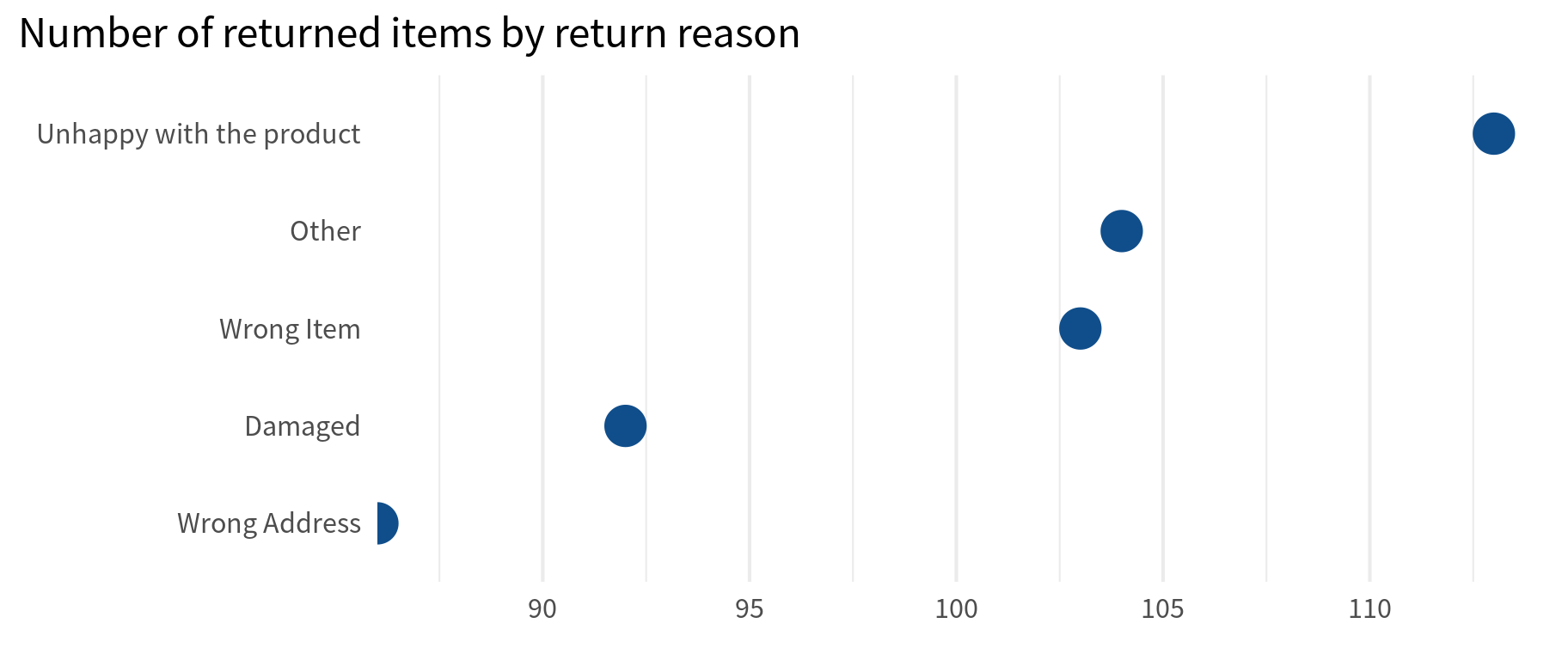
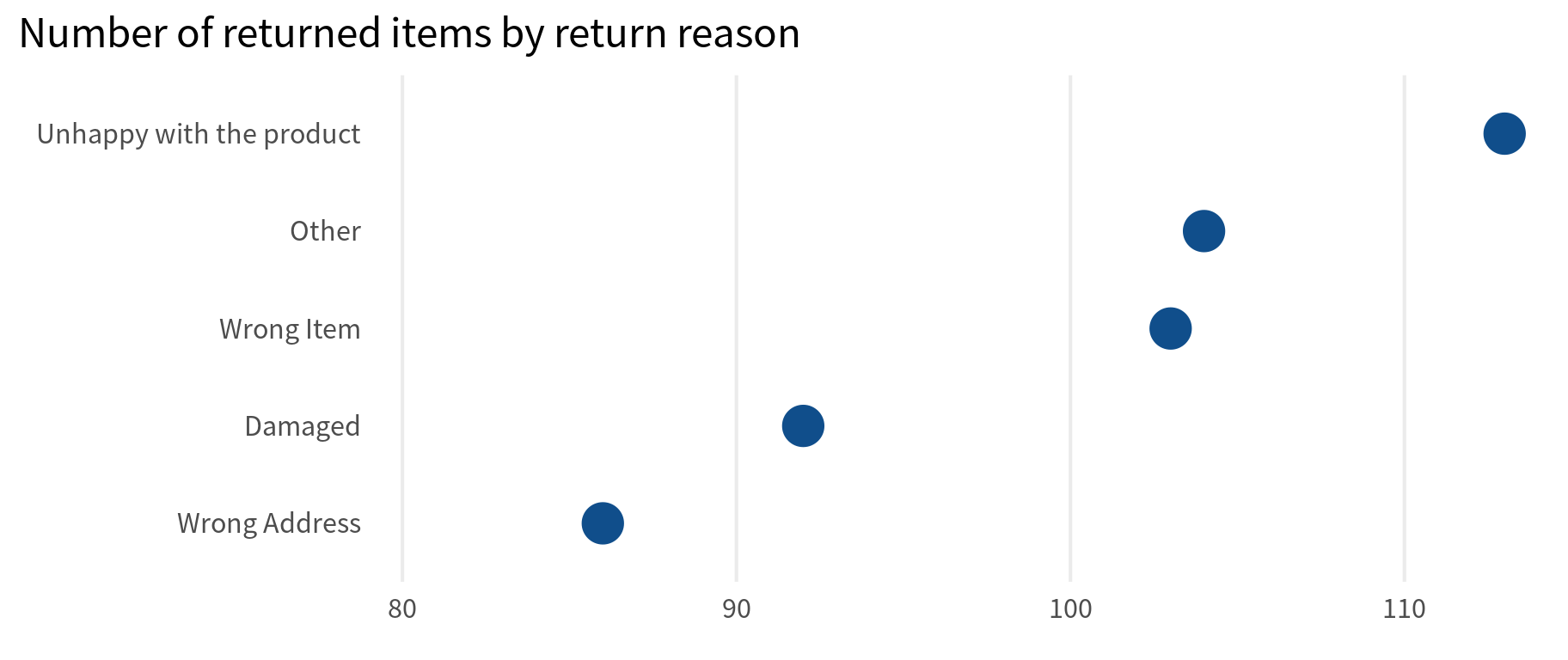
That was easy. But now we should probably make a couple of tweaks. Namely, we can remove the x-axis minor grid lines (because there’s just too many grid lines) and change the x-axis expansion to make room for the labels.
sorted_dat |>
  ggplot(
    aes(
      y = reason_for_return,
      x = returned_items
    )
  ) +
  geom_point(
    color = 'dodgerblue4',
    size = 8
  ) +
  theme_minimal(
    base_size = 16,
    base_family = 'Source Sans Pro'
  ) +
  labs(
    title = "Number of returned items by return reason",
    x = element_blank(),
    y =element_blank()
  ) +
  scale_x_continuous(
    expand = expansion(mult = c(0.25, 0.05))
  ) +
  theme(
    panel.grid.major.y = element_blank(),
    panel.grid.minor.x = element_blank(),
    plot.title.position = 'plot'
  )
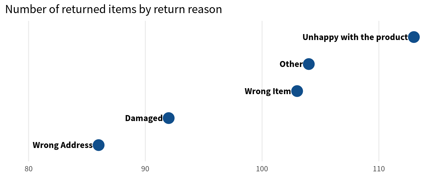
Finally, all that’s left to do is to
- add the labels to the points with
geom_text(). - remove the y-axis labels
sorted_dat |>
  ggplot(
    aes(
      y = reason_for_return,
      x = returned_items
    )
  ) +
  geom_point(
    color = 'dodgerblue4',
    size = 8
  ) +
  geom_text(
    aes(
      label = reason_for_return
    ),
    hjust = 1,
    nudge_x = -0.5,
    size = 5,
    family = 'Source Sans Pro',
    fontface = 'bold'
  ) +
  theme_minimal(
    base_size = 16,
    base_family = 'Source Sans Pro'
  ) +
  labs(
    title = "Number of returned items by return reason",
    x = element_blank(),
    y =element_blank()
  ) +
  scale_x_continuous(
    expand = expansion(mult = c(0.25, 0.05))
  ) +
  theme(
    panel.grid.major.y = element_blank(),
    panel.grid.minor.x = element_blank(),
    plot.title.position = 'plot',
    axis.text.y = element_blank()
  )
And if we wanted to make sure that the labels are more legible, we could also add a white background to the labels. The easiest way to do that is via geom_richtext() from {ggtext}.
Sidenote: {ggtext} is one of my most favorite ggplot extensions. If you’re looking for more extensions, you can check out one of my YT videos:
sorted_dat |>
  ggplot(
    aes(
      y = reason_for_return,
      x = returned_items
    )
  ) +
  geom_point(
    color = 'dodgerblue4',
    size = 8
  ) +
  ggtext::geom_richtext(
    aes(
      label = reason_for_return
    ),
    hjust = 1,
    nudge_x = -0.5,
    size = 5,
    family = 'Source Sans Pro',
    fontface = 'bold'
  ) +
  theme_minimal(
    base_size = 16,
    base_family = 'Source Sans Pro'
  ) +
  labs(
    title = "Number of returned items by return reason",
    x = element_blank(),
    y =element_blank()
  ) +
  scale_x_continuous(
    expand = expansion(mult = c(0.25, 0.05))
  ) +
  theme(
    panel.grid.major.y = element_blank(),
    panel.grid.minor.x = element_blank(),
    plot.title.position = 'plot',
    axis.text.y = element_blank()
  )
But as you can see, this comes with a border around the labels. So that’s why you can set label.colour to NA.
sorted_dat |>
  ggplot(
    aes(
      y = reason_for_return,
      x = returned_items
    )
  ) +
  geom_point(
    color = 'dodgerblue4',
    size = 8
  ) +
  ggtext::geom_richtext(
    aes(
      label = reason_for_return
    ),
    hjust = 1,
    nudge_x = -0.5,
    size = 5,
    family = 'Source Sans Pro',
    fontface = 'bold',
    label.colour = NA
  ) +
  theme_minimal(
    base_size = 16,
    base_family = 'Source Sans Pro'
  ) +
  labs(
    title = "Number of returned items by return reason",
    x = element_blank(),
    y =element_blank()
  ) +
  scale_x_continuous(
    expand = expansion(mult = c(0.25, 0.05))
  ) +
  theme(
    panel.grid.major.y = element_blank(),
    panel.grid.minor.x = element_blank(),
    plot.title.position = 'plot',
    axis.text.y = element_blank()
  )
Nice. Notice how the grid lines don’t mess with the lebigility of the labels anymore. And with that we have finished our blog post for this week. If you found this helpful, here are some other ways I can help you:
- 3 Minute Wednesdays: A weekly newsletter with bite-sized tips and tricks for R users
- Insightful Data Visualizations for “Uncreative” R Users: A course that teaches you how to leverage
{ggplot2}to make charts that communicate effectively without being a design expert.


