library(tidyverse)
palmerpenguins::penguins |>
  filter(!is.na(sex)) |>
  select(where(is.numeric))
## # A tibble: 333 × 5
##    bill_length_mm bill_depth_mm flipper_length_mm body_mass_g  year
##             <dbl>         <dbl>             <int>       <int> <int>
##  1           39.1          18.7               181        3750  2007
##  2           39.5          17.4               186        3800  2007
##  3           40.3          18                 195        3250  2007
##  4           36.7          19.3               193        3450  2007
##  5           39.3          20.6               190        3650  2007
##  6           38.9          17.8               181        3625  2007
##  7           39.2          19.6               195        4675  2007
##  8           41.1          17.6               182        3200  2007
##  9           38.6          21.2               191        3800  2007
## 10           34.6          21.1               198        4400  2007
## # ℹ 323 more rowsCorrelation heat maps with {ggplot2}
Visualization
I show you how to create a correlation heat map with
{ggplot2}, how to avoid using the wrong colors and how to use some nice variations of standard heat maps.
Correlation heat maps are pretty easy to create with {ggplot}. But there are some things you have to watch out for. For example, ggplot doesn’t use the correct colors for such a chart by default. In this blog post, I show you how to create a correlation heat map, some of its variants and how to avoid common pitfalls. And if you’re interested in seeing the video version of this blog post, you can find it here:
Computing the correlation
To create a correlation heat map, we first need to compute the correlations. And in order to do that, we need some data. So let’s have a look at our favorite penguins data set.
And with the cor() function, it becomes really easy to compute the correlations.
cov_matrix <- palmerpenguins::penguins |>
  filter(!is.na(sex)) |>
  select(where(is.numeric)) |>
  cor()
cov_matrix
##                   bill_length_mm bill_depth_mm flipper_length_mm body_mass_g
## bill_length_mm         1.0000000    -0.2286256         0.6530956  0.58945111
## bill_depth_mm         -0.2286256     1.0000000        -0.5777917 -0.47201566
## flipper_length_mm      0.6530956    -0.5777917         1.0000000  0.87297890
## body_mass_g            0.5894511    -0.4720157         0.8729789  1.00000000
## year                   0.0326569    -0.0481816         0.1510679  0.02186213
##                          year
## bill_length_mm     0.03265690
## bill_depth_mm     -0.04818160
## flipper_length_mm  0.15106792
## body_mass_g        0.02186213
## year               1.00000000
While this output is great for a quick overview, it is not necessarily great for using it in ggplot. That’s why we have to rearrange the data a bit. And of course, we should also convert the matrix to a tibble. When we do that, we have to make sure to preserve the row names (since they contain useful information).
cov_tibble <- cov_matrix |>
  as_tibble(rownames = 'var_a') |>
  pivot_longer(
    -var_a,
    names_to = "var_b",
    values_to = "correlation"
  )
cov_tibble
## # A tibble: 25 × 3
##    var_a          var_b             correlation
##    <chr>          <chr>                   <dbl>
##  1 bill_length_mm bill_length_mm         1
##  2 bill_length_mm bill_depth_mm         -0.229
##  3 bill_length_mm flipper_length_mm      0.653
##  4 bill_length_mm body_mass_g            0.589
##  5 bill_length_mm year                   0.0327
##  6 bill_depth_mm  bill_length_mm        -0.229
##  7 bill_depth_mm  bill_depth_mm          1
##  8 bill_depth_mm  flipper_length_mm     -0.578
##  9 bill_depth_mm  body_mass_g           -0.472
## 10 bill_depth_mm  year                  -0.0482
## # ℹ 15 more rows
Nice, we have out data in a good format now. With that, we can plot our first heat map.
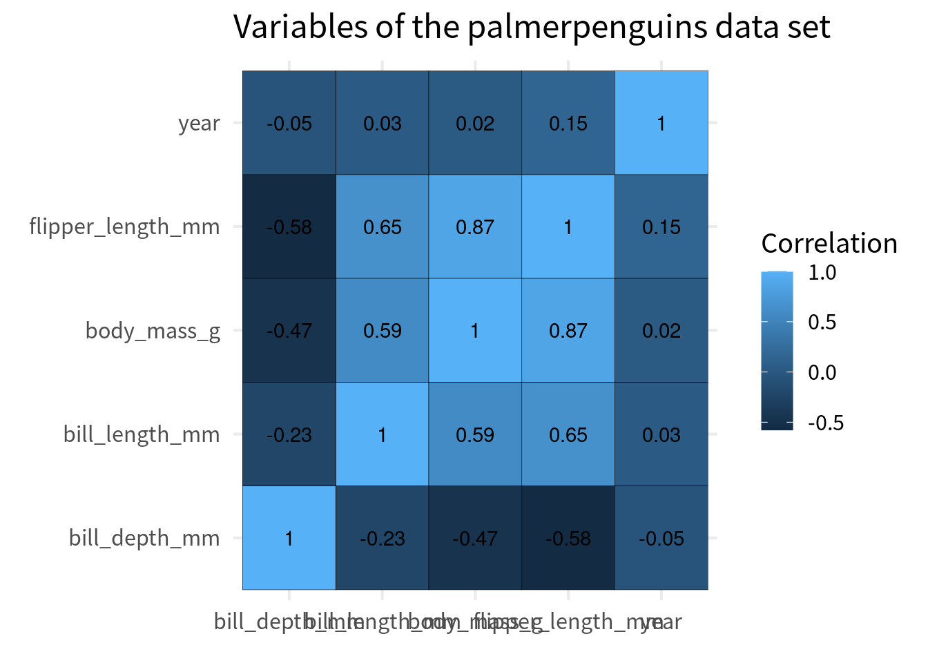
cov_tibble |>
  ggplot(aes(var_a, var_b)) +
  geom_tile(aes(fill = correlation), color = 'black') +
  geom_text(aes(label = round(correlation, 2))) +
  theme_minimal(
    base_size = 16,
    base_family = 'Source Sans Pro'
  ) +
  labs(
    x = element_blank(),
    y = element_blank(),
    fill = 'Correlation',
    title = "Variables of the palmerpenguins data set",
  )
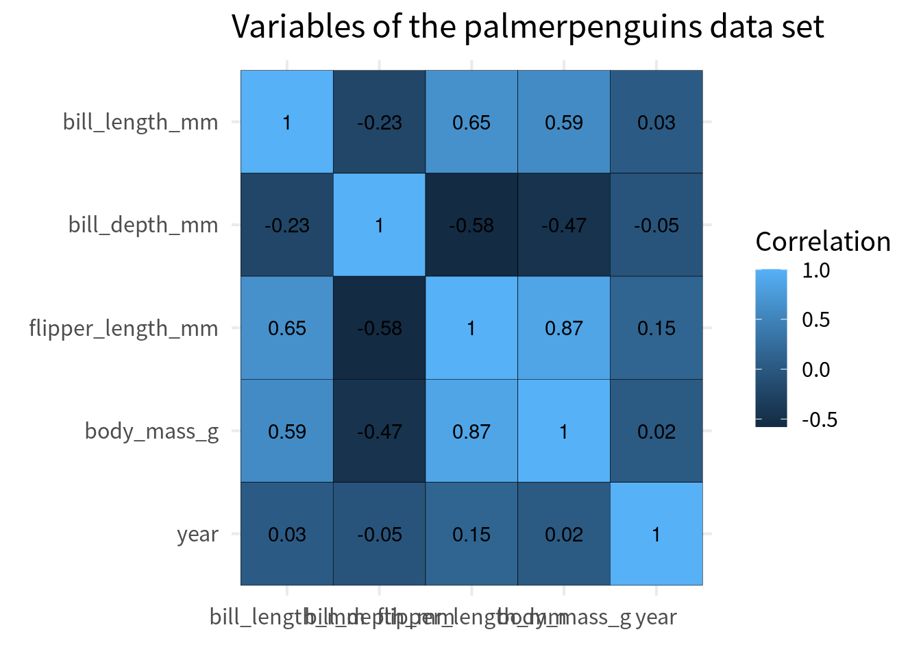
Ordering the cells
Typically, the y axis is chosen so that the perfect correlation of 1 go from top left to bottom right. The easiest way to do that is to convert the variable to a factor and then reverse the order of the levels for the variable that goes on the y-axis.
var_names <- unique(cov_tibble$var_a)
cov_tibble_factored <-  cov_tibble |>
  mutate(
    var_a = factor(var_a, levels = var_names),
    var_b = factor(var_b, levels = rev(var_names))
  )

cov_tibble_factored |>
  ggplot(aes(var_a, var_b)) +
  geom_tile(aes(fill = correlation), color = 'black') +
  geom_text(aes(label = round(correlation, 2))) +
  theme_minimal(
    base_size = 16,
    base_family = 'Source Sans Pro'
  ) +
  labs(
    x = element_blank(),
    y = element_blank(),
    fill = 'Correlation',
    title = "Variables of the palmerpenguins data set",
  )
Fix colors
Next, we have to make sure that we get a proper color scale. Here, we should choose the colors from a diverging color palette. You see, right now ggplot uses a sequential color palette. This means that it’s basically one bluish color that gets darker.
But this suggests that there’s only an order in one direction. However, with correlations there are two opposing directions. The positive and negative correlations with the zero correlation in between. So we need a color palette that has two opposing directions with a middle ground in between. That’s a diverging color palette.
We can easily create such a color palette ourselves. All we have to do is use scale_fill_gradient2() and specify the colors for the low, mid, and high values.
cov_tibble_factored |>
  ggplot(aes(var_a, var_b)) +
  geom_tile(aes(fill = correlation), color = 'black') +
  geom_text(aes(label = round(correlation, 2))) +
  theme_minimal(
    base_size = 16,
    base_family = 'Source Sans Pro'
  ) +
  labs(
    x = element_blank(),
    y = element_blank(),
    fill = 'Correlation',
    title = "Variables of the palmerpenguins data set",
  ) +
  scale_fill_gradient2(
    high = 'dodgerblue4',
    mid = 'white',
    low = 'firebrick2'
  )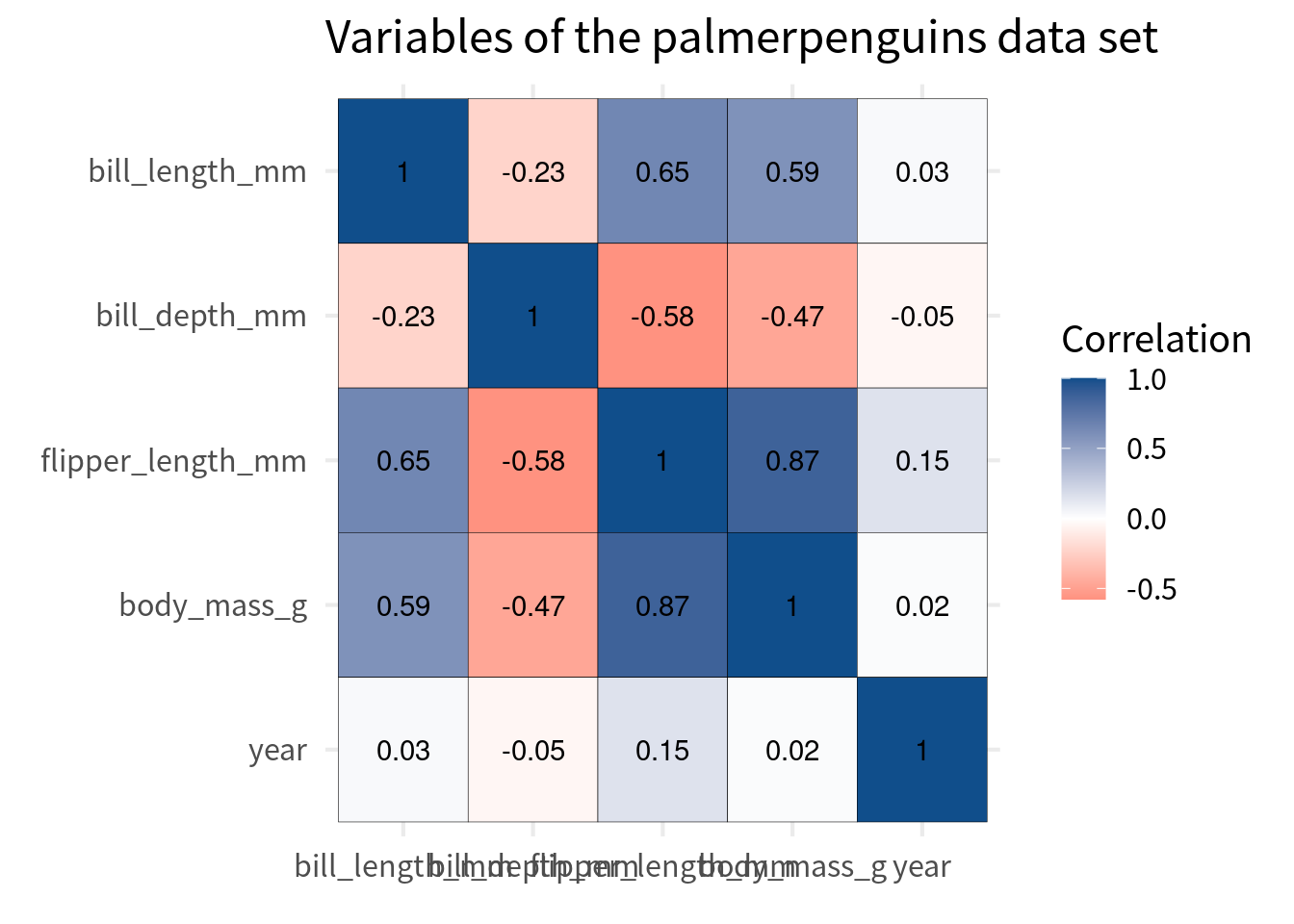
But watch out here. We should make sure that the color scale covers the whole range of correlations. This means that it can cover values from -1 to 1.
cov_tibble_factored |>
  ggplot(aes(var_a, var_b)) +
  geom_tile(aes(fill = correlation), color = 'black') +
  geom_text(aes(label = round(correlation, 2))) +
  theme_minimal(
    base_size = 16,
    base_family = 'Source Sans Pro'
  ) +
  labs(
    x = element_blank(),
    y = element_blank(),
    fill = 'Correlation',
    title = "Variables of the palmerpenguins data set",
  ) +
  scale_fill_gradient2(
    high = 'dodgerblue4',
    mid = 'white',
    low = 'firebrick2',
    limits = c(-1, 1)
  )
And to be sure that the white middle is indeed at 0, we should set the midpoint to 0. This won’t change much here, but it’s good to know that we have made sure that the color scale is really appropriate.
cov_tibble_factored |>
  ggplot(aes(var_a, var_b)) +
  geom_tile(aes(fill = correlation), color = 'black') +
  geom_text(aes(label = round(correlation, 2))) +
  theme_minimal(
    base_size = 16,
    base_family = 'Source Sans Pro'
  ) +
  labs(
    x = element_blank(),
    y = element_blank(),
    fill = 'Correlation',
    title = "Variables of the palmerpenguins data set",
  ) +
  scale_fill_gradient2(
    high = 'dodgerblue4',
    mid = 'white',
    low = 'firebrick2',
    limits = c(-1, 1),
    midpoint = 0
  )
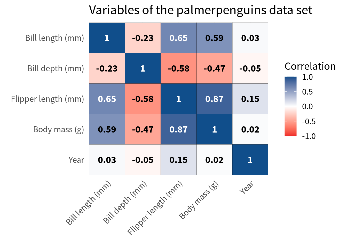
Nice, our correlation heat map is starting to look good. The most important part, i.e. choosing the right colors, is done. If you want to learn more about colors for data visualization, you can check out my dataviz video course.
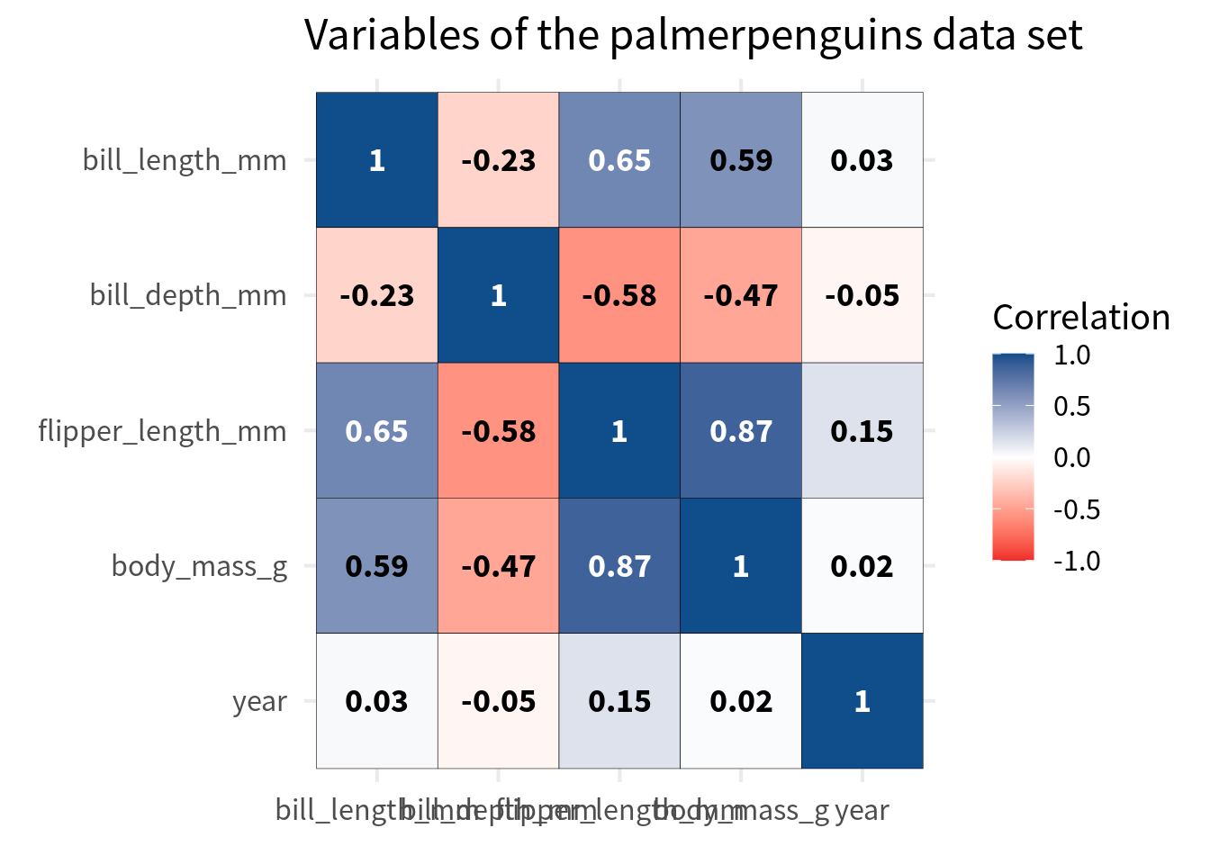
Improve labels
Next, we should improve the labels in the cells of the heat map. Right now, we have the correlation values in there and that’s fine but they’re not particularly easy to read. The best way to ensure legibility is to
- make them bold,
- make the fonts larger, and more importantly
- change the color based on the background.
You see with stronger correations i.e. closer to 1 or -1, the text is harder to read. That’s because the black font color does not have such a good contrast against the dark blue or dark red background. So we should change the font color base on the correlation value.
cov_tibble_factored |>
  ggplot(aes(var_a, var_b)) +
  geom_tile(aes(fill = correlation), color = 'black') +
  geom_text(
    aes(label = round(correlation, 2)),
    color = ifelse(
      abs(cov_tibble_factored$correlation) > 0.6,
      'white',
      'black'
    ),
    size = 5,
    family = 'Source Sans Pro',
    fontface = 'bold'
  ) +
  theme_minimal(
    base_size = 16,
    base_family = 'Source Sans Pro'
  ) +
  labs(
    x = element_blank(),
    y = element_blank(),
    fill = 'Correlation',
    title = "Variables of the palmerpenguins data set",
  ) +
  scale_fill_gradient2(
    high = 'dodgerblue4',
    mid = 'white',
    low = 'firebrick2',
    limits = c(-1, 1),
    midpoint = 0
) 
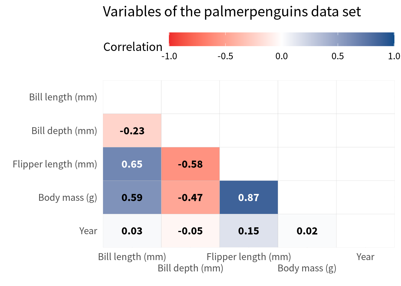
Speaking about labels, let’s talk about the variable labels. First, we should make sure that they are nice English labels instead of some cryptic variable name. The easiest way to do that is to pass both the var_a and var_b column into case_match(). But since we have already converted the variables to factors, we have to use fct_relabel() and wrap case_match() into an anonymous function to use in conjunction with fct_relabel().
cov_tibble_factored_relabeled <- cov_tibble_factored |>
  mutate(
    var_a = fct_relabel(
      var_a,
      \(x) case_match(x,
        'body_mass_g' ~ 'Body mass (g)',
        'bill_depth_mm' ~ 'Bill depth (mm)',
        'bill_length_mm' ~ 'Bill length (mm)',
        'flipper_length_mm' ~ 'Flipper length (mm)',
        'island' ~ 'Island',
        'year' ~ 'Year'
      )
    ),
    var_b = fct_relabel(
      var_b,
      \(x) case_match(x,
        'body_mass_g' ~ 'Body mass (g)',
        'bill_depth_mm' ~ 'Bill depth (mm)',
        'bill_length_mm' ~ 'Bill length (mm)',
        'flipper_length_mm' ~ 'Flipper length (mm)',
        'island' ~ 'Island',
        'year' ~ 'Year'
      )
    )
  )

cov_tibble_factored_relabeled |>
  ggplot(aes(var_a, var_b)) +
  geom_tile(aes(fill = correlation), color = 'black') +
  geom_text(
    aes(label = round(correlation, 2)),
    color = ifelse(
      abs(cov_tibble_factored$correlation) > 0.6,
      'white',
      'black'
    ),
    size = 5,
    family = 'Source Sans Pro',
    fontface = 'bold'
  ) +
  theme_minimal(
    base_size = 16,
    base_family = 'Source Sans Pro'
  ) +
  labs(
    x = element_blank(),
    y = element_blank(),
    fill = 'Correlation',
    title = "Variables of the palmerpenguins data set",
  ) +
  scale_fill_gradient2(
    high = 'dodgerblue4',
    mid = 'white',
    low = 'firebrick2',
    limits = c(-1, 1),
    midpoint = 0
) 
And while we’re at it, we should also make sure that the labels are closer to the cells. This can be easily achieved by removing the axes expansions in coord_cartesian().
cov_tibble_factored_relabeled |>
  ggplot(aes(var_a, var_b)) +
  geom_tile(aes(fill = correlation), color = 'black') +
  geom_text(
    aes(label = round(correlation, 2)),
    color = ifelse(
      abs(cov_tibble_factored$correlation) > 0.6,
      'white',
      'black'
    ),
    size = 5,
    family = 'Source Sans Pro',
    fontface = 'bold'
  ) +
  theme_minimal(
    base_size = 16,
    base_family = 'Source Sans Pro'
  ) +
  labs(
    x = element_blank(),
    y = element_blank(),
    fill = 'Correlation',
    title = "Variables of the palmerpenguins data set",
  ) +
  scale_fill_gradient2(
    high = 'dodgerblue4',
    mid = 'white',
    low = 'firebrick2',
    limits = c(-1, 1),
    midpoint = 0
  ) +
  coord_cartesian(expand = FALSE)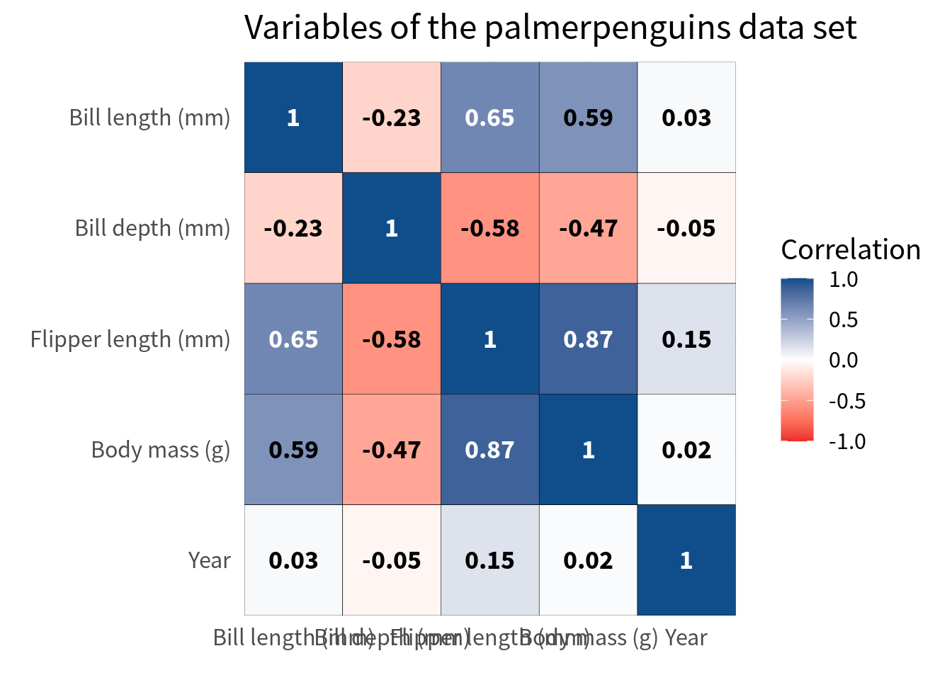
Avoid overlap of labels
Finally, we should make sure that the labels on the x-axis don’t overlap. This one is a bit tricky. A lot of people would probably just rotate the labels. But I think that this is a teeeeeeeeeerrible thing to do in 99.99999% of all dataviz cases. In this particular case, I think it is acceptable if you have a huge amount of variables but still I want to first give you a couple of ways around that.
The first thing you could try is to move the legend color bar to the top. This way, the labels get at least a little bit more space.
cov_tibble_factored_relabeled |>
  ggplot(aes(var_a, var_b)) +
  geom_tile(aes(fill = correlation), color = 'black') +
  geom_text(
    aes(label = round(correlation, 2)),
    color = ifelse(
      abs(cov_tibble_factored$correlation) > 0.6,
      'white',
      'black'
    ),
    size = 5,
    family = 'Source Sans Pro',
    fontface = 'bold'
  ) +
  theme_minimal(
    base_size = 16,
    base_family = 'Source Sans Pro'
  ) +
  labs(
    x = element_blank(),
    y = element_blank(),
    fill = 'Correlation',
    title = "Variables of the palmerpenguins data set",
  ) +
  scale_fill_gradient2(
    high = 'dodgerblue4',
    mid = 'white',
    low = 'firebrick2',
    limits = c(-1, 1),
    midpoint = 0
  ) +
  coord_cartesian(expand = FALSE) +
  theme(legend.position = 'top') +
  guides(
    fill = guide_colorbar(
      barwidth = unit(10, 'cm')
    )
  )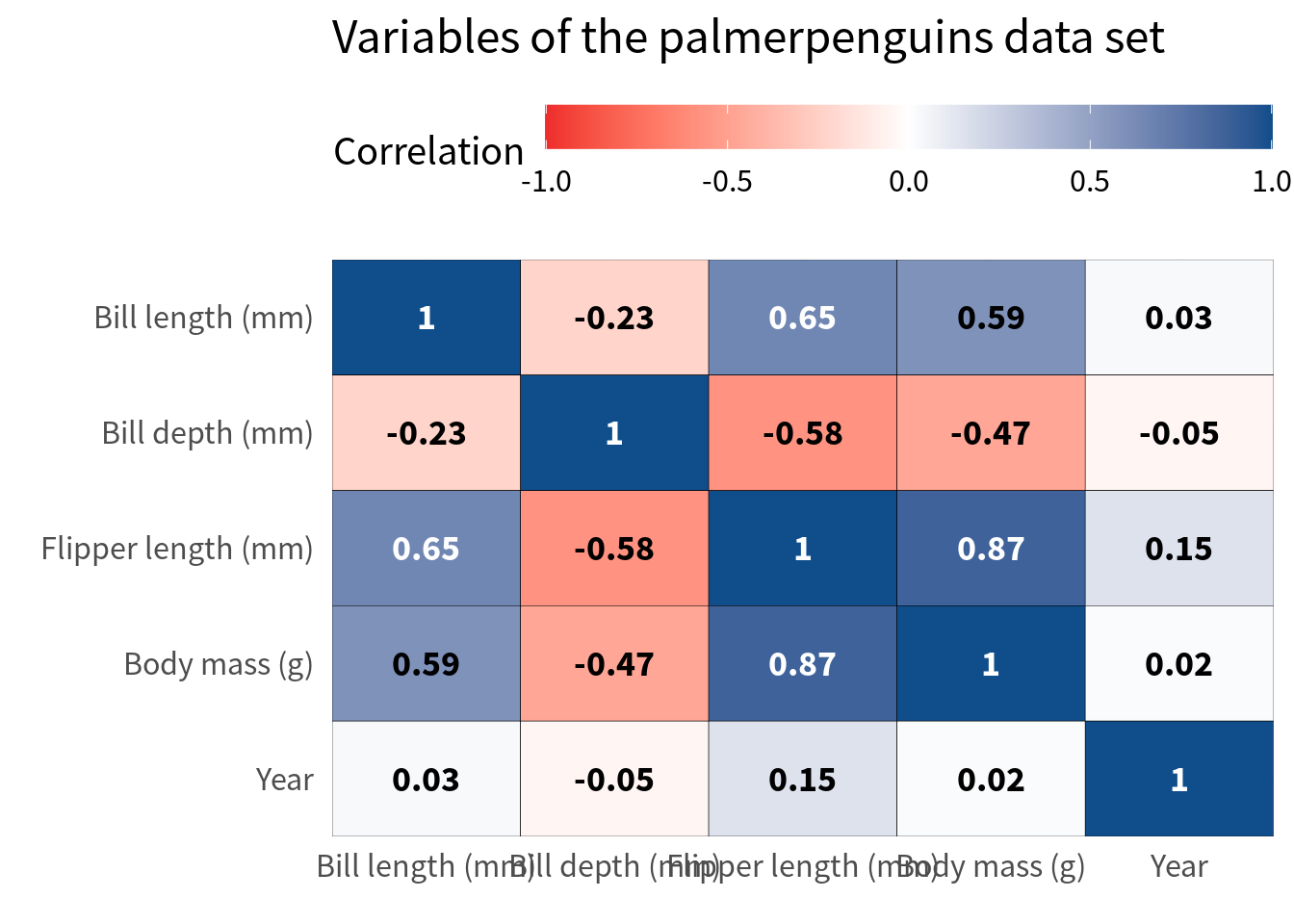
Nice, this gives us some space but it’s still not enough. Next, we can modify the guides of the x-axis by setting the n.dodge argument in guide_axis() to a higher value.
cov_tibble_factored_relabeled |>
  ggplot(aes(var_a, var_b)) +
  geom_tile(aes(fill = correlation), color = 'black') +
  geom_text(
    aes(label = round(correlation, 2)),
    color = ifelse(
      abs(cov_tibble_factored$correlation) > 0.6,
      'white',
      'black'
    ),
    size = 5,
    family = 'Source Sans Pro',
    fontface = 'bold'
  ) +
  theme_minimal(
    base_size = 16,
    base_family = 'Source Sans Pro'
  ) +
  labs(
    x = element_blank(),
    y = element_blank(),
    fill = 'Correlation',
    title = "Variables of the palmerpenguins data set",
  ) +
  scale_fill_gradient2(
    high = 'dodgerblue4',
    mid = 'white',
    low = 'firebrick2',
    limits = c(-1, 1),
    midpoint = 0
  ) +
  coord_cartesian(expand = FALSE) +
  theme(legend.position = 'top') +
  guides(
    fill = guide_colorbar(
      barwidth = unit(10, 'cm')
    ),
    x = guide_axis(n.dodge = 2)
  )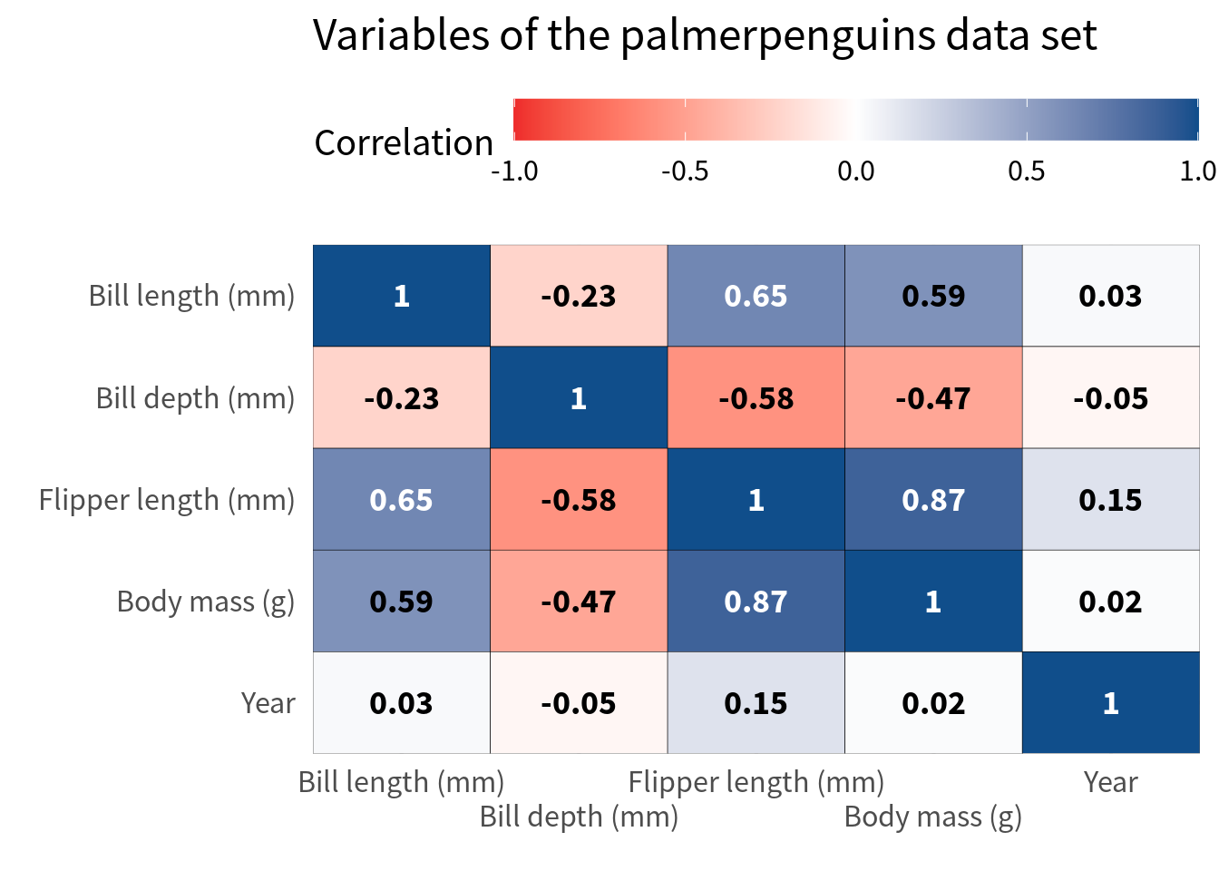
Hooray, this worked pretty well. But of course, this approach often works only when you have a handful of variables as in this case. If you have more variables, you might have to resort to rotating the labels. Here’s how that looks. But please use that only as a last resort.
cov_tibble_factored_relabeled |>
  ggplot(aes(var_a, var_b)) +
  geom_tile(aes(fill = correlation), color = 'black') +
  geom_text(
    aes(label = round(correlation, 2)),
    color = ifelse(
      abs(cov_tibble_factored$correlation) > 0.6,
      'white',
      'black'
    ),
    size = 5,
    family = 'Source Sans Pro',
    fontface = 'bold'
  ) +
  theme_minimal(
    base_size = 16,
    base_family = 'Source Sans Pro'
  ) +
  labs(
    x = element_blank(),
    y = element_blank(),
    fill = 'Correlation',
    title = "Variables of the palmerpenguins data set",
  ) +
  scale_fill_gradient2(
    high = 'dodgerblue4',
    mid = 'white',
    low = 'firebrick2',
    limits = c(-1, 1),
    midpoint = 0
  ) +
  coord_cartesian(expand = FALSE) +
  theme(
    axis.text.x = element_text(angle = 45, hjust = 1)
  )
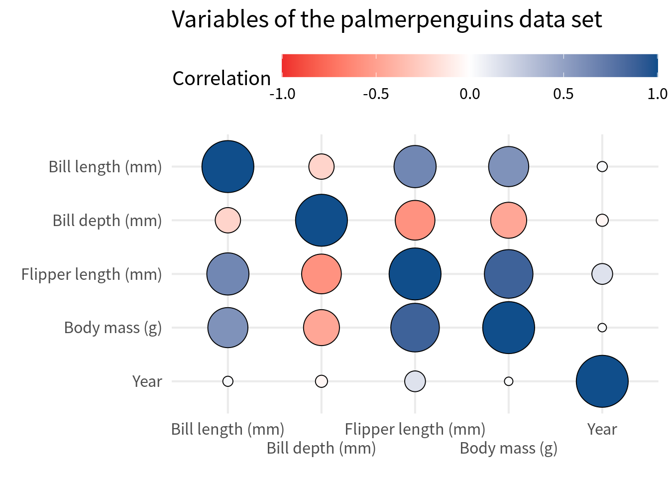
Alternative: Circle heat map
Often, people like to replace squares with circles. That’s easily doable by replacing geom_tile() with geom_point(). In that case, we will have to use
shape = 21so that we get filled circles,size = abs(correlation)so that the size of the circle corresponds to the absolute value of the correlation,scale_size_area()so that the size of the circle is not too big but also not too small either,size = guide_none()inguides()so that we don’t get a legend for the size of the circle,- enable axes expansion so that points do not get cut off, and
- omit the text labels because there’s not enough space for them in small circles.
cov_tibble_factored_relabeled |>
  ggplot(aes(var_a, var_b)) +
  geom_point(
    aes(fill = correlation, size = abs(correlation)),
    color = 'black',
    shape = 21
  ) +
  theme_minimal(
    base_size = 16,
    base_family = 'Source Sans Pro'
  ) +
  labs(
    x = element_blank(),
    y = element_blank(),
    fill = 'Correlation',
    title = "Variables of the palmerpenguins data set",
  ) +
  scale_fill_gradient2(
    high = 'dodgerblue4',
    mid = 'white',
    low = 'firebrick2',
    limits = c(-1, 1),
    midpoint = 0
  ) +
  scale_size_area(
    limits = c(0, 1),
    max_size = 18
  ) +
  coord_cartesian() +
  theme(legend.position = 'top') +
  guides(
    fill = guide_colorbar(
      barwidth = unit(10, 'cm')
    ),
    size = guide_none(),
    x = guide_axis(n.dodge = 2)
  )
Alternative: Half heat map
In a lot of cases, only half of the heat map is shown. That’s because we’ll have a perfect correlation on the diagonal anyway and the other half is just a mirror image of the first half.
So let’s create a correlation heat map that only shows half of the heat map. In order to do that, you only have to filter the data set to only include the lower triangle of the correlation matrix.
The easiest way to do that is to use the fact that factor variables are encoded as integers behind the scenes. So, if you use as.numeric() on a factor variable, you get the level number of a given category. Hence, you can filter the level numbers of the first and second variable so that you get the values that correspond to the lower triangle of the correlation matrix.
filtered_cov <- cov_tibble_factored_relabeled |>
  mutate(
    lvl_a = as.numeric(var_a),
    lvl_b = as.numeric(var_b |> fct_rev()),
    correlation = if_else(lvl_a < lvl_b, correlation, NA)
  )
Notice that I have filtered here in a sense of replacing the correlations with NA that are not in the lower triangle. This is a good idea because it makes sure that the cells that are not in the lower triangle are still there (but empty). Had I used filter() to filter out those cells, I would have lost the cells in the plot completely. But this way, we still have 5 rows and columns in the plot:
filtered_cov |>
  ggplot(aes(var_a, var_b)) +
  geom_tile(
    aes(fill = correlation),
    color = 'grey80'
  ) +
  geom_text(
    aes(label = round(correlation, 2)),
    color = ifelse(
      abs(filtered_cov$correlation) > 0.6,
      'white',
      'black'
    ),
    size = 5,
    family = 'Source Sans Pro',
    fontface = 'bold'
  ) +
  theme_minimal(
    base_size = 16,
    base_family = 'Source Sans Pro'
  ) +
  labs(
    x = element_blank(),
    y = element_blank(),
    fill = 'Correlation',
    title = "Variables of the palmerpenguins data set",
  ) +
  scale_fill_gradient2(
    high = 'dodgerblue4',
    mid = 'white',
    low = 'firebrick2',
    limits = c(-1, 1),
    midpoint = 0,
    na.value = 'white'
  ) +
  coord_cartesian(expand = FALSE) +
  theme(legend.position = 'top') +
  guides(
    fill = guide_colorbar(
      barwidth = unit(10, 'cm')
    ),
    x = guide_axis(n.dodge = 2)
  )
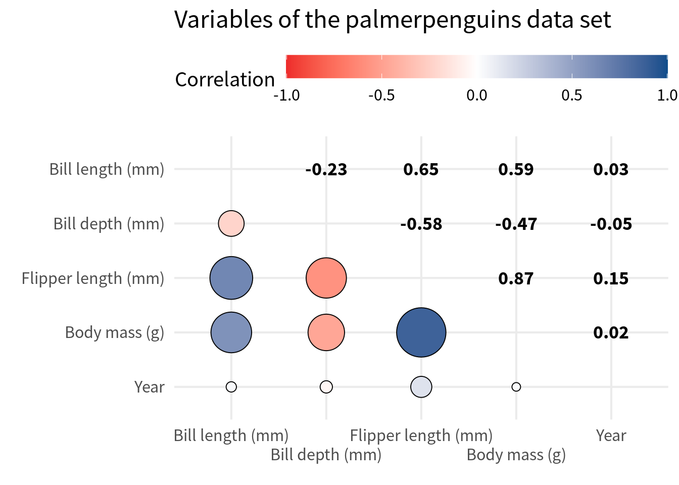
Alternative: Circles + Correlations
Now that we have only the lower triangle, we could fill the remaining white space with other stuff. Common variations are to fill
- the diagonal with a histogram or density plot of the variable and
- the upper triangle with a scatter plot.
Creating this is a bit tricky. We’ll do that in another blog post. But what is easy is combining the circles with texts that correspond to the correlation values. In that case, we have to do the same thing as before but filter the other way around.
reversed_filtered_cov <- cov_tibble_factored_relabeled |>
  mutate(
    lvl_a = as.numeric(var_a),
    lvl_b = as.numeric(var_b |> fct_rev()),
    correlation = if_else(lvl_a > lvl_b, correlation, NA)
  )

filtered_cov |>
  ggplot(aes(var_a, var_b)) +
  geom_point(
    aes(fill = correlation, size = abs(correlation)),
    color = 'black',
    shape = 21
  ) +
  geom_text(
    data = reversed_filtered_cov,
    aes(label = round(correlation, 2)),
    color = 'black',
    size = 5,
    family = 'Source Sans Pro',
    fontface = 'bold'
  ) +
  theme_minimal(
    base_size = 16,
    base_family = 'Source Sans Pro'
  ) +
  labs(
    x = element_blank(),
    y = element_blank(),
    fill = 'Correlation',
    title = "Variables of the palmerpenguins data set",
  ) +
  scale_fill_gradient2(
    high = 'dodgerblue4',
    mid = 'white',
    low = 'firebrick2',
    limits = c(-1, 1),
    midpoint = 0
  ) +
  scale_size_area(
    limits = c(0, 1),
    max_size = 18
  ) +
  coord_cartesian() +
  theme(legend.position = 'top') +
  guides(
    fill = guide_colorbar(
      barwidth = unit(10, 'cm')
    ),
    size = guide_none(),
    x = guide_axis(n.dodge = 2)
  )
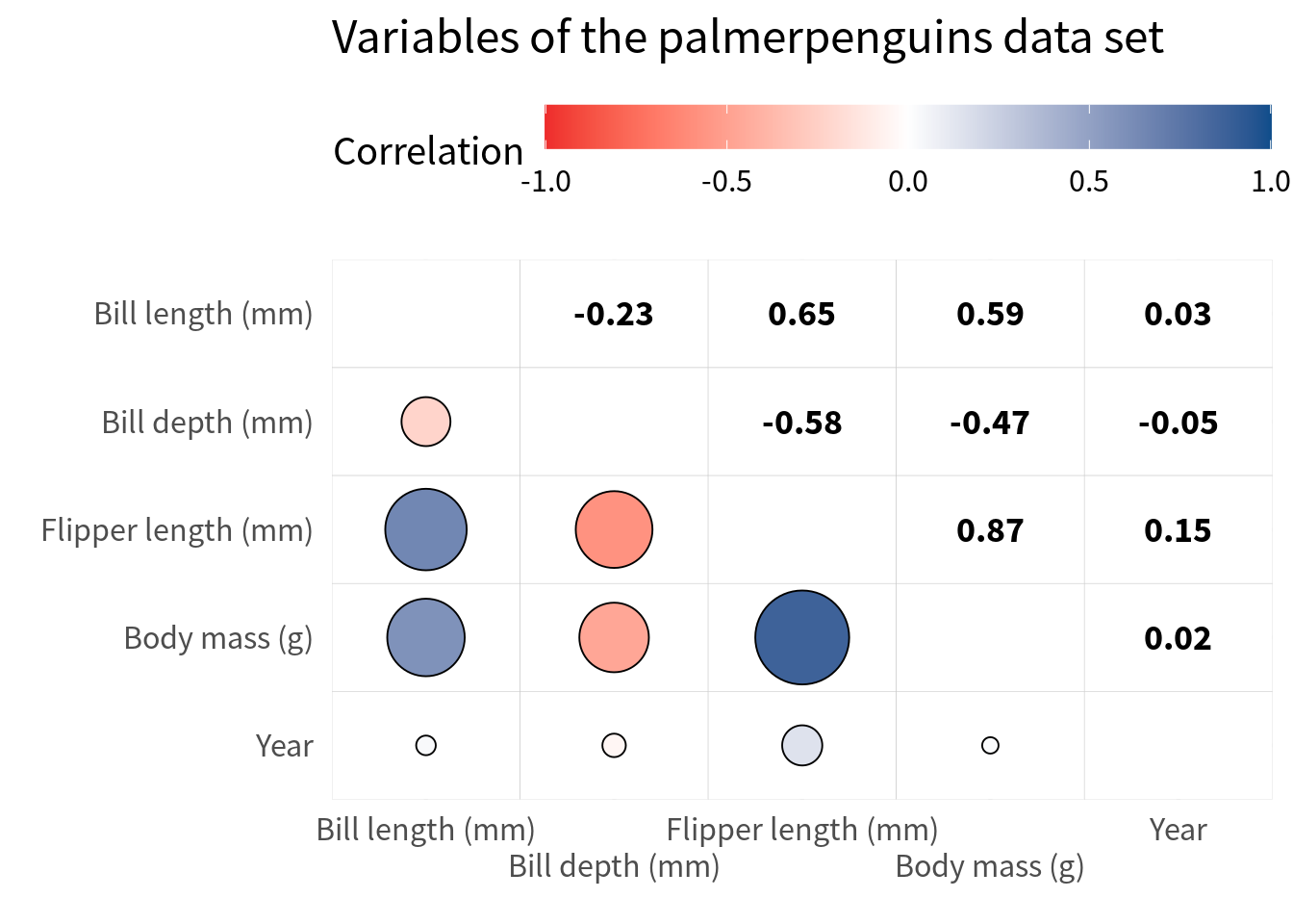
Right now, with the gridlines it’s a bit hard to read the correlations. But here’s a trick for ya. We just throw in white tiles as the bottom layer. And then we can remove the axes expansion again.
filtered_cov |>
  ggplot(aes(var_a, var_b)) +
  geom_tile(fill = 'white', col = 'grey80') +
  geom_point(
    aes(fill = correlation, size = abs(correlation)),
    color = 'black',
    shape = 21
  ) +
  geom_text(
    data = reversed_filtered_cov,
    aes(label = round(correlation, 2)),
    color = 'black',
    size = 5,
    family = 'Source Sans Pro',
    fontface = 'bold'
  ) +
  theme_minimal(
    base_size = 16,
    base_family = 'Source Sans Pro'
  ) +
  labs(
    x = element_blank(),
    y = element_blank(),
    fill = 'Correlation',
    title = "Variables of the palmerpenguins data set",
  ) +
  scale_fill_gradient2(
    high = 'dodgerblue4',
    mid = 'white',
    low = 'firebrick2',
    limits = c(-1, 1),
    midpoint = 0
  ) +
  scale_size_area(
    limits = c(0, 1),
    max_size = 18
  ) +
  coord_cartesian(expand = FALSE) +
  theme(legend.position = 'top') +
  guides(
    fill = guide_colorbar(
      barwidth = unit(10, 'cm')
    ),
    size = guide_none(),
    x = guide_axis(n.dodge = 2)
  )
Conclusion
Nice. With that we have finished our blog post for this week. If you found this helpful, here are some other ways I can help you:
- 3 Minute Wednesdays: A weekly newsletter with bite-sized tips and tricks for R users
- Insightful Data Visualizations for “Uncreative” R Users: A course that teaches you how to leverage
{ggplot2}to make charts that communicate effectively without being a design expert.


