library(tidyverse)
set.seed(32353)
schools_dat <- tibble(
  school_id = paste('School', LETTERS),
  below_in_math = sample(
    c(TRUE, FALSE),
    length(school_id),
    replace = TRUE
  ),
  below_in_reading = sample(
    c(TRUE, FALSE),
    length(school_id),
    replace = TRUE
  ),
  below_in_writing = sample(
    c(TRUE, FALSE),
    length(school_id),
    replace = TRUE
  ),
)
schools_dat
## # A tibble: 26 × 4
##    school_id below_in_math below_in_reading below_in_writing
##    <chr>     <lgl>         <lgl>            <lgl>
##  1 School A  FALSE         TRUE             FALSE
##  2 School B  TRUE          TRUE             FALSE
##  3 School C  FALSE         TRUE             FALSE
##  4 School D  TRUE          FALSE            TRUE
##  5 School E  TRUE          FALSE            FALSE
##  6 School F  FALSE         FALSE            FALSE
##  7 School G  TRUE          FALSE            TRUE
##  8 School H  TRUE          FALSE            TRUE
##  9 School I  TRUE          TRUE             FALSE
## 10 School J  TRUE          TRUE             FALSE
## # ℹ 16 more rowsCreating upset charts with ggplot2
Visualization
In this blog post, I show you how to create upset charts with
ggplot2
I recently saw this cool chart on a Storytelling with data community post. It shows you how many schools are below average in maths, reading, and writing. Notice that a school can be below average in more than one subject and the dots between the bar charts show you in how many (if any) subjects a school is below average.
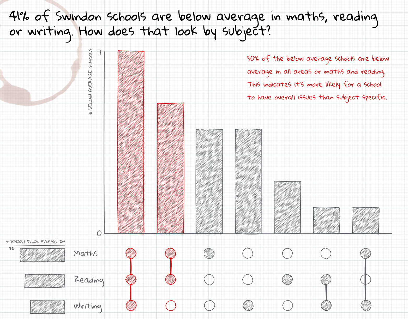
Now, it’s not a particularly informative thing to simply check for “below-averageness”. Still, the visualization form is quite interesting. It’s called upset charts and they are a great way to show the overlap of different groups. In this blog post, we learn how to create such a chart with ggplot2. And as always, if you’re interested in the video version of this blog post, you can find it on YouTube.
Create ficticious data
First thing we need to create a chart like this is data. Here, I want to generade some ficticious data. Let’s simulate a data set by drawing random samples for each school and subject. In each of the columns below_in_math, below_in_reading, and below_in_writing, we draw a random sample of TRUE and FALSE values. This will tell us whether a school is below average in a subject or not.
The easy way to create upset charts
The easiest way to create a chart similar to what we want is to use the ggupset package. This requires that our data set contains a list-like column that contains the combinations of subjects.
combinations_dat <- schools_dat |>
  mutate(
    combination = pmap(
      list(below_in_math, below_in_reading, below_in_writing),
      \(lgl1, lgl2, lgl3) {
        c('math', 'reading', 'writing')[c(lgl1, lgl2, lgl3)]
      }
    )
  )
Then, we can use the ggupset package to create the chart. Basically, all we have to do is to create a bar chart using geom_bar and then use the scale_x_upset function to transform the x-axis into the upset chart.
library(ggupset)
combinations_dat|>
  ggplot(aes(x = combination)) +
  geom_bar() +
  scale_x_upset()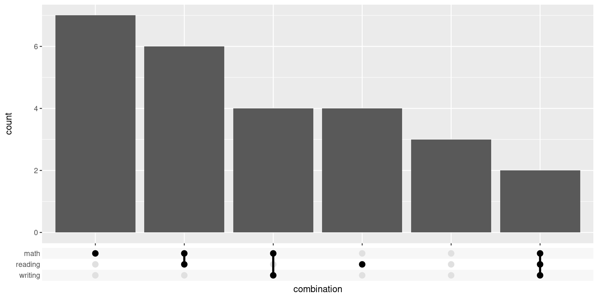
This was easy but it not quite what we want. After all, we also want to add a horizontal bar chart. While there may be a hack to do that. We can also just use a combination of ggplot2 and patchwork to create our desired chart from scratch.
Build the chart from scratch
First, we need to count how many schools are below average in each combination of subjects. Here, I create a new column combination that combines the words “math”, “reading”, and “writing” based on the values in the columns below_in_math, below_in_reading, and below_in_writing. Then, I count the number of schools in each combination.
counts_combinations <- schools_dat |>
  mutate(
    combination = pmap_chr(
      list(below_in_math, below_in_reading, below_in_writing),
      \(lgl1, lgl2, lgl3) {
        c('math', 'reading', 'writing')[c(lgl1, lgl2, lgl3)] |>
          paste(collapse = ',')
      }
    )
  ) |>
  count(combination)
counts_combinations
## # A tibble: 6 × 2
##   combination                n
##   <chr>                  <int>
## 1 ""                         3
## 2 "math"                     7
## 3 "math,reading"             6
## 4 "math,reading,writing"     2
## 5 "math,writing"             4
## 6 "reading"                  4
To make sure that our bar charts are sorted later on in the order of largest to smallest counts, we convert the combination column into a factor.
counts_combinations <- counts_combinations |>
  mutate(
    combination = fct_reorder(combination, n, .desc = TRUE)
  )
Similarly, we need to count how many schools are below average in each subject. This requires first reordering the data so that the subjects are in a single column.
schools_dat |>
  pivot_longer(
    cols = -school_id,
    names_to = 'subject',
    values_to = 'below',
    names_prefix = 'below_in_'
  )
## # A tibble: 78 × 3
##    school_id subject below
##    <chr>     <chr>   <lgl>
##  1 School A  math    FALSE
##  2 School A  reading TRUE
##  3 School A  writing FALSE
##  4 School B  math    TRUE
##  5 School B  reading TRUE
##  6 School B  writing FALSE
##  7 School C  math    FALSE
##  8 School C  reading TRUE
##  9 School C  writing FALSE
## 10 School D  math    TRUE
## # ℹ 68 more rows
Then we can count the number of schools in each subject. Notice that this uses the fact that a TRUE value is treated as 1 and a FALSE value as 0 when we sum them up.
counts_of_subjects <- schools_dat |>
  pivot_longer(
    cols = -school_id,
    names_to = 'subject',
    values_to = 'below',
    names_prefix = 'below_in_'
  ) |>
  summarize(
    counts = sum(below),
    .by = subject,
  )
counts_of_subjects
## # A tibble: 3 × 2
##   subject counts
##   <chr>    <int>
## 1 math        19
## 2 reading     12
## 3 writing      6
Assemble subplots
Alright cool. Now we have all data that we need and can start plotting. Let’s start with the bar chart. It’s actually pretty straightforward.
counts_combinations  |>
  ggplot(aes(x = combination, y = n)) +
  geom_col(width = 0.6, fill = 'dodgerblue4')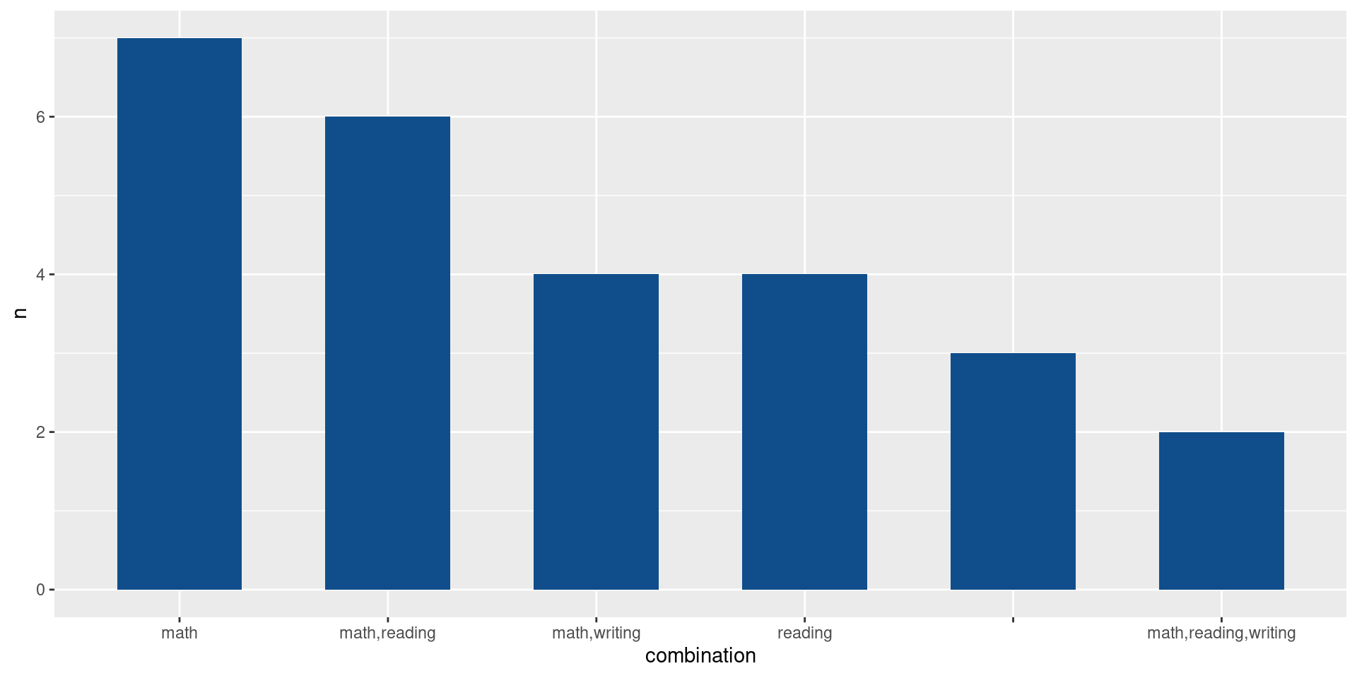
But of course we should make sure that it looks semi-nice. This means applying a theme, removing unnecessary grid lines and labels. Also, we remove the grid expansion because that will later get in our way when we assemble the subplots.
bar_chart <- counts_combinations  |>
  ggplot(aes(x = combination, y = n)) +
  geom_col(width = 0.6, fill = 'dodgerblue4') +
  theme_minimal(
    base_size = 16,
    base_family = 'Source Sans Pro'
  ) +
  theme(
    panel.grid.major.x = element_blank(),
    panel.grid.minor.y = element_blank()
  ) +
  coord_cartesian(expand = FALSE) +
  labs(x = element_blank(), y = element_blank())
bar_chart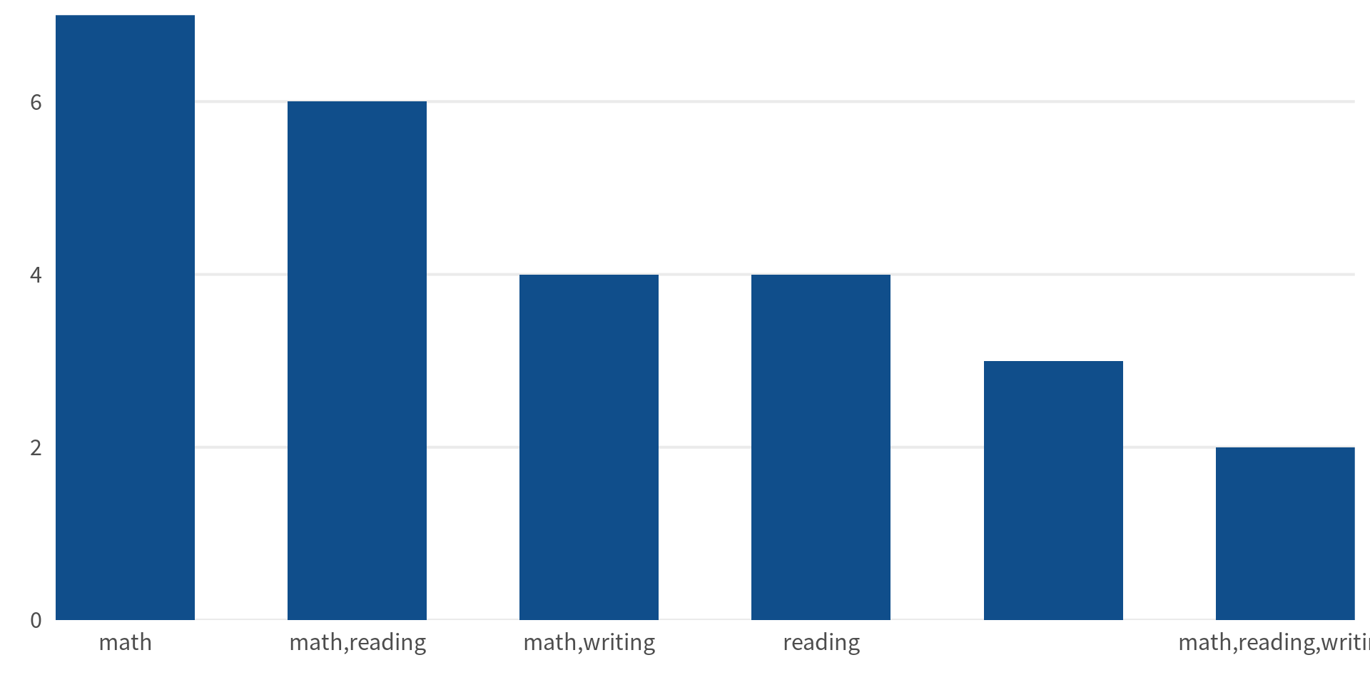
Next, we deal with the points. To do so, we need to split up the combinations into individual subjects.
counts_combinations |>
  mutate(
    subjects = map(
      combination,
      ~str_split_1(as.character(.), ',')
    )
  ) |>
  unnest(subjects)
## # A tibble: 10 × 3
##    combination                n subjects
##    <fct>                  <int> <chr>
##  1 ""                         3 ""
##  2 "math"                     7 "math"
##  3 "math,reading"             6 "math"
##  4 "math,reading"             6 "reading"
##  5 "math,reading,writing"     2 "math"
##  6 "math,reading,writing"     2 "reading"
##  7 "math,reading,writing"     2 "writing"
##  8 "math,writing"             4 "math"
##  9 "math,writing"             4 "writing"
## 10 "reading"                  4 "reading"
With that, all that is left to do is to transform everything to factors so that the order of the axes are correct.
points_data <- counts_combinations |>
  mutate(
    subjects = map(
      combination,
      ~str_split_1(as.character(.), ',')
    )
  ) |>
  unnest(subjects) |>
  mutate(
    subjects = factor(
      subjects,
      levels = counts_of_subjects |>
        arrange(counts) |>
        pull(subject)
    ),
    combination = factor(
      combination,
      levels = levels(counts_combinations$combination)
    )
  ) |>
  filter(!is.na(subjects)) # Remove the missing values
points_data
## # A tibble: 9 × 3
##   combination              n subjects
##   <fct>                <int> <fct>
## 1 math                     7 math
## 2 math,reading             6 math
## 3 math,reading             6 reading
## 4 math,reading,writing     2 math
## 5 math,reading,writing     2 reading
## 6 math,reading,writing     2 writing
## 7 math,writing             4 math
## 8 math,writing             4 writing
## 9 reading                  4 reading
After that the we create the points and the lines. This one is a bit more complicated, but still not too bad. Let’s start with just the points.
points_data |>
  ggplot(aes(x = combination, y = subjects)) +
  geom_point(size = 10, col = 'dodgerblue4')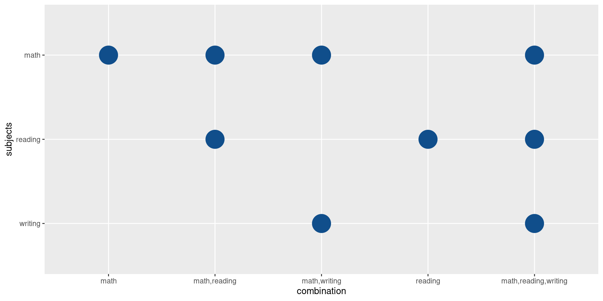
Hmm this misses the row for the schools that are not below average in any subject. The reason for that is that by default ggplot will drop factor levels that are not used. That’s the case here, because for those schools we don’t need any points. So, let’s instruct ggplot to not drop the extra levels.
points_data |>
  ggplot(aes(x = combination, y = subjects)) +
  geom_point(size = 10, col = 'dodgerblue4') +
  scale_x_discrete(drop = FALSE)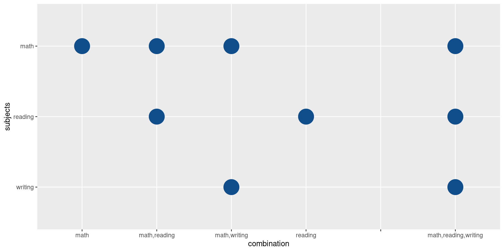
Sweet. Now, we should also add the lines. We can easily make use of the group aesthetic here. This will draw one line for each group of points. In this case, this gives us the vertical lines we want.
points_data |>
  ggplot(aes(x = combination, y = subjects)) +
  geom_line(aes(group = combination), col = 'dodgerblue4') +
  geom_point(size = 10, col = 'dodgerblue4') +
  scale_x_discrete(drop = FALSE)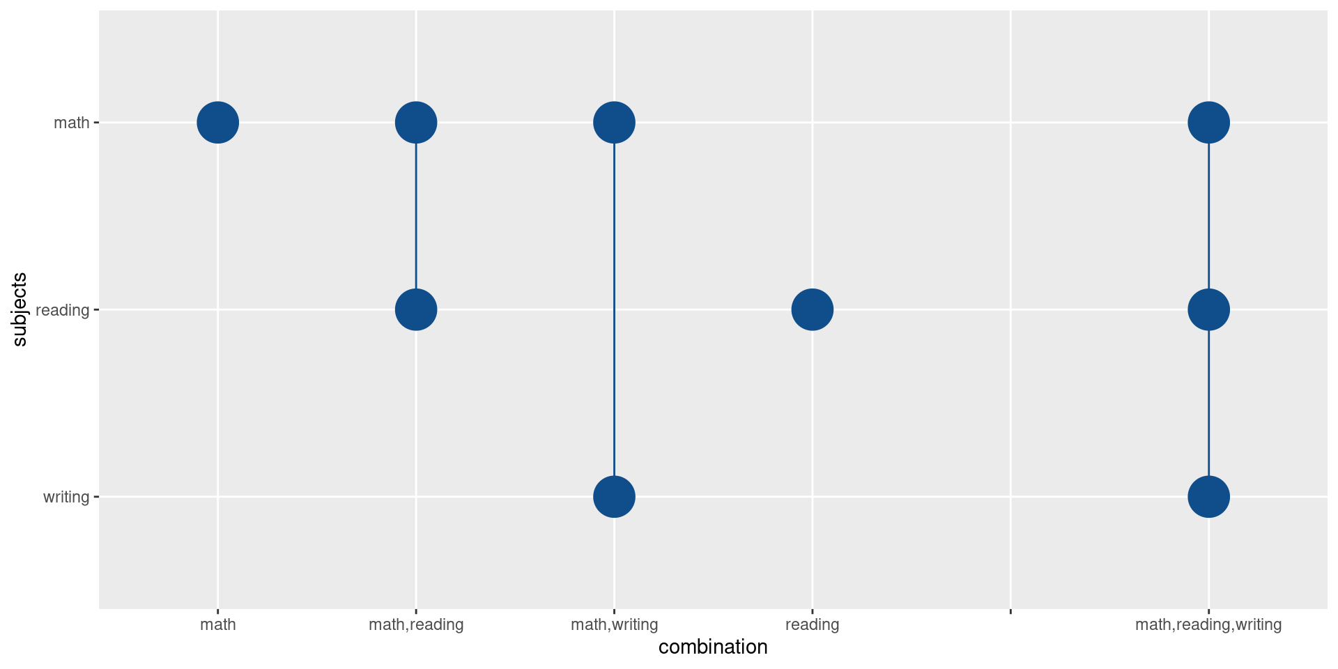
Nice. After that it’s just a matter of making this chart look nice. We’ll apply similar changes as for the bar chart.
point_chart <- points_data |>
  ggplot(aes(x = combination, y = subjects)) +
  geom_line(aes(group = combination), col = 'dodgerblue4') +
  geom_point(size = 10, col = 'dodgerblue4') +
  theme_minimal(base_size = 16, base_family = 'Source Sans Pro') +
  theme(
    panel.grid.major.x = element_blank(),
    panel.grid.minor.y = element_blank(),
    axis.text.y = element_text(hjust = 0.5)
  ) +
  labs(x = element_blank(), y = element_blank()) +
  scale_x_discrete(drop = FALSE)
point_chart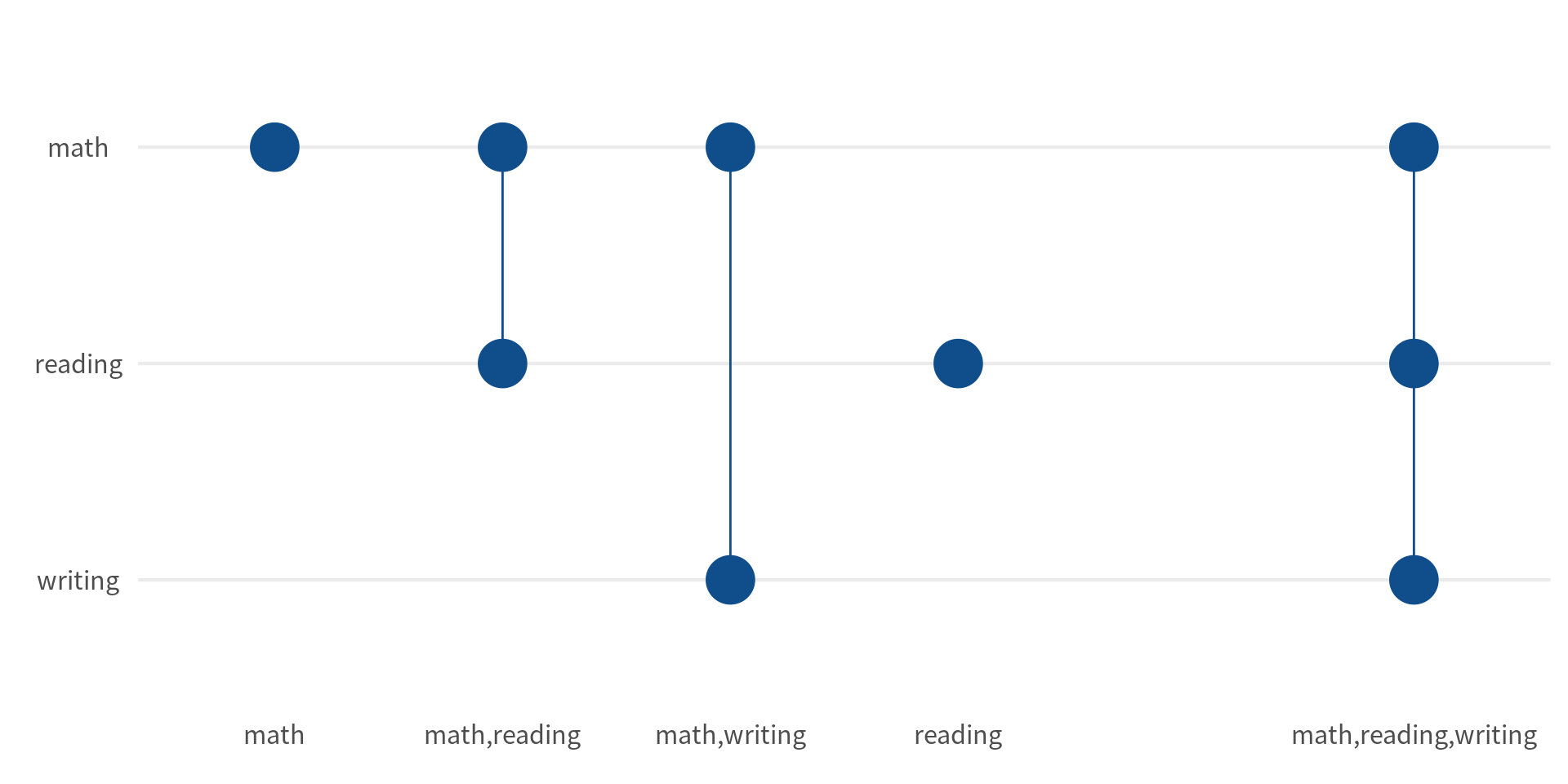
Finally, we have to create the bar charts for each of the three subjects. At this point, it’s a fairly straightforward bar chart. Just remember to reorder the bars by the counts and use the negative value of the counts so that the bars go to the left.
subject_bars <- counts_of_subjects |>
  mutate(subject = fct_reorder(subject, counts)) |>
  ggplot(aes(x = -counts, y = subject)) +
  geom_col(width = 0.6, fill = 'dodgerblue4') +
  theme_minimal(base_size = 16, base_family = 'Source Sans Pro') +
  theme(
    panel.grid.major.y = element_blank(),
    panel.grid.minor.x = element_blank()
  ) +
  coord_cartesian(expand = FALSE) +
  labs(x = element_blank(), y = element_blank())
subject_bars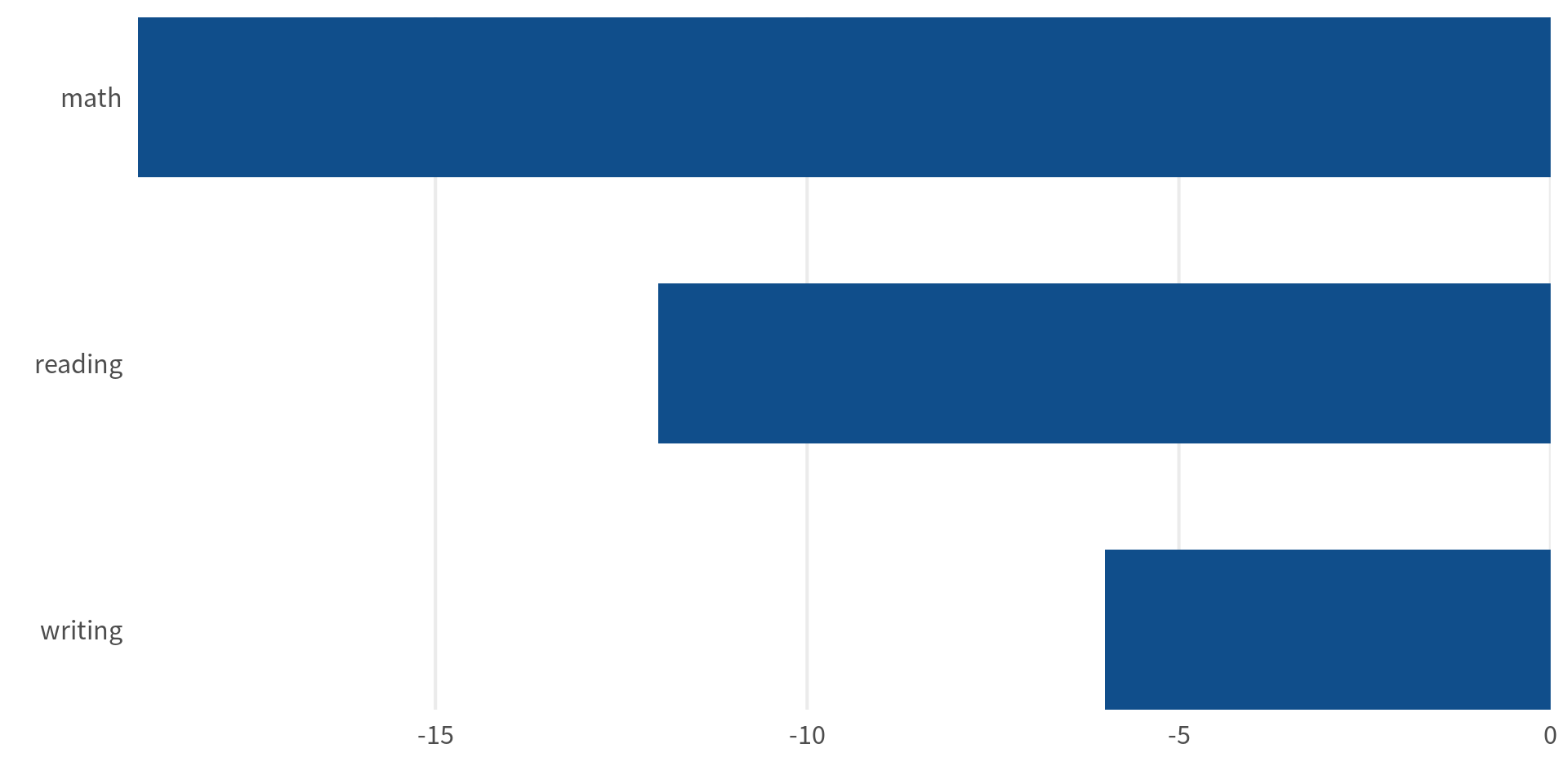
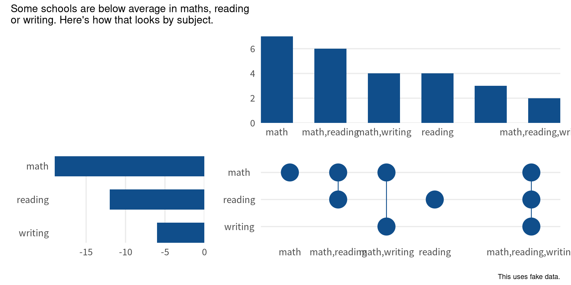
Excellent! Now we can put everything together. We’ll use the patchwork package for that. All we have to do is to specify the layout and then add the plots together.
library(patchwork)
layout <- '
##AAAA
BBCCCC'

bar_chart +
  subject_bars +
  point_chart +
  plot_layout(design = layout) +
  plot_annotation(
     title = 'Some schools are below average in maths, reading\nor writing. Here\'s how that looks by subject.',
    caption = 'This uses fake data.',
  )
If all of this means gibberish to you, you may want to check out my guide to the patchwork package.
Now, notice how the bars and points are shifted by a bit. But we’ll fix that soon. For now, we should remove the axis titles. We have left them in there until this point to check that the order of the axes are correct. Now that we have verified that, we can remove them.
(bar_chart + scale_x_discrete(labels = NULL)) +
  (
    subject_bars + scale_y_discrete(labels = NULL)
  ) +
  (
    point_chart +
      scale_x_discrete(
        labels = NULL,
        drop = FALSE
      ) +
      scale_y_discrete(
        labels = str_to_title # Make subject into title-case
      )
  ) +
  plot_layout(design = layout) +
  plot_annotation(
    title = 'Some schools are below average in maths, reading\nor writing. Here\'s how that looks by subject.',
    caption = 'This uses fake data.'
  )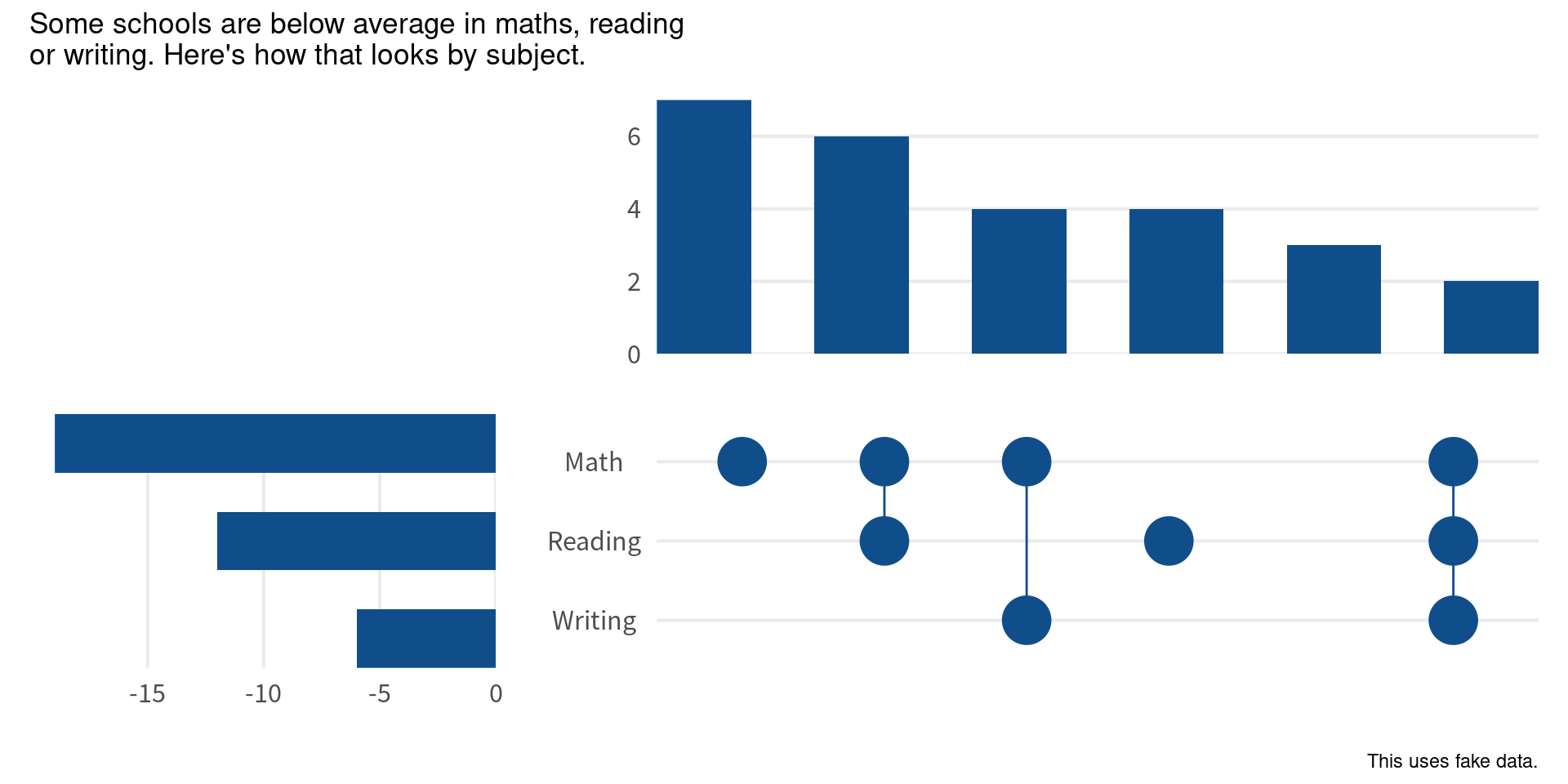
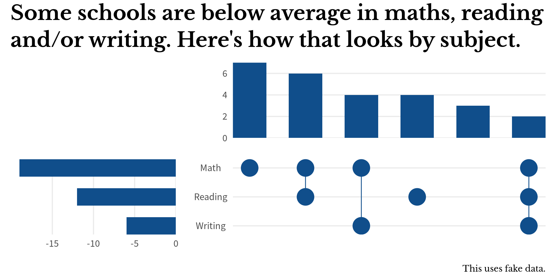
Finally, we can play around with the axis expansion of the point chart a bit. This will make sure that the points and bars align nicely. And while we’re at it, we might as well format the title a little bit.
(bar_chart + scale_x_discrete(labels = NULL)) +
  (
    subject_bars + scale_y_discrete(labels = NULL)
  ) +
  (
    point_chart +
      scale_x_discrete(
        labels = NULL,
        drop = FALSE,
        expand = expansion(add = 0.3) # Add a bit of space
      ) +
      scale_y_discrete(
        expand = expansion(add = 0.3), # Add a bit of space
        labels = str_to_title
      )
  ) +
  plot_layout(design = layout) +
  plot_annotation(
    title = 'Some schools are below average in maths, reading\nand/or writing. Here\'s how that looks by subject.',
    caption = 'This uses fake data.',
    theme = theme(
      title = element_text(
        size = rel(2),
        family = 'Libre Baskerville'
      ),
      plot.title = element_text(face = 'bold', lineheight = 1.1),
      plot.caption = element_text(size = rel(0.5))
    )
  )
Conclusion
Hoooray! We made it. Hope you enjoyed this little tutorial. Have a great day and see you next time. And if you found this helpful, here are some other ways I can help you:
- 3 Minute Wednesdays: A weekly newsletter with bite-sized tips and tricks for R users
- Insightful Data Visualizations for “Uncreative” R Users: A course that teaches you how to leverage
{ggplot2}to make charts that communicate effectively without being a design expert.


