In this blog post, I explain why it’s not a great idea to rely too heavily on box plots.
Author
Albert Rapp
Published
June 9, 2024
Box plots are a very common tool in data visualization to show how your data is distributed. But they have a crucial flaw. Let’s find out what that flaw is.
And if you’re interested in the video version of this blog post, you can find it here:
The flaw of box plots
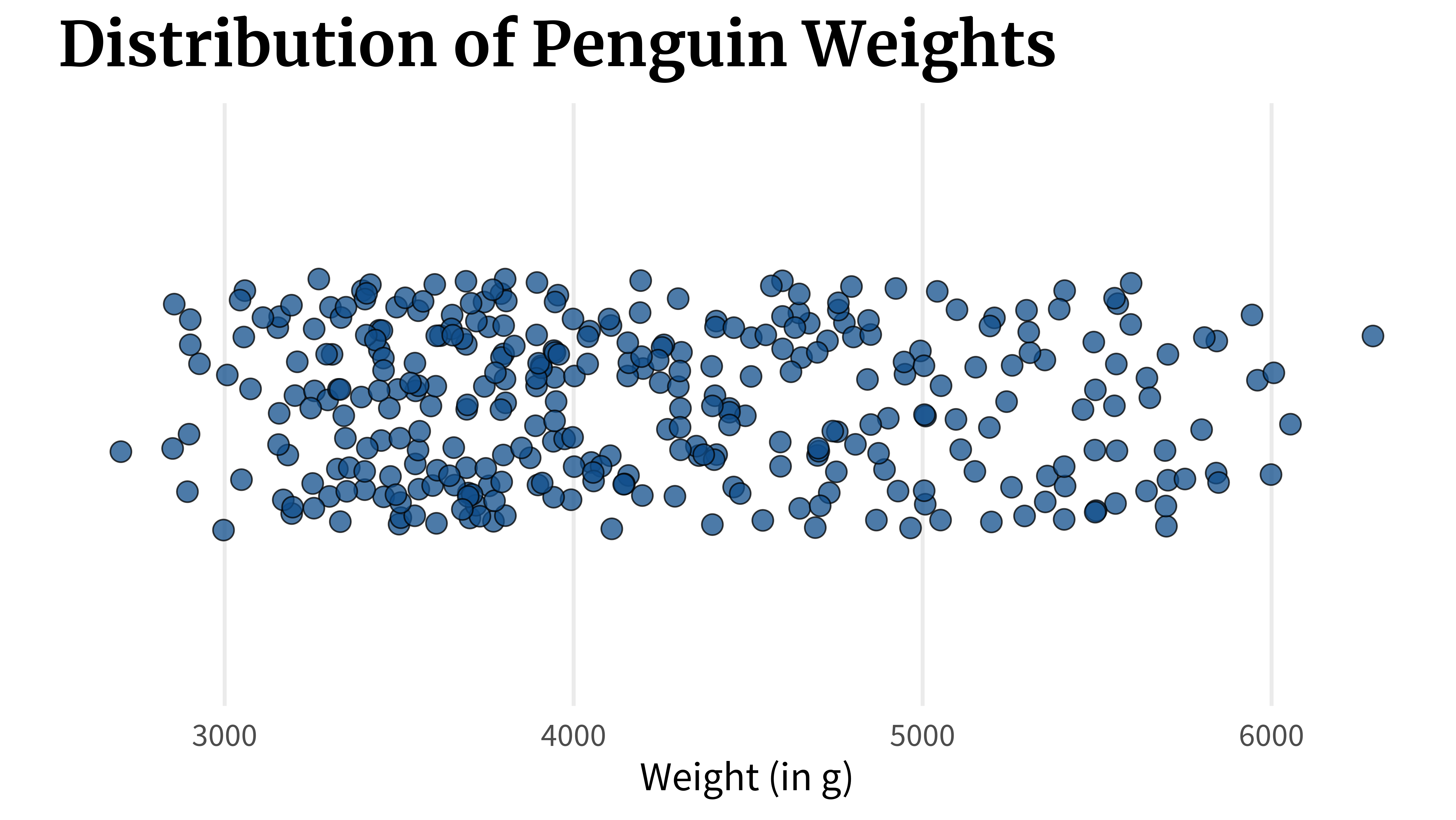
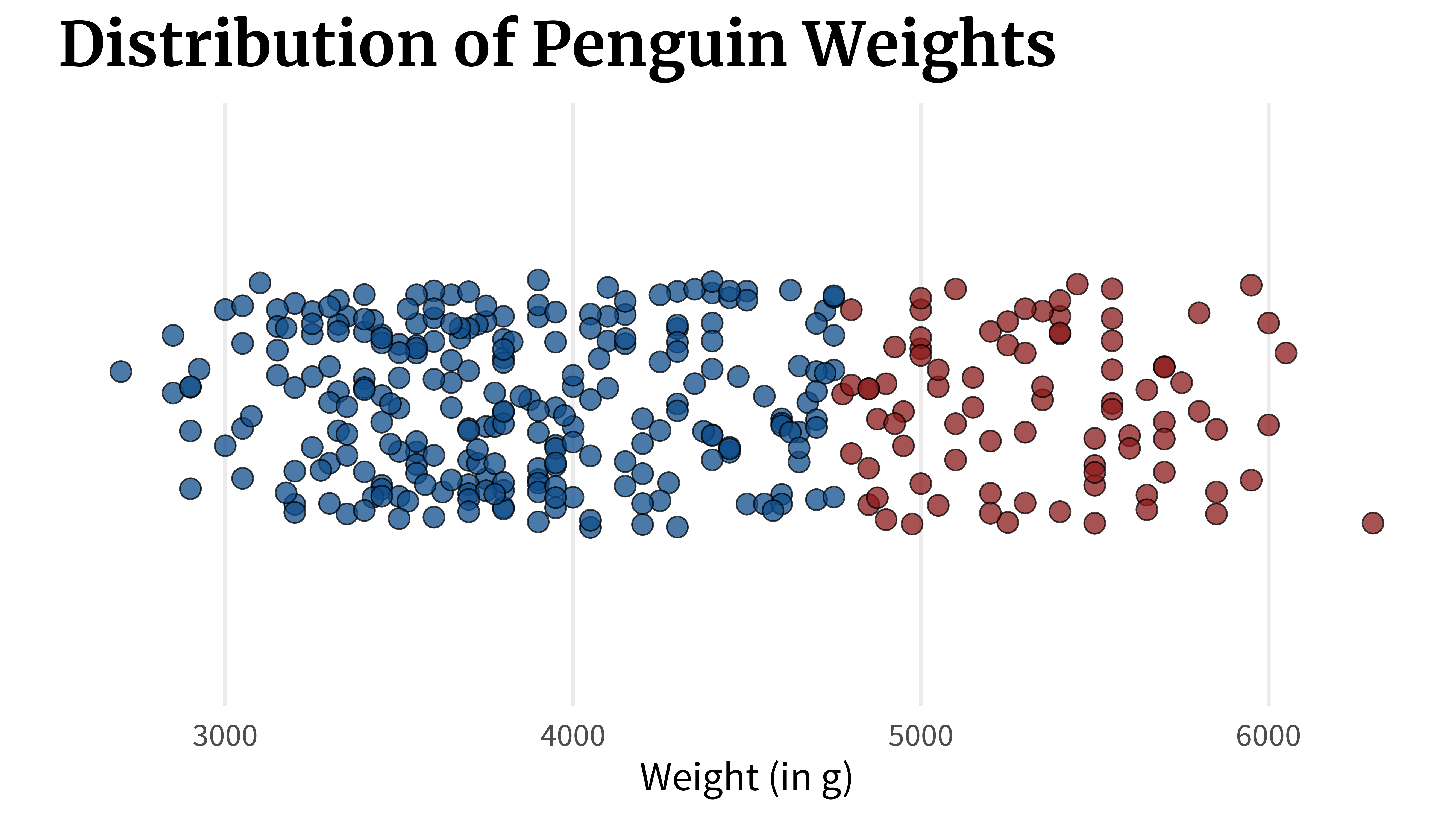
Imagine that you have a numeric variable, like the weight of penguins.
library(tidyverse)penguins_dat <- palmerpenguins::penguins |>filter(!is.na(sex))penguins_dat |>ggplot(aes(x = body_mass_g, y ='')) +geom_point(size =4, alpha =0.75,shape =21,fill ='dodgerblue4',color ='black',position =position_jitter(height =0.25,seed =2343 ) ) +theme_minimal(base_size =18, base_family ='Source Sans Pro' ) +labs(x ='Weight (in g)', y =element_blank(),title ='Distribution of Penguin Weights' ) +theme(panel.grid.minor =element_blank(),panel.grid.major.y =element_blank(),plot.title =element_text(size =rel(1.5),family ='Merriweather',face ='bold' ) )
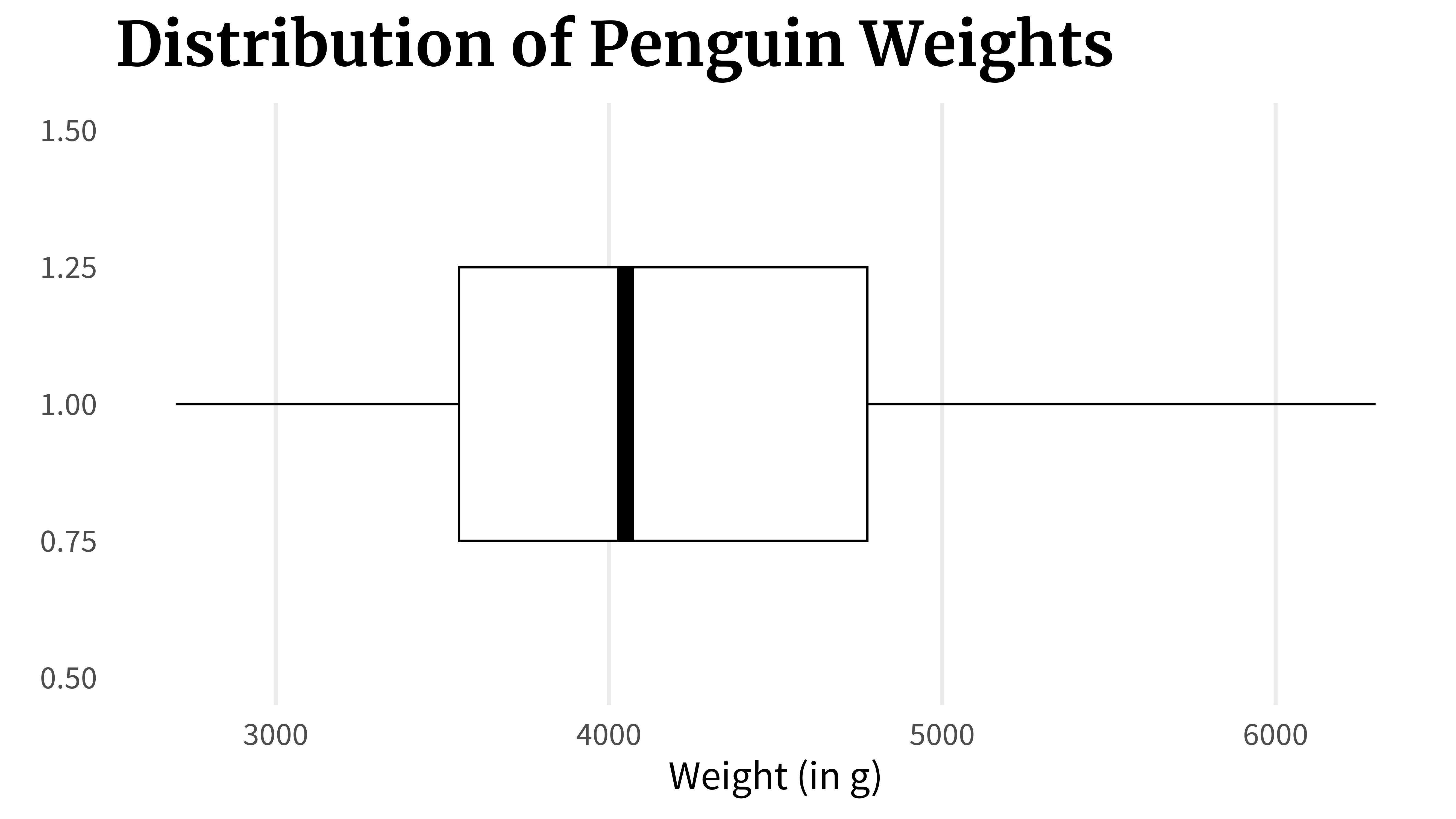
A box plot can show you this. In fact, that’s exactly what it shows. But there’s a crucial flaw. Let’s check out what it does. What a box plot does is that it computes key quantities like
the lowest value,
the highest value,
the point where 25% of the data are lower than that,
the point where 50% of the data are lower than that,
and the point where 75% of the data are lower than that.
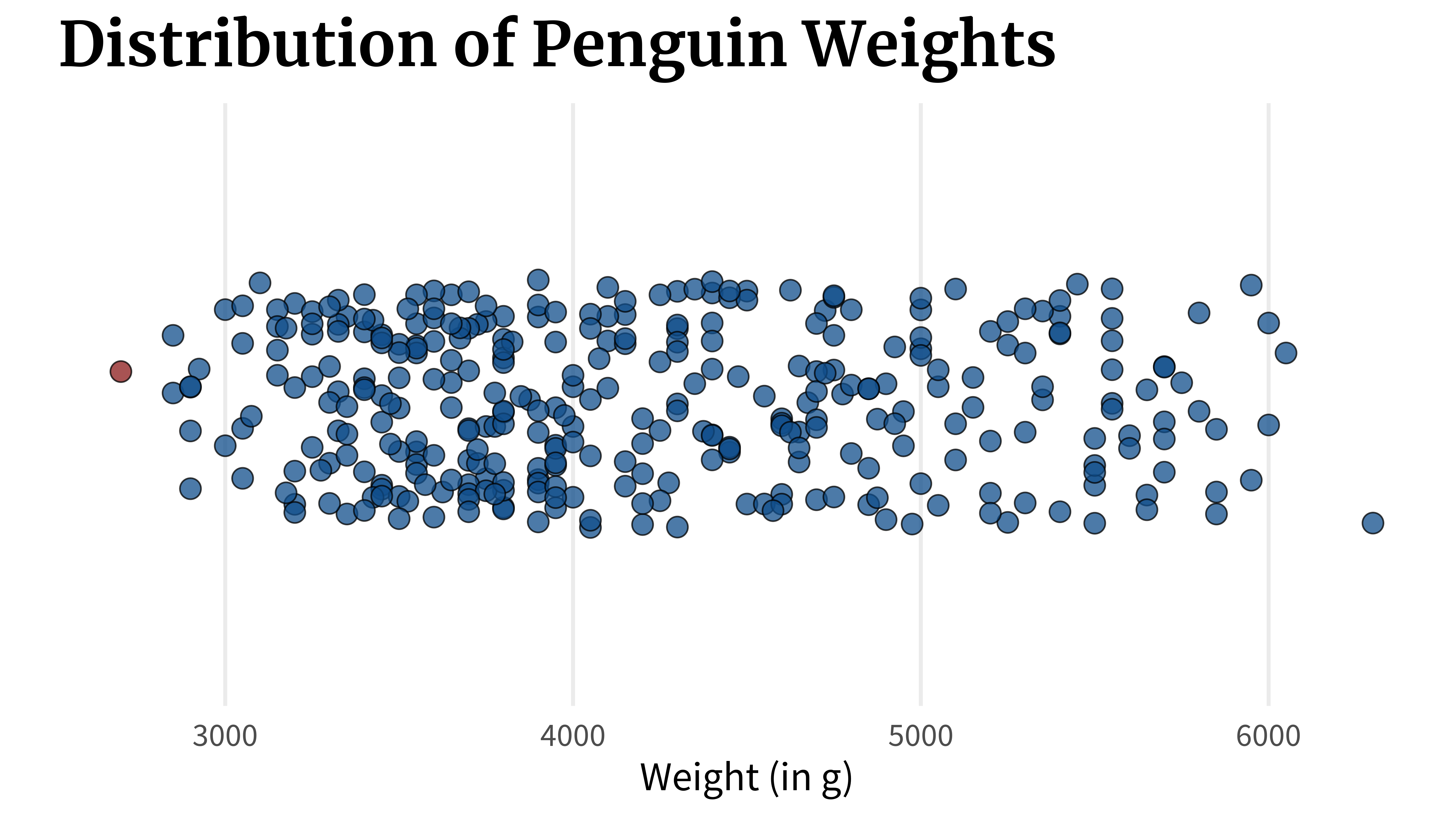
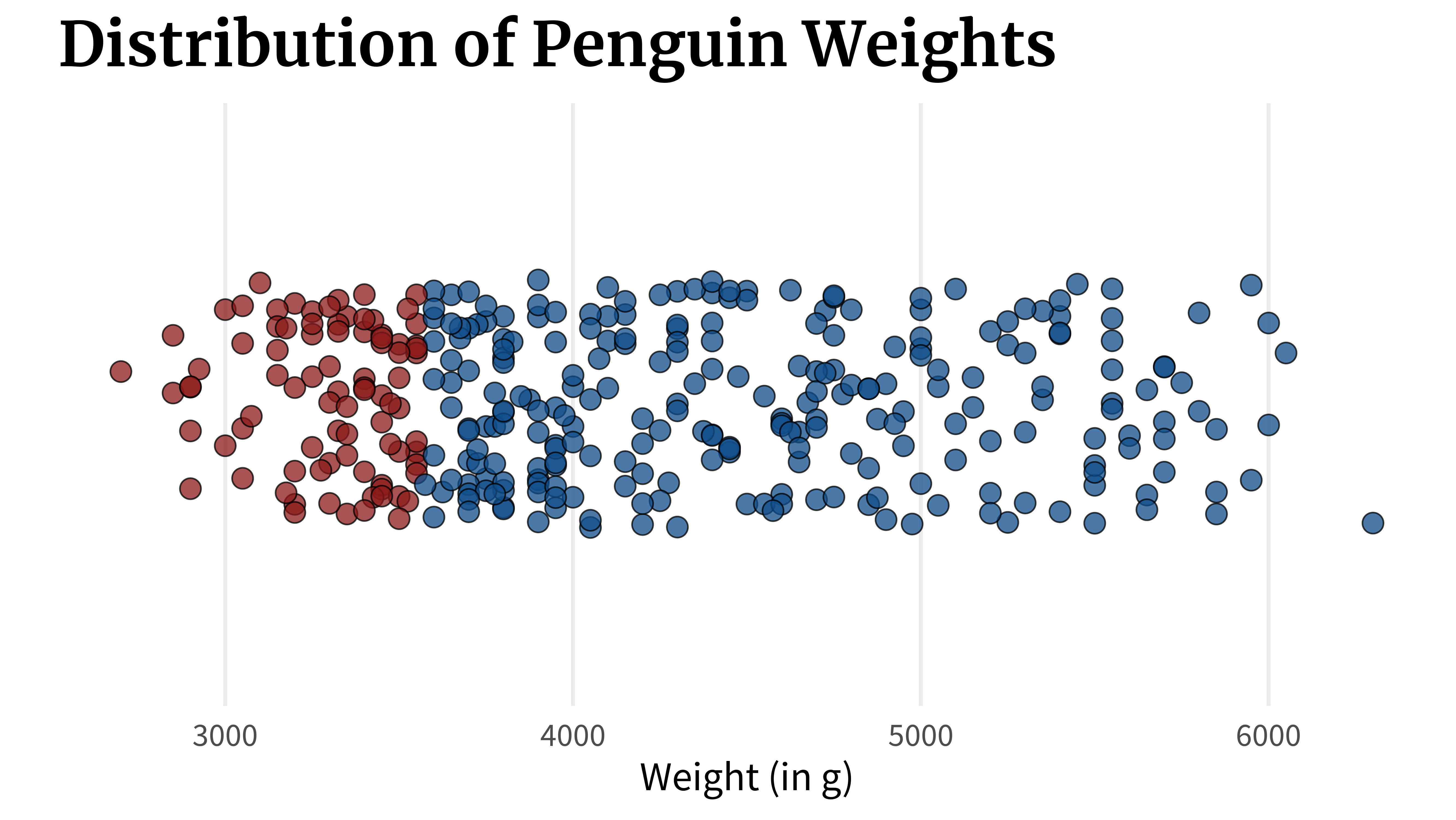
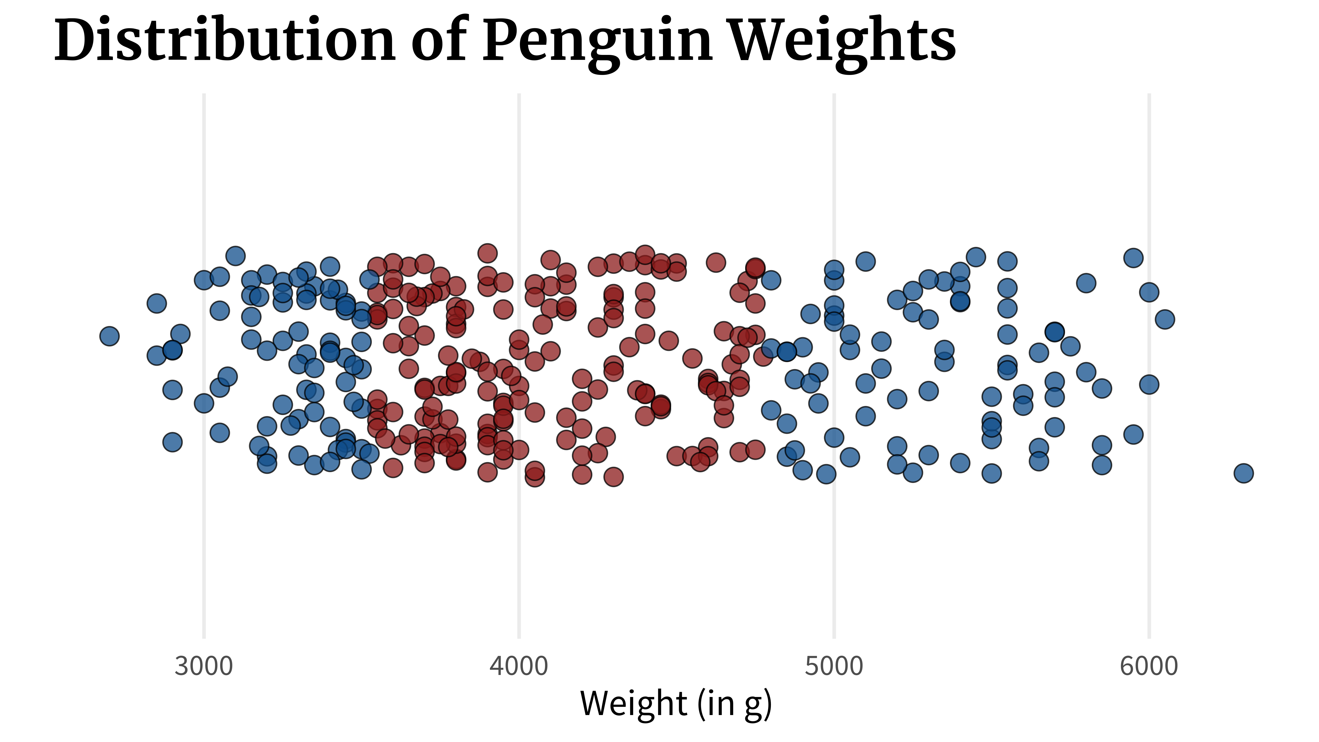
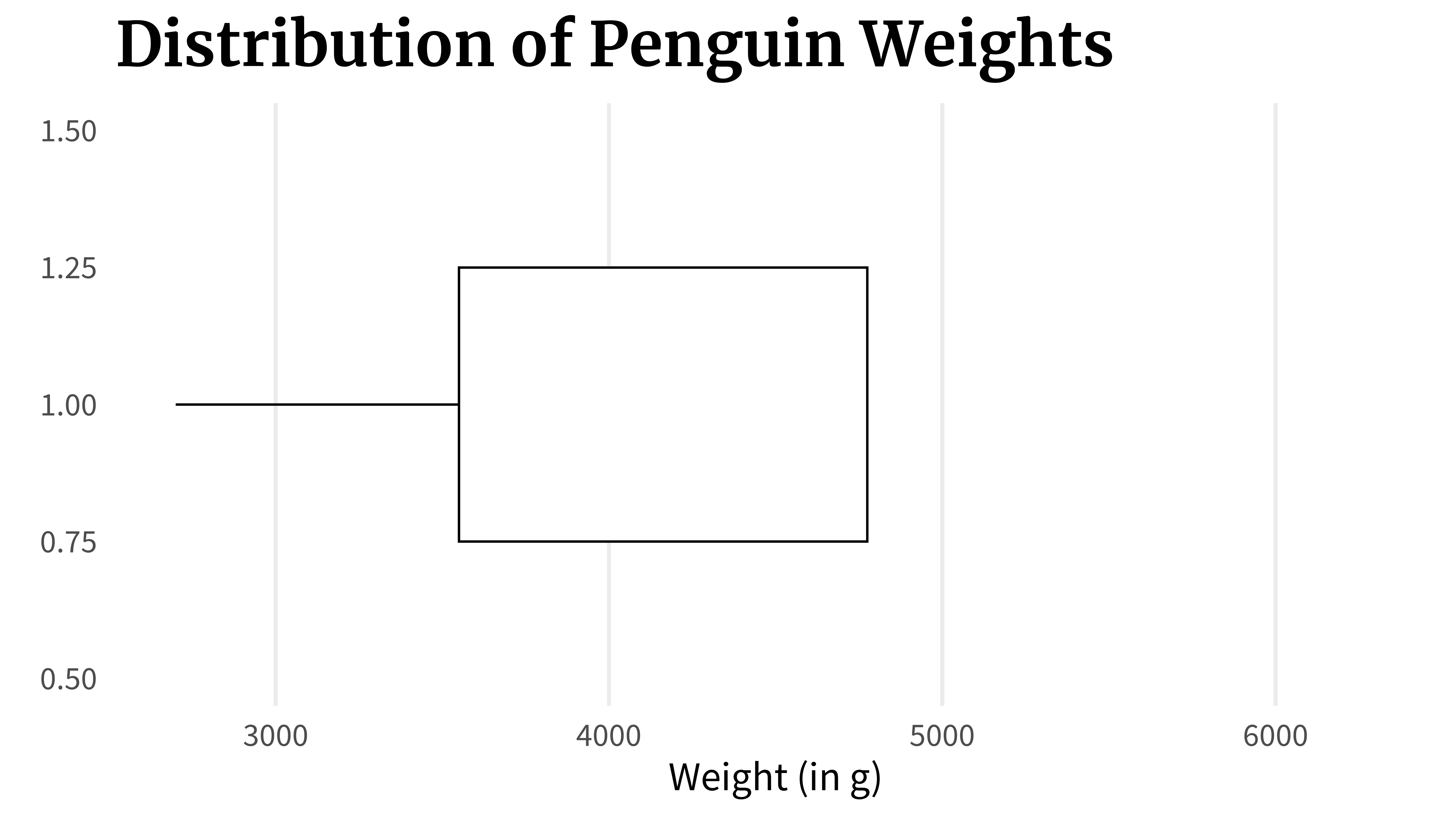
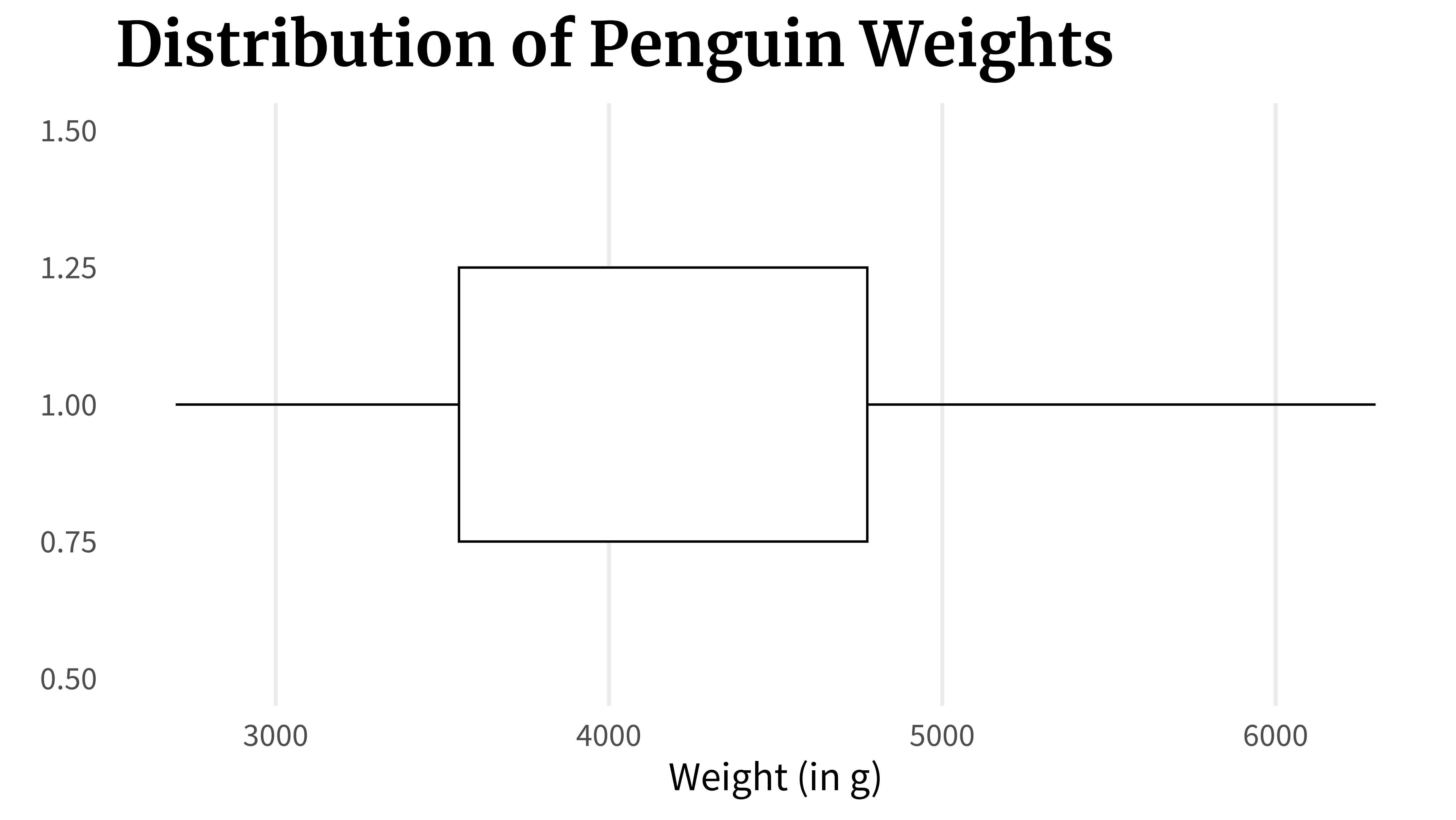
Once these values are calculated, the box plot can be assembled by just connecting the dots. First, you draw a line from the first to the second point which would represent the lowest 25% of the data.
penguins_dat |>ggplot(aes(x = body_mass_g, y =1)) +geom_boxplot() +theme_minimal(base_size =18, base_family ='Source Sans Pro' ) +labs(x ='Weight (in g)', y =element_blank(),title ='Distribution of Penguin Weights' ) +theme(panel.grid.minor =element_blank(),panel.grid.major.y =element_blank(),plot.title =element_text(size =rel(1.5),family ='Merriweather',face ='bold' ),legend.position ='none' ) +coord_cartesian(xlim =range(penguins_dat$body_mass_g),ylim =1+c(-0.5, 0.5) )
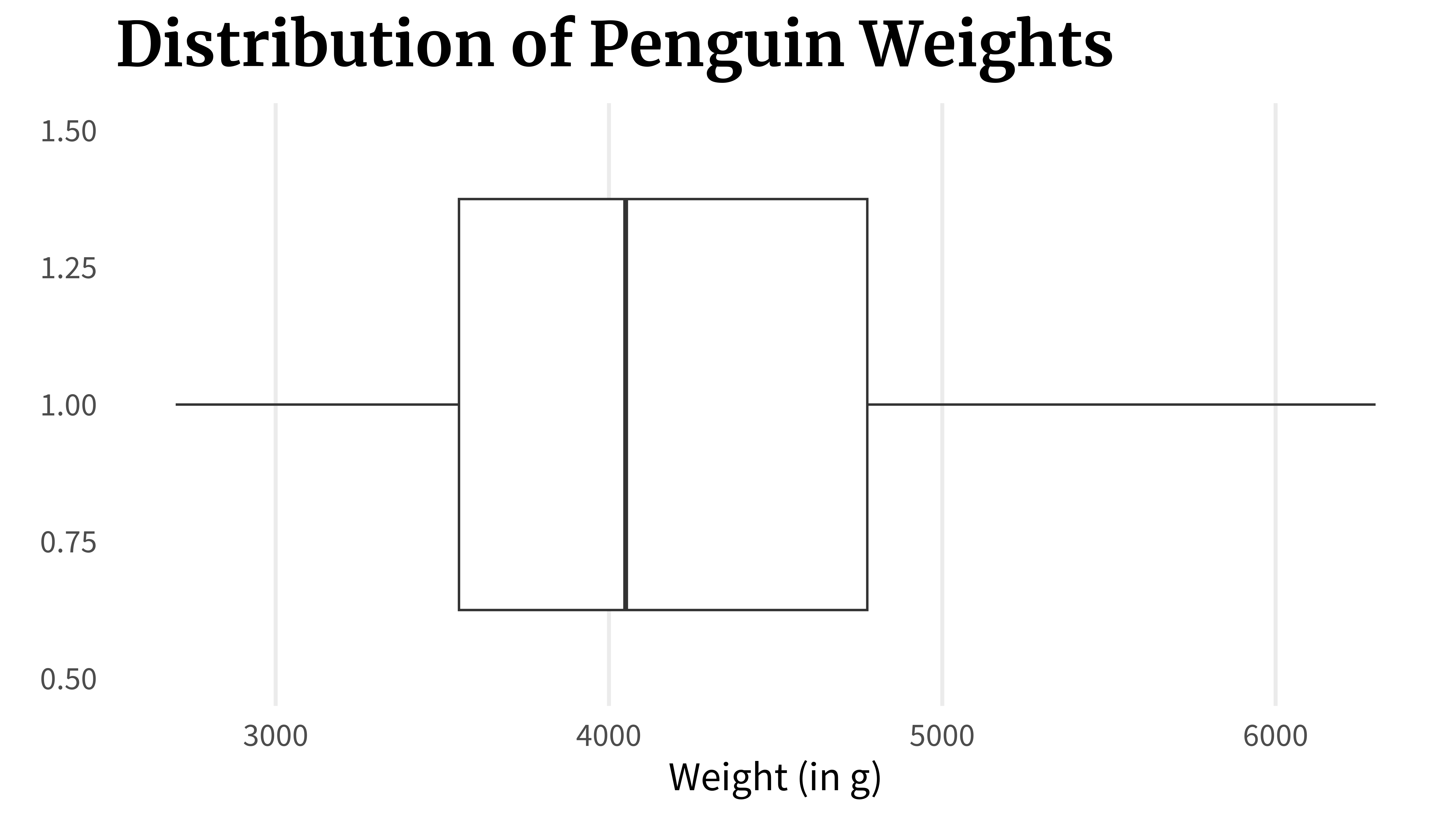
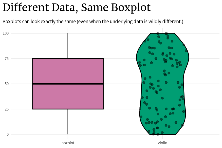
The problem with that is that the underlying data can look wildly different even if two box plots are the same. The thing is: As long as these key points (0%, 25%, …, 100%) are the same, the boxplot will look the same. So that’s how you can end up with a whole bunch of box plots that look exactly the same but the underlying data is completely different.
Code
plot_comparison <-function(vals_tib) { vals_tib |>ggplot() +geom_boxplot(aes(x ='boxplot', y = boxplot_vals),fill ='#CC79A7',col ='black',linewidth =1 ) +geom_violin(aes(x ='violin', y = boxplot_vals),fill ='#009E73',col ='black',linewidth =1 ) +coord_cartesian(ylim =c(0, 100)) +theme_minimal(base_size =15,base_family ='Source Sans Pro' ) +labs(x =element_blank(),y =element_blank(),title ='Different Data, Same Boxplot',subtitle ='Boxplots can look exactly the same, even when the distribution is wildly different.' ) +theme(plot.title =element_text(family ='Merriweather',face ='bold',size =rel(2) ),plot.title.position ='plot',panel.grid.minor =element_blank() )}runif_boxplot_vals <-function(x, sample_size =25) {tibble(seq = x,boxplot_vals =c(0,runif(sample_size, min =0, max =25),25,runif(sample_size, min =25, max =50),50,runif(sample_size, min =50, max =75),75,runif(sample_size, min =75, max =100),100 ) )}set.seed(5345234)library(gganimate)sim_dat <-map2_dfr(c(1, 3, 5, 7), c(25, 25, 25, 1000), runif_boxplot_vals) |>bind_rows(tibble(seq =2,boxplot_vals =c(0,rep(12.5, 100),25,rep(75/2, 100),50,rep(125/2, 100),75,rep(175/2, 100),100 ) ) ) |>bind_rows(tibble(seq =4,boxplot_vals =c(0,pmin(rexp(100, rate =1/12), 25),25,25+pmin(rexp(100, rate =1/12), 25),50,50+pmin(rexp(100, rate =1/12), 25),75,75+pmin(rexp(100, rate =1/12), 25),100 ) ) ) |>bind_rows(tibble(seq =6,boxplot_vals =c(0,25-pmin(rexp(100, rate =12), 25),25,50-pmin(rexp(100, rate =12), 25),50,75-pmin(rexp(100, rate =1/12), 25),75,100-pmin(rexp(100, rate =1/12), 25),100 ) ) ) anim <- sim_dat |>ggplot() +geom_boxplot(aes(x ='boxplot', y = boxplot_vals),fill ='#CC79A7',col ='black',linewidth =1 ) +geom_violin(aes(x ='violin', y = boxplot_vals),fill ='#009E73',col ='black',linewidth =1 ) + ggforce::geom_sina(aes(x ='violin', y = boxplot_vals, size =as.factor(seq)),alpha =0.5 ) +scale_size_manual(values =c(3, 3, 3, 3, 3, 3, 1)) +coord_cartesian(ylim =c(0, 100)) +theme_minimal(base_size =15,base_family ='Source Sans Pro' ) +labs(x =element_blank(),y =element_blank(),title ='Different Data, Same Boxplot',subtitle ='Boxplots can look exactly the same (even when the underlying data is wildly different.)' ) +theme(plot.title =element_text(family ='Merriweather',face ='bold',size =rel(2) ),plot.title.position ='plot',panel.grid.minor =element_blank(),legend.position ='none' ) +transition_states( seq, transition_length =1, state_length =5 ) +enter_fade() +exit_fade()animate( anim, nframes =200,fps =30,renderer =gifski_renderer(),width =900,height =600,res =100,units ='px',quality =90)
Think about it. The way to compute these key points is very simple:
You just sort all your data that you have in ascending order.
Assuming that you have approximately 100 points, all you have to do to get these points is to just take the first, the 25th, the 50th, the 75th, and the 100th points.
All the other data in between these points does not matter for the box plot. The data points can vary as much as they like as long as they stay within the range of the two key points that they are put in between.
So that’s why it’s generally not a good idea to solely rely on box plots. Instead, you can additionally use something like violin plots that try to show the underlying distribution and not just the key quantities.
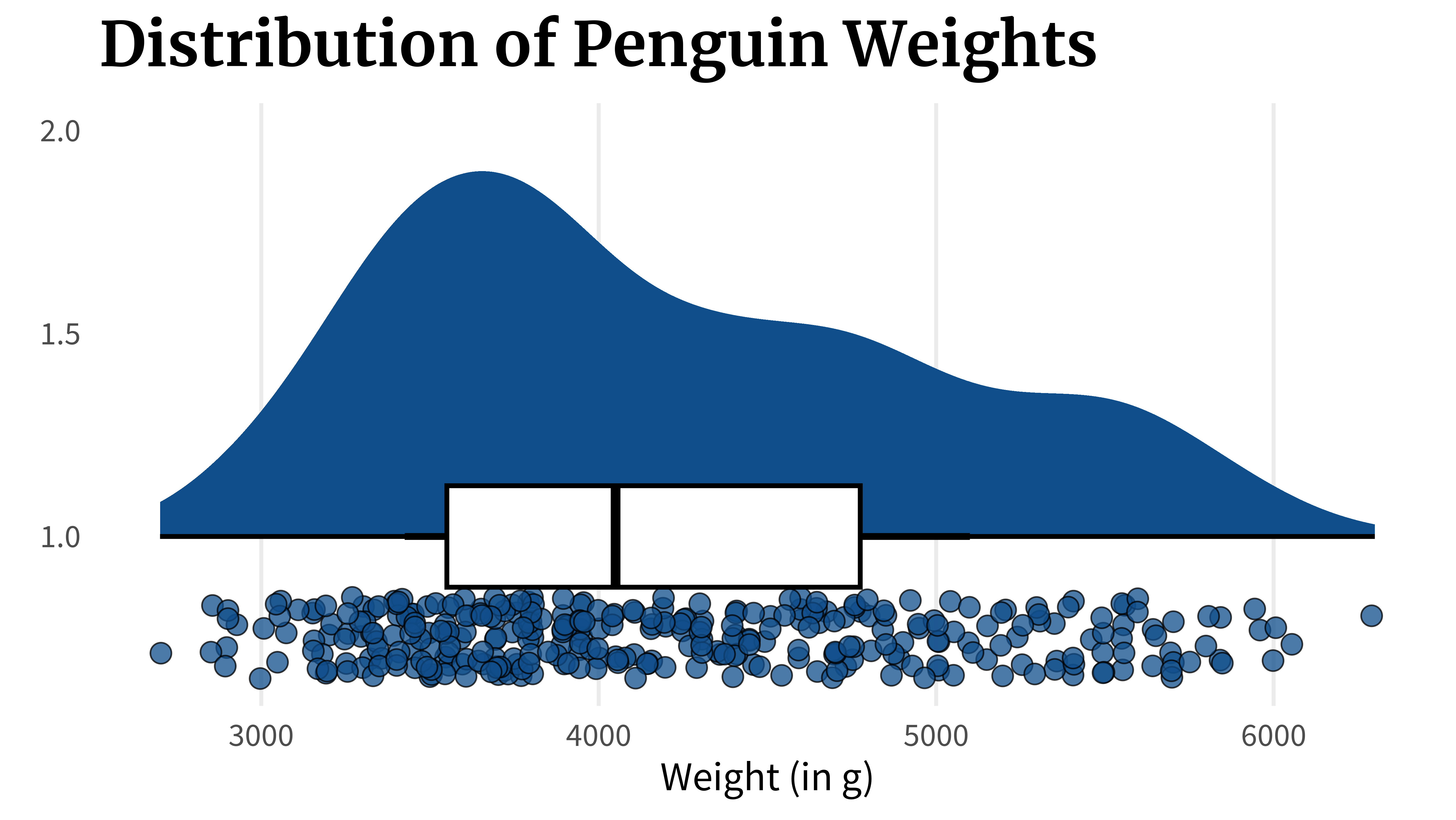
penguins_dat |>ggplot(aes(x = body_mass_g, y =1)) +geom_violin(fill ='dodgerblue4') +geom_boxplot(width =0.25, color ='black', linewidth =1) +theme_minimal(base_size =18, base_family ='Source Sans Pro' ) +labs(x ='Weight (in g)', y =element_blank(),title ='Distribution of Penguin Weights' ) +theme(panel.grid.minor =element_blank(),panel.grid.major.y =element_blank(),plot.title =element_text(size =rel(1.5),family ='Merriweather',face ='bold' ),legend.position ='none' ) +coord_cartesian(xlim =range(penguins_dat$body_mass_g),ylim =1+c(-0.5, 0.5) )
Or you could even go further and go for a rain cloud plot that combines box plots and violin plots with another histogram that shows the data more explicitly. And the way they are set up, they look like rain clouds, hence the name.
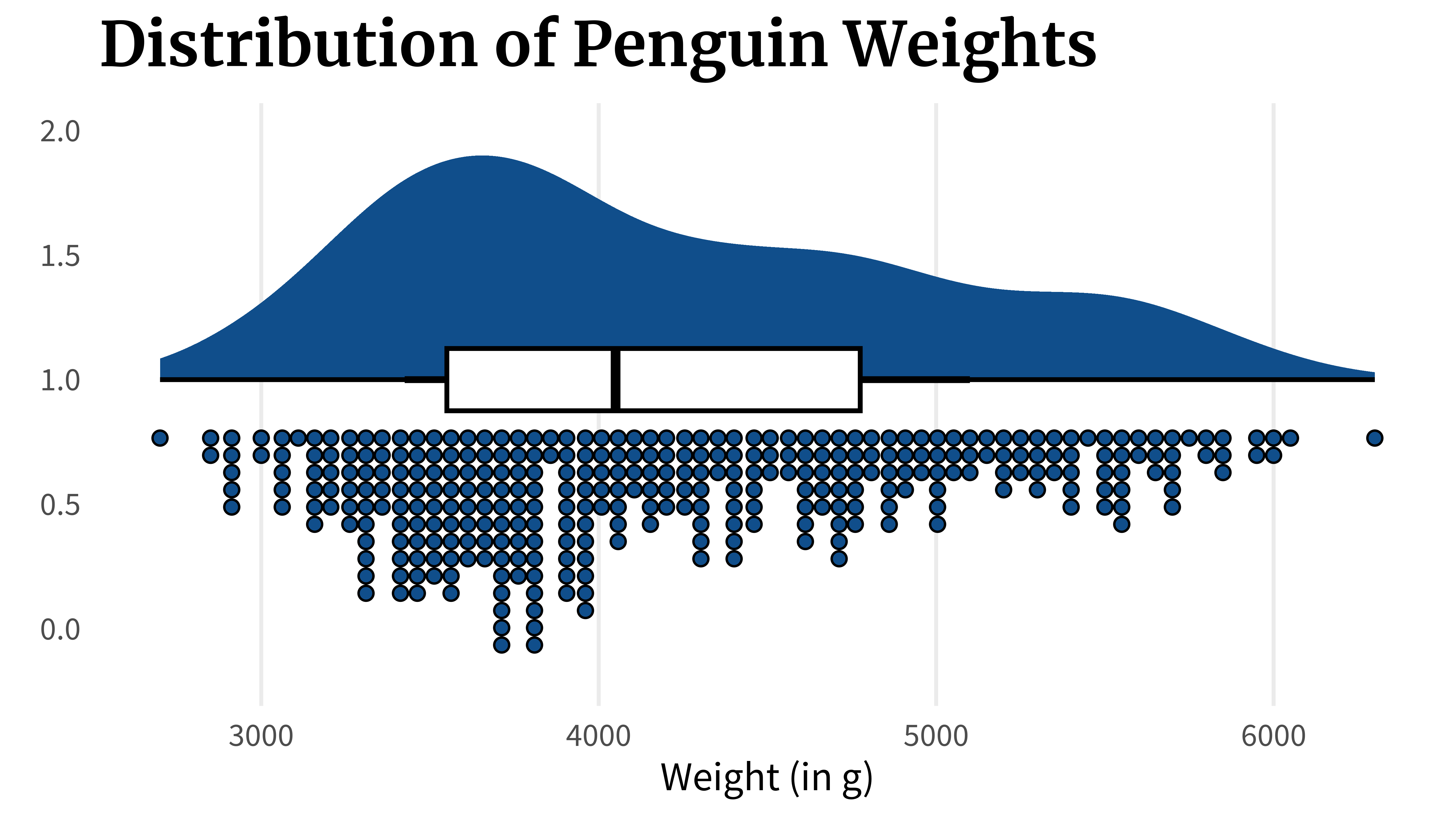
penguins_dat |>ggplot(aes(x = body_mass_g, y =1)) + ggdist::stat_halfeye(fill ='dodgerblue4') + ggdist::stat_dots(aes(y =0.8),fill ='dodgerblue4', color ='black',side ='bottom' ) +geom_boxplot(width =0.25, color ='black', linewidth =1) +theme_minimal(base_size =18, base_family ='Source Sans Pro' ) +labs(x ='Weight (in g)', y =element_blank(),title ='Distribution of Penguin Weights' ) +theme(panel.grid.minor =element_blank(),panel.grid.major.y =element_blank(),plot.title =element_text(size =rel(1.5),family ='Merriweather',face ='bold' ),legend.position ='none' ) +coord_cartesian(xlim =range(penguins_dat$body_mass_g) )
Or you can plot the points explicitly instead of using a histogram.
penguins_dat |>ggplot(aes(x = body_mass_g, y =1)) + ggdist::stat_halfeye(fill ='dodgerblue4') +geom_point(aes(y =0.75),size =4, alpha =0.75,shape =21,fill ='dodgerblue4',color ='black',position =position_jitter(height =0.1,seed =2343 ) ) +geom_boxplot(width =0.25, color ='black', linewidth =1) +theme_minimal(base_size =18, base_family ='Source Sans Pro' ) +labs(x ='Weight (in g)', y =element_blank(),title ='Distribution of Penguin Weights' ) +theme(panel.grid.minor =element_blank(),panel.grid.major.y =element_blank(),plot.title =element_text(size =rel(1.5),family ='Merriweather',face ='bold' ),legend.position ='none' ) +coord_cartesian(xlim =range(penguins_dat$body_mass_g) )
Conclusion
I hope you’ve enjoyed this short blog post. Have a great day and see you next time. And if you found this helpful, here are some other ways I can help you:
3 Minute Wednesdays: A weekly newsletter with bite-sized tips and tricks for R users
This in-depth video course teaches you everything you need to know about becoming better & more efficient at cleaning up messy data. This includes Excel & JSON files, text data and working with times & dates. If you want to get better at data cleaning, check out the course page.
Insightful Data Visualizations for "Uncreative" R Users
This video course teaches you how to leverage {ggplot2} to make charts that communicate effectively without being a design expert. Course information can be found on the course page.