library(tidyverse)
sp500_data_wide <- gt::sp500 |>
  select(date, open, close) |>
  filter(year(date) == 2014, month(date) == 1)
sp500_data_wide
## # A tibble: 21 × 3
##    date        open close
##    <date>     <dbl> <dbl>
##  1 2014-01-31 1791. 1783.
##  2 2014-01-30 1777. 1794.
##  3 2014-01-29 1790. 1774.
##  4 2014-01-28 1783  1792.
##  5 2014-01-27 1791. 1782.
##  6 2014-01-24 1827. 1790.
##  7 2014-01-23 1842. 1828.
##  8 2014-01-22 1845. 1845.
##  9 2014-01-21 1841. 1844.
## 10 2014-01-17 1844. 1839.
## # ℹ 11 more rowsQuick dataViz techniques for nicer line charts with ggplot
Today I’m showing you a couple of quick ggplot techniques that you can apply to quickly make your line charts nicer
Line charts are one of the most fundamental chart type out there. That’s why there’s a lot of tips for line charts out there. Today, I’m going to walk you through a couple of techniques that you can use to make your line chart nicer. Here, I’ll provide you with all the code chunks. All explanations can be found in my corresponding YT video:
Get the data
Bring into a nice format for ggplot
sp500_data <- sp500_data_wide |>
  pivot_longer(
    cols = -date,
    names_to = 'type',
    values_to = 'price'
  )
Create a basic line chart
sp500_data |>
  ggplot(aes(date, price, col = type)) +
  geom_line(linewidth = 1.25)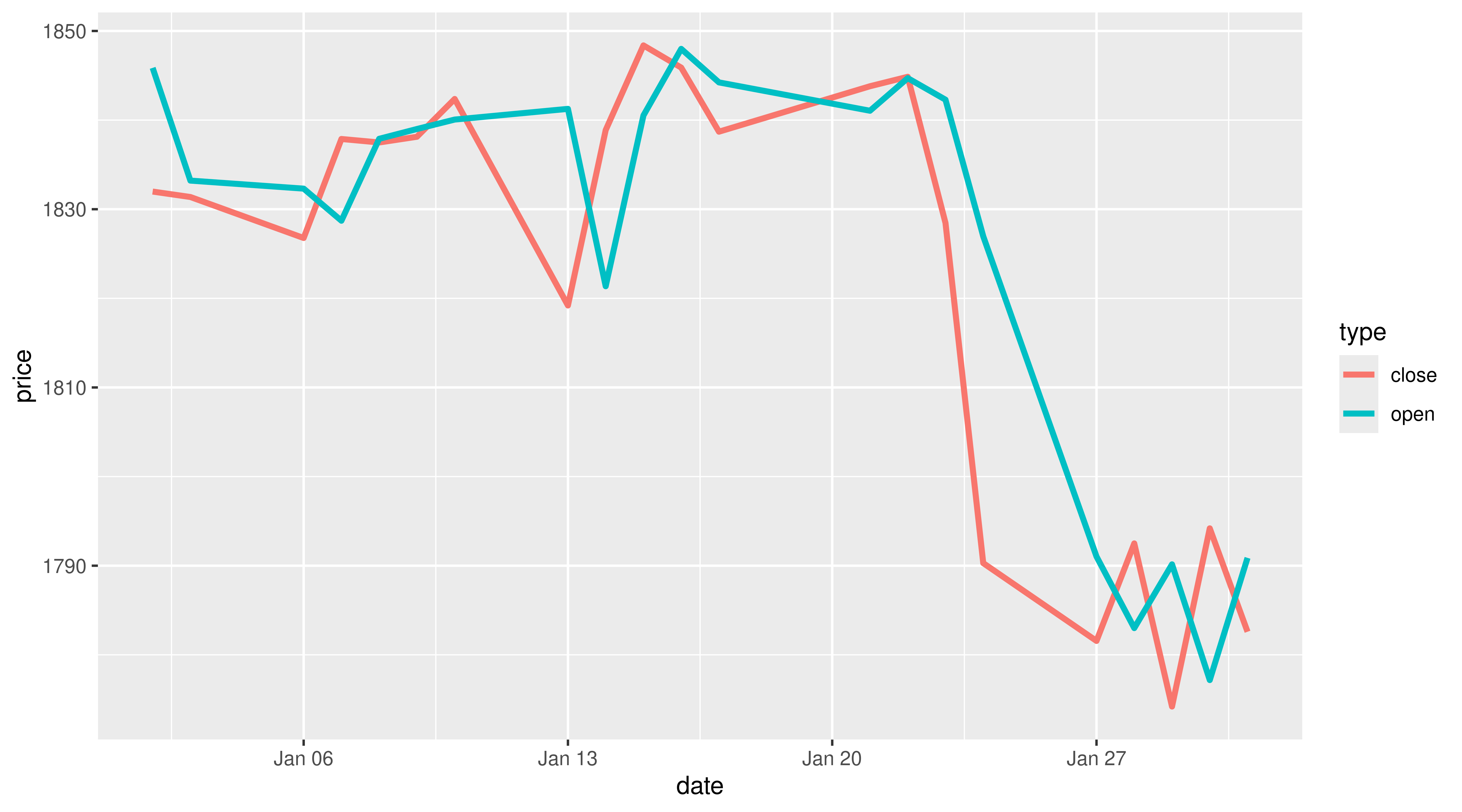
Apply a theme
sp500_data |>
  ggplot(aes(date, price, col = type)) +
  geom_line(linewidth = 1.25) +
  theme_minimal(
    base_size = 20,
    base_family = 'Source Sans Pro'
  ) +
  theme(
    panel.grid.minor = element_blank()
  )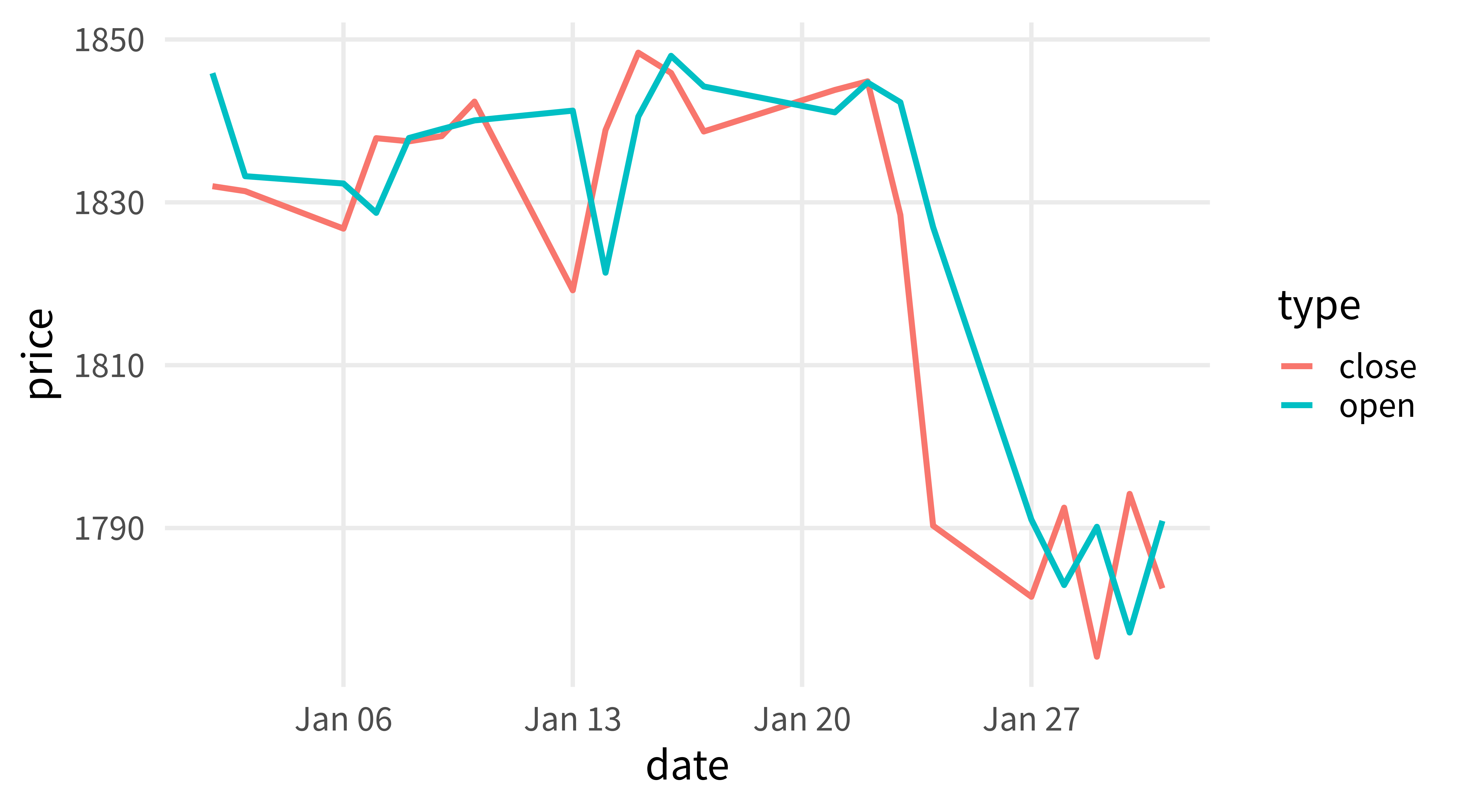
Use nicer colors
sp500_data |>
  ggplot(aes(date, price, col = type)) +
  geom_line(linewidth = 1.25) +
  theme_minimal(
    base_size = 20,
    base_family = 'Source Sans Pro'
  ) +
  theme(
    panel.grid.minor = element_blank()
  ) +
  scale_color_manual(
    values = c('#0072B2', '#D55E00')
) 
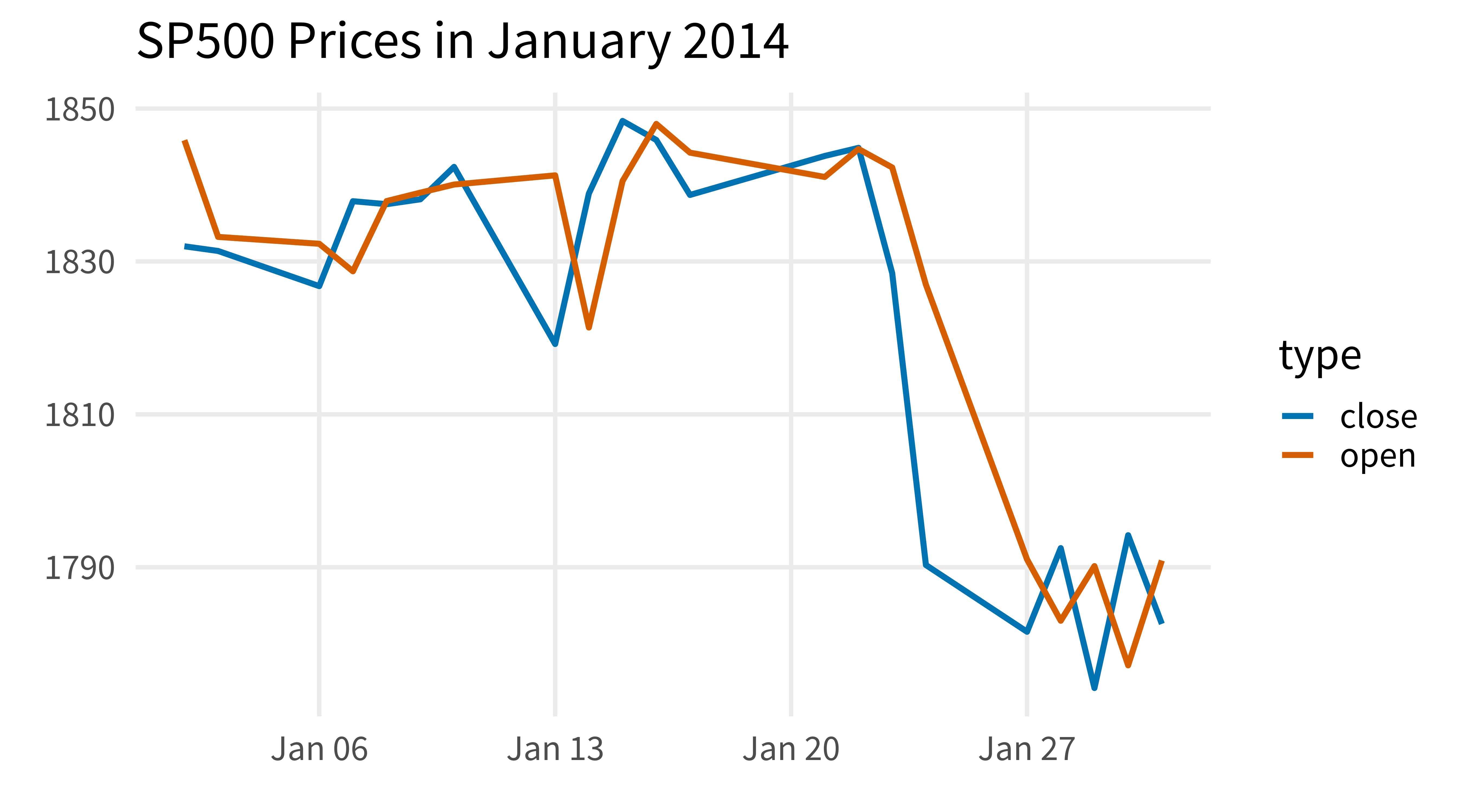
Use meaningful labels
sp500_data |>
  ggplot(aes(date, price, col = type)) +
  geom_line(linewidth = 1.25) +
  theme_minimal(
    base_size = 20,
    base_family = 'Source Sans Pro'
  ) +
  theme(
    panel.grid.minor = element_blank()
  ) +
  scale_color_manual(
    values = c('#0072B2', '#D55E00')
  ) +
  labs(
    x = element_blank(),
    y = element_blank(),
    title = 'SP500 Prices in January 2014'
) 
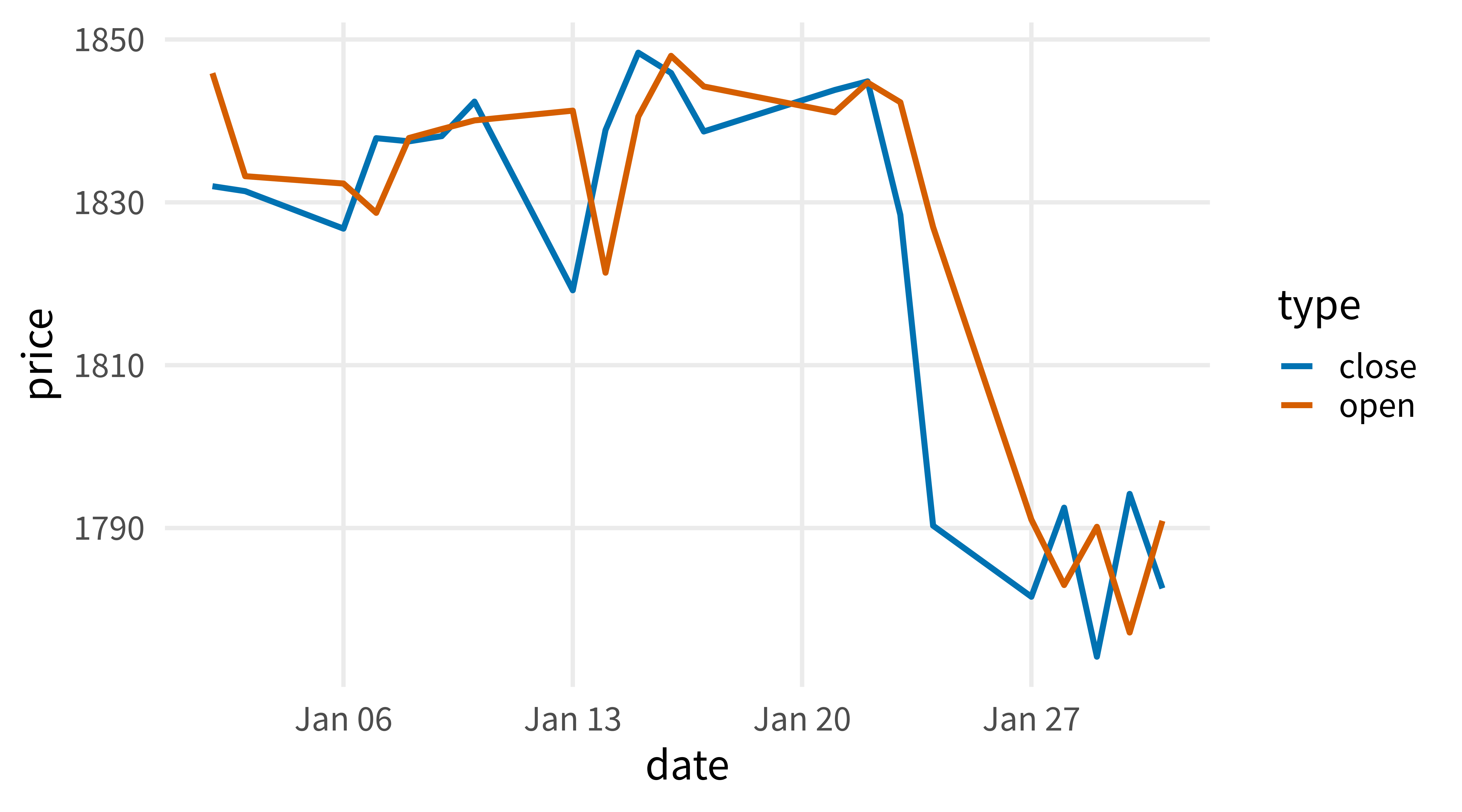
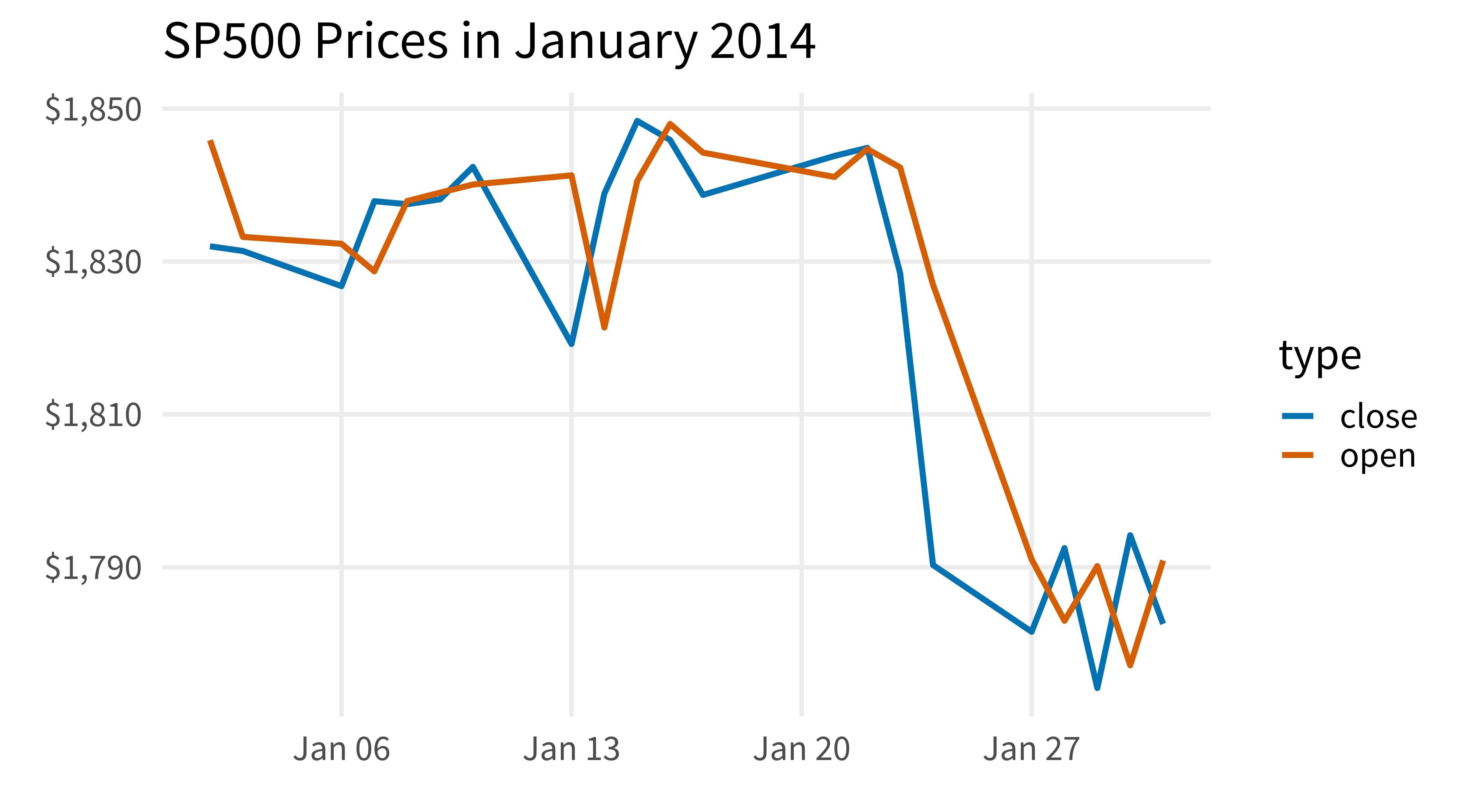
Make labels into currency
sp500_data |>
  ggplot(aes(date, price, col = type)) +
  geom_line(linewidth = 1.25) +
  theme_minimal(
    base_size = 20,
    base_family = 'Source Sans Pro'
  ) +
  theme(
    panel.grid.minor = element_blank()
  ) +
  scale_color_manual(
    values = c('#0072B2', '#D55E00')
  ) +
  labs(
    x = element_blank(),
    y = element_blank(),
    title = 'SP500 Prices in January 2014'
  ) +
  scale_y_continuous(
    labels = scales::label_dollar()
  )
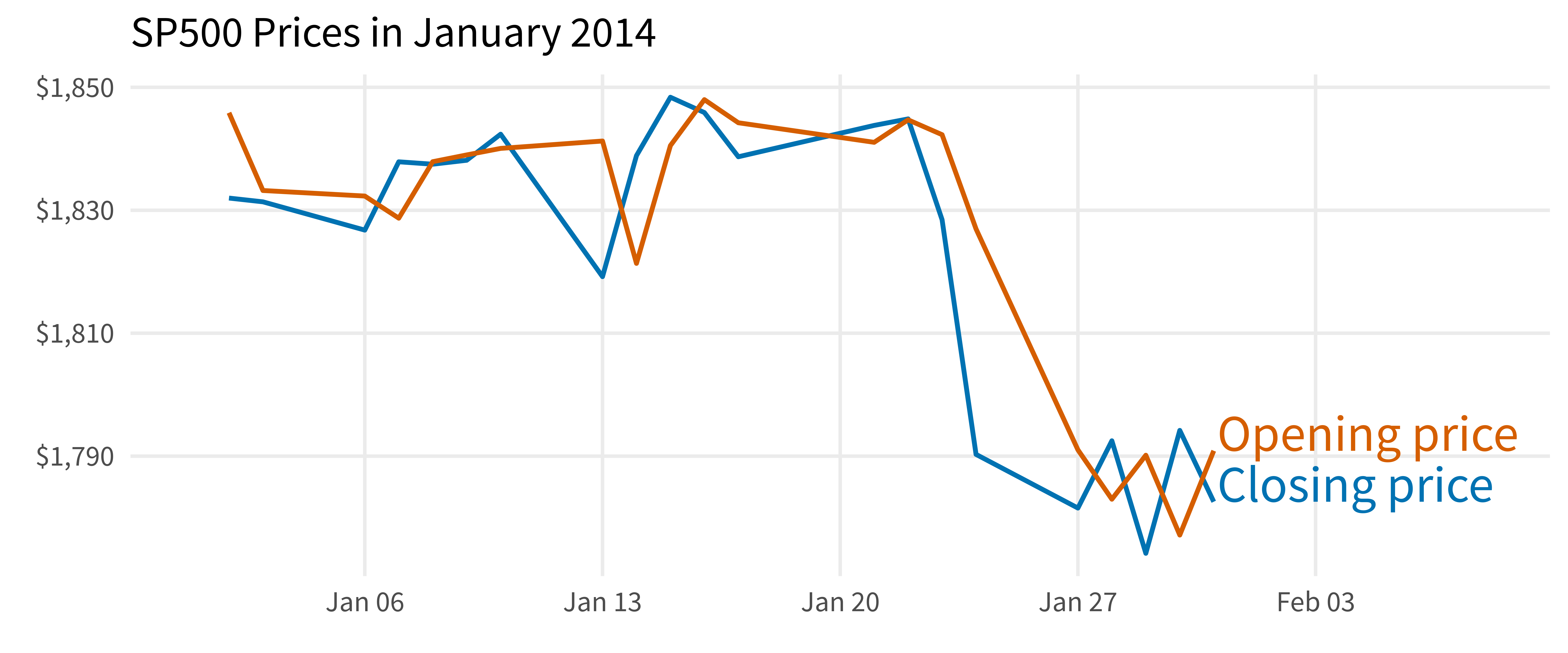
Use direct labels instead of legend
sp500_data |>
  ggplot(aes(date, price, col = type)) +
  geom_line(linewidth = 1.25) +
  geom_text(
    data = sp500_data |> slice_head(n = 1, by = type),
    aes(label = type),
    hjust = 0,
    vjust = 0,
    family = 'Source Sans Pro',
    size = 10,
    nudge_x = 0.1
  ) +
  theme_minimal(
    base_size = 20,
    base_family = 'Source Sans Pro'
  ) +
  theme(
    panel.grid.minor = element_blank(),
    legend.position = 'none'
  ) +
  scale_color_manual(
    values = c('#0072B2', '#D55E00')
  ) +
  labs(
    x = element_blank(),
    y = element_blank(),
    title = 'SP500 Prices in January 2014'
  ) +
  scale_y_continuous(
    labels = scales::label_dollar()
  ) +
  scale_x_date(
    limits = c(
      make_date(2014, 1, 1),
      make_date(2014, 2 ,3)
    )
  )
Make nicer labels
sp500_data_with_nicer_labels <- sp500_data |>
  mutate(
    type = if_else(
      type == 'open',
      'Opening price',
      'Closing price'
    )
  )

sp500_data_with_nicer_labels|>
  ggplot(aes(date, price, col = type)) +
  geom_line(linewidth = 1.25) +
  geom_text(
    data = sp500_data_with_nicer_labels |>
      slice_head(n = 1, by = type),
    aes(label = type),
    hjust = 0,
    vjust = 0,
    family = 'Source Sans Pro',
    size = 10,
    nudge_x = 0.1
  ) +
  theme_minimal(
    base_size = 20,
    base_family = 'Source Sans Pro'
  ) +
  theme(
    panel.grid.minor = element_blank(),
    legend.position = 'none'
  ) +
  scale_color_manual(
    values = c('#0072B2', '#D55E00')
  ) +
  labs(
    x = element_blank(),
    y = element_blank(),
    title = 'SP500 Prices in January 2014'
  ) +
  scale_y_continuous(
    labels = scales::label_dollar()
  ) +
  scale_x_date(
    limits = c(
      make_date(2014, 1, 1),
      make_date(2014, 2, 8)
    )
  )
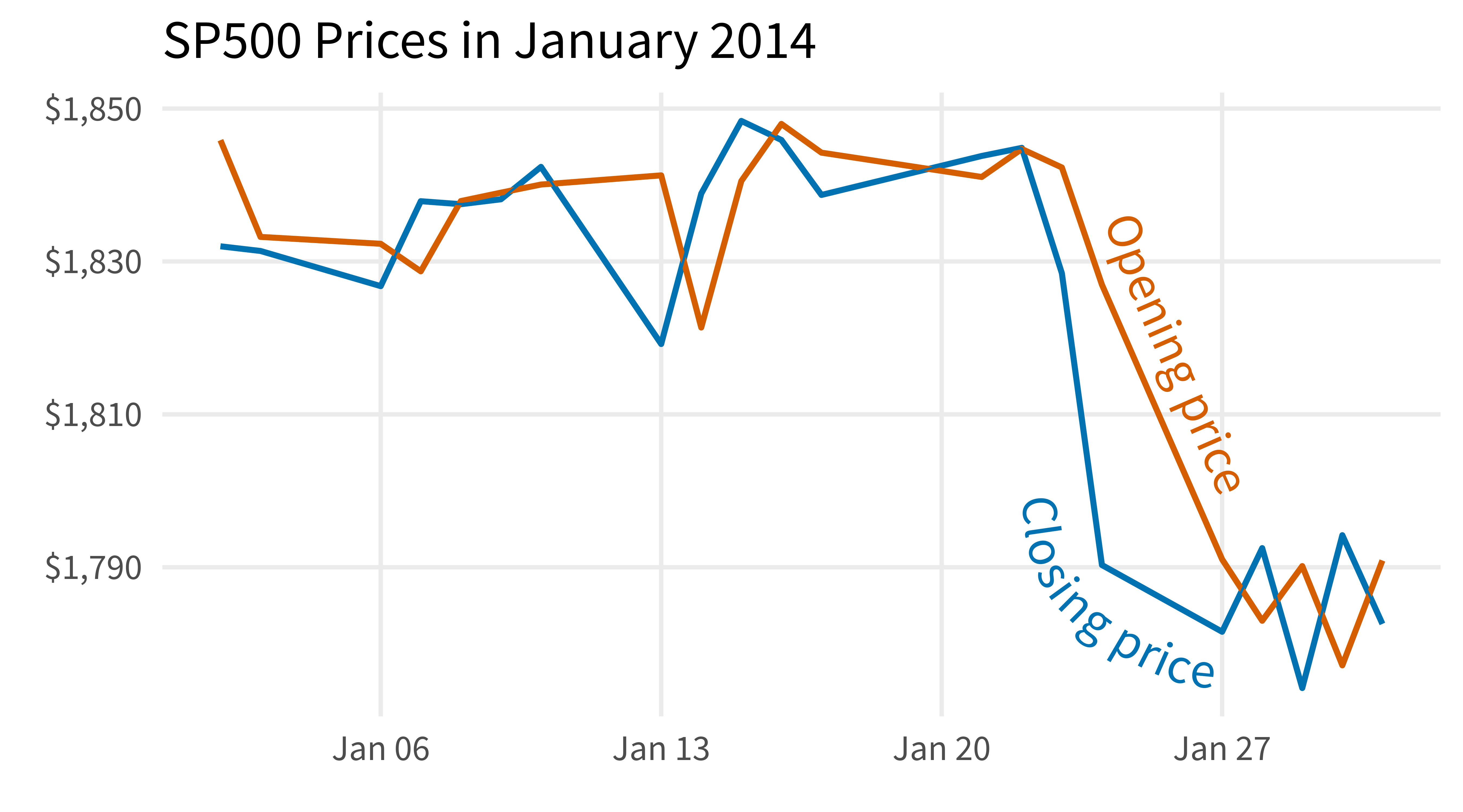
Place labels closer to the lines
sp500_data_with_nicer_labels |>
  ggplot(aes(date, price, col = type)) +
  geom_line(linewidth = 1.25) +
  geomtextpath::geom_textline(
    data = sp500_data_with_nicer_labels |>
      filter(type == 'Opening price'),
    aes(label = type),
    hjust = 0.76,
    vjust = 0,
    family = 'Source Sans Pro',
    size = 8
  ) +
  geomtextpath::geom_textline(
    data = sp500_data_with_nicer_labels |>
      filter(type == 'Closing price'),
    aes(label = type),
    hjust = 0.77,
    vjust = 1,
    family = 'Source Sans Pro',
    size = 8,
    text_smoothing = 40,
    offset = unit(-14, 'mm')
  ) +
  theme_minimal(
    base_size = 20,
    base_family = 'Source Sans Pro'
  ) +
  theme(
    panel.grid.minor = element_blank(),
    legend.position = 'none'
  ) +
  scale_color_manual(
    values = c('#0072B2', '#D55E00')
  ) +
  labs(
    x = element_blank(),
    y = element_blank(),
    title = 'SP500 Prices in January 2014'
  ) +
  scale_y_continuous(
    labels = scales::label_dollar()
) 
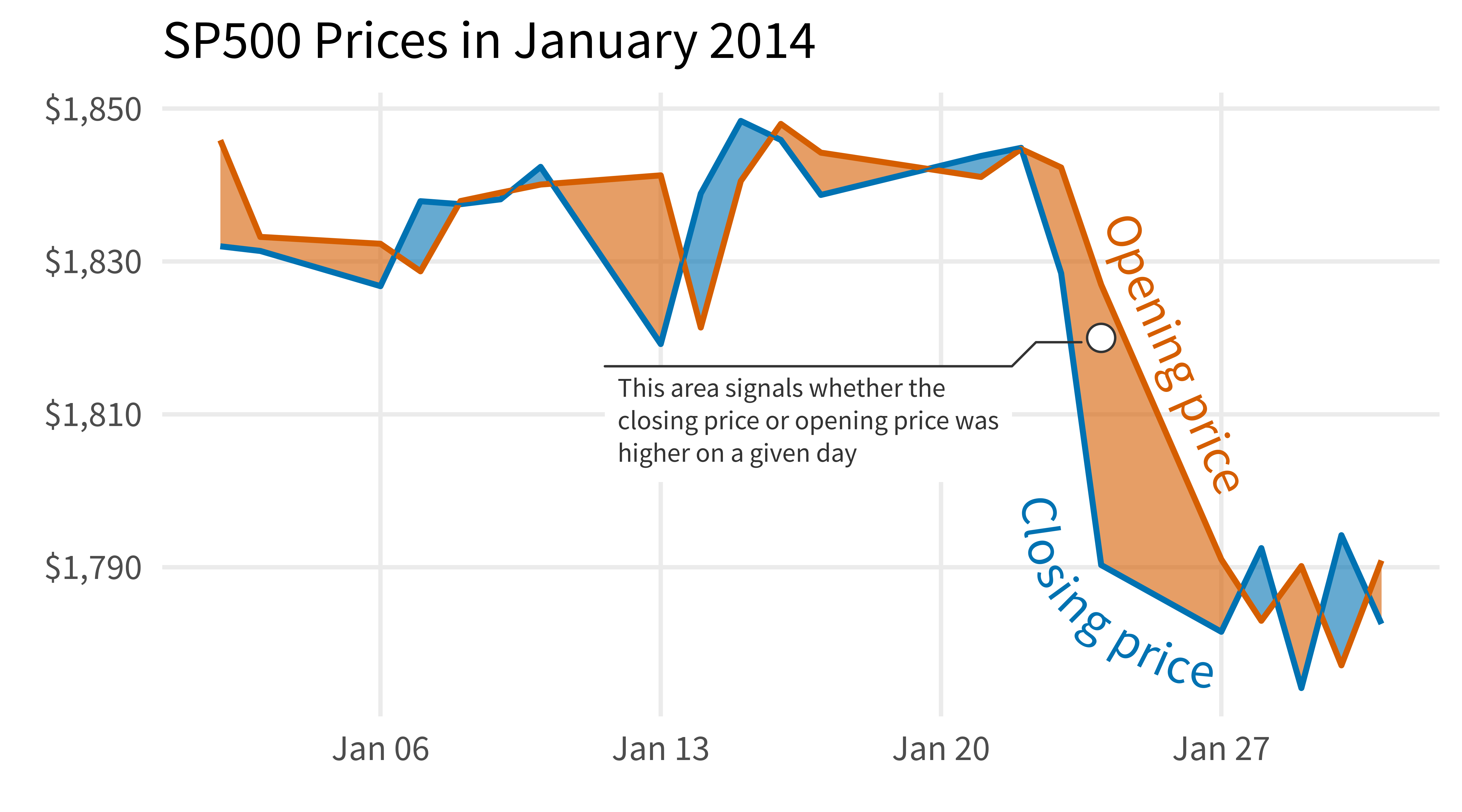
Highlight area between lines.
sp500_data_with_nicer_labels |>
  ggplot(aes(date, price, col = type)) +
  ggbraid::geom_braid(
    data = sp500_data_wide,
    aes(
      y = NULL, ## Overwrite the inherited aes from ggplot()
      col = NULL,
      ymin = open,
      ymax = close,
      fill = open < close
    ),
    alpha = 0.6
  ) +
  geom_line(linewidth = 1.25) +
  geomtextpath::geom_textline(
    data = sp500_data_with_nicer_labels |>
      filter(type == 'Opening price'),
    aes(label = type),
    hjust = 0.76,
    vjust = 0,
    family = 'Source Sans Pro',
    size = 8
  ) +
  geomtextpath::geom_textline(
    data = sp500_data_with_nicer_labels |>
      filter(type == 'Closing price'),
    aes(label = type),
    hjust = 0.77,
    vjust = 1,
    family = 'Source Sans Pro',
    size = 8,
    text_smoothing = 40,
    offset = unit(-14, 'mm')
  ) +
  theme_minimal(
    base_size = 20,
    base_family = 'Source Sans Pro'
  ) +
  theme(
    panel.grid.minor = element_blank(),
    legend.position = 'none'
  ) +
  scale_color_manual(
    values = c('#0072B2', '#D55E00')
  ) +
  scale_fill_manual(
    values = c('TRUE' = '#0072B2', 'FALSE' = '#D55E00')
  ) +
  labs(
    x = element_blank(),
    y = element_blank(),
    title = 'SP500 Prices in January 2014'
  ) +
  scale_y_continuous(
    labels = scales::label_dollar()
  )
## `geom_braid()` using method = 'line'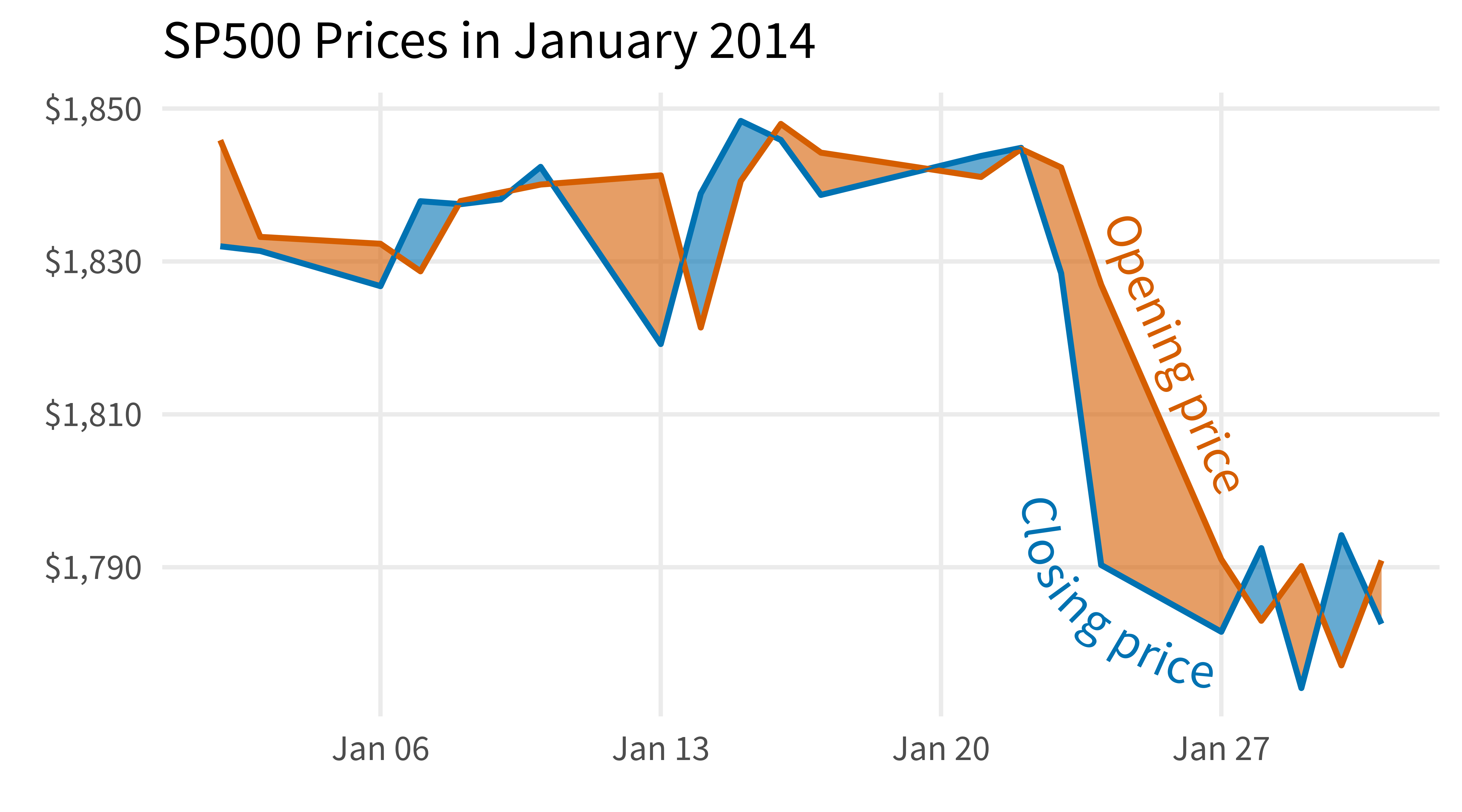
Add a callout label box
sp500_data_with_nicer_labels |>
  ggplot(aes(date, price, col = type)) +
  ggbraid::geom_braid(
    data = sp500_data_wide,
    aes(
      y = NULL, ## Overwrite the inherited aes from ggplot()
      col = NULL,
      ymin = open,
      ymax = close,
      fill = open < close
    ),
    alpha = 0.6
  ) +
  geom_line(linewidth = 1.25) +
  geomtextpath::geom_textline(
    data = sp500_data_with_nicer_labels |>
      filter(type == 'Opening price'),
    aes(label = type),
    hjust = 0.76,
    vjust = 0,
    family = 'Source Sans Pro',
    size = 8
  ) +
  geomtextpath::geom_textline(
    data = sp500_data_with_nicer_labels |>
      filter(type == 'Closing price'),
    aes(label = type),
    hjust = 0.77,
    vjust = 1,
    family = 'Source Sans Pro',
    size = 8,
    text_smoothing = 40,
    offset = unit(-14, 'mm')
  ) +
  ggforce::geom_mark_circle(
    data = tibble(
      date = make_date(2014, 1, 24),
      price = 1820
    ),
    aes(
      col = NULL,
      label = 'This area signals whether the\nclosing price or opening price was\nhigher on a given day'
    ),
    fill = 'white',
    color = 'grey20',
    alpha = 1,
    x0 = make_date(2014, 1, 13),
    y0 = 1805,
    label.family = 'Source Sans Pro',
    label.colour = 'grey20',
    label.hjust = 0,
    label.fontsize = 12,
    label.fontface = 'plain',
    con.colour = 'grey20',
    con.cap = unit(1, 'mm'),
    expand = 0.011
  ) +
  theme_minimal(
    base_size = 20,
    base_family = 'Source Sans Pro'
  ) +
  theme(
    panel.grid.minor = element_blank(),
    legend.position = 'none'
  ) +
  scale_color_manual(
    values = c('#0072B2', '#D55E00')
  ) +
  scale_fill_manual(
    values = c('TRUE' = '#0072B2', 'FALSE' = '#D55E00')
  ) +
  labs(
    x = element_blank(),
    y = element_blank(),
    title = 'SP500 Prices in January 2014'
  ) +
  scale_y_continuous(
    labels = scales::label_dollar()
  )
## `geom_braid()` using method = 'line'