Calendar Plots With ggplot2
Today I’m showing you ggplot techniques to create calendar plots in no time.
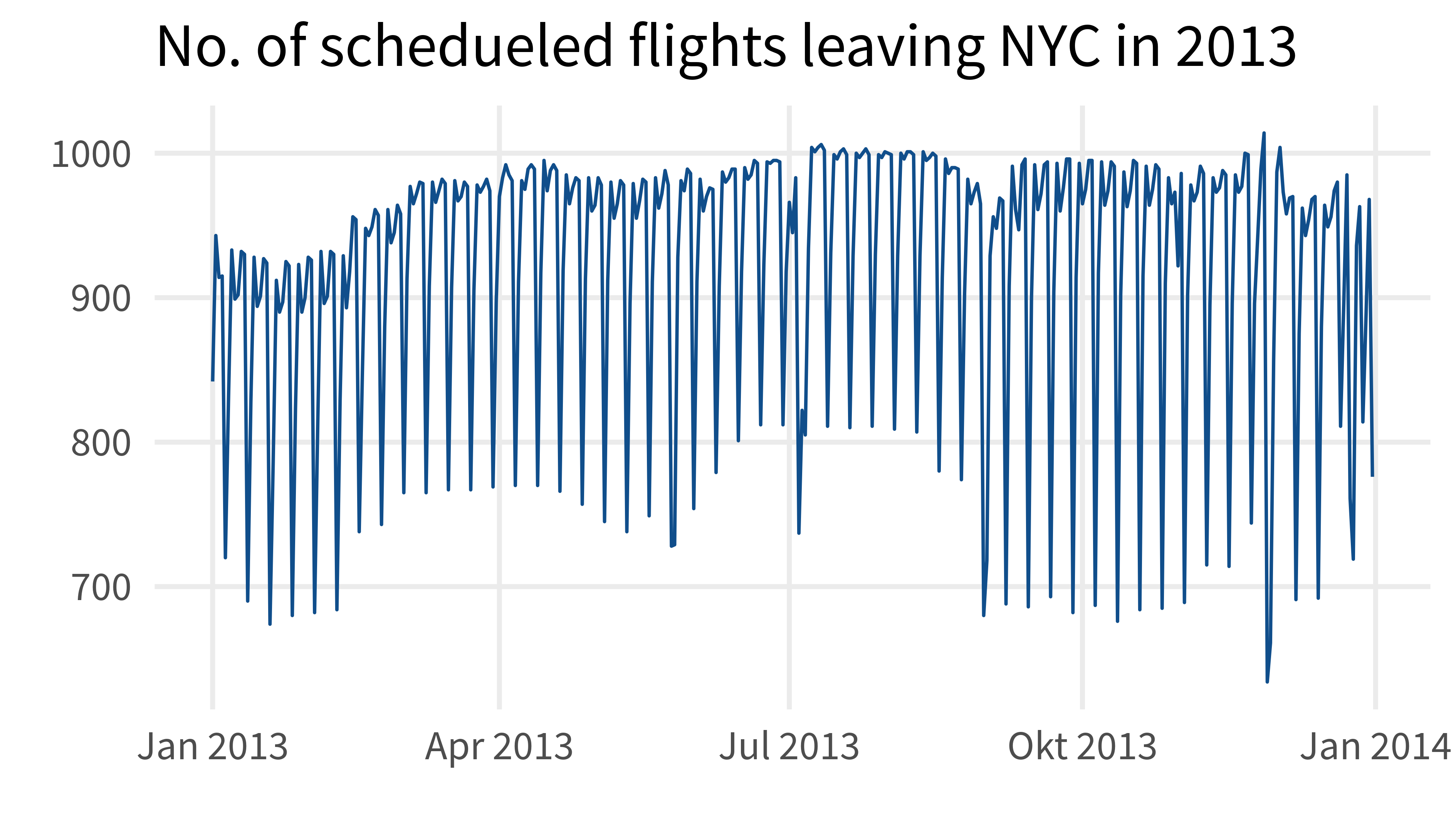
Take a look at this chart:
Clearly, it shows a periodic behavior. At some point of the week there are always much less flights scheduled than on other days of the week. This begs the question: “On what day are there less flights?”
It would be great if there’s a visualization that can show that more clearly. Thankfully, there is. Namely, there are calendar plots that can do just that. And with {ggplot2} it’s not that hard to create them.
In this blog post I show you how. All of the code can be found here. For more detailed explanations, check out the corresponding YT video:
Load the tidyverse and take a look at our data
library(tidyverse)
flights <- nycflights13::flights
flights
## # A tibble: 336,776 × 19
##     year month   day dep_time sched_dep_time dep_delay arr_time sched_arr_time
##    <int> <int> <int>    <int>          <int>     <dbl>    <int>          <int>
##  1  2013     1     1      517            515         2      830            819
##  2  2013     1     1      533            529         4      850            830
##  3  2013     1     1      542            540         2      923            850
##  4  2013     1     1      544            545        -1     1004           1022
##  5  2013     1     1      554            600        -6      812            837
##  6  2013     1     1      554            558        -4      740            728
##  7  2013     1     1      555            600        -5      913            854
##  8  2013     1     1      557            600        -3      709            723
##  9  2013     1     1      557            600        -3      838            846
## 10  2013     1     1      558            600        -2      753            745
## # ℹ 336,766 more rows
## # ℹ 11 more variables: arr_delay <dbl>, carrier <chr>, flight <int>,
## #   tailnum <chr>, origin <chr>, dest <chr>, air_time <dbl>, distance <dbl>,
## #   hour <dbl>, minute <dbl>, time_hour <dttm>
Count flights per date
From the first three columns we can easily create a date and then count how often each date appears
date_counts <- flights |>
  mutate(
    date = make_date(
      year = year, month = month, day = day
    )
  ) |>
  count(date)
date_counts
## # A tibble: 365 × 2
##    date           n
##    <date>     <int>
##  1 2013-01-01   842
##  2 2013-01-02   943
##  3 2013-01-03   914
##  4 2013-01-04   915
##  5 2013-01-05   720
##  6 2013-01-06   832
##  7 2013-01-07   933
##  8 2013-01-08   899
##  9 2013-01-09   902
## 10 2013-01-10   932
## # ℹ 355 more rows
Get days of the month, week day, week of month
date_counts_w_labels <- date_counts |>
mutate(
day = mday(date),
month = month(
date, label = T, abbr = F, locale = 'en_US.UTF-8'
),
wday = wday(date, label = T, locale = 'en_US.UTF-8'),
week = stringi::stri_datetime_fields(date)$WeekOfMonth
)
date_counts_w_labels
## # A tibble: 365 × 6
## date n day month wday week
## <date> <int> <int> <ord> <ord> <int>
## 1 2013-01-01 842 1 January Tue 1
## 2 2013-01-02 943 2 January Wed 1
## 3 2013-01-03 914 3 January Thu 1
## 4 2013-01-04 915 4 January Fri 1
## 5 2013-01-05 720 5 January Sat 1
## 6 2013-01-06 832 6 January Sun 2
## 7 2013-01-07 933 7 January Mon 2
## 8 2013-01-08 899 8 January Tue 2
## 9 2013-01-09 902 9 January Wed 2
## 10 2013-01-10 932 10 January Thu 2
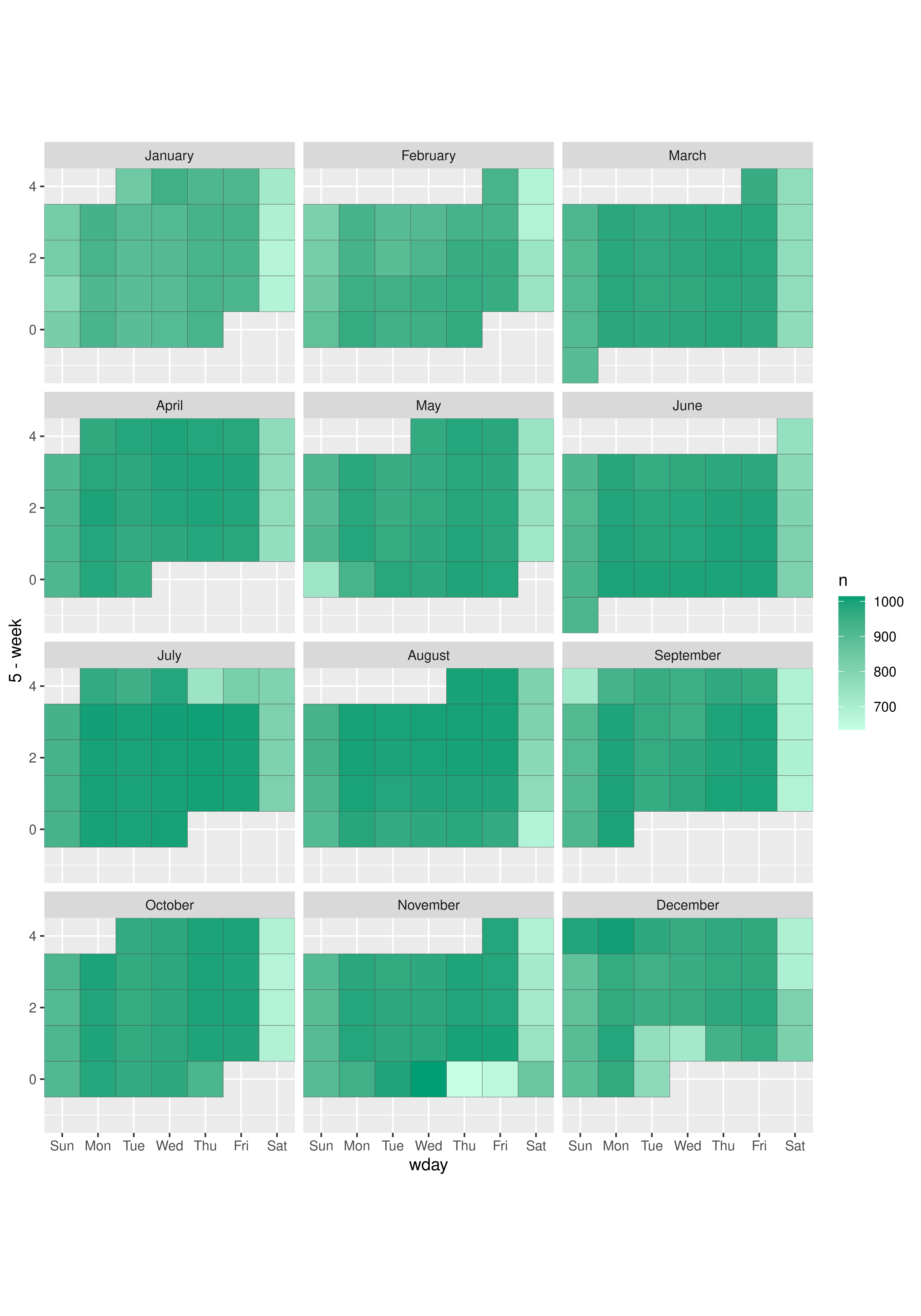
## # ℹ 355 more rowsCreate first faceted plot
labels_color <- 'grey30'

date_counts_w_labels |>
  ggplot(aes(wday, 5 - week)) +
  geom_tile(
    aes(fill = n),
    col = labels_color
  ) +
  facet_wrap(vars(month), ncol = 3)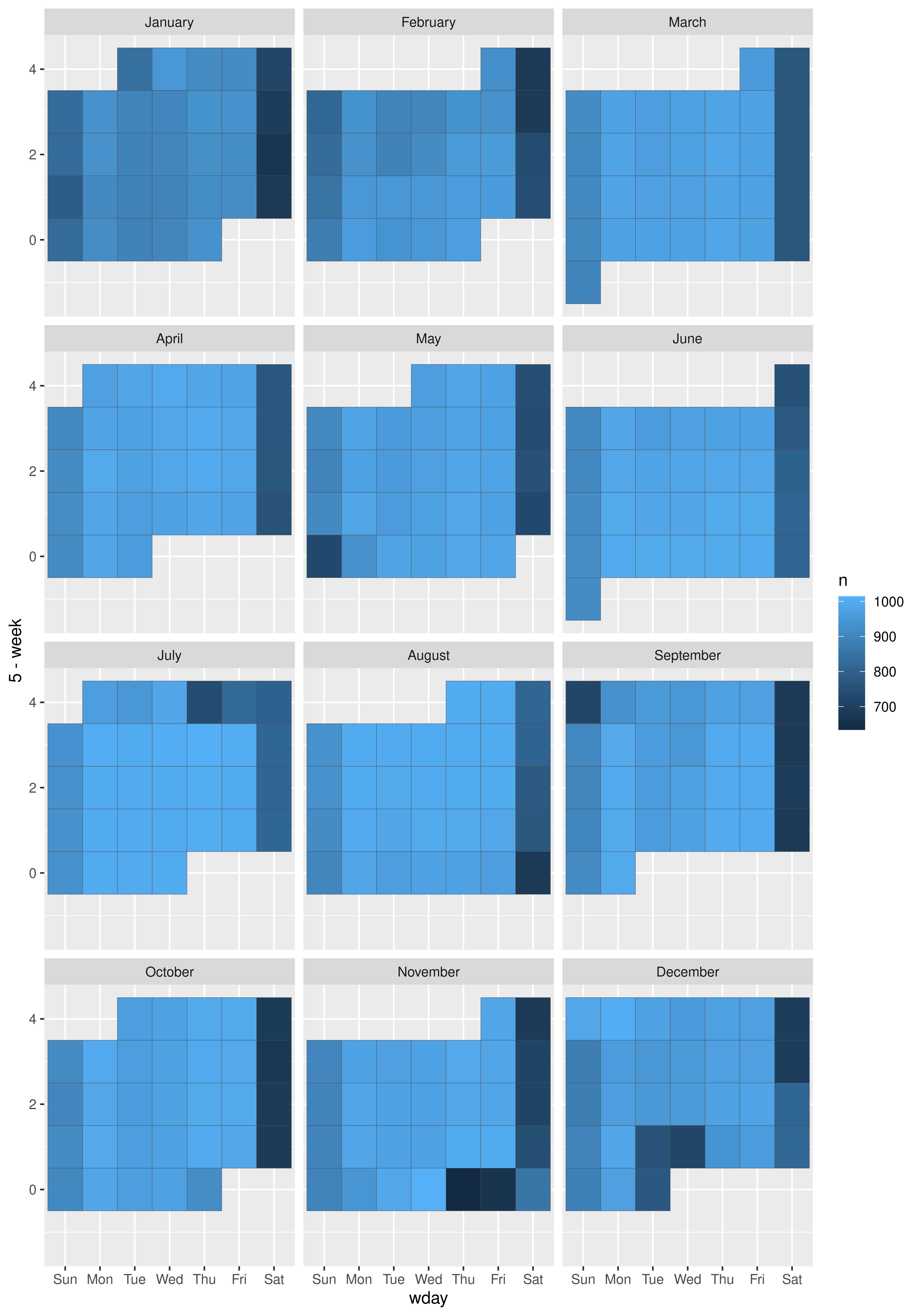
Make shapes square-ish
labels_color <- 'grey30'

date_counts_w_labels |>
  ggplot(aes(wday, 5 - week)) +
  geom_tile(
    aes(fill = n),
    col = labels_color
  ) +
  facet_wrap(vars(month), ncol = 3) +
coord_equal(expand = FALSE) 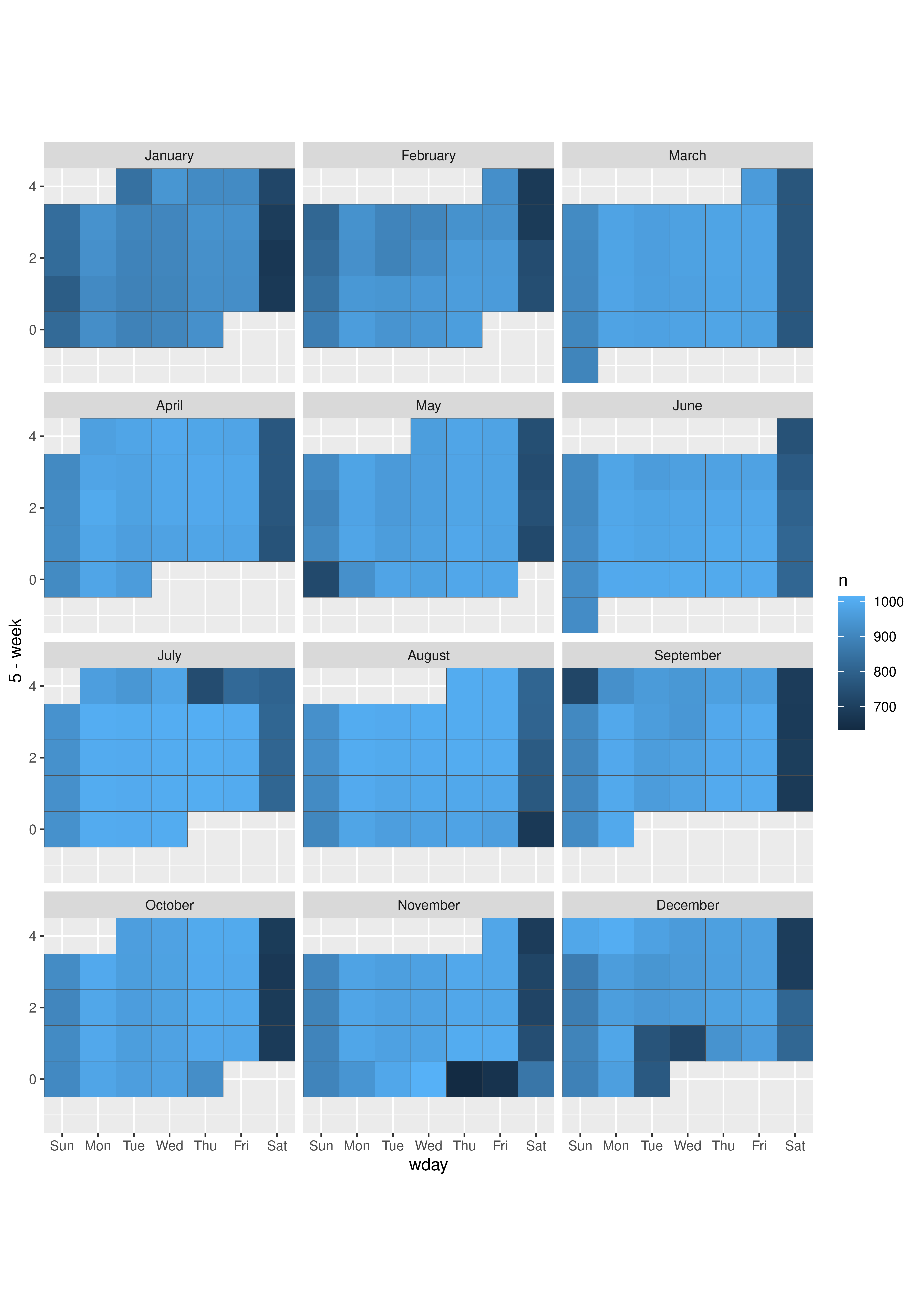
Make nicer color
labels_color <- 'grey30'
schedueled_color <- '#009E73'

date_counts_w_labels |>
  ggplot(aes(wday, 5 - week)) +
  geom_tile(
    aes(fill = n),
    col = labels_color
  ) +
  facet_wrap(vars(month), ncol = 3) +
  coord_equal(expand = FALSE) +
  scale_fill_gradient(
    high = schedueled_color,
    low = colorspace::lighten(schedueled_color, 0.9),
  )
Remove grid lines
labels_color <- 'grey30'
schedueled_color <- '#009E73'

date_counts_w_labels |>
  ggplot(aes(wday, 5 - week)) +
  geom_tile(
    aes(fill = n),
    col = labels_color
  ) +
  facet_wrap(vars(month), ncol = 3) +
  coord_equal(expand = FALSE) +
  scale_fill_gradient(
    high = schedueled_color,
    low = colorspace::lighten(schedueled_color, 0.9),
  ) +
theme_void() 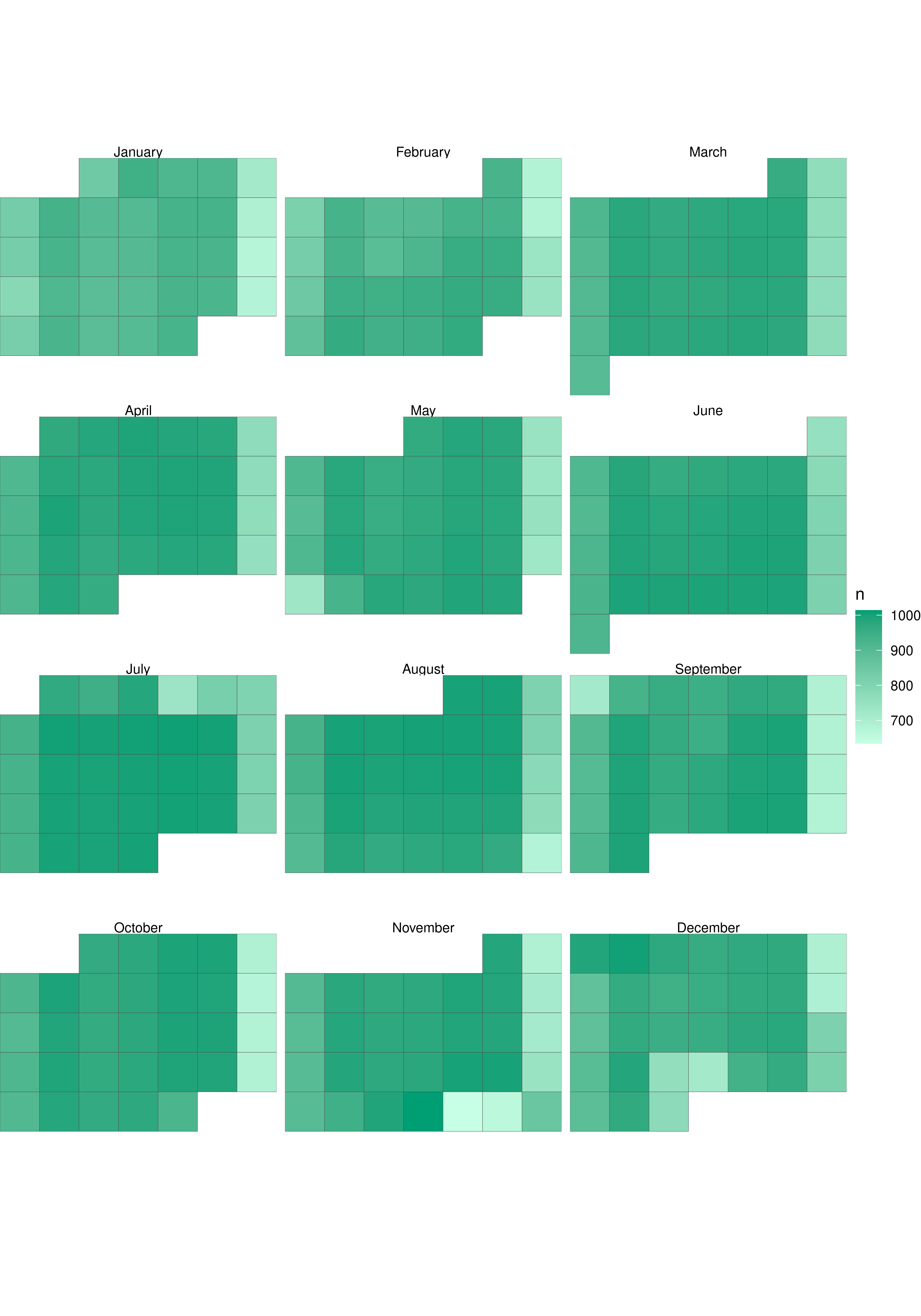
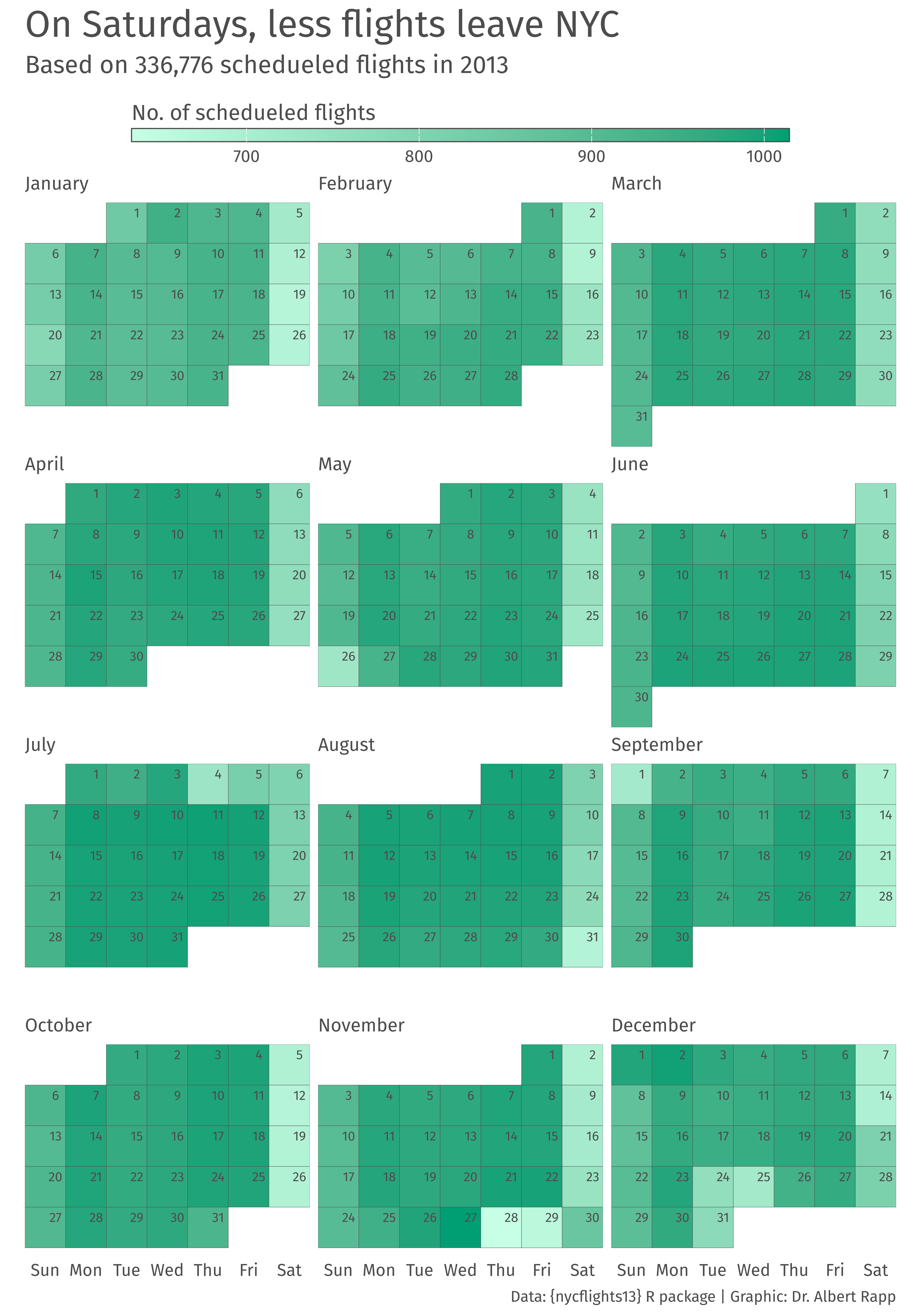
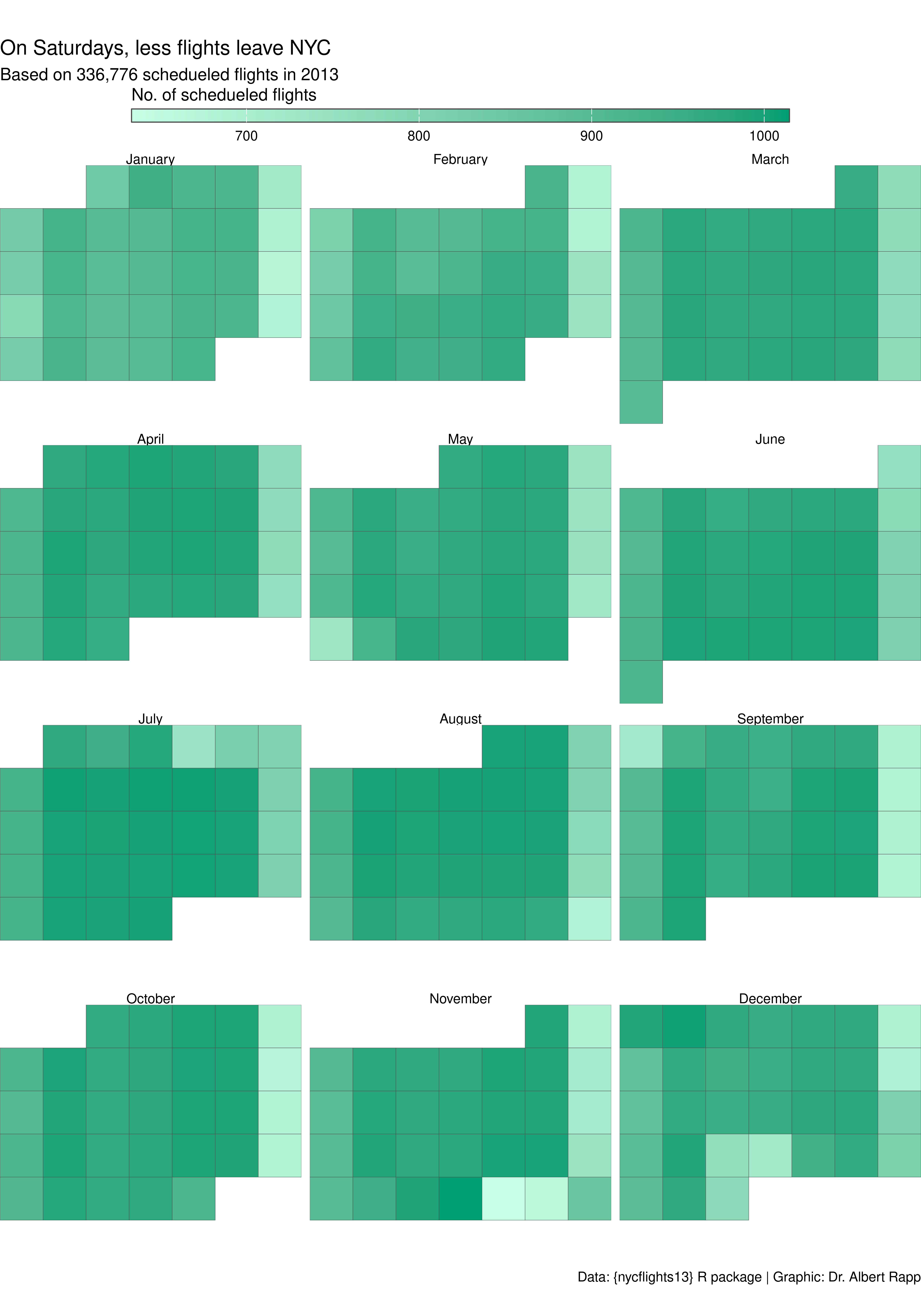
Add titles, caption, and subtitle
labels_color <- 'grey30'
schedueled_color <- '#009E73'

date_counts_w_labels |>
  ggplot(aes(wday, 5 - week)) +
  geom_tile(
    aes(fill = n),
    col = labels_color
  ) +
  facet_wrap(vars(month), ncol = 3) +
  coord_equal(expand = FALSE) +
  scale_fill_gradient(
    high = schedueled_color,
    low = colorspace::lighten(schedueled_color, 0.9),
  ) +
  theme_void() +
  labs(
    title = 'On Saturdays, less flights leave NYC',
    subtitle = 'Based on 336,776 schedueled flights in 2013',
    fill = 'No. of schedueled flights',
    caption = 'Data: {nycflights13} R package | Graphic: Dr. Albert Rapp'
  )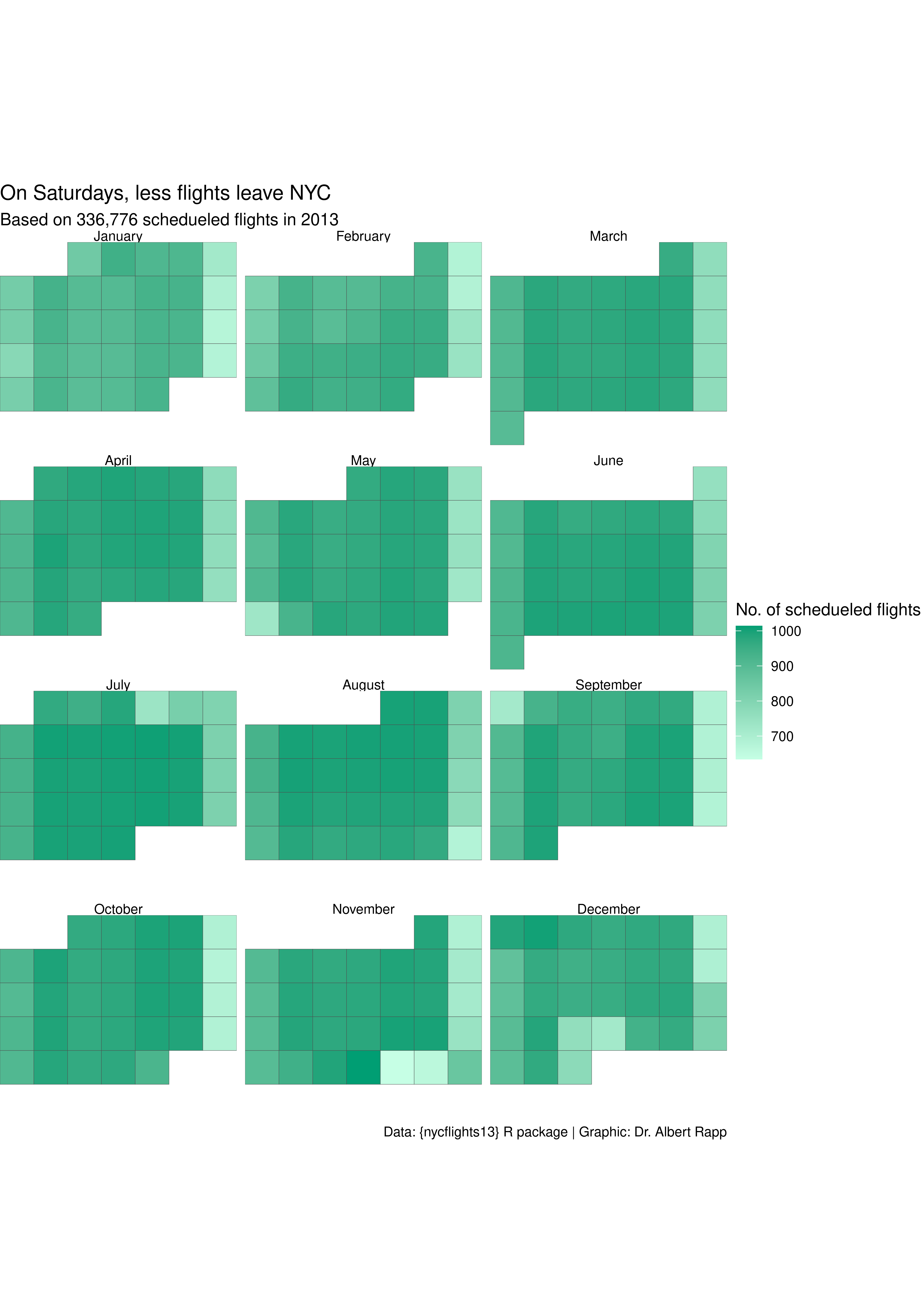
Move legend to top
labels_color <- 'grey30'
schedueled_color <- '#009E73'

date_counts_w_labels |>
  ggplot(aes(wday, 5 - week)) +
  geom_tile(
    aes(fill = n),
    col = labels_color
  ) +
  facet_wrap(vars(month), ncol = 3) +
  coord_equal(expand = FALSE) +
  scale_fill_gradient(
    high = schedueled_color,
    low = colorspace::lighten(schedueled_color, 0.9),
  ) +
  theme_void() +
  labs(
    title = 'On Saturdays, less flights leave NYC',
    subtitle = 'Based on 336,776 schedueled flights in 2013',
    fill = 'No. of schedueled flights',
    caption = 'Data: {nycflights13} R package | Graphic: Dr. Albert Rapp'
  ) +
  theme(
    legend.position = 'top'
  )
Style legend
labels_color <- 'grey30'
schedueled_color <- '#009E73'
bar_width_cm <- 15
bar_height_cm <- 0.3

date_counts_w_labels |>
  ggplot(aes(wday, 5 - week)) +
  geom_tile(
    aes(fill = n),
    col = labels_color
  ) +
  facet_wrap(vars(month), ncol = 3) +
  coord_equal(expand = FALSE) +
  scale_fill_gradient(
    high = schedueled_color,
    low = colorspace::lighten(schedueled_color, 0.9),
  ) +
  theme_void() +
  labs(
    title = 'On Saturdays, less flights leave NYC',
    subtitle = 'Based on 336,776 schedueled flights in 2013',
    fill = 'No. of schedueled flights',
    caption = 'Data: {nycflights13} R package | Graphic: Dr. Albert Rapp'
  ) +
  theme(
    legend.position = 'top'
  ) +
  guides(
    fill = guide_colorbar(
      barwidth = unit(bar_width_cm, 'cm'),
      barheight = unit(bar_height_cm, 'cm'),
      title.position = 'top',
      title.hjust = 0,
      title.vjust = 0,
      frame.colour = labels_color
    )
) 
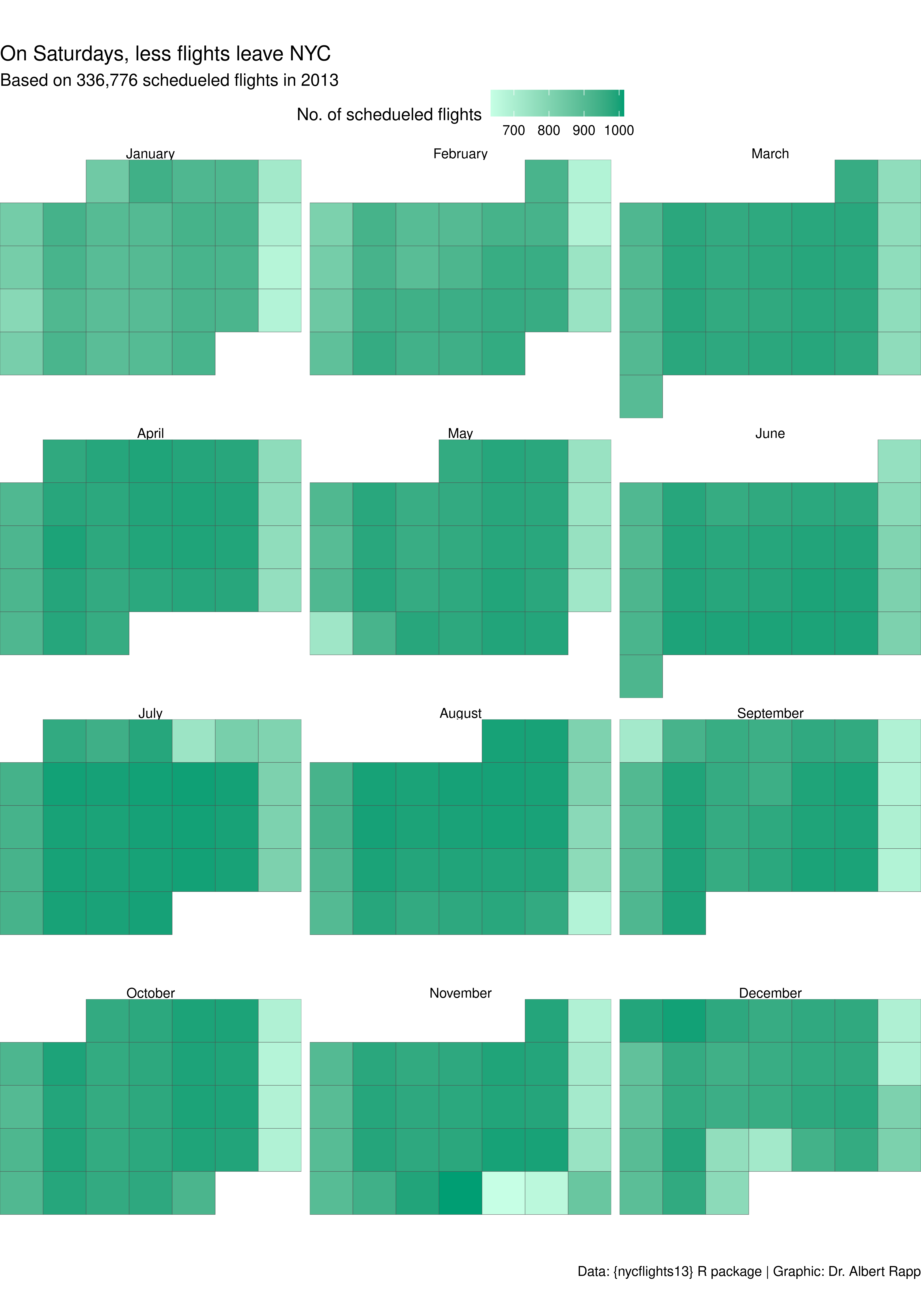
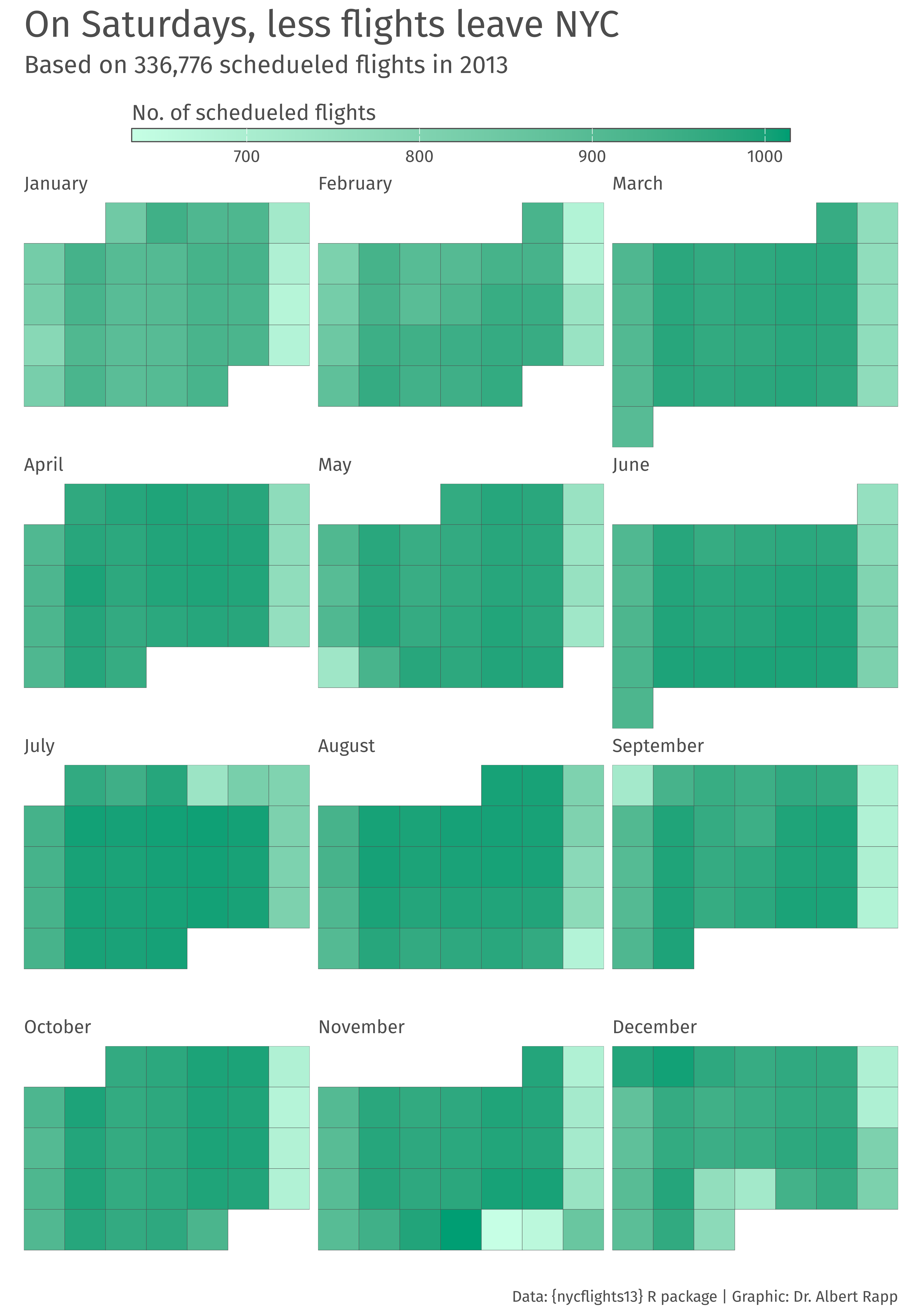
Style texts & spacing
labels_color <- 'grey30'
schedueled_color <- '#009E73'
bar_width_cm <- 15
bar_height_cm <- 0.3
font_family <- 'Fira Sans'
bar_labels_size <- 11
month_size <- 12

date_counts_w_labels |>
  ggplot(aes(wday, 5 - week)) +
  geom_tile(
    aes(fill = n),
    col = labels_color
  ) +
  facet_wrap(vars(month), ncol = 3) +
  coord_equal(expand = FALSE) +
  scale_fill_gradient(
    high = schedueled_color,
    low = colorspace::lighten(schedueled_color, 0.9),
  ) +
  theme_void() +
  labs(
    title = 'On Saturdays, less flights leave NYC',
    subtitle = 'Based on 336,776 schedueled flights in 2013',
    fill = 'No. of schedueled flights',
    caption = 'Data: {nycflights13} R package | Graphic: Dr. Albert Rapp'
  ) +
  theme(
    legend.position = 'top',
    text = element_text(
      color = labels_color,
      family = font_family
    ),
    plot.title = element_text(
      size = 24,
      margin = margin(t = 0.25, b = 0.25, unit = 'cm')
    ),
    plot.subtitle = element_text(
      size = 16,
      margin = margin(b = 0.5, unit = 'cm')
    ),
    plot.caption = element_text(
      size = 10,
      margin = margin(b = 0.25, unit = 'cm')
    ),
    legend.text = element_text(size = bar_labels_size),
    legend.title = element_text(size = 14),
    strip.text = element_text(
      hjust = 0,
      size = month_size,
      margin = margin(b = 0.25, unit = 'cm')
    )
  ) +
  guides(
    fill = guide_colorbar(
      barwidth = unit(bar_width_cm, 'cm'),
      barheight = unit(bar_height_cm, 'cm'),
      title.position = 'top',
      title.hjust = 0,
      title.vjust = 0,
      frame.colour = labels_color
    )
) 
Add text labels into the boxes
labels_color <- 'grey30'
schedueled_color <- '#009E73'
bar_width_cm <- 15
bar_height_cm <- 0.3
font_family <- 'Fira Sans'
bar_labels_size <- 11
month_size <- 12
nudge_labels <- 0.25
labels_size <- 3

date_counts_w_labels |>
  ggplot(aes(wday, 5 - week)) +
  geom_tile(
    aes(fill = n),
    col = labels_color
  ) +
  geom_text(
    aes(label = day),
    nudge_x = nudge_labels,
    nudge_y = nudge_labels,
    col = labels_color,
    size = labels_size,
    family = font_family
  ) +
  facet_wrap(vars(month), ncol = 3) +
  coord_equal(expand = FALSE) +
  scale_fill_gradient(
    high = schedueled_color,
    low = colorspace::lighten(schedueled_color, 0.9),
  ) +
  theme_void() +
  labs(
    title = 'On Saturdays, less flights leave NYC',
    subtitle = 'Based on 336,776 schedueled flights in 2013',
    fill = 'No. of schedueled flights',
    caption = 'Data: {nycflights13} R package | Graphic: Dr. Albert Rapp'
  ) +
  theme(
    legend.position = 'top',
    text = element_text(
      color = labels_color,
      family = font_family
    ),
    plot.title = element_text(
      size = 24,
      margin = margin(t = 0.25, b = 0.25, unit = 'cm')
    ),
    plot.subtitle = element_text(
      size = 16,
      margin = margin(b = 0.5, unit = 'cm')
    ),
    plot.caption = element_text(
      size = 10,
      margin = margin(b = 0.25, unit = 'cm')
    ),
    legend.text = element_text(size = bar_labels_size),
    legend.title = element_text(size = 14),
    strip.text = element_text(
      hjust = 0,
      size = month_size,
      margin = margin(b = 0.25, unit = 'cm')
    )
  ) +
  guides(
    fill = guide_colorbar(
      barwidth = unit(bar_width_cm, 'cm'),
      barheight = unit(bar_height_cm, 'cm'),
      title.position = 'top',
      title.hjust = 0,
      title.vjust = 0,
      frame.colour = labels_color
    )
) 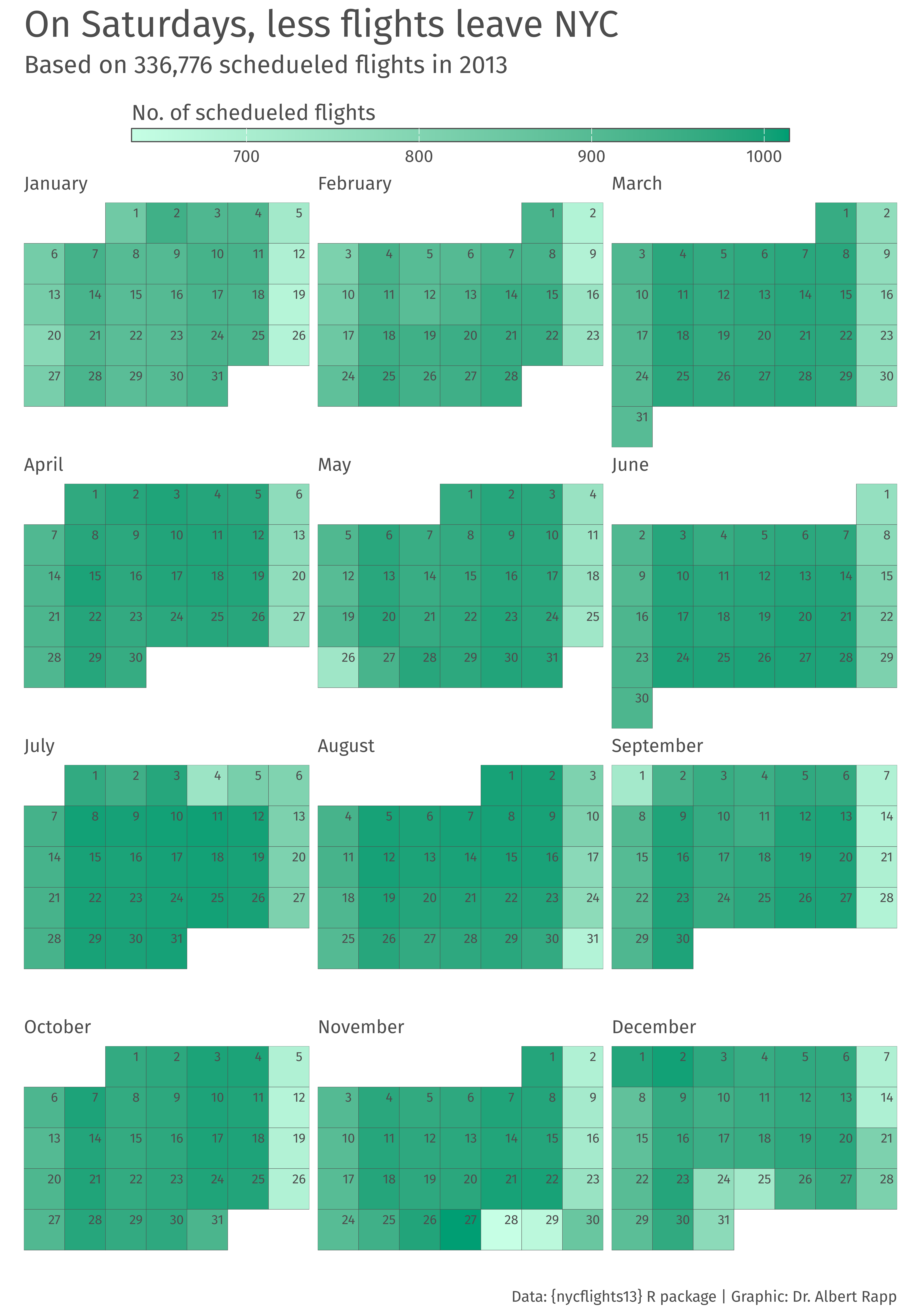
Add Weekday labels back in
labels_color <- 'grey30'
schedueled_color <- '#009E73'
bar_width_cm <- 15
bar_height_cm <- 0.3
font_family <- 'Fira Sans'
bar_labels_size <- 11
month_size <- 12
nudge_labels <- 0.25
labels_size <- 3

date_counts_w_labels |>
  ggplot(aes(wday, 5 - week)) +
  geom_tile(
    aes(fill = n),
    col = labels_color
  ) +
  geom_text(
    aes(label = day),
    nudge_x = nudge_labels,
    nudge_y = nudge_labels,
    col = labels_color,
    size = labels_size,
    family = font_family
  ) +
  facet_wrap(vars(month), ncol = 3) +
  coord_equal(expand = FALSE) +
  scale_fill_gradient(
    high = schedueled_color,
    low = colorspace::lighten(schedueled_color, 0.9),
  ) +
  theme_void() +
  labs(
    title = 'On Saturdays, less flights leave NYC',
    subtitle = 'Based on 336,776 schedueled flights in 2013',
    fill = 'No. of schedueled flights',
    caption = 'Data: {nycflights13} R package | Graphic: Dr. Albert Rapp'
  ) +
  theme(
    legend.position = 'top',
    text = element_text(
      color = labels_color,
      family = font_family
    ),
    plot.title = element_text(
      size = 24,
      margin = margin(t = 0.25, b = 0.25, unit = 'cm')
    ),
    plot.subtitle = element_text(
      size = 16,
      margin = margin(b = 0.5, unit = 'cm')
    ),
    plot.caption = element_text(
      size = 10,
      margin = margin(b = 0.25, unit = 'cm')
    ),
    legend.text = element_text(size = bar_labels_size),
    legend.title = element_text(size = 14),
    strip.text = element_text(
      hjust = 0,
      size = month_size,
      margin = margin(b = 0.25, unit = 'cm')
    ),
    axis.text.x = element_text(
      margin = margin(t = -0.6, b = 0.3, unit = 'cm')
    )
  ) +
  guides(
    fill = guide_colorbar(
      barwidth = unit(bar_width_cm, 'cm'),
      barheight = unit(bar_height_cm, 'cm'),
      title.position = 'top',
      title.hjust = 0,
      title.vjust = 0,
      frame.colour = labels_color
    )
  )