library(htmltools)
div(
  style = css(
    width = '300px',
    height = '300px',
    background = 'lightgrey'
  ),
  div(
    style = css(
      width = '50px',
      height = '50px',
      border = '1px solid #333333',
      background = 'red'
    )
  ),
  div(
    style = css(
      width = '50px',
      height = '50px',
      border = '1px solid #333333',
      background = 'red'
    )
  ),
  div(
    style = css(
      width = '50px',
      height = '50px',
      border = '1px solid #333333',
      background = 'red'
    )
  )
) |>
  div(style = 'all: initial', br()) |>
browsable()WebDev4R: Flexbox
WebDev
There’s two major systems in CSS for aligning things. These are
flexbox and grid. Both of them are really useful to know. In this blog post, I’ll show you how flexbox works.
There are two major systems to align things in CSS. These are flexbox and grid layout. Both of them are really useful to know to have any chance to make nice websites or apps. And today we’re going to focus on flexbox. And as always, if you want to see the video version of this blog post, you can find it on my YouTube channel:
INSERT VIDEO HERE
What is flexbox?
flexbox is a one-dimensional layout method for laying out items in rows or columns. You can trigger it by setting the display property of the parent element to flex. Let me show you how that looks with {htmltools}. First, let’s create a rectangle with a bunch of squares inside without using flexbox:
Notice, how by default the squares are stacked on top of each other. But the moment we use flexbox, they are aligned in a row:
div(
  style = css(
    display = 'flex', ## Change here
    width = '300px',
    height = '300px',
    background = 'lightgrey'
  ),
  div(
    style = css(
      width = '50px',
      height = '50px',
      border = '1px solid #333333',
      background = 'red'
    )
  ),
  div(
    style = css(
      width = '50px',
      height = '50px',
      border = '1px solid #333333',
      background = 'red'
    )
  ),
  div(
    style = css(
      width = '50px',
      height = '50px',
      border = '1px solid #333333',
      background = 'red'
    )
  )
) |>
  div(style = 'all: initial', br()) |>
  browsable()
Neat, huh? This is a great way to align things in a row.
Center with flexbox
Within flexbox, you can also control the spacing between the items. Let’s focus on centering things within a parent container first. This is done by setting the justify-content and/or align-items properties to center. The first property controls the spacing along the main axis, and the second one controls the spacing along the cross axis. Sounds complicated, right? Let me show you how it works with a simple example. First, let’s throw in a justify-content (remember in {htmltools} it’s justify_content) and set it to center:
div(
  style = css(
    display = 'flex',
    justify_content = 'center', ## Change here
    width = '300px',
    height = '300px',
    background = 'lightgrey'
  ),
  div(
    style = css(
      width = '50px',
      height = '50px',
      border = '1px solid #333333',
      background = 'red'
    )
  ),
  div(
    style = css(
      width = '50px',
      height = '50px',
      border = '1px solid #333333',
      background = 'red'
    )
  ),
  div(
    style = css(
      width = '50px',
      height = '50px',
      border = '1px solid #333333',
      background = 'red'
    )
  )
) |>
  div(style = 'all: initial', br()) |>
  browsable()
Notice how the squares are now centered horizontally. By default, the horizontal axis is the main axis. But you can also change the main axis to the vertical axis. To do so, you have to set the flex-direction property to column:
div(
  style = css(
    display = 'flex',
    justify_content = 'center',
    flex_direction = 'column', ## Change here
    width = '300px',
    height = '300px',
    background = 'lightgrey'
  ),
  div(
    style = css(
      width = '50px',
      height = '50px',
      border = '1px solid #333333',
      background = 'red'
    )
  ),
  div(
    style = css(
      width = '50px',
      height = '50px',
      border = '1px solid #333333',
      background = 'red'
    )
  ),
  div(
    style = css(
      width = '50px',
      height = '50px',
      border = '1px solid #333333',
      background = 'red'
    )
  )
) |>
  div(style = 'all: initial', br()) |>
  browsable()
Now, to center along the other axis as well, you can use the align-items property.
div(
  style = css(
    display = 'flex',
    justify_content = 'center',
    align_items = 'center', ## Change here
    flex_direction = 'column',
    width = '300px',
    height = '300px',
    background = 'lightgrey'
  ),
  div(
    style = css(
      width = '50px',
      height = '50px',
      border = '1px solid #333333',
      background = 'red'
    )
  ),
  div(
    style = css(
      width = '50px',
      height = '50px',
      border = '1px solid #333333',
      background = 'red'
    )
  ),
  div(
    style = css(
      width = '50px',
      height = '50px',
      border = '1px solid #333333',
      background = 'red'
    )
  )
) |>
  div(style = 'all: initial', br()) |>
  browsable()
Notice how this is different from the output if the flex-direction is left at it’s default value.
div(
  style = css(
    display = 'flex',
    justify_content = 'center',
    align_items = 'center',
    ## Removed flex_direction here
    width = '300px',
    height = '300px',
    background = 'lightgrey'
  ),
  div(
    style = css(
      width = '50px',
      height = '50px',
      border = '1px solid #333333',
      background = 'red'
    )
  ),
  div(
    style = css(
      width = '50px',
      height = '50px',
      border = '1px solid #333333',
      background = 'red'
    )
  ),
  div(
    style = css(
      width = '50px',
      height = '50px',
      border = '1px solid #333333',
      background = 'red'
    )
  )
) |>
  div(style = 'all: initial', br()) |>
  browsable()
More complex spacings
Both justify-content and align-items have more options than just center. Both can also use flex-start and flex-end. Also, for justify-content you can also use space-between and space-around. Let me show you one example of that in action.
div(
  style = css(
    display = 'flex',
    justify_content = 'space-between',
    align_items = 'flex-end',
    width = '300px',
    height = '300px',
    background = 'lightgrey'
  ),
  div(
    style = css(
      width = '50px',
      height = '50px',
      border = '1px solid #333333',
      background = 'red'
    )
  ),
  div(
    style = css(
      width = '50px',
      height = '50px',
      border = '1px solid #333333',
      background = 'red'
    )
  ),
  div(
    style = css(
      width = '50px',
      height = '50px',
      border = '1px solid #333333',
      background = 'red'
    )
  )
) |>
  div(style = 'all: initial', br()) |>
  browsable()
Neat how space-between distributed everything evenly, right? Also with flex-end the squares are now at the bottom of the parent container. But of course all of this can be quite overwhelming to remember and grasp at first. That’s why I recommend playing a little CSS game, name flexboxdefense. Here’s how it looks.
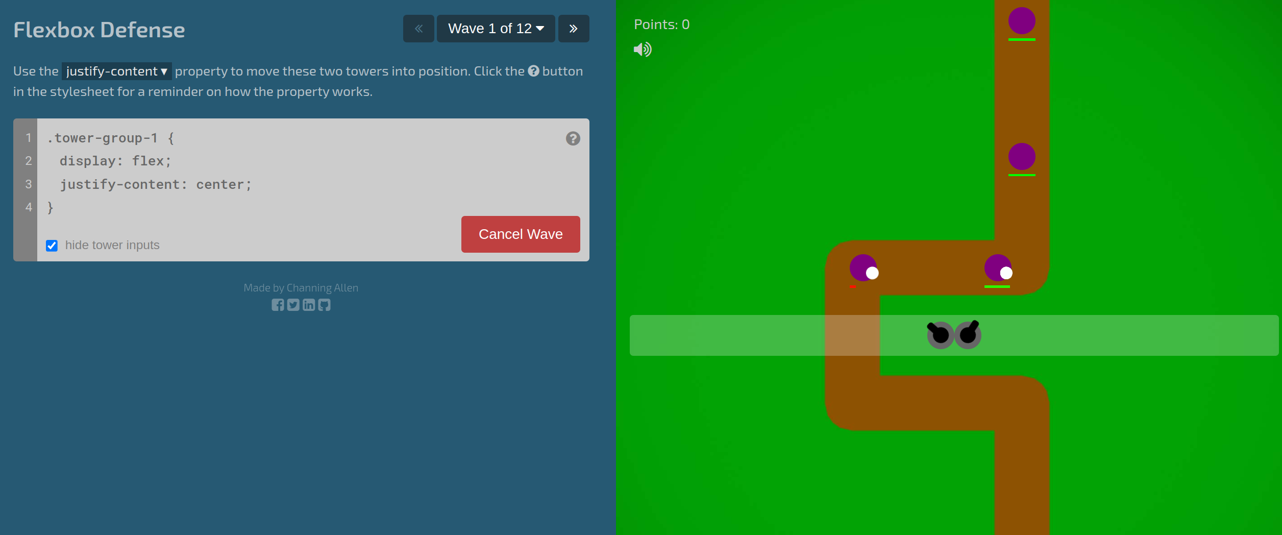
As you can see, it’s a tower defense game where you have to use CSS code and flexbox to position your towers. Personally, I think it’s a great way to learn flexbox and have fun at the same time.
Using automargins and wrapping containers
Now, before we end this blog post, I want to show you two more things. First, here’s a little trick I like to use to center things within a parent container. You can also make the container that you want to align into a flexbox and then use margin-left: auto and margin-right: auto to center it horizontally.
div(
  style = css(
    width = '300px',
    height = '300px',
    background = 'lightgrey'
    ## No flexbox on the outside
  ),
  div(
    style = css(
      width = '50px',
      height = '50px',
      border = '1px solid #333333',
      background = 'red',
      display = 'flex',      ## Change here
      margin_left = 'auto',  ## Change here
      margin_right = 'auto'  ## Change here
    )
  )
) |>
  div(style = 'all: initial', br()) |>
  browsable()
If you leave out one of margin-left or margin-right, then you can align the item to the right or left respectively. And also if you have a bunch of squares that don’t fit in one row. You can use flex-wrap to wrap containers to the next row. First, let’s look at an example without flex-wrap.
div(
  style = css(
    display = 'flex',
    width = '300px',
    height = '300px',
    background = 'lightgrey'
  ),
  div(
    style = css(
      width = '100px',
      height = '100px',
      border = '1px solid #333333',
      background = 'red'
    )
  ),
  div(
    style = css(
      width = '100px',
      height = '100px',
      border = '1px solid #333333',
      background = 'red'
    )
  ),
  div(
    style = css(
      width = '100px',
      height = '100px',
      border = '1px solid #333333',
      background = 'red'
    )
  ),
  div(
    style = css(
      width = '100px',
      height = '100px',
      border = '1px solid #333333',
      background = 'red'
    )
  )
) |>
  div(style = 'all: initial', br()) |>
  browsable()
Notice how the squares look weird. That’s because even though they are supposed to be 100px wide, they are squished together to fit into the 300px wide parent container. You can turn that off by using flex-shrink: 0 on the squares.
div(
  style = css(
    display = 'flex',
    width = '300px',
    height = '300px',
    background = 'lightgrey'
  ),
  div(
    style = css(
      width = '100px',
      height = '100px',
      border = '1px solid #333333',
      background = 'red',
      flex_shrink = 0  ## Change here
    )
  ),
  div(
    style = css(
      width = '100px',
      height = '100px',
      border = '1px solid #333333',
      background = 'red',
      flex_shrink = 0  ## Change here
    )
  ),
  div(
    style = css(
      width = '100px',
      height = '100px',
      border = '1px solid #333333',
      background = 'red',
      flex_shrink = 0  ## Change here
    )
  ),
  div(
    style = css(
      width = '100px',
      height = '100px',
      border = '1px solid #333333',
      background = 'red',
      flex_shrink = 0  ## Change here
    )
  )
) |>
  div(style = 'all: initial', br()) |>
  browsable()
But that means that the squares go out of the parent container. That’s not particularly nice. So let’s use flex-wrap on the parent container to wrap the squares to the next row.
div(
  style = css(
    display = 'flex',
    flex_wrap = 'wrap', ## Change here
    width = '300px',
    height = '300px',
    background = 'lightgrey'
  ),
  div(
    style = css(
      width = '100px',
      height = '100px',
      border = '1px solid #333333',
      background = 'red',
      flex_shrink = 0
    )
  ),
  div(
    style = css(
      width = '100px',
      height = '100px',
      border = '1px solid #333333',
      background = 'red',
      flex_shrink = 0
    )
  ),
  div(
    style = css(
      width = '100px',
      height = '100px',
      border = '1px solid #333333',
      background = 'red',
      flex_shrink = 0
    )
  ),
  div(
    style = css(
      width = '100px',
      height = '100px',
      border = '1px solid #333333',
      background = 'red',
      flex_shrink = 0
    )
  )
) |>
  div(style = 'all: initial', br()) |>
  browsable()
Nice, that looks much better, right? But we can make that even better by using justify-content to spread out the containers a little bit.
div(
  style = css(
    display = 'flex',
    flex_wrap = 'wrap',
    justify_content = 'space-around', ## Change here
    width = '300px',
    height = '300px',
    background = 'lightgrey'
  ),
  div(
    style = css(
      width = '100px',
      height = '100px',
      border = '1px solid #333333',
      background = 'red',
      flex_shrink = 0
    )
  ),
  div(
    style = css(
      width = '100px',
      height = '100px',
      border = '1px solid #333333',
      background = 'red',
      flex_shrink = 0
    )
  ),
  div(
    style = css(
      width = '100px',
      height = '100px',
      border = '1px solid #333333',
      background = 'red',
      flex_shrink = 0
    )
  ),
  div(
    style = css(
      width = '100px',
      height = '100px',
      border = '1px solid #333333',
      background = 'red',
      flex_shrink = 0
    )
  )
) |>
  div(style = 'all: initial', br()) |>
  browsable()
Conclusion
Nice! We learned a powerful concept to align things in CSS. Next week, we’re goung to look at grid layout. This is an even better system to align things on a, well, grid. Have a great day and see you next time. And if you found this helpful, here are some other ways I can help you:
- 3 Minute Wednesdays: A weekly newsletter with bite-sized tips and tricks for R users
- Insightful Data Visualizations for “Uncreative” R Users: A course that teaches you how to leverage
{ggplot2}to make charts that communicate effectively without being a design expert.