Storytelling in ggplot using rounded rectangles
Visualization
We build rebuild a ‘Storytelling with Data’ plot which uses rounded rectangles. I’ll show you an easy and a hard way to make rectangles round.
A standard ggplot output can rarely convey a powerful message. For effective data visualization you need to customize your plot. A couple of weeks ago, I showed you how.
In this blog post, I will rebuild another great data viz from scratch. If you have read my original blog post, then you won’t have to learn many new tricks. Most of the techniques that I use can be found there. This is also why I save explanations only for the parts that are new. This should keep this blog post a bit shorter. You’re welcome.
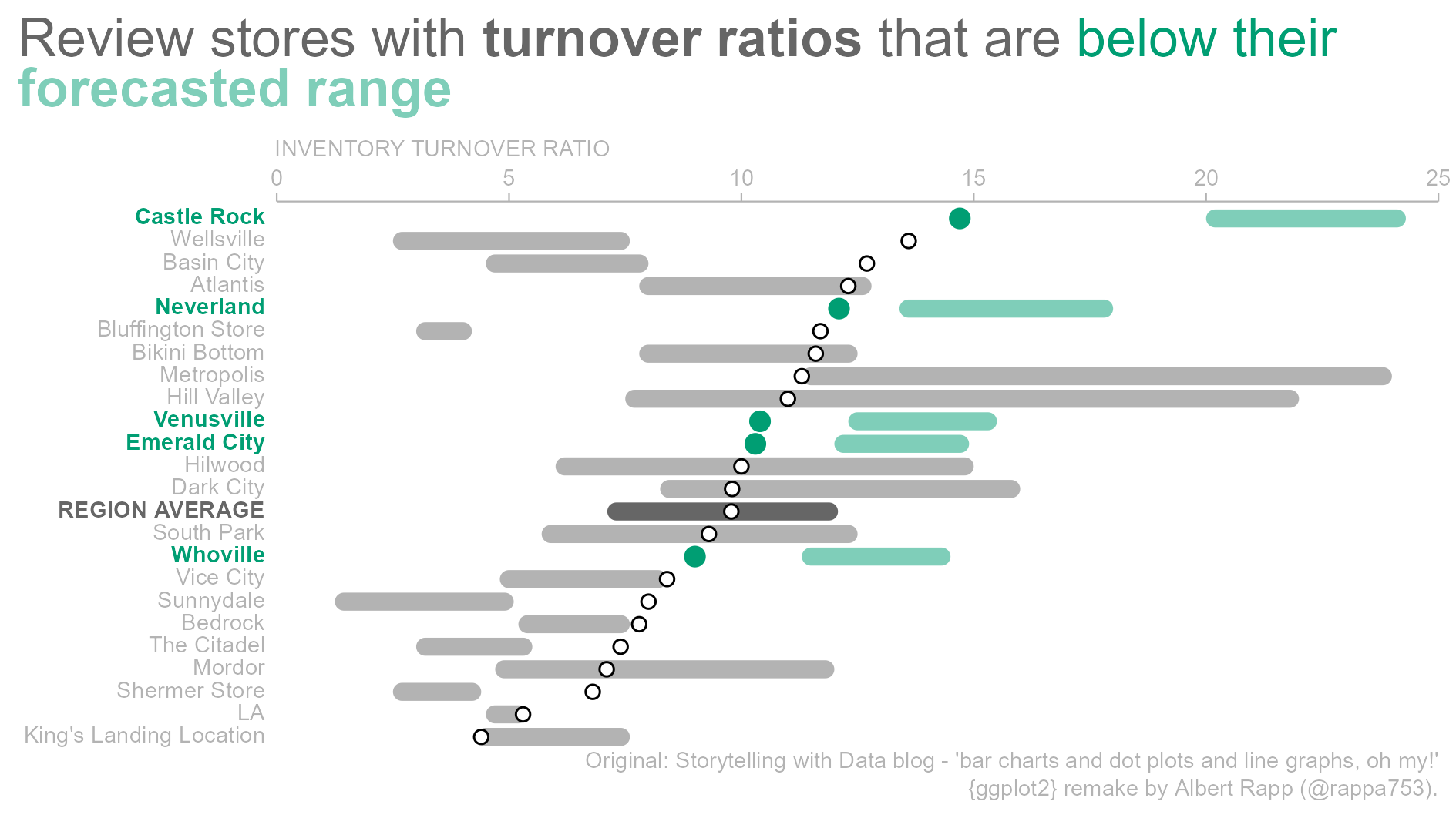
Nevertheless, in today’s installment of my ggplot2 series I will teach you something truly special. I will teach you how to create…*drum roll*…rounded rectangles. Sounds exciting, doesn’t it? Well, maybe not. But it looks great. Check out what we’ll build today.
This plot comes to you via another excellent entry of the storytelling with data (SWD) blog. To draw rectangles with rounded rectangles we can leverage the ggchicklet package. Though, for some mysterious reason, the geom_* that we need is hidden in that package. Therefore, we will have to dig it out. That’s the easy way to do it. And honestly, this is probably also the practical way to do it.
However, every now and then I want to do things the hard way. So, my dear reader, this is why I will also show you how to go from rectangles to rounded rectangles the hard way. But only after showing you the easy way first, of course. Only then, in the second part of this blog post, will I take the sadistically-inclined among you on a tour to the world of grobs.
Grobs, you say? Is that an instrument? No, Patrick, it is an graphical object. Under the hood, we can transform a ggplot to a list of graphical objects. And with a few hacks, we can adjust that list. This way, the list will contain not rectGrobs but roundrectGrobs. Then, we can put everything back together, close the hood and enjoy our round rectangles. Now, enough intro, let’s go.
Basic plot
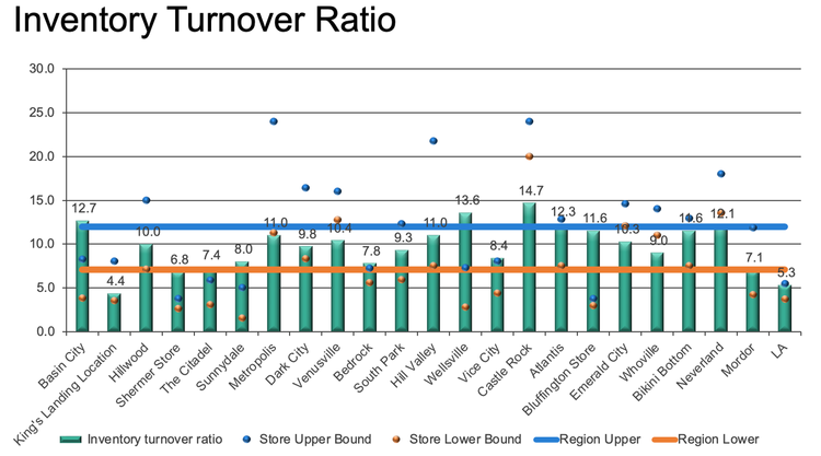
First, let us recreate the “bad” plot that the above SWD blog post remodels. In the end, we will work on the remodeled data viz too. As always, though, there is something to be learnt from creating an ugly plot. So, here’s the beast that we will build.
Read data
I didn’t find the underlying data and had to guess the values from the plot. Thus, I probably didn’t get the values exactly right. But for our purposes this should suffice. If you want, you can download the European csv-file that I created here.
library(tidyverse)
# Use read_csv2 because it's an European file
dat <- read_csv2('ratios.csv')
Compute averages
Let me point out that taking the average of the ratios may not necessarily give an appropriate result (in a statistical kind of sense). But, once again, this should not bother us as we only want to learn how to plot.
avgs <- dat %>%
  pivot_longer(
    cols = -1,
    names_to = 'type',
    values_to = 'ratio'
  ) %>%
  group_by(type) %>%
  summarise(ratio = mean(ratio)) %>%
  mutate(location = 'REGION AVERAGE')
avgs
# A tibble: 3 × 3
type ratio location
<chr> <dbl> <chr>
1 inventory_turnover 9.78 REGION AVERAGE
2 store_lower 7.11 REGION AVERAGE
3 store_upper 12.1 REGION AVERAGE### Combine with data
dat_longer <- dat %>%
pivot_longer(
cols = -1,
names_to = 'type',
values_to = 'ratio'
)
dat_longer_with_avgs <- dat_longer %>%
bind_rows(avgs)Create bars
## Colors we will use throughout this blog post
color_palette <- thematic::okabe_ito(8)

# Make sure that bars are in the same order as in the data set
dat_factored <- dat_longer %>%
  mutate(location = factor(location, levels = dat$location))

p <- dat_factored %>%
  ggplot(aes(location, ratio)) +
  geom_col(
    data = filter(dat_factored, type == 'inventory_turnover'),
    fill = color_palette[2]
  ) +
  theme_minimal()
p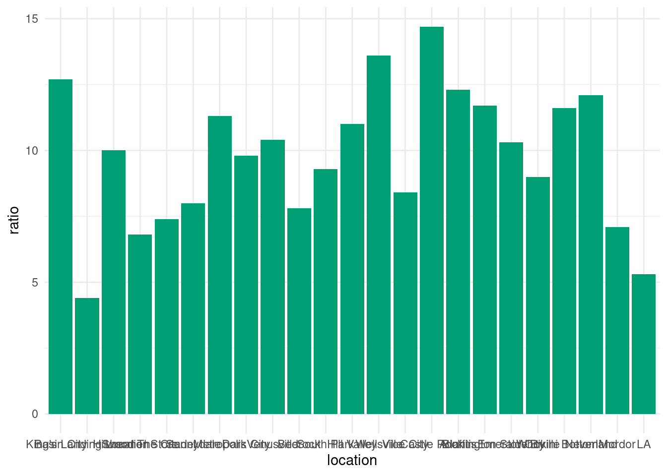
Turn labels and get rid of axis text
p <- p +
  labs(x = element_blank(), y = element_blank()) +
  theme(
    axis.text.x = element_text(angle = 50, hjust = 1)
  )
p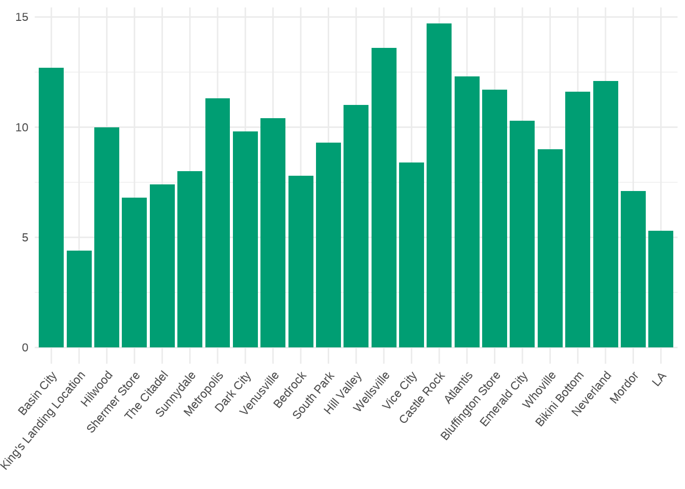
Remove expansion to get x-labels closer to the bars
p <- p + coord_cartesian(ylim = c(0, 30), expand = F)
p
Remove other grid lines
p <- p +
  theme(
    panel.grid.minor = element_blank(),
    panel.grid.major.x = element_blank(),
    panel.grid.major.y = element_line(colour = 'black', size = 0.75)
  )
p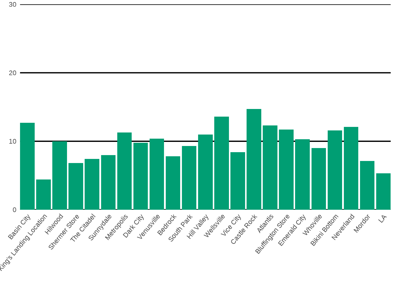
Format y-axis
p <- p +
  scale_y_continuous(
    breaks = seq(0, 30, 5),
    labels = scales::label_comma(accuracy = 0.1)
  )
p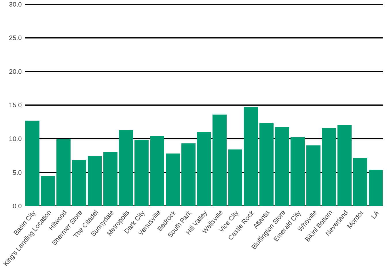
Add points
p <- p +
  geom_point(
    data = filter(dat_factored, type == 'store_lower'),
    col = color_palette[1],
    size = 3
  ) +
  geom_point(
    data = filter(dat_factored, type == 'store_upper'),
    col = color_palette[3],
    size = 3
  )
p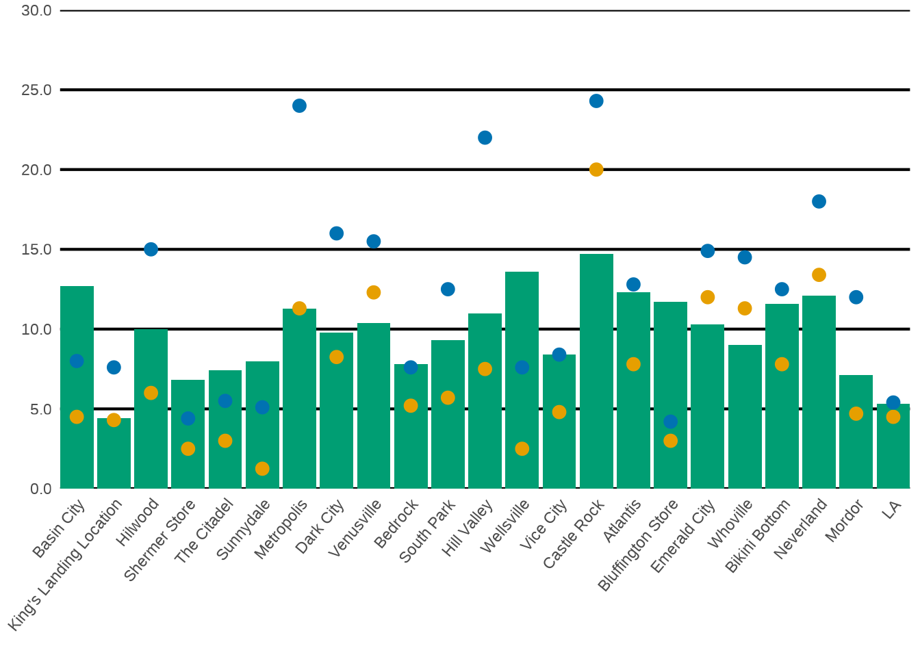
Add average lines
p <- p +
  geom_hline(
    yintercept = avgs[[3, 'ratio']],
    size = 2.5,
    col = color_palette[3]
  ) +
  geom_hline(
    yintercept = avgs[[2, 'ratio']],
    size = 2.5,
    col = color_palette[1]
  )
p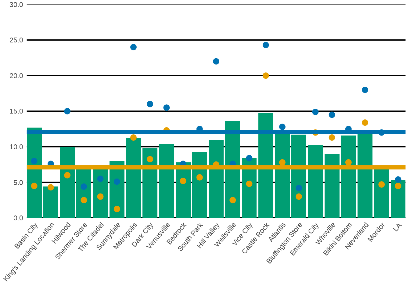
Add text labels
p +
  geom_text(
    data = filter(dat_factored, type == 'inventory_turnover'),
    aes(label = scales::comma(ratio, accuarcy = 0.1)),
    nudge_y = 0.8,
    size = 2.5
  )
Improved plot
Now, let us begin building the improved plot. First, let us get the long labels onto the y-axis and use regular rectangles before we worry about the rounded rectangles.
Flip axes and use rectangles to show upper and lower bounds.
Unfortunately, geom_rect() does not work as intended.
dat_with_avgs <- dat_longer_with_avgs %>%
  pivot_wider(
    names_from = 'type',
    values_from = 'ratio'
  )

dat_with_avgs %>%
  ggplot() +
  geom_rect(
    aes(
      xmin = store_lower,
      xmax = store_upper,
      ymin = location,
      ymax = location
    )
  )
Instead, let us create a new numeric column containing a location’s rank based on its inventory_turnover. This is done with row_number(). While we’re at it, let us create a new tibble that also contains information on the colors each geom will use. Then, we can map to these new columns in ggplot and make sure that the values are used as is by setting scale_*_identity(). This is one convenient way to control the aesthetics of each geom without functional programming. With the image from above in mind, we know that our final plot will need
- different
col,fillandsizevalues ingeom_point() - different
fillandalphavalues ingeom_rect()
Here’s what this tibble looks like.
bar_height <- 0.4
no_highlight_col <- 'grey70'
average_highlight_col <- 'grey40'
below_highlight <- color_palette[2]

sorted_dat <- dat_with_avgs %>%
  mutate(num = row_number(inventory_turnover)) %>%
  # Sort so that everything is in order of rank
  # Important for text labels later on
  arrange(desc(num)) %>%
  mutate(
    rect_color = case_when(
      inventory_turnover < store_lower ~ below_highlight,
      location == 'REGION AVERAGE' ~ average_highlight_col,
      T ~ no_highlight_col
    ),
    rect_alpha = if_else(
      inventory_turnover < store_lower,
      0.5,
      1
    ),
    point_color = if_else(
      inventory_turnover < store_lower,
      below_highlight,
      'black'
    ),
    point_fill = if_else(
      inventory_turnover < store_lower,
      below_highlight,
      'white'
    ),
    point_size = if_else(
      inventory_turnover < store_lower,
      3,
      2
    )
  )
sorted_dat
# A tibble: 24 × 10
locat…¹ inven…² store…³ store…⁴ num rect_…⁵ rect_…⁶ point…⁷ point…⁸ point…⁹
<chr> <dbl> <dbl> <dbl> <int> <chr> <dbl> <chr> <chr> <dbl>
1 Castle… 14.7 24.3 20 24 #009E73 0.5 #009E73 #009E73 3
2 Wellsv… 13.6 7.6 2.5 23 grey70 1 black white 2
3 Basin … 12.7 8 4.5 22 grey70 1 black white 2
4 Atlant… 12.3 12.8 7.8 21 grey70 1 black white 2
5 Neverl… 12.1 18 13.4 20 #009E73 0.5 #009E73 #009E73 3
6 Bluffi… 11.7 4.2 3 19 grey70 1 black white 2
7 Bikini… 11.6 12.5 7.8 18 grey70 1 black white 2
8 Metrop… 11.3 24 11.3 17 grey70 1 black white 2
9 Hill V… 11 22 7.5 16 grey70 1 black white 2
10 Venusv… 10.4 15.5 12.3 15 #009E73 0.5 #009E73 #009E73 3
# … with 14 more rows, and abbreviated variable names ¹location,
# ²inventory_turnover, ³store_upper, ⁴store_lower, ⁵rect_color, ⁶rect_alpha,
# ⁷point_color, ⁸point_fill, ⁹point_size
# ℹ Use `print(n = ...)` to see more rowsNow, we can create our plot. Notice that I set shape = 21 in geom_point() to use both the fill and col aesthetic.
sorted_dat %>%
  ggplot() +
  geom_rect(
    aes(
      xmin = store_lower,
      xmax = store_upper,
      ymin = num - bar_height,
      ymax = num + bar_height,
      fill = rect_color,
      alpha = rect_alpha
    ),
  ) +
  geom_point(
    aes(
      x = inventory_turnover,
      y = num,
      fill = point_fill,
      col = point_color,
      size = point_size
    ),
    shape = 21,
    stroke = 1
  ) +
  scale_fill_identity() +
  scale_color_identity() +
  scale_size_identity() +
  scale_alpha_identity() +
  theme_minimal()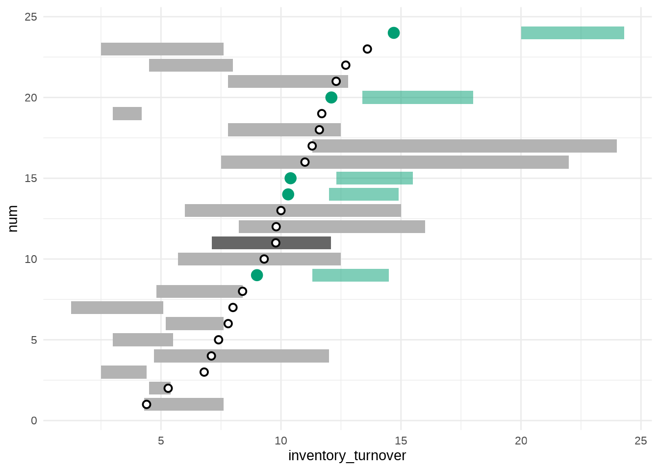
Use ggchicklet for rounded rectangles
The whole point of this blog post is to use rounded rectangles. So let’s do that. The ggchicklet package has a geom called geom_rrect(). It works just like geom_rect() but accepts another value r which is used to determine the radius of the rounded rectangles. Unfortunately, this geom is not an exported function of this package. This means that if you write ggchicklet:: (e.g. in RStudio) and press TAB you won’t see geom_rrect(). Thus, you have to access the internal function via ::: (three colons).
p <- sorted_dat %>%
  ggplot() +
  ggchicklet:::geom_rrect(
    aes(
      xmin = store_lower,
      xmax = store_upper,
      ymin = num - bar_height,
      ymax = num + bar_height,
      fill = rect_color,
      alpha = rect_alpha
    ),
    # Use relative npc unit (values between 0 and 1)
    # This ensures that radius is not too large for your canvas
    r = unit(0.5, 'npc')
  ) +
  geom_point(
    aes(
      x = inventory_turnover,
      y = num,
      fill = point_fill,
      col = point_color,
      size = point_size
    ),
    shape = 21,
    stroke = 1
  ) +
  scale_fill_identity() +
  scale_color_identity() +
  scale_size_identity() +
  scale_alpha_identity() +
  theme_minimal()
p
Remove grid lines, move axis and add some text elements
We will set the y-axis labels manually later on. Otherwise, we cannot change its colors one-by-one. For now, let’s get rid of superfluous grid lines, move the x-axis and add a title.
Notice that I draw the axis line manually with a segment annotation. This seems weird, I know. Unfortunately, it cannot be helped because I still need room for the y-axis labels. And if I do not plot the axis line manually, then the axis line will start all the way to the left. Make sure that you set clip = 'off' in coord_cartesian() for the annotation to be displayed.
title_lab <- 'Review stores with turnover ratios that are below their\nforecasted range'
title_size <- 14
axis_label_size <- 8
text_size <- 18
p <- p +
  scale_x_continuous(
    breaks = seq(0, 25, 5),
    position = 'top'
  ) +
  coord_cartesian(
    xlim = c(-5, 25),
    ylim = c(0.75, 24.75),
    expand = F,
    clip = 'off'
  ) +
  annotate(
    'segment',
    x = 0,
    xend = 25,
    y = 24.75,
    yend = 24.75,
    col = no_highlight_col,
    size = 0.25
  ) +
  labs(
    x = 'INVENTORY TURNOVER RATIO',
    y = element_blank(),
    title = title_lab
  ) +
  theme(
    text = element_text(
      size = text_size,
      color = average_highlight_col
    ),
    plot.title.position = 'plot',
    panel.grid = element_blank(),
    axis.title.x = element_text(
      size = axis_label_size,
      hjust = 0.21,
      color = no_highlight_col
    ),
    axis.text.x = element_text(
      size = axis_label_size,
      color = no_highlight_col
    ),
    axis.ticks.x = element_line(color = no_highlight_col, size = 0.25),
    axis.text.y = element_blank(),
    axis.line.x = element_blank()
  )
p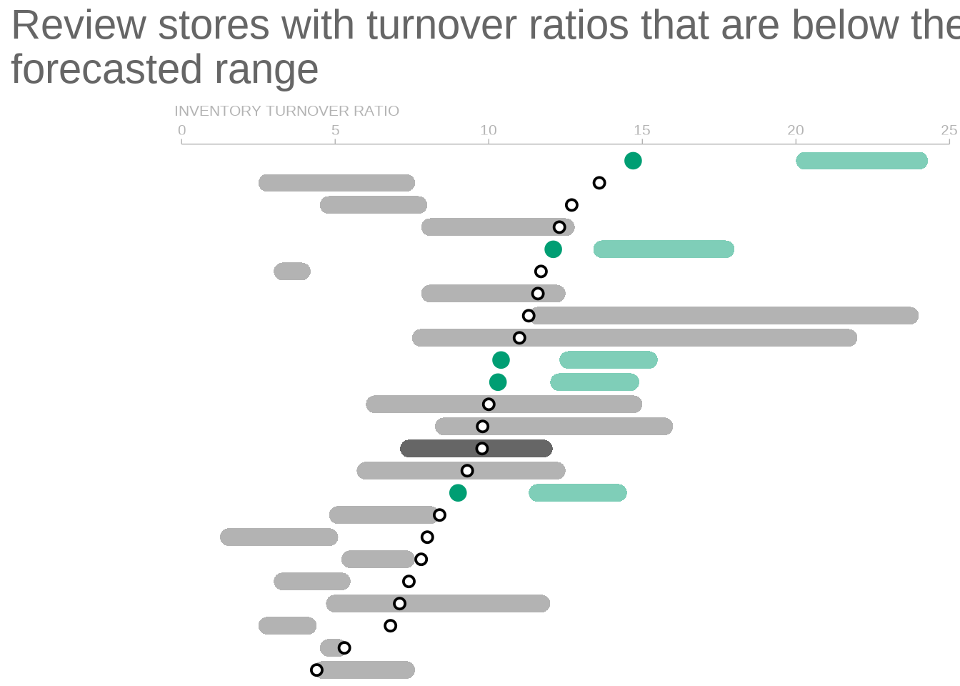
Add y-axis labels
y_axis_text_size <- 3
p +
  geom_text(
    aes(
      x = 0,
      y = num,
      label = location,
      col = no_highlight_col,
      hjust = 1,
      size = y_axis_text_size
    )
  )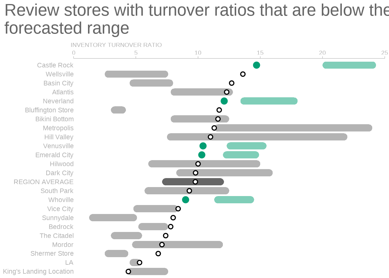
Highlight words
Let us turn to text highlights. For that we will need ggtext. This will let us use geom_richtext() instead of geom_text(). Notice that I have note saved the last geom_text() modification in p. Otherwise, we would get two overlapping layers of text. You can highlight single words as demonstrated in my blog post about effective use of colors.
library(ggtext)
sorted_dat_with_new_labels <- sorted_dat %>%
  mutate(location_label = case_when(
    inventory_turnover < store_lower ~ glue::glue(
      '<span style = "color:{below_highlight}">**{location}**</span>'
    ),
    location == 'REGION AVERAGE' ~ glue::glue(
      '<span style = "color:{average_highlight_col}">**{location}**</span>'
    ),
    T ~ location
  ))

p <- p +
  geom_richtext(
    data = sorted_dat_with_new_labels,
    aes(
      x = 0,
      y = num,
      label = location_label,
      col = no_highlight_col,
      hjust = 1,
      size = y_axis_text_size
    ),
    label.colour = NA,
    fill = NA
  )
p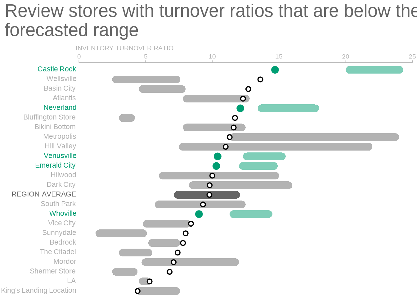
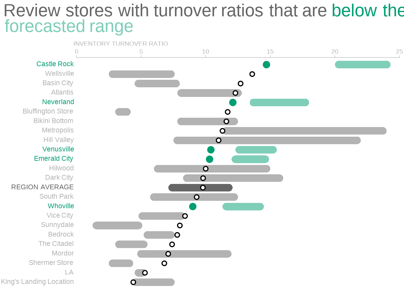
Fantastic! Next, we only have to highlight words in our call to action. Make sure that plot.title in theme() is an element_markdown().
title_lab_adjusted <- glue::glue(
  "Review stores with **turnover ratios** that are <span style = 'color:{below_highlight}'>below their</span><br><span style = 'color:#7fceb9;'>**forecasted range**</span>"
)

p +
  labs(title = title_lab_adjusted) +
  theme(
    plot.title = element_markdown(),
    panel.background = element_rect(color = NA, fill = 'white')
  )
There you go. This concludes the easy way to draw rounded rectangles with ggplot2 and ggchicklet. Now, I am well aware that this is probably the moment when many readers will drop out. So, let me do some shameless self-promotion before everyone’s gone.
If you enjoyed this post, follow me on Twitter and/or subscribe to my RSS feed. For reaching out to me, feel free to hit the comments or send me a mail. I am always happy to see people commenting on my work.
Rounded rectangles with grobs
Alright, this is where the hacking begins. In this last part of the blog post, I will show you to how transform rectangles to rounded rectangles. In principle, you could then create our SWD plot using geom_rect() and transform the rectangles afterwards. No additional package needed.
Simple example with one bar
Let me demonstrate a quick hack when there is only one bar in the plot. Unfortunately, this does not work with more than one bar. Still, this should get you acquainted with grobs. First, create a simple dummy plot.
library(tidyverse)
p <- mpg %>%
  filter(year == 2008) %>%
  ggplot(aes(year)) +
  geom_bar() +
  theme_minimal()
p
Next, we can turn this plot into a so-called TableGrob. From what I understand, it is a highly nested list that contains all the graphical objects (grobs) that are part of our plot p.
l <- ggplotGrob(p)
l
TableGrob (12 x 9) "layout": 18 grobs
z cells name grob
1 0 ( 1-12, 1- 9) background zeroGrob[plot.background..zeroGrob.831]
2 5 ( 6- 6, 4- 4) spacer zeroGrob[NULL]
3 7 ( 7- 7, 4- 4) axis-l absoluteGrob[GRID.absoluteGrob.820]
4 3 ( 8- 8, 4- 4) spacer zeroGrob[NULL]
5 6 ( 6- 6, 5- 5) axis-t zeroGrob[NULL]
6 1 ( 7- 7, 5- 5) panel gTree[panel-1.gTree.814]
7 9 ( 8- 8, 5- 5) axis-b absoluteGrob[GRID.absoluteGrob.817]
8 4 ( 6- 6, 6- 6) spacer zeroGrob[NULL]
9 8 ( 7- 7, 6- 6) axis-r zeroGrob[NULL]
10 2 ( 8- 8, 6- 6) spacer zeroGrob[NULL]
11 10 ( 5- 5, 5- 5) xlab-t zeroGrob[NULL]
12 11 ( 9- 9, 5- 5) xlab-b titleGrob[axis.title.x.bottom..titleGrob.823]
13 12 ( 7- 7, 3- 3) ylab-l titleGrob[axis.title.y.left..titleGrob.826]
14 13 ( 7- 7, 7- 7) ylab-r zeroGrob[NULL]
15 14 ( 4- 4, 5- 5) subtitle zeroGrob[plot.subtitle..zeroGrob.828]
16 15 ( 3- 3, 5- 5) title zeroGrob[plot.title..zeroGrob.827]
17 16 (10-10, 5- 5) caption zeroGrob[plot.caption..zeroGrob.830]
18 17 ( 2- 2, 2- 2) tag zeroGrob[plot.tag..zeroGrob.829]In this case, calling l gave us an overview of plot parts. We will want to change stuff in the panel. Thus, let us extract the grobs from the sixth list entry of l. As we have seen in the table, this will give us a gTree. That’s another nested list. And it contains an interesting sublist called children. That’s where the grobs of this gTree are stored.
grobs <- l$grobs[[6]]
grobs$children
(gTree[grill.gTree.812], zeroGrob[NULL], rect[geom_rect.rect.800], zeroGrob[NULL], zeroGrob[panel.border..zeroGrob.801]) Here, the rect grob is what we want to access. Thus, let us take a look what we can find there.
# str() helps us to unmask the complicated list structure
grobs$children[[3]] %>% str()
List of 10
$ x : 'simpleUnit' num 0.0455native
..- attr(*, "unit")= int 4
$ y : 'simpleUnit' num 0.955native
..- attr(*, "unit")= int 4
$ width : 'simpleUnit' num 0.909native
..- attr(*, "unit")= int 4
$ height: 'simpleUnit' num 0.909native
..- attr(*, "unit")= int 4
$ just : chr [1:2] "left" "top"
$ hjust : NULL
$ vjust : NULL
$ name : chr "geom_rect.rect.800"
$ gp :List of 6
..$ col : logi NA
..$ fill : chr "#595959FF"
..$ lwd : num 1.42
..$ lty : num 1
..$ linejoin: chr "mitre"
..$ lineend : chr "square"
..- attr(*, "class")= chr "gpar"
$ vp : NULL
- attr(*, "class")= chr [1:3] "rect" "grob" "gDesc"This is a grob. It can be build using grid::rectGrob(). Basically, what you see here is a specification of everything from x and y position to graphical properties (gp) of this rectangular grob.
There is also a function grid::roundrectGrob(). As you may have guessed, it builds the rounded rectangle grobs that we so desperately crave. From grid::roundrectGrob()’s documentation, we know that we will have to specify another variable r to determine the radius of the rounded rectangles. So, here’s what we could do now.
- Extract
x,y,gpand so on fromgrobs$children[[3]]. - Add another argument
r. - Pass all of these arguments to
grid::roundrectGrob() - Exchange
grobs$children[[3]]with our newly builtroundrectGrob
This is what we will have to do at some point. But in this simple plot, I want to show you a different hack. Did you notice the class attributes of grobs$children[[3]]? Somewhere in there it says - attr(*, "class")= chr [1:3] "rect" "grob" "gDesc". And we can access and change that information through attr().
attr(grobs$children[3][[1]], 'class')[1] "rect" "grob" "gDesc"Now, a really basic hack is to
- change the class attribute from
recttoroundrect. - stick another argument
rinto the list - put everything back together as if nothing happened
## Change class attribute of grobs$children[3][[1]] from rect to roundrect
current_attr <-  attr(grobs$children[3][[1]], 'class')
new_attr <- str_replace(current_attr, 'rect', 'roundrect')
attr(grobs$children[3][[1]], 'class') <- new_attr

# Add r argument for grid::roundrectGrob()
# We need to add a "unit"
# Here I use the relative unit npc
grobs$children[3][[1]]$r <- unit(0.5, 'npc')

# Copy original list and change grobs in place
l_new <- l
l_new$grobs[[6]] <- grobs

# Draw grobs via grid::grid.draw()
grid::grid.newpage()
grid::grid.draw(l_new)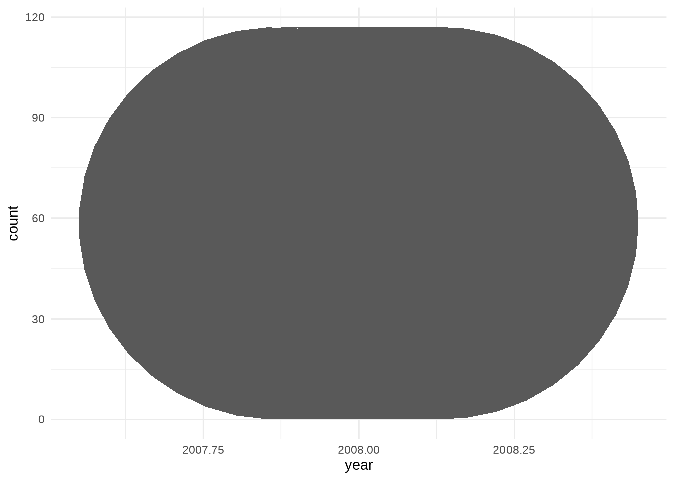
Dealing with multiple bars
The previous hack works if we plot only one bar. However, if there are multiple x arguments, then grid::roundrectGrob() will error. It seems like that function is not vectorized. So, we will build the rounded rectangles ourselves with functional programming. First let’s take a look at the plot that we want to modify.
p <- mpg %>%
  ggplot(aes(class, fill = class)) +
  geom_bar() +
  theme_minimal()
p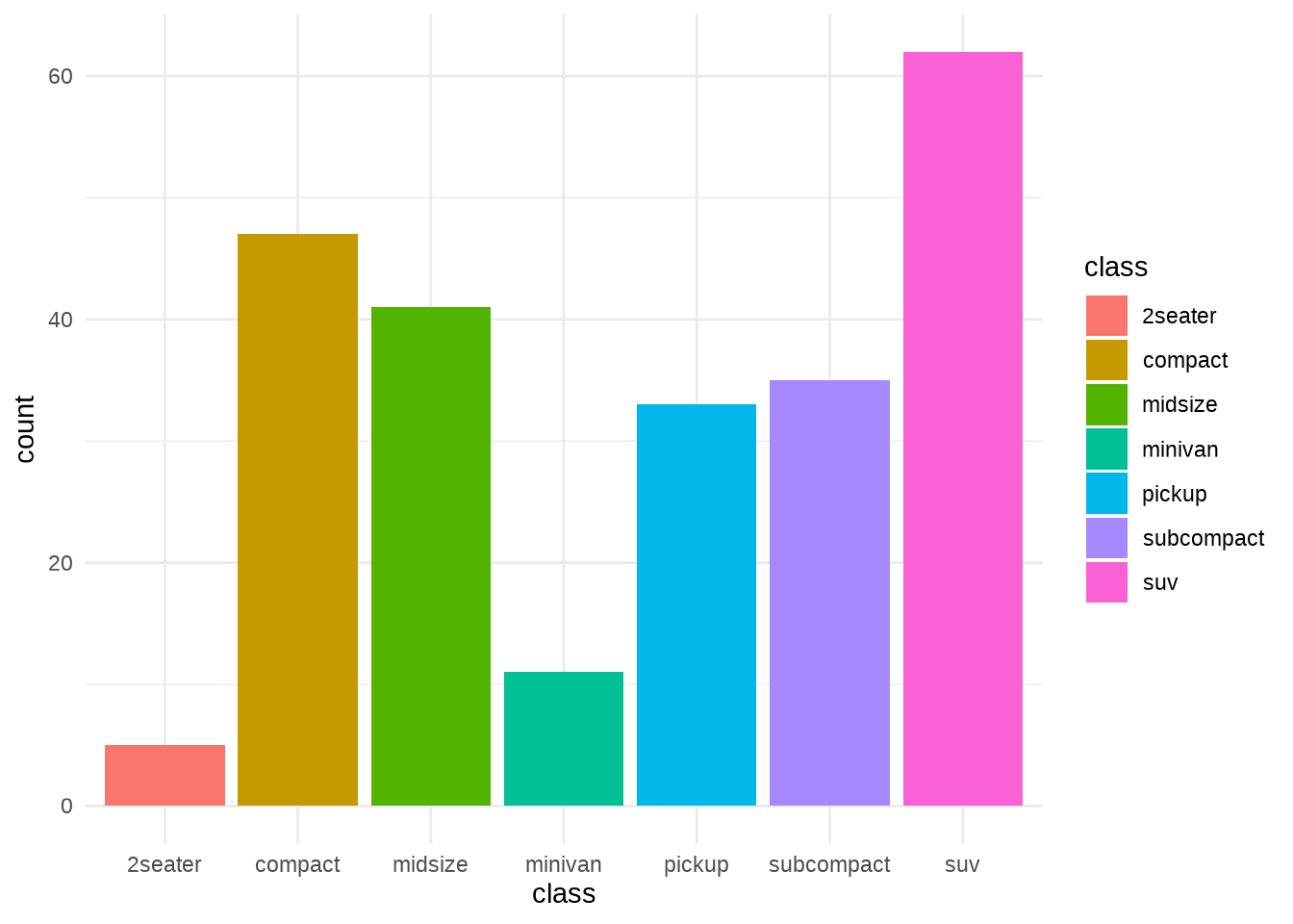
Now, let’s find out what arguments grid::roundrectGrob() accepts and extract as many of these from grobs$children[3] as possible.
l <- ggplotGrob(p)
grobs <- l$grobs[[6]]

# What arguments does roundrectGrob need?
arg_names <- args(grid::roundrectGrob) %>% as.list() %>% names()
# Somehow last one is NULL
arg_names <- arg_names[-length(arg_names)]
arg_names
[1] "x" "y" "width" "height"
[5] "default.units" "r" "just" "name"
[9] "gp" "vp" # Extract the arguments roundrectGrob needs from grobs$children[3]
extracted_args <- map(arg_names, ~pluck(grobs$children[3], 1, .))
names(extracted_args) <- arg_names
extracted_args %>% str()List of 10
$ x : 'simpleUnit' num [1:7] 0.0208native 0.16native 0.299native 0.438native 0.576native ...
..- attr(*, "unit")= int 4
$ y : 'simpleUnit' num [1:7] 0.119native 0.735native 0.647native 0.207native 0.529native ...
..- attr(*, "unit")= int 4
$ width : 'simpleUnit' num [1:7] 0.125native 0.125native 0.125native 0.125native 0.125native 0.125native 0.125native
..- attr(*, "unit")= int 4
$ height : 'simpleUnit' num [1:7] 0.0733native 0.689native 0.601native 0.161native 0.484native ...
..- attr(*, "unit")= int 4
$ default.units: NULL
$ r : NULL
$ just : chr [1:2] "left" "top"
$ name : chr "geom_rect.rect.911"
$ gp :List of 6
..$ col : logi [1:7] NA NA NA NA NA NA ...
..$ fill : chr [1:7] "#F8766D" "#C49A00" "#53B400" "#00C094" ...
..$ lwd : num [1:7] 1.42 1.42 1.42 1.42 1.42 ...
..$ lty : num [1:7] 1 1 1 1 1 1 1
..$ linejoin: chr "mitre"
..$ lineend : chr "square"
..- attr(*, "class")= chr "gpar"
$ vp : NULLAs you can can see, in our vector extracted_args the components x, y and so on are vectors of length 7 (since we have 7 bars in p). As I said before, this works because it is a rectGrob. But, with a roundrectGrob this would cause errors.
Next, let us make sure that we know how many rectangles we need to change. Also, we will need to specify the radius r, and the graphical parameters gp should always have the same amount of arguments.
## How many rectangles are there?
n_rects <- extracted_args$x %>% length()

## Add radius r
extracted_args$r <- unit(rep(0.25, n_rects), 'npc')

## Make sure that all list components in gp have equally many values
extracted_args$gp$linejoin <- rep(extracted_args$gp$linejoin, n_rects)
extracted_args$gp$lineend <- rep(extracted_args$gp$lineend, n_rects)
Now comes the tedious part. We have to split up extracted_args into multiple nested lists. Unfortunately, the purrr package does not provide a function that works the way we want. That’s because we need many custom steps here. For instance, for the columns x and y we have to always extract a single value out of extracted_args. But with the columns just and name we need to extract the whole vector. Also, we have to adjust the names to ensure that they are unique.
In this blog post, we will get the tedious stuff out of the way with the following helper functions. Feel free to ignore them, if you only care about the general idea.
## Write function that does splitting for each rectangle
## Found no suitable purrr function that works in my case
extract_value <- function(list, arg, rect) {
  x <- list[[arg]]
  # name and just need do be treated different
  # In all cases just pick the i-th entry of list[[arg]]
  if (!(arg %in% c('name', 'just'))) return(x[rect])

  ## There is only one name, so extract that and modify id
  if (arg == 'name') {
    return(paste0(x,  rect))
  }

  # 'just' is two part vector and should always be the same
  if (arg == 'just') return(x)
}

split_my_list <- function(list, n_rects) {
  combinations <- tibble(
    rect = 1:n_rects,
    arg = list(names(list))
  ) %>%
    unnest(cols = c(arg))

  flattened_list <- combinations %>%
    pmap(~extract_value(list, ..2, ..1))

  names(flattened_list) <- combinations$arg
  split(flattened_list, combinations$rect)
}
Finally, we can split extracted_args into sub-lists. Each of these is then used to call grid::roundrectGrob() with do.call(). Then, we have to replace the same part in our list grobs as we did before. However, since we have multiple grobs now that need to be put into a single location. Therefore, we have to bundle the grobs into one object. This is done via grid::grobTree() and do.call().
list_of_arglists <-  split_my_list(extracted_args, n_rects)
list_of_grobs <- map(list_of_arglists, ~do.call(grid::roundrectGrob, .))

# Build new list of grobs by replacing one part in old list
grobs_new <- grobs

# save one list argument into children[3]
grobs_new$children[3] <- do.call(grid::grobTree, list_of_grobs) %>% list()
l_new <- l
l_new$grobs[[6]] <- grobs_new

# Draw Plot
grid::grid.newpage()
grid::grid.draw(l_new)
Conclusion
Woooow! Marvel at our glorious rounded rectangles! Thanks to our excellent programming skills we made it through the grob jungle. In practice, it is probably easier to use geom_chicklet(). But still, this was a somewhat fun exercise and helped to demystify grobs (at least to some extend).
That’s it for today. If you’ve made it this far, then you already know that you should follow me on Twitter and/or subscribe to my RSS feed. So, I expect you to be here next time. There’s no way out anymore. So long!


