Alternatives to paired bar charts
Visualization
We take a look at a couple alternatives to paired bar charts.
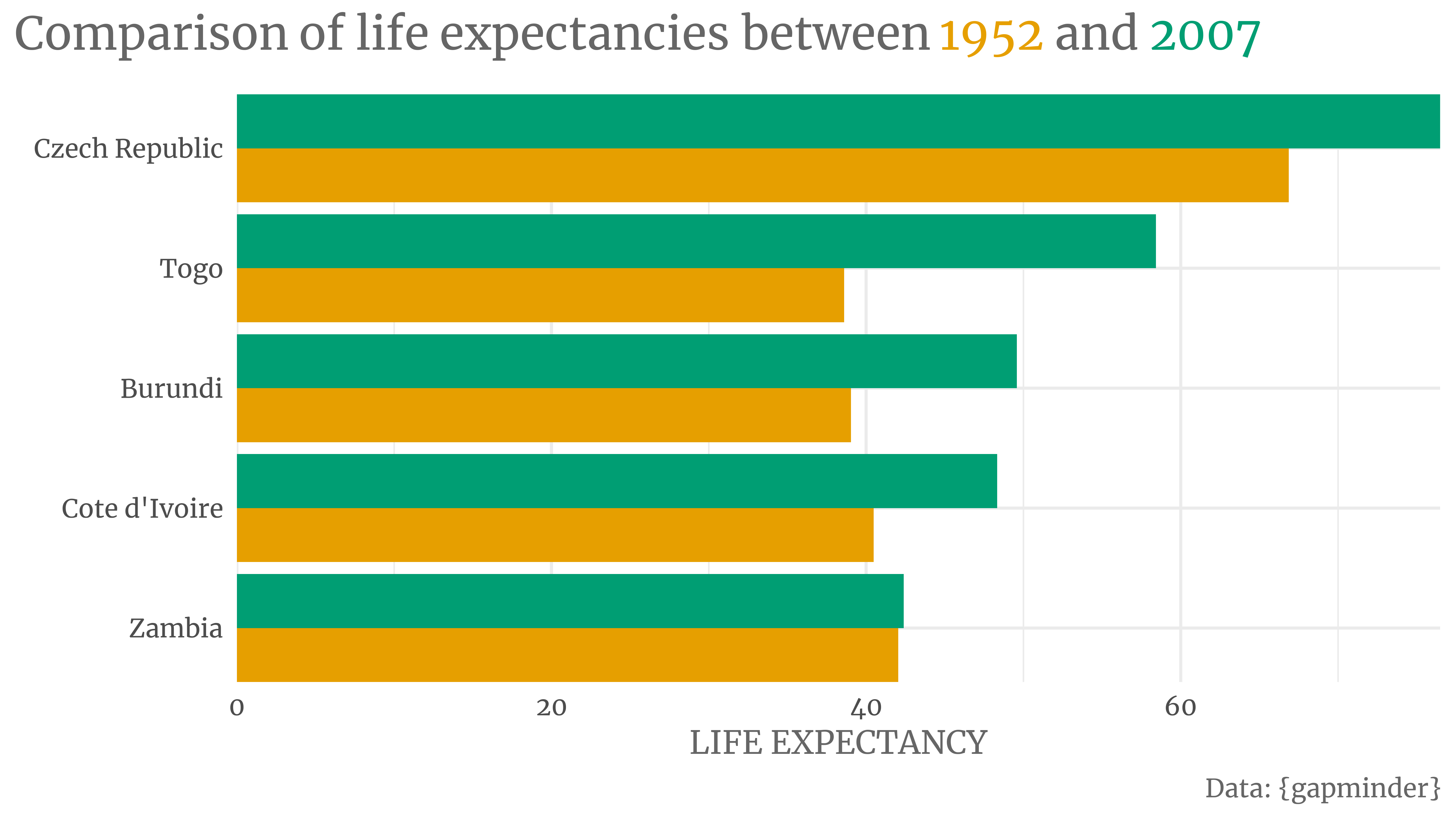
Have a look at this paired bar plot. It compares the life expectancies of selected countries in 1952 and 2007. The data is courtesy of the Gapminder foundation.
You can find such a plot almost everywhere. I think that’s because paired bar charts are easy to make. But I’m not a big fan of them. I find them hard to read and it annoys the crap out of me to move my eyes back and forth to make comparisons.
But they have another problem: Paired bars are crappy at scaling. Have a look at the following monstrosity when I compare more than five countries.
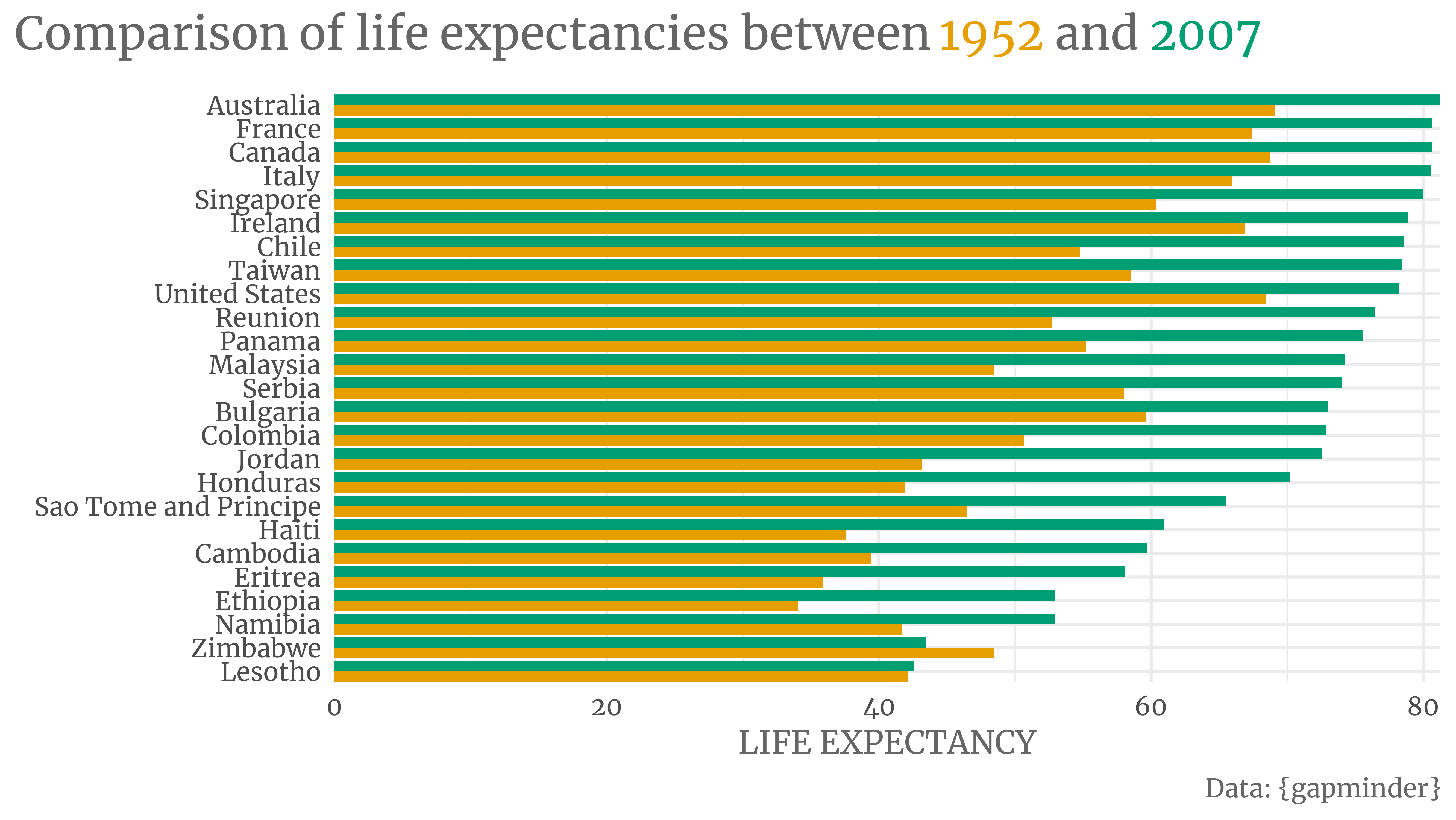
Hard to read, right? So let me show you how to create alternatives with ggplot2.
Preliminaries
First, let us begin by loading a few packages. Also, let us set a theme that we’ll use throughout this post.
library(tidyverse)
library(ggtext)
library(showtext)
font_add_google('Merriweather', 'Merriweather')
showtext_auto()
showtext_opts(dpi = 300)

my_theme <- theme_minimal(base_size = 14, base_family = 'Merriweather') +
  theme(
    legend.position = 'none',
    plot.title.position = 'plot',
    text = element_text(color = 'grey40'),
    plot.title = element_markdown(size = 20, margin = margin(b = 5, unit = 'mm'))
  )
theme_set(my_theme)

# Colors we will use later
color_palette <- thematic::okabe_ito(2)
names(color_palette) <- c(1952, 2007)
Dot plots aka dumbbell plots
Now we can take a look at our data.
gapminder_1952_2007 <- gapminder::gapminder |>
  janitor::clean_names() |>
  filter(year %in% range(year)) |>
  mutate(year = factor(year))
gapminder_1952_2007
#> # A tibble: 284 × 6
#>    country     continent year  life_exp      pop gdp_percap
#>    <fct>       <fct>     <fct>    <dbl>    <int>      <dbl>
#>  1 Afghanistan Asia      1952      28.8  8425333       779.
#>  2 Afghanistan Asia      2007      43.8 31889923       975.
#>  3 Albania     Europe    1952      55.2  1282697      1601.
#>  4 Albania     Europe    2007      76.4  3600523      5937.
#>  5 Algeria     Africa    1952      43.1  9279525      2449.
#>  6 Algeria     Africa    2007      72.3 33333216      6223.
#>  7 Angola      Africa    1952      30.0  4232095      3521.
#>  8 Angola      Africa    2007      42.7 12420476      4797.
#>  9 Argentina   Americas  1952      62.5 17876956      5911.
#> 10 Argentina   Americas  2007      75.3 40301927     12779.
#> # … with 274 more rows
#> # ℹ Use `print(n = ...)` to see more rows
Same as with the bar plot, we’ll also sample a couple of countries from this data set.
set.seed(234)
all_country_names <- unique(gapminder_1952_2007$country)

# Sample 5 countries
selected_countries <- gapminder_1952_2007 |>
  filter(country %in% sample(all_country_names, size = 5))

# Sample 25 countries
more_selected_countries <- gapminder_1952_2007 |>
  filter(country %in% sample(all_country_names, size = 25))
Let’s start by building a dot plot based on the smallest data set.
dot_plot <- selected_countries |>
  # Sorting - More on that later
  mutate(country = fct_reorder(country, life_exp, max)) |>
  ggplot(aes(x = life_exp, y = country, col = year)) +
  geom_point(size = 4) +
  scale_color_manual(values = color_palette)
dot_plot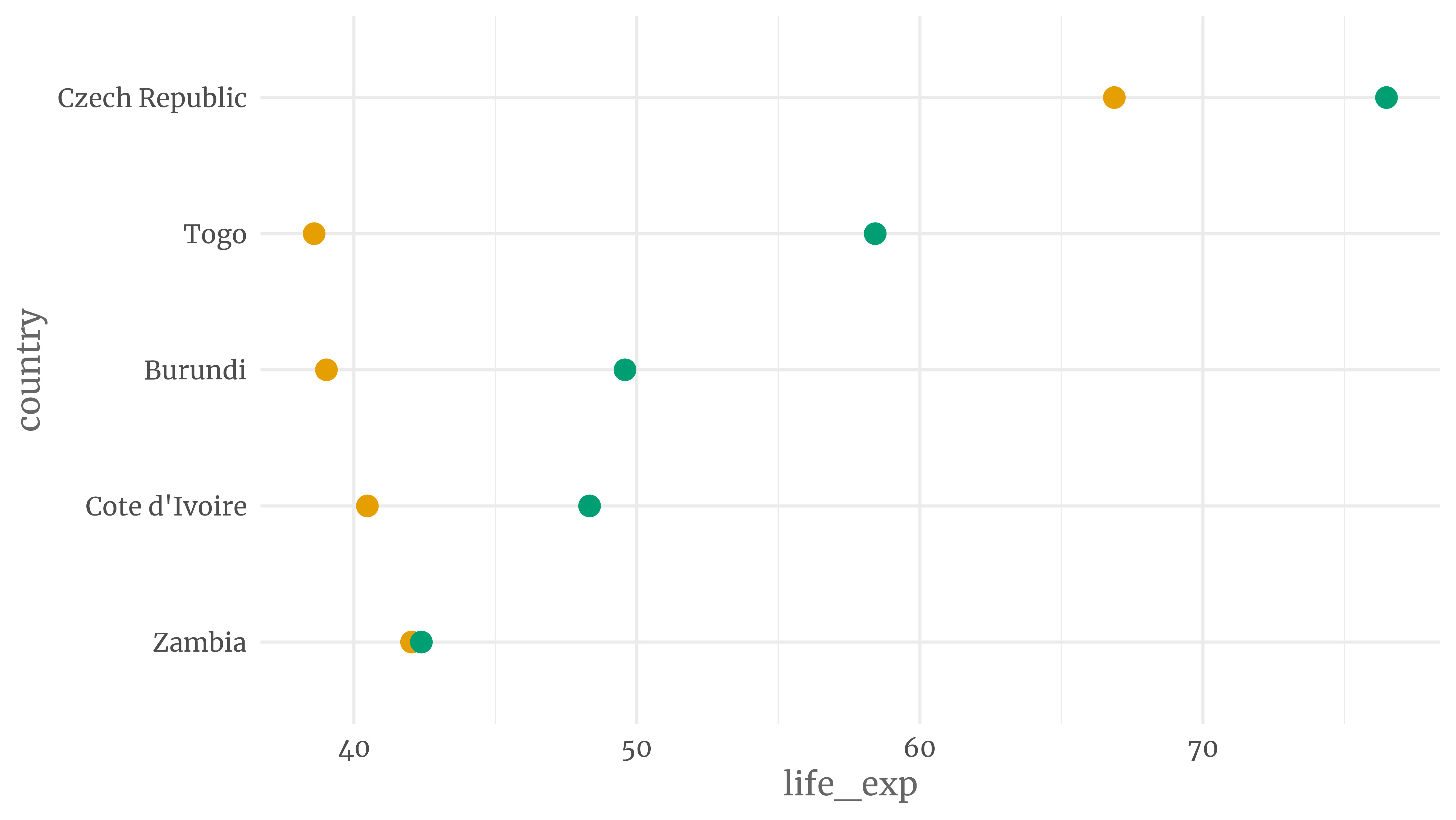
That wasn’t too hard, right? But this plot can still use some improvement. For starters, we need to show what year the dots stand for. Also, the axis labels could use some polishing.
We’ll use some magic from the ggtext package to color appropriate words in the title. If you don’t get that syntax yet, feel free to ignore that part for now. You can always read how that works later.
title_text <- glue::glue(
      "Comparison of life expectancies between <span style = 'color:{color_palette['1952']}'>1952</span> and <span style = 'color:{color_palette['2007']}'>2007</span>"
    )

labeled_dot_plot <- dot_plot +
  labs(
    x = 'LIFE EXPECTANCY',
    y = element_blank(),
    title = title_text
  )
labeled_dot_plot
Ok, this already looks way better. This is a dot plot in its truest form. But dot plots can also be called dumbbell plots. Why? Because when you draw horizontal lines to connect dots, then it looks like a dumbbell. To make that happen, we need to rearrange the data a bit.
segment_helper <- selected_countries |>
    select(country, year, life_exp) |>
    pivot_wider(names_from = year, values_from = life_exp, names_prefix = 'year_') |>
    mutate(
      change = year_2007 - year_1952,
      country = fct_reorder(country, year_2007 * if_else(change < 0, -1, 1))
    )
segment_helper
#> # A tibble: 5 × 4
#>   country        year_1952 year_2007 change
#>   <fct>              <dbl>     <dbl>  <dbl>
#> 1 Burundi             39.0      49.6 10.5
#> 2 Cote d'Ivoire       40.5      48.3  7.85
#> 3 Czech Republic      66.9      76.5  9.62
#> 4 Togo                38.6      58.4 19.8
#> 5 Zambia              42.0      42.4  0.346
We can use this little helper tibble to add lines to our previous plot.
selected_countries |>
  ggplot(aes(x = life_exp, y = country, col = year)) +
  geom_segment(
    data = segment_helper,
    aes(x = year_1952, xend = year_2007, y = country, yend = country),
    col = 'grey60',
    size = 1.25
  ) +
  geom_point(size = 4) +
  scale_color_manual(values = color_palette) +
  labs(
    x = 'LIFE EXPECTANCY',
    y = element_blank(),
    title = title_text
  )  +
  theme(
    panel.grid.major.y = element_blank(),
    panel.grid.minor.x = element_blank()
  )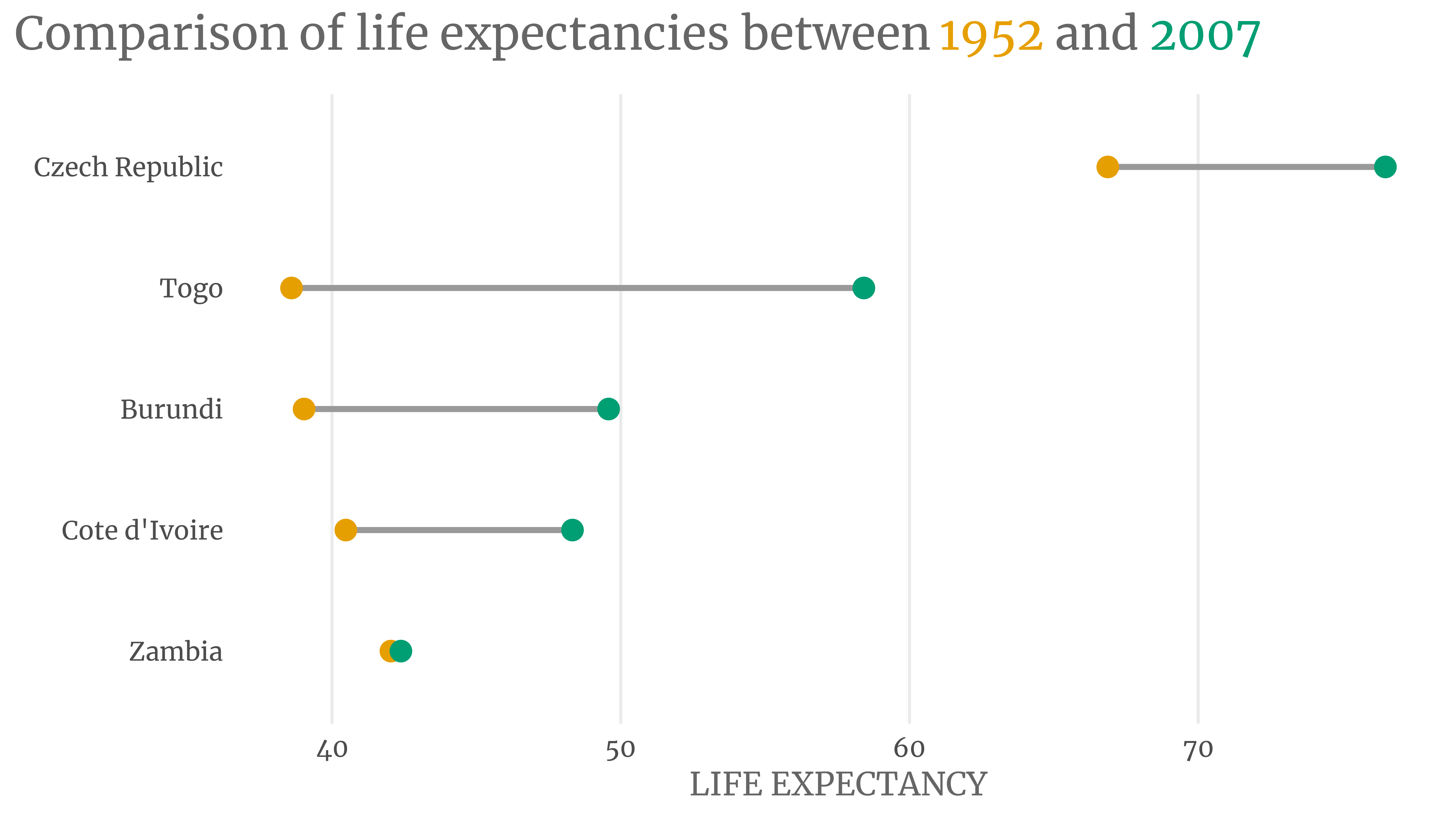
Notice three things:
- I’ve had to redo the whole code here because the points need to be plotted above the horizontal lines.
- I’ve also removed the grid lines of the y-axis. These are superfluous now.
- The dumbbells are sorted by decreasing life expectancy in 2007. That didn’t happen by accident. We’ve implemented that order with
fct_reorder()when we computedsegment_helper. The same step also ensured that countries where the green dot is left of the orange dot are grouped together (and vice versa).
The last point is extra cool. It allows you to change the sorting to whatever you like. You could order by the 1952 value or by the amount of change. The choice is yours.
So now we’ve learned how to create a dumbbell plot. Cool, cool, cool! We could technically redo everything using the larger data set more_selected_countries. But if there’s one thing I try to avoid, it’s code duplication.
That’s why I’ve implemented a function to do all of that for us. Its first argument takes a data set like selected_countries. The second argument decides what we sort on. If you’re interested in the code, feel free to unfold the following code chunk. To see the function in action, keep on reading.
Code
create_dot_plot <- function(countries, sort_var = NULL) {
  segment_helper <- countries |>
    select(country, year, life_exp) |>
    pivot_wider(names_from = year, values_from = life_exp, names_prefix = 'year_') |>
    mutate(
      change = year_2007 - year_1952,
      country = fct_reorder(country, year_2007 * if_else(change < 0, -1, 1))
    )

  # Missing is the key here to check whether sort_var is not NULL
  # Make sure that dots are ordered such that change of direction is visible
  if (!missing(sort_var)) {
    segment_helper <- segment_helper |>
      mutate(country = fct_reorder(country, {{sort_var}} * if_else(change < 0, -1, 1)))
  }

  ggplot() +
    geom_segment(
      data = segment_helper,
      aes(y = country, yend = country, x = year_1952, xend = year_2007),
      col = 'grey60',
      size = 1.25
    ) +
    geom_point(
      data = countries,
      aes(x = life_exp, y = country, col = year), size = 4
    ) +
    labs(
      x = str_to_upper('Life expectancy'),
      y = element_blank(),
      title = title_text,
      caption = 'Data: {gapminder}'
    ) +
    scale_color_manual(values = color_palette) +
    theme(
      panel.grid.major.y = element_blank(),
      panel.grid.minor.x = element_blank()
    ) +
    scale_x_continuous(expand = expansion(mult = 0.01))
}
First, check out the different sortings.
create_dot_plot(selected_countries, desc(year_2007))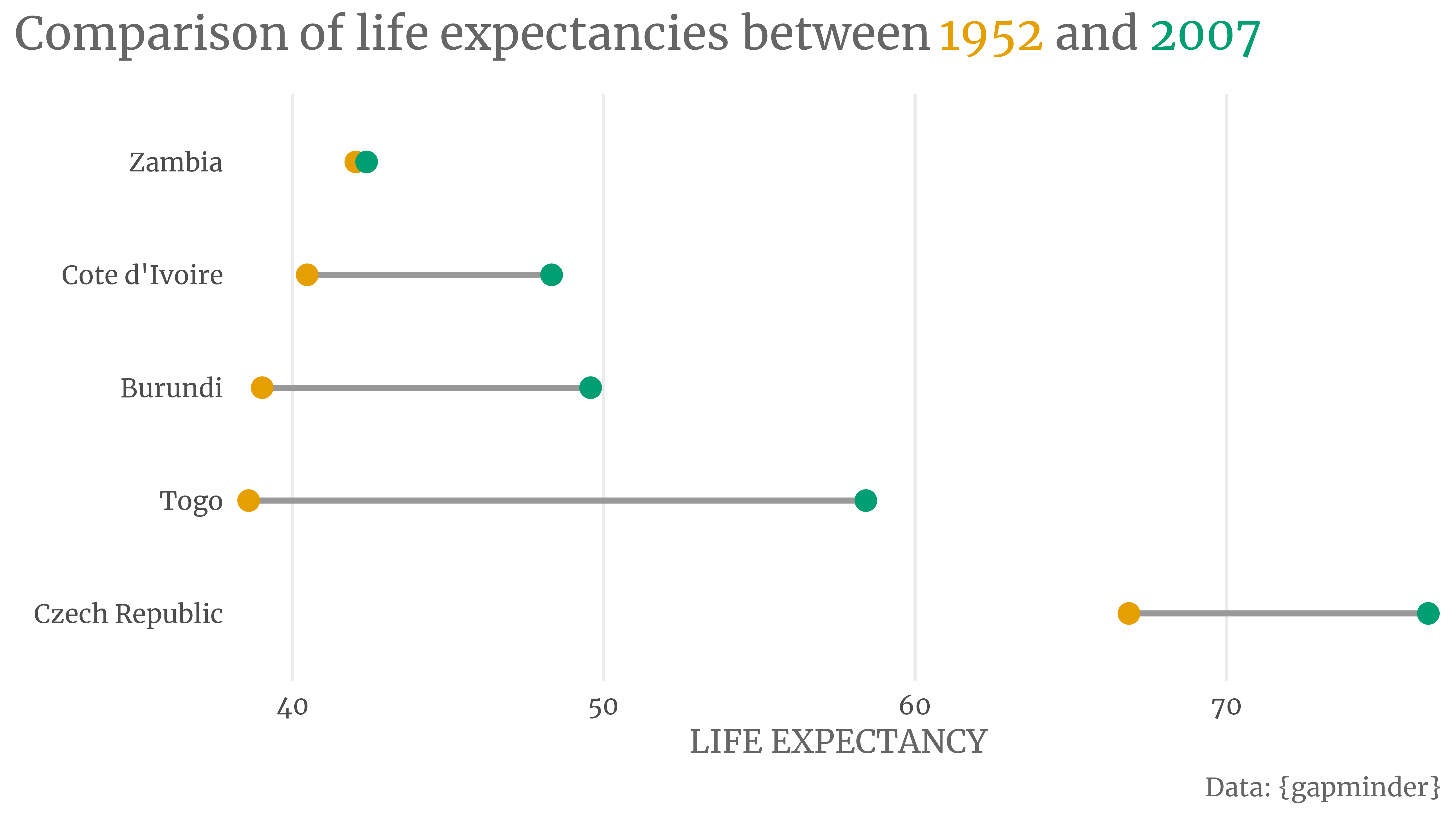
create_dot_plot(selected_countries, year_1952)
create_dot_plot(selected_countries, desc(change))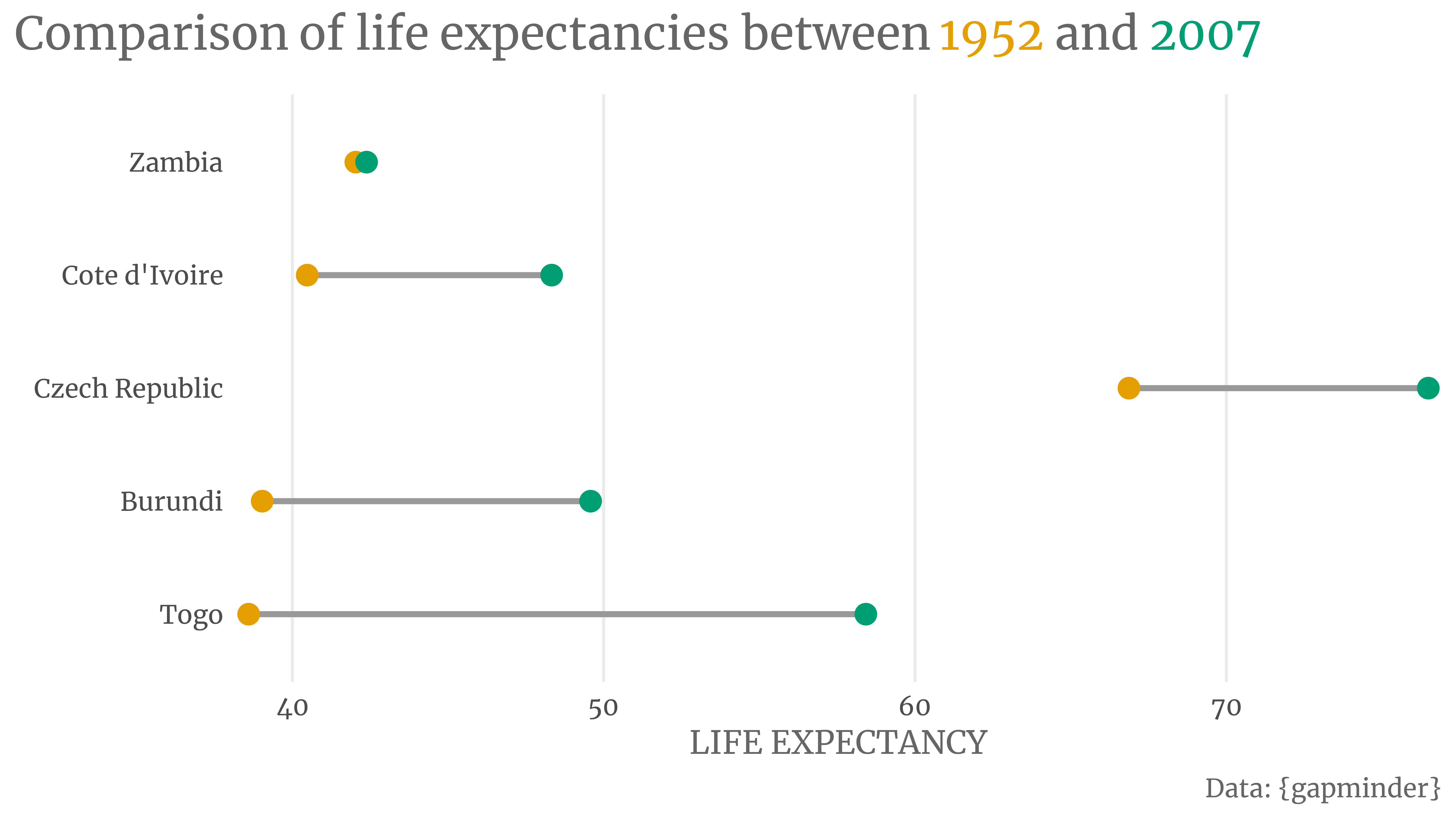
Now, admire how dumbbell plots scale well for many countries.
create_dot_plot(more_selected_countries, desc(year_2007))
Have you noticed how Zimbabwe decreased its life expectancy? That’s why it’s plotted at the top. Otherwise, this change of direction might be hard to spot. So keep in mind that you need to sort your dumbbell charts. Also, with many countries maybe a very light grid could be helpful.
create_dot_plot(more_selected_countries, desc(year_2007)) +
  theme(panel.grid.major.y = element_line(linetype = 3, color = 'grey80'))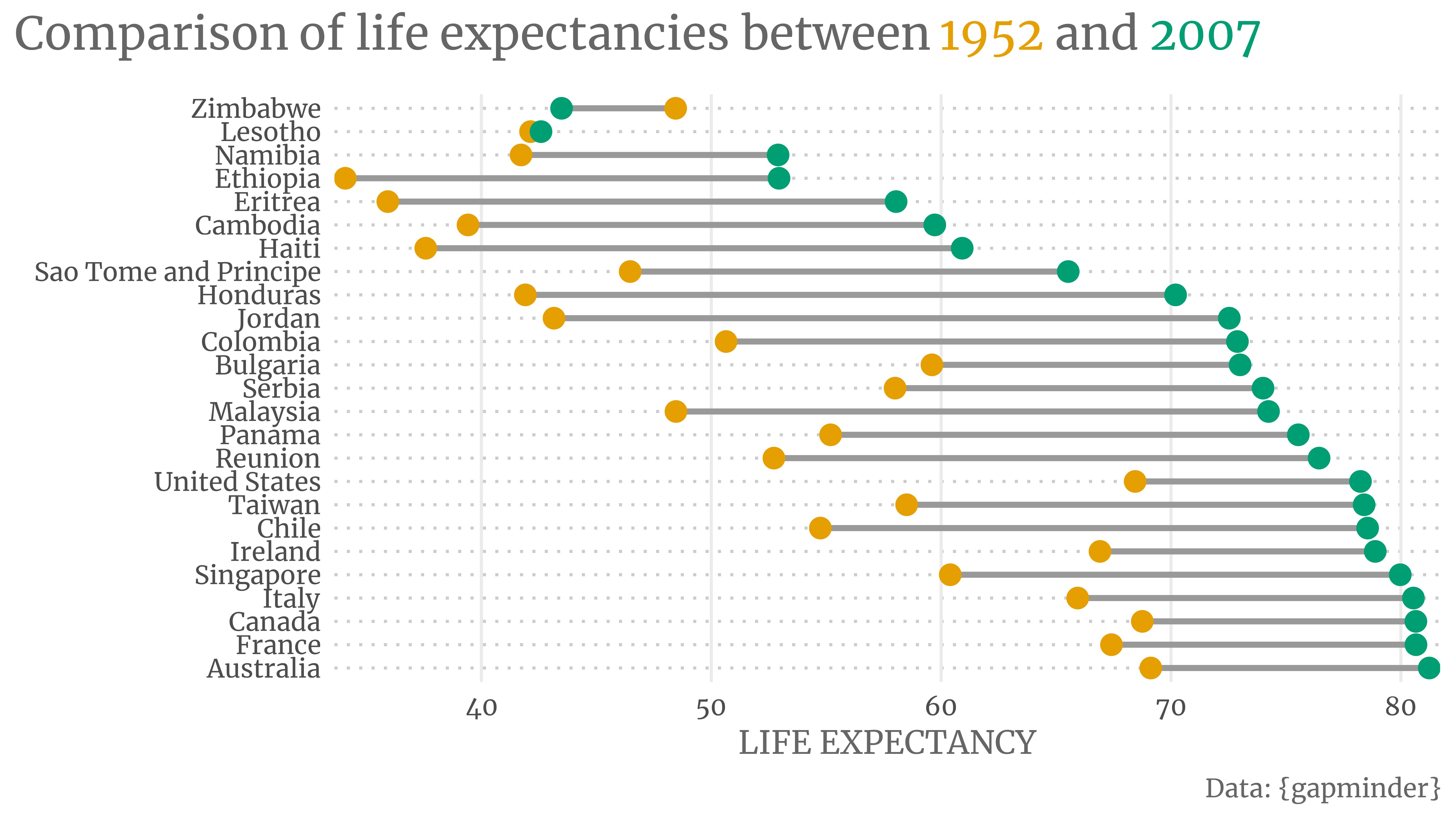
Use colored arrows instead of dumbbells
On Twitter, Ricardo and Brani suggested to improve the plot even further. I’ve combined the two ideas into one: Use colored arrows instead of dumbbells.
Let’s do that for our larger data set. First, we need to create a helper tibble again.
larger_segment_helper <- more_selected_countries |>
  select(country, year, life_exp) |>
  pivot_wider(names_from = year, names_prefix = 'year_', values_from = life_exp) |>
  mutate(
    change = year_2007 - year_1952,
    sign_change = (change > 0),
    country = fct_reorder(country, year_2007 * if_else(sign_change, -1, 1))
  )
larger_segment_helper
#> # A tibble: 25 × 5
#>    country   year_1952 year_2007 change sign_change
#>    <fct>         <dbl>     <dbl>  <dbl> <lgl>
#>  1 Australia      69.1      81.2   12.1 TRUE
#>  2 Bulgaria       59.6      73.0   13.4 TRUE
#>  3 Cambodia       39.4      59.7   20.3 TRUE
#>  4 Canada         68.8      80.7   11.9 TRUE
#>  5 Chile          54.7      78.6   23.8 TRUE
#>  6 Colombia       50.6      72.9   22.2 TRUE
#>  7 Eritrea        35.9      58.0   22.1 TRUE
#>  8 Ethiopia       34.1      52.9   18.9 TRUE
#>  9 France         67.4      80.7   13.2 TRUE
#> 10 Haiti          37.6      60.9   23.3 TRUE
#> # … with 15 more rows
#> # ℹ Use `print(n = ...)` to see more rows
Then, we can plot that using geom_segment(). Notice that we have to set the arrow argument there. Otherwise, we’ll only get lines.
arrow_plot <- larger_segment_helper |>
  ggplot(
    aes(
      x = year_1952, xend = year_2007,
      y = country, yend = country,
      color = sign_change
    )
  ) +
  geom_segment(
    arrow = arrow(angle = 30, length = unit(0.2, 'cm')),
    size = 1
  ) +
  labs(
    x = 'LIFE EXPECTANCY',
    y = element_blank(),
    title = 'Comparison of life expectancies between 1952 and 2007'
  ) +
  scale_color_manual(
    values = unname(color_palette)
  ) +
  theme(
    panel.grid.major.y = element_line(linetype = 3, color = 'grey80'),
    panel.grid.minor = element_blank()
  )
arrow_plot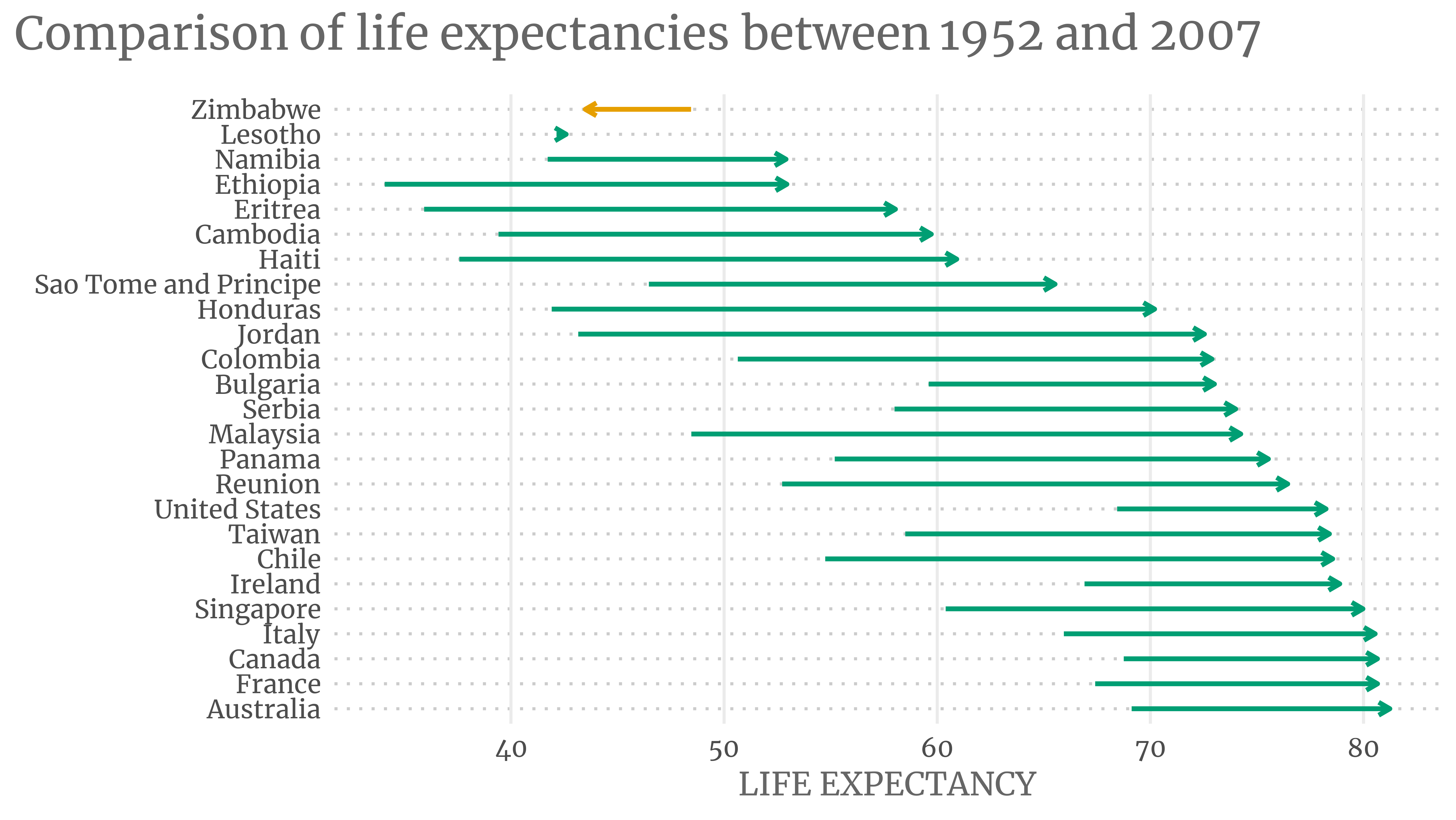
Notice that we represented the temporal order using the direction of the arrow. This way, we were able to use the colors to signify that some countries did not increase their life expectancy. However, we might want to make sure that people understand the temporal order.1
The easiest way to do this is probably by adding a text annotation to the first green and orange arrows. But let’s do something fancy. Let us add a custom legend. Hence, we have to create a legend first.
fake_dat <- tibble(
  country = c(1.1, 1),
  year_1952 = c(2, 1),
  year_2007 = c(1, 2)
)

fake_dat_longer <- fake_dat |>
  pivot_longer(
    cols = -country,
    names_to = 'label',
    values_to = 'life_exp',
    names_prefix = 'year_'
  )

custom_legend <- ggplot() +
  geom_rect(
    aes(xmin = 0.8, xmax = 2.2,
    ymin = 0.9, ymax = 1.2),
    fill = 'white',
    col = 'grey40'
  ) +
  geom_segment(
    data = fake_dat,
    mapping = aes(
      x = year_1952, xend = year_2007,
      y = country, yend = country,
    ),
    arrow = arrow(angle = 30, length = unit(0.2, 'cm')),
    color = color_palette,
    size = 1
  ) +
  geom_text(
    data = fake_dat_longer,
    mapping = aes(x = life_exp, y = country, label = label),
    hjust = c(-0.1, 1.1, 1.1, -0.1),
    family = 'Merriweather',
    color = rep(color_palette, each = 2)
  )  +
  theme_void() +
  coord_cartesian(
    ylim = c(0.8, 1.3),
    xlim = c(0.75, 2.25),
    expand = F
  )
custom_legend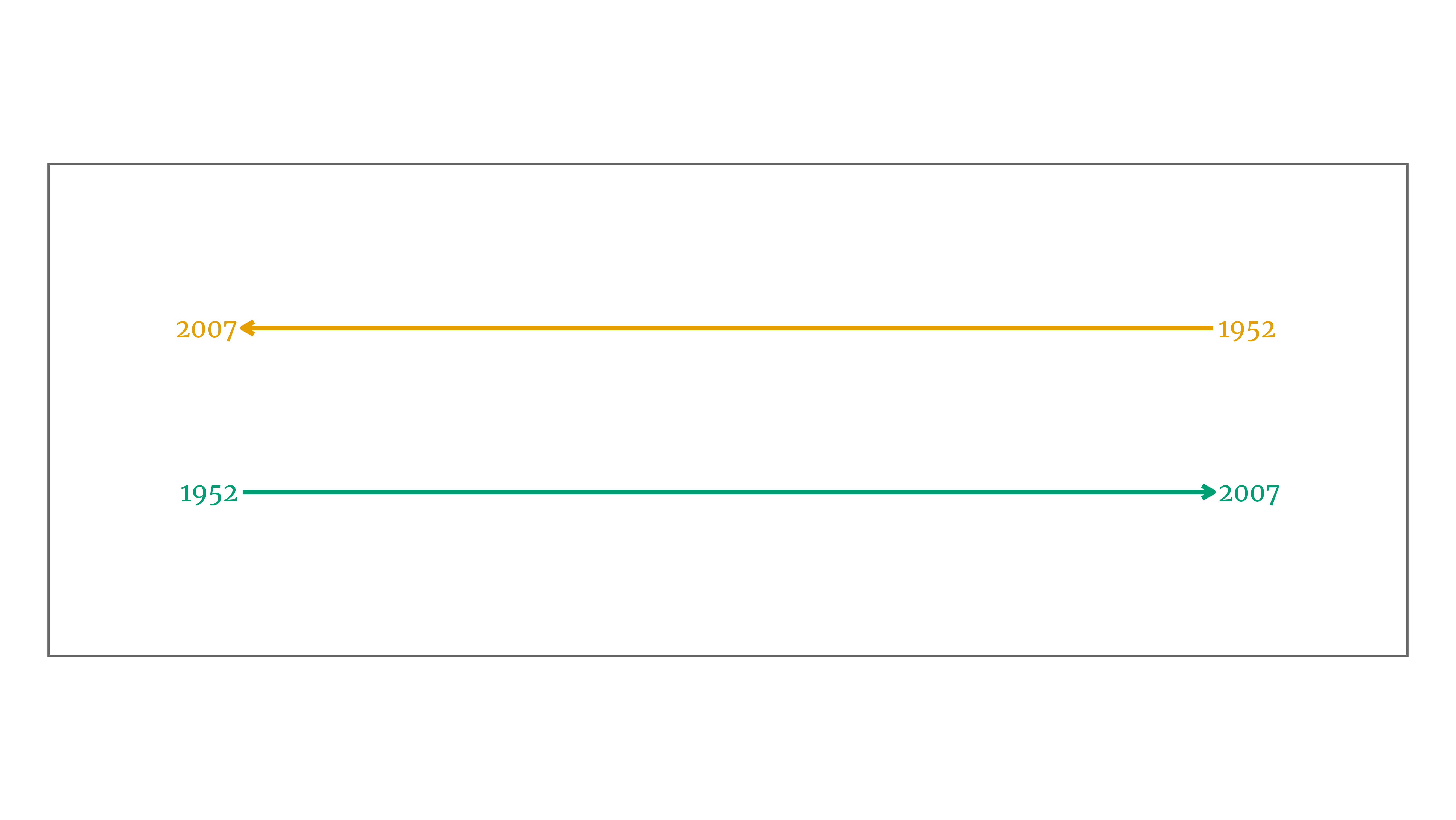
Now, we can add this to our arrow plot with inset_element() from the patchwork package. Choosing the values of left, right, top and bottom is a bit tricky. Some trial-and-error will do the trick.
library(patchwork)

arrow_plot +
  inset_element(custom_legend, left = 0.525, right = 1.01, top = 1.025, bottom = 0.8)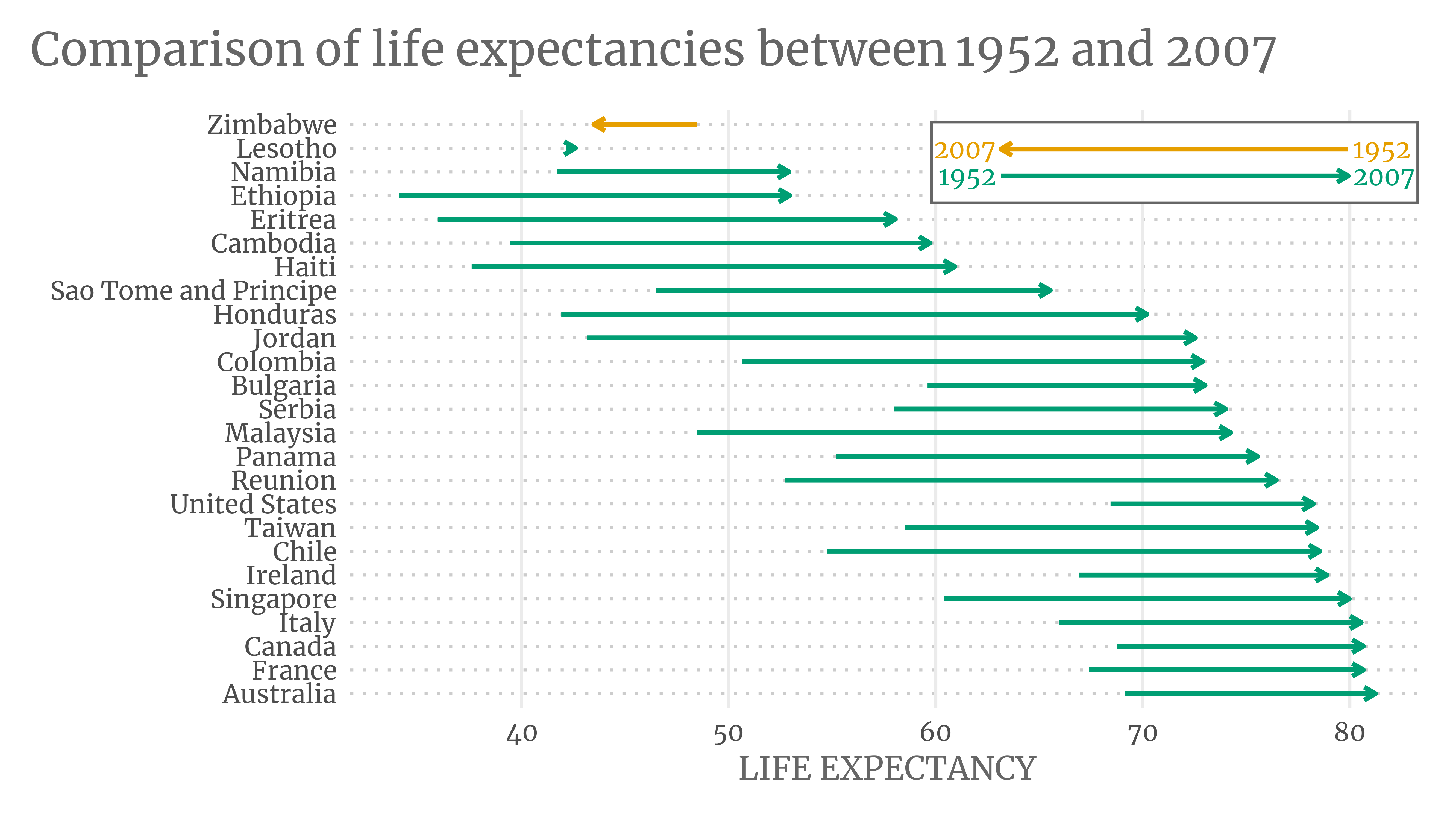
Slope charts
Dot plots may scale well. But when we use a lot of countries even dot plots reach their limits. In this case, we really have to decide what exactly we want to show.
For example, we could decide that we only care about the change of the life expectancies from a few countries. Of course, we should still put the change into the context of the whole data set. This could be an excellent use case for slope charts. Here’s one.
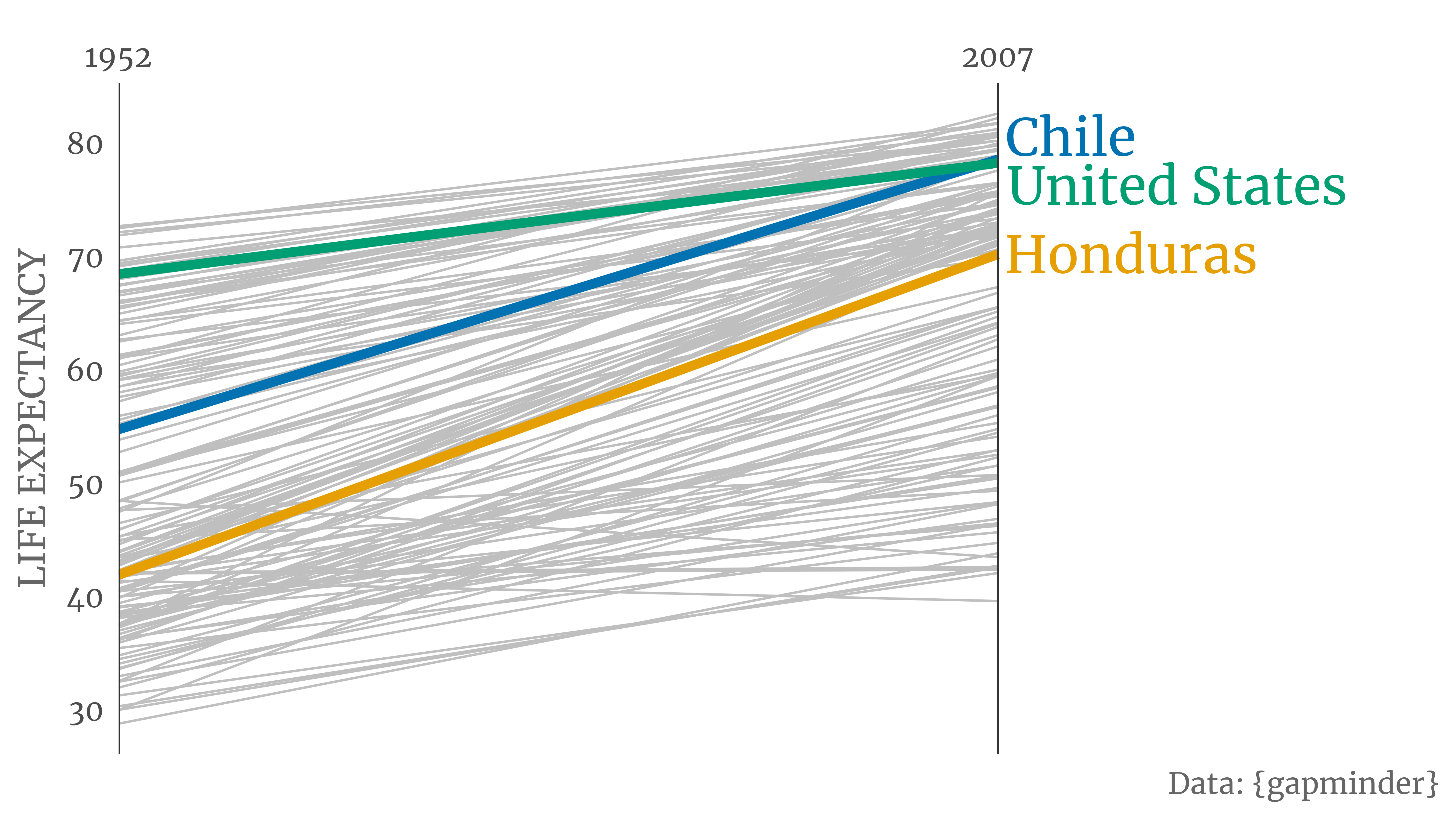
A simple trick to generate these highlighted slope charts is to stack line layers. First, create an all-grey slope chart for all countries. Then, do the same but with a smaller data set (containing the selected countries). In this layer, you can change the color and the thickness of the lines.
highlight_colors <- thematic::okabe_ito(3)
names(highlight_colors) <- c('Honduras', 'United States', 'Chile')
highlight_data <- gapminder_1952_2007 |>
  filter(country %in% names(highlight_colors))

annotation_data <- highlight_data |>
  filter(year == 2007) |>
  mutate(color = highlight_colors[as.character(country)])

slope_chart <- gapminder_1952_2007 |>
  ggplot(aes(x = year, y = life_exp, group = country)) +
  geom_line(size = 0.5, color = 'grey75') +
  geom_line(
    data = highlight_data,
    aes(color = country),
    size = 2
  ) +
  annotate(
    'segment',
    x = c(1, 2),
    xend = c(1, 2),
    y = -Inf,
    yend = Inf,
    col = 'grey20'
  ) +
  scale_x_discrete(expand = expansion(mult = c(0, 0.5)), position = 'top') +
  labs(
    x = element_blank(),
    y = str_to_upper('Life Expectancy'),
    caption = 'Data: {gapminder}'
  ) +
  scale_color_manual(values = highlight_colors) +
  theme_minimal(base_size = 16, base_family = 'Merriweather') +
  theme(
    text = element_text(color = 'grey40'),
    panel.grid = element_blank(),
    legend.position = 'none'
  )
slope_chart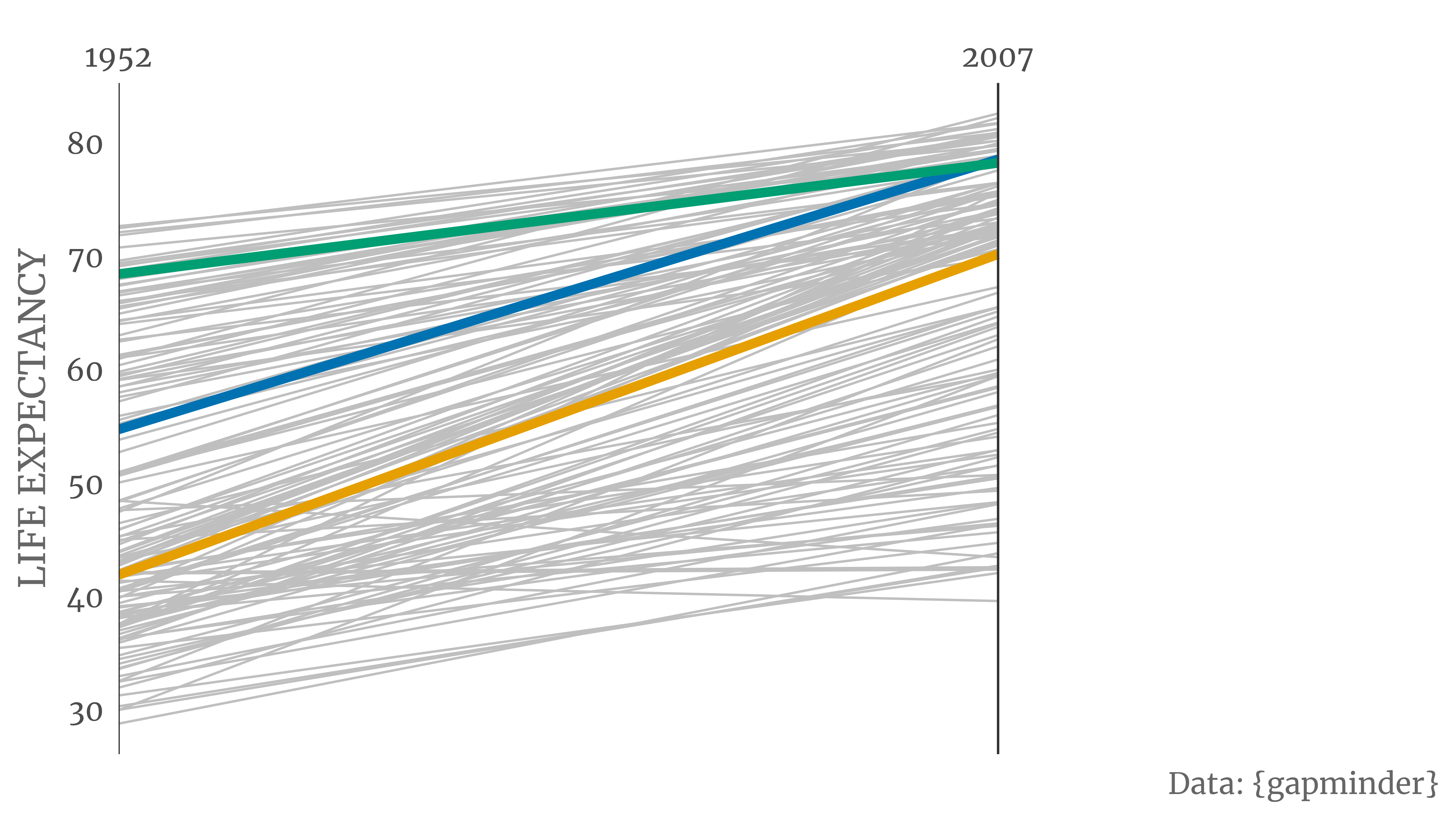
Notice how scale_x_discrete() removed all white space on the left-hand side of the plot and added a lot of white space on the right. This leaves some room for a custom annotation. After all, the reader should know which countries we highlighted.
slope_chart +
  annotate(
    'text',
    x = as.numeric(annotation_data$year) + 0.01,
    y = as.numeric(annotation_data$life_exp) + c(2, 0, -2),
    label = annotation_data$country,
    hjust = 0,
    col = annotation_data$color,
    family = 'Merriweather',
    size = 8
  )
Closing
That’s a wrap. I hope I could inspire you to ditch paired bar charts. If you have any questions, feel free to reach out to me on Twitter or use the comment section below. See you next time!
Footnotes
I’m not sure if the arrows are ambiguous. I find them quite intuitive. But better safe than sorry, right?↩︎


