library(tidyverse)
library(giscoR)
germany_districts <- gisco_get_nuts(
  year = "2021",
  nuts_level = 3,
  epsg = 3035,
  country = 'Germany'
) |>
  # Nicer output
  as_tibble() |>
  janitor::clean_names()
germany_districts
## # A tibble: 401 × 11
##    nuts_id levl_code urbn_type cntr_code name_latn          nuts_name mount_type
##    <chr>       <dbl>     <dbl> <chr>     <chr>              <chr>          <dbl>
##  1 DE254           3         1 DE        Nürnberg, Kreisfr… Nürnberg…          4
##  2 DE255           3         1 DE        Schwabach, Kreisf… Schwabac…          4
##  3 DE256           3         3 DE        Ansbach, Landkreis Ansbach,…          4
##  4 DE257           3         1 DE        Erlangen-Höchstadt Erlangen…          4
##  5 DE258           3         1 DE        Fürth, Landkreis   Fürth, L…          4
##  6 DE259           3         2 DE        Nürnberger Land    Nürnberg…          4
##  7 DE25A           3         3 DE        Neustadt a. d. Ai… Neustadt…          4
##  8 DE25B           3         2 DE        Roth               Roth               4
##  9 DE25C           3         3 DE        Weißenburg-Gunzen… Weißenbu…          4
## 10 DE261           3         1 DE        Aschaffenburg, Kr… Aschaffe…          4
## # ℹ 391 more rows
## # ℹ 4 more variables: coast_type <dbl>, fid <chr>, geo <chr>,
## # geometry <POLYGON [m]>How to create interactive country maps with R.
Visualization
In this blog post, I show you how to create interactive maps with ggplot.
In today’s blog post, I’m going to show you how to create interactive maps like this with R.
And we’re going to proceed in five short steps to make that happen:
- Get the geographic data via the
{giscoR}package - Create a static plot from that with
{ggplot2} - Make the chart interactive with
{ggiraph} - Merge state- and district-level geographic data for nicer hover labels with
{sf} - Polish with nicer colors for chart and hover effects
And as always, you can also watch the video version of this blog post on YouTube:
With that said, let’s get started!
Step 1: Get the data
First, we need to get the geographic data for Germany. We can do that with the {giscoR} package. And we’re going to use the gisco_get_nuts() function to do that.
This will give us the NUTS level 3 data for Germany. This system is used by the European Union to define regions within the EU. Here, the nuts_level parameter defines the level of detail we want.
For Germany, nuts_level = 3 corresponds to the districts but it’s a tiny bit different for each country. And it can also be a bit different for each year, so you might need to adjust the year parameter accordingly. Here’, we just chose the most recent year for which there’s data.
Finally, you may be wondering what the epsg parameter is. This is the coordinate reference system we want the data in. Here, we chose epsg = 3035 which is the ETRS89 / LAEA Europe projection. And this doesn’t have to tell you much but what you should take away from this, is that you should choose a projection that fits your needs.
You see, with geographic data there are different ways of representing the earth’s surface on a flat map. That’s what the projection does. And depending on the projection you choose, the map will look different.
Step 2: A first static plot
With that data, we can now create a first static plot with {ggplot2}. And since the data has a column geometry that contains the polygons for each district, we can use that to plot the districts. All we have to do is to use the geom_sf() function to do that.
germany_districts |>
  ggplot(aes(geometry = geometry)) +
  geom_sf()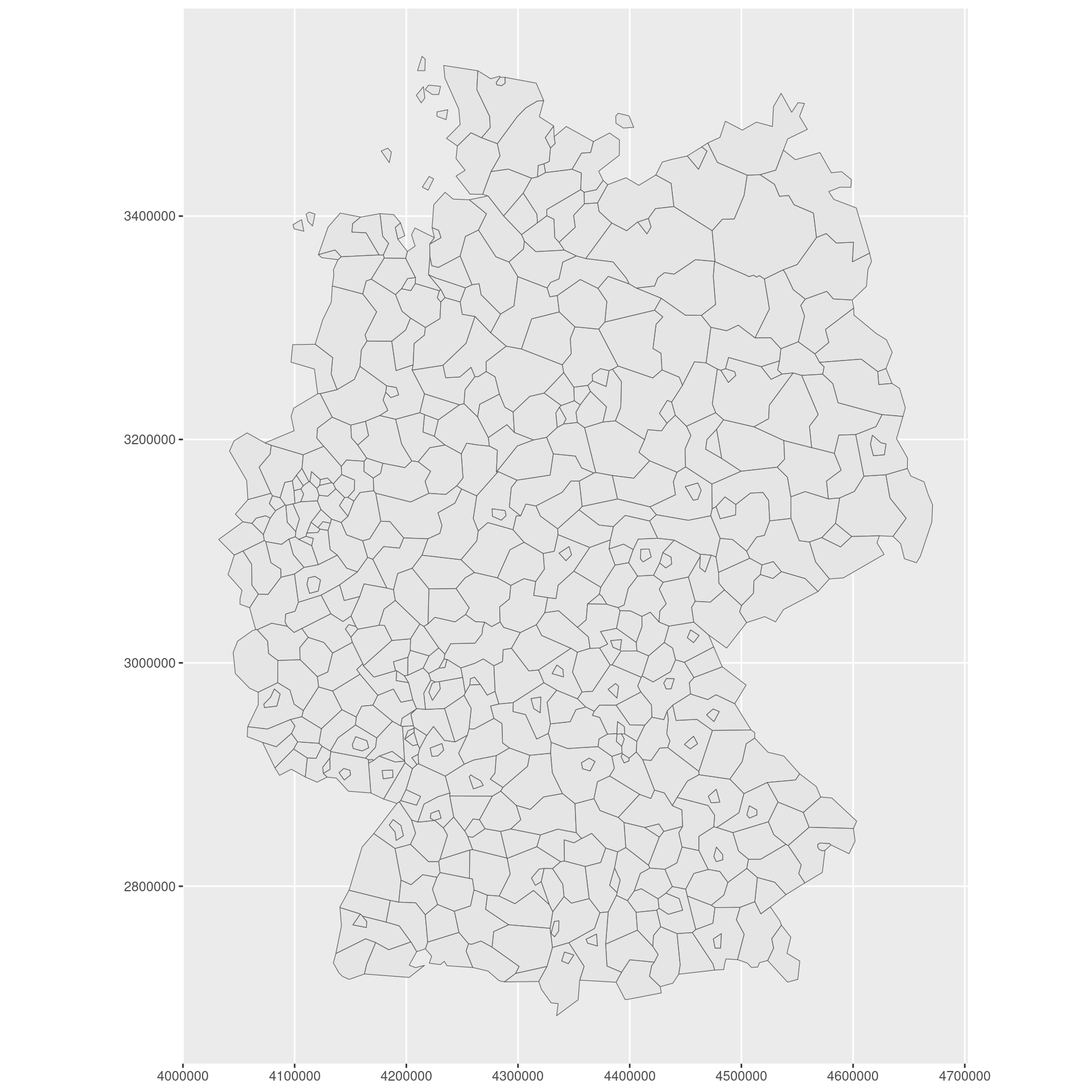
Nice! That was pretty easy wasn’t it? Let’s add the state borders to this chart as well. For this we need to get the state-level data for Germany (with a nuts_level = 1).
germany_states <- gisco_get_nuts(
  year = "2021",
  nuts_level = 1,
  epsg = 3035,
  country = 'Germany'
) |>
  as_tibble() |>
  janitor::clean_names()
germany_states
## # A tibble: 16 × 11
##    nuts_id levl_code urbn_type cntr_code name_latn          nuts_name mount_type
##    <chr>       <dbl>     <dbl> <chr>     <chr>              <chr>          <dbl>
##  1 DE1             1         0 DE        Baden-Württemberg  Baden-Wü…          0
##  2 DE6             1         0 DE        Hamburg            Hamburg            0
##  3 DE7             1         0 DE        Hessen             Hessen             0
##  4 DE8             1         0 DE        Mecklenburg-Vorpo… Mecklenb…          0
##  5 DE9             1         0 DE        Niedersachsen      Niedersa…          0
##  6 DEA             1         0 DE        Nordrhein-Westfal… Nordrhei…          0
##  7 DEB             1         0 DE        Rheinland-Pfalz    Rheinlan…          0
##  8 DEC             1         0 DE        Saarland           Saarland           0
##  9 DED             1         0 DE        Sachsen            Sachsen            0
## 10 DEE             1         0 DE        Sachsen-Anhalt     Sachsen-…          0
## 11 DEF             1         0 DE        Schleswig-Holstein Schleswi…          0
## 12 DEG             1         0 DE        Thüringen          Thüringen          0
## 13 DE2             1         0 DE        Bayern             Bayern             0
## 14 DE3             1         0 DE        Berlin             Berlin             0
## 15 DE4             1         0 DE        Brandenburg        Brandenb…          0
## 16 DE5             1         0 DE        Bremen             Bremen             0
## # ℹ 4 more variables: coast_type <dbl>, fid <chr>, geo <chr>,
## #   geometry <GEOMETRY [m]>
Cool! We can now add another geom_sf() layer to the plot to show the state borders. But here, we need to make sure that this new layer uses
- the
germany_statesdata, and - the
nuts_namecolumn for the fill color
germany_districts |>
  ggplot(aes(geometry = geometry)) +
  geom_sf(
    data = germany_states,
    aes(fill = nuts_name),
    color = 'black',
    linewidth = 0.5
  ) +
  geom_sf()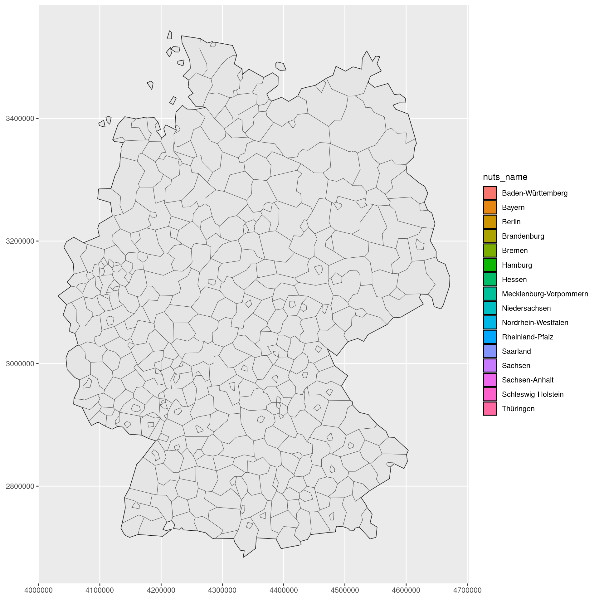
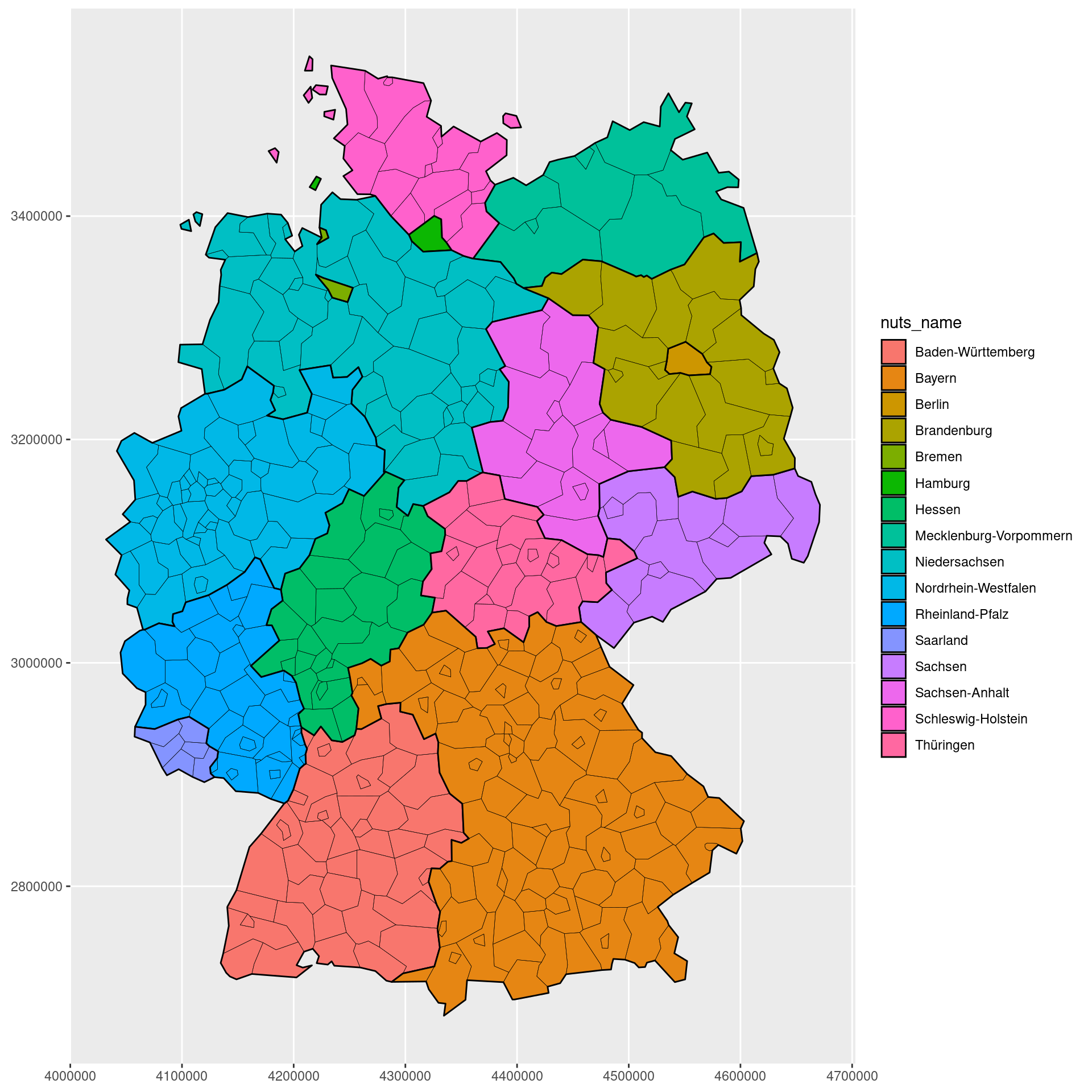
Notice how there is a legend now but we don’t actually see the colors. That happens because the districts are plotted on top of the states. We can fix that by making the districts transparent.
germany_districts |>
  ggplot(aes(geometry = geometry)) +
  geom_sf(
    data = germany_states,
    aes(fill = nuts_name),
    color = 'black',
    linewidth = 0.5
  ) +
  geom_sf(
    fill = NA,
    color = 'black',
    linewidth = 0.1
  )
So what’s the point of throwing in the district level data if we make them transparent anyway? Well, that’s where the interactivity comes in.
Step 3: Make the chart interactive
With the {ggiraph} package, we can make the chart interactive. All we have to do is to make the geom_sf() layer for the districts interactive by using geom_sf_interactive() instead. Once we have that, we can
- define the
data_idandtooltipaesthetics to make the chart interactive, and - render the chart with the
girafe()function.
library(ggiraph)
gg_plt <- germany_districts |>
  ggplot(aes(geometry = geometry)) +
  geom_sf(
    data = germany_states,
    aes(fill = nuts_name),
    color = 'black',
    linewidth = 0.5
  ) +
  geom_sf_interactive(
    fill = NA,
    aes(
      data_id = nuts_id,
      tooltip = glue::glue('{nuts_name}')
    ),
    linewidth = 0.1
  )
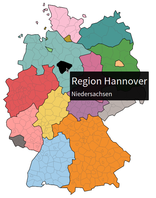
girafe(ggobj = gg_plt)Nice! Now we have an interactive map. When you hover over a district, you see the district name and the region turns orange.
If you want to get the full details on how to create interactive maps with R, check out my corresponding YT video and blog post.
We can make the chart even better by merging the state- and district-level data. That way, the tooltip can show the state name as well as the district name. Let’s get rid of the unnecessary legend and grid first though.
library(ggiraph)
gg_plt <- germany_districts |>
  ggplot(aes(geometry = geometry)) +
  geom_sf(
    data = germany_states,
    aes(fill = nuts_name),
    color = 'black',
    linewidth = 0.5
  ) +
  geom_sf_interactive(
    fill = NA,
    aes(
      data_id = nuts_id,
      tooltip = glue::glue('{nuts_name}')
    ),
    linewidth = 0.1
  ) +
  theme_void() +
  theme(
    legend.position = 'none'
  )

girafe(ggobj = gg_plt)
Step 4: Merge geographic data
To merge the state- and district-level data, we need to find out which district belongs to which of Germany’s 16 states. To do so, we are going to use spatial calculations to figure out with a district geometry is contained within a state geometry. That’s what the {sf} package and it’s st_within() function is for. By iterating over all district geometries and checking if they are within a state geometry, we can find out which state each district belongs to.
library(sf)
state_nmbrs <- map_dbl(
  germany_districts$geometry,
  \(x) {
    map_lgl(
      germany_states$geometry,
      \(y) st_within(x, y) |>
        as.logical()
    ) |> which()
  }
)
state_nmbrs
##   [1] 13 13 13 13 13 13 13 13 13 13 13 13 13 13 13 13 13 13 13 13 13 13 13 13 13
##  [26]  1  1  1  1  1  1  1  1  1  1  1  1  1  1  1  1  1  1  1 13 13 13 13 13 13
##  [51] 13 13 13 13 13 13 13 13 13 13 13 13 13 13 13 13 13  6  6  6  6  6  6  1  1
##  [76]  1  1  1  1  1  1  1  1  1  1  1  1  1  1  1  1  1  1  1  1  1  1  1 13 13
## [101] 13 13 13 13 13 13 13 13 13 13 13 13 13 13 13 13 13 13 13 13 13 13 13 13 13
## [126] 13 13 13 13 13 13 13 13 13 13 13 10 10 10 10 11 11 11 11 11  9  9  9 10 10
## [151] 10 10 10 10 10 10 10 10 11 11 11 11 11 11 11 11 11 11 12 12 12 12 12 12 12
## [176] 12 12 12 12 12 12 12 12 12 12 12 12 12 12 12 12  5  5  5  5  5  5  5  5  5
## [201]  5  5  5  5  5  5  6  6  6  6  6  6  6  6  6  6  6  6  6  6  6  6  6  6  6
## [226]  6  6  6  6  6  6  6  6  6  6  6  6  6  6  6  6  6  6  6  6  6  6  6  6  6
## [251]  6  6  6  7  7  7  7  7  7  7  7  7  7  7  7  7  7  7  7  7  7  7  7  7  7
## [276]  7  7  7  7  7  7  7  7  7  7  7  7  7  7  8  8  8  8  8  8  9  9  9  9  9
## [301]  9  9  9  9  9 13 13 13 13 13 13 13 13 13 13 14 15 15 15 15 15 15 15 15 15
## [326] 15 15 15 15 15 15 15 15 15 16 16  2  3  3  3  3  3  3  3  3  3  3  3  3  3
## [351]  3  3  3  3  3  3  3  3  3  3  3  3  3  4  4  4  4  4  4  4  4  5  5  5  5
## [376]  5  5  5  5  5  5  5  5  5  5  5  5  5  5  5  5  5  5  5  5  5  5  5  5  5
## [401]  5
Once we have that, we can add the state names to the district data.
germany_districts_w_state <- germany_districts |>
  mutate(
    state = germany_states$nuts_name[state_nmbrs]
  )
germany_districts_w_state |> select(nuts_name, state)
## # A tibble: 401 × 2
##    nuts_name                          state
##    <chr>                              <chr>
##  1 Nürnberg, Kreisfreie Stadt         Bayern
##  2 Schwabach, Kreisfreie Stadt        Bayern
##  3 Ansbach, Landkreis                 Bayern
##  4 Erlangen-Höchstadt                 Bayern
##  5 Fürth, Landkreis                   Bayern
##  6 Nürnberger Land                    Bayern
##  7 Neustadt a. d. Aisch-Bad Windsheim Bayern
##  8 Roth                               Bayern
##  9 Weißenburg-Gunzenhausen            Bayern
## 10 Aschaffenburg, Kreisfreie Stadt    Bayern
## # ℹ 391 more rows
Excellent! With that we can just use a different tooltip in the geom_sf_interactive() layer to show the state name as well.
gg_plt <- germany_districts_w_state |>
  ggplot(aes(geometry = geometry)) +
  geom_sf(
    data = germany_states,
    aes(fill = nuts_name),
    color = 'black',
    linewidth = 0.5
  ) +
  geom_sf_interactive(
    fill = NA,
    aes(
      data_id = nuts_id,
      tooltip = glue::glue('{nuts_name}<br>{state}')
    ),
    linewidth = 0.1
  ) +
  theme_void() +
  theme(
    legend.position = 'none'
  )

girafe(ggobj = gg_plt)
Step 5: Polish
Sweet! We have all the basics covered. Let’s make sure that the chart looks nice.
To do so, we can
- create a nicer tooltip labels (by using better fonts and font sizes)
- and use nicer colors via the
scale_fill_manual()function.
For the first step, let’s create a function that creates nice text labels. This function will wrap the texts in HTML <span> tags and apply some CSS to make them look nice.
make_nice_label <- function(nuts_name, state) {
  nuts_name_label <- htmltools::span(
    nuts_name,
    style = htmltools::css(
      fontweight = 600,
      font_family = 'Source Sans Pro',
      font_size = '32px'
    )
  )
  state_label <- htmltools::span(
    state,
    style = htmltools::css(
      font_family = 'Source Sans Pro',
      font_size = '20px'
    )
  )
  glue::glue('{nuts_name_label}<br>{state_label}')
}

germany_districts_w_state_and_labels <- germany_districts_w_state  |>
  mutate(
    nice_label = map2_chr(
      nuts_name,
      state,
      make_nice_label
    )
  )
Afterwards, we just have to replace the tooltip aesthetic in the geom_sf_interactive() layer with the nice_label column. And while we’re at it, we can also use nicer colors for the chart.
ggplt <- germany_districts_w_state_and_labels  |>
  ggplot(aes(geometry = geometry)) +
  geom_sf(
    data = germany_states,
    aes(fill = nuts_name),
    color = 'black',
    linewidth = 0.5
  ) +
  geom_sf_interactive(
    fill = NA,
    aes(
      data_id = nuts_id,
      tooltip = nice_label
    ),
    linewidth = 0.1
  ) +
  geom_sf(
    data = germany_states,
    aes(fill = nuts_name),
    color = 'black',
    linewidth = 0.5
  ) +
  geom_sf_interactive(
    fill = NA,
    aes(
      data_id = nuts_id,
      tooltip = nice_label
    ),
    linewidth = 0.1
  ) +
  theme_void() +
  theme(
    legend.position = 'none'
  ) +
  scale_fill_manual(
    values = c("#A0CBE8FF", "#F28E2BFF", "#FFBE7DFF", "#59A14FFF", "#8CD17DFF", "#B6992DFF", "#F1CE63FF", "#499894FF", "#86BCB6FF", "#E15759FF", "#FF9D9AFF", "#79706EFF", "#BAB0ACFF", "#D37295FF", "#FABFD2FF", "#B07AA1FF", "#D4A6C8FF", "#9D7660FF", "#D7B5A6FF")
  )

girafe(ggobj = ggplt)
And in the final step, we can make sure that the hover effect is nicer. Here, our final change is simple. Just turn the hover area black.
girafe(
  ggobj = ggplt,
  options = list(
    opts_hover(
      css = girafe_css(
        css = '',
        area = 'stroke: black; fill: black;'
      )
    )
  )
)
Conclusion
Sweeeet! We created a nice interactive map of Germany. I hope you enjoyed this little tutorial. Have a great day and see you next time. And if you found this helpful, here are some other ways I can help you:
- 3 Minute Wednesdays: A weekly newsletter with bite-sized tips and tricks for R users
- Insightful Data Visualizations for “Uncreative” R Users: A course that teaches you how to leverage
{ggplot2}to make charts that communicate effectively without being a design expert.


