Insightful Data Visualizations for "Uncreative" R Users
Leverage {ggplot2} to make charts that communicate effectively without being a design expert.
Communicate insights nowWe use cookies
We use cookies and other tracking technologies to improve your browsing experience on our website, to show you personalized content and targeted ads, to analyze our website traffic, and to understand where our visitors are coming from.
In the last installment, we learned about the web inspector of any modern web browser. This gave us insights into the structure of a website and the CSS styles that are applied to it. In today’s blog post, we want to build a little something with HTML and CSS ourselves.
And to do it in an R fashion, we will use the htmltools package. This makes it easy to create HTML and CSS code with R. And more importantly, we can focus on just the structure of the HTML tags nested into one another and setting CSS keywords. We don’t have to worry about the overhead of setting up a <body> tag etc.
So after this blog post, you will be able to create a simple HTML and CSS structure with R. And you’ll be equipped with a whole bunch of CSS keywords to style your HTML elements. As always, if you enjoy video content more, you can watch the corresponding video on my YouTube channel:
Before we start building, let me show you what we’re going for. It’s nothing fancy. It’s just a div container that contains a headline, a paragraph, a button and a whole bunch of CSS styles. All of that is something I have to do to reimagine the sales page of my data visualization course. So we might as well make a learning experience out of it. Here’s how it looks:
Leverage {ggplot2} to make charts that communicate effectively without being a design expert.
Communicate insights nowFirst, what we want to to is to load the htmltools package and then create a div container with it.
library(htmltools)
div('This is a div container')
What you’d get if you execute this code in your console, is your console displaying
<div>This is a div container</div>That’s nice to see the structure of the HTML. But it’s not particularly nice if we want to see the rendered version. Luckily, the htmltools package has a function called browsable() that we can use to see the rendered version of the HTML in our RStudio Viewer.
div('This is a div container') |>
  browsable()
Neat. Now we can iterate inside of RStudio until the output looks like we want. Here, what we want to do is to add a headline, a paragraph and a button to the div container. By now you should know that the corresponding tags for these are h1, p and, well, we haven’t covered buttons yet, have we? But here’s secret for you: In a lot of cases, what looks like a button is actually just a hyperlink with a bunch of CSS styles applied to it. Therefore, we’ll need an a tag.
div(
  h1('This is a headline'),
  p('This is a paragraph'),
  a(
    'This is a button',
    href = 'https://arapp.thinkific.com/courses/insightful-data-visualizations-for-uncreative-r-users'
  )
) |>
  browsable()
Notice that I have inserted the href argument into the a tag. This will simply use the href attribute of the a tag to create a link. In HTML code, this looks like
<a href="https://arapp.thinkific.com/courses/insightful-data-visualizations-for-uncreative-r-users">This is a button</a>In any case, the output looks a bit crude. But that’s to be expected. After all, we haven’t applied any CSS styles to the tags yet.
Next, let us fill the content of the tags with something more meaningful.
div(
  h1('Insightful Data Visualizations for "Uncreative" R Users'),
  p(
    "Leverage",
    "{ggplot2}",
    "to make charts that communicate effectively",
    "without being a design expert."
  ),
  a(
    'Communicate insights now',
    href = 'https://arapp.thinkific.com/courses/insightful-data-visualizations-for-uncreative-r-users'
  )
) |>
browsable()Leverage {ggplot2} to make charts that communicate effectively without being a design expert.
Communicate insights nowNotice that I have put the text for the paragraph onto separate lines. The reason for that is that each of these lines will need some custom styling. But more on that later.
For now, notice that in the output the extra lines are not reflected. The reason for that is that all of the tags inside of {htmltools} use only this ... catchall argument. This means that any tag function just accepts whatever is passed to it and the docs tell us that all unnamed arguments simply become “children” of the tag. For a p tag, this means that all of the text is just put into one paragraph.
But there’s more. Named arguments are used to set attributes of the tag. That’s what we have seen in action with href already. You see, there we passed in a named argument (href is the name). So, if we want to add the style attribute to a tag, we can do the same thing but with style.
div(
  h1(
    'Insightful Data Visualizations for "Uncreative" R Users',
    style = css(

    )
  ),
  p(
    "Leverage",
    "{ggplot2}",
    "to make charts that communicate effectively",
    "without being a design expert.",
    style = css(

    )
  ),
  a(
    'Communicate insights now',
    href = 'https://arapp.thinkific.com/courses/insightful-data-visualizations-for-uncreative-r-users',
    style = css(

    )
  ),
  style = css(

  )
) |>
browsable()Leverage {ggplot2} to make charts that communicate effectively without being a design expert.
Communicate insights now
Here, I have just inserted the style argument into each tag because I already now that every tag will need a bit of styling. Crucially, I have used the css() function to set the style attribute. This is a function from the htmltools package that allows us to set CSS keywords in R.
You know, normally we have to pass a string to the style attribute of a tag. Something like color:blue; font-size:24px; font-weight: 600;. That’s because CSS works that way. But this is tediuos to write and hard to read. So instead, we use the helper function that translates a list of CSS keywords into a string. Have a look.
css(
  color = 'blue',
  font_size = '24px',
  font_weight = 600
)
## [1] "color:blue;font-size:24px;font-weight:600;"
Much more legible, right? But did you notice the font_size keyword? The output of that was font-size (with a dash - instead of an underscore _). The latter is the correct CSS variable name. But R would not like it if we used a dash in a variable name. Hence, the css() functions lets us use an underscore and then translates it into a dash.
Now, let’s fill the css() functions with some actual CSS keywords. You have already seen some in the last blog post and here I’ve also already used color, font_size and font_weight. They’re probably easy to understand so that’s why I didn’t explain them before. But just to be sure, I’ll include some explanations on all keywords in the next sections.
Let’s begin our journey into more CSS keywords with the keywords that relate to text and fonts. The ones we are going to use here are
font_family: Set this to a font family name (actually it’s a bit more complicated but for this blog post it’s okay)font_size: Set this to a font size (e.g. 24px)font_weight: Set this to a font weight (e.g. 600 for bold and 300 for regular)line_height: Set this to a line height (e.g. 1.3)text_decoration: Set this to a text decoration (e.g. none to remove underlines from links)div(
h1(
'Insightful Data Visualizations for "Uncreative" R Users',
style = css(
font_family = 'Libre Baskerville',
font_size = '42px',
font_weight = 600,
line_height = 1.3
)
),
p(
"Leverage",
"{ggplot2}",
"to make charts that communicate effectively",
"without being a design expert.",
style = css(
font_size = '26px',
line_height = 1.3
)
),
a(
"Communicate insights now",
href = "https://arapp.thinkific.com/courses/insightful-data-visualizations-for-uncreative-r-users",
style = css(
font_size = '24px',
font_weight = 600,
text_decoration = 'none'
)
),
style = css(
font_family = 'Source Sans Pro'
)
) |>
browsable()Leverage {ggplot2} to make charts that communicate effectively without being a design expert.
Communicate insights nowThis is a great start to remind yourself of the concept of specificity. You see, the font_family keyword is applied to the whole div container and set to Source Sans Pro. But the h1 tag has a font_family keyword set to Libre Baskerville. Thus, the h1 tag will have a different font family than the rest of the div container because the style instruction that we specified in the h1 tag are more specific than the ones in the div container.
Next, let us bring some colors into the mix. The variables that we need for that are
color: Set this to a text color (e.g. blue)background: Set this to a background color (e.g. #0454a4) or to a function like linear-gradient(45deg, #bcd7e1, #c7dbf0) that creates a gradient instead of a solid color. The 45deg is the angle of the gradient and the two colors are the start and end color of the gradient.div(
h1(
'Insightful Data Visualizations for "Uncreative" R Users',
style = css(
font_family = 'Libre Baskerville',
font_size = '42px',
font_weight = 600,
line_height = 1.3
)
),
p(
"Leverage",
"{ggplot2}",
"to make charts that communicate effectively",
"without being a design expert.",
style = css(
font_size = '26px',
line_height = 1.3
)
),
a(
"Communicate insights now",
href = "https://arapp.thinkific.com/courses/insightful-data-visualizations-for-uncreative-r-users",
style = css(
font_size = '24px',
font_weight = 600,
text_decoration = 'none',
background = '#0454a4', ### <- Change here
color = 'white', ### <- Change here
)
),
style = css(
font_family = 'Source Sans Pro',
background = "linear-gradient(45deg, #bcd7e1, #c7dbf0)", ### <- Change here
color = '#333333', ### <- Change here
)
) |>
browsable()Leverage {ggplot2} to make charts that communicate effectively without being a design expert.
Communicate insights nowFinally, let’s add some spacing and positioning to the mix. The keywords that we need for that are
margin: Set this to a margin (e.g. 20px)padding: Set this to a padding (e.g. 20px)I can already hear you say “But what’s the difference between margin and padding?”. I’m glad you asked young padawan. At first glance, they seem to do the same thing. And I found them confusing when I first learned about it. But here’s the difference:
margin sets the space between the border of the element and the next elementpadding sets the space between the border of the element and the content inside of the elementSo, what we want to do in the next is to move the texts further into the div container. It’s just plain ugly when the border of a rectangle is right there where the text is at. This is clear case of using padding on the div container. Let’s do that.
There are multiple ways to use the padding keyword. The most common ones are
padding: 20px; sets the padding to 20px on all sidespadding: 20px 10px; sets the padding to 20px on the top and bottom and 10px on the left and rightpadding: 20px 20px 10px 5px; sets the padding to 20px on the top, 20px on the right, 10px on the bottom and 5px on the leftAnd if you want to change just a single side, you can use padding-top, padding-right, padding-bottom and padding-left instead of padding. Here, let’s try to set the padding to 50px on the top and bottom and 30px on the left and right.
div(
  h1(
    'Insightful Data Visualizations for "Uncreative" R Users',
    style = css(
      font_family = 'Libre Baskerville',
      font_size = '42px',
      font_weight = 600,
      line_height = 1.3
    )
  ),
  p(
    "Leverage",
    "{ggplot2}",
    "to make charts that communicate effectively",
    "without being a design expert.",
    style = css(
      font_size = '26px',
      line_height = 1.3
    )
  ),
  a(
    "Communicate insights now",
    href = "https://arapp.thinkific.com/courses/insightful-data-visualizations-for-uncreative-r-users",
    style = css(
      font_size = '24px',
      font_weight = 600,
      text_decoration = 'none',
      background = '#0454a4',
      color = 'white',
    )
  ),
  style = css(
    font_family = 'Source Sans Pro',
    background = "linear-gradient(45deg, #bcd7e1, #c7dbf0)",
    color = '#333333',
    padding = '50px 30px' ### <- Change here
  )
) |>
browsable()Leverage {ggplot2} to make charts that communicate effectively without being a design expert.
Communicate insights nowOkay, this worked but it’s not perfect. The top and bottom padding doesn’t look really symmetric. What’s going on there?
And honestly, I don’t know. At least that was my initial reaction. But then I used the web inspector to see what’s going on. If you hover over the h1 tag, you will see that there is a margin applied to it. You can see that by the orange space that appears around the h1 tag.
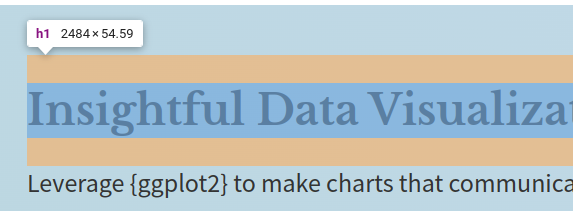
And if you scroll down in the styles panel, you can actually see a diagramm that tells you that the margin is not zero.
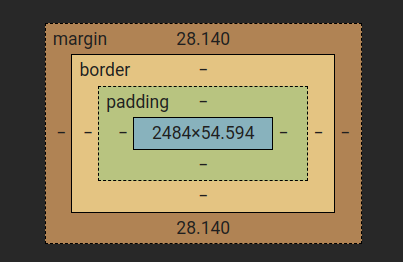
Notice that this also shows you how paddings do not auto-collapse. What I mean by that is that the padding of the div container and the padding of the h1 tag seem to be added together resulting in a huge gap. But that’s not what we want. Hence, if we want to make the padding symmetric, we have to set the margin of the h1 tag to zero.
div(
  h1(
    'Insightful Data Visualizations for "Uncreative" R Users',
    style = css(
      font_family = 'Libre Baskerville',
      font_size = '42px',
      font_weight = 600,
      line_height = 1.3,
      margin = '0px' ### <- Change here
    )
  ),
  p(
    "Leverage",
    "{ggplot2}",
    "to make charts that communicate effectively",
    "without being a design expert.",
    style = css(
      font_size = '26px',
      line_height = 1.3
    )
  ),
  a(
    "Communicate insights now",
    href = "https://arapp.thinkific.com/courses/insightful-data-visualizations-for-uncreative-r-users",
    style = css(
      font_size = '24px',
      font_weight = 600,
      text_decoration = 'none',
      background = '#0454a4',
      color = 'white',
    )
  ),
  style = css(
    font_family = 'Source Sans Pro',
    background = "linear-gradient(45deg, #bcd7e1, #c7dbf0)",
    color = '#333333',
    padding = '50px 30px'
  )
) |>
browsable()Leverage {ggplot2} to make charts that communicate effectively without being a design expert.
Communicate insights nowAh much better. Notice that the paragraph is now much closer to the headline. We could have just set margin-top in <h1> to zero and still left the bottom margin but we can want to modify the margins of the paragraph anyway. So it’s all good.
div(
  h1(
    'Insightful Data Visualizations for "Uncreative" R Users',
    style = css(
      font_family = 'Libre Baskerville',
      font_size = '42px',
      font_weight = 600,
      line_height = 1.3,
      margin = '0px'
    )
  ),
  p(
    "Leverage",
    "{ggplot2}",
    "to make charts that communicate effectively",
    "without being a design expert.",
    style = css(
      font_size = '26px',
      line_height = 1.3,
      margin_bottom = '20px',            ### <- Change here
      margin_top = '15px',               ### <- Change here
    )
  ),
  a(
    "Communicate insights now",
    href = "https://arapp.thinkific.com/courses/insightful-data-visualizations-for-uncreative-r-users",
    style = css(
      font_size = '24px',
      font_weight = 600,
      text_decoration = 'none',
      background = '#0454a4',
      color = 'white',
    )
  ),
  style = css(
    font_family = 'Source Sans Pro',
    background = "linear-gradient(45deg, #bcd7e1, #c7dbf0)",
    color = '#333333',
    padding = '50px 30px'
  )
) |>
browsable()Leverage {ggplot2} to make charts that communicate effectively without being a design expert.
Communicate insights nowNext, let us deal with our ugly button. We can apply the same trick and use the padding keyword to make the button look a bit more appealing.
div(
  h1(
    'Insightful Data Visualizations for "Uncreative" R Users',
    style = css(
      font_family = 'Libre Baskerville',
      font_size = '42px',
      font_weight = 600,
      line_height = 1.3,
      margin = '0px'
    )
  ),
  p(
    "Leverage",
    "{ggplot2}",
    "to make charts that communicate effectively",
    "without being a design expert.",
    style = css(
      font_size = '26px',
      line_height = 1.3,
      margin_bottom = '20px',
      margin_top = '15px',
    )
  ),
  a(
    "Communicate insights now",
    href = "https://arapp.thinkific.com/courses/insightful-data-visualizations-for-uncreative-r-users",
    style = css(
      font_size = '24px',
      font_weight = 600,
      text_decoration = 'none',
      background = '#0454a4',
      color = 'white',
      padding = '15px',                      ### <- Change here
    )
  ),
  style = css(
    font_family = 'Source Sans Pro',
    background = "linear-gradient(45deg, #bcd7e1, #c7dbf0)",
    color = '#333333',
    padding = '50px 30px'
  )
) |>
browsable()Leverage {ggplot2} to make charts that communicate effectively without being a design expert.
Communicate insights nowNice, our button looks a bit more appealing now. But notice how the space between the paragraph and the button decreased quite a lot. You’d think that the 20px margin-bottom of the paragraph would have prevented that. But somehow the padding isn’t taken into account when the margin is calculated. Have a look how the padding of the button and the margin of the paragraph overlap.
And the reason for that is simple but it can drive you mad if you don’t know what you’re looking for. The thing is that the a tag is an inline element. And inline elements behave differently. Their paddings certainly don’t seem to respect the margin keyword of adjacent blocks. So that’s why we have to tell the inline element to behave like a block element instead. We do that with the display keyword.
div(
  h1(
    'Insightful Data Visualizations for "Uncreative" R Users',
    style = css(
      font_family = 'Libre Baskerville',
      font_size = '42px',
      font_weight = 600,
      line_height = 1.3,
      margin = '0px'
    )
  ),
  p(
    "Leverage",
    "{ggplot2}",
    "to make charts that communicate effectively",
    "without being a design expert.",
    style = css(
      font_size = '26px',
      line_height = 1.3,
      margin_bottom = '20px',
      margin_top = '15px',
    )
  ),
  a(
    "Communicate insights now",
    href = "https://arapp.thinkific.com/courses/insightful-data-visualizations-for-uncreative-r-users",
    style = css(
      font_size = '24px',
      font_weight = 600,
      text_decoration = 'none',
      background = '#0454a4',
      color = 'white',
      padding = '15px',
      display = 'block'                     ### <- Change here
    )
  ),
  style = css(
    font_family = 'Source Sans Pro',
    background = "linear-gradient(45deg, #bcd7e1, #c7dbf0)",
    color = '#333333',
    padding = '50px 30px'
  )
) |>
browsable()Leverage {ggplot2} to make charts that communicate effectively without being a design expert.
Communicate insights nowWell that worked quite nicely. The padding of the button is now respected and the space between the paragraph and the button is back to normal. Check it out in the web inspector if you don’t believe me.
But as cool as that is, the button now fills the whole line. That’s not what we want. But that’s how blocks behave: They fill the whole line they’re in. That was the reason why we used an inline element in the first place. Because inline elements don’t fill the whole line.
If only we could have a block element and an inline element both at once. Something like inline-block element. That would be convenient. And it’s a good thing that we can actually do that with the display keyword as well.
div(
  h1(
    'Insightful Data Visualizations for "Uncreative" R Users',
    style = css(
      font_family = 'Libre Baskerville',
      font_size = '42px',
      font_weight = 600,
      line_height = 1.3,
      margin = '0px'
    )
  ),
  p(
    "Leverage",
    "{ggplot2}",
    "to make charts that communicate effectively",
    "without being a design expert.",
    style = css(
      font_size = '26px',
      line_height = 1.3,
      margin_bottom = '20px',
      margin_top = '15px',
    )
  ),
  a(
    "Communicate insights now",
    href = "https://arapp.thinkific.com/courses/insightful-data-visualizations-for-uncreative-r-users",
    style = css(
      font_size = '24px',
      font_weight = 600,
      text_decoration = 'none',
      background = '#0454a4',
      color = 'white',
      padding = '15px',
      display = 'inline-block'                     ### <- Change here
    )
  ),
  style = css(
    font_family = 'Source Sans Pro',
    background = "linear-gradient(45deg, #bcd7e1, #c7dbf0)",
    color = '#333333',
    padding = '50px 30px'
  )
) |>
browsable()Leverage {ggplot2} to make charts that communicate effectively without being a design expert.
Communicate insights nowFinally, let’s learn two more keywords that are quite useful. One is border_radius and the other is box_shadow. With the former we can make the button and the div container look a bit more appealing by rounding off their edges. And with the latter we can give a little bit of depth to the button. The arguments for box_shadow are x_offset, y_offset, blur_radius and shadow color. You can play around with these to get the shadow that you want.
div(
  h1(
    'Insightful Data Visualizations for "Uncreative" R Users',
    style = css(
      font_family = 'Libre Baskerville',
      font_size = '42px',
      font_weight = 600,
      line_height = 1.3,
      margin = '0px'
    )
  ),
  p(
    "Leverage",
    "{ggplot2}",
    "to make charts that communicate effectively",
    "without being a design expert.",
    style = css(
      font_size = '26px',
      line_height = 1.3,
      margin_bottom = '20px',
      margin_top = '15px',
    )
  ),
  a(
    "Communicate insights now",
    href = "https://arapp.thinkific.com/courses/insightful-data-visualizations-for-uncreative-r-users",
    style = css(
      font_size = '24px',
      font_weight = 600,
      text_decoration = 'none',
      background = '#0454a4',
      color = 'white',
      padding = '15px',
      display = 'inline-block',
      border_radius = '8px',                         ### <- Change here
      box_shadow = '5px 5px 10px rgba(0, 0, 0, 0.6)' ### <- Change here
    )
  ),
  style = css(
    font_family = 'Source Sans Pro',
    background = "linear-gradient(45deg, #bcd7e1, #c7dbf0)",
    color = '#333333',
    padding = '50px 30px',
    border_radius = '8px'                            ### <- Change here
  )
) |>
browsable()Leverage {ggplot2} to make charts that communicate effectively without being a design expert.
Communicate insights nowHooray. With that we have finished our little project and learned tons of CSS keywords along the way. If you found this helpful, here are some other ways I can help you:
{ggplot2} to make charts that communicate effectively without being a design expert.Here are three other ways I can help you:

Every week, I share bite-sized R tips & tricks. Reading time less than 3 minutes. Delivered straight to your inbox. You can sign up for free weekly tips online.

This in-depth video course teaches you everything you need to know about becoming better & more efficient at cleaning up messy data. This includes Excel & JSON files, text data and working with times & dates. If you want to get better at data cleaning, check out the course page.

This video course teaches you how to leverage {ggplot2} to make charts that communicate effectively without being a design expert. Course information can be found on the course page.